Chapter 6 – Temperature Changes in the United States of the U.S. Global Change Research Program’s recently published Climate Science Special Report (2017) clearly shows and discusses, under the heading of “6.1.2 Temperature Extremes”, how temperature extremes for the contiguous United States have become more moderate over the last 118 years, with the coldest daily temperatures warming and the warmest daily temperatures cooling. In other words, temperature-extreme-related climate in the United States has improved.
TEMPERATURE EXTREMES
Their Figure 6.3 is presented below (click to enlarge):

Figure 6.3 from U.S. GCRP CSSR 2017
The caption for their Figure 6.3 reads:
Observed changes in the coldest and warmest daily temperatures (°F) of the year in the contiguous United States. Maps (top) depict changes at stations; changes are the difference between the average for present-day (1986–2016) and the average for the first half of the last century (1901–1960). Time series (bottom) depict the area-weighted average for the contiguous United States. Estimates are derived from long-term stations with minimal missing data in the Global Historical Climatology Network–Daily dataset.16 (Figure source: NOAA/NCEI).
For those having trouble reading the graphs and maps, see the individual cells below.

Portion of Figure 6.3 from U.S. GCRP CSSR 2017 – Map – Change in Coldest
# # #

Portion of Figure 6.3 from U.S. GCRP CSSR 2017 – Graph – Change in Coldest
# # #

Portion of Figure 6.3 from U.S. GCRP CSSR 2017 – Map – Change in Warmest
# # #

Portion of Figure 6.3 from U.S. GCRP CSSR 2017 – Graph – Change in Warmest
The caption for Table 6.2 reads:
Table 6.2. Observed changes in the coldest and warmest daily temperatures (°F) of the year for each National Climate Assessment region in the contiguous United States. Changes are the difference between the average for present-day (1986–2016) and the average for the first half of the last century (1901–1960). Estimates are derived from long-term stations with minimal missing data in the Global Historical Climatology Network–Daily dataset.16
And for your viewing pleasure, here’s their Table 6.2:
 Table 6.2 from U.S. GCRP CSSR 2017
Their Figure 6.4 is below:

Figure 6.4 from U.S. GCRP CSSR 2017
The caption for their Figure 6.4 reads:
Observed changes in cold and heat waves in the contiguous United States. The top panel depicts changes in the frequency of cold waves; the middle panel depicts changes in the frequency of heat waves; and the bottom panel depicts changes in the intensity of heat waves. Cold and heat wave frequency indices are defined in Zhang et al.,15 and the heat wave intensity index is defined in Russo et al.14 Estimates are derived from long-term stations with minimal missing data in the Global Historical Climatology Network–Daily dataset.16 (Figure source: NOAA/NCEI).
The text for that section reads:
6.1.2 Temperature Extremes
Shifts in temperature extremes are examined using a suite of societally relevant climate change indices14 ,15 derived from long-term observations of daily surface temperature.16 The coldest and warmest temperatures of the year are of particular relevance given their widespread use in engineering, agricultural, and other sectoral applications (for example, extreme annual design conditions by the American Society of Heating, Refrigeration, and Air Conditioning; plant hardiness zones by the U.S. Department of Agriculture). Cold waves and heat waves (that is, extended periods of below or above normal temperature) are likewise of great importance because of their numerous societal and environmental impacts, which span from human health to plant and animal phenology. Changes are considered for a spectrum of event frequencies and intensities, ranging from the typical annual extreme to the 1-in-10 year event (an extreme that only has a 10% chance of occurrence in any given year). The discussion focuses on the contiguous United States; Alaska, Hawai‘i, and the Caribbean do not have a sufficient number of long-term stations for a century-scale analysis.
Cold extremes have become less severe over the past century. For example, the coldest daily temperature of the year has increased at most locations in the contiguous United States (Figure 6.3). All regions experienced net increases (Table 6.2), with the largest rises in the Northern Great Plains and the Northwest (roughly 4.5°F [2.5°C]), and the smallest in the Southeast (about 1.0°F [0.6°C]). In general, there were increases throughout the record, with a slight acceleration in recent decades (Figure 6.3). The temperature of extremely cold days (1-in-10 year events) generally exhibited the same pattern of increases as the coldest daily temperature of the year. Consistent with these increases, the number of cool nights per year (those with a minimum temperature below the 10th percentile for 1961–1990) declined in all regions, with much of the West having decreases of roughly two weeks. The frequency of cold waves (6-day periods with a minimum temperature below the 10th percentile for 1961–1990) has fallen over the past century (Figure 6.4). The frequency of intense cold waves (4-day, 1-in-5 year events) peaked in the 1980s and then reached record-low levels in the 2000s.17
Changes in warm extremes are more nuanced than changes in cold extremes. For instance, the warmest daily temperature of the year increased in some parts of the West over the past century (Figure 6.3), but there were decreases in almost all locations east of the Rocky Mountains. In fact, all eastern regions experienced a net decrease (Table 6.2), most notably the Midwest (about 2.2°F [1.2°C]) and the Southeast (roughly 1.5°F [0.8°C]). The decreases in the eastern half of Nation, particularly in the Great Plains, are mainly tied to the unprecedented summer heat of the 1930s Dust Bowl era, which was exacerbated by land-surface feedbacks driven by springtime precipitation deficits and land mismanagement.18 However, anthropogenic aerosol forcing may also have reduced summer temperatures in the Northeast and Southeast from the early 1950s to the mid-1970s,19 and agricultural intensification may have suppressed the hottest extremes in the Midwest.20 Since the mid-1960s, there has been only a very slight increase in the warmest daily temperature of the year (amidst large interannual variability). Heat waves (6-day periods with a maximum temperature above the 90th percentile for 1961–1990) increased in frequency until the mid-1930s, became considerably less common through the mid-1960s, and increased in frequency again thereafter (Figure 6.4). As with warm daily temperatures, heat wave magnitude reached a maximum in the 1930s. The frequency of intense heat waves (4-day, 1-in-5 year events) has generally increased since the 1960s in most regions except the Midwest and the Great Plains.17 ,21 Since the early 1980s (Figure 6.4), there is suggestive evidence of a slight increase in the intensity of heat waves nationwide14 as well as an increase in the concurrence of droughts and heat waves.22
AND NOW FOR THE ODDEST GRAPH IN THE REPORT
After discussing and illustrating how heat waves and daily high temperatures have decreased since the 1930s, the report continues:
Changes in the occurrence of record-setting daily temperatures are also apparent. Very generally, the number of record lows has been declining since the late-1970s while the number of record highs has been rising.23 By extension, there has been an increase in the ratio of the number of record highs to record lows (Figure 6.5). Over the past two decades, the average of this ratio exceeds two (meaning that twice as many high-temperature records have been set as low-temperature records). The number of new highs has surpassed the number of new lows in 15 of the last 20 years, with 2012 and 2016 being particularly extreme (ratios of seven and five, respectively).

Figure 6.5 from U.S. GCRP CSSR 2017
The caption for their Figure 6.5 reads:
Observed changes in the occurrence of record-setting daily temperatures in the contiguous United States. Red bars indicate a year with more daily record highs than daily record lows, while blue bars indicate a year with more record lows than highs. The height of the bar indicates the ratio of record highs to lows (red) or of record lows to highs (blue). For example, a ratio of 2:1 for a blue bar means that there were twice as many record daily lows as daily record highs that year. Estimates are derived from long-term stations with minimal missing data in the Global Historical Climatology Network–Daily dataset.16 (Figure source: NOAA/NCEI).
That graph is so silly it’s laughable. After they present something as nonsensical as that, do they expect us to take the rest of the report seriously?
Of course, those daily record highs and lows happened throughout the year. What they aren’t telling us is that the recent record highs likely occurred least often during the summer months and that they likely occurred most often during winter months.
My Figures 1 and 2 show the seasonal maximum temperatures (TMAX) and minimum temperatures (TMIN) for the contiguous U.S. so that you can see which seasons are showing increases in TMIN and TMAX and what season is showing no increase in TMAX. The data for the graphs in my Figures 1 and 2 can be retrieved through the NOAA webpage here. More specifically, the NOAA data page that includes the monthly TMIN and TMAX in absolute form in deg F used to be available here. Good thing I archived it here

Figure 1
# # #

Figure 2
BACK TO THE CLIMATE SCIENCE SPECIAL REPORT
Of course the “Highlights of the Findings of the U.S. Global Change Research Program Climate Science Special Report” which starts the Executive Summary fails to mention the highs in the 1930s. The 8th paragraph of the Executive Summary reads (their boldface):
Heatwaves have become more frequent in the United States since the 1960s, while extreme cold temperatures and cold waves are less frequent. Recent record-setting hot years are projected to become common in the near future for the United States, as annual average temperatures continue to rise. Annual average temperature over the contiguous United States has increased by 1.8°F (1.0°C) for the period 1901–2016; over the next few decades (2021–2050), annual average temperatures are expected to rise by about 2.5°F for the United States, relative to the recent past (average from 1976–2005), under all plausible future climate scenarios.
I’ll let you comment on that nonsense. That’s it for now.
Have fun in the comments and enjoy the remainder of your day.
STANDARD CLOSING REQUEST
Please purchase my recently published ebooks. As many of you know, this year I published 2 ebooks that are available through Amazon in Kindle format:
- Dad, Why Are You A Global Warming Denier? (For an overview, the blog post that introduced it is here.)
- Dad, Is Climate Getting Worse in the United States? (See the blog post here for an overview.)
To those of you who have purchased them, thank you. To those of you who will purchase them, thank you, too.
Regards,
Bob
And all these pretty, colorful maps are based off a shoddy, manipulated ‘data-set’ that is scientifically meaningless, at least to an honest scientist.
Exposure to the sky at the horizon has probably decreased at most locations due to tree growth and new buildings. When i look at old aerial views from the 1930s it is shocking how few trees there were then compared to now. Wouldn’t this in and of itself explain a little decrease in daily highs (sushine obscured a little bit more now in one spot morning and evening) and a larger increase in daily lows (the entire 360 degree sky view at horizon is now less, resulting in less IR lost to space and a higher nighttime temperature).
“When i look at old aerial views from the 1930s it is shocking how few trees there were then compared to now.”
Well the doomsdayers simply don’t report good news-
https://phe.rockefeller.edu/docs/Nature_Rebounds.pdf
They’re a depressive bunch of sad sacks.
If these are the trends using the whole Global Historical dataset, what do they look like using only well-sited stations, like the USCRN, that minimize the Urban Heat Island effect?
The graph fits in with my personal observation that here in the Southeast region things have been getting slightly cooler. No explanation for why that is happening, but we have had more ice and snow here the past few winters than in my entire life. They always blame global warming for that, too.
As a lay person I noted the graphing of temperatures maintained by HadCRUT4 when separated into those in the Northern Hemisphere and those in the Southern Hemisphere, the rate of increase is greater in the former. It seems to me that much of this would be attributable to the heat island effect given that there is significantly less land mass in the latter and there is more of modern urban civilization in the former. I would be interested in knowledgeable individuals comments.
The PDO and AMO basically give the majority of “global” temperature rise and fall. It all boils down to pressure zones kicking the ice out of the Arctic or not. There is no CO2 GH effect involved. I have yet to read a definitive answer as to what drives the PDO and AMO. It just “does”. Judith Curry has her “Stadium Wave” paper describing the sloshing effect on the Arctic ice.
Anybody notice that the MSM isn’t complaining anout the new head of the EPA anywhere near like it was with Scott Pruitt?
Think it’s time to put Pruitt back in as the head of the EPA…
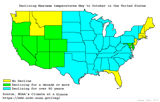
Figure 6.3 pretty much matches this image:
Thank you, Bob
After reading your article, I went to the NCA4 and downloaded everything. I whent through NCA4 chapter by chapter, although I did not read every word. I then went to the Summary. I have questions about the chapters, but I expected that the summary would at least mirror what was in the chapters. The chapter 6 graphic in the summar is the one that Bob points out as being “the oddest graph in the report.”
Although I find NCA4 to be a series of cherry picked data to support the CAGW agenda, I feel that the summary is individually bits of cherry pits compbined with statements which are not supported by the NCA4 chapters.
The US is 2% of the planets surface.
Its just not very relevant for GLOBAL warming trends.
I would recommend reading the entire section for a clearer picture.
Climate Science Special Report: Temperature Changes in the United States
(https://science2017.globalchange.gov/chapter/6/?fbclid=IwAR0e8PX404eH51BZqP8GYZGRPXiiCUh_HqLVed0jTkMoihfwj-FWevo__5s)
The same report you are linking to said this about GLOBAL warming :
“Based on extensive evidence … “it is extremely likely that human activities, especially emissions of greenhouse gases, are the dominant cause of the observed warming since the mid-20th century,”**
For the warming over the last century,”
there is no convincing alternative explanation supported by the extent of the observational evidence**.”
Climate Science Special Report: Executive Summary
(https://science2017.globalchange.gov/chapter/executive-summary/)
UHI effects are produced not only by the higher heat-absorption of man-made materials, but also by a direct increase in the available thermal energy due to burning of fuel. The distinctive signature is a secular rise of nightly low temperatures, particularly in winter, when fuel consumption is highest. That’s precisely what the Special Report shows for the USA, where 20th century urbanization/industrialization was truly unprecedented. The third world is now catching up.