Guest Post by Willis Eschenbach
[See Update at the end.] [See Second Update at the end.]
In a recent post, I discussed the new CERES Edition 4.0 dataset. See that post for a discussion of the CERES satellite-based radiation data, along with links to the data itself. In that post I’d said:
I bring all of this up because there are some new datasets in CERES Edition 4. In the CERES TOA group, there are now measurements of cloud area, cloud pressure, cloud temperature, and cloud optical depth. These are quite interesting in themselves, but that’s another story for another day.
It turns out that “another day” is today, so here is an overview of the new cloud datasets.
Let me start with cloud area. This is expressed as the “cloud area fraction”, the percentage of the time that from the satellite’s point of view the surface is obscured by clouds. Figure 1 shows cloud area fraction around the globe.

Figure 1. Cloud area fraction. Red shows the areas with the most clouds. Blue shows the cloudless deserts, including Antarctica, the frozen desert.
Some items of interest. I can see why photos of the Southern Ocean are usually overcast. Also, the land on average only has 2/3 of the oceanic cloud coverage.
Next up is the cloud average visible optical depth. From the AMS Meteorology Glossary:
cloud optical depth
The vertical optical thickness between the top and bottom of a cloud.
Cloud optical depths are relatively independent of wavelength throughout the visible spectrum, but rise rapidly in the infrared due to absorption by water, and many clouds approximate blackbodies in the thermal infrared. In the visible portion of the spectrum, the cloud optical depth is almost entirely due to scattering by droplets or crystals, and ranges through orders of magnitude from low values less than 0.1 for thin cirrus to over 1000 for a large cumulonimbus. Cloud optical depths depend directly on the cloud thickness, the liquid or ice water content, and the size distribution of the water droplets or ice crystals.

Figure 2. Average vertical optical thickness of the clouds
The most surprising feature of that map is the infamous “brown cloud” over China …
Now, the next two datasets are about the cloud tops. They give the pressure and temperature of the cloud tops. But those numbers don’t mean a whole lot to me. I can’t envision what a cloud top at -34°C and 300 hPa pressure means. What I really wanted to look at was the altitude of the cloud tops.
So I used those two to calculate the altitude of the cloud tops (details in the endnotes). Figure 3 shows how high the tops of the clouds are.

Figure 3. Cloud top altitude (km).
We see that the tallest clouds are the towering cumulonimbus thunderstorm clouds over the Pacific Warm Pool to the north of Australia.
I was glad to see these new datasets because I hoped that they would provide further evidence in support of my hypothesis about the thermal regulation of the global temperature. I’ve espoused for many years now the hypothesis that one of the largest thermoregulating mechanisms involves the timing of the daily emergence and the extent of first the daily tropical cumulus field, and then the ensuing development of tropical thunderstorms.
I have said that these processes are threshold based. For example, in the daily cycle of tropical weather, when morning temperatures exceed some local threshold, the cumulus field starts developing. Within about half an hour to an hour, the cumulus field is fully developed.
Then, if the day continues to warm, when some temperature threshold is passed we start to see thunderstorms. And as with the cumulus field, once the threshold is passed, further thunderstorm development is quite rapid.
So my hope was that the data would support my hypothesis. To investigate that, I looked at a scatterplot showing how clouds respond to different ocean temperatures. First, here is how cloud area fraction responds to different temperatures. I use the response over the ocean because it is free of the dozens of other factors involved over the land (altitude, slope, soil moisture, mountains and valleys, plants, etc.).

Figure 4. Scatterplot of sea surface temperatures versus cloud area fraction.
Can you say “non-linear”? I knew you could. This is why averages are often meaningless, or worse, misleading. But I digress.
There appear to be three separate regimes going on here. The first is on the left, below freezing, where we’re looking at clouds over sea ice. In that regime, cloud coverage increases with temperature.
In the middle section, from freezing to somewhere around 26°C (79°F), cloud coverage generally goes down with increasing temperature.
Finally, in the tropics, somewhere above 26°C, cloud area fraction starts increasing rapidly, just as my hypothesis predicts. As tropical temperatures rise, cloud area fraction increases at a very steep angle.
Next, the cloud optical depth is shown in Figure 5.

Figure 5. Scatterplot of sea surface temperatures versus cloud optical depth
The overall shape of the changes in optical depth is similar to the shape of the changes in the cloud area shown in Figure 4 above. However, optical depth doesn’t start rising at 26°C. It bottoms out a bit warmer, around 27°C, and increases from there. I suggest that this increase in optical depth is the sign of the increasing development of thunderstorms.
Finally, we have the cloud top altitude. As shown in Figure 3, in tropical thunderstorms the altitude of the tops can average 8 km (5 miles). Here is how cloud height varies with temperature.

Figure 6. Scatterplot of sea surface temperatures versus cloud top altitude
If you ever wanted a temperature hockeystick, there it is … you can see how rapidly the thunderstorms boil upwards towards the tropopause once the temperatures get warm enough.
My conclusion? These graphs absolutely support my hypothesis that tropical cumulus and thunderstorms act together to keep tropical temperatures, and hence global temperatures, within a fairly narrow range (e.g. ± 0.3°C over the entire 20th century).
w.
[UPDATE] Intrigued by Figure 6, I wanted to look at it another way. Here is Figure 3, showing cloud top heights, overlaid with gray isothermal lines at 27, 28, and 29°C.

Figure 7. As in Figure 3, with an overlay of three gray lines showing sea surface temperatures of 27°, 28°, and 29°C.
You can see the very close correspondence between the temperature and the thunderstorms.
[UPDATE 2] – A commenter suggested that looking at monthly averages rather than the annual average would be instructive. We are indeed a full-service website, so here, in the format of Figure 7 above, is the same overlay of sea surface temperatures over cloud heights. This time, however, it is by individual months.

The correspondence of sea surface temperature (gray lines) with cloud top height (colors) is most amazing. You can watch the tall thunderstorms following the warm ocean water as it wanders around the tropics.
ONCE AGAIN WITH FEELING: I’m tired of people accusing me of things I never said. I’m fed up with vaguely couched attacks on something I am claimed to have written sometime somewhere. I’ve had it with my ideas being taken out of context, twisted, and then fed back as something I’m supposed to have claimed. So please, QUOTE WHAT YOU ARE TALKING ABOUT! I am likely to get stroppy if you don’t quote whatever it is you are on about. Quote it, or don’t bother posting.
MATH: Here’s the R function showing the relationship between air temperature (Tair), surface atmospheric pressure (surfpress), pressure at altitude (pressure), and altitude. Hashmark (#) shows that what follows is a comment.
elevation.from.pressure = # function name
function(Tair = -30, pressure = 300, surfpress = 1013.171) { # default values
-29.3*(Tair+273.15)*log(pressure/surfpress)/1000 # altitude calculation in km
}
Because I didn’t know the average surface atmospheric pressure for each gridcell, I used the global average surface pressure of 1013 hPa. This leads to a possible error of about ± 1% in the calculated altitude, far too small to be meaningful for this analysis.
I’ve been following your work as shown on WUWT for some time, I’ve always thought of the climate as a chaotic system seeking a balance, a balance it will never fully achieve! That is something we should probably thank God for! Your hypothesis not only makes a great deal of sense but is soo logical that even Mr. Spock would be impressed!
Clouds with raining are quite different from clouds without raining in the energy balance.
Dr. S. Jeevananda Reddy
Off Topic:
Colorado University has finally published a new release from their Sea Level Research Group
http://sealevel.colorado.edu/
Great objective run through the data as always Willis.
If the earth’s glacial climate has local surface air temperatures perhaps 10deg lower than today (as some suggest), and a resultant lowering of sea surface temperatures, then your Fig 4 suggests this should lead to increased cloud cover for most regions of the globe, except the hot tropics and some polar areas.
Maybe the hot tropics-tropical cumulus field disappears completely in the glacial periods?
Geological evidence has long suggested that glacial periods in earth history are much more cloudy than todays interglacial climate.
DaveR February 12, 2018 at 8:04 pm
An interesting thought. Nowhere is the open ocean over 30°C, and the area where the cumulonimbus cloud top height goes way up with temperature is the area over 26-27°C. So there’s not a wide range at the top where this phenomenon is operating strongly.
Finally, let me note that the cumulus and cumulonimbus are emergent phenomena. As such, they only emerge as and when the temperature goes over a certain threshold … so if it does not ever get over that threshold, it would never emerge.
So I’d say yes, your speculation above is absolutely possible.
w.
The geological evidence (landforms, sedimentation, soil mineralogy, fossil fauna and flora, themoluminescence) for different climate epochs at the same temperate latitude location (30-60deg) in glacial/interglacial times is interesting, apart from glacial climates being cooler:
Glacial = cooler, cloudier (less solar radiation), windier (landforms)
There aren’t too many SST series that span an entire glacial cycle from the Pacific Warm Pool, but yes, temperatures may sink below 26 degrees during the very coldest intervals:
https://www.academia.edu/28471552/Mindanao_Dome_variability_over_the_last_160_kyr_Episodic_glacial_cooling_of_the_West_Pacific_Warm_Pool
As usual, a neat piece of work and analysis to go with it.
Consider however that cloud cover over the Equatorial Pacific can vary dramatically between El Niño and subsequent La Niña years. The 17 year time period covered shows an average taken over the entire time span, and as the La Niña’s prevailed, the cloud area fraction is biased towards a moderate average of cloud cover.
Cloud coverage contributes to increased albedo, and the reflectivity occurs at wavelengths that CO2 does not intercept – a classic characteristic of a La Niña time period, while oceanic absorption of incoming sunlight increases during a subsequent El Niño.
The rest as they say, becomes weather history!
Thanks, Willis, for delivering your insight to WUWT readers!!!
Cloud coverage for convective clouds can never reach 100% since there will always be places where air is descending that are cloud-free.
Low clouds over cold ocean areas on the other hand can reach 100% and stay that way for long periods since the moisture mostly comes from warmer areas rather than being evaporated “in place”.
I probably missed it somewhere, but what are the units for optical depth?
Thanks
It’s a dimensionless measure.
w.
How can something be dimensionless and a measure at the same time ?!
dimensionless and a measure
===≠==
a bleems / b bleems = x%
x% is a measure without dimension.
A / B, where A and B are the same units. It happens frequently where you are comparing things, eg as a percentage.
On figure 5, the label says optical depth units are hPa
Dimensionless pressure? (just kidding)
Smart Rock February 13, 2018 at 6:33 pm
You bet it is dimensionless pressure, available only in the finest climate stores … sorry, it was a holdover from another graphic. Thanks, fixed.
w.
https://en.wikipedia.org/wiki/Optical_depth
log of the ratio of what gets through the cloud compared to what arrives on top of it.
China is interesting. Could it be that such ‘man made warming’ as there has been is due to the environmentalists pushing to clean up industrial pollution and especially coal smog in the 50s and 6os?
Oh, the irony..
Another interesting thing about the China-cloud is just how localized it is: The optical depth quickly drops off to background levels as one moves away from the source region.
MH, makes physical sense. The typical dwell time for troposhere volcanic aerosols is 2-4 weeks depending on latitude. Lower latitudes shorter dwell time because more rain out just as Willis Theory predicts. Volcanic aerosols usually (not always) injected much higher into tropopause than China coal based aerosols. So China pollution dwell time should be quite short, hence the observed rapid dissipation away from ‘brown cloud’ source.
Rather odd that it is so concentrated to southern China. Admittedly that is most heavily industrialized part, but there is a lot of coal smoke up north too, quite probably more than in the south at least in winter due to much greater need for heating. I suspect that the high optical depth isn’t due to the “brown cloud” per se, but rather to the combination of “brown cloud” condensation nuclei and high moisture. Northern China is very much drier than southern China, particularly in winter.
Even here at 19°S, south west of the PWP, the reality of your conclusion is obvious Willis, particularly this year for some reason. I’ll redouble my efforts to get a visual record of these events.
Figure 6 – very impressive if verified. What is so magical about 26C that such an abrupt effect develops? I mean it looks like someone threw a switch… How can a 4% higher temperature result in a 100% increase in altitude of clouds?
Robert of Texas February 12, 2018 at 9:13 pm
Good question. Actually, you can’t use percentages with degrees C. You have to use absolute temperature. 26 Celsius = 299 Kelvin, so four degrees is a bit over a 1% change.
But that’s the nature of threshold-based control systems. It’s like your thermostat in your house. The temperature changes a little bit, it goes over a threshold, and suddenly everything is changed.
Inspired by your “impressive if verified”, I added an update at the end of the head post. It’s a map of the cloud top height overlaid with isothermal lines … take a look.
w.
“Figure 6 – very impressive if verified. What is so magical about 26C that such an abrupt effect develops? I mean it looks like someone threw a switch… How can a 4% higher temperature result in a 100% increase in altitude of clouds?”
For 26°C, the freezing point is approximately at an elevation h= 26/6.5 = 4 km. I don’t know the miracles going on in that height.
W, such thresholds are characteristic of nonlinear dynamic systems. I gave an example in my 2000 peer reviewed paper on a new productivity paradign. My team working with the truck company actually ran the following accidental experiment in North America’s largest heavy truck assembly plant. The metric was rework (trucks off the end of the assembly line needing rework because not assembled properly (wrong parts, missing parts). Plant order mix was about 60% ‘custom’ (special order) and 40% standard. Rework was persistently about 40% of all trucks and a big cost problem. We ran a four month dealer special (lower factory prices to generate volume) but standard orders only. The special/ standard mix flipped to 60% standard and rework dropped to about 10%. We built a fairly simple nonlinear dynamic model of the factory using a nonlinear dynamic software tool called Stella (developed at Dartmouth) and were able to show that the emergent rework threshold was about 48% standard. Caused us to raise prices on special orders to cut down on them, keeping them below 45% of the order mix. That threshold discovery was worth several tens of millions annually in cost savings.
So your observed 26C emergent threshold is IMO very credible given that. Limate is by definition a nonlinear dynamic system (chaotic, therefore strange attractors in N-1 Poincare space, therefore thresholds).
When you boil water on the stove you begin to get bubbles caused by the dissolved gases coming out of solution at or near 26C. The gasses include oxygen, nitrogen, carbon dioxide, etc. When a gas goes into solution it loses some degrees of freedom and gives up energy to the solution; it regains this energy when it comes out of solution. At 30C there is some sort of change in the chemistry as the phase diagram shows that they cannot remain in solution above this temperature; although, according to Henry’s Law they are still present in the solution. I am not sure how this chemistry plays a part in the sharp cooling around 30C, but I suspect that it does.
The old yardstick for a likely cyclone in the SW Pacific was water temperature over 26°C and a thunderstorm in the Solomon Sea.
My suggestion. The reason is water vapour’s ability to strengthen convection. At 26C, enough water evaporates and convects to push cloud tops up, which condenses enough water to free energy that pumps air up enough to keep the engine running. This results from water’s molecular weight and polarity, which affect how much energy it releases and in what temperature and pressure when it condenses.
So it 26°C is just about the threshold of runaway thunderstorming when enough water is available in the atmosphere. I tried to find some psychrometric charts to show that, but a text book on meteorology might work better.
Willis, while your Tuvalu centred maps do good for us Europeans, I feel cornered. Could you consider a projection that is rectangular and equiareal? That would spoil the latitudes but would make reading the map little easier at parts I know.
Hugs February 13, 2018 at 12:45 am
I use the Mollweide projection specifically because it is equal-area. Not sure why you say Pacific-centered maps are “good for us Europeans”.
I dislike all four of the rectangular equal-area map projections. Mostly I think it is artistic, in that we are trying to map a sphere, not a cube. They just look ugly to my eye.
Finally, I center on the Pacific because that’s where the climate action is. It takes up about half the planet, it contains the Pacific Warm Pool and the El Nino/La Nina warm water pump.
w.
PS—There’s a good description of the various projections here.
Willis,
Europe has been traditionally at the midline. Australians, Chinese and Americans of course have long made maps that have different center. I think it does good to see you can put the centre whereever necessary, and it is not that London ‘just is’ the pole around which everything revolves.
I thought you would, but now I’m flabbergasted by the four. Inside-out, northpole down, how do you do four rectangular area preserving projections? You tend to drop facts that fill my day if I’m not careful.
But really as I come from the far north, I don’t like the very heavy distortions this projection results in. The simple latitudes as straight lines, longitudes as straight lines in area-preserving manner is somewhat more readable, though of course it distorts just in another manner. But it has the virtue that you can show more than 360 longitudes for reader’s convenience.
So it was the Lambert equiareal that I consider treating polar region better. I didn’t realize you can compress or scale it to get several (infinitely many) slightly modified versions
There is no magic temperature where a switch is flipped. You need to just look at the many outliers and trend below 26 C to know that this is general correlation and not causation. So what is causing the observed data then? Latitude, angle of solar incidence, and geography — or in short, the overarching convection pattern of the atmosphere and the pressure belts that are created.
http://cci-reanalyzer.org/clim/animations/scycle/World_ERAI_MSLP_scycle.gif
https://www.nature.com/articles/s41598-017-07038-6/figures/4
http://www.physicalgeography.net/fundamentals/6i.html
RWturner February 13, 2018 at 11:38 am
Thanks, RW. I’d put it a different way. There is indeed a magic temperature when a switch is flipped. But it varies from place to place and from day to day.
You can see it most mornings in the tropics. After dawn it’s usually clear and stays clear for a few hours. But sometime in the late morning, it’s as though a switch has indeed been thrown. Generally within about half an hour from the time that the first cumulus cloud appears, a sky-filling cumulus full cumulus field has emerged.
And the same is true with thunderstorms. First there are none … but once the first one appears, they spring up all around.
So yes, there are outliers. And yes, there are thunderstorms that occur below 26°C.
But that does not change the underlying nature of what is happening. We’re seeing a threshold-based thermoregulatory system. These various different thresholds control the emergence of the cumulus field, the thunderstorms, and a variety of other threshold-based phenomena (e.g. dust devils, El Nino/La Nina pump).
w.
Hugs,
Your proposed mechanism suggests to me that there is a limiting process that leads to the 30 degree stop. In your case, might this be the rate at which more heat can rise to the water surface to continue the evaporation process. Then the main constraint would be the thermal conductivity of sea water- but then, there is much mixing. Scales of vertical distance become important. Thoughts? Geoff
What is so magical about 26C that such an abrupt effect develops?
===========
its the tipping point of water. why is freezing point 0C and boiling point 100C?
Lol, this is good. I think the approximate quarterway between freezing and boiling is somehow related.
Freezing point is 273,15K, boiling point 373,15K…..
Poor pressure, the forgotten and neglected physical parameter.
RWturner February 13, 2018 at 12:55 pm
Thanks for that great chart, RW. It’s true that pressure is often neglected. One place that it is not neglected is the Southern Ocean Index, which is a pressure-based measure of the El Nino/La Nina warm water pump.
Often, however, pressure is neglected because at the surface, sea level atmospheric pressure only varies by ± a percent or two. As a result, for many things it’s a third-order variable, and thus is not included in a first-cut analysis such as this one.
w.
PS—I divide variables into first, second, and third order. First order can cause a change of greater than 10% in the result. You absolutely need to include them.
Second order can cause a change of 1% to 10% in the outcome. You can include them as the analysis goes deeper.
Finally, third order variables are those that can only cause a change of less than 1%. They can be neglected in all but the most detailed analyses.
This is well known:
“Deep convection over tropical oceans is observed generally above a threshold for sea surface temperature, which falls in the vicinity of 26–28°C.”
Johnson, N. C., & Xie, S. P. (2010). Changes in the sea surface temperature threshold for tropical convection. Nature Geoscience, 3(12), 842.
Willis believes that he has discovered something new, but that is the problem with not reading the scientific literature. His “discovery” is well known to science since the mid-80’s and the mechanism behind is well understood since 1999.
Sud, Y. C., Walker, G. K., & Lau, K. M. (1999). Mechanisms regulating sea‐surface temperatures and deep convection in the tropics. Geophysical research letters, 26(8), 1019-1022.
“Consequently, the tropical ocean seesaws between the states of net energy absorber before, and net energy supplier after, the deep moist convection”
http://onlinelibrary.wiley.com/doi/10.1029/1999GL900197/pdf
We are really talking about a relatively well-known phenomenon here, deep convection, without any attribution to the scientists that have published on it.
Willis approach to science of ignoring what is published condemns to constant rediscovery of what was already known.
Science YEAH!
[Pruned. No further warnings. .mod]
XYZ ‘s comment is disgusting and needs to be removed.
If this has been well understood for so long, why are all the experts saying CO2 controls the temperature of the earth?
That’s an interesting question, Jack.
Historically the CO₂ hypothesis was proposed in 1896, but the CO₂ levels were not well known until the late 1950’s. However over the 60’s and early 70’s no warming was observed despite rising CO₂. Interested scientists were puzzled by the lack of match so there was general relieve by the early 80’s when observations finally matched the hypothesis. The previous cooling was explained away. By the time observations again did not match the hypothesis, by mid 2000’s, too much effort, dedication, and too many careers have been dedicated to the hypothesis so it became easier to continue entrenching in the hypothesis, particularly since no clear alternative was available.
Deep convention is incorporated to models, so despite Willis thinking that it is the alternative explanation, it is clearly not. At best it is part of the explanation.
From here it is my opinion, and I will talk more about this in my next article of the “Nature Unbound” series at Climate Etc. Many climate experts are wrong at defending that CO₂ is the main temperature control on the planet. It is just the second most abundant GHG and it has a secondary role. The main role corresponds to water, that as a gas is the most abundant GHG gas, but as the only molecule that presents three different states on the planet, and due to its great abundance has a disproportionate role. Essentially water’s role is to resist temperature changes and to increase the temperature inertia of the planet. So while the increase of CO₂ is warming the planet, it is not doing a great job because of water, and tropical deep convection is just a part of that, as it only acts in the warm pool at certain times.
It may have been identified previously but the point Willis is making is with regard to the Earth’s temperature regulation.
I note that Nick S and ToneB are absent here as we discuss something that smells too much like “negative feedback”.
Why is it that climate “science” ignores an entire side of the equation?
Javier,
Nothing wrong with that.
But Willis is exploring something more than just deep convection. He hypothesizes a global thermostat that keeps the earth at a relatively constant temperature even if radiative forcing increases. This data supports that hypothesis.
It’s interesting that optical depth is greater near the poles (figure 5). This could be due to the reduced angle of incidence. Cloud area fraction is also greater over cold polar water (figure 4).
Everything to the right side of the scatterplots from the 26 °C line is explained by deep convection, that is not global in nature but happens only in certain tropical areas.
I am no expert, but the rest of the data might be explainable by the relation between temperature, absolute humidity and relative humidity.
And the Earth doesn’t keep at a relatively constant temperature unless you include the LIA within that “relatively constant.” I think that the hypothesis that water is largely responsible for the planet’s temperature homeostasis is as old as science. All the discussion about the possibility of a very ancient snowball Earth is imbued on it.
I wouldn’t call it “rediscovery”. It would call it independent observation and confirmation. Even better, it’s double blinded (in the sense that Willis doesn’t know the original findings and the original researchers don’t know Willis)
To “condemn” this is ridicules. If there’s anything science needs more of, it’s truly independent confirmation or dis-confirmation of previous findings.
Peter
Javier,
I don’t post much, but I have been reading this blog very near to it’s beginning. As you have posted, I find myself taking the time to read your posts in detail and find them informative. However, the comment below serves no purpose. If one goes back and reads Willis’ own thoughts on this issue, it’s easy to conclude you are intentionally being insulting. I see no need for that.
“Willis believes that he has discovered something new, but that is the problem with not reading the scientific literature. “
Insulting? No Mark, I’m being critic. I defend science and its methodology, however imperfect, as the best way to find the truth.
Willis has publicly defended his approach of analyzing the data obtained by scientists, while deliberately ignoring what they have published. In science however one is required to have read what others have written on the issue researched. One does not have to agree, but needs to know it. This prevents mistakes like this one.
There is no alt-science. Science is auto-correcting and in due time everything will be sorted out.
I almost never disagree with you Javier, but…
Not quite.
Arrhenius performed some cool experiments for his time. But there were/are major problems with his assumptions.
• Use of reflected “moon heat”
• Two types of heat energy; light and dark.
• Use of a “rock salt prism” for light refraction
• Assumptions that dark energy light absorption/transmittance was all attributable to “carbonic acid” or “water vapor”.
From “On the Influence of Carbonic Acid in the Air upon the Temperature of the Ground”
Svante Arrhenius (1859-1927)
Philosophical Magazine 41, 237-276 (1896)
Arrhenius refers to one small area of infrared frequency spectrum where CO2 is IR active.
CO2 is a linear molecule limiting CO2’s infra red activity; especially in comparison to H2O’s angular very infrared active molecule.
From Caltech:
“Figure 6 shows the infrared spectrum of a gaseous sample of carbon dioxide. Note that the intensity of the transmitted light is close to 100% everywhere except where the sample absorbs: at 2349cm-1 (4.26 um) and at 667cm-1 (15.00 um).”
http://wag.caltech.edu/home/jang/genchem/ir_img7.gif
A range of Infrared frequencies swamped by both by H2O’s abundance and activity.
Nor should it be overlooked that H2O is infrared active in all three states, especially in the aqueous and gaseous states.
Arrhenius performed excellent work for back in the 1890s, and Arrhenius fully believed CO2 warmed the Earth. Only Arrhenius was extrapolating extensively based on his assumptions.
Arrhenius performed excellent work for back in the 1890s, and Arrhenius fully believed CO2 warmed the Earth. Only Arrhenius was extrapolating extensively based on his assumptions.
When one states that CO2 has a secondary role after H2O’s primary role, that is akin to labelling the Gulf Current’s influence as secondary to the Oceans… Comparing apples to armadillos is easier.
Claiming that H2O’s impacts are to resist temperature changes…, while CO2 warms the Earth is especially puzzling.
Exactly how is H2O’s infrared activity functionally different than CO2’s infrared activity?
Are you claiming that CO2’s small active IR frequency range allows CO2’s infrared absorption/emission to substantially affect Earth’s atmospheric and surface temperature(s), while H2O’s large atmospheric composition active over an immense range of IR frequencies has a minimal effect?
Describing Earth’s surface waters as resisting temperature changes? That appears to overlook Earth’s atmospheric water components; water vapor, aqueous, solid; rarely described as collectively impacting the atmosphere.
I will agree that H2O’s abundances does provide substantial mass, that combined with H2O’s 3 physical states and the phase transitions between states handle energy far better than CO2’s few IR active frequencies.
A miniscule amount of CO2, a minimal infrared frequency range with weak eV energy levels, somehow ramps up Earth’s atmospheric temperature far greater than CO2’s small increases? Seriously?
Back to Arrhenius: Arrhenius’s research focused on CO2’s ground warming effect…
I look forward to your articles, Javier!
Hi ATheoK,
I am not sure if we are having a misunderstanding, as we appear to be saying similar things.
Of the main bands of CO2 absorption/emission, the band at > 13 µm is not very significative, because its peak corresponds to temperatures of emission below what is usually found in most of the planet < 230 K (–40 °C). When water vapor is at 2-3% abundance, the lines at 1.5-4 µm are quite saturated at the lower troposphere, an effect enhanced by collision broadening and pressure broadening. That leaves only areas where the air is quite dry (polar areas and higher in the atmosphere) for most of the effect of increasing CO2.
So water vapor appears to decrease sensitivity to CO2. That's why I say CO2 appears to have a secondary role, not a main one.
But on top of that, water has an important role through its changes of state that essentially resists temperature changes. For example in the Arctic sea ice forms when the Arctic is cooling, releasing energy, and melts when the Arctic is warming absorbing energy. And during the winter it insulates the ocean preventing heat loss. On the tropics we have deep convection taking energy at the surface and releasing it at the top of the clouds. And elsewhere evaporation-condensation-precipitation is transferring heat upwards in a temperature dependent manner.
All together it appears that water plays a big role in stabilizing Earth's temperatures.
Somewhat surprising to me that the Americas seem to get a pass on the subtropical “desert” cloud area fraction. Particularly as the Atacama desert in Chile is renown for low stratus.
Tropical Africa seems to generate more cloud top altitude than South America.
Optical depth is a dimensionless construct with different meanings in different disciplines. The impressive optical depth over China indicates to me that molecules besides water are involved…
Great work, as usual.
So basically the ‘top of the atmosphere’ is a bit like ‘the end of the rainbow’?
Good work Willis.
What causes the “ripples” in the figs? Is this a recording accuracy limit?
It looks like the number of points at each temperature is not the same? This would seem to effect the appearance of the graphs?
Tony February 12, 2018 at 9:37 pm
Well, sort of. It’s because of the size of the gridcells. Over the ocean there’s often only gradual change from gridcell to gridcell along the lines of latitude (parallel to the equator). Then there’s a step change to the next row of gridcells parallel to the equator.
So it’s not the accuracy of the measurements that’s the issue. It’s the step changes between adjacent rows of gridcells.
w.
Willis You do great work with observations and thankfully no computer simulations but I suspect that no matter how much proof that you come up with about the water cycle, the alarmists will always point to the magical properties of CO2 . We must not get sidetracked. We must nail the coffin shut by analyzing just how weak the IR absorption properties are of a molecule that is so faint in the atmosphere (CO2).
Cloud tops also appear to be the lowest on the western side of almost every continent. Any ideas why this is happening (the west of a continent also has way rockier beaches)?
These are areas of oceanic upwelling. So the SST is colder than it would otherwise be. The answer be in there somewhere.
Jet stream moving west to east seems most likely to me.
“The answer be in there somewhere.”
It is. Upwelling areas (cold surface water) typically have low stratus clouds, essentially “high fog”. Nearby coasts are extreme deserts since there is not enough moisture in the air to condense at low altitude, and not really enough to give decent rain even in high mountains.
John February 12, 2018 at 9:59 pm
I think that’s an illusion caused by the fact that the cloud top is given as altitude above sea level. It is not the height above ground level. I say that because of the outlining of the Rockies, the Andes, and the Himalayas.
I should probably modify my graph by subtracting out the land elevation … hang on … OK, here’s cloud height above ground.
w.
I would say that the terndency for low cloud tops over upwelling areas and nearby coasts actually got more conspicuous.
As well as the way the Tibetan Plateau works as a “third pole”.
it would be interesting to see if this effect persists seasonally and if it varies through el nino/la nina periods. prevailing wind direction and ocean/ land temp differences will be factors.
great work once again willis .
“These graphs absolutely support my hypothesis that tropical cumulus and thunderstorms act together to keep tropical temperatures, and hence global temperatures, within a fairly narrow range…”
The range: ± 0.3°C over the entire 20th century may have held for the tropics but as you move away would you expect the effect to diminish. If it did might that help explain the apparent Arctic amplification which is 10x that?
The Arctic changes are most likely driven by the reduction in sea ice which in turn is driven by warmer water flowing into the Arctic as a result of the +AMO. That is why there is no similar amplification in Antarctica which one should see if GHGs were the reason.
I do agree that a tropical thermostat by no means implies it will control the entire globe. I suspect that the effect itself is global just not as obvious as in the tropics. Convection increases as surface temperatures increase which increases clouds and decreases high altitude water vapor.
This would be almost impossible to see given all the frontal systems at higher latitudes which also produce clouds. The tropics without these frontal systems is the perfect place to see what is happening.
the effect in the arctic for me is during prolonged periods of extended winter and summer ice cover that warmer water cannot lose its warmth to the atmosphere so easily. this means a build up of warmer water predominantly in the north east atlantic that begins the process of reducing annual ice cover. changes in weather patterns as a result enhance the effect.
as the ice extent lowers ,the warmth from atlantic inflow is now lost to space and over a period of time the outflow from the arctic gets cooler . this is the amo, imo.
zazove February 12, 2018 at 10:10 pm
Sorry for the lack of clarity, but the ± 0.3°C is for the entire globe, not the tropics.
The Arctic did NOT change in temperature by ± 3.0°C over the 20th century, that’s simply not true.
w.
Going by this I’d say it is true. If you are not going by this data what data are you using?.
zazove February 13, 2018 at 12:07 pm
I’m going by “Arctic Temperatures in the 20th Century“, q.v. It shows about ± 1°C, which is only a third of what you are claiming.
Now, recall where we started. I’d said:
Yes, it is larger in the Arctic, ± 1°C over the entire 20th Century
.
However, when we consider the climate as a planet-sized heat engine, we have to do our calculations in Kelvins (K) rather than degrees Celsius (C).
Now, the Arctic averages -10°C. This is about 263 K. So the ± 1°C (or ± 1K) variation in the Arctic is far less than a 1% variation in temperature. To me, as a man who has dealt with a lot of heat engines, this is a very narrow range. It was the tiny size of the historical temperature variation that first set me out to look for a global temperature regulating mechanism. No way a system controlled by clouds and wind and water would be that thermally stable (plus or minus less than half a percent even in the Arctic) without some kind of thermal regulation.
w.
Fair enough if you stop the clock at the year 2000. My mistake was including the rise in the Arctic this century.
The same source here https://www.grida.no/resources/5241 shows the first 5 years of this century when it appears to have accellerated markedly and by all accounts warmed even more since then.
I think your temperature range for last century needs to be seen in the context of being prior to further warming, or maybe it just applies in the tropics. In any case the global average does seem outside your range.
Yes, a big heat engine: extraordinarily complex, difficult to predict and in some areas finely balance about phase-change thresholds. In 2018 it is now in the order of a “1% variation” in some of these very areas.
Actually “Arctic Amplification” is exactly what You would expect. Increased evaporation means more latent heat in the atmosphere. A fairly large part of that increase gets transported to high latitudes where it is ultimately lost to space. Most of the extratropics are only inhabitable due to heat (and water) generated over the tropical oceans and transported to higher latitudes.
In past warmer epochs like the Eocene, when there were alligators and cypress swamps at 80 degrees north, the tropics were only slightly warmer than now.
Willis: Is each dot on your scatter plot a monthly mean SST and a monthly mean cloud phenomena (% cloudy, altitude, optical depth). Or are these annual averages?
Annual averages. They’re just a scatterplot of the data in the first three figures. I didn’t want to confuse things with the interseasonal differences.
w.
As I’m sure you are aware, the ITCZ moves north and south during the year, producing rainy and dry seasons in some tropical locations. I don’t know if SSTs remain the same all year around in the tropics or if they move with the ITCZ. You might may or may not find the scatter plots using monthly data clearer. If you are dealing with true cause and effect, the patterns should be better defined with monthly data.
Thanks for the suggestion. Here’s the graphic from the second update I just added to the head post.
You can see the thunderstorms following the warm water …
w.
Willis and Frank, the cloud tops (Update 2 monthly animation) clearly shows the cloud tops following the direct incidence of the Sun, that is July max in the northern hemisphere and December max in the southern hemisphere. Does CO2 move around like this? NO! It’s the Sun what did it! Very interesting report.
Ron Long February 13, 2018 at 2:53 am
Huh? I don’t know anyone who is saying that CO2 causes the seasonal changes in weather …
w.
Thanks, Willis. Absolutely awesome demonstration that the highest clouds are over the warmest ocean. One hypothesis could be that all temperatures in the upper tropical troposphere (say 10 km) are about the same due to mixing by winds, locating the most unstable lapse rate over the warmest ocean.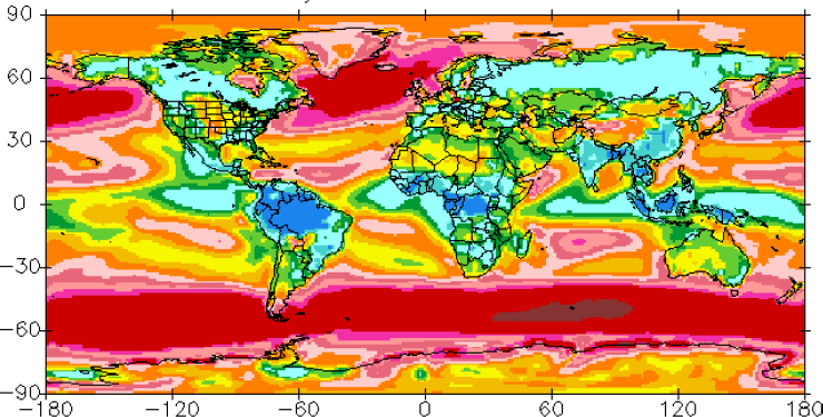
I don’t think evaporation is responsible, because the rate of ocean evaporation does NOT depend on temperature. A bit counter-intuitive, isn’t it. You can find monthly maps of latent heat flux at the link below. The Western Pacific Warm Pool released less latent heat than most of the tropical ocean – according to this source.
http://climvis.org/anim/maps/global/lhtfl.html
We know that when relative humidity is 100% (not matter what the temperature), no evaporation takes place. With 100% relative humidity, water molecules are traveling from the air to the water as fast as they are traveling from the water to the air. As relative humidity drops, less water vapor travels from the air to the water while water molecules continue to move from liquid to gas at the same rate. So the rate of evaporation is proportional to the “undersaturation” (1-RH) of the air. Undersaturation can vary with temperature when absolute humidity is fixed, but nothing makes absolute humidity fixed. I can’t find a decent map of relative humidity over the ocean.
The rate of evaporation is also proportional to wind speed. A thin layer of air adhering to the ocean is saturated with water vapor, making the slow step in evaporation the vertical transport of water vapor from the surface. That happens through turbulence associated with surface winds. The Western Pacific Warm Pool is an area with relatively weak wind, which probably accounts for its relatively modest flux of latent heat. The average water molecule remains in the atmosphere for five days in the tropics (total column water vapor/daily precipitation rate) and 9 days outside the tropics, so water vapor can travels many thousand kilometers between evaporation and condensation.
https://www.climate-charts.com/World-Climate-Maps.html
Nevertheless, the graphic is awesome. Why this happens is an intriguing mystery. I’m wondering if the Western Equatorial Pacific is the warmest ocean because it has the highest, coldest clouds – clouds that emit less LWR than the rest of the Tropics.
Willis: All clouds art not created equal. To some extent the may reflect the similar fractions of incoming SWR (though high cirrus clouds are often so thin they are hard to detect and quantify. However, the higher the cloud top, the less OLR it emits to space.
For example, in the Western Pacific Warm Pool, where it is cloudy nearly all of the time, cloud top heights are 8 km and about 250 K (assuming a 6.5 K/km lapse rate). Assuming unit emissivity, those clouds emit about 225 W/m2 and some of that upward flux is still lost before it reaches the TOA. The average location on the planet emit 240 W/m2 across the TOA. So those high clouds above the warm ocean actually make the planet warmer, not cooler – at least when viewed from this perspective.
The low (2 km, dark blue) marine boundary layer clouds found off the West coast of continents may reflect sunlight as well as those in the Western Pacific Warm pool, but top of marine boundary layer clouds are far warmer.
You mean “where it is partly cloudy nearly all the time”. Convective cloud cover can’t be continuous for obvious reasons.
tty: What is the obvious reason? Trade winds swept moist air from the subtropics and tropics to the ITCS all the time, and then create convective clouds and precipitation. This is a fairly continuous process.
The average water molecule remains in the atmosphere for nine days (five in the tropics) between evaporation and precipitation and therefore travels long distances.
We saw a dramatic example of this during the Houston hurricane last fall that dropped nearly 50 inches of rain in less than a week. The amount of water vapor in the atmosphere is enough produce only a couple inches of rain if all the air were raised to the tropopause. Warm moist air from the Gulf of Mexico was swept over Houston and convected into the high atmosphere for nearly a week. Fortunately, the atmospheric phenomena to lift warm moist air usually tend to move to new locations from day to day.
So the Earth’s ocean surface temperature-cloud feedback loop is actually a finely-tuned non-linear thermostat. Makes perfect sense. To my inexpert mind, Willis, you appear to have advanced our understanding of climate science by several orders of magnitude. That 26 deg celcius is the critical (phase-transition) number for ocean surface temp is clear but as per Robert from Texas’ comment – would be good to understand the physical relevance of this number in respect to cloud dynamics on planet Earth. Perhaps the Hitch Hiker’s Guide ultimate answer to everything of ’42’ was out by 16…!?
Very nice! Now all these details are somewhat ignorant of the gorilla in the room.


Combine this…
“Clouds increase the global reflection of solar radiation from 15% to 30%, reducing the amount of solar radiation absorbed by the Earth by about 44 W/m². This cooling is offset somewhat by the greenhouse effect of clouds which reduces the outgoing longwave radiation by about 31 W/m². Thus the net cloud forcing of the radiation budget is a loss of about 13 W/m²”
https://en.wikipedia.org/wiki/Cloud_forcing with reference to the 1990 IPCC report
https://www.ipcc.ch/ipccreports/far/wg_I/ipcc_far_wg_I_full_report.pdf (page 79)
with this..
https://www.weather.gov/jetstream/energy
which means that:
And then let us have a discussion on how you want to argue a greenhouse effect, while sorting out the contradiction within the consensus GH model..
Cloud cover as a natural thermostat. This fits with Richard Lindzen’s idea of thunderstorms as a major escape route for heat from the surface, and with Nir Shaviv and Jan Vezier’s approach to how cosmic rays affect cloud formation and so climate. Good work.
Willis, remarkable confirmation of your hypothesis and genuinely humbling for such as myself. I’m sure the more experienced readers will know, but what SST dataset are you using? No trickery intended, just curious! Thanks in advance…
Thanks, Julian. As I explained in the first post linked to above:
Regards,
w.
Willis
At 300 HPA the boiling point of water is 67C. Freezing point doesn’t change much, still at about 0 C
Thanks, Alex, but I’m not sure what your point is here. I haven’t discussed boiling at all.
w.
Perhaps I should have said liquification of water vapour. Just saying that at 9000 metres the water vapour will probably be ice. No other point being made.
To further this, dew point (differs from boiling point) sets heat transfer rate. As no storm is steady state, enthalpy of condensation equals or is greater than radiative and convective energies.
Keith J
Brain fart on my side. Of course cloud formation is due to dew point and not boiling point.
I’m intrigued by the apparent “herring-boning” visible in the scatter-plots. Any thoughts?
I have seen this sort of thing before, particularly in scatter plots. It is usually caused by the sampling interval used, or sometimes by post-processing of the raw data for whatever reason.
The IPCC thinks clouds are net positive feedback. The Southern Hemisphere is postulated to be cooler than the NH. The cloud cover over the SH seems to be greater.
So much uncertainty.
The optical depth is also higher.
Lee,
I think the IPCC admits that the sign and the magnitude of the cloud feedback is unknown.
Guess that’s better than admitting they’re just wrong! :<)
Tsushima & Manabe (2013) found cloud feedback to be slightly negative according to all available satellite datasets, but that virtually all GCM assumed it to be positive:
http://www.pnas.org/content/110/19/7568
“IPCC AR5 Technical Summary – ‘Quantification of Climate System Responses”
“The net radiative feedback due to all cloud types combined is likely positive. ”
http://www.gci.org.uk/images/IPCC_AR5_CS.pdf
Brilliant. Non-linear response confuses the CAGW acolytes.
Again I offer the condition of virga which escapes ground based quantification. It dramatically increases thermal conductivity of the atmosphere. It is far more common over large land masses.
Great post.
I can now see the (“hockey stick”) driving / release point.
Willis thanks for all your hard work you share with us on here.
Always interesting. Thanks.
Off Topic:
Colorado University has finally published a new release from their Sea Level Research Group
http://sealevel.colorado.edu/
In this context also interesting: there is no Acceleration in the 24-year period of SSH. The SSH increases continuously with + -3mm / year. Except the recent years, but there was also a record El Nino. Acceleration is now trying hard to help with the masking theory on of the Pinatubo outbreak on the jumps. In my opinion, in vain. The whole acceleration theory will collapse like a house of cards.
http://sealevel.colorado.edu/content/%E2%80%9Ccal-mode%E2%80%9D-correction-topex-satellite-altimetry-and-its-effect-global-mean-sea-level-time -se
The abstract, if the link doesnt work:
“Comparison of satellite altimetry against a high-quality network of tide gauges suggests that sea-surface heights from the TOPEX altimeter may be biased by ±5 mm, in an approximate piecewise linear, or U-shaped, drift. This has been previously reported in at least two other studies. The bias is probably caused by use of an internal calibration-mode range correction, included in the TOPEX “net instrument” correction, which is suspect owing to changes in the altimeter’s point target response. Removal of this correction appears to mitigate most of the drift problem. In addition, a new time series based on retracking the TOPEX waveforms, again without the calibration-mode correction, also reduces the drift aside for a clear problem during the first 2 years. With revision, the TOPEX measurements, combined with successor Jason altimeter measurements, show global mean sea level rising fairly steadily throughout most of 24 year time period, with rates around 3 mm/yr, although higher over the last few years.”
New abstract on Science Daily says sea level rise is accelerating. Based on satellite data analysis. I guess all the major cities of the world have failed to inundate as they were unaware.
Topex – 4.2cm, Jason1,2and3 – 3.3cm. Good luck finding 3mm.
Thanks, Willis for this interesting post.
As you can clearly see from the cloud high-level, it is the Indo-Pacific Warmingpool, which mainly regulates the temperatures of the earth. There is no comparable area in the tropics in extent and strength in which so much heat is derived via the tropopause. ENSO is just an internal heat distribution system, the IPWP dissipates the heat directly, as the two poles but probably more effective because closer to the source, into space. The IPWP’s influence even extends to the SST of the Atlantic via currents and Eddy’s around the Horn of Africa. Years ago there was a NASA paper (before the AGW hype under Obama) that attributed the strength and size of the IWPW to the temperature of almost all other global territories. Also, a colleague of mine once tried to correlate the temperature and expansion of the IWPW with the global temperature and found a much higher correlation than ENSO (Nino areas 1-4). I think the IWPW is part of the ENSO area and could even be considered as one of ENSO’s drivers.