Guest essay by Jim Steele
A recent survey conducted by Weather Central and George Mason University makes this claim: TV Weathercasters’ Views of Climate Change Appear to Be Rapidly Evolving
Meteorologists examine causes of weather change every day. They are the scientists most likely to understand when unusual weather extremes are weather or climate change. Thus they have been polled every year about climate change.
However most don’t respond. Basically three fourths of weather scientists choose NOT to get entangled in a political, non-scientific debate. In 2015 the response rate was 22%, just 32% in 2016 and in 2017 just 22%. And as true for most skeptics, most agreed climate change is happening. However the question is: What is the cause of that change?
Of 2017’s respondents, only 15% thought climate change was entirely due to humans, while 34% thought 60 to 80% could be attributed to human activity. However the survey did not separate human contributions to climate change from urbanization, deforestation, loss of wetlands or CO2 .

One fifth, or 21% thought changes were mostly or entirely natural while 8% admitted they just didn’t know.
So for ALL meteorologists surveyed only 11% actually claimed humans were mostly responsible for observed climate change: 22%(response) X 49% (attribution).
The survey was done by advocates of CO2 warming at ClimateCentral. Read it here:
Discover more from Watts Up With That?
Subscribe to get the latest posts sent to your email.
They surveyed TV weathercasters – that might include a few air-heads who wouldn’t know an isobar from a nudge bar . For your reasons you morph them into “Meteorologists” and from Meteorologists into “weather scientists”.
“three fourths of weather scientists choose NOT to get entangled in a political, non-scientific debate”
Did you poll them? Or is that your opinion?
My guess is they were busy with something more important, but if they had have bothered, the percentages wouldn’t have changed much.
“My guess is they were busy with something more important,”
Yep, most know its a NON-issue
“the percentages wouldn’t have changed much.”
Now you are just making things up… again.
I said it was my guess.
Yep, a normal mcleod comment, backed by knowing nothing.
“I said it was my guess”
Climate alarmism in a nutshell.
How about making a contribution instead of flaming me.
What post is this in response to? – Mod
Was waiting for you to make a rational contribution McLeod.
Waiting,… and waiting…. and waiting !!
It used to drive me nuts that our tv competitors would refer to their weather people as meteorologists because they did weather during a 30 minutes newscast……..some had no clue about what they were talking about.
However, I learned far more about weather forecasting while doing it AFTER graduating.
On the respondents to this particular question, we have a wide variation between those in this group that understand the driving forces of the atmosphere well and those that don’t.
That would not be the case if the respondents had PHD’s.
However, weathercasters have unique opportunities to actually observe the weather real time while using predictive models which can empart an understanding not taught in the classroom.
“However, I learned far more about weather forecasting while doing it AFTER graduating.”
Yep – it brings it home when you have a squadron of jet pilot instructors and their pupils in front of you as you do the early morning briefing.
Why is this poster allowed to continually flame Tony Mcleod Mod?
Why are you crying? McLeod was using empty underhanded tactics as always.
Then you starts whimpering when he gets a bit back
Do either of you have a backbone?
OK, tone it down please.
I’m pleased to see that the survey included the percentage of people that just didn’t know the specific cause of measured warming. Unlike the Cook paper which eliminated 67% of the respondents who “just didn’t know” and pretended that position doesn’t have any significance.
Something else: Even with 97% looking like a cherrypicked figure for consensus of scientists that global warming is actually occurring and majority manmade, this does not mean 97% of the scientists in the cherrypicked group agree that manmade global warming will be catastrophic.
In response to the headline question:
Do ursine mammals defecate in the forest?
“Of 2017’s respondents, only 15% thought climate change was entirely due to humans, while 34% thought 60 to 80% could be attributed to human activity. However the survey did not separate human contributions to climate change from urbanization, deforestation, loss of wetlands or CO2 .”
You left out the main cause of mann made global warming: Data tampering.
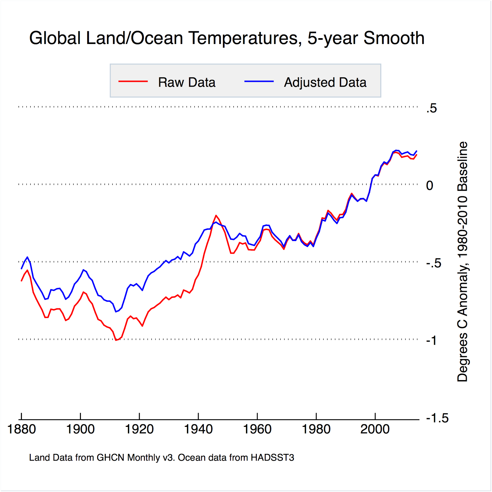
Looking at raw measured temperatures only, it becomes difficult to say if there has been any net warming over the past 100-150 years. There is ample reason to believe that days are becoming less hot over the past 100+ years in the US.
And since the U.S. Is the only place with very good records over that span of time and with good coverage of a continental-scale area, I less someone can give an even plausible mechanism by which one entire continent has an opposite trend than the rest of the world, it becomes a strain on credulity to assert the entire globe is warmimg.
It seems more likely we are instead experiencing a lessening of extremes, temporally and spatially. IOW, we have very unscary global moderating.
“And since the U.S. Is the only place with very good records over that span of time and with good coverage of a continental-scale area, unless someone can give an even plausible mechanism by which one entire continent has an opposite trend than the rest of the world, it becomes a strain on credulity to assert the entire globe is warmimg.”
The fact is if we look at unmodified charts from the rest of the world we see the same temperature profile as the U.S. unmodified surface temperature charts, i.e., the 1930’s are as hot or hotter than subsequent years.
Granted temperature data from the entire world is sparse, but the unmodified data available shows that the temperatures are no hotter today than they were in the 1930’s. And that applies to both hemispheres. In fact, according to Hansen 1999, 2016, the “Hottest Year Evah!” according to NOAA and NASA, was actually 0.4C cooler than the hottest point in the 1930’s, so we have actually been on a temperature downtrend since the 1930’s and temperatures will have to increase by over 0.5C from the present in order to break this downtrend.
The unmodified surface temperature data from around the world matches the temperature profile of the unmodified U.S. surface temperature chart. Numerous examples are available.
The Alarmist bogus, bastardized Hockey Stick charts which cool the 1930’s to insignificance, and show a continually rising temperature profile are made-up garbage created to sell the CAGW narrative. It’s the only piece of “evidence” the Alarmists can present but it is a Big Lie, looking nothing like the true temperature profile of the globe.
The Hockey Stick shows a temperature uptrend. The true temperature profile shows an overall downtrend if we start from the 1930’s.
+++++
“The fact is if we look at unmodified charts from the rest of the world we see the same temperature profile as the U.S. unmodified surface temperature charts, i.e., the 1930’s are as hot or hotter than subsequent years.”
“…unmodified data available shows that the temperatures are no hotter today than they were in the 1930’s. ”
Really?


Just a small sample to be going on with …..
http://2.bp.blogspot.com/-Qbfm3JWna-Y/UwSzIZvHHyI/AAAAAAAAAEw/KFIvIggOIek/s1600/Temp.png

http://english.mep.gov.cn/standards_reports/soe/soe2010/201307/W020130711540579096429.jpg
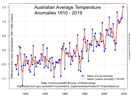
Australian and NZ data is KNOWN to be highly homogenised to meet the AGW requirements
Australia was warmest in the late 1800’s. It has been found that the last 20 years of Australian data is basically worthless because they are not sticking to world standards of temperature measurement
Many Australia sites have had cooling trends changed to warming trends for absolutely ZERO reason.
Here are REAL measurements, as opposed to highly dubious surface data for the last 20 years.

Your Denmark graph CLEARLY shows cooling from 1940-1980, and one can only imaging how much that windmill based country tampers with its data.
Using data from Environment Canada, we see that from 1998 onwards Canada is actually COOLING

I wonder just how much CORRUPTED data you are really willing to use ???????
Bom vs REALITY since 2000

And again, why doesn’t the Chinese graph go back to the 1930’s..
…. rather deceitful attempt, yet again.
How much urbanisation in China during that period do you think there might have been, Toneb
Or are you like NOAA who think urbanisation doesn’t have a large warming effect.
Let see if you care about where the Chinese data comes from..
Here’s some interesting quotes you can find for yourself. [“Jones” is Phil Jones CRU]
“But when Jones turned down requests from them to reveal details about the location of the 84 Chinese weather stations used in the study, arguing that it would be “unduly burdensome”, they concluded that he was covering up the error.
And when, in 2007, Jones finally released what location data he had, British amateur climate analyst and former City banker Doug Keenan accused Jones and Wang of fraud.
He pointed out that the data showed that 49 of the Chinese meteorological stations had no histories of their location or other details. These mysterious stations included 40 of the 42 rural stations. Of the rest, 18 had certainly been moved during the story period, perhaps invalidating their data.
Keenan told the Guardian: “The worst case was a station that moved five times over a distance of 41 kilometres”; hence, for those stations, the claim made in the paper that “there were ‘few if any changes’ to locations is a fabrication”.
————
“”even if WMO [the World Meteorological Organization] agrees, we will still not pass on the data. We have 25 or so years invested in the work. Why should I make the data available to you, when your aim is to try and find something wrong with it?”
The Chinese graph is a monumental case of GIGO + UHI !!
I maintain the climate has not changed since humans have walked upright.
About 65 million years ago the climate was clearly different. Now we have ice caps at the poles and glaciers that grow and recede.
What caused this change? Scientist do not know!
There are lots of theories. When scientist present theories as facts, this engineer says BS!
When we design nuclear power plants we have theories about what the the weather will be be during the life of the plant. We use this to model things like heat transfer of decay heat from spent fuel to the environment.
We then verify and validate the model.
Two things here. These calculations are complicated but relatively simple compared to global models. The uncertainty in the calculation is much greater than natural variability.
Second, ‘scientist’ say lots of things.
“You’re not confusing a meteorologist with a weather presenter are you?”
And
“Quite right Tony. So what is your opinion on why around 75% did not respond to the survey?
That is often the case amongst the general public. After all that is where they encounter them. On their TV screens.
I am a retired meteorologist. An “on-the-bench one”, briefing RAF aircrew and then in the commercial field.
I also have a friend who is a serving national weather presenter.
What strikes me about this survey….
Of those that work as presenters on TV/radio and are employed by same, I suggest that those that did not respond, did so because of because of cognitive dissonance.
It is a well-known psychology that we take on board the opinions of our peer-group.
Is the organisation tending toward the Fox News or the CNN end of the political spectrum?
What is the proportion of that spectrum in the US media?
Are those working for a deliverer of weather forecasts different from those that actually work to make them.
I say they are.
You may say that those working for the likes of the UKMO are biased towards the “97%”.
I would say that the bias is towards the science, they know, work with and observe it on a daily basis.
32 years in my case.
Oh and if all else fails have the “with one bound he was free” approach ….
“You left out the main cause of mann made global warming: Data tampering.”
“There is ample reason to believe that days are becoming less hot over the past 100+ years in the US.”
What about the 97% of the planet that isn’t the US?
The clue is the “G” in AGW.
Toneb
“I would say that the bias is towards the science, they know, work with and observe it on a daily basis.
32 years in my case.”
I am an ex Met Office forecaster and I would say it is one of the most group think places you could imagine where innovation and difference of opinion and thought is actively not encouraged. I experienced this first hand and one of the reasons I left to go to the commercial sector.
So using the Met Office as some sort of platform for higher authority is BS.
“So using the Met Office as some sort of platform for higher authority is BS.”
That is your opinion – to which I do not subscribe.
So to use your eloquence…
Is BS.
Or in our native vernacular my friend.
Bollocks.
Tone, The Met office has been shown to be woefully bad at forecasts, and has been shown to be using mal-adjusted data.
So you comment is, as always,… Bollocks.
“The clue is the “G” in AGW.”
Which it ISN’T
Only places affected by ENSO event show any warming at all in the satellite era.
And ONLY from El Nino events.
So no, There is no “G”, and there is no “A”
There has been some local, NATURAL, ocean event warming…
.. that have been smeared and mal-adjusted to make an agenda driven Global surface temperature farce.
As ever …. if you say so.
Oh, and you managed to say it so nicely.
And you, as usual, say NOTHING. !
May I refer you to ….
https://wattsupwiththat.com/2017/12/22/is-the-97-climate-consensus-fake-news/#comment-2700276
“May I refer you to ….”
Yawn !! Your groupthink with Nick is quite funny.
Yes, he is good at manipulating statistics to say what he want them to say.
Trends match…. NO TOBS adjustment required except to adjust for AGW expectations.
“Toneb: the clue is in the fact that Steve Goddard has a website showing government employees simply altering the past, cooling it and warming the present, over and over.”
Like I said, any adjustments made to compare apple with apples in the US record makes not a jot of difference to the global average.
As for Goddard (aka T Heller) – I refer you to Nick Stokes excellent take down of his misconceived maths….
https://moyhu.blogspot.co.uk/2014/05/ushcn-adjustments-averages-anomalies.html
and of the necessity of TOBS…
https://moyhu.blogspot.co.uk/2014/06/tobs-nailed.html
Unless, of course, you subscribe to keeping the TOBS errors?
And if you do then why not go back to reading a max temp at near the time it occurs (and resetting the thermometer) such that if a cooler air-mass arrives overnight it will ALSO be the max of the next day as well.
Sound a good idea?
“altering the past, cooling it and warming the present”
Err, no.
It seems these “Government employees” weren’t clever enough to make their “scam” work – as they warmed the past as well (Globally).
As for the rest of your post.
It is muddled.
Are you suggesting that the ideal gas laws should govern amospheric temp?
because they don’t.
The reason?
Because a) the atmosphere cannot be contained at constant volume.
And b) neither can it be contained a constant pressure.
IOW it is not a closed system.
So PV=nRT does not apply.
The LR (deltaT/DeltaZ) is governed by the relation -g/cp and is set by atmospheric motion, modified by the GHE. The surface temp, which would be -18C otherwise is now at an altitude of ~8km with the lapse rate continued down to the surface, setting the surface temp of 15C.
The climate system cools via LWIR to space.
It is the only way it can.
That is governed by input > Solar SW absorbed.
And by the ability of LWIR to exit to space.
That process is governed by GHG’s and their temperature (through the entirety of the vertical extent of the atmosphere.
Colder > less efficient emission.
Which is why Beer-Lambert equ has path-length as a variable.
Also the Planck relation of T^4 ensures that the surface temp has to rise to overcome the above. To achieve equilibrium with solar TSI absorbed.
Well actually Andrew the gas laws get rather mucked up in the presence of water as it hops about between it’s phase changes, releasing or absorbing large energies.
I think this is the problem the IPCC et al. has when attempting to arrive at the sensitivity coefficient. It is thus not very surprising that global temperatures are not behaving properly in accordance with its doctrines.
Calculations based on Watts/sq.m are inappropriate for establishing temperature and here lies the logical error. Only changes in enthalpy can achieve this and that only when other energy parameters are known. Not an easy task.
For instance: A body accelerated by force of X Watts/sq.m for say one minute will probably not increase in temperature. (Ignoring friction). The energy being transformed into its velocity form.
Similarly a kilo of liquid water receiving 680 WattHrs will not increase in temperature as all the energy will be absorbed into the phase change to gaseous form.
So much for the gas laws!
(Perhaps Toneb has something to say about that.)
“It seems these “Government employees” weren’t clever enough to make their “scam” work – as they warmed the past as well (Globally).”
Nice try Toneb. The warming adjustment to the early 20th century was made to eliminate the very inconvenient rapid warming rate of the 1940’s. This is because it is difficult to claim ‘unprecedented’ anthropogenic warming in the late 20th and early 21st century when the record shows a much greater rate of warming during the 1940’s when anthropogenic CO2 emissions were much lower. This is a very inconvenient truth that must be ‘adjusted’ into oblivion.
“As for Goddard (aka T Heller) – I refer you to Nick Stokes excellent take down of his misconceived maths….”
Stokes’ mathematics can and do provide apparently incontrovertible take-downs of the proposition that 2 + 2 = 4 if it suits his purpose as an AGW gatekeeper,
That’s his speciality and and to be fair, he’s extremely good at it, very plausible indeed.
Doesn’t make them correct though.
Really Toneb
Showing one set is LESS adjusted than another, even though both are massively adjusted. You can do better…. maybe.
TH showed TOBS is a FARCE of an adjustment. End of story
Nick is shooting blanks twisting stats and thinking no-one will notice.. its an ego thing.,
MEANINGLESS.
No TOBS here

or Here
“and of the necessity of TOBS…”
Your whole argument is based on your arrogant thinking that you are more intelligent that those reading the thermometers in the past.
I very much doubt it.
I have yet to see anything from you to back up your ego.
“No TOBS here”
Then why are the 2 traces showing a delta of 2 days?
That is precisely where the TOBS is.
Just to point out that the issue is MOVING from taking a max in the evening to taking a max in the morning.
The change-over would move the two traces together and so cause an apples to oranges result.
Homegenisation creates a level playing field, so we know that before the change = after the change over (as near as we can get).
You really ought not to rely on Heller.
Ask Nick stokes relates …
https://moyhu.blogspot.co.uk/2014/05/ushcn-adjustments-averages-anomalies.html
“TH showed TOBS is a FARCE of an adjustment. End of story.”
OK – how about we go back to that practice?
Then we woud get the orange trace moving up to the blue one my friend.
Artifical warming.
Wot you say?
Oh, BTW you appear to be getting excited again.
“You’ve claimed gas laws aren’t necessary to calculate the temperature of gases.”
No, I “claimed” that the gas laws cannot calculate temperatures in the atmosphere.
Very different.
“You’ve claimed Steve Goddard hasn’t caught government employees altering global data.”
No I claimed that Nick Stokes debunked Hellers maths and gave a link.
Please address why the past was warmed to reduce the GW trend.
(graph linked in my OP).
Exactly counter to what you claimed.
“.. showing government employees simply altering the past, cooling it and warming the present..”
“Would that be right?”
No.
“No I claimed that Nick Stokes debunked Hellers maths and gave a link.”
And your claim is WRONG
“Then why are the 2 traces showing a delta of 2 days”
ROFLMAO.. I left out the latitude graph , just to see how little you were actually aware of what was going on.
And you fell straight into your own ignorance. Well done. 🙂
Afternoon readings are taken at higher latitudes…
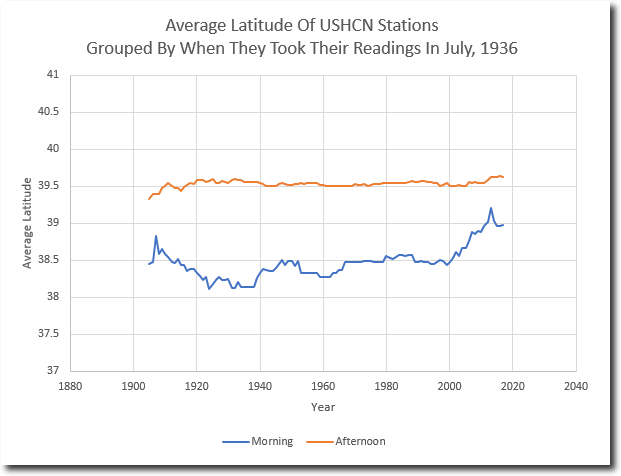
OOPS, says Toneb. !!! 🙂
As you can see, the TREND in both cases is the same, so TOBs corrections should NOT alter the trend.
Except , that is EXACTLY the reason it was invented, isn’t it. 🙂
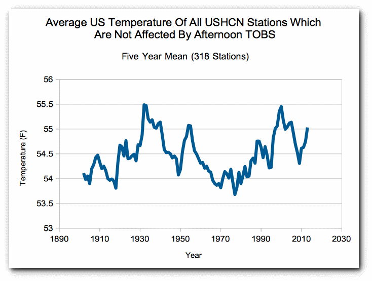
Or you could just look at those stations not affected by TOBS

Wrong chart, sorry… Here is the one of TOBS unaffected sites.
Andrew,
Ideal gas law is an equation of state. Putting in the known values allows us to find a missing value, if the gas is in thermodynamic equilibrium with its surroundings. If it’s not in equilibrium then we have to wait for equilibrium to be achieved before ideal gas law is truly applicable. Using average numbers for pressure, atmospheric make-up, and density, ideal gas law will give us a fairly good approximation of average surface temp.
However, this should not be confused with since form of causation. Too a first approximation, we receive enough radiation from the sun to maintain approx 255K. To be warmer than that we must receive additional energy. To get thermal energy out of a gas requires doing work on the gas. While the surface layer of the atmosphere is being compressed, work is defined as a change in status. There must be an increasing amount of compression to get thermal energy from a gas. That is simply not the case.
If you air up a bike tire quickly and put your hand on it, it will feel a little warm if you did it fast enough. Come back 10minutes later and it will feel the same as room temperature. It doesn’t maintain a higher temperature value because the air inside is compressed.
Eric. Your final conclusion is: “So for ALL meteorologists surveyed only 11% actually claimed humans were mostly responsible for observed climate change: 22%(response) X 49% (attribution).” I do not agree with this statement. Even though the response rate was as low as 22 %, the responses are anyway the best estimates for the whole population.
You summarized two categories, which are
– Largely or entirely by human activity, 15%
– Mostly by human activity, 34 %.
Anybody summarizing categories, must be very careful in wording. I think that the category of 49 % (15+34) should be described by words: “Largely, entirely or mostly by human category 49 %”. The percentage of 11 % is misleading and it is not supported by results of the inquiry.
There are other surveys carried out. In 2012 the American Meteorological Society (AMS) surveyed its 7,000 members, receiving 1,862 responses: Of those, only 52 % said they think global warming over the 20th century has happened and is mostly manmade (the IPCC position). The remaining 48 % either think it happened but natural causes explaining at least half of it, or it didn’t happen, or they don’t know.
The Netherlands Environmental Agency has published a survey of international climate experts. 6550 questionnaires were sent out, and 1868 responses were received. 66 % agreed with the IPCC that global warming has happened and humans are mostly responsible.
There is no consensus about the climate change. The summary of these surveys is that about 48%-66% of climate researchers think that humans are totally or partially responsible for the climate change. If you try to get a more accurate answer, you have to look at each question.
In the study of Cook et al., only 0.5 % of research papers took a position that humans are explicitly the primary cause of the climate change with quantified evidence and 7.6% states that the anthropogenic climate change is a known fact without quantified effects. If you squeeze these results into one figure like 32% of climate change researchers are in favour of the human made global warming, you already manipulated the numbers and it is not true. You forgot by purpose that this number includes also those who think that humans are only partially responsible. The consensus figures 97% and 98% are totally nonsense.
A study that has a 70 odd % non-participation rate is meaningless. Right up there with an internet poll.
The only useful result is that a majority of meteorologists either have more important things to do or are afraid to answer for one reason or another.
Scientists have nevre registered and voted on the AGW conjecture so there is no consensus. But the reality is that science is not a democracy. The laws of science are not some sort of legislation. Scientific theories are not validated through a voting process. So if there were such a consensus it would be meaningless in terms of sceince.
http://www.irisheconomy.ie/wp-content/uploads/Dublin%2009.jpg
The alarmists here don’t like these graphs.
Bangalore, India

And of course, older data shows the cooling from 1940 – 1975

And of course, Tom Karl himself shows a drop of some 0.8ºC from 1936 to 1985

And we know there has only been about 0.5ºC rise since 1985 in real temperatures from RSS or UAH.
So, As confirmed at many other places, around 1940 was probably at least as warm as now.
I see “Japan” has come up….
Ignore the corrupted Japanese data,
Real data is shown below.
Japan shows the normal small step around the mid 1990s
but before that

and after

India shows a small amount of winter UHI effect

and we all know the Antarctic is dead level or cooling slightly
So……
Warming is NOT global.
And its NOT Anthropogenic.
What? Missing the 8 warmest years in the record but still showing a slight rise?
Whats to like about it?
Add in the 1930’s and what do you get?
Jaycee, any chance of going back to 1940 with Dublin temperatures?
Not in a linkable graph.
Oddly enough, Ireland experienced slightly warmer temperatures in the 1940s, cooling towards the 1960s.
Of note here is that the national weather service, Met Eireann, has been publicly criticised by the environmental lobbyists for not jumping wildly onto the AGW bandwagon.
One of our weather forecasters, talking about “climate change” said that:
“It is a global phenomenon that needs to be looked at globally over decades and not days…Our climate is changing but you could not use the weather in any one country in any one month, day or year to say that this is the evidence of climate change…Climate change is evident all over the globe all of the time”.
Needless to say, the environmental activists took great umbridge with such an intelligent observation.
http://www.thinkorswim.ie/met-eireann-climate-change-time-to-break-the-silence/
Believe it or not, we have many such climate alarmist groups here, with most of them roundly admonishing Ireland (a speck on the west of Europe) for not doing enough to avert catastrophic man made climate change.
So I usually ask them to quantify the percentage of “climate change” or indeed, “global warming” that they think Ireland should be held internationally accountable for.
I also ask them what percentage of climate change can be averted if Ireland acted according to their wishes.
I don’t get any replies.
“Oddly enough, Ireland experienced slightly warmer temperatures in the 1940s, cooling towards the 1960s.”
That’s not odd at all. All the unmodified surface temperature charts I’ve seen from around the world show the same warming in the 1930’s-40’s, as warm or warmer than today.
Precisely, TA.
The peak around 1940 shows up in most RAW temperature data.
“Oddly enough, Ireland experienced slightly warmer temperatures in the 1940s, cooling towards the 1960s.”

https://www.met.ie/climate-ireland/surface-temperature.asp
Nice graph Tone, shows EXACTLY what I have been saying
1940ish temperatures were close to current
Thanks for that. 🙂

It seems that whoever drew that graph has applied an “adjustment” to bring the two peaks in 1940 down somewhat
Here is the data DIRECT from Met-ie

Now explain what caused the warming from 1910 – 1940
Which I steeper than from 1970 – 2010.
And gees, someone had FUDGED that last bit of data, haven’t they.
Real Data is here.
http://www.data.jma.go.jp/cpdinfo/temp/list/mon_jpn.html
And since 1998 it looks like this.

Climate Science should go trendy by invoking the talisman word ‘BlockChain’ into it some how.
The trick is to start with someone fronting some lazy, trivial and pointless act that hastily and sloppily ties the two things together… such as, sucking a sensational Mann white paper PDF into the ledger field of a crypto transaction. Where it becomes immutably signed and thus beautified, as would a Catholic Saint. Incorporating irrelevant data into the ledgers of financial systems had always been seen as a lame hack, personal fetish or abuse… until now.
It is an old adage reborn — like the cliche of the bank’s ‘free toaster’ being the carrot on the stick you could fix on mentally while you’re skimming over the fine print and signing your life away. No carrot or stick anymore, investing in cryptocurrency confers nothing but bragging rights, but your bragging has been limited to those who already care or understand what you’re talking about. By obsessing over the ‘things’ that have been uselessly embedded into the ledgers of public blockchains, you can avoid the tedium of attempting to describe the blockchain’s structure and purpose. You can just point to something shiny… and shriek, with wild eyes, “……SEE? IT’S A KITTEN!”
In the hope that it makes your point, without needing one. The problem with traditional banking is you cannot raise any excitement about it because any idiot can understand what is going on. And those idiots rebel against your effort to excite them about banking. They sense some ruse or sales pitch, or you’re about to just ask them for money.
With cryptocurrency that’s all changed. The news wants to talk about it and they sense that out there… there is a seething mass of desperate people who crave information about it. Actually there isn’t, it’s just a tabloid fascination fueled out of the need to find out why others are oddly talking about it. And learn just enough to avoid scams and stay clear.
But clicks pass for interest these days, and nothing generates clicks like discovering that some ‘thing’ has been embedded into a blockchain. It’s described with breathless excitement, as if the trivially embedded ‘thing’ had been unearthed in an archeological dig, full of ancient mystery. People are led into farcical discussions of its implications… when they should be clicking out angry at the waste of their time. Those who wax on it are squandering their sense of childlike wonder. What will they do when it runs out?
So global warmists should embed their orthodoxy into the blockchain and point to that instead of claiming ‘97% consensus’. They can then say, it’s ‘100% embedded in the blockchain’ instead. And none dare refute them. They can pretend that cryptographically signed is the same as unassailable logic. And the financial news networks will blab about it incessantly until the asteroid hits.
Not with a bang, but a whimper.
“However the survey did not separate human contributions to climate change from urbanization, deforestation, loss of wetlands or CO2 .”
This is the underlying deception in the claims of human made climate change. Kind of like a doctor saying “You are sick and you need to take medicine” without defining if it is bacterial or viral. If you take the wrong medicine it will not help at all.
The Anderberg et al. study that claimed a 97% consensus looked pretty dodgy. It began by eliminating anyone with fewer than seven publications as not being a “real” climate scientist. Then it eliminated anyone who took no position on causation. The methodology after that was equally circular in its reasoning.
I was recently looking at 1937 aerial photos of my town (Wisconsin mapped the entire state for some reason) and was stunned by the lack of trees 5 miles from town.
Basically none. The whole area was small farms and every acre was farmed. Trying to figure this out, I concluded that back in those days most food came from the neighboring community rather than being shipped long distance like it is now … so every acre close to town was important and farmed. Since that time, the town became more urbanized, but the trees also came back. Prior to thus I thought urbanization automatically resulted in increased temperatures, now I am not so sure it is true in every case.
If one were to look at a squiggly histortical temperature plot of this area, one might conclude this or that, but there is an awful lot of stuff one is being ignorant of to draw that conclusion. I think most opinions are completly worthless unless one has a very very deep understanding of the issue.
Your inference is misleading. The survey suggests 49% of meteorologists believe that most of the increase in temperatures is due to human activities. The 11% value you suggest is meaningless, you are conflating an estimate with a sample proportion.
A survey with less than a thirty percent response rate is meaningless in the first place. Either the meteorologists were working on something else that was more important (what could be more important than saving the planet? Washing the dog?) or they were afraid to respond (wonder why that might be). Either way it lends credence to the CC hoax charge.
Most surveys have less than a 30% response rate. There are hundreds of reasons why someone might not respond to a survey- I am sure you have ignored many. I it is pure speculation to suggest they were afraid.
Um, no. Go learn a little about statistics. Try doing a scientific experiment while ignoring 70 percent of the variables. You end up with a meaningless result. Sound familiar to anyone? Bueller?
Leghorn You are conflating response rate with variables- they are completely different concepts. Me thinks you need to go back to your elementary statistics.
No. You can’t read. And how many times have you been to the arctic? I spent two years above the arctic circle. It is still really cold.
I’ve been to the arctic half a dozen times and have spent several months north of the arctic circle. I also have several family members who live and work in the arctic who keep close tabs on what is happening. You obviously haven’t kept up with the rapid warming and associated changes that are occurring in the arctic. I suggest you go back and talk to some of the people that are living there.
Really? Just spent 2 days hunting with several men who work “above the Arctic Circle” and they say you are full of (snip). Who to believe? Men I have stood eye to eye with and discussed the situation? Or you?
Honest, skilled scientists I imagine would have a consensus of “We just don’t know as of yet”.
The main reason for not knowing is that the models have horribly failed to predict the actual real temperature. If theory is not able to accurately predict then we don’t have the correct theory, or in other words we don’t know.
From the Irish met service.
Original comment responded to….
“Oddly enough, Ireland experienced slightly warmer temperatures in the 1940s, ”
response from a poster….
“1940ish temperatures were close to current”
For Ireland?
No not “close”, or even (as was said), “slightly warmer”…. but a good 0.5 warmer.
Ignoring the red line (30yr trend), by eye a least squares would give around 0.25 in 1940 and 0.75 at the end.
NO.. there is an immeasurable difference between the peaks in 1945 and 1948 and the urban heated peak in 2008.
You are talking nonsense yet again . !!
A 30 year average curve is meaningless. Looks like its off set by 15 years anyway. Should start in 1915.
And please feel free to show pictures of these surface stations, see if they are free from urban effects.
Yes, and latest temps a good 0.5C warmer than those in 1940.
Armagh Observatory, Ireland
http://www.warwickhughes.com/cool/armagh1790.jpg
Absolutely ZERO sign of any human or CO2 changes, just a gradual climb out of the LIA..
Lets all be VERY THANKSFUL we are not still back in that bleak time.!!
Oh dear.. please don’t read this 😉
http://mobile.met.ie/news/display.asp?ID=330
I’ve extracted the temperature graph for all to see. .. Enjoy 🙂

Thanks,
That would explain why Met Eireann is reluctant to jump on the CAGW bandwagon.
Problem is, there are so many faux lefty greens in Ireland who are so set on implementing the UN’s transfer of wealth plans and economic experiments dressed up as “averting climate change”.
And they’re an odd lot, usually middle class, reasonably well educated and successful, the typical “frequent flyer” who advises against frequent flying and advising others to be cycling, childless vegans.
This statement self-resolves to weather change is weather change. Climate change requires agreement there exists evidence there has been a trend of weather change.
It’s a trick question. CO2 has nothing significant to do with climate but the increasing water vapor, about half of which is a result of human activity, is countering global cooling.
It is clearly not doing it’s job effectively.
What is “it”?
But thats not right, its decreasing isn’t it? And that is another problem with the CO2 theori, water vapor had to increase and its suppose to be hot-spots high up over the equator for the theori to be right.
And as all of this suppose to happen or occur stuff in the theori, does not happen and does not occur.
Here is an illustration of a Hansen U.S. surface temperature chart (1999) alongside a global Hockey Stick surface temperature chart.
I consider the U.S. surface temperature chart to be representative of the True temperature profile of the Earth. The Global surface temperature chart is a bogus, bastardized Hockey Stick chart that was created by the Climate Gurus to sell the CAGW narrative, and does not resemble reality.
Unmodified surface temperature charts from around the world resemble the Hansen 1999 U.S. surface temperature chart profile, which shows the 1930’s as being as hot or hotter than subsequent years.
The temperature profile of unmodified surface temperature charts DO NOT resemble the bogus, bastardized Hockey Stick chart.
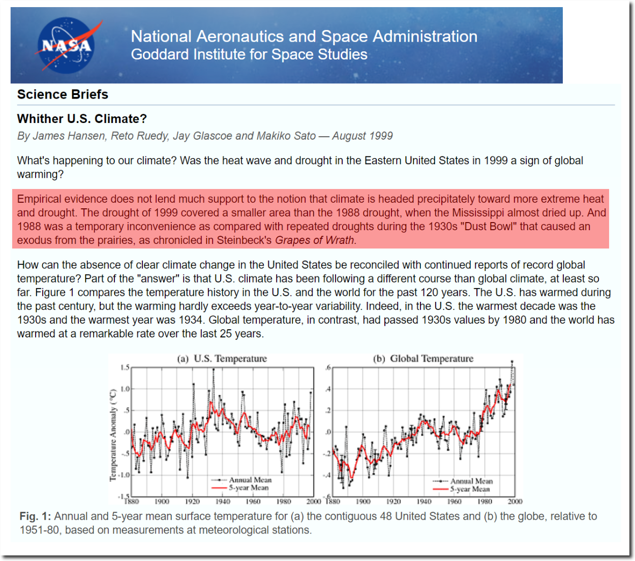
Link to the above NASA page:
https://www.giss.nasa.gov/research/briefs/hansen_07/
Here’s an unmodified surface temperature chart from Sodankyla, Finland. Notice it has the same temperature profile as the Hansen 1999 U.S. surface temperature chart: The 1930’s are as hot or hotter than subsequent years.
Finland is located about 180 degrees around the globe from the U.S., yet it has the same unmodified temperature profile as the U.S.

Here’s a chart of Yola Nigeria, 427 km southwest of Ndjamena, showing the 1930’s as being hotter than subsequent years. The same temperature profile as the Hansen 1999 U.S. surface temperature chart. It looks nothing like the Hockey Stick chart Lie.

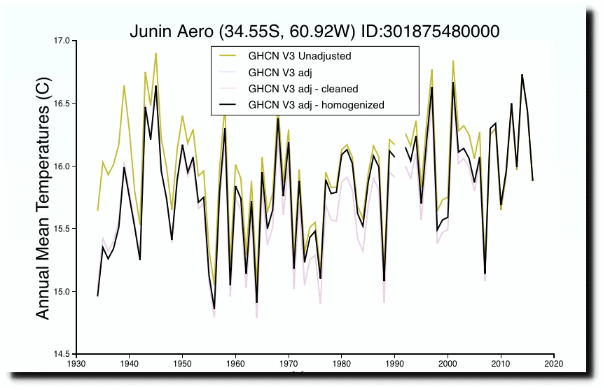
Here is a surface temperature chart from Argentina that shows the same profile as the Hansen 1999, U.S. surface temperature chart: The 1930’s being as hot or hotter than subsequent years. It doesn’t resemble the Hockey Stick chart.
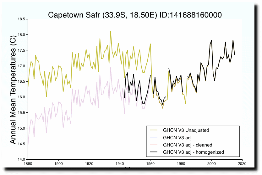
Here’s one of Capetown, South Africa. Same profile as Hansen 1999, with the 1930’s being as hot or hotter than subsequent years.
Here is the Hansen 1999 U.S. chart which shows how NASA modified it to cool the 1930’s and warm subsequent years. NASA changed a temperature downtrend into a temperature uptrend.
The Hansen 1999 U.S. surface temperature chart is about as close as we are going to get to a true profile of the world’s temperatures. The Hockey Stick charts are all big lies meant to fool people into believing the CAGW narrative.
With regard to the NASA adjustments to the 1999 chart (in red) just keep in mind that Hansen’s 1999 chart shows the high point of the 1930’s as being 0.5C hotter than 1998, which means that the 1930’s were 0.4C hotter than 2016. Which means the U.S. and the world have been in a temperature downtrend since the 1930’s.
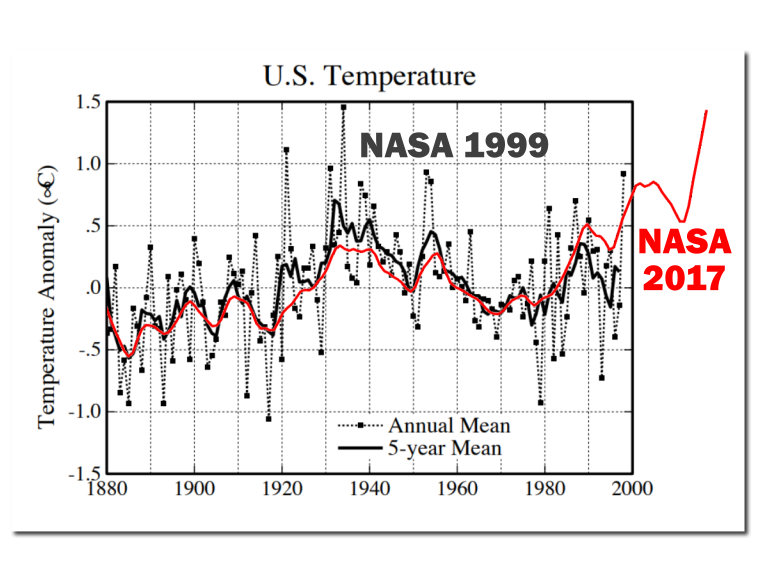
That red bit is a bit embarassing.
Yep especially after 2000 , when we know there was no warming until 2015..
Massive embarrassment for Gavin, shows up his maniacal tampering so clearly.
And very embarrassing for you Mcleod, because you can’t see the agenda driven corruption of the data after 1985
US peak of 1940 is above that of 1998.. Do you even notice?
Or are you remaining , as always .. wilfully blinkered.
“Spring is occurring earlier in parks
Spring has already advanced in three-quarters of the 276 parks examined, and half of the parks are experiencing an “extreme” early spring that exceeds 95% of historical conditions as measured by first leaf index and/or first bloom index from indicator plant species. No parks are experiencing extreme delays in spring onset. Managers in the “extreme” early parks have thus already been working under relatively anomalous conditions for the past 10-30 years.”
https://www.nps.gov/subjects/climatechange/springonset.htm
“The growing season for crops and plants in England over the past decade is around a month longer than it was during 1961-90, say scientists at the UK’s Met Office.
Their analysis also shows the number of days where temperatures dipped low enough for a frost has decreased in recent years.”
https://www.carbonbrief.org/englands-growing-season-now-almost-a-month-longer-says-met-office
https://www.epa.gov/climate-indicators/climate-change-indicators-length-growing-season

http://cires.colorado.edu/news/alaska%E2%80%99s-north-slope-snow-free-season-lengthening

http://cybele.bu.edu/greenergh/gs.jpg
http://cybele.bu.edu/greenergh/gs.nt.html
LOL, all then graphs from 1979….very funny. 🙂
Its pointless even discussing when you keep doing clown acts like that.
WOW, and extended growing season..
and enhanced atmospheric CO2
No wonder crop yields just keep on climbing. 🙂
Please explain what is in any way BAD about this ?
Hmm.. I wish all Canadian a nice warm Christmas..
My wishes rarely come true, sorry !! 🙁
http://wxmaps.org/pix/temp2.html
From the so called “study” cited by Climate Central … http://assets.climatecentral.org/pdfs/Oct2017_ClimateMatters_Research_BAMS.pdf
So that leads back to http://journals.ametsoc.org/doi/full/10.1175/BAMS-D-13-00091.1# “Meteorologists’ Views About Global Warming: A Survey of American Meteorological Society Professional Members” Neil Stenhouse et al 2014
I began reading it and found this:
So their percentages are worth exactly as much as the “97% Consensus” … horse dung. Their response rate is NOT 72%, they received 270 responses from 7062. In my universe that is a response rate of 3.8%.
What they refuse to admit is that very few of the meteorologists who do not believe in CC nonsense are going to be willing to stick their necks out and lose their jobs over it as many brave ones already have. Being a climate “denying” meteorologist in the 21st century broadcast industry is a lot like being a Christen in 1st century Rome, few want to be martyrs for the truth.
Merry Christmas!
Webb Survey Polls merely measure the marketing influences inherent in the questions.
Little correlation with matters of truth.
“Brave…”
Unless it was anonymous.