The Paris Agreement adopted in December 2015 during the COP21 climate conference stipulates that the increase in the global average temperature is to be kept well below 2°C above “pre-industrial levels” and that efforts are pursued to limit the temperature increase to 1.5°C above “pre-industrial levels.” Closer inspection of the treaty text, however, reveals that the term “pre-industrial levels” is nowhere defined in this epochal UN-document, that has meanwhile been ratified by 170 Parties. This is particularly odd because the “pre-industrial” temperatures of the past 10,000 years have varied quite significantly, as meticuloulsy documented by hundreds of paleoclimate studies.
Puzzled by this apparent gap in the Agreement, Fritz Vahrenholt went out and researched the history of the temperature limit definition. The former renewable energy manager and current head of the German Wildlife Foundation was surprised to find that the initial description of this important climate goal dates back to the mid 1970s, proposed by an economist, by the name of William Nordhaus. Nordhaus’ idea was as simple as effective: He looked at the maximum temperatures recorded during the past several hundred thousand years and warned that this natural range should not be exceeded in the future. Two decades later, in 1995, the German Advisory Council for Global Change further refined this concept, but kept Nordhaus’ original idea of a tolerable ‘temperature window’.
Vahrenholt:
“Unfortunately this important palaeoclimatological perspective was lost in subsequent key papers on the subject that paved the way to the Paris Agreement. Reports by the World Bank and United Nations Framework Convention on Climate Change (UNFCCC) in 2014 and 2015 narrowed their view to the last 200 years which does not do justice to the enormous natural temperature fluctuations on a multi-millennial perspective.”
In order to better understand the complex pre-industrial temperature history of the past, Vahrenholt teamed up with Sebastian Lüning, a professional resources geologist who in his sparetime works on paleoclimatological studies with the Switzerland-based Institute for Hydrography, Geoecology and Climate Sciences. Lüning researched the literature and integrated the Paris Agreement 2.0°C and 1.5°C temperature limits into the climate development of the past 2000, 10,000 and 120,000 years.
Lüning:
“Comparing the modern warming to reference levels at the end of the Little Ice Age about 150 years ago does not really make much sense because this period represents one of the coldest times of the past 10,000 years. The choice of a baseline near the lower extreme of a variable parameter is uncommon in science. The temperature level that was reached during the interval 1940-1970 may serve as a better reference level because it appears to roughly correspond to the average pre-industrial temperature of the past two millennia.”
On an even longer time scale, it is found that current temperatures have not yet even exceeded the warmest temperatures of a natural warm phase that globally occurred some 7000 years ago, the so-called ‘Holocene Thermal Maximum’. Global temperatures may have even partly exceeded the 1.5°C limit during this warm phase, when combined land and sea surface temperatures are taken into account. The increase in this natural temperature window and the baseline shift potentially enlarges the headroom for the 1.5°C temperature limit of the Paris Agreement which deserves further study.
Nevertheless, the two researchers caution that the upper ceiling of the 2°C limit is not affected by this, because it is represented by the even warmer climate of the last Interglacial, some 120,000 years ago. The 2°C limit therefore remains valid, especially because sea level was 5-7 m higher than today during this time, which would have serious consequences for modern life if repeated today.
The study that was published on 12 December 2017 in the journal ‘frontiers in Earth Science’ reminds policymakers, scientists and the public that the “pre-industrial” times cited in the Paris Agreement involve a dynamic alternation of warm and cold phases which need to be viewed in context. The Little Ice Age that ended around 1850 AD does not represent a suitable reference level for the 20th and early 21st century warming as it fails basic scientific baseline criteria.
Paper:
Lüning, S., F. Vahrenholt (2017): Paleoclimatological context and reference level of the 2°C and 1.5°C Paris Agreement long-term temperature limits. Frontiers in Earth Science, 12 December 2017, doi: 10.3389/feart.2017.00104
I want every global warmer to put their name and occupation in a database and promise to resign when it is finally proved that there is no such thing as AGW. Equally the non warmers should put their name in the same database and also promise to resign if someone can prove that AGW does exist. I feel certain that the non warmers will be much more likely to add their names to that database.
I should add that if you don’t want to risk a resignation then you could put your name in the database as being in a 3rd category that of I DONT KNOW – THE SCIENCE ISNT SETTLED
AGW is one of these “not even wrong”, unscientific, thing, that cannot be proven true or false.
One of the reason it is so political.
It’s quite simple. Three degrees would have been too easy to keep under – no need to damage capitalism. One degree would be too difficult – golly, at 0.87 we are nearly there already! So two degrees and sell your SUV into a falling market, yeah?
Surely the best approach is to measure temperatures from “now”?
There is nothing wrong with today’s climate, despite attempts to blame every bit of bad weather on global warming. And I have yet to see any evidence or argument that climate was better in the LIA.
Exactly. The scam of “climate change” is that it is actually manmade. Manmade like a movie set is manmade.
Good point
Although there ARE things wrong with today’s climate (hell, if i could live outdoors, i would, but it is way too wet and cold), it just isn’t worse than any previous man-known climate
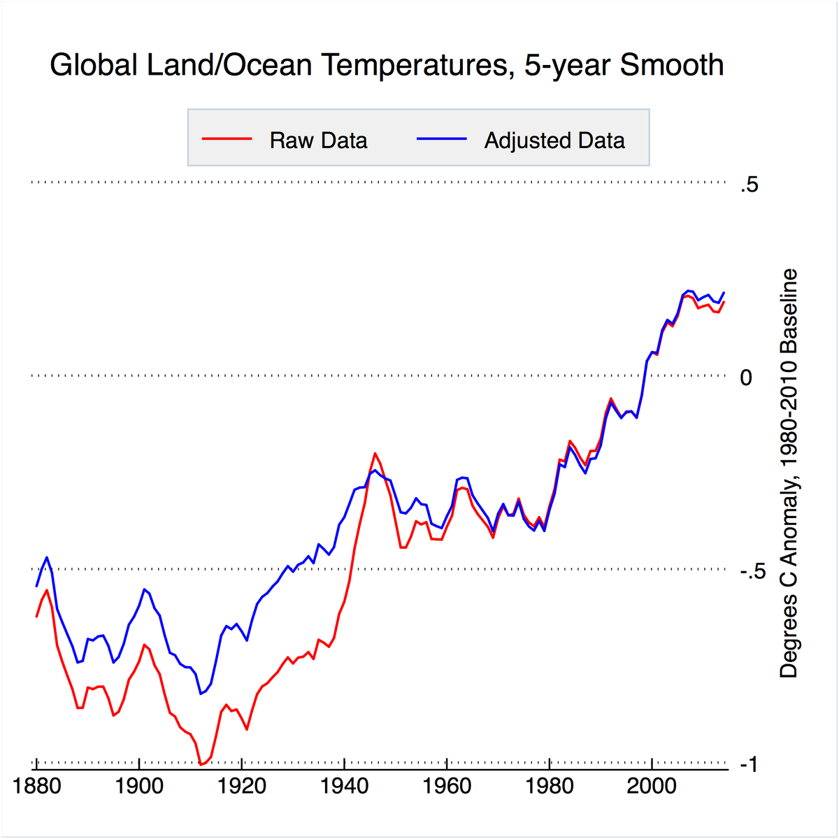
Many people reference NOAA’s old graph showing how they manipulated raw temperature data from 1900 to 2000, by cooling raw temps in the first half of century, and adding 0.6F to raw temp data from 1950~2000 (they mysteriously stopped updating this graph from 2000):

You’ll notice this is a Way-Back Machine URL because NOAA deleted this graph from their website on June 03, 2017:

I did a quick check and found it interesting that Trump announced pulling the US out of the Paris Agreement on June 02, 2017..
Coincidence? Sure, or perhaps NOAA realizes CAGW’s days are numbered, and are busy pulling a Lois Lerner by deleting embarrassing evidence prior to tiresome Congressional Hearings starting in the future..
http://www.realclimate.org/images//GISS-adjustments.jpg
You KNOW they all use the same pre-adjusted data.
Why are you bothering to post this misleading propaganda?
Toneb-san:
According to the magical CAGW sc@m, the lower troposphere should be warming at a much faster pace than surface temps due to rapidly increasing downwelling LWIR from the mighty CO2 molecule “trapping” (LOL) all that heat…
Not so much:
http://www.woodfortrees.org/plot/gistemp-dts/from:1979/plot/gistemp-dts/from:1979/trend/plot/hadcrut4gl/from:1979/plot/hadcrut4gl/from:1979/trend/plot/uah6/from:1979/plot/uah6/from:1979/trend
The larger the disparities between surface and lower troposphere temp datasets become, the more laughable the CAGW sc@m becomes…
It’s time for the CAGW sc@m to tossed in the very large pile of failed ideas.
The no adjustments line is patently false, it could not exist as a temp series if it had no adjustments lol
There is no RAW
even the CRU deleted their raw years ago.
Plus it is clear what NOAA have been doing
http://notrickszone.com/wp-content/uploads/2017/01/NOAA-Data-Manipulation-Global-1880-2014.jpg
It is clear that NOAA have been adjusting data to match CO2 growth, not to warm the present
“The no adjustments line is patently false,”
Yes, it is. The “no adjustments” line looks just like the other Hockey Stick graphs on the chart, which just tells you that the “no adjustment” line was as adjusted as the other lines.
Hockey Stick charts are a Big Lie.
“…… by cooling raw temps in the first half of century….”
BTW: my posted graphs were to address the above.
The US is not the planet.
And for GMT’s the past has acually warmed.
The opposite.
Just anotger examoke if skeptics … and President Trump… being correct.
But the power hunger, greed and hatred fueling the climate obsessed means they won’t change a thing.
The underlying ignorance and hubris of “climate change” policies is awe inspiring.
“The choice of a baseline near the lower extreme of a variable parameter is uncommon in science”
indeed.
Also starting in 1880 in a la nina was no accident for NOAA and the Oz BOM in 1910, because those darned late 1800s were too warm for the CO2 levels, so models cannot explain the warming of that period.
When Ed hawkins put out his spiral graph the first thing I noticed, given it had temps back to mid 1800s, was that late 1880s temps were not surpassed until 1980 and April 1978 was about .6c cooler than April 2016, el Nino to El Nino.
Give or take a few 10ths of a degree either way with MoE and there is relatively little difference between 2016 and 1978.
*Late 1800s temps
*relatively little difference between 2016 and 1878.
Darn typos, sorry
And there is little difference between 2016 and 1998 either. About one-tenth of a degree C difference. And the 1930’s is hotter than both years: 0.5C hotter than 1998, and 0.4C hotter than 2016. We have to climb more than 0.4C from here to break the longterm (1930’s to present) temperature downtrend we are in.
The average temperature
has already increased,
at least +2 degrees C.,
from the very cold period,
in the late 1600s,
during the Maunder Minimum.
Anecdotal evidence shows,
people hated the cold climate,
and were thrilled,
by the warming that followed.
(1) The +2.0 degree C. “Tipping Point”,
is fake climate science,
just a number pulled out of a hat,
or two feet lower,
used by politicians to scare people.
Other fake science includes:
(2) fake Mann Hockey Stick Chart,
(3) fake 97% consensus,
(4) fake IPCC 95% confidence level, and
(5) half fake surface measurements
with half wild guesses ( “infilling”),
that can’t be verified or falsified,
used instead of satellite data,
with far less infilling
Climate blog for non-scientists
No money for me – a public service
http://www.elOnionBloggle.Blogspot.com
Let’s not forget the fake fiziks too.
. . . . . . . . . . . . . . . . . . . . . . . F I Z I C I S T

Seriously, though, I feel that I could use a step-by-step explanation of how global temperature “anomalies” are arrived at.
Okay, we’ve got temp station data, right? Does satellite and balloon data figure in somehow too? And how is all this data handled? How is a baseline figured? … So many questions to resolve my ignorance.
Do most people talking about this stuff REALLY understand how a temperature anomaly is derived? I suspect that many people are thinking about simple averages, especially politicians, celebrities, and policy makers.
Again, some step-by-step insight would be great here. Maybe somebody write an article on it. Thanks.
I have attempted to think through this whole global-temperature-anomaly idea to find words to capture my lack of being convinced by it.
Somehow an average of statistical trends seems more suspicious than an average of real physical quantities, because measures of real physical entities seem transformed into measures of NON-physical entities that then get further transformation into entities even farther removed from any physical reality that they supposedly represent.
I found a comment (in the comment section) at … http://wmbriggs.com/post/3558/ … that seems to capture some of my own perceptions:
The mean temperature anomaly is just an index, kind of like the Dow Jones index or IQ, and its meager usefulness depends on constancy in the population of measurement stations, stability of the recipe for calculating it, and other factors. It estimates nothing. It just is what it is. Assuming that those underlying factors remain constant, which they have not [been] so far, all that trend analysis can do is track some nebulous expected value of this unphysical index. The trend goes up or down, so someone wants to say that the globe is getting “warmer” or “cooler”. But what the index has to do with “climate change” and what it can tell us about trends in important physical quantities or processes is just assumed, based on the blatherings of journalists and some of the purveyors of the index.
Another comment from the same comment section sparked additional insight:
The N measurements of the local temperature which go into calculation of an average do not represent N measurements of a property of the same material. They are instead N measurements of a property of different materials at the same location.
Think about it — the actual, physical mass of the atmosphere is constantly overturning. Each temperature reading, thus, is NEVER the measure of the same mass, … NEVER the measure of the same forces operating on the same mass. Yet, when we think of temperature, we tend to think of it statically in this respect.
Temperature itself is a measure of change. This change that temperature measures is at a micro AND macro level, and all the possible changes that can take place at these levels cannot be captured in one temperature number like an anomaly. A temperature anomaly, then, seems like a measure of a measure of change, without direct connection to the actual stuff in which physically real changes might be taking place.
“Global Average Temperature” or “Global Average Temperature Anomaly” … it doesn’t seem to matter, in terms of assessing reality. The former is an oversimplified reality. The latter is an overblown statistical invention.
Yet, I am amazed by the amount of time, space, and human resources spent creating, tabulating, and discussing this statistical invention so seemingly divorced from tangible reality.