by Dr David Whitehouse, GWPF Science Editor
A new paper has been published in the Analysis section of Nature called Reconciling controversies about the ‘global warming hiatus.’ It confirms that the ‘hiatus’ or ‘pause’ is real. It is also rather revealing.
It attempts to explain the ‘Pause’ by looking into what is known about climate variability. They say that four years after the release of the IPCC AR5 report, which contained much about the ‘hiatus’ it is time to see what can be learned.
One could be a little sarcastic in saying why would Nature devote seven of its desirable pages to an event that some vehemently say never existed and maintain its existence has been disproved long ago. Now, however, as the El Nino spike of the past few years levels off, analysing the ‘pause’ seems to be coming back into fashion.
The authors of this recent paper delicately tread a line between the two opposing camps saying, on the one hand, that both sides have a point and their particular methods of analysis are understandable. But on the other hand they make it clear that there is a real event that needs studying.
As someone who has paid close attention to the ‘pause’ for almost a decade I am perhaps more attentive than most when it comes to a retelling of the history of the idea and the observations.
The authors say the pause started with claims from outside the scientific community. Well, yes and no. It was tentatively suggested in 2006 and 2007 by climate sceptics many of whom were experienced scientists and quite capable of reading a graph and calculating statistics. A decade after it was raised, every time the ‘pause’ is debated it is a tribute to those who first noticed it and faced harsh criticism. It was the sceptics who noticed the ‘pause,’ and in doing so made a valuable contribution to science. For years it was only analysed and discussed on the blogosphere before journals took notice.
There is nothing new in their recent paper or that hasn’t been discussed by the GWPF. Perhaps that will give pause for thought for some who see battle lines drawn between pause supporters (sceptics) and pause busters (scientists).
What the authors miss, with their three definitions of the pause, is a simple fact we have often pointed out. Look at HadCRUT4 from 2001 (after the 1999-2000 El Nino/La Nina event) until 2014 (before the start of the recent El Nino event) and you will see the temperature is flat. Apart from the recent El Nino there has been no global increase since 2001, even though there have been El Ninos and La Ninas in that period. Now that’s what I call a pause.
I will leave it to the reader to calculate the trend, and the error of the trend for the same period using other global surface temperature data sets. The duration of the pause is about half of the nominal 30-year basic climate assessment period, so if it resumes in the next few years it may become the dominant climate event of recent times. The pause ended not because of gradual global warming but because of a natural weather event whose temporary increased rate of global warming was far too large to be anthropogenic. This didn’t stop some from claiming we had entered a period of catastrophic global warming.

Look at their Fig 1 showing trends in global temperature data sets. It shows that since about 2000 the trend in all data sets has been decreasing. This was only halted by the recent El Nino. Note that all the variations on the graph are said to be within the bounds of natural variability according to the authors, indicating that nothing unusual has happened over the duration of the graph.

Consider also their figure 2b and c. It shows HadCRUT3 from 1980 -2008 and points out the recent pause period. It then shows five global temperature data sets from 1980 – 2015 showing that the pause has gone away. Never mind that the reason why the pause has stopped is not a climatic one, but due to the short-term El Nino.

Look also at their Fig 5 which is said to reconcile observations and computer models showing that there is no discrepancy. Again it is the recent El Nino that brings models and data together. Without the introduction of this short-lived weather event the climate models would obviously be running too warm.

All this negates the paper’s aim to explain the pause in terms of what is known about climate variability.
There is also a commentary on the paper published in Nature’s news and views section by Risbey and Lewandowsky which is absurd. They are wrong in their views about HadCRUT4 and flat periods, see above. They point out that the data sets continue to show significant warming trends when the trend length exceeds 16 years. This is an obvious point when looking at the rise in global temperature seen in the years prior to the 1998 El Nino event. They should also look at Fig 1 again and bear in mind what I say about El Ninos.
The pause has been extremely valuable and illuminating for climate science. A decade ago it was held that the anthropogenic signal of global warming was strong. Only when surface temperatures did not increase by the 0.3°C per decade most climate models had predicted that qualifications were made. Natural decadal variability was used to explain the lack of temperature rise and it resulted in a gradual change of view.
Now it was claimed that the anthropogenic signal was being obscured by decadal climatic variability and it would be several decades before it emerged and exceeded it, as Meehl et al said in Nature Climate Change, “Longer-term externally forced trends in global mean surface temperatures are embedded in the background noise of internally generated multidecadal variability.”
Whether the pause will return after the recent El Nino and its aftermath settles down remains to be seen. From its sceptical beginnings the pause has become the major controversy and debating point in climate science. Despite ongoing attempts to either deny it altogether or to find new reasons for its existence, nobody really knows what caused it or whether it will be re-established.
Thanks Nick. I was going to point out that there has been no scientifically-significant T change over the hiatus, from any honest dataset, nor the gerrymandered ones except for Karl. But you have pretty well done it for me.
What I do ask those here, is how come 95% confidence level is ever accepted in any weather data referred to as scientific?
Oops – for @ur momisugly Nick Stokes
May 4, 2017 at 3:58 pm
“I will leave it to the reader to calculate the trend, and the error of the trend for the same period using other global surface temperature data sets.”
From start 2001 to end 2013 (which seems to be the period here):
HADCRUT 0.063 +-0.602 C/cen
GISS 0.506 +- 0.734
NOAA 0.509 +- 0.652
BEST 0.468 +- 0.863
C&W 0.489 +- 0.783
The hiatus is figured running back in time as far as it actually does, of course.
I don’t see any evidence that global warming has paused.
Here’s a chart showing a 360 month moving average of global temperature anomalies over the period Jan. 1880 to Feb. 2017. Judge for yourself if you think it looks like that line has flattened out in recent years. http://i.imgur.com/IQoiRG5.png
Here’s a chart showing the rate of change of global temperature anomalies, expressed as a decadal (120 month) rate, calculated over consecutive 360 month periods on data covering the period Jan. 1880 to Feb. 2017. http://i.imgur.com/go49NMO.png If global warming had truly paused, that blue line should be approaching 0. Instead it has been hovering close to its highest value, set in Nov. and Dec. 2013 of +0.194°C/decade (it currently stands at +0.178°C/decade). So according to this analysis, while it might be possible to say that the rate of warming appears in the short term to have stopped increasing, and that the current rate by this measure is 0.016°C below the record highest value, it is none the less quite close to the fastest rate in recorded history. It also renders the claim that global warming has paused rather absurd.
And finally, here’s a chard showing a regression of global temperature anomalies on atmospheric CO2 concentrations. http://i.imgur.com/Qs7PAY2.png No pause in warming is evident on that chart either.
Apparently you’re unaware the the allegedly historical temperature “data sets” upon which you’re relying at totally fake, cooked books.
You mean, they’re faked and cooked unless they show what you want them to show.
No; because they change unexpectedly and without explanation
They are cooked because they are.
Just compare NOAA’s reconstruction in the 1970s from the 1880s with what it looks like now. The adjustments are unwarranted and all in the direction to support the narrative.
The book cookers have admitted what they do and discussed it in emails.
You can imply a direct relationship between two variables on a time-series graph simply by fiddling with the scaling of the y-axes, that graph could suggest temperature is driving the CO2 concentration.
The period for which solid reliable data exists shows a poor temp/CO2 correlation:
http://c3headlines.typepad.com/.a/6a010536b58035970c01b7c7f4b97f970b-pi
Thank you marmocet. It is the best trial I have seen to find a function between temperatures and CO2. Sorry that it is not appreciated here.
“… the best trial I have seen to find a function between temperatures and CO2 …”.
===================================
Here’s a better one, CO2 lags temperature by about 800 years:
http://www.euanmearns.com/wp-content/uploads/2014/11/vostok_150001.png
I wouldn’t suggest that the MWP was the sole cause of the current CO2 trend but it may be a contributing factor, no-one knows for sure.
My point is that the graph posted by marmoset was a clever piece of chairmanship that suggests a direct correlation between CO2 and temperature which doesn’t exist in the reliable instrumental record,
e.g.
http://www.dailyyonder.com/wp-content/uploads/2015/09/Correlations02-760×365.jpg
As has been pointed out the surface record has been constantly adjusted to exaggerate that spurious direct relationship:
http://www.climate4you.com/images/GISS%20Jan1910%20and%20Jan2000.gif
Chartmanship not chairmanship.
Are you claiming that the CO2 concentration does not lag temperature in the ice core record?
The Ice core temperature data are very low resolution while the CO2 data is at much lower resolution more of a moving average but the fact remains CO2 appears to precede temperature by around 800 years (+ or -).
Plant stomata show much greater fluctuations compared to ice cores over recent centuries.
In paleo-studies CO2 shows no correlation with temperature.
If you want to learn more read this:
https://wattsupwiththat.com/2010/12/26/co2-ice-cores-vs-plant-stomata/
Marmoset’s graph is clever chartmanship but like most CAGW propoganda simplistic and highly misleading.
I’m a victim of the propaganda myself, temperature precedes CO2.
One will notice that enargpia has perfected pedantry.
He tries to refute the proven, historical record by pointing out that the present trend doesn’t match that record.
He doesn’t deal with why the present may not match the past, that’s not his goal.
Disruption, confusion and obfuscation.
That’s his only goal.
What is totally lacking here is any comprehension of the simple analytic fact that the 360-month moving average LAGS the underlying signal by exactly 180 months. In other words, the MA result for 2016 expresses the smoothed value for 2004.. Yet another demonstration of the “competence” of AGW-fixated data analysts.
1sky1 – Moving averages reflect all the information they incorporate. A slowdown in warming would be immediately apparent in a 360 period moving average. This is easy to demonstrate.
Self described skeptics like to claim that there hasn’t been any global warming since February 1997. See here for example: http://www.cfactcampus.org/wp-content/uploads/2015/12/No-warming-18-years-9-months.png
That claim is easy to test. Here’s a chart showing global temperature anomalies from Jan. 1979 to Jan. 1997, along with the linear warming trend plus and minus two standard deviations of the regression errors. http://i.imgur.com/y9A8ZL3.png If global warming did indeed halt starting in February 1997, then all of the subsequent temperature data should cluster around the horizontal blue trendline, with about 50% of it being above that line, about 50% below it, and about 98% of it between the blue dashed lines that form the 2 standard error channel. Alternatively, the data might show warming continued along the same trend established over the period Jan. 1979 to Jan. 1997. In that case, the temperature data for the period Feb. 1997 to Mar. 2017 should cluster around the red line, with 50% of it being above the trendline, 50% below it, and about 98% of it falling within the 2 standard error channel marked by the red dashed lines.
So what happened? This chart – http://i.imgur.com/sCtqEtY.png – shows that almost every single monthly temperature anomaly came in above the blue “warming pause” trendline, and perhaps as much as half of it is also above the upper 2 standard error line as well. So global warming didn’t pause. The fact that most of the data points are also above the red trend line and far more than 2% of them are above the red 2 standard error line shows that the rate of warming actually accelerated relative to the 01.79-01.97 trend.
So there was no pause. Global warming actually sped up. But what would the chart have looked like if there really had been a pause in global warming from 02.97 to 03.17? That’s fairly easy to illustrate as well, as I show in this chart: http://i.imgur.com/poVlnHb.png. Find the new trend for the period 02.97 to 03.17, then subtract that trend out of the data to get the residuals, then recenter them by adding the value of the Y intercept of the “no warming” trendline (~ 0.33°C). Then substitute this detrended, recentered data for the original data and you get this: http://i.imgur.com/claypLD.png That’s what a chart that shows no warming from 02.97 to 03.17 looks like.
And now that I have that adjusted data, I can show you that your comment about the 360 period moving average is complete nonsense. This chart shows the 360 period moving average based on the actual temperature data, shown here covering the period 01.79 to 03.17: http://i.imgur.com/p1GKJew.png And here’s a chart Showing two 360 period moving averages, one calculated using the real temperature data and the other calculated using the detrended and recentered data for the period 02.97 to 03.17: http://i.imgur.com/fZzy6MU.png As you can see, the MA calculated for the “warming pause” scenario does exactly what I said it would – it immediately diverges from the MA based on the real temperature data and quickly flattens out as it approaches the “warming pause” temperature mean of about 0.33 °C.
The same goes for the chart showing the decadal rate of change calculated from consecutive 360 month periods. Here’s the chart spanning 01.79 to 03.17 that shows the calculation based on the actual temperature data: http://i.imgur.com/L1x29GQ.png. And here’s a chart showing what happens when I make the same calculations using the 02-97-03-17 data that I detrended and recentered to simulate a pause in global warming: http://i.imgur.com/lNdlU4Y.png Again, it shows exactly what I said it would. If global warming had actually paused, the 360 month rate of change would have steadily approached zero.
So yes, someone here lacks competence when it comes to basic statistical analysis, but it isn’t me.
marmocet:
I’ve learned the hard way not to waste time arguing with computational wonks, who generalize from specific numerical examples without any clear grasp of the underlying universal analytic truths. It’s the latter that I addressed in my comment. The fact that you fail to recognize the well-known universal phase-lag of moving averages is revealing; the fact that you fail to note that in your example http://i.imgur.com/L1x29GQ.png the regressional slope coefficient tops out in 2004 is disturbing. But your ultimate claim that
is totally damning. Enough said!
Is it really a “pause” though? That implies the warming will continue at some point. I’ve seen no concrete evidence that it will.
That’s why I prefer “plateau”, ie a relatively flat terrain from which a traveler could either go up or down.
I think you mean shelf.
Nope. Plateau.
Shelf implies that there was practically no statistically significant warming previously, which might be more accurate, but I’m willing to grant the Warmunistas 1977-97.
Shelves are barely above MSL. A plateau could be significantly higher.
Thinking of ice shelves. A continental shelf is obviously below MSL.
Um, plateaus go down the other side. Do you have your fingers crossed?
Tony, you blithering ignoramus. Apparently you are as ignorant of geography and geology as of every other scientific discipline.
Plateaus in the real world go up more often than down. Dunno on which continent your eke out your miserable existence, but here in North America, plateau lands are famous for coming before further uplands. I live on one, called the Columbia Plateau, which after leveling off, subsequently rises to the Blue Mountains.
Please try to join us in the real world. Thanks.
Your insults are unpersausive.
Describing the shape of the graph as plateau-like will only be true if temperatures start steeply falling away for a decade or. Good luck with that.
I think is more like shelf: it rose steadily for years, leveled of for a while before resuming the rise.
I could post a link to a definition of plateau but it might have been adjusted.
“but I’m willing to grant the Warmunistas 1977-97”
Not me. 🙂
“I think is more like shelf: it rose steadily for years”
Only in the bogus computer models of the manipulators.
Tony,
Sorry for the insult, but it appears that you’re thinking of a mesa, ie table.
Plateaus typically end in mountains.
” I’ve seen no concrete evidence that it will.”
It did.
An El Nino peak isn’t made of concrete. It collapses too easily.
It’s a flat trend.
the other trends are up and down
keep it simple
It is not prudent to analyse the global temperature curves because there are inputs to them of uncertain magnitude and timing.
If the curves were good enough to guide national policies, their authors would be able to untangle them into the sub-curves that show the magnitude and timing of all candidate suspects. This would cover CO2 and other GHG separately, geometric effects like precession, various cloud effects, ocean heat redistributions and more plus of course natural variation conveyed by some of the above.
As yet, there is no way good enough for policy to separate natural from anthro, so it is premature to compose and use such graphs, except for the usual purpose of scientific inquiry.
It is pointless to blog on about guesses and opinions until there is much better understanding of fundamental causes of variation. It is just fairly useless gossip. Geoff.
If not for gossip, what would the Internet have?
But it there was some evidence that discharging a chemical into a waterway was causing fish-kills the most prudent stategy to find out if that chemical was a cause, over and above natural variation, would be to keep discharging?
Tony,
Not a meaningful analogy, because there is no evidence that humans are having a measurable effect on global temperature, which can’t be measured anyway, nor that any such effect, if real, is a bad thing.
So far, four molecules of plant food per 10,000 dry air molecules instead of the three a century ago has been an unalloyed good thing.
Without wishing to be facetious it might depend on the value of the process generating the chemical.
Wow! No evidence that CO2 does anything remotely like that.
What a ridiculous straw man argument you make. Do you not see how ignorant that makes you appear?
I’m guessing not.
HAS
Without wishing to be facetious it might depend on the value of the process generating the chemical.
Lol if it wasn’t true.
tony, at the time I was vaguely contemplating a process that produced chemicals that saved millions of fish more than it killed :).
Precaution is a difficult game to play.
Since there is no evidence that CO2 is causing a problem, much less killing fish, why do anything beyond study it more?
No tony we would have unequivocal evidence in your analogy of poisoned fish, like we did when the EPA did just that.
https://www.usatoday.com/story/news/nation/2015/08/09/navajo-nation-epa-spill/31384515/
Real scientists have been asking for the smoking gun evidence that CAGW is real. The sum total of what we get is “What else could it be?” Well we replied, that you had no warming for a period as long as the period of warming that your scientists were agitating about while CO2 rose 30% of the total rise since the industrial revolution. Yes It warmed 1980-1998 from the trough of a cooling decline that had started in 1945, a decline that had some of your same scientists of today agitating about a coming ice age also caused by humans. Today, they spin and conflate for laymen like you, an undisputed period of warming with an end-of-the-world warming. They lie about us d*nying it has warmed to heap another layer of opaqueness.
Did you know rhe”pause” caused a number of warming proponent scientists to suffer career-ending clinical depression popularly known as the Climate Blues? They understood what such a pause meant for them. I feel sorry for them because these were honest believers in the theory. How would you feel to wake up one morning and know half or all your career, your university studies, thesis and publications was a waste. It’s also a powerful motivation for many to cling and spin and hide their eyes and plug their ears and hermetically seal their minds, and yes, cheat. Com’on tony, be honest with yourself. You didn’t make this mess. Do some thinking of your own. Suspend belief and see where it might take you. It could be the most rewarding time of your life.
“It is pointless to blog on about guesses and opinions until there is much better understanding of fundamental causes of variation.”
What is to the point is your point that we need a better understanding of the fundamentals, and this is worthy of being repeated daily in every venue.
TA, we’re it not for such bloggers pushing unwanted honest information into the faces of this Nouveau Monde toталiтаяуаи movement , you would be in danger of being selected for rehabilitation, attitude adjustments and a re-education to the trills of a mandolin in hard labor camp. This not about science my boy/girl.
“nobody really knows what caused it”
There have been many papers published that explain what happened. Here is one with a title I like.-
“A Hiatus of the Greenhouse Effect”
https://www.nature.com/articles/srep33315
I hate to say that, David, but the hiatus is really a cooling period. It is easy to convince yourself of that by using the current UAH temperature chart which Roy Spencer puts out monthly. I can’t paste it here so you will have to retrieve it for yourself. People do weird things with such temperature charts but actually analyzing what is in it is almost practically never done. I will have to explain something about it before we analyze what it shows. First, on this single chart there are four independent happenings. The first one on the left runs from 1979 to 1997 .It is a hiatus period of 18 years as I proved in my book in 2010. IPCC does not think so and transmogrified it into a non-existent warming. Fortunately they still do not control satellites and the hiatus can still be seen in satellite records. Next in line is the super El Nino of 1998. It takes up a narrow slice from years 1997 to 1999. When it pulled out again it left behind it a large chunk of warm waster. That warm water caused an almost instantaneous heating: in only yjree years, from 1999 to 2002, it raised global temperature by 0.3 degrees Celsius. , it That was peak warming from it and what followed was cooling because there was no more heat coming from the super El Nino. Cooling was slow at first and with the background noise the next six years looked to many like it might be a hiatus. It was also hard to see where the temperature was going because first the La Nina of 2008 and then the El Nino of 2010 were covering up the view of the background. I did no take another look until the next El Nino (of 2016) had started and then realized that the end of the cooling curve was finally free of interference. And just in time, because after 2012 the buildup to the 2016 El Nino took over the display. But enough was visible so that you caoulduse a ruler to draw a straight line that slopes down from year 2002 and 0.22 degrees Celsius to year 2012 and 0.05 degrees Celsius. That is a temperature drop of 0.17 degrees Celsius per decade. You can extrapolate it further just to see what is ahead of us.It looks to me like by the time the 2016 El Ninos is all gone we are going to have a global temperature level a tenth of a degree below the zero degree line that Roy Spencer uses on this graph. Probably the warm water that the super El Nino left behind is finished its cooling by then and the ground temperature more than likely will revert to what it was in the eighties and nineties. And that’s the story of just one month from the archives of USB as tended by Roy Spencer.
Arno,
Please, I’m beggin’ ya, do as so many have asked for so many years and learn how to form paragraphs.
Thanks.
“Fortunately they still do not control satellites and the hiatus can still be seen in satellite records.”
And we are happy about that! The alarmists hate it. They don’t like things that make their CAGW theories look bad.
According to Fred Singer, and backed by Marine night time temps as well as satellite data and balloon data, the second warming phase after the 1970s is fake. Artifact of analysis.
Only the surface station data sets (which nearly all of rely on 1 data set) are the only ones to show pronounced late 20th century warming of significance.
So it is fair to say most warming of the 20th century happened by 1940, and there has been little warming since.
To clarify 8 data sets support Fred’s conclusion. Essentially 2 data sets disagree (CRU NECI are two separate data sets?)
TA, it would be fair to say that most of the warming happened prior to 1940, and almost all of the increase in CO2 happened after 1940.
CO2 is so powerful it’s affects can be felt backwards through time.
“So it is fair to say most warming of the 20th century happened by 1940, and there has been little warming since.”
I would say there is no warming since 1934. According to Hansen, 1934 was the hottest year, being 0.5C hotter than 1998 (see chart), which also makes 1934 hotter than 2016. The U.S. and the world have been in a temperature downtrend since 1934.
https://www.giss.nasa.gov/research/briefs/hansen_07/
And from a quote from the above posted NASA article:
“How can the absence of clear climate change in the United States be reconciled with continued reports of record global temperature? Part of the “answer” is that U.S. climate has been following a different course than global climate, at least so far.”
Does anyone other than Hansen and his fellow alarmists believe that the U.S. and the rest of the Earth “follow a different course” when it comes to temperature? I think that is absurd, and the evidence available also says it is absurd.
Unaltered temperature charts from all over the Earth are similar to the Hansen U.S. temperature chart, and NONE of them are similar to the bogus surface temperature charts. What does that tell you?
Hansen should be required to prove that the U.S. and the Earth have different temperature profiles. And showing a bogus global surface temperature chart is not any proof at all.
I think the series have evolved into something different, they are not the same. BEST, as Mosh has said, they basically calculate a climate field, not the temps, as that has weather in it. They remove weather. There use to be “classifications” for regional climate. It seem that’s more what BEST is than what I produce, which is an average of station data, temps and anomalies. It almost seems they are just pulling the signal out of the data they want. Like a statue out of a block of marble, the statue is in there just waiting to be revealed. They show the warming they just “know” is there once they get rid of all of the noise in the data. It’s science ya’no!
It could equally be argued that the ‘pause’ started as a result of a natural temporary weather event: the 1997/98 El Niño. If you consider a period shorter than 20 years and you start counting from the peak of one big El Niño and stop counting before the onset of the next one then guess what – you get a “pause”. Equally, if you start counting from the trough of La Niña and stop counting at the peak of an El Niño you can get a nice ‘acceleration’.
Perhaps a more balanced approach would be to remove the effects of both strong El Niño periods and figure out what the underlying long term trend is. I’m not sure how to do that in a refined way statistically, but a crude way might be to just discount all monthly anomalies between the two big El Niños. It should give us a rough indication.
I’ve tried that using HadCRUT4, as David Whitehouse does above, and going back 30 years, which he describes as “the nominal 30-year basic climate assessment period”. The trend in that period without excluding either strong El Niño event is 0.17 C/dec warming. When you exclude the two big El Niño periods the trend remains 0.17 C/dec warming.
Just to be clear, I started the series at April 1987 (30 years exactly before March 2017, the latest HadCRUT4 monthly temperature update) then discounted the monthly values between April 1997 and June 1998, and again between October 2014 and July 2016 (the respective start and end months of the centred 3-month average El Niño periods according to NOAA).
There is no difference, to 2 decimal places, in the HadCRUT4 warming trend over the past 30 years whether you include the months affected by the big large El Niño periods or whether you discount them. Now ‘that’ is revealing.
Incidentally, I did the same thing with UAH and got similar results. Warming of 0.11 C/dec over the past 30 years with the months containing the El Niños included; warming of 0.10 C/dec with them taken out.
DWR54 on May 5, 2017 at 1:06 am / 1:32 am
This is absolutely correct as far as UAH(6.0) is concerned: I did the same little exercise, and it shows.
http://fs5.directupload.net/images/170505/9sybjdd6.jpg
From April 1987 till March 2017: 0.10 °C / decade for UAH minus El Niños, and 0.11 °C for UAH.
But I’m not sure that the method is 100 % correct; one should eliminate out of the UAH records not those anomalies within the ENSO periods, but rather those with a 4 month lag. But I don’t think that the difference will be perceptible.
It would be interesting to find a simple layman’s way imitating the job of Santer & al. who dropped all ENSO and volcano signals off RSS3.3 TLT, and obtained for 1979-2013 0.09 °C / decade instead of 0.12 °C for the original record at that time.
You have not taken the 1998 El Nino out.
You still use the El Nino step up in your trend.. because its the only way you can get a trend.
You are only FOOLING yourself.
Reality
http://s19.postimg.org/v9zxq3zzn/RSS_El_Nino_step.png
AndyG55 on May 5, 2017 at 7:31 pm
You have not taken the 1998 El Nino out.
Typical AndyG55 message… the first I was teached before wrting was… to read.
We are talking about El Niño here, AndyG55, and not about UAH as such. But I understand your point, and thus modified the Excel table such that really all of what I call the ‘UAH Niño’ now is dropped off, even till 2017:
http://fs5.directupload.net/images/170506/3m2o3cgg.jpg
That results in a huge modification: the OLS estimate for the SuperNiñoless UAH6.0 series crashes down from 0.101 down to 0.095 °C / decade, an incredible difference of 0.006 °C (excusez-moi, Mr Courtney).
Oh my.
enargpia, I know that arguing honestly is not your forte, but AndyG55 gave a reason why the El Nino should be tossed out.
If you can’t deal with the argument that was actually made, then you reveal yourself to be nothing more than a poorly educated troll.
The pause started about a year before the 97/98 El Nino.
Dr. Whitehouse is very optimistic here. In fact this paper is all about trying to claim that the models were right all along. ie if you adjust obs upwards and models downwards they agree just fine.
Just a sample of dishonesty from the papers intro..:
“Even though the [climategate] scientists were exonerated for scientific wrongdoing by several independent inquiries,”
->In reality only one was nearly independent and all of them had their terms of references limited to exclude anything important (having been directed only to a selection of uncontroversial papers that were pre-selected by UEA) and excluded any prosecution witnesses. Plus it was about the ‘hockey-stick’ not the modern temperature record so had nothing whatsoever to do with the ‘pause’.
“..groups with particular interests used the case to question the trust in both climate science and the use of climate models”
->The only ‘particular interest’ is the pursuance of honest science rather than anti-capitalist dogma! The reason skeptics are mainly outside the climate community is because there is obviously not enough honesty or skepticism inside it.
“..When we take these into consideration, what we are left with from the apparent hiatus is not inconsistent with the understanding of human influence on global climate. In fact, it increases the confidence in the dominant role of humans in long-term warming.”
->Sure if you adjust obs upwards and models downwards you get agreement but that should not increase an honest persons confidence in the models: They remain inadequate for policy – especially when nobody is actually adjusting them downwards! The IPCC understanding on human influence is in fact merely a broken syllogism; ‘it’s warming, we presume it isn’t natural (based on sunspots), so it must be us’. This pathetically unscientific dogma ignores ample evidence that the climate can change massively all by itself for reasons we are also unsure of (most especially the cooling events). A weak ‘not inconsistent with’ is no basis for destroying our energy infrastructure.
JasG: “Sure if you adjust obs upwards and models downwards you get agreement”
Reminds me of a project manager of my acquaintance who seriously screwed up the scheduling on an airport new terminal build. I was working for one of the contractors and responsible for scheduling our work into the overall plan. The b*stard project manager kept moving the window for our works back at short notice, giving a new start date (based on when he anticipated pre-requisite work to be completed), which was then not met and had to be postponed again. Every week or so this *sshole would issue a new schedule, each as much of a fiction as the last. Anyway, long story short, the terminal eventually opened 6 months late. The project manager sent out a thank you email congratulating everyone for their hard work and for bringing the project in on time. And of course it WAS pretty-much “on-time” – according to the very last iteration of his ever moving schedule. In industry, as elsewhere, a lot of people are heavily invested in any given project being a “success”. There is often a lot of revisionist history writing required to bring about this happy state, and it usually suits most people to go along with it.
How much clearer this post would have been if Karl and others had not adjusted the recent T record.
Time will show if he was correct or not. Until then, the left side of the brain will not know how the right side thinks about the pause. Logic versus art.
Wake me when it is more clear who was correct.
Geoff.
I realize this is slightly off topic, and a confirming datum for “Godwin’s Law” I picked it up from Lubos Motl’s blog. Here’s ANOTHER opinion article from “NATURE”.
http://www.astronauticsnow.com/history/appeasement/index.html
“The Promotion of Peace
Editorial, Nature, vol. 142, No. 3597, October 8, 1938.
The agreement arrived at by the four-power conference, which met at Munich on September 30 to find a peaceful solution of the conflicting rights of Czechs and Germans to territory assigned to Czechoslovakia by peace treaties which followed the Great War, marks the beginning of a new era in the history of the world, and will be gratefully welcomed by scientific workers in natural and national fields as a significant stage in the progressive ethical evolution of the human race.
The British people have expressed their enthusiastic admiration for the self-sacrifice and unceasing endeavour exercised by Mr. Neville Chamberlain, the Prime Minister, to secure this end. Suggestions have been made that a national tribute fund should be opened, and Sir Charles Hyde has put, at the disposal of the University of Birmingham the sum of £10,000 to provide a Neville Chamberlain fund or scholarship. Appropriate recognition, independent of nationality, could be given by the Nobel peace prize, which is awarded “to the person who shall have most or best promoted the fraternity of nations and the abolition or dissemination of standing armies and increase of peace congresses”.
The immediate object of the meeting between Mr. Chamberlain, M. Daladier, Herr Hitler and Signor Mussolini, reinforced by letters from President Roosevelt, was to find a peaceable settlement of a bitter dispute between Czechs and Germans; and though the people of Czechoslovakia naturally regard the terms imposed upon them as harsh, they and other nations would suffer far more if active hostilities had eventually to determine them. Even more important than the agreement of the four great European powers as to new boundaries between Germany and Czechoslovakia was the declaration signed by Mr. Chamberlain and Herr Hitler as the result of a further talk.
“We regard,” it says, “the agreement signed last night and the Anglo-German Naval Agreement as symbolic of the desire of our two peoples never to go to war with one another again. We are resolved that the method of consultation shall be the method adopted to deal with any other questions that may concern our two countries, and we are determined to continue our efforts to remove possible sources of difference and thus to contribute to assure the peace of Europe.”
This is, indeed, a step forward in the promotion of peaceful methods of settling disputes between nations; and however much we may deplore the intolerance of intellectual freedom, and the persecution of a defenceless minority, by which Germany is suppressing the advancement of knowledge and the rights of man, the declaration of the new Anglo-German undertaking makes the outlook much brighter. Sixty years ago, another Prime Minister, Disraeli, avoided a war between Russia and Britain by the Treaty of Berlin, as the result of consultation with the councils of Europe, and secured his “peace with honour”. We hope and believe that the resolution now made between the German Fuhrer and Chancellor and the British Prime Minister will have more lasting influence than that reached by Disraeli, of whose treaty it was said soon afterwards:
“Once ‘peace with honour’ home was brought;
And there the glory ceases.
For peace a dozen wars has fought,
And honour’s all to pieces.”
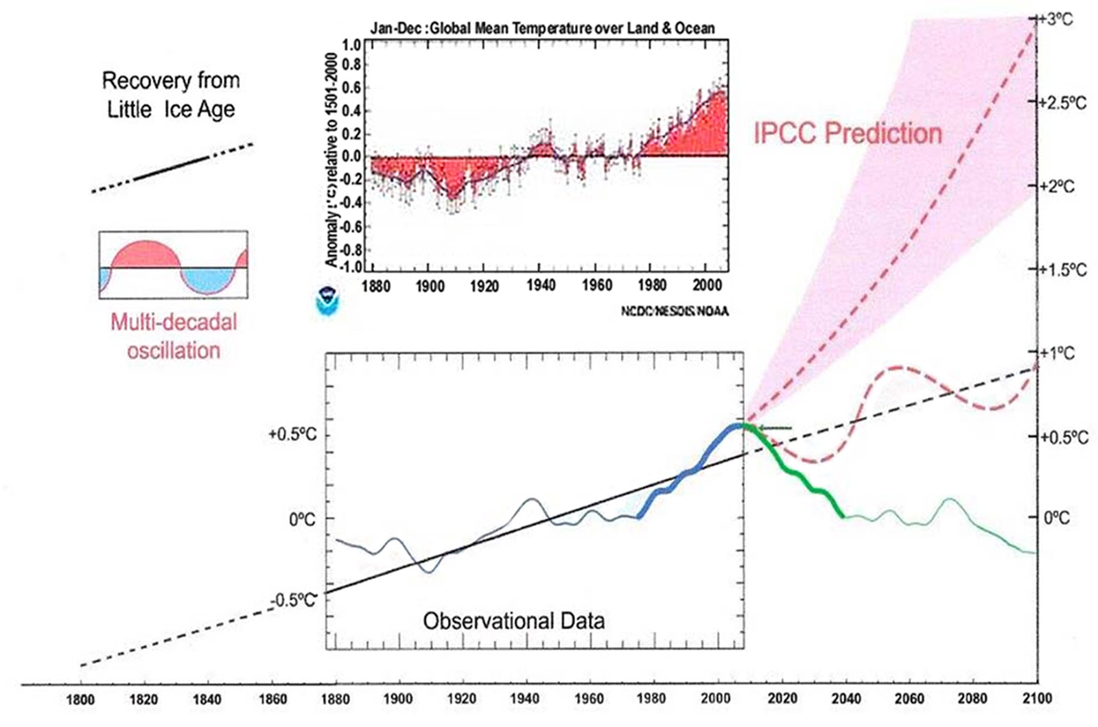
Climate is controlled by natural cycles. Earth is just past the 2004+/- peak of a millennial cycle and the current cooling trend will likely continue until the next Little Ice Age minimum at about 2650.See my Energy and Environment paper at http://journals.sagepub.com/doi/full/10.1177/0958305X16686488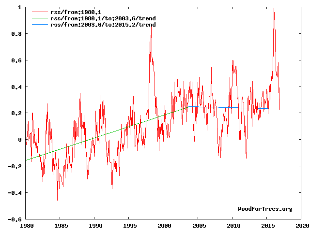
and an earlier accessible blog version at http://climatesense-norpag.blogspot.com/2017/02/the-coming-cooling-usefully-accurate_17.html
Here is the abstract for convenience :
“ABSTRACT
This paper argues that the methods used by the establishment climate science community are not fit for purpose and that a new forecasting paradigm should be adopted. Earth’s climate is the result of resonances and beats between various quasi-cyclic processes of varying wavelengths. It is not possible to forecast the future unless we have a good understanding of where the earth is in time in relation to the current phases of those different interacting natural quasi periodicities. Evidence is presented specifying the timing and amplitude of the natural 60+/- year and, more importantly, 1,000 year periodicities (observed emergent behaviors) that are so obvious in the temperature record. Data related to the solar climate driver is discussed and the solar cycle 22 low in the neutron count (high solar activity) in 1991 is identified as a solar activity millennial peak and correlated with the millennial peak -inversion point – in the RSS temperature trend in about 2004. The cyclic trends are projected forward and predict a probable general temperature decline in the coming decades and centuries. Estimates of the timing and amplitude of the coming cooling are made. If the real climate outcomes follow a trend which approaches the near term forecasts of this working hypothesis, the divergence between the IPCC forecasts and those projected by this paper will be so large by 2021 as to make the current, supposedly actionable, level of confidence in the IPCC forecasts untenable.”
The paper was published in E&E on line at DOI: 10.1177/0958305X16686488
See Fig 4 in the blog version linked above
“The RSS cooling trend in Fig. 4 and the Hadcrut4gl cooling in Fig. 5 were truncated at 2015.3 and 2014.2, respectively, because it makes no sense to start or end the analysis of a time series in the middle of major ENSO events which create ephemeral deviations from the longer term trends. By the end of August 2016, the strong El Nino temperature anomaly had declined rapidly. The cooling trend is likely to be fully restored by the end of 2019.”
For overview and forecast to 2100 see Fig 12
Fig. 12. Comparative Temperature Forecasts to 2100.
Fig. 12 compares the IPCC forecast with the Akasofu (31) forecast (red harmonic) and with the simple and most reasonable working hypothesis of this paper (green line) that the “Golden Spike” temperature peak at about 2004 is the most recent peak in the millennial cycle. Akasofu forecasts a further temperature increase to 2100 to be 0.5°C ± 0.2C, rather than 4.0 C +/- 2.0C predicted by the IPCC. but this interpretation ignores the Millennial inflexion point at 2004. Fig. 12 shows that the well documented 60-year temperature cycle coincidentally also peaks at about 2004.Looking at the shorter 60+/- year wavelength modulation of the millennial trend, the most straightforward hypothesis is that the cooling trends from 2004 forward will simply be a mirror image of the recent rising trends. This is illustrated by the green curve in Fig. 12, which shows cooling until 2038, slight warming to 2073 and then cooling to the end of the century, by which time almost all of the 20th century warming will have been reversed.
May I ask why you chose to stop your ‘From 2003.6’ trend line at 2015.2, considering that the site you are using runs RSS data up to 2017.17? Why did you cut outthe last year’s data?
Here are the same data you plotted only this time running the ‘from 2003.6’ trend line to the latest data point: http://www.woodfortrees.org/plot/rss/from:1980.1/plot/rss/from:1980.1/to:2003.6/trend/plot/rss/from:2003.6/trend
It shows warming, not cooling and not a flat line. Why did you chose to obscure this?
DWR54 on May 5, 2017 at 2:54 pm
Why did you chose to obscure this?
I guess Mr PAGE simply did it to have the plot best fitting to his eternal narrative.
Because he is expecting a la nina cooling to follow the el nino warming event, as it always does. You either include both or neither if you are trying to be scientific.
Look at Fig 4 above . I say
“The RSS cooling trend in Fig. 4 and the Hadcrut4gl cooling in Fig. 5 were truncated at 2015.3 and 2014.2, respectively, because it makes no sense to start or end the analysis of a time series in the middle of major ENSO events which create ephemeral deviations from the longer term trends. By the end of August 2016, the strong El Nino temperature anomaly had declined rapidly. The cooling trend is likely to be fully restored by the end of 2019.”
Look e.g.at how the 1998 El Nino appears relative to the trend. The 2016 El Nino is just an ephemeral bump which is also happens to be very close in time to the top of the RSS millennial cycle at 2003.6
JasG Of course – that is how geology works. You use all the available proxy and instrumental data including the solar activity and cloud data to build an hypothesis which fits all the data and choose Figures which illustrate your working hypothesis. Read the entire Blogpost linked above.
Richard Greene My claim is rather modest actually
“Estimates of the timing and amplitude of the coming cooling are made. If the real climate outcomes follow a trend which approaches the near term forecasts of this working hypothesis, the divergence between the IPCC forecasts and those projected by this paper will be so large by 2021 as to make the current, supposedly actionable, level of confidence in the IPCC forecasts ”
Also, climate forecasts can only be tested against future outcomes – so of course I’m willing to suggest tests of my working hypotheses. If they don’t turn out I will modify my proposals.
There is nothing mysterious about the late 20th century warming. 2004 is by chance at the peak of both the millennial and 60 year cycles – see Fig 12
Mr. Page
I like the fact that you are not chasing the CO2 boogeyman ,,, but I believe you come across as too sure of your own theories, which hurts your credibility.
I believe you further hurt your credibility by making very specific climate predictions.
I’ve been reading about climate change since 1997 mainly because the demonization of fossil fuels may have a huge negative effect on economic growth and prosperity — my main interest is economic and finance.
I believe the three most important things I have learned about climate change are that no one knows exactly what causes climate change, predictions of the future climate are almost always wrong, and CO2 is not likely to be a major climate change variable.
The two easiest ways to make oneself look foolish on the subject of climate change are to claim you know what causes climate change ,,, and then make specific predictions of the future climate that could be proven wrong while you are still alive!
Are there climate cycles?
Maybe.
But the proxy temperature data are too rough and LOCAL — they are not accurate enough GLOBAL data to conclude there’s a specific cycle, such as 1,000 years.
Could there be a 1,000 to 2,000 year solar cycle?
There is some evidence of that in ice core data.
But I don’t think some evidence of a long-term cycle from ice cores is going to explain the mystery of the sudden warming from the 1993 low to the 2003 high — a step up — followed by a flat trend to 2015.
New Study Confirms:
“Between about 1998 and 2012, a time that coincided with political negotiations for preventing climate change, the surface of Earth seemed hardly to warm. This phenomenon, often termed the ‘global warming hiatus’, caused doubt in the public mind about how well anthropogenic climate change and natural variability are understood. Here we show that apparently contradictory conclusions stem from different definitions of ‘hiatus’ and from different datasets. A combination of changes in forcing, uptake of heat by the oceans, natural variability and incomplete observational coverage reconciles models and data. Combined with stronger recent warming trends in newer datasets, we are now more confident than ever that human influence is dominant in long-term warming.”
Is that what the GWPF meant to say?
You mean conclude that climate science is all about post-facto adjustments to explain why everything they ever predict turns out to be wrong? Btw the hiatus in the stratosphere has existed since 1995; ie the main fingerprint of man-made warming – stratospheric cooling – has been missing for 22 years. Care to speculate on how and when the charlatans will adjust that inconvenient data to show cooling again?
JasG said:
“the hiatus in the stratosphere has existed since 1995; ie the main fingerprint of man-made warming – stratospheric cooling – has been missing for 22 years.”
The stratospheric cooling has been found — it is at the bottom of the oceans where all other missing fingerprints of man made warming are eventually located.
My source: The internet
The “science” behind the climate change cult is so bad that it should not be called “science” at all — just another phony environmental boogeyman used to gain attention, money and power … supported by meaningless wild guess computer games — the only connection to science is many of the climate con men happen to have science degrees.
Richard,
I’m pretty sure that Trenberth could talk US taxpayers into funding his expedition to the deep sea to find the missing tropical tropospheric hot spot there, too.
If it would get the rent-seeker permanently out of the US and back to his native NZ, I’d pony up my share gladly.
Perhaps this is naive, but…
I am most impressed by Anthony’s ability to keep his temper.
I feel bad for people under 30. You guys are going to have to hear about this man made catastrophic global warming fake science for the rest of your lives. If the media hasn’t given up on this in the real face of facts yet, they never will. I mean come on, they report with straight faces that supposed global warming and plant food cause cold weather. Morons like that will never go away…