Guest Post by Werner Brozek, Extended Comments from Barry and Edited by Just The Facts
UAH (University of Alabama in Huntsville) and RSS (Remote Sensing Systems) are two major satellite groups that provide monthly climate anomalies. From January 1998 to January 2016, the slope was slightly negative, a period which many have referred to as a “pause”, although some prefer other names. Since a huge anomaly spike in February 2016 due to a very strong El Nino, the so called pause is gone.
Last month, Barry wrote about several things that must happen for the pause to return for UAH, which I excerpted in an article titled How Imminent is the UAH Pause? (Now Includes Some January Data) This month, Barry has written about what must happen for the pause to return for RSS, as well as provided additional information with respect to the UAH pause.
Barry’s comments follow:
This RSS analysis leverages the RSSv3 TLT global data set. The following plot contains the full record with 12 month averages for visual accompaniment:
 - 1979 to Present")
Ordinary least squares linear regression, trends in degrees Celsius, the mean trend from January 1998 to:
Feb 2016: 0.019 /decade
Mar 2016: 0.028 /decade
Apr 2016: 0.035 /decade
May 2016: 0.038 /decade
Jun 2016: 0.041 /decade
Jul 2016: 0.043 /decade
Aug 2016: 0.045 /decade
Sep 2016: 0.049 /decade
Oct 2016: 0.049 /decade (higher to 4 decimal places than Sep)
Nov 2016: 0.050 /decade
Dec 2016: 0.048 /decade
Jan 2017: 0.052 /decade
Feb 2017: 0.053 /decade
Unlike UAHv6, there is one month (Dec 2016) that lowered the then warming trend slightly. I’ve plotted monthly data and the trend to Nov 2016, and you can see the Dec 2016 anomaly is below the trend line. That’s why December lowered the then trend slightly:
 - 1979 to Present")
Otherwise, every other month after the peak warm month of Feb 2016 increased the trend, even though they were all cooler than February. The trend rose because subsequent months were warmer than the trend itself, except December 2016. For the ‘pause’ from 1998 to resume next month, the March anomaly would have to be -3.6C. For the pause to resume by December 2017, the annual average anomaly for 2017 would have to be -0.02C. The last time an annual temperature anomaly was this cool or cooler in the RSSv3 TLT dataset was 1993 (-0.118C). However, January and February 2017 have been 0.41 and 0.44 respectively, so for the pause to resume by December, the average of the next 10 months would have to be -0.12C. The last time this happened was in 1992 (-0.19C).
For a pause to resume by 2020 (Dec 2019), the three year averaged anomaly 2017 to 2019 for RSS would have to be -0.04C. The last time a 3 year average was that cool or cooler was 1992 through 1994 (-0.09). For the pause to resume by 2020, we’d need to see temps of the next three years similar to those of the early 1990s. Check the graph above to see what that looks like.
The section below provides some additional updates for UAH.
Next month’s anomaly would have to be lower than 0.2C to reduce the trend slightly. To get a flat or negative trend since 1998, the March anomaly would have to be -3.8C. The decimal point is in the correct place!
For the 1998 trend to return to flat or negative values by the end of this year, the annual average anomaly for 2017 would have to be -0.16C. We have 2 months data already, at around 0.5C warmer than that, so what would the average temperature anomaly for the rest of 2017 have to be to get a flat/negative trend since 1998? -0.26C (Mar-Dec)
The most recent year the annual average anomaly was that cool was in 1985. The annual average then was -0.35C. With 2017 predicted to be an el Nino or ENSO neutral year the chances of a flat trend by December are very slim. As I expect some warming with atmospheric CO2 increase, however one may argue the magnitude, I think it is unlikely we will see a year as cold as 1985, barring a volcanic eruption of greater magnitude than the 1991 Pinatubo eruption. Consequently, I think it is unlikely the ‘pause’ will return at all if 1998 is used as the start date.
In comments last month Werner asked how cool the annual anomalies would have to be to get a flat trend if there were a succession of cool years. For the trend since 1998 to go flat by 2020 (December 2019) the annual average temperature anomaly for the three years Jan 2017 to Dec 2019 would have to be: 0.05C
When did we last have 3 consecutive years as cool or cooler than that?
2007 to 2009: 0.05C However, January and February 2017, being 0.30 and 0.35C respectively, would raise the three year average to 0.6 0.065 if the rest of the months through 2019 were 0.05C. So we have to go further back in time to get a cooler 3-year average. Most recent is: 1994 to 1996: 0.0C
Those predicting imminent cooling from lower solar ebb or ocean-atmosphere oscillations may expect to see annual temperatures like the early 1990s sometime soon. I am less confident of that. Time will tell.
————-
Written by Barry
In the sections below, we will present you with the latest facts. The information will be presented in two sections and an appendix. The first section will show for how long there has been no statistically significant warming on several data sets. The second section will show how 2017 compares with 2016, the warmest year so far, and the warmest months on record so far. The appendix will illustrate sections 1 and 2 in a different way. Graphs and a table will be used to illustrate the data.
Section 1
For this analysis, data was retrieved from Nick Stokes’ Trendviewer available on his website. This analysis indicates for how long there has not been statistically significant warming according to Nick’s criteria. Data go to their latest update for each set. In every case, note that the lower error bar is negative so a slope of 0 cannot be ruled out from the month indicated.
On several different data sets, there has been no statistically significant warming for between 0 and 23 years according to Nick’s criteria. Cl stands for the confidence limits at the 95% level.
The details for several sets are below.
For UAH6.0: Since December 1993: Cl from -0.009 to 1.776
This is 23 years and 3 months.
For RSS: Since October 1994: Cl from -0.006 to 1.768 This is 22 years and 5 months.
For Hadcrut4.5: The warming is statistically significant for all periods above four years.
For Hadsst3: Since May 1997: Cl from -0.031 to 2.083 This is 19 years and 9 months.
For GISS: The warming is statistically significant for all periods above four years.
Section 2
This section shows data about 2017 and other information in the form of a table. The table shows the five data sources along the top and other places so they should be visible at all times. The sources are UAH, RSS, Hadcrut4, Hadsst3, and GISS.
Down the column, are the following:
1. 16ra: This is the final ranking for 2016 on each data set. On all data sets, 2016 set a new record. How statistically significant the records were was covered in an earlier post here: https://wattsupwiththat.com/2017/01/26/warmest-ten-years-on-record-now-includes-all-december-data/
2. 16a: Here I give the average anomaly for 2016.
3. mon: This is the month where that particular data set showed the highest anomaly. The months are identified by the first three letters of the month and the last two numbers of the year.
4. ano: This is the anomaly of the month just above.
5. sig: This the first month for which warming is not statistically significant according to Nick’s criteria. The first three letters of the month are followed by the last two numbers of the year.
6. sy/m: This is the years and months for row 5.
7. Jan: This is the January 2017 anomaly for that particular data set.
8. Feb: This is the February 2017 anomaly for that particular data set if available.
9. ave: This is the average anomaly of all available months with at least two months of data.
10. rnk: This is the 2017 rank for each particular data set assuming the average of the anomalies stay that way all year. Of course they won’t, but think of it as an update 5 minutes into a game.
| Source | UAH | RSS | Had4 | Sst3 | GISS |
|---|---|---|---|---|---|
| 1.16ra | 1st | 1st | 1st | 1st | 1st |
| 2.16a | 0.503 | 0.574 | 0.773 | 0.613 | 0.98 |
| 3.mon | Feb16 | Feb16 | Feb16 | Jan16 | Feb16 |
| 4.ano | 0.829 | 0.996 | 1.070 | 0.732 | 1.30 |
| 5.sig | Dec93 | Oct94 | May97 | ||
| 6.sy/m | 23/3 | 22/5 | 19/9 | ||
| 7.Jan | 0.299 | 0.409 | 0.741 | 0.488 | 0.92 |
| 8.Feb | 0.348 | 0.440 | |||
| 9.ave | 0.324 | 0.425 | |||
| 10.rnk | 4th | 4th | 3rd | 3rd | 2nd |
| Source | UAH | RSS | Had4 | Sst3 | GISS |
If you wish to verify all of the latest anomalies, go to the following:
For UAH, version 6.0beta5 was used.
http://www.nsstc.uah.edu/data/msu/v6.0/tlt/tltglhmam_6.0.txt
For RSS, see: ftp://ftp.ssmi.com/msu/monthly_time_series/rss_monthly_msu_amsu_channel_tlt_anomalies_land_and_ocean_v03_3.txt
For Hadcrut4, see: http://www.metoffice.gov.uk/hadobs/hadcrut4/data/current/time_series/HadCRUT.4.5.0.0.monthly_ns_avg.txt
For Hadsst3, see: https://crudata.uea.ac.uk/cru/data/temperature/HadSST3-gl.dat
For GISS, see:
http://data.giss.nasa.gov/gistemp/tabledata_v3/GLB.Ts+dSST.txt
To see all points since January 2016 in the form of a graph, see the WFT graph below.
 - 1979 to Present")
As you can see, all lines have been offset so they all start at the same place in January 2016. This makes it easy to compare January 2016 with the latest anomaly.
The thick double line is the WTI which shows the average of RSS, UAH, HadCRUT4.5 and GISS.
Appendix
In this part, we are summarizing data for each set separately.
UAH6.0beta5
For UAH: There is no statistically significant warming since December 1993: Cl from -0.009 to 1.776. (This is using version 6.0 according to Nick’s program.)
The UAH average anomaly so far is 0.324. This would rank in fourth place if it stayed this way. 2016 was the warmest year at 0.503. The highest ever monthly anomaly was in February of 2016 when it reached 0.829.
RSS
For RSS: There is no statistically significant warming since October 1994: Cl from -0.006 to 1.768.
The RSS average anomaly so far is 0.425. This would rank in fourth place if it stayed this way. 2016 was the warmest year at 0.574. The highest ever monthly anomaly was in February of 2016 when it reached 0.996.
Hadcrut4.5
For Hadcrut4.5: The warming is significant for all periods above four years.
The Hadcrut4.5 average anomaly for 2016 was 0.773. This set a new record. The highest ever monthly anomaly was in February of 2016 when it reached 1.070. The January anomaly was 0.741 which would rank 2017 in third place if it stayed this way.
Hadsst3
For Hadsst3: There is no statistically significant warming since May 1997: Cl from -0.031 to 2.083.
The Hadsst3 January anomaly is 0.488. This would rank third if it stayed this way. The highest ever monthly anomaly was in January of 2016 when it reached 0.732.
GISS
For GISS: The warming is significant for all periods above four years.
The GISS average anomaly for 2016 was 0.98. This set a new record. The highest ever monthly anomaly was in February of 2016 when it reached 1.30. The January anomaly was 0.92 which would rank 2017 in second place if it stayed this way.
Conclusion
Do you think RSS will ever have a pause of over 18 years again? Why or why not?
UAH6.0beta5
For UAH: There is no statistically significant warming since December 1993: Cl from -0.009 to 1.776.
That is significant warming at the p less than 5% level.
My aim here is to give what Phil Jones would agree with. Here is an earlier exchange I had with Nick:
Werner Brozek
January 26, 2017 at 11:53 am
“Would Phil Jones use either your numbers or those of SkS to determine if warming over 15 years was statistically significant or not?”
Nick Stokes
January 26, 2017 at 12:19 pm
“My usage there is the same as SkS and is conventional – 95% chance of being within CI. I think from memory that this is what PJ was using too.”
In every case, note that the lower error bar is negative so a slope of 0 cannot be ruled out from the month indicated.
From the data you show there is ~97% chance that there is warming and ~3% chance that there is cooling.
True. But keep in mind that I did not set the standards that climate scientists deem appropriate.
Werner Brozek March 16, 2017 at 7:52 am
“From the data you show there is ~97% chance that there is warming and ~3% chance that there is cooling.”
True. But keep in mind that I did not set the standards that climate scientists deem appropriate.
It’s nothing to do with ‘climate science’, it’s routine statistical significance testing. When you say ‘warming’ you are explicitly referring to a one tailed test. You’re applying a two tailed test, in the case of the RSS data you quoted: there has been no statistically significant warming for between 0 and 23 years according to Nick’s criteria. Cl stands for the confidence limits at the 95% level.
For UAH6.0: Since December 1993: Cl from -0.009 to 1.776
So there is a 5% possibility that the trend is below -0.009 or above 1.776, the 2.5% above 1.776 is part of the warming, not cooling!
Werner, I don’t appreciate very much this somewhat lochnessy discussion about what is ‘statistically significant’ or not, but I think reading again the discussion following this comment
https://wattsupwiththat.com/2016/11/18/rss-resets-former-pause-length-and-2016-record-race-now-includes-september-and-october-data/comment-page-1/#comment-2346071
might be of some help to you. Commenter dikranmarsupial had a perfect match on the topic.
Speaking for myself, I am fine with what Phil Jones and Lord Monckton would accept for the different parts. If others wish to go deeper or in different directions, that is up to them.
Apologies if it’s been mentioned previously, but the RSS data cited (TLT v.3.3) comes with a very clear caveat from its producers:
“RSS TLT version 3.3 contains a known cooling bias. We are working to eliminate the bias in the new version of TLT.” http://images.remss.com/papers/rsstech/Jan_5_2017_news_release.pdf
I believe the authors of this article should have made this clear at the outset, since it has been the RSS position for several months.
I am told that RSS now have a new TLT version (4.0) and that the paper describing their methods is currently in peer review. Should be interesting to compare the latest RSS TLT series to that recently produced by UAH.
Nick Stokes has mentioned it. We use what they give us and when the new one comes along, we will do comparisons.
Werner: What conclusions do you want readers to draw from data that RSS no longer trusts. In cargo Cult Science, Feynman tell us:
“It’s a kind of scientific integrity, a principle of scientific thought that corresponds to a kind of utter honesty—a kind of leaning over backwards. For example, if you’re doing an experiment, you should report everything that you think might make it invalid—not only what you think is right about it: other causes that could possibly explain your results; and things you thought of that you’ve eliminated by some other experiment, and how they worked—to make sure the other fellow can tell they have been eliminated.
Details that could throw doubt on your interpretation must be given, if you know them. You must do the best you can—if you know anything at all wrong, or possibly wrong—to explain it. If you make a theory, for example, and advertise it, or put it out, then you must also put down all the facts that disagree with it, as well as those that agree with it. There is also a more subtle problem. When you have put a lot of ideas together to make an elaborate theory, you want to make sure, when explaining what it fits, that those things it fits are not just the things that gave you the idea for the theory; but that the finished theory makes something else come out right, in addition.
In summary, the idea is to try to give all of the information to help others to judge the value of your contribution; not just the information that leads to judgment in one particular direction or another.
The easiest way to explain this idea is to contrast it, for example, with advertising…”
Now, the IPCC certainly doesn’t meet this standard for scientific conduct. Their reports contain scientific information, but not presented in a scientific context. Every projection they make should in the SPM should start with the phrase “If AOGCMs are correct, we project …” Then they need to explain in the SPM why the AOGCMs might be wrong – not bury this information in a 1000+ page report that will be released in six months!
Then we have Michael Mann misusing Tiljander proxies that he knows are contaminated in the modern era and dissembling about this problem when M&M wrote a comment.
If RSS were the only satellite data set available, it would be a completely different situation. But now we have a situation where the latest new and improved version of UAH6.0beta5 is presumably trustworthy but RSS is not. Yet both agree with each other more or less! I am not sure what conclusion to draw from this. It bothers me a little bit that the RSS boss has a clear bias and wishes there were a higher warming rate.
Werner Brozek March 16, 2017 at 5:29 am
Werner: What conclusions do you want readers to draw from data that RSS no longer trusts.
If RSS were the only satellite data set available, it would be a completely different situation. But now we have a situation where the latest new and improved version of UAH6.0beta5 is presumably trustworthy but RSS is not. Yet both agree with each other more or less! I am not sure what conclusion to draw from this.
But they are not the same product, as a result of their changes UAH v6.0 no longer covers the same region of the atmosphere (weighting peaks at ~4km compared with the previous ~2km). The confusion arises because UAH still uses the same name (LT). RSS produces a similar product which covers the same altitude range using a similar algorithm for the same reasons (eliminating errors inherent in the TLT product), which they called TTT.
UAHLT v6.0 should be compared with RSS TTT v4 (not with RSS TLT), and they don’t agree. If RSS does produce a corrected version of TLT it will not be comparable with UAH LTv6.0.
In that case, the two groups should get their act together as much as they can to avoid confusion. As well, WFT does not even cover RSS TTT.
Werner Brozek March 16, 2017 at 8:00 am
“UAHLT v6.0 should be compared with RSS TTT v4 (not with RSS TLT), and they don’t agree.”
In that case, the two groups should get their act together as much as they can to avoid confusion. As well, WFT does not even cover RSS TTT.
Well UAH could have helped with that if they had renamed the product rather than use the same name with a new version number, implying that it was the same rather than a completely different one. Interestingly Christy didn’t refer to LT in his House Committee presentation but referred to MT which is used to derive their new version but includes some stratospheric contribution.
UAH LT v6.0 LT = 1.538*MT -0.548*TP +0.01*LS
RSS TTT TTT = 1.1*TMT – 0.1*TLS
Phil. says, March 16, 2017 at 8:28 am:
That makes no sense. Here are the UAHv6.0 atmospheric layers (TLT, TMT, TTP and TLS) from 1997: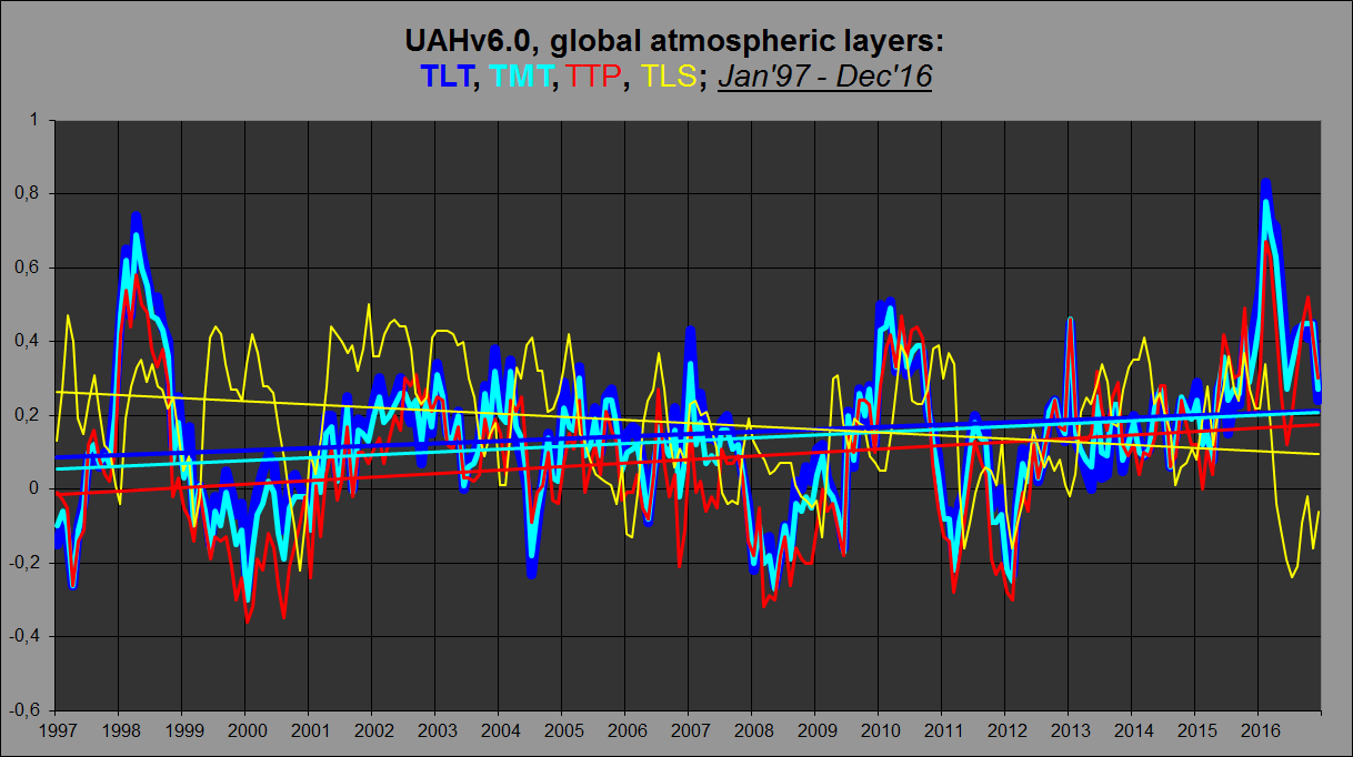
As you can see, the TLS trend is negative, yet the higher up you go from the surface towards the tropopause, the trend gets steeper (TTP > TMT > TLT). So over the last 20 years, the “stratospheric contribution” argument doesn’t work.
BTW, UAHv6.0 TLT agrees very well indeed with NOAA/STAR v3.0 TMT: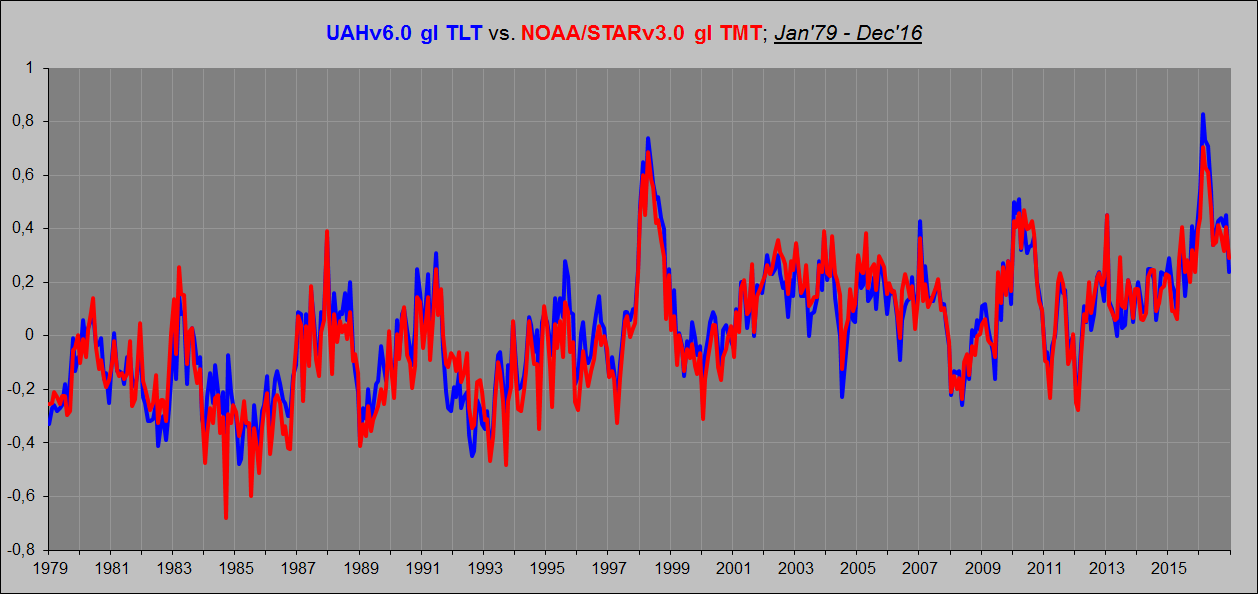
Kristian March 16, 2017 at 10:24 pm
Phil. says, March 16, 2017 at 8:28 am:
Interestingly Christy didn’t refer to LT in his House Committee presentation but referred to MT which is used to derive their new version but includes some stratospheric contribution.
UAH LT v6.0 LT = 1.538*MT -0.548*TP +0.01*LS
That makes no sense. Here are the UAHv6.0 atmospheric layers (TLT, TMT, TTP and TLS) from 1997:
As you can see, the TLS trend is negative, yet the higher up you go from the surface towards the tropopause, the trend gets steeper (TTP > TMT > TLT). So over the last 20 years, the “stratospheric contribution” argument doesn’t work.
MT weighting peaks at 4km but extends up to 22km, in order to remove the contribution from the stratosphere UAH subtracts the TP component (peak weighting ~11km, up to 22km) and a minor adjustment from LS (peak ~17 km, unto 26 km).
Here are the weighting factors:
http://www.drroyspencer.com/wp-content/uploads/MSU2-vs-LT23-vs-LT.gif
Kristian on March 16, 2017 at 10:32 pm
BTW, UAHv6.0 TLT agrees very well indeed with NOAA/STAR v3.0 TMT
Sometimes I ask me wether some people are simply naive or rather malicious.
1. Here is Okulaer’s comparison of NOAA’s STARV3 with UAH6.0 TMT

2. Here is NOAA’s STARV3 TMT graph alone to make it better visible
3. Here is my comparison of UAH6.0 TMT with UAH6.0 TLT
http://fs5.directupload.net/images/170318/nhzysc9n.jpg
Whereas UAH’s TLT record shows for 1979 0.124 °C /decade, TMT shows 0.089 °C, i.e. 30% less; but STAR’s TMT shows 0.128 °C, i.e. the same as UAH6.0 TLT.
Now everybody understands why Okulaer alias Kristian compares STAR TMT with UAH TLT, and not with UAH… TMT which probably is measured a few kilometers higher than STAR’s.
Different time periods are not directly comparable. Especially in short data sets, where a new data point can change the trend by a lot.
That’s Bob Tisdale’s graph in my post, by the way.
In any case, both sets of figures show a previous warming trend followed by a higher warming trend after adjustment. ‘Pause-buster’ is not an accurate term. Neither is ‘Karlised’, unless one is referring to the Karl et al data set.
Sticking with the technical terms and avoiding rhetoric keeps it to justthefacts.
Bindidon on March 17, 2017 at 8:46 pm
1. Here is Okulaer’s comparison of NOAA’s STARV3 with UAH6.0 TMT
Typo error here: of course I meant TLT.
I just wish to point out that I did not come up with those terms, as accurate or as inaccurate as they are. Typing in “pause buster” in the WUWT search bar brings up at least 13 articles with those words in the title itself.
Typing in “karlization” brings two articles with that word in the title but many more blog posts in which that term or some variation of it appears.
Bindidon says, March 17, 2017 at 8:46 pm:
Exactly. And that’s why I compared the UAHv6 TLT product with the NOAA/STARv3 TMT product rather than the UAHv6 TMT product. If I were to start my graph in 1997 rather than in 1979, however, I could include UAHv6 TMT and it would look like this: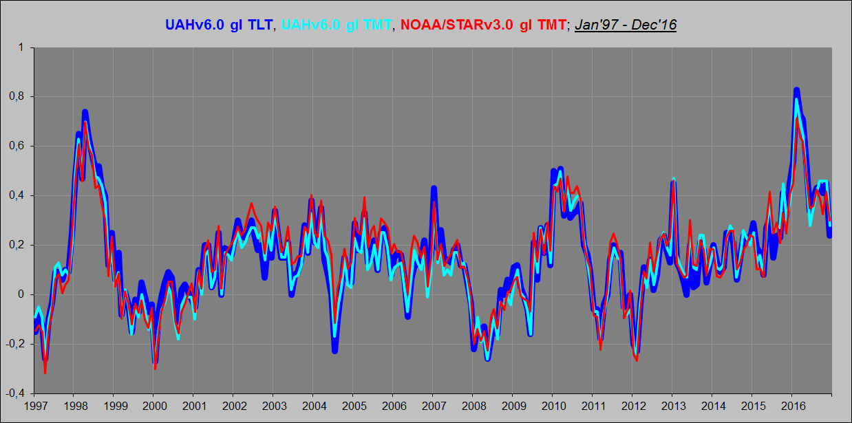
What is interesting here is how the UAHv6 TLT product compares to the NOAA/STARv3 and RSSv4 TMT products, because I at least focus on UAHv6 TLT rather than on UAHv6 TMT (whose “stratospheric contribution” problem becomes evident once we go back all the way to 1979, but not when only moving back to 1997-98). I don’t think UAHv6 TMT shows the correct tropospheric temperature evolution since 1979. It is too cool. I think UAHv6 TLT shows the correct tropospheric temperature evolution since 1979. And I think NOAA/STARv3 TMT is close, but not quite there. Same with RSSv4 TMT. Here’s why:
It is very clear from this plot that NOAA/STARv3 TMT and RSSv4 TMT both trace strangely low compared to UAHv6 TLT between 1983 and 2001. In fact, none of them shows any systematic warming whatsoever from 1979 to the end of 1997 (when the 1997/98 Super-El Niño struck). Which is in direct contradiction to both RSSv3.3 TLT, UAHv6 TLT (seen in the plot), and all surface series!
They simply haven’t fully managed to adjust out the “stratospheric contribution”. There is no such influcence in the TLT products, and so they are much more aligned with the surface series. However, there is no plausible physical reason why the TLT should represent a substantially different temperature evolution over time than the TMT and TUT. It’s all to do with that “stratospheric contribution” component and how you adjust for it. The people at NOAA/STAR and RSS have apparently done a better job than the people at UAH when it comes to their TMT products, but not good enough. There is still a residual to be seen. And it is seen when you compare their TMT products with the UAHv6 TLT product, which is the more correct one …
Finally, here’s UAHv6 gl TLT vs. CERES EBAF Ed4 gl OLR at the ToA: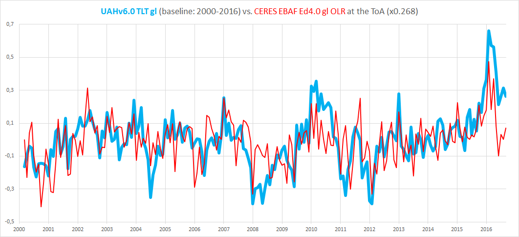
Once again, the overall agreement is impressive, considering these are two fundamentally different (albeit connected) parameters. Coming from two independent sources.
We use the latest data sets. For UAH, we used the v6.0 data set, even though at the time of writing (and last month, too) the methods paper had not been published. The paper was published a week ago, shortly after I had done the calcs. When RSS v4 TLT data becomes available (if they still use TLT), we will use that.
Side note: whenever I look at surface data, I don’t use the Karl data version. But if the main institutes incorporate that to their main data sets, I will apply the same standard as before. Others can argue the merits, but the principle can’t be applied selectively.
Just to be sure there is no confusion here, in my opinion, GISS has been Karlized and that is the only version of GISS that you see. My basis for this statement is by using Bob Tisdale’s article here:
https://wattsupwiththat.com/2017/01/23/december-2016-global-surface-landocean-and-lower-troposphere-temperature-anomaly-update-with-a-look-at-the-year-end-annual-results/
Karl did not author the ERSST.v4 adjustments. He uses the product in the ‘Karlised’ data set. That data set is distinct from the one used by NOAA. You can choose either from the Uni of York trend analyser.
barry March 15, 2017 at 5:28 pm
We use the latest data sets. For UAH, we used the v6.0 data set, even though at the time of writing (and last month, too) the methods paper had not been published. The paper was published a week ago, shortly after I had done the calcs. When RSS v4 TLT data becomes available (if they still use TLT), we will use that.
So why not use TTT, the methodology for which has been available for some time, rather than TLT v3.3 which suffers from similar problems to UAH LT v5.x?
Actually I never did NOAA for the simple reason that it never was on WFT. But I did do GISS and here is a snapshot of what I am talking about:
From:
https://wattsupwiththat.com/2014/05/25/can-giss-and-other-data-sets-set-records-in-2014-now-includes-april-data/#comment-1648290
When I said “flat”, I meant very slightly negative.
However if you plot the same thing today here:
http://www.woodfortrees.org/data/gistemp/from:2001.8/to:2013.25/plot/gistemp/from:2001.8/to:2013.25/trend
You get a positive slope of
By the way, if you wish to check any other pauses over the last four years that I have been having monthly columns of this nature, just type in “now includes” in the WUWT search bar and all of my posts will show up.
Oooops!
Sorry I was off by a year.
See:
http://www.woodfortrees.org/plot/gistemp/from:2001.8/to:2014.25/plot/gistemp/from:2001.8/to:2014.25/trend
However my point still stands, even more so:
#Selected data from 2001.8
#Selected data up to 2014.25
#Least squares trend line; slope = 0.00364774 per year
Werner,
This may be a quibble over the term ‘Karlised.’
ERSSTv4 is not a product co-authored by Karl. He just used it in his paper, and combined it with other data resulting in a data set different from NOAA’s official data set, which also has updated to ERSSTv4.
‘Karlised’ to me refers to his method of data analysis, not to the construction of ERSSTv4, which other people produced. That’s why there are two different data packages, one labeled NOAA, and a different one named Karl (2015).
It’s probably not as sexy for rhetorical purposes to call the NOAA data “ERSSTv4-ised,” but it would be more accurate.
I agree. And his “method of data analysis” led to the pause buster paper.
… which yields a different data set to NOAA’s official temp record. The official set hasn’t been ‘Karlised’, whether the term means ‘using Karl’s data set’, or ‘processed in the same way as Karl et al’.
‘Karlised’, ‘Pause-buster’… these are rhetorical terms, and rhetoric often muddies the waters. For example, the ‘pause-buster’ didn’t bust a pause at all. There was a mild warming trend before, and a higher warming trend after the update to ERSSTv4.
I had an article about the pause buster paper here:
http://wattsupwiththat.com/2015/07/08/is-noaas-hiatus-gone-now-includes-may-data/
One quote:
You show a jump from 0.046 to 0.093 over a slightly different time period. So even using these numbers gives a very clear picture in that 0.113 to 0.093 is virtually no change, but 0.113 to 0.046 is a huge change.
Werner: I admire the calm tone of your replies and will try to suppress my impatience with this subject. Patience is a virtue and deserves patience in return.
When were you impatient? You raised valid points and perspectives that deserved good answers, both for you and any onlookers.
I was certainly frustrated when I was writing and that can leads to trouble. I’m glad you found something useful in my comments. Lord Monckton never did.
Recently, commenter ‘O R’ published a very interesting post concerning the UAH TLT record:
https://wattsupwiththat.com/2017/01/18/berkeley-earth-record-temperature-in-2016-appears-to-come-from-a-strong-el-nino/#comment-2401985
OR showed that an incredibly low amount of measurement points (18) within the UAH grid cell record are sufficient to represent the entire record with some amazing accuracy:

This of course motivated me to repeat the experiment, using the UAH 2.5° grid dataset found in the files
http://www.nsstc.uah.edu/data/msu/v6.0/tlt/tltmonamg.1978_6.0
through
http://www.nsstc.uah.edu/data/msu/v6.0/tlt/tltmonamg.2016_6.0.
Instead of using 18 points however, I selected only 4 evenly distributed points within the useful part of UAH’s 72×144 grid (the latitude zones 82.5S-90S and 82.5N-90N don’t have valuable data).
The 4 points (or better: grid cells) are
– 60S-90W: near Cap Horn and the Antarctic Peninsula;
– 20S-90E: between Madagascar and Australia;
– 20N-90W: in Guatemala;
– 60N-90E: in eastern Siberia near Tula.
A time series over 1979-2016 averaging these 4 cells looks like this when compared with an averaging of 512 cells and all 9,504 respectively:
http://fs5.directupload.net/images/170316/7n2iiukj.jpg
Again, it is amazing to see how good 512 cells fit to the 9,504 of the whole grid (though they sum up to no more than laughable 5% of it), see the yellow plot showing the tiny differences between the two.
{ That wasn’t quite unknown to me: a UAH6.0 time series collected out those 2,100 grid cells encompassing all GHCN surface stations is nearly identical to UAH’s global mean made out of 9,500. }
But the more interesting point is the difference, in the blue 4-point-plot, between 1998 and 2016: while the 4 points are very near to the whole average in 1998, they moved quite a lot above it in 2016.
The reason was quickly found: while in 1998 the 4th cell in Siberia showed a temperature far below that of the 3 others, all 4 cells showed equivalent warmth for 2016.
Whenever something looks warm in a satellite record, you soon hear „That’s El Niño!“. But in 2016, El Niño was weaker than in 1998 and thus hardly could be the difference’s origin.
My humble guess: El Niño itself isn’t the origin of warming. It is rather one of its many sentinels. How else could we explain that four so distant points on Earth show a behavior similar to El Niño?
Pat Frank has several times claimed that “Systematic measurement error is not a constant bias, Frank.” Nevertheless, I have cited several types of systematic measurement error that have a constant bias and therefore do not interfere from calculating an accurate trend: 1) Recording degK in place of degC. 2) Poor ventilation/air circulation. 3) UHI. Pat has cited no examples of “systematic measurement error” that will cause a biased trend. If he does so, his example probably won’t involve a changing error – the only kind of error that can that can interfere with a trend. Increasing UHI, not constant UHI, for example.
I’ll play.
TOBS for the US.
Buckets to ship intake measurements for the global SSTs.
These produced systematic errors.
For there to be a non-warming trend from Jan 2009 to Dec 2017, the remaining months of this year would have to be -0.28C on average. It’s a bigger hurdle than getting a flat trend since 1998. (UAHv6.0 data)
Last time we had temps that cold was in 1992 (-0.28c)
The average temperature anomaly for 2017 would have to be -0.18C.
Last time we had temps that cold were in 1993 (0.20C)
should be 1993 (-0.20C)
Thank you!
So it would appear that in the future we will have pauses of either less than 4 years or more than 20 years, but nothing in between.
Yes, typo from me.
Pauses, so-called, will be of all sorts of different lengths in the future. A 25-year pause (flat or negative mean trend) would be a significant challenge to AGW.
@ur momisugly Werner Brozek March 16, 2017 at 5:29 am
“If RSS were the only satellite data set available, it would be a completely different situation. But now we have a situation where the latest new and improved version of UAH6.0beta5 is presumably trustworthy but RSS is not. Yet both agree with each other more or less! I am not sure what conclusion to draw from this. It bothers me a little bit that the RSS boss has a clear bias and wishes there were a higher warming rate.”
Werner, Happy St. Patty’s Day! The words “the latest new and improved version” demand to by placed within quotation marks. Here’s what bothers me. A few years back in the comments section on his own site prior V6, Dr. Spencer opined that RSS was running too cool and that there’d have to be some upward adjust/correction made. In the same comment he stated his belief that UAH 5.6 was running a bit to warm and he’d likely have to corrected a bit downward. Then what happened??? Dr. Spencer releases V6 that matches the RSS product he had stated was too cool. That, my friend, is bothersome. I will not be surprised to see an upward adjustment to the UAH product at some point during the next few years.
That reminds me of reading that at one point, only two people understood general relativity, but they disagreed at least on parts of it.
I am certainly not in a position to judge anything here. But it would be nice if both groups agreed on the criteria to use and the numbers they obtained.
If they did exactly the same thing, wouldn’t that make one of them redundant?
To expand on that – it’s better to have teams looking at the same or similar data in different ways, each providing a check on the other.
I would agree providing that unbiased third parties who are knowledgeable in these matter agree that each of the different ways has equal merit.
Which is exactly how RSS, Fu et al., got into it, realizing that the initial UAH MSU T2LT (which controversially was showing a cooling trend due inter alia to orbital decay) needed correcting. The main difference between RSS and UAH appears to be how to deal with the change from MSU to AMSU.
John@EF on March 17, 2017 at 9:50 am
Dr. Spencer releases V6 that matches the RSS product he had stated was too cool. That, my friend, is bothersome.
I agree!
When we carefully read Chrsty’s 2016 Feb testimony, we moreover see that politics, and not science, is the real background of many technical decisions made at UAH.
It is btw so nice to see all the time that RSS4.0 is refuted because having got warmer than revision 3.3, while UAH6.0 is accepted because it is a lot cooler then revision 5.6.
Au royaume des aveugles, le borgne est roi!