Tropics cool in January; globe doesn’t
Global climate trend since Nov. 16, 1978: +0.12 C per decade
January temperatures (preliminary)
Global composite temp.: +0.30 C (about 0.54 degrees Fahrenheit) above 30-year average for January.
Northern Hemisphere: +0.27 C (about 0.49 degrees Fahrenheit) above 30-year average for January.
Southern Hemisphere: +0.33 C (about 0.59 degrees Fahrenheit) above 30-year average for January.
Tropics: +0.07 C (about 0.13 degrees Fahrenheit) above 30-year average for January.
December temperatures (revised):
Global Composite: +0.24 C above 30-year average
Northern Hemisphere: +0.19 C above 30-year average
Southern Hemisphere: +0.30 C above 30-year average
Tropics: +0.21 C above 30-year average
(All temperature anomalies are based on a 30-year average (1981-2010) for the month reported.)
Notes on data released Feb. 1, 2017:
Temperatures in the tropical atmosphere continued to drop in January as temperatures there moved closer to their long-term averages, according to Dr. John Christy, director of the Earth System Science Center at The University of Alabama in Huntsville. Composite temperatures over both hemispheres, however, bumped slightly warmer in January, especially in the higher latitudes. In the Northern Hemisphere, pockets of warmer than normal air were especially pronounced over the eastern U.S., Canada and the North Atlantic. In the Southern Hemisphere, Australia and a large area of southern ocean between South America and New Zealand were warmer than normal.


Compared to seasonal norms, the warmest average temperature anomaly on Earth in January was in the southern Indian Ocean about 1,000 miles north of the Getz ice shelf in Western Antarctica. January temperatures there averaged 4.98 C (about 8.96 degrees F) warmer than seasonal norms. Compared to seasonal norms, the coolest average temperature on Earth in January was off the east coast of Tunisia in the Gulf of Hammamet. January temperatures there averaged 2.91 C (about 5.24 degrees F) cooler than seasonal norms.
The complete version 6 lower troposphere dataset is available here:
http://www.nsstc.uah.edu/data/msu/v6.0/tlt/uahncdc_lt_6.0.txt
Archived color maps of local temperature anomalies are available on-line at:
As part of an ongoing joint project between UAH, NOAA and NASA, Christy and Dr. Roy Spencer, an ESSC principal scientist, use data gathered by advanced microwave sounding units on NOAA and NASA satellites to get accurate temperature readings for almost all regions of the Earth. This includes remote desert, ocean and rain forest areas where reliable climate data are not otherwise available.
The satellite-based instruments measure the temperature of the atmosphere from the surface up to an altitude of about eight kilometers above sea level. Once the monthly temperature data are collected and processed, they are placed in a “public” computer file for immediate access by atmospheric scientists in the U.S. and abroad.
Neither Christy nor Spencer receives any research support or funding from oil, coal or industrial companies or organizations, or from any private or special interest groups. All of their climate research funding comes from federal and state grants or contracts.
— 30 —
Dr. Roy Spencer adds at his blog:
The Version 6.0 global average lower tropospheric temperature (LT) anomaly for January 2017 was +0.30 deg. C, up a little from the December value of +0.24 deg. C (click for full size version):

The global, hemispheric, and tropical LT anomalies from the 30-year (1981-2010) average for the last 25 months are:
YEAR MO GLOBE NHEM. SHEM. TROPICS
2015 01 +0.30 +0.44 +0.15 +0.13
2015 02 +0.19 +0.34 +0.04 -0.07
2015 03 +0.18 +0.28 +0.07 +0.04
2015 04 +0.09 +0.19 -0.01 +0.08
2015 05 +0.27 +0.34 +0.20 +0.27
2015 06 +0.31 +0.38 +0.25 +0.46
2015 07 +0.16 +0.29 +0.03 +0.48
2015 08 +0.25 +0.20 +0.30 +0.53
2015 09 +0.23 +0.30 +0.16 +0.55
2015 10 +0.41 +0.63 +0.20 +0.53
2015 11 +0.33 +0.44 +0.22 +0.52
2015 12 +0.45 +0.53 +0.37 +0.61
2016 01 +0.54 +0.69 +0.39 +0.84
2016 02 +0.83 +1.16 +0.50 +0.99
2016 03 +0.73 +0.94 +0.52 +1.09
2016 04 +0.71 +0.85 +0.58 +0.93
2016 05 +0.54 +0.65 +0.44 +0.71
2016 06 +0.34 +0.51 +0.17 +0.37
2016 07 +0.39 +0.48 +0.30 +0.48
2016 08 +0.43 +0.55 +0.32 +0.49
2016 09 +0.44 +0.49 +0.39 +0.37
2016 10 +0.41 +0.42 +0.39 +0.46
2016 11 +0.45 +0.40 +0.50 +0.37
2016 12 +0.24 +0.19 +0.30 +0.21
2017 01 +0.30 +0.27 +0.33 +0.07
So it’s basically the same temperatures now as it was in the 1980’s…. After it cooled from 1935 to 1975. Can someone please explain what the problem is?
Mark,
No, a local dip in 2016/7 matches a few local peaks in the 1980’s. The fact that a local dip now is still +0.3°C relative to the 1981-2010 average is telling you something.
But no-one thinks the problem is in the troposphere. What matters for us is what happens down here.
Bit it cooled an average of .3 to .5 up to 1980 from 1940 as 100’s of peer reviewed research back then showed. I still don’t see the problem Nick..
“Bit it cooled an average of .3 to .5 up to 1980 from 1940 “
Just not true. But again jumping from one dataset to another. There is no data on the troposphere in that time.
Well Nick, in order to be able to say that the Temperature now (last month) is 0.3 deg. C higher, you need two things.
First off you need the Temperature now (last month).
No choice there; we only have one choice for last month; it is what it is.
But you also need to have that 30 year baseline “average” (of anomalies) to compare with last month.
Now the handcuffs are off. You have complete freedom of choice of that baseline period, and the 0.3 deg. C number is totally dependent on your quite arbitrary choice of that cherry picked period.
Now I don’t have ANY argument with how Dr. Roy and Prof Christy are getting their data.
It sure beats the hell out of putting thermometers on airport runways, or University campus parking lots.
And for a change, the sampling regimen at least makes a best effort at acknowledging sampled data system theory.
So gold stars for UAH and RSS for doing something with a real scientific foundation.
Of course in the end, they end up with UAH, or RSS as the case may be.
What it means besides UAH is not at all apparent; so we shouldn’t be losing any sleep over it.
We have enough fixable environmental problems we could be addressing, and fixing for finite amounts of money and effort.
The Atmospheric CO2 molecular abundance is not one of those issues.; other than being necessary for life on earth.
G
Nick ==> “what happens down here”… is weather, changing weather, same weather, new weather, or more weather. What we need to be concerned about is the answer to the question “Is the Earth system being heated by GHGs? and if so, to what extent?”
That questions is answered by measuring whether or not the atmosphere is being warmed and by how much — and is NOT answered by whether the “air temperature at 2 meters above ground surface at the few places where we put our thermometers” is warming. And certainly not a matter of 10ths or 100ths of a degree.
I have been sending the occasional url to a watermelon acquaintance of mine, with a bit of grumping about lack of the base data and precise methods used to homogenize, interpolate, extrapolate, not-so-arbitrarily choose base times or time periods for the “anomalies”, aggregate and then publish only the resulting few numbers. Why don’t we get the whole story? Why do they fight so hard against the FOIA law-suits? If they are, as they claim to be, scientists, applying the scientific method, all of this shoul be out in the open. (Why not choose the hottest previous inter-glacial? Or the coldest previous ice age? Or the worst year of the Little Ice Age? Why not 1900, or 1910, or 1915 as the anomaly base?) “is what it is” but we do not know what it actually is, because all we get are the results of what seems to be chicanery.
But, if they are merely power-mad watermelons 🍉 wanting to punish the average citizens of developed economies, to engage in more “redistribution”, while they jet-set around on the tax-victim dime, then it all makes perfect sense.
I confess that between this and the dysfunctional STEM job markets, I am quite frustrated and annoyed.
Doesn’t really matter does it Nick, AGW theory is an epic fail. Therefore, most of your support of global warming is wrong. 8 years ago the global temperature was sited at being 1.2 C above normal. And now we are talking about 0.3 C ?
Nick – “But no-one thinks the problem is in the troposphere. What matters for us is what happens down here.”
Misdirection and irrelevant. Sure, what happens down here does matter to us, but it is only the effect from what is happening above, called weather and along and along, climate. Those weather satellites showing clouds and wind and storms and hurricanes and emergency warnings are not showing stuff crawling along the first 5-6 feet of the surface. The CAUSE of what happens down here is due to what’s going on up there. That is why “up there”, where weather is generated is more important.
We get earthquakes too, but nobody is looking for their cause in the first 5-6 feet of the surface.
“Now the handcuffs are off. You have complete freedom of choice of that baseline period, and the 0.3 deg. C number is totally dependent on your quite arbitrary choice of that cherry picked period.”
Actually, no. UAH data runs from 1979. If you want the customary 3 calendar decades, your only choice is 1981-2010, which is what they use. If they could choose an earlier period, the result would be higher.
But,
rishrac,
“8 years ago the global temperature was sited at being 1.2 C above normal. And now we are talking about 0.3 C ?”
As always, no cites or backup. I don’t think anyone was talking about current temperatures 1.2°C above normal eight years ago. But if they were talking about 0.7 or so, it would have been relative to a normal from say 1951-80. The 0.3C is a rise from a much more recent base – 1981-2010. And of course, probably a different place, but I know few here bother with such details.
BobM,
“The CAUSE of what happens down here…”
Yes. But people aren’t talking about the cause. They are talking about the observed temperature. And it is far too simplistic to say that cause of surface warming is troposphere warming.
Nick Stokes:
You said “….far too simplistic to say that cause of surface warming is tropospheric warming.”
Rather the other way around. Surface warming, due to increased insolation, causes warming of the troposphere. And decreased insolation cools the troposphere.
Nick – “They are talking about the observed temperature.”
No, the “temperature” “they are talking about” is a gross approximation of an amalgamation that is not “observed” anywhere. It has no serious relationship to my weather or climate. While the Troposphere is not the be all and end all of my weather and climate, it is only a couple of miles away, a constantly moving and changing mass of weather, the effects of which I do observe every day. The ground has little to nothing to do with it. If I was to be a “climate scientist” I’d be more interested in the close at hand and clear driver of my weather and climate instead of the local surface around me and and the completely irrelevant infilled “temperature” from some Siberian outpost which means nothing to anybody but some reindeer herders.
BobM
“No, the “temperature” “they are talking about” is a gross approximation of an amalgamation that is not “observed” anywhere.”
I was referring to what is being talked about here. The topic of the thread. UAH TLT. I think you overstate a little.
Ah. So that was why the models predicted a massive “hot spot” in the Troposphere, then?
No, a local dip in 2016/7 matches a few local peaks in the 1980’s. The fact that a local dip now is still +0.3°C relative to the 1981-2010 average is telling you something.
Agreed.
Kip, here
 ~80 million surface stations.
About 3 clear sky days in the outback. Min temps follow dew point temp.
Given the large daily and seasonal range of temperatures, coupled with the variability in tidal flows and wind driven ocean currents, it should come as no surprise to any reasonably competent statistician that this short term variability will give rise to long term variability on scales of decades and centuries.
Nick wrote: “But no-one thinks the problem is in the troposphere. What matters for us is what happens down here.”
Nick, you imply that the satellites don’t measure surface temperatures, but, according to the article above:
“The satellite-based instruments measure the temperature of the atmosphere from the surface up to an altitude of about eight kilometers above sea level.”
“From the surface” seems to satisfy your “what happens down here” requirement.
Is the article wrong, the satellites don’t measure the surface?
TA February 2, 2017 at 10:28 am
Nick wrote: “But no-one thinks the problem is in the troposphere. What matters for us is what happens down here.”
Nick, you imply that the satellites don’t measure surface temperatures, but, according to the article above:
“The satellite-based instruments measure the temperature of the atmosphere from the surface up to an altitude of about eight kilometers above sea level.”
“From the surface” seems to satisfy your “what happens down here” requirement.
Is the article wrong, the satellites don’t measure the surface?
What caused the adjustments to UAH and RSS TLT was the problems with the emissions from the surface. particularly from high ground (Himalayas, Antarctica, Greenland etc.) as a result they both changed their methodology to collect data from higher in the troposphere (UAH still calls it LT but RSS changed its name to TTT). The peak weighting of both products is now at ~4km rather than the previous ~2km.
From Roy Spencer:
“We describe the major changes in processing strategy, including a new method for monthly gridpoint averaging; a new multi-channel (rather than multi-angle) method for computing the lower tropospheric (LT) temperature product; and a new empirical method for diurnal drift correction. We also show results for the mid-troposphere (“MT”, from MSU2/AMSU5), tropopause (“TP”, from MSU3/AMSU7), and lower stratosphere (“LS”, from MSU4/AMSU9). The 0.026 C/decade reduction in the global LT trend is due to lesser sensitivity of the new LT to land surface skin temperature (est. 0.010 C/decade), “
Surely the global mean temperature for 30 years was well known prior to 1979.
Evidently we have data that goes back 650 million years (at least).
So what’s the problem with using any 30 year period from that time scale to use as a reference for today’s measurements.
You pick your global 30 year baseline Temperature to your liking, and you subtract that from last month’s observations.
I presume that what UAH measured last month was ACTUAL TEMPERATURES.
If you subtract a fixed value from all of those new observed temperatures, you now have anomalies referred to that baseline value.
What’s the problem ??
Are you suggesting that UAH or RSS actually observe and measure directly just anomalies.
How does that work ??
G
If I have a data set A =(A, A2, A3, …..An) and another data set B = (B1, B2, B3, …..Bn) taken at different climate times.
I can calculate a = (A1+A2+A3+…..An)/n and also b = (B1+B2+B3+…..Bn)/n
So a-b = (A1+A2+A3+…..An)/n – (B1+B2+B3+…..Bn)/n
Or I can calculate a-b = ((A1-B1)+(A2-B2)+(A3-B3)+……(An-Bn))/n
And the result is the same: EXACTLY.
So I do NOT need to know the values of Ai in the set A so long as I do know the value of (a).
Ergo I CAN accurately compute the change in last month’s UAH Actual Temperature anomalies compared to ANY prior period for which I do have the value of (a). I do not need to know (Ai).
G
Eh? I thought the alleged AGW problem originated in the troposphere.
George,
“I presume that what UAH measured last month was ACTUAL TEMPERATURES.”
They actually measure an incoming microwave signal which is a composite of emissions from oxygen molecules at various levels. From that, they have to attribute some kind of temperature to a region of troposphere. They use a weighting function. The levels of troposphere have widely varying absolute temperature, so yes, I think they have to use anomalies, even at that stage. That is why diurnal drift is such a problem. It affects the anomaly base.
” ANY prior period for which I do have the value of (a)”
And how can you know (a) from before they had satellite measurements (1979)?
Nick, you need a list of climate change ( global warming then) advocates on How Climate Works?
Geoff Vallis
David Schimel
David Randall
David Archer
Michael Bender
Shawn Marshall
Andrew Ingersoll
Andrew Revkin
By the way, I guess you never bothered to read any of the books or articles they were selling. You wouldn’t have to ask for references. I’m sure you are familiar with these people as I am. You’re just trying to support your position by claiming I’m incorrect or failing to cite references when we both know what was being said. You’re reverting to elementary school tactics.
At the start of AGW the only question I had was the MWP and the LIA. AGW rode into town claiming the science was settled and anyone who disagreed was guilty of war crimes. I thought surely, if anybody would know about this, it’d be me. I thought initially that they might be right if they could explain those 2 events. Extensive amounts of data on both. They dismissed them as if they hadn’t happened. As time has gone by, I don’t worry about whether I’m right in opposing CAGW. The people in AGW have proven that it’s wrong.
I don’t know how you can hazard supporting this quack science. Failed models, falsifying data, every prediction being wrong ( the probability on that is higher than nobody hitting the lottery ever), collusion between researchers, misleading and invalid papers rubber stamped as being peer reviewed, claiming that there are overwhelming amount of scientists who agree when there isn’t, no critical thinking on carbon cycles, sinks, failures in TSI, switching major statements on isotopic co2, an aggressive political agenda trying to subvert modern democracy, trying to add a poison pill agreement on climate change at Paris, running a dictatorship through the EPA.
And you need references ? Did you just now join this discussion or is the science already settled in your mind ?
“But no-one thinks the problem is in the troposphere. What matters for us is what happens down here.”
So you are now telling us that the models are shit and we don’t look to the Hot Spot in the troposphere?? You are an F’ing moron racehorse.
Nick
Care to explain why the collective climate establishment with the IPCC in the vanguard, for more than 20 years told all and sundry that the proverbial canary in the coal mine – the “human fingerprint”, proof of the anthropogenic roots of CAGW/CACC- would be found in the Lower Troposphere data?
And that the same establishment -and its representatives and mouthpieces like you- quietly walked away from that prediction when it failed to materialize – like the so many other failed predictions.
And then buy into your nonsense that it in fact is the surface temp data [which we know have been adjusted/manipulated beyond recognition to the point of being scientifically dangerously useless] we should have been focusing on all along?
Tetris… +1..
rishrac,
“And you need references ?”
You make a specific claim,
“8 years ago the global temperature was sited at being 1.2 C above normal. And now we are talking about 0.3 C ?”
I don’t think that is true. But you are always jumping from one data set to another, even in the same para (the 0.3 is troposphere), so it is hard to tell. I asked for a specific cite or link on who ‘sited’ that, and would check what they actually said. Instead you give a long torrent of words on how people have written books, and it goes downhill from there. The question is, who said it and what did they say?
KK,
“So you are now telling us that the models are shit “
No. I am simply saying that it is surface temperatures that affect us, and it is important to watch what is happening to them. There are theories linking them to upper air temperatures, so those are of interest. But in the end, it is surface temperatures that count.
While I get there a failed troposphere Hotspot missing, I agree with Nick, it’s the surface that matters, and co2 has hardly affected surface temperatures, there is little to no changes due to agw, it’s +90% natural ocean cycles.
Time to shut this fracking nonsense down.
micro6500:
“It’s +90% natural ocean cycles”
No, its the amount of dimming SO2 aerosols in the troposphere. Google “Climate Change Deciphered”
Min temps follow dew points, and you can see the rapid changes in the sensitivity to available energy in surface temps. I’m not saying SO2 does nothing, it is just not the change blamed on human CO2, that was the ocean cycles that either they didn’t notice, or ignored. The more I learn the worse the science is, and the integrity of some scientists who are generating what seems to be nothing more than propaganda. It’s disgusting.
micro6500:
You do need to read the “Climate Change Deciphered” post.
For the past 165 years, temporary increases in sea surface (and land) temperatures have occurred whenever there has been a business recession, due to fewer industrial SO2 aerosol emissions.
The generally upward trend in average global and sea surface temperatures is due to the intentional reduction in SO2 aerosol emissions.
tetris,
” the collective climate establishment with the IPCC in the vanguard, for more than 20 years told all and sundry that the proverbial canary in the coal mine “
I think you exaggerate. But your claim that “quietly walked away from that prediction when it failed to materialize” is just wrong. Sherwood (2015), Po-Chedley, Mitchell et al 2013 show the materialization.
I can see millions of climate refugees and most of Florida is under 4 feet of water. There is 20 feet of water on Canal St. In NYC too ! You’re delusional Nick. Everything Tetris said is true. In 2000 the far off future is going on 4 years now in the past. And going further back, they were issuing dire warnings of impending doom in the 1980’s. Nobody on the skeptic side set the time scale, the CAGW community did. That was to push their political agenda. Didn’t have anything to do with science.
I can establish a publishing company. I don’t see any reason why, I couldn’t allow all skeptical arguments to be published and none from the CAGW side. It wouldnt matter how flimsy or unsupported. Then the playing field for the appeal to published articles would be level. Unlike some publications that claim to be skeptical and are nothing more than mouth pieces for the IPCC.
Nick, any article or paper that you present supporting your position I immediately suspect as being corrupt. Your arguments hold no substance, they are worthless. Your dream world and reality are vastly different.
If you want to be honest and measure the surface, why not just measure the surface or 6 inches below the surface? That way we stop all of that sillyness.
Phil argued, using a Dr. Spencer explanation of UAH adjustments:
“a new multi-channel (rather than multi-angle) method for computing the lower tropospheric (LT) temperature product;”
Thanks for that info, Phil. From the wording above, it looks like UAH is still measuring the LT, with adjustments. 🙂
“The 0.026 C/decade reduction in the global LT trend is due to lesser sensitivity of the new LT to land surface skin temperature (est. 0.010 C/decade), “”
So UAH has adjusted for the discrepancy, which is miniscule, and have corrected their LT measurements, and are, as far as can be known, now measursing LT accurately. Correct? So UAH *does* measure from the ground up. Correct? Do I win the point?
The 1981 – 2010 average is about 0.6 °C higher than the 1951 – 80 one. This is the reason why the colder time-span is the preferred yardstick for European climate-alarmists; the resulting trend-curve just looks so much more appealing (= alarming).
Nick says: “But no-one thinks the problem is in the troposphere. What matters for us is what happens down here.” I believe that luke-warmer is the best description for myself. (I accept the “greenhouse” science of greenhouse gases, and I certainly expect that humans have an impact on climate — via greenhouse gases and otherwise. But I am far from convinced that what we will see catastrophic consequences, and attempts to link today’s severe weather to CO2 makes me even more skeptical.)
Your quoted statement makes me even more skeptical. That undermines much of what the climate science was about just a few years ago. Furthermore, what is happening down here is more good than bad. Tornadoes are not as severe as years ago. Hurricane ACE has even fallen. Crop yields are rising. Polar Bears are doing great. When wildlife has problems, it is more often due to cold than to heat. The earth is becoming more green. The % of hot days are falling. Human casualties from severe weather are falling.
It is true that scaremongering occurs every time there is severe weather, but only the poorly informed — or those intended to deceive — would say that we are having unprecedented severe weather. We are doing fine down here.
Talking point: Don’t say “it was hotter in the 1930s than today.”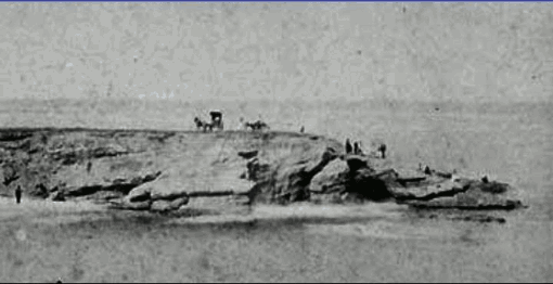
Instead say: we’ve been going through 100 years of runaway hockey stick style out of control warming. The world is soon going to be sizzling hot as the boiling oceans expand to flood much of the world.
Don’t mention that a century of runaway warming is inconsistent with the indisputable fact that all but one of the 7 continents set their all-time cold temperature record more recently than their all-time hot temperature records: http://www.space.com/17816-earth-temperature.html
And don’t mention that so far the oceans have risen about … ZERO:
La Jolla, CA in 1871 and today:
Since we don’t know what the tidal stand was when the La Jolla Cove photos were taken, there’s no useful indication of sea-level change that can be gleaned from them. They do show the memorable collapse of the “Alligator Arch” unmistakably!
wrong, study photos carefully, not the rocks but the beach in relation to the rocks. same. The stairs show the high in modern and the arch of the beach in the 1871 photo is near the same.
michael
A picture is “anecdotal evidence” and not very good even as such.
The oceans have been rising, but each place have their different relative sea levels trends based on land movement. Also, seas may be measured in depth or in surface height. the first being more difficult to measure. The tide gauges, which provide the best clue on how sea levels affect, are showing receding sea in many parts and slowly rising sea in many other parts. Where sea levels rise most, the problem is not the sea but the land.
So all in all, yes, sea levels rise and there is no sign it would be any news. The unrealistic and badly named RCP8.5 projections which include high end scenarios are very very uncertain about the rise, and despite that, the skeptics are said to pound on uncertainty. Judith Curry has well written on the ruin problem like sea level rise and uncertainty.
There’s a tide gauge at la Jolla: http://www.psmsl.org/data/obtaining/stations/256.php
Pretty clear upward trend in sea level (about 2.2 mm/yr, or about 8 inches since the 1920s): http://www.psmsl.org/data/obtaining/rlr.monthly.plots/256_high.png
Rubbish! Anybody reasonably acquainted with La Jolla Cove would recognize that my reference to “Alligator Arch” is to the rock formation at the right center of the photos, which collapsed within living memory, rather than to any “arch” of the beach near the stairs at the left margin.
The first rule of jurisprudence is, “follow the money”. In other words, lots of money needs to be transferred from government hands into the hands of the warmists.
You don’t get $100B a year without some sort of emergency, even if you made it up out of a bunch of badly constructed models.
Eisenhower’s Farewell speech. Even a Limey such as I is aware of this
“Akin to, and largely responsible for the sweeping changes in our industrial-military posture, has been the technological revolution during recent decades.
In this revolution, research has become central, it also becomes more formalized, complex, and costly. A steadily increasing share is conducted for, by, or at the direction of, the Federal government.
…
The prospect of domination of the nation’s scholars by Federal employment, project allocation, and the power of money is ever present and is gravely to be regarded.
Yet in holding scientific discovery in respect, as we should, we must also be alert to the equal and opposite danger that public policy could itself become the captive of a scientific-technological elite.”
Mark:
Google “Climate Change Deciphered” for the explanation.
This post said: Tropics cool in January; globe doesn’t”
But global Lower Troposphere (LT) temperature lags tropical LT temperature by about one months. Give it another month or so.
This post is from 3Jan2017:
https://wattsupwiththat.com/2017/01/03/2016-edges-1998-as-warmest-year-in-satellite-record-by-0-02c/comment-page-1/#comment-2388202
The Nino3.4 SST Anomaly continued to cool to -0.73C in October 2016 before warming to -0.42C in December 2016.
http://www.cpc.ncep.noaa.gov/data/indices/sstoi.indices
My formula is: UAHLT Anom. Calc. (4 months in the future) = 0.20*Nino3.4SST Anom. +0.15
So “theoretically” (and assuming I can still run a hand calculator), UAHLT should decline to about 0.00C in February 2017 before recovering to about +0.07C in April 2017.
OK, let’s round that to 0.0C in February 2017 and +0.1C in April 2017.
Agree. I see the mid-latitude heat working its way to the poles in the next 2 months, with additional impressive snowfalls along the way. Watch out, CA!
Mark February 1, 2017 at 3:59 pm says
“So it’s basically the same temperatures now as it was in the 1980’s”.
That’s a bit of a weird comment, especially as the graph is right in front of you
The average anomaly for the 1980s was -0.21 degrees
The average anomaly for 2016 was 0.5 degrees, and 0.3 for January 2017
But not so weird once you consider the drop in temperature over the 30-40 years prior to 1980. Again, I see practically no temp change since 1940 or any issues. Nick is avoiding what was confirmed in the late 70’s.
Mark. Politics.
How can a constant CO2 cause such temperature variation? How does trapping heat ever result is falling temperatures? Answer? It can’t.
Climate “Science” on Trial; CO2 is a Weak GHG, it has no Permanent DiPole
https://co2islife.wordpress.com/2017/01/30/climate-science-on-trial-co2-is-a-weak-ghg-it-has-no-dipole/
Temperatures continue to flatline, WAY off the mark of what the vaunted models said would happen:
Not only that, but Chicken Littles’ predictions of doom, every single one of them, has failed to come true, and been essentially OPPOSITE of reality.
For example, since 1988 when this prediction was made, the sea has risen maybe a quarter of an inch, if that. The amount of eco-refugees is … ZILCH:
For the next two predictions we’ll stipulate we’re pretty much already at 2020.
First, again, there’s been effectively ZERO sea-level rise, and effectively ZERO temperature or climate change, but we got this:
Or this. Dead from climate change: none:
“Temperatures continue to flatline”
Continue? Looks like your last data point is about 2012.
And why pick out only the tropical mid-troposphere?
Would 2017 make a difference?
Nick Stokes – 2016 was 0.02°C hotter than 1998: http://www.drroyspencer.com/2017/01/global-satellites-2016-not-statistically-warmer-than-1998/
That’s called flatline.
“Would 2017 make a difference?”
Plot it and see. Why stop 4+ years ago? What logical reason is there for doing that?
“… why pick out only the tropical mid-troposphere? ,,,”.
=================================
Because as Professor Christy explained in testimony to the US House Committee on Science & Technology in Feb 2016:
“… [the mid-troposphere layer is used because] … it overlaps with the region of the tropical atmosphere that has the largest anticipated signature of the greenhouse response by bulk mass [ 20,000-50,000ft] …”.
Nick, in case you do not understand the advantages of satelite measuring of the troposphere, I will list some of the pros and cons for you.
Terrestrial temperature measurements suffer from the following.
Lack of homogeneity There are many temperature stations near or in population centers but precious few on the ocean, deserts and polar regions etc.
Amongst other things, Terrestrial measurements suffer from Urban Island effect as cities spread around established measuring stations.
Terrestrial measurements suffer from the need to adjust for altitudes etc. Another avenue for errors.
Satellites are able to measure all regions of the planet and easily achieve a full homogeneity.
Satellites are able to record temperatures at closer intervals – both in time and distance.
There can be no urban island effect no errors from tarmac, buildings or reflection from the ground in anyway.
There is no need to estimate or guess/extrapolate temperatures for areas where there is no actual equipment installed.
There are no worries about what to do when a station needs to be relocated for any reason.
I could go on.
What do you think? Which one would you trust for accuracy and consistency?
Cheers
Roger
http://www.rogerfromnewzealand.wordpress.com
Roger,

“Which one would you trust for accuracy and consistency?”,/i>
Well, here is the consistency story (from here)
Comparing UAH V6, V5.6 and three versions of GISS, as published (Wayback) 2005,2011,2015, anomaly base 1981-2010:
or the difference plot
“Satellites are able to record temperatures at closer intervals – both in time and distance”
Certainly not in time – maybe twice a day, at times that can’t be controlled. And working out even what the time of day you are seeing is an issue – diurnal drift.
“There is no need to estimate or guess/extrapolate temperatures”
Poles are missing. And high altitudes are unreliable because of surface glare – RSS leaves them out, which is appropriate
“There are no worries about what to do when a station needs to be relocated for any reason.”
The satellites change every few years. And big adjustments are needed to keep them consistent.
Yes Nick, we know UAH5.6 has issues.
They have been fixed now in v6.0..
GET OVER IT
The trouble with satellites is that they depend on a model to calculate temperature, whereas the surface uses thermometers. I don’t trust models, do you?
Nick, why did you stop the first graph before the El Nino transient. And why the smoothing?
Data exists to December 2016.
What are you trying to hide. !
“Nick, why did you stop the first graph”
Because it is from a post I wrote in Dec 2015.
“Yes Nick, we know UAH5.6 has issues.
They have been fixed now in v6.0”
I was told I should prefer satellite measures because of their consistency.
could we have that chart in whole degrees c nick ? just to emphasise how scary all that warming really is …….. not .
Error fix.. what don’t you comprehend???
Are you really that think inside that AGW brain-washing of yours?
Reallyskeptical:
“The trouble with satellites is that they depend on a model to calculate temperature, whereas the surface uses thermometers. I don’t trust models, do you?”
No, mercury thermometers measure the expansion of mercury, not temperature. A (simple) model converts that expansion into temperature. If the mercury isn’t pure, if the assumed volume is wrong, if the glass between the mercury and the air is thicker or thinner, if the markings are wrongly spaced, if the model itself is inaccurate by a few decimal points….
You have an instrument that measures temperature directly?
AndyG55
“Yes Nick, we know UAH5.6 has issues.
They have been fixed now in v6.0..”
UAHv5.6 does not have issues with trends in the AMSU-era, because it relies on non-drifting “reference” satellites. If v6.0 doesn’t follow the reference satellites, it most certainly has issues.
Imagine if NOAA came up with a new US temperature product that didn’t follow the reference USCRN network. Then they would be in deep sh…
The problem with “reference” stations and satellites is that they are too few. For spatial detail they have to be infilled with lower quality data. But if the merging with lower quality data produce large scale trends that differ from reference-only trends, then the merged product most certainly has issues.
RSS v4 agrees with “reference” AMSU satellites, eg UAH 5.6, or RSS’ own similar experimental products MIN_DRIFT and REF_SAT.
You are correct that we should look at all the temperature records, not just surface and not just troposphere.
I think you just lie about what you trust. Troll.
Define “directly”. It is a relative thing, directness.
Well Nick, the satellite data trend of ENSO neutral months from 1997-2017 is .01 C / decade. I think that qualifies as flat-line. I often wonder why AGW supporters continue to deny reality.
O R said, February 2, 2017 at 2:44 am:
There is no “AMSU problem”, Olof. It’s all in your head. The satellite folks are actually aware of satellite drift, you know. And they do actually correct for it. It seems you think they don’t.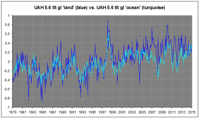
UAHv5.6 has issues. Serious issues at that. Processing issues. It is a flawed dataset. As in “wrong”. And that’s why the UAH team realised they needed to do something about it. Hence their new and greatly improved version 6.0. Get over it:
No. UAHv6.0 agrees with all relevant independent observations, such as reality oriented surface series:


… and CERES LW flux at the ToA:
I also responded to your continued nonsense here, quite recently:
https://wattsupwiththat.com/2017/01/12/satellite-records-and-slopes-since-1998-are-not-statistically-significant-now-includes-november-and-december-data/#comment-2399651
https://wattsupwiththat.com/2017/01/28/homogenization-of-temperature-data-makes-capetown-south-africa-have-a-warmer-climate-record/#comment-2411506
But you just keep evading and bounce around.
Kristian, You are funny. Please explain why non-drifting reference satellites should be adjusted down by use of lower quality drifting satellites with drift adjustments that have not been properly validated. You can’t motivate such adjustments with some home-manipulated outdated irrelevant datasets, and poor apples -to-oranges comparisons.
That is really backward science…
I am sure you that you would try to adjust the international meter prototype, by use of a random stick found in the woods, that you believe have the preconceived right length..
Try to find any upper air ( not surface) dataset that can prove the reference satellites are wrong, showing too high temperature trends. All you will find points in the opposite direction..
Satellite data…
Reanalyses..
Radiosondes…
IF you ask me kindly I can direct you to a cherry pick of low-trend datasets, the lowest of the lowest, but they would still not prove your point..
Olof,
For crying out loud, don’t ask me these inane questions. Ask the people behind UAH, RSS, NOAA/STAR. You’re implying they’re all idiots. But I’m sure they are in fact well able to answer you. Have you asked?
What I’m doing is simply showing you, time and time again, how your claims have no bearing on anything, certainly not on reality. They’re just loose claims. Assertions. Speculations.
Again: The hghly adjusted radiosonde datasets don’t agree at all with the surface datasets, the satellite datasets, OR with the ToA radiation flux data of CERES. UAHv6.0 TLT agree extremely well with all of them. You continue to evade this crucial point …
O R said, February 2, 2017 at 10:20 am:
Too funny. No. Satellite data agrees with UAH and not with the radiosondes. 3rd generation reanalyses (ERA Interim, NASA MERRA, JRA55) agree with UAH and not with the radiosondes. Yes, that’s tropospheric data. And OLR at the ToA (CERES) agrees with UAH and not AT ALL with the radiosondes.
Sorry, mate. You’ve got nothing. You’ve only got some clearly flawed radiosonde datasets that you – inside your little fantasy bubble – believe somehow represent “Troposphere Truth”. Because the radiosondes, after all, “thermometers in the sky”, right? The radiosonde datasets do not represent “Troposphere Truth”, Olof. They’ve got serious issues.
Kristian, UAH 6 doesn’t agree with any other satellite dataset in the AMSU-era, and once again, RSS TLT3.3 doesn’t count since it is proven faulty by RSS.
The reanalysis graphs you show are most certainly surface and not upper air. If you persist in calling them upper air, what is their weighting profile? 850-300 mbar, TLT or TMT?. Also, have you noticed that the rise between the Nino-peaks of 1998 and 2016 is at least 0.4 C. Can you find such a rise in UAH v6?
By the way, the lowest reanalysis trend is from Merra 2. It agrees almost perfectly with RSS v4. I guess the reason is that Merra doesnt use radiosonde data ( except for z 500 mbar). THey dont use met station data either, but relies on a backbone of remote analysis data (satellites) What else could you expect from a Space Agency product?
And you still have to explain the “devils intervention” that makes radiosonde data wrong. Unadjusted radiosonde data has 0.14 C/ decade larger AMSU era trends than UAH v6, Adjusted data 0.19 C/decade.
Explain how the simple adjustment procedure in Ratpac A cause error, i e to cut the station series when they change to more modern types of radiosondes ( that usually are less sensitive to spurious solar heating)
And Ceres data. For Gods sake, I beg you not to compare apples with oranges, and then you go on comparing apples with soya beans…
Nick Stokes-
I would say satellites have the edge over ground based stations-
WMO- “In order to assess the state of the climate
in any region, regular distributed and longterm observations are needed within that
region Unfortunately, WMO Regional
Baseline Climatological Network (RBCN)
stations and GCOS Global Surface Network
(GSN) stations across the African continent
often lack resources to report on monthly
o
O R said, February 3, 2017 at 1:02 am:
Hehe, you really don’t get it, do you, Olof? If you don’t even hold an overall understanding of the physical connection between tropospheric temperatures and outgoing LW radiation (OLR) from the top of the atmosphere, then there’s really no place for you asserting anything about anything regarding the quality (and/or “correctness”) of different datasets.
The CERES OLR flux data at the ToA is pretty much the gold standard when it comes to stability and precision over time. If tropospheric temperature data agrees with it over time (not necessarily from year to year, but over multiple years), it means it’s mostly likely close to correct. It’s that simple …
This is something you should know. You apparently don’t. And by that you just prove your fundamental ignorance on this subject.
Nick
Why don’t you ask the RSS and UAH and the various radio sond data teams who have accumulated close to 40 years of reliable Lower Troposphere temp data that question?
Hint: the answer is that those data sets are demonstrably by far more reliable than the tortured surface temp data produced by GISS, HadCru, NOAA and the likes. Problem for the climate establishment is of course that the Lower Troposphere data sets jointly and separately do not show even an indication of rapidly increasing GW – forget about any catastrophe or proof for the anthropogenic component.
Instead ask yourself this question: what is the mathematical probability that past data without exception is cooler and the near present data invariably warmer, every time the good folks at above named institutions make a new adjustment ? Even my -admittedly very intelligent- dog understands that probability is +/- nil.
Meanwhile, let’s all wait with quiet anticipation the confirmation of Pruitt to the EPA and his counterpart at NASA likely next week – after which things will likely get catastrophically hot for certain well known cardinals of the climate establishment – Trenberth is apparently taking out early retirement…
tetris,
“the answer is that those data sets are demonstrably by far more reliable than the tortured surface temp data”
OK, I’ll ask Carl Mears, the scientist behind RSS:
“A similar, but stronger case can be made using surface temperature datasets, which I consider to be more reliable than satellite datasets (they certainly agree with each other better than the various satellite datasets do!).”
“that past data without exception is cooler”
Just not true!
“Trenberth is apparently taking out early retirement…”
He won’t be doing that. He’s 72.
This chart should be updated from 2011…to at least 2016…
Sorry that chart is utterly bogus.
1. Doesn’t include all models.
2. Inproperly baselined
3. In properly masked.
4. Compares two different metrics of two different things calculated in two different ways.
O R said, February 3, 2017 at 1:02 am:
Er, yes, it does, Olof. In the “AMSU era” it agrees with UAHv6.0 TMT, RSSv3.3 TLT (and TMT) and NOAA/STARv3.0 TMT:
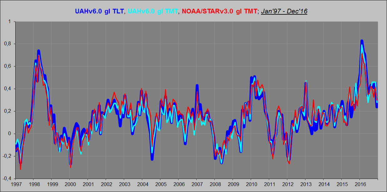


It also agrees almost to perfection with surface series AND with ToA LW flux data from CERES:
These tight correlations are pretty solid. And you know it.
No. It is CLAIMED faulty by RSS.
Just to put this into perspective: 2016 beat 2015 by a statistically insignificant 0.02 C leaving 2016 and 2015 statistically tied for first place. 0.30 would rank it in fourth place if it stayed that way for the rest of 2017. Naturally it won’t. Being more than 0.1 below the 2016 average of 0.505, it will not be statistically tied for first place either.
WOW, a MASSIVE 0.3ºC above the 30 year average.
That’s HUGE and UNPRECEDENTED… or something !!!
We are all going to die !!!
Warmth in the mid troposphere won’t kill you.
Lack of warmth on the surface will.
Warm in the Arctic won’t either., dopey… Cold will.
Warm from asphalt might, if you don’t keep the water up.
Or being in the blast of an aircraft jet engine.
.
Just in case you aren’t bright enough to catch it.
The last two refer to surface temperature data.
Nick, I’m now going out. it is about 272K there.
That makes Jan 2017 equal 7th, out of 39, for January temps.
Whoopy -doo !!!
its whoopdy doo i think
hmmm.. I’m not sure.. I really think I was correct.
Both acceptable, how does that work you. ?
Andyg55
sorry your wrong
We have a whoopy-do/ whoopdy-do anomaly! In whoopyI do trust!
In the tropics January 2017 is 15th warmest January out of 39.
The bovine fecal matter gets deeper and deeper.
For the last several years, UAH TLT anomalies have fluctuated at levels above ~0.25K. There’s no firm basis for talking about the onset of global cooling until they drop below that threshold and stay there.
I agree, there is no global cooling. OTOH, there is no evidence of warming. That should remain the point.
So Spencer et al says in spring 2015 (yes, check Roy’s web site) that a paper has been submitted to validate the 6.0 (then) UAH. Fall of last year they finally say it is accepted. So can someone say where this paper is? Roy Spencer, can you help?
Suggest you start filling out the FOI request, then be prepared to get screwed around for about three years. Dont blame Roy but thems the rules as set out by the CRU.
cheers
ReallySkeptical February 1, 2017 at 6:01 pm
So Spencer et al says in spring 2015 (yes, check Roy’s web site) that a paper has been submitted to validate the 6.0 (then) UAH.
You’re out by a year, it was submitted in March 2016.
“Tuesday, March 1st, 2016
NOTE: This is the eleventh monthly update with our new Version 6.0 dataset. Differences versus the old Version 5.6 dataset are discussed here. Note we are now at “beta5” for Version 6 (hopefully the last beta before submission of the methodology for publication)”
Typically, on these down-steps from themEl Niño peaks,,you are going to get a jump back up every now and again. 1998 had the same pattern as all the really big El Ninos exhibit. We are almost all the way to max down-dip right now – another 0.1C to go. This won’t be fully in place until about the March or April 2017 temps.
Bill, that depends on the type of el Nino.
For the classic el Nino of the 1997-1999 type with ocean warming focused on Peruvian coastal waters, then yes, the reactive La Nina counterstroke indeed pumps warm water poleward and causes a step-up in global temperatures.
But the 2015-2016 “el Nino” was not the classic type, but instead a “Modoki”. Warming was in the central equatorial Pacific, nothing much off Peru. There was no real engagement of the Bjerknes feedback of Trade winds and Peruvian upwelling. So there is only a weak reactive La Nina and no large poleward pumping of warm water.
Therefore I predict that there will be no step-up in global temperatures after the 2016 el Nino as there was after the 1999 one.
One more time. We are in an interstadial period. Earth has been here before. It is supposed to be warm. Is it? Yes. There is absolutely nothing different about this one compared to previous interstadials. Enjoy it while it lasts.
+ 1
Interstadials are the anomaly and they don’t last long. Eight or nine out of every ten Pleistocene years are (very) cold.
Sadly this is almost certainly correct.Other than the ridiculou spending to achieve nothing, the most unfortunat thing about this whole fiasco is the fact that global warming doesn’t work!
Up Above,
Nick Stokes said:
Stunning
For 30 years, I have been treated to every disaster scenario imaginable. And what is the cause of these calamities? Catastrophic Anthropogenic Global Warming. Carbon dioxide released into the atmosphere enhances the Earth’s natural greenhouse effect and heats the planet. In short, the enhanced warming happens in the troposphere. Everybody here knows the rest.
Now I am told that nothing alarming is happening in the troposphere, so the problem is elsewhere, at the surface.
Whiplash!
Yet I am still told that carbon dioxide and other greenhouse gasses are still a critical problem.
Whiplash!
Yet the surface is warming faster than the mid-troposphere, opposite of enhanced greenhouse theory.
Whiplash!
All this whiplash is not good for your health.
“Now I am told that nothing alarming is happening in the troposphere, so the problem is elsewhere, at the surface.”
I’m saying that our problem is what happens at the surface. That’s what you need to watch.
i have been watching out for these problems for a few years now nick. yet to find any . feel free to point me in the right direction, i must be looking in the wrong place 😉
OK, fair enough.
Nick Stokes February 1, 2017 at 7:00 pm
“I’m saying that our problem is what happens at the surface. That’s what you need to watch.”
I agree. The mountains to the east of me have had snow on them most of Jan. I live in N.W. AZ. USA. Had to break out my winter parka from New England. Glad I kept it.
Used the wood stove all of Dec, and Jan.
michael
You wanna talk about the weather Mike? A warm January in Brisbane is warm.
http://www.bom.gov.au/web03/ncc/www/awap/temperature/mindecile/month/colour/latest.gif
February is on track for the same. Won’t need a parker.
Nick,
If we believe in AGW we must look to the troposphere for “signs” of impending doom on the surface. The “sign” will appear before the doom, after 30 years or more of looking the “sign” cannot be seen. Therefore there should be no doom at the surface to watch out for.
Suggest you grab your dog eared copy of AR5 and re read it from cover to cover as a refresher.
Yep McClod, Its been a very nice summer down here.
Thanks for pointing that out 🙂
“Now I am told that nothing alarming is happening in the troposphere, so the problem is elsewhere, at the surface.”
I’m saying that our problem is what happens at the surface. That’s what you need to watch.
”
ROFLMAO.
Now all you have to do is explain how the lapse rate has change giving different trends on the surface from the TLT.
2. Then figure out how to fix all the surface stations and remove all the UHI and AGW biases.
Good luck with that.!
tony mcleod February 1, 2017 at 7:56 pm
“A warm January in Brisbane is warm.”
Summer there is it not? Here it is on the cold side for winter. I was hoping to get some gardening started. Brisbane sounds nice you getting a tan?
michael
tony mcleod, Interesting. But why does the Gold Coast not feature January 2017 as the warmest ever for Highest Max temp, Highest Min temp on daily or monthly basis? It is supposed to be the highest on record? Same applies to Toowoomba.
Stokes,
It sounds like you are making an argument that we should primarily be concerned about land temperatures and not concatenate them with ocean temperatures.
Brown as a berry.
The map is minimums, ie we’ve had hot nights.
Yes, and I addressed the minimums as well.
BoM shows monthly minimum mean for January 2017 of 21.4. It shows the highest monthly mean for January at 22.5.
http://www.bom.gov.au/jsp/ncc/cdio/weatherData/av?p_nccObsCode=123&p_display_type=dailyDataFile&p_stn_num=040913
Not all that warm in Melbourne: only had the aircon on at home for a few days this? Doesn’t feel like the global wrong is going to kill me yet. One day it was 10C hotter then the previous day. I dread this 1.5C per century <sarc
No Tony
No what Forrest? I posted a clearly labelled map, intimated how hot Brisbane is in January if you’ve had any kind of ‘Warmest on record event’, mentioned it indicates warmer nights, and you seem to be calling me a liar. That’s real nice.
I was talking about the weather. Is that ok?
Not sure what you’re getting at lee. The map I posted is pretty course-grained but It does indicate a large area had a sweltering month of warm nights (large parts of the state the maximums were also ‘highest on record’ or ‘very much above average’). Brisbane, Gold Coast and Sunshine Coast where I live all had a brutally humid January. I was out in it quite a bit and I can assure Forrest it was the equal of anything Cairns can dish up (Yes, I’ve lived there too. There were times it seemed more like Darwin, yes, there also). That doesn’t mean that every station in the area had it’s record hottest January – although as far as minimums go I’d be surprised if they didn’t.
tony, BoM proclaimed it was a record warm January, on minima. Their own figures provide the lie. I did find one spot, Redlands that was the warmest on record; but Redlands has only been open since 2015. I checked Brisbane, Brisbane Aero, Archerfield. They all failed the sniff test. How did they calculate for Brisbane?
Lee.
I see the table of max and mins you posted but it doesn’t give the average min for Jan 2017 nor the (previous) record highest average min.
Lie is a serious claim, can you back it up with some more info?
tony, from the link- Highest monthly mean 22.5, Mean 21.4
Daily minimum temps January.
Hope you’re enjoying that heat, Tony.We could use a little up here in Canada. Does the above average minimums mean you have high humidity as well?
So…. No evidence of Anthropogenic warming…. Just natural variation of climate.
Nice to know.
Here at the surface over the past 40 years, most life has been experiencing the best weather, climate and CO2 conditions since the Medieval Warm Period, 1,000 years ago.
This has occurred, not in spite of global warming but in part BECAUSE OF the slight beneficial warming, which has warmed the coldest places at the coldest times of year the most.
The noteworthy exception has been the increase in excessive rain events. However, the benefits from the slight warming and massive benefits from the increase in carbon dioxide outweigh the negatives by several orders of magnitude.
Should we continue down this current path, the benefits should continue for several decades.
There will likely not be a “tipping point” that features an acceleration in the warming. In fact, the biosphere and climate system have negative feedbacks built in.
So True.
We are lucky to live in one of the nicest, most benign and stable climate periods for a long, long time.
The LIA could not have been nice in many areas of the NH.
Are the 1985 Cold Wave (polar vortex) and Michigan’s Year without a Summer in 1992 (attributed to Mt Pinatubo) biasing the climate data?
I looked at Dr Roy Spencer’s data today. I trust the satellite data. Unfortunately the period of record begins only as recently as 1979. For reasons this web site has explained extensively, I don’t trust ground station data. I have dealt with statistical analysis of data a lot in my time. Anyway the first thing I did was to view the data as a whole to look for outliers. 90% of the anomaly data fall between +0.4 deg C and -0.3 deg C. Adjust the 0 line up by 0.05 deg C and call it +- 0.35. However four years out of 37 stood out as outliers, which I was looking to eliminate given the short duration of the dataset. The 1997-1998 and the 2015-2016 El Ninos were obvious, with +0.8 deg C anomaly at the peak. When I eliminated them, two cold anomalies remained prior to 1998, with -0.5 deg C anomalies at the peak. They turned out to be 1985 and 1992, record-breaking cold periods in North America. While the El Ninos upwardly bias the data after 1998, likewise do the cold waves downwardly bias the earlier data resulting in a false trend? Has anyone given this any thought?
Jim Powers.:
You say that you “trust the satellite data”
If NASA/GISS data from 1981 -on is converted to the same base period used for satellite measurements (1981-2010), you will find that both sets of measurements are essentially identical, with the caveat that since the mid-1990’s NASA’s data with 250 Km smoothing is more in agreement than that with the normally reported 1200 Km smoothing.
1983 was also a big volcano I believe. El Chicon?
Man we have some smart folks here. Earlier proposed most federal climate change spending for 2017 be redirected to law enforcement in high crime areas, education, and housing in distressed communities. How much are we talking… GAPO shows about 25B but that is far from inclusive. Does not seem to billion tucked into the defense budget. That I suggest we turn back to actual defense spending. If the number is 25B that will buy quite a bit for a surge in law enforcement (Chicago, the border) and upgraded housing.
Do I believe that further federal spending is a long term solution for systemic problems. No. The money will be spent any way so lets spend it asymmetrically.
troe February 1, 2017 at 8:12 pm
We are losing people in training accidents due to the fact all our aircraft are old and the air frames are suffering from structural fatigue. The last two administrations stripped maintenance funds out of the budget as well as replacement aircraft. We can’t afford not to increase the military budget.
michael
I agree completely. Suggested we redirect DOD climate funds to other parts of military budget only.
The U.S. has borrowed 10 billion dollars in the last eight years.
Losing it! 10 trillion!
Warmer is better.
The lower troposphere global map in this blog shows Western Australia (lower right corner) with temps that suggest January was from 0.5C to 2.5C above average in the southern half of the state.
Yesterday I did my ongoing update of WA’s rolling 12 month average temps. Across WA at the state’s oldest 32 weather stations, January min was 0.7C below the long-term average of the existing sites. Max was neutral and the mean was 0.4C below average, maintaining a six month run of below average temperatures. For example, on 30 January the capital city of Perth had its fourth coldest January daily maximum since 1897.
24 of the stations are south of the coastal city of Geraldton, which is roughly where the darker yellow shading on the LT global map suggests Jan temps were up to 2.5C above average.
Those 24 had a January min 2.0C below their long-term average, max 0.2C above average and mean 0.9C below average.
The LT anomaly data in this blog is based on a 1981-2010 baseline. The 24 stations I’m comparing have lifespans from just a handful of years to early 20th C, many being relocated to their current sites around the year 2000. My averages above are of only the current sites, not their predecessors.
However, I have a baseline of all averages at the 32 stations from their start years to 1931, as published by Australia’s CSIR and Meteorological Bureau in 1933 (http://www.waclimate.net/csir.pdf). Most stations opened around the year 1900.
The <1931 January baseline shows that in January 2017, the mean temperature at the 24 southern WA stations had warmed 0.7C – min 0.2C cooler, max 1.5C warmer (bearing in mind the 24 include several UHI centres including the capital city). Exclude the four major population hotspots of Perth, Geraldton, Bunbury and Busselton, and the January 2017 mean temp at 20 southern stations increased 0.4C since <1931 Januarys.
Among the eight northern WA stations (where rainfall was well above average in January), the mean temperature in January 2017 was 0.4C below the pre 1931 January average. The mean at all 32 stations across WA in January 2017 was 0.2C warmer than average Januarys before 1931.
The <1931 baseline shows that in the last 12 months (Feb16-Jan17), the mean temperature at the 24 southern WA stations had warmed 0.02C since the late 1800s/early 1900s.
In the case of southern WA (seemingly one of the warmest land areas in the southern hemisphere during January) the LT colour coding doesn't agree with actual weather station observations.
“In the case of southern WA (seemingly one of the warmest land areas in the southern hemisphere during January) the LT colour coding doesn’t agree with actual weather station observations.”
Showing again that the troposphere is just a different place to the surface. Tony McLeod upthread shows a BoM surface map of Australia which is much more consistent with your observation.
Yes. except Brisbane was warmer by -1.1C apparently.
Prague-Klementinum (formerly a Jesuit library), the oldest weather station in Central and Eastern Europe (since 1770) and the warmest weather station in Czechia, has seen the coldest January since 1940. Google search for “Prague: coldest January since 1940” for details.
Lubos Motl February 1, 2017 at 10:23 pm
Thank you, to often we don’t get to look out other people’s “windows” to see what the weather is like there.
Always good to hear from you, though you may not know me.
michael
The Klementinum is still a beautiful museum in the middle of the city not sure why that makes for a good site for a weather station. What did the surrounding weather stations show?
Dear Mike, thanks for your kind words and not forgetting me!
Phil.: Clementinum looks like a highly historical, baroque building but it’s actually still actively used as a library by productive people, not a museum!
It makes a very nice weather station, I think. I realize that this claim surely clashes with the whole Anthony Watts’ anti-asphalt movement of auditors of U.S. weather stations. But you must understand that even though the measurements in Clementinum started in 1770, the “urbanization” of the vicinity of the building was basically non-existent since that time simply because downtown Prague was already a fully urbanized, dense place back in 1770. In some relative sense, downtown Prague could have been globally more important in the late 18th century than it is today.
Also, the weather station gadgets are either on the roof of Clementinum or elevated to be high above the ground. Search Google Images for “stanice pocasi klementinum” (weather station Clementinum) to get an idea about the surroundings.
You should also search Google Images etc. for “mapa prahy 18. stoleti” (map of Prague in 18th century). You will see that these central portions of Prague looked basically identical 200+ years ago as they do now. The trend of further urbanization there is minimal. On the contrary, if you go to the periphery of Prague, you may see urbanization. So perhaps paradoxically, I would be much more afraid of the uncontrollable effects of urban heat islands etc. when it comes to the station Prague-Ruzyně, at the international airport, and many others.
January 2017 was much cooler than the average January in most of Czechia – and other countries of Central and Western Europe and similar records must have been set at many other places. I don’t have an easy access to other stations’ readings and even the monthly data of ČHMÚ for the regions haven’t been officially released on the website I sometimes follow. But even if you go to “relatively recent” eras like 1940, you won’t find too many stations that would be as controllable and uninterrupted like Clementinum.
“Heap Big Warmy Warmy!”
Seriously, the planet has been naturally warming and cooling in fits and starts for the last ~ 12,000 years of the Holocene intraglacial warming period. The current temperature data indicates +/- 0.3C temperature variations, minor temperature ‘wiggles’ and well within the historical temperature variations during the Holocene period, as best we know it.
What is the problem, then?
No one ‘denies’ the planet has been warming, naturally!
Why are we spending Billion$ on documenting minor temperature wiggles, spending Billiion$ and Billion$ more writing wild ass guess computer programs to over-predict plant food ‘driven’ temperature waggles,
and then Billion$ more arguing endlessly about the supposed differences between measured reality, fallacious models/outputs, and emotionally charged and intellectually bankrupt claims of impending disaster?
This is insane…..
Nick Stokes,
Can you do the exercise for surface temperatures that Santer did for TLT?:
http://www.nature.com/ngeo/journal/v7/n3/fig_tab/ngeo2098_F1.html
John,
Foster and Rahmstorf did that. Tamino has an update here.
Maybe you can use the TLT just like Santer. Tamino is way off.
John,
Yes, I see they are somewhat different. I’ll try to figure out why.
You can’t match up the TLT very well without using the AMO which Foster/Tamino did not use (although he tested it given it was in his database). Then you have to go back to the beginning of the data and not start in 1971 like Foster/Tamino did (as in data selection to avoid the 60 year cycle in temperatures).
And then you need to use an up-to-date solar cycle estimate and not use an outdated version that suffered from instrumental degradation (and caused Foster/Tamino to have the wrong sign on the solar cycle regression. I mean Foster/Tamino is only an Astonomer specializing in variable stars and how he would get the sign backwards on our closest variable star, the Sun, is simply mind-boggling/not believable).
Given Foster is very good with math and has even written textbooks about mathematically analyzing variable stars, so these type of problems in his methodology should give one pause about what is really going here and with Tamino’s website.
All this up and downs are not of interest, as they say nothing about global warming. What matters is the trend over long time. The trend for UAH over all the years say it is warming ca 0,01 degC each year. And all the blogosphere noise to tell us that this is no warming, or to tell us how dangerous it is.
Strangely no mention of the arctic, where there have been and continue to be a string of anomalously high temps, of up to 30C, over a wide area…?
And not to mention the northern Russia area which has had heaps of highly anomalously COLD temperatures. and anomalously cold periods in USA, and Europe as the jet stream wobblys about
And the massive snowfalls all over the place.
Wouldn’t want to mention any of that, would you Griff
Also, many locations in the NW US reported their coldest January on record. It appears Griff is still in denial of the effect of the AMO.
Griff, it is about the only area not in deep freeze.
You have a talent in missing the forest,for that one tree you keep harping over,your narrow minded thinking is incredible.
You are indeed a weather bigot.
Griff February 2, 2017 at 1:06 am
“Strangely no mention of the arctic,”
The Russian icebreakers are still frozen in on the Russian arctic coast. I’m sure they find your “continue to be a string of anomalously high temps, of up to 30C, over a wide area” very comforting and encouraging. Why don’t you go visit the crew and show them your ice graph, I think they may be running low on vodka by now and in need of a distraction
michael
Ha ha ha…,forgot about that.
Is that why we had the sixth coldest january since 1980? Oh yes and february seems to be another “earth turns the freezer on” month…..
Seventh warmest, according to UAH V6, behind 1998, 2003, 2007, 2010, 2013 and 2016.
Of course you’re right,Griff . It is nonstop night up North now,and all that beautiful heat has nowhere to go but up and out to space! Winter is coming , and the nights are cold and dark!