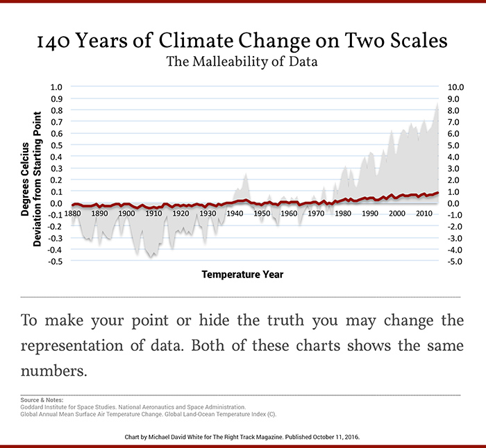
Skeptics often get asked to show why they thinks climate change isn’t a crisis, and why we should not be alarmed about it. These four graphs from Michael David White are handy to use for such a purpose.


Note: the top chart of 10,000 years of climate change has been updated to reflect the x-axis on 1/31/17
Excellent!
This one says it all: ?w=840
https://co2islife.wordpress.com/
With the greatest respect, in reply to your first statement, “This one says it all:”, “Um, no it doesn’t”! First, there are two charts not one and second, what is obvious to you isn’t obvious to me. Please do me the courtesy of explaining what you mean. I need all the help I can get. Your intentions are good but my abilities are not.
The two charts are indistinguishable. The one is of atmospheric temperature, the other is of atmospheric H2O. Where H2O is, warmth is. The same can not be said about CO2. More is written here: https://co2islife.wordpress.com/
Here is another one: ?w=840
Just How Much Does 1 Degree C Cost?
https://co2islife.wordpress.com/2017/01/25/just-how-much-does-1-degree-c-cost/
OT, ( somewhat). On this site and others, I have seen a lot of articles and comments about the 800 year lag of rising CO2 and temps. The last figure in the article shows a distinct “spike” in temps ( around 1100 YBP) it is now ~ 800 years later. and the CO2 levels are slowly rising. Is that a correct observation?
I have been pointing that out, on and off for the past 20 years, and nobody (pro or con) has taken me up on the observation.
@asybot: Yes we are watching that too, and expect just what you point out, a lag of c.800yrs. A la ice cores. A slowly cooking proof, you might say….
I don’t think that we can prove with that spike 800 years ago that our present CO2 is from natural ressources.
1. The spikes in long time observations are from proxies and somehow dampened and not related to exact years or an exact rise like the Keeling Curve.
2. We actually add double as much CO2 into the Atmosphere than it is left at the end of the year. So Ocean and Biomass are actually swallowing half of our CO2.
This posting details the 800 year lag.
Exhibit A: Al Gore’s Ice Core CO2 Temperature Chart
https://co2islife.wordpress.com/2017/01/15/climate-science-on-trial-the-forensic-files-exhibit-a/
Thanks co2., Great info.
Trump is accused of lying every day, CNN talks about nothing else lately. “Alternative Facts”. Yet Obama and Dem Senators like Whitehouse and Gillibrand are never called out for big lies and easily debunked “facts” like “2016 was the hottest year on record, 2015 the second hottest, 2014 the third hottest ….” and “Sea level rise is accelerating rapidly” and “Severe weather events are much more frequent and devastating”.
If 2016 was not the hottest year in the temperature record, which one was, and what record are you using?
The .02 degree F difference reported by msm between 1998 and 2016 cannot be within the instrumental sensitivity of the measuring apparatus being used to claim that 2016 was the warmest year. There must be an error bar on the measurement devices as well a a statistical error bar.2014 and 2015 differences from 1998 would have to be even smaller than the .02 degrees F though I suspect we are camparing ground to satellite measurements on the latter.
So which one was? Obama is accused of lying for saying 2016 was. Why is that a lie? Which year do you claim was hottest?
1934 was the hottest prior to homogenization. According to Greenland ice core studies, a bit above 90% of the past 10,000 years were warmer than any one of the past 100. For Santa Rosa and Ukiah, California, roughly half of the years from 1925 to 1940 were warmer than 2016 (before homogenization). During the Eemian interglacial, 125,000 years ago, almost all of the years were warmer than the average of the Holocene interglacial. Current warming “is much sound and fury signifying nothing.”
It’s called “statistical insignificance”. Ergo 2016 was indistinguishable from 1998. By my reckoning that means no significant warming for 19 years, or one entire human generation. No kid graduating HS this spring has lived through any warming.
Now, please show me the data or graph showing accelerating sea level rise. Hello? [Is this thing on?]
“1934 was the hottest prior to homogenization.”
Nonsense
” that means no significant warming for 19 years”
But somehow it just got hot?
Its called an El Nino, Nick
and its GONE.. finished.
Get over it !!!
AndyG55 January 29, 2017 at 1:19 am
El Niño likely to return this year but you are probably correct. Nick is just playing his silly games today.
The definition of lying is always difficult and therefore leaves it open to challenge but dishonest not so much. Obummer was being dishonest as are all those scientists who do not you error statistics.
Obummer was an inveterate liar and could have been called out many times but those on the bread would never do that now would they. However, there is a new man in the house, the scientists are screaming. Lets wait and see. A whistleblower will almost certainly come forward when his her job is threatened
“Obummer was an inveterate liar and could have been called out many times..”
Yeah, unlike Trump who said he would release his tax returns if elected. Oops, there’s lie #1. Who said he would drain the swamp in DC, then appointed insiders and billionaires. Oops, there’s lie #2. Who said Mexico was going to pay for the wall. Oops, there’s lie #3. And we’re only starting week 2!
Nick
“2016 was the hottest year.”
Nonsense.
Nick,
So Phil Jones spouted nonsense?
https://stevengoddard.wordpress.com/2014/06/23/noaanasa-dramatically-altered-us-temperatures-after-the-year-2000/
In the best temperature series, ie the US, 1934 remains the warmest year “on record”. But of course most of the Holocene has been and the Eemian was warmer. Since the end of the LIA cold period, the ’30s still haven’t been beaten by another decade.
NOAA and HadCRU cro0ks have cooked the books by cooling the 1920-40s, and warming since then.
“1934 remains the warmest year “
It is hard to maintain any kind of dialogue when people are so careless with facts. No one was talking here about the continental US.
!975 was the hottest I can remeber to me nearly every day broke records.
I remember it well because it was the year I got married. Boy it was the hottest year ever for a 23 year old.
I still want to know how 2015 and 2014 can be claimed as record hot years if 2016 only beat 1998 by 0.02F. Was 2015 0.01F hotter than 1998 or are they using the “alt facts” form the Karl et al 2015 paper?
“If you like your health insurance plan, you can keep it. If you like your doctor, you can keep him or her.”
Pages of lies upon lies, but just scratching the surface:
http://www.politifact.com/personalities/barack-obama/statements/byruling/false/
A telling addition re: Climate Models Fail … (second graph) would be some older model predictions/projections, which didn’t benefit from hindsight. The one shown suggests there is some sort of “reasonable” (even if too hot) correlation between model and reality up until ~1996. This is deceptive since the ACTUAL (historical) data was known at the time of the model run and parameters/inputs can be adjusted to somewhat mirror past known reality. Some older model run graphs would indicate that the models have ALWAYS failed to predict and always ran too hot and diverged from reality, unless by pure fluke over some brief period.
I do not have a comment about anything in the article but I do have a comment on how the data is presented.
The last graph, 140 years over 10,000 years.
For someone like me that has some color blindness I have a difficult time discerning the two colors used in the graph.
Some ten years ago I was doing some GIS work a learned the hard way the what may look good on my computer screen, what may still look good when turned into a PowerPoint presentation or turned into PDF, can look horrible when presented using a projector.
I’ve recently been having to tweak some fire alarm CAD work that was done outside the office because line styles and colors aren’t different enough and have caused some confusion. It probably looked different enough to the creator but they are used to how they do it and they are also familiar with the work.
On the graphs here we are only talking about a couple of lines. Some colors may look great on your own system but won’t look good on everyone’s system.
It would have been so easy to use bright red and blue or use dark green and orange.
Some key presentations, and charts, from the recent Heartland conferences from you blog host.
I would encourage most to take a look at the inventory of talent via video from the Heartland conferences. It is really good stuff. See for yourself. Share it and spread the word. Just sayin.
https://www.youtube.com/user/HeartlandTube/playlists?shelf_id=3&view=50&sort=dd
Thank you Joe Bast for doing what you do for all of us!
http://www.sealevel.info/MSL_graph.php?id=8&boxcar=1&boxwidth=2&c_date=1866/12-2019/12&datasource=psmsl
http://www.sealevel.info/120-022_Wismar_2017-01_150yrs.png
http://www.sealevel.info/MSL_graph1.php?id=Sydney&boxcar=1&boxwidth=2&thick&datasource=psmsl
http://www.sealevel.info/680-140_Sydney_vs_CO2.png
http://www.sealevel.info/MSL_graph.php?id=Honolulu&boxcar=1&boxwidth=2&thick&datasource=noaa
http://www.sealevel.info/1612340_Honolulu_vs_CO2.png
Takeaway: increasing CO2 from under 310 ppmv to over 400 ppmv has caused no significant acceleration in the rate of sea-level rise in over 85 years, in any high-quality, long-term sea-level record, anywhere in the world.
“These four graphs from Michael David White are handy to use for such a purpose.”
The first graph is a version of one on the WUWT paleo page, labelled there “Incorrect graph”. Although the x axis says “Years in the past”, in fact the data ends in 1855. So the claim that in the years shown, man played no part, is spurious.
The second graph gives no indication of what data it is talking about. You may meet a real skeptic who will ask. It looks to me like some comparison of modelled surface temperatures with measured troposphere.
The third graph is just one that shows how you can disguise information by compressing the scale. You could do that with anything.
The fourth is just the misleading graph from one, and misleadingly comparing a single unusual location with a global average anomaly. The two y-axes already make a nonsense of it.
thank you – I’m still awaiting anything from Lief about how #1 is mislabeled
accuracy is tantamount – some here are trying to learn; we get the gist, but the details ???
The x-axis is labeled ‘thousands of years in the past’. It is not ‘thousands of years’ but only ‘years’.
Amazing that people only see what they want to, and what is there.
NOT there, of course
Nick Stokes
I think you just ruined the party.
“in fact the data ends in 1855”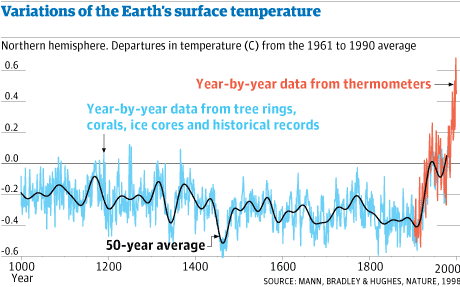
So you are saying Mickey Mann’s graph is wrong??
Mickey’s graph clearly shows the tick up starting in about 1910 with the 1940’s peak then dip to 1970
I propose that Mickey got the date correct (even though he goofed completely on the pre 1800 stuff)),
and that the tick up on the paleo graph is actually ending at 1940.
It’s nothing to do with Mann. It is Alley’s ice core data, and it ends in 1855.
Surface thermometers are unreliable and subject to UHI effect, siting problems, neglect, even tampering. Satellite data is much better for the recent past, but most of the data keepers are keen to keep “adjusting” the data.
Poor Nick
Run and HIDE, you squirmy little worm
You have been caught out, and you KNOW it !!
You either have to say Mann was wrong , or admit that the up-tick on the paleo graph is from 1910-1940.
Catch-22 of the AGW SCAM
So funny to watch you squirming.. 🙂
Wow.. great EVASION, Nick. 😉
Graph 1 (GISP2) looks OK to me, the temperature line stops short of the X-axis ‘0’ as it should being highly smoothed implying the mid-nineteenth century before human CO2 emissions took off around 1940, although human as well as animal influence on local climates has gone on for millennia no doubt .
The statement that temperature variation over the Holocene in the ice core record or any other proxy for that matter was ~6.5F (~3.5C) is an understatement because the actual noise or decade to decade, century to century variation is unrecoverable hence smoothed away.
Graph 4 is nonsensical for the same reason.
To emphasise that last point, here is a plot of Nuuk, Greenland anomalies since 1865 vs Gistemp land/ocean. Compare with Graph 4 here. It’s just what you get when you campare a single point with a global average. It doesn’t mean the climate was more volatile. It just means that single locations are more volatile.
This should follow the comment below.
Everybody should note the massive cooling trend from 1940-1970,
and that the recent El Nino transient has dropped back to probably below average.
Thanks Nick ! 🙂
ps.. Thanks for the graph Nick.
I have saved it, and will be using to show the HUGE cooling trend from 1940-1970, and the transient nature of the 2015 El Nino.
Many sites will see this. 🙂
I wonder if Nick realises that his Nuuk graph has TOTALLY DESTROYED the AGW scam. 🙂
You are a wonder, Nick.
The world will thank you. 🙂
“and that the recent El Nino transient has dropped back”
No, data from Nuuk has been patchy lately. The last data point there is 2011. It is well known that Greenland had a warm period in the 1930’s.
Nick Stokes, you mislabeled your axis. It should say “year”, not “years”. Just trying to be as picky as you were earlier.

Nuuk updated to 2016. Nick’s chart ends in 2014 and the NCDC has made even more adjustments to Nuuk’s temperatures in the last year or so
Unadjusted monthly here. This is NOT global warming.
And this how “Global Warming is Manufactured”. Adjustments made to Nuuk quality controlled data by the NCDC in its “adjusted” version. Earliest years down, later years up and just leave out any cold years that don’t add the manufactured line.
Nuuk NCDC adjusted data here:
http://climexp.knmi.nl/data/t4250_mean1_anom_a.txt
Nuuk Unadjusted but quality controlled here:
http://climexp.knmi.nl/data/ta4250_mean1_anom_a.txt
Here is a NOAA plot of NUUK, Greenland, over 150 years. It shows a range of about 7°C. Individual locations, especially in Greenland, are vastly more variable than a global average.
Interesting pick Nick, would you care to comment this:
https://realclimatescience.com/2016/12/more-spectacular-arctic-temperature-fraud-from-noaanasa/
Wow look at that huge COOLING trend from1940 to 1970
I thought you said it didn’t exist.
Foot in mouth disease, Nick.
Can’t keep up with you own lies, so it seems. !!
That spike.. El Nino, transient at best, and you know it.
“Interesting pick Nick, would you care to comment this:”
Yes. It’s a typically dishonest Goddard post. Ranting about Gavin Schmidt, when GISS in fact didn’t alter Nuuk data at all. As so often, he reaches back to some earlier dataset to find a difference with GHCN V3 adjusted, when all he needs to do is look up GHCN V3 unadjusted. I don’t know why it is so impossible for him and followers to acknowledge that this set exists. And NOAA displays it in datasets; the one for Nuuk is here. The adjustments, made by NOAA, are clearly shown.
Plus of course the usual con – switching of datasets. Gavin was saying that GISS has not removed the 40’s warmth. So Goddard produces nothing more that a plot of one location (Nuuk) and says Gavin is lying.
An evasive non-answer from Nick as expected.
Nick, would you rather comment this:
http://notrickszone.com/2017/01/30/robust-evidence-noaa-temperature-data-hopelessly-corrupted-by-warming-bias-manipulation
The use of one of these four graphs would show that a sceptic is foolish! It lowers the bar too much. There is no reason to discuss BS!
Yet you do. always.
AndyG55: I think you are the same person who wrote this BS: http://notrickszone.com/2017/01/28/germanys-flagship-mediatop-pols-fanning-trump-hatred-veiled-attempt-to-trigger-an-assassin/#comment-1159823 . So it seems to me it’s a waste of time to respond to your propaganda and hatefully comments for the Kindergarten- people who believe in your alternative facts.
Nick wrote: “The fourth is just the misleading graph from one, and misleadingly comparing a single unusual location with a global average anomaly. The two y-axes already make a nonsense of it.”
Actually, the graph has two y-axes and two x-axes (:)). The 10,000 year x-axis isn’t shown. However the graph is still somewhat interesting because of polar amplification. In general, we expect more (twice?) as much temperature change in polar regions as on the planet as a whole. This is the case when glacials and interglacials are compared, for example. Over the last 10,000 years (but not the most recent 150 years, since this Greenland ice core record apparently started 150 years ago), temperature in Greenland has varied about 4 degC. Over the last 140 years, GMST (presumably over land) has risen about 1.5 degC. So recent warming over the last 140 years is comparable to the largest warming we have experienced in 10 millennia.
Hardly. The point of the first graph was to illustrate that over a relatively long time span before industrialization the available data indicate that “climate” was considerably variable (changeable). That’s all.
The second graph would be better if the modeled and actual trend lines were properly referenced. Nevertheless, the message is clear. “Climate Scientists” and their projections are kiddies in the sandpit. They haven’t got a clue what is going on.
The 3rd graph is useful in that it shows how scaling can be used/misused to create alarm (actually Nick, this was the very graph you used on a different thread to do that very thing, wasn’t it?).
The fourth graph makes a visual comparison of the magnitude of change observed in the data over 10,000 years (prior to most man made CO2) and of the recent past (150 years of industrialization) showing that the magnitude of change (range of temp change) for the industrial period is around one third the range of change observed in the longer, pre-industrial period.
The conclusion: there is nothing in the man-made climate change hyperbole to be alarmed about. Now I think that is what has really alarmed you, Nick.
Nick: “in fact the data ends in 1855. So the claim that in the years shown, man played no part, is spurious.”
Author: The assumption is that from 1855 and going backwards in time man had no influence on temperature. The fact that the data ends in 1855 to my mind validates the statement that “man played no role in the change of temperature or the carbon level” in the data charted. Your objection does not make sense to me.
Nick: “second graph gives no indication of what data it is talking about”.
Author: The data is: GISP2 Ice Core Temperature and Accumulation Data. NOAA Paleoclimatology Program and World Data Center for Paleoclimatology (Boulder). It is listed on the chart at the bottom but it is difficult to read.
Nick: “The third graph is just one that shows how you can disguise information.”
Author: Yes. I was trying to prove it is easy to disguise data.
Nick: “The fourth is just the misleading graph from one, and misleadingly comparing a single unusual location with a global average anomaly.”
Author: Reasonable sources say the GISP2 is a good proxy for global temperatures. Check the story below:
https://wattsupwiththat.com/2011/01/24/easterbrook-on-the-magnitude-of-greenland-gisp2-ice-core-data/
Michael David White posts: “Author: Reasonable sources say the GISP2 is a good proxy for global temperatures”
.
.
If you accept that it’s a good proxy, look at the GISP2 data when you plot the site temperature for 1855 and 2009:
Michael,

“The fact that the data ends in 1855 to my mind validates…”
But you don’t say that it ends in 1855. Looking at the graph, it seems to go to 0 years in the past. And the natural interpretation of “man played no role in the change of temperature” is that industrial activity had no effect, as shown in the graph.
“The data is: GISP2 Ice Core…”
It isn’t. It is troposphere data. Apparently derived somehow from models, and by averaging satellite data which seems to be TMT, though it doesn’t say. There is no way of telling whether they are the same levels of the troposphere.
“Yes. I was trying to prove it is easy to disguise data.”
So what does that have to do with climate? You can do it with anything.
“Reasonable sources say the GISP2”
Easterbrook writing on a blog is not an authoritative source. But in the post you link to, he only says that global and GISP2 temperatures are correlated. He skips the question of scale. He shows a drop of over 20°C in the glacial. Nobody thinks global temps did that.
I showed below the relation of one place in Greenland, Nuuk, to the global GISS land/ocean. It looks similar to your plot 4. But all it proves is that a single Greenland location can be much more variable than a global average.
Michael,
“The fact that the data ends in 1855 to my mind validates…”
But you don’t say that it ends in 1855. Looking at the graph, it seems to go to 0 years in the past. And the natural interpretation of “man played no role in the change of temperature” is that industrial activity had no effect, as shown in the graph.
Author: The chart does allude to the fact that the data is pre-industrial. Chart meant for general audience. If you get into the 1855 end-date and start the 10,000-year clock in 1855 that is abnormal for most readers. It is confusing. I am going to change the X-axis label so it’s clearer.
“The data is: GISP2 Ice Core…”
Nick: It isn’t. It is troposphere data. Apparently derived somehow from models, and by averaging satellite data which seems to be TMT, though it doesn’t say. There is no way of telling whether they are the same levels of the troposphere.
Author: Data source for chart 2 is listed below and at bottom of chart::
John R. Christy, Distinguished Professor of Atmospheric Science, Alabama’s State Climatologist, and Director of the Earth System Science Center at The University of Alabama in Huntsville.
Projected: Tropical average mid-tropospheric temperature variations (5-year averages) for 32 models (lines) representing 102 individual simulations.
Actual: Satellite record is the average of three satellite datasets (green – UAH, RSS, NOAA).
Author: “Yes. I was trying to prove it is easy to disguise data.”
Nick: So what does that have to do with climate? You can do it with anything.
Author: The point of chart 3 is that it is easy to commit fraud by misrepresenting the data. A lot of the current debate is not about data but about fake data. The chart shows it is easy to fake data. If fraud is being committed in the presentation of data, then it is a central issue. You may know it is easy to fake data. Most people don’t.
Nick: I showed below the relation of one place in Greenland, Nuuk, to the global GISS land/ocean. It looks similar to your plot 4. But all it proves is that a single Greenland location can be much more variable than a global average.
Author: Quote from Easterbrook: “correlation of the ice core temperatures with world-wide glacial fluctuations and correlation of modern Greenland temperatures with global temperatures confirms that the ice core record does indeed follow global temperature trends and is an excellent proxy for global changes.” It looks like he is saying GISP2 is a good proxy for climate change. I don’t have the expertise to comment on your charts. If you have a better 10,000-year record I would like to know what it is.
A graph of tidal forces is interesting. Today, the distance between the Earth and the Moon is aprox. 15x greater compared to what it was, when the Moon was created.
An the tidal forces back then were about 3400 times stronger…
It shouldn’t require much, to recognize the difference and the impact.
A statistical population is required for this argument to be meaningful. What is it?
There needs to be a 5th(&6th?)

Why co2 doesn’t matter
And
micro6500, I don’t understand what you’re showing here.
Let’s just start with the first graph.
You have no label or scale on the horizontal axis, but I think it’s a time scale recording data (at intervals of a minute or a few minutes( over a period of four days. Is that right?
You have three different traces, but only one vertical axis label, and I don’t understand what those numbers (ranging from -75 to +125) mean. Which trace(s) do they label?
“RH” (the red trace) I presume is Relative Humidity?
Green is air temperature (Fahrenheit? in Australia??)? Measured where — ground level?
Blue is labeled “NetRad W/m^2” — so that’s apparently depicting the difference between incoming and outgoing radiation. I guess that means where it’s low is nighttime? But where? Ground level? TOA?
The graph label, “Proof of active temperature regulation at night by water vapor that controls the amount of heat released to space,” suggests your NetRad is for TOA. But the reference to a particular location in Australia suggests it’s lower than that, perhaps even ground level.
I also don’t understand how relative humidity (rather than absolute humidity) could possibly affect radiation to space.
I also don’t understand how any of this demonstrates an “active temperature regulation” (feedback) mechanism.
Usually when someone using an anonymous handle posts complicated graphs “proving” something, which make no sense to to me, I assume it’s crackpottery and move on. But I’ve seen you post astute comments in the past, so I doubt that’s the case this time.
Can you please explain it?
Also, as a suggestion for the future, a horizontal scale and label, and vertical grid lines for it, are helpful in any graph.
Dave, as soon as I can figure out how to get dang x axis that’s labeled I will gladly, Excel just does not like that data, unless all you want to see is the axis only.
Okay.
Yes about 4 days, rel humidity, temp, net rad at the surface, clear skies.
Additional information is here.http://wp.me/p5VgHU-2A
The paper I borrowed the data from is listed as well. There is an exponential decay in the rate of temp drop at night, that is not due to equilibrium. I have detected it in my weather and ir data, when I read their paper and they did not identify the cause, I knew right where to look.
Which is thus graph.
Yes, it seems that when rel humidity goes near its upper limit, the net cooling rate drops, it does this most of the planet.
Now, so outgoing radiation leaves the surface, at 2 speeds, low rel humidity like at sunset, cools very fast, high rel humidity cools very slow. I think we will find with more data, the high rate will vary over a range of absolute water vapor, and as long as it nears 100% rel humidity that will shutdown outgoing, or it just gets really bright in ir at the surface and the net drops. That pretty color ir radiating that co2isnotevil posted, what I expect is that as water vapor condenses it lights up at 15u, which lights up co2, and you get that pretty orange and red spike.
But too much data is just generic averages, and this is a dynamic process almost every night, you won’t see this on a std atmosphere modtran run.
The result of this, is minimum temps are regulated to dew point temperature.
Dave, thanks!
Oh, it is my name, minus the 6500, just spelled out differently so a search by name in my workplace keeps this separate.
Scale percentage, degrees F, and radiation in W/m^2
”..minimum temps are regulated to dew point temperature.”
Dew point temperature is an interesting subject, mishandled by many. There is no fundamental law supporting your assertion I clipped. Two fundamental processes occur as atm. air is cooled toward its dew point: water vapor is removed from the air, which lowers its dew point, and condensation (net of evaporation) gives rise to warming.
Rather than unqualifiedly write air temperature is regulated to the dew point, it is far more defensible to write on a clear day with light winds the late afternoon dew point is a good estimate of min. overnight temperature which is often taught in meteorology; note the qualifications. Your charts do not show wind speed nor sky condition (as far I can tell).
Sure there is, the added energy of condensation. But that might not be what’s happening. There are two choices for that net radiation. DWIR stays the same and OWIR slows down. Or OWIR stays the same and DWIR goes up. It’s still night, so not solar. I am leaning towards DWIR going way up. Also what happens to photons in a plasma that the same wave length of the plasma itself. Your bright spike at 15u.
Fair enough.
You’d see different temperature profiles like this.
I believe the data set also has all of that, but those are clear sky calm winds.
An advantage of having your own cheap weather station, you can compare actual weather to what gets recorded.
“Sure there is, the added energy of condensation.”
No fundamental law or show a law that computes night time min. temperature from the “added energy of condensation”.
The two processes I noted compete in calm, clear sky conditions, add wind and clouds and the overnight min. is much harder to predict. It might have occurred before sunset and the temperature rise overnight, no law says min. temperature is regulated to occur at night or at any temperature such as the dew point.
Ah, there’s an equation in the paper that defines the decaying temperature profiles, they could not find the correlation. There’s going to be two main ones, absolute humidity and rel humidity and the length of day. But an exact formula including those I do not.
Yes, the others are immaterial though in defining the “best” atm condition to radiate to space under. And then what are the key parameters, like you would characterize a transmission line.
Micro 650 notes:
First, when the air near the ground drops to the dew point, dew forms. This released latent heat and if the temperature is warm enough, greatly slows down the overall cooling. My weather station shows this quite nicely.
Second, fog may start forming. Like any cloud, it reflects LWIR back down, and greatly slows down the overall cooling. Unlike other clouds, it’s warm and top of the fog may radiate quite well, though perhaps mainly in H2O’s absorption band. I don’t have tools to measure all that.
If it’s cold enough, say -20C, then the air is so dry that there isn’t much latent heat getting released and cooling slows down only slightly.
I think the “warm enough ” part is just the level of absolute humidity.
The higher the level the slower the high cooling rate radiates energy. And the the slow rate is based on rel humidity. But because there are 2 distinct rates, and the slower rate is engaged based on temperature, this is classic switching power regulation. And in this case it is temp set to a little above dew point.
That what this shows.
This is why climate science, and co2 being any kind of control knob is plain wrong.since switch over happens after air temps near whatever dew point is, it cools to this point, then the cooling rates significantly.
Micro6500 also notes:
Yes, I had assumed clear and calm with a very thin air temperature inversion.
If there’s a wind, then the inversion doesn’t form and the mixing leads to a much warmer low temperature. Now the cooling ground has a lot more air to cool so the rate of cooling goes way down. It likely radiates more heat, but the mass of the atmosphere overwhelms the blackbody radiation.
The only correlation I see with minimum temp are to dew points.
And of course clouds reduces cooling.
”when the air near the ground drops to the dew point, dew forms.”
Not exactly, dew forms on a surface at a temperature (of the surface) that is not well defined. A good discussion is in Wylie 1965 Humidity and Moisture Vol. 1, dew-point hygrometer p. 125.
For calm, clear conditions micro is correct as the data shows the air temperature does not usually drop below the dew point. Thus min. air temp.s can be estimated for the coming night in calm, clear conditions. The surface however, radiating to the clear night sky, often does so as dew (or frost) on a colder surface is often observed.
”fog may start forming. Like any cloud, it reflects LWIR back down..”
Fog is interesting like dew points too but what is true for polished silver and aluminum is not true for fog (or clouds). Although fog and thick clouds may have high reflectivities for visible solar radiation, the same fog & clouds are nearly black (very absorbing, low reflectivity) in the terrestrial LWIR bands emitted by the ground.
Don’t forget, I had noted above:
FWIW, here’s a calm, cold, clear night from near Concord NH last month:
http://wermenh.com/images/dec19-20.png
It looks like an air mass changes was going on, but the air inversion sets around 15F. The jump in dew point temp may be from a nearby river. Frost soon begins to form, most notably at first on the cars as radiational cooling chills the interior of the car faster than the ground. The frost point is a couple of degrees warmer than the dewpoint, as ice crystals latch on to water vapor molecules more strongly than liquid water.
The cold conditions mean that there isn’t much water vapor so little latent heat gets released, and by dawn the air temperature reaches -22C, colder than the dew point at the start of the inversion.
I have to head to work, I could dig up a clear summer night that shows the dew point floor nicely.
That’s what I would think too. I don’t think I have noticed that bump, I’ll have to start looking for them.
I’ve noticed another dynamic, and that’s as the planet starts cooling with longer nights, for a while air temps push harder against 100% humidity, I think until the amount of water vapor starts to drop as the Sun moves towards the other hemisphere.
The paper I referenced, they looked for cross correlations between temps or rate (I’m not sure which), against both absolute humidity and rel humidity, but it had a poor correlation.
This is because absolute humidity would correlate to the high cooling rate only, so only when say rel humidity was 0 to ~70%, and the slow cooling rate correlates to rel humidity from ~70 to 100%, and most places on the planet see this swing as it goes from day to night and back.
”It looks like an air mass changes was going on..”
Don’t think so. On Dec 20, sunrise at Concord was 7:15am and as you write the weather was shown as clear, sunny day w/very light 2mph winds persisting all day, so – if I am reading your time stamps correctly – this temperature/dew point graph (6:12am comment) is coincident with impact on temperatures simply from sunrise.
That’s not from me, so I can’t be sure, but I wasn’t referring the bottoming, but the bump in the middle of the night.
This is more what clear days looks like here. And this is in July too.
Not quite as sharp, But these two were vastly different amounts of absolute humidity. And I think that will correlate to change in the high speed cooling rate. But even in Ric’s you can see how steep the curve is at first, and how much it slows.
You can also see it is not in equilibrium, as it’s still cooling pretty good even at the slow rate.
There are two “bumps” correlated to sunrise, one each day 19th and 20th, that then start to decline around 4:00pm each day. There is no obvious bump in the middle of either night when the temperature trace steadily declines. At least if I understand the time stamps which aren’t explicitly labeled except for start on 19th and stop on 20th.
I don’t understand the timing of this, it looks like later afternoon to late afternoon the next day, but that doesn’t match what I’d guess from the labels. I would expect more like what I posted.
Start at top left temperature line, begins at midnight 12/19, steady decline over night for little more than 8 hash marks (hours) to after sunrise at 7:15am, then bumps up for about 8 hash marks in daytime (8hr.s) to about 4:00pm when it falls off again overnight to the bump up just before the third 12/20 which is just before 8:00am 12/20.
The weather on the 19th was windy, 14-17mph, so there is a case that colder air mass was moving in on the 19th for the lower overnight min. T on 12/20 which as discussed before was almost to the dew point of the previous late afternoon 12/19 (-9), when calm conditions returned overnight on the 19-20th justifying earlier discussion for the calm, clear night of the 19-20th reliable estimate for min. T actual was -7 overnight, therefore proved out.
Add the dew point graph to your July data.
Probably not till morning till I can get to it.
This might be acceptable
Thx, yes, if look at dewpoint at 18:00 each late afternoon then next overnight min. T is reliably ~5F higher.
The average chart up thread has about a 5 F spread between min and dew point too.
I disagree with the initial statement. At least in my experience the questions thrown at skeptics do not get beyond “why are you anti-science” or “why don’t you believe the real experts” or “what are you, nuts”?
I would faint if a believer were to finally ask me to substantiate an argument.
Don’t forget these two, which the skeptic will always be asked to explain:

Your top plot shows that there has been a loss of ice area of about 1 to 2 million sq km depending upon month (ie., Jan a drop from 15 million sq km to 14 million sq km, Sep a drop from about 8 million sq km to say about 5.5 million sq km).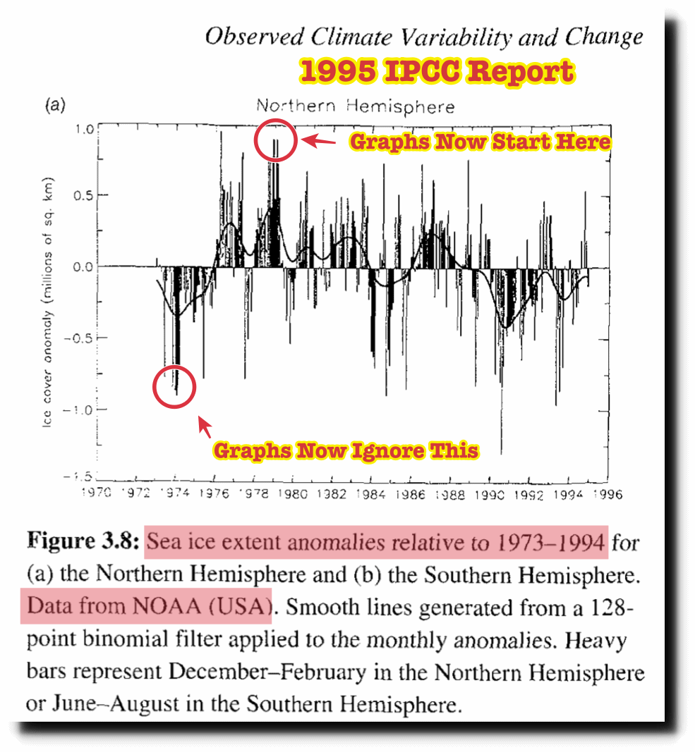
If that is so, it suggests that we have today broadly the same area of ice as was assessed in 1974. See the IPCC data from AR1 that suggests that ice area extent grew by about 1.8 million sq km between the end of 1973/beinning of 1974 through to 1976.
Nothing to get particularly alarmed about. 2 million sq km is clearly within the bounds of natural variation.
Yes, but for the Griffs of the world, the idea that “the skeptic will always be asked to explain” doesn’t infer that a) they want answers, or b) they’d understand the answers.
They’ll just keep asking, and asking, and asking, like one of those little bird ornaments that keeps dunking, and dunking, and dunking…
My fafourite Graph is this:
http://www.woodfortrees.org/plot/hadcrut3vgl/from:1940/plot/esrl-co2/normalise/offset:0.4/to:2015/scale:1.2/plot/hadcrut3vgl/mean:49/from:1940
30 years alignment with CO2. Everybody thinks this is the proof, but suddenly the pause. But also before 1960 no correlation.
Please be aware: This is Hadcrut 3, which ended in 2014, but had no extreme data rework. It compares even nicely tothe satellite data.
Another interesting graph: Annual average ice area in the Arctic has an upward trend now for 12 years. Or a 13 years pause. Antarctic sea ice upward trend for 38 years.
http://www.woodfortrees.org/plot/nsidc-seaice-n/mean:13/plot/nsidc-seaice-s/mean:13/plot/nsidc-seaice-n/last:144/trend/plot/nsidc-seaice-s/trend
excuse me for not understanding.
Shouldn’t the black and brown lines in the bottom graph “the banality of climate change” be at the same temperature for the present day ?
CO2 is a well mixed gas, temperatures track together in the Northern and Southern Hemispheres, until they started diverging about 1990. That divergence has become quite extreme http://www.woodfortrees.org/plot/hadcrut4nh/from:1960/plot/hadcrut4sh/from:1960/to:1997/trend/plot/hadcrut4nh/from:1960/to:1997/trend/plot/hadcrut4sh/from:1960/plot/hadcrut4sh/from:1997/trend/plot/hadcrut4nh/from:1997/trend
In the 1990s, at least since 1996 the Tropospheric Aerosol Injection (TAI) was started and the full water grabbing rolled out. Since that time also the shale petrol and gas fracking and desert fracking industry began to grow together with cheap airline companies, followed by huge investments of gulf Arabs into the aviation industry.
All this is not a coincidence, because TAI is implemented by spraying aerosol building fine dust by accordingly prepared airplanes, which are registered as “passenger jets”, but their only service is TAI. That is the reason for the cheap airlines being cheap, because the passenger transports were only a disguising second income.
Please give feedback, if You understand this, else I can give You further explanations on the geoarchitektur.blogspot.
So what happened to my comment to this article? It went into moderation and hours later it disappeared. Is this some sort of censorship? After putting some effort into a comment it is not nice to see it erased arbitrarily.
WordPress seems to occasionally lose comments, you can submit them but they never show up in the thread or in the review queue. I suspect WP has some race conditions when two comments are processed at exactly the same time.
For important posts, I like to use the “It’s all text” add-on which lets me edit a comment in my everyday editor and when I save the file, the contents are copied to the text box.
Thank you Ric, but my comment showed up in moderation for a couple of hours, so it didn’t get lost.
Anything substantial, I’ve learned always to copy.
Dear friends, writing valuable comments and delivering informative charts about CO2 and disproving the lies about it.
It is all true, but be assured, that the liars know that they lie!
Why do the fraudsters need this single strategy scam.
Principles of Climatology Faith
At the bottom the Geoengineering Mafia has only one lie to prove its claims, a second lie to push it forward, a third lie to blame it on the victims, a fourth lie as conclusion and a fifth lie to glue the scam together!
1. CO2 is producing global warming by positive feedback of energy. Earth becomes a warming green house!
2. As a result of first lie, the climate is changing dramatically, causing drought, flash rain, super hail, super lightnings and environment and people are dying!
3. The suffering and dying people have to blame themselves for the current and upcoming catastrophes, because they are pouring CO2 into the Atmosphere by industrial activities.
4. The humanity has to pay a CO2 tax to global authority, which will use this money to regulate the emission of CO2 to save the climate, the environment and the survival of humanity!
5. You are not allowed to question all this lies, because much more intelligent people, named “scientists” have found a 97% consensus! You have to believe it, else You may be declared a denier and no one will love You!
You may read further here about that!
http://geoarchitektur.blogspot.de/2016/06/single-strategy-scam.html
I disagree. Rather than lying, the geoengineering Mafia equivocates. An equivocation is harder to spot than a lie accounting for the continuing appeal of this particular equivocation.
You are right equivocation is always part of the manipulation. This is done by abusing the missing knowledge.
The geoengineering mafia proposes Stratospheric Aerosol Injection as a solution for “climate change” but Aerosol Injection can only be done in the Troposphere.
When asked if SAI is already applied they can always “plausibly deny” it.
Look here.
#Plausible #Deniability!
http://geoarchitektur.blogspot.com/2017/01/plausible-deniability.html
Most people don’t know anything about the Troposphere and Stratosphere!
Good article and charts.
Here’s another chart I propose top ridicule the current sorry state of climate science:
Title: “Future Climate = Hot to Damn Hot”
Chart is a rectangle around a picture of a smarmy-looking politician saying :
“It’s gonna’ get so hot you could go outside
and boil an egg on a bald man’s head …”
unless you give me money, vote for me,
and then do exactly what I say.
That would sum up climate science” in one chart
Climate Modelers = non-science = nonsense***
*** The modelers and their decades of wrong predictions are not real climate science
Right. Also, to convert climate pseudoscience to a legitimate science is straightforward. The first step is to place a statistical population underneath each climate model. Well meaning but statistically challenged bloggers are inclined to mistake a time series for a statistical population. Though a time series is present a statistical population is not.
This is a good chart from Lindzen
http://cosy.com/Science/Lindzenlineplot800.gif
Another good chart by Scotese
http://worldview3.50webs.com/6temp.chart.n.co2.jpg
The chart by Scotese is an example of a time series. A statistical population is not evident but is required for a conclusion to be reached by Scotese’s argurment. A conclusion cannot be reached as Soctese’s argument is an example of an equivocation.
By your logic, ice core data are worse since they are from one location. Scotese reconstruction is from multiple location globally.
[snip – lose the accusations -mod]