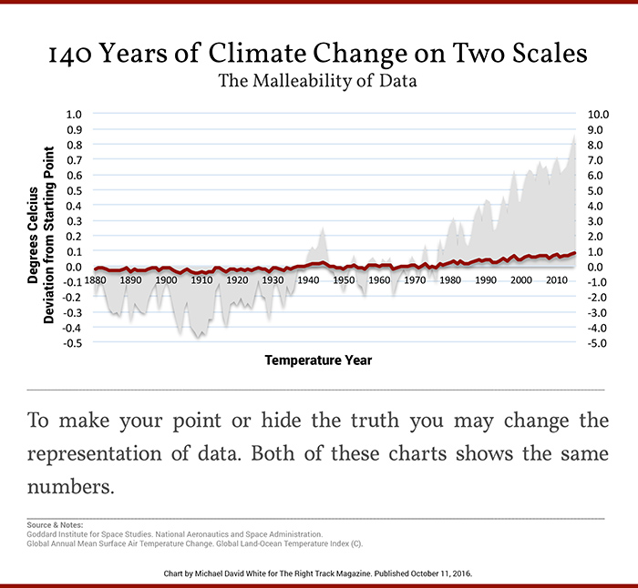
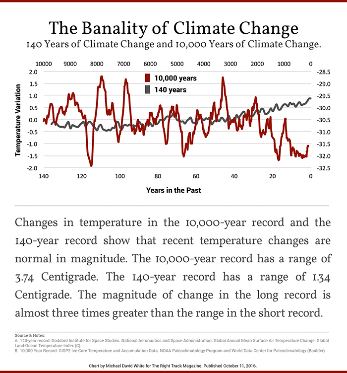
Skeptics often get asked to show why they thinks climate change isn’t a crisis, and why we should not be alarmed about it. These four graphs from Michael David White are handy to use for such a purpose.


Note: the top chart of 10,000 years of climate change has been updated to reflect the x-axis on 1/31/17
[snip -cry me a river -mod]
It’s a pity that charts directed to be used by ‘skeptics’ are missing so much information.
First of all, the citing is uninformative. How does one climateaudit this? I found data for the graphs myself, but do not know whether it is the same data used by the author, particularly the Greenland data. The waters are muddy from the outset.
First chart of Central Greenland is missing 20th Century. ‘Age before present’ usually means from 1950, but even if it was from 2000, that would still mean the last 95 years is missing (ref). Current temps are around -29C. (ref)
Some context – Greenland received more insolation 10k years ago from orbital dynamics.
Second chart of models/obs is of mid-troposphere (satellites) showing divergence between models and obs. But the divergence is overblown. To compare temperature evolution properly there should be some baseline matching, but neither line intersects anywhere. The gap between is an arbitrary value. There should be at least a 5 year baseline where both are zeroed.
Third graph is a note on scale. Well, yes, if you want to diminish anything increase the scale. On the scale of a kilometer, I’m pretty much the same height now as I was when I was two years old. My mother will be surprised to hear that.
5C is the difference between 100 meters of global sea level and ice sheets across the North of America and Europe hundreds of meters thick. So we should be interested in each degree of global climate change – and the pace at which it has/may occur. The scale suggested above is 15C…..
Fourth graph conflates one location with global, diminishes by using scale (a lot more variability in Greenland temps than global), and still is missing the last 100 years in the Greenland temps.
I’m all for well-reasoned criticism, but these graphs would mislead the uninformed.