Guest Post by Bob Tisdale
*Or Maybe the GISS Land-Ocean Temperature Index is Redundant.
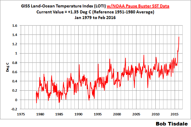
In the post Alarmism Cranked Up to Absurd Level, we discussed the misleading media reports about the temporary February 2016 El Niño-related uptick in monthly global surface temperature data from the Goddard Institute of Space Studies. There have been numerous new same-topic news articles since NOAA released its February 2016 global temperature data a few days ago. The NOAA/NCEI data show an uptick similar to the one we recently saw with the GISS data. See Figure 1. (A similar graph of the GISS data is here.)

Figure 1
(Data can be found here.)
Let’s focus on the AP story Beyond record hot, February was ‘astronomical’ and ‘strange’ by Seth Borenstein. It begins:
WASHINGTON (AP) — Earth got so hot last month that federal scientists struggled to find words, describing temperatures as “astronomical,” ”staggering” and “strange.” They warned that the climate may have moved into a new and hotter neighborhood.
Let’s see to whom Seth Borenstein attributes the “astronomical,” ”staggering” and “strange.”
“Astronomical” comes from NOAA’s Jessica Blundel. The AP article reads:
“The departures are what we would consider astronomical,” Blunden said. “It’s on land. It’s in the oceans. It’s in the upper atmosphere. It’s in the lower atmosphere. The Arctic had record low sea ice.”
The “staggering” comes from NOAA’s Deke Arndt, Chief of the Climate Monitoring Branch, at their National Center for Environmental Information (NCEI):
Scientists at NOAA’s National Centers for Environmental Information in Asheville, North Carolina, were astonished by the “staggering” numbers, said Deke Arndt, the centers’ global monitoring chief.
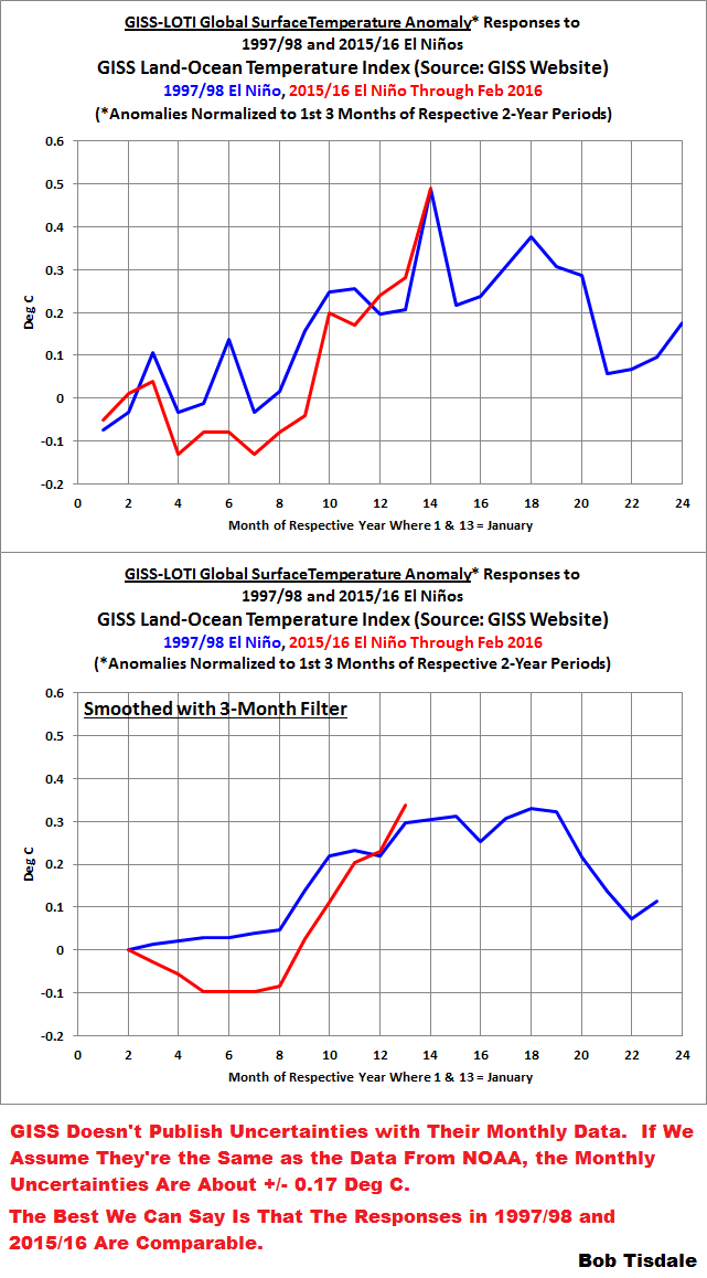
One wonders why NOAA’s scientists were “astonished” or consider the uptick “staggering” and “astronomical” when the 2015/16 El Niño has been compared in strength to the 1997/98 El Niño for many months. See NOAA’s Oceanic Nino Index, which is their “official” metric for monitoring the strengths, timings and durations of El Niño and La Niña events. It only takes a quick comparison graph, Figure 2, to show that there were comparable responses in global surface temperatures to both strong El Niños.

Figure 2
What many readers of that article are likely finding “astonishing” and “staggering” is that NOAA’s scientists weren’t aware that global surface temperatures were going to respond as they have, given that there was a similar uptick in global surface temperatures in response to the similarly sized 1997/98 El Niño. If the scientists had been aware, they wouldn’t have been astronomically astonished.
Notes about Figure 2: It compares the responses of global surface temperatures to the 1997/98 and 2015 El Niño events. The data have been normalized to the first 3 months of their respective first years. The normalization was done so that we can easily compare, visually, the responses of global surface temperatures to the two comparably sized strong El Niño events. This is not an attempt to hide the fact that global surfaces have warmed between the two events, according to the NOAA land+ocean data. In Figure 2, we’re simply providing a side-by-side comparison.
The recent monthly uncertainties in the NOAA data are about +/- 0.17 Deg C. (See the NOAA webpage here.) The best we can say is that the global temperature responses to both El Niño events were comparable, given the uncertainties of the data.
That land+ocean dataset from NOAA includes their new ERSST.v4 “pause buster” sea surface temperature data. It has many curiosities over the term of the data, as discussed and illustrated in the posts here and here.
[End notes]
And the “strange” reportedly comes from Gavin Schmidt, Director of the Goddard Institute of Space Studies:
NASA’s chief climate scientist Gavin Schmidt usually discounts the importance of individual record hot months, but said this month was different, calling it “obviously strange.”
Looking again at Figure 2, or the comparable graph using the GISS Land-Ocean Temperature Index data here from the post Alarmism Cranked Up to Absurd Level, there was nothing “obviously strange” about the response of global surface temperatures to this El Niño. It’s precisely what we would expect. If global surfaces had not warmed in response to the 2015/16 El Niño similarly to how they responded to the one in 1997/98, that would have been “obviously strange”.
Another quote from NOAA’s Deke Arndt:
“Usually these are monthly reminders that things are changing,” Arndt said. “The last six months have been more than a reminder, it’s been like a punch in the nose.”
Figure 3 illustrates the 6-month changes in global surface temperature anomalies over the term of the NOAA land+ocean surface temperature data. The recent 6-month change (February 2016 minus September 2015) in surface temperature anomalies (+0.29 deg C) has been exceeded many times in the past.

Figure 3
When you read quotes like the one from NOAA’s Chief of the Climate Monitoring Branch at their National Center for Environmental Information, you might begin to wonder whether NOAA scientists bother to examine their own data.
CLOSING
As expected, the comical alarmism about the recent uptick in global surface temperature anomalies continued with the release of the NOAA data for February. Toward the end of this month, we should expect see it again when the UKMO releases their monthly update.
With the global warming misinformation and misleading alarmism coming from NOAA scientists, one might conclude they’ve lost their objectivity. Thus, many readers might agree with Congressman Lamar Smith who was recently reported to have said in the ChristianScienceMonitor article NOAA should focus on weather, not climate change, says Rep. Lamar Smith:
“Instead of hyping a climate change agenda, NOAA should focus its efforts on producing sound science and improving methods of data collection,” said Smith. “NOAA should prioritize areas of research that significantly impact Americans today, such as ways to improve weather forecasting. Unfortunately,climate alarmism often takes priority at NOAA.”
FOR THOSE NEW TO DISCUSSIONS OF EL NIÑO EVENTS AND THE REASONS FOR THE RECENT REPORTS OF RECORD HIGH SURFACE TEMPERATURES
I discussed in detail the naturally occurring and naturally fueled processes that cause El Niño events (and their long-term aftereffects) in Chapter 3.7 of my recently published free ebook On Global Warming and the Illusion of Control (25 MB). For those wanting even more detail, see my earlier ebook Who Turned on the Heat? – The Unsuspected Global Warming Culprit: El Niño-Southern Oscillation. Who Turned on the Heat? only costs $5.00 (US).
And we discussed and illustrated the natural causes of the 2014 “record high” surface temperatures in General Discussion 2 of my free ebook On Global Warming and the Illusion of Control (25 MB). And we discussed the naturally caused reasons for the record highs in 2015 in General Discussion 3.
I is “astronomical, staggering and strange” to see how those temperature records are being manipulated and massaged by NOAA/NCEI and GISS.
+1
While the February 2016 *estimated* global temperature anomalies are the highest on record for all global data sets that I have seen, there are several important considerations:
1) Global average temperature and anomaly estimates probably have uncertainties of at least plus or minus 0.3C to 0.5C and the uncertainties are probably much larger for older estimates from before the satellite era starting around 1979. Thus, we can only say that February 2016 is among the highest anomalies since 1979, but we can’t say with high confidence that it is *the* highest monthly anomaly on record.
2) Most people don’t realize that estimated global average temperatures have a seasonal pattern dominated by the Northern Hemisphere, with December, January, and February more than 3C lower than June, July, and August. Thus the global average temperature in February 2016 cannot be the highest on record because the global average temperatures last June, July, and August were over 3C higher.
3) The annual global average temperature is somewhere around 15C, which is not “hot” by most peoples’ standards and as mentioned in (2) the normal range in monthly global average temperatures is over 3C across the year. So the global average temperature for February 2016 was probably over 3C “colder” than June, July, and August of 2015. So much for the “hottest month ever”.
Meanwhile, Antarctic (60S-90S) temperature anomalies as indicated by CFSR estimates had a little bump up to near the 1981-2010 reference period the last few months, but continue to show a significant overall decline corresponding to about 1C since 1979 despite what the GCMs predict. Why doesn’t this make the news?
When the trend in temperature shows region specificity, then how we can call such changes as global warming? or for that matter contributed by anthropogenic greenhouse gases.
Dr. S. Jeevananda Reddy
I think the concept of global temperature is useful mainly as an overview of what is happening on the Earth, including long term trends and past paleo climate, but to really understand what is happening requires looking at regional climates as well. The regional climates are more important for most individuals.
I thought about adding a (4) to my comment above to discuss the regional variations in February but ran out of time. The highest anomalies were at high latitudes in the Northern Hemisphere where it was just not as cold as average and certainly did not correspond to “hot” temperatures. By comparison the Southern Hemisphere was not showing any large anomalies and overall looked slightly below normal, at least in the Antarctic zone as can be seen on the contour maps below provided for GISS estimates (note gray areas have no data within 250 km and there is lots of gray at the poles including northern Canada where it was quite cold in February).
http://data.giss.nasa.gov/tmp/gistemp/NMAPS/tmp_GHCN_GISS_ERSSTv4_250km_Anom2_2016_2016_1981_2010_100__180_90_0__2__POL/amaps.png
“I thought about adding a (4) to my comment above to discuss the regional variations in February but ran out of time.”
___
Please do, when you can.
“Why doesn’t this make the news?”
UNIVERSAL TRUTH #87: “The news” is never actual news.
“If it bleeds it leads”
The “news” these days is basically a press release re-written by an unpaid intern.
I’ve had to get up earlier lately, so decided to shut the TV off earlier and head to bed before the news.
My blood pressure has dropped significantly, and I can still hold my own in the water cooler discussions.
antarctica doesn’t make the news as it is a very inconvenient truth for the CO2 induced greenhouse effect believers.
it’s a very clear cut sign that most of the warming we see is natural. It’s a pity i am not into science that much or i would have written an essay for WUWT with “land use change and AGW”. I did look for graphs for this idea but found none that were statisfying to write it.
actually in our region (Flanders region) we even passed the benchmark of 30% of constructed land (so 30% is now houses concrete parking lots or roads, which is one third of the total land surface of flanders. In Wallonia (the other region) this rise didn’t happen. While wallonia saw freeze and snow this year, we saw only rain. This discrepancy in the weather started from the mid 80’s when the soar in Flanders of construction also started. 30% of an area of 14000 km² is pretty vast and can cause considereable thermals able to influence weather on the scale of our country (which is only 33000 km² big imho
it should be interesting to have data about this idea as i believe the IPCC is seriously underestimating the change of energy balance caused by land use changes.
Frederik, I agree that land cover is an important influence, especially for micro-climates and to a lesser extent for regional climates. My shady backyard on average has higher temperatures at night and lower during the day compared to nearby locations without trees, like airport weather stations where some of the official temperature measurements are made, or nearby shopping centers with buildings, large asphalt parking lots, and little vegetation. Urban and suburban micro-climates are still a relatively small part of regional climates and only a tiny part of the global climate that is dominated by the oceans. I’m guessing that agriculture and rural land usage may play a larger role in regional climates as compared to urban influence. But as far as I know our climate models can’t handle this level of detail very well, if at all.
During the many recent glacial periods, with cooler air driving lower humidity and rainfall and also from lower CO2 levels driving weaker vegetative growth, deserts expanded greatly and many regional climates became drier. This desertification led to huge and frequent dust storms that covered the large glacial areas with dust and probably led to their rapid reduction by increasing melting in the summers. This effect may explain why the glacial periods ended faster than they started.
The main effect of rapidly increasing CO2 at present may be increased vegetative growth, which should be net beneficial for humans by helping to increase crop yields and expand arable lands into deserts. Likewise, if any warming occurs from the reduction of outgoing radiation from CO2, this should be net beneficial for humanity by allowing expansion of arable land and longer growing seasons.
The greening of deserts should slightly reduce overall global albedo levels and might cause a slight contribution to global warming (depending on feedbacks with water vapor and clouds). This effect may have also contributed to warming at the end of each glacial period as more CO2 was slowly released from gradually warming oceans, which in turn led to increased vegetation. If this is true, this effect might also help to delay the next glacial period, which would definitely be beneficial for humanity.
“”While the February 2016 *estimated* global temperature anomalies are the highest on record for all global data sets that I have seen,”
Not true for ASIA nor North America, Check the data.from NOAA Climate AT A GLACE
Also not true for the Southern Hemisphere mid-latitudes (30S-60S) and probably for many other regions as well. I was referring to “global” average temperature anomalies.
Earth temperatures are primarily and to the greatest extent controlled by our local star.
According to some scientist solar activity is well represented by the C14 proxy. This to a degree is correct, but as you will notice there is an un-natural burst in 1780s. There is no logic or reliable data to justify this.
An up tic in solar activity equal to that in previous or following decades is most likely but the CET didn’t follow that time.
http://www.vukcevic.talktalk.net/C14s.png
There is a good reason for that; there was strong volcanic activity in Iceland at the time, which greatly affected N. W European climate for number of years.
The Laki eruption starting in June 1873 lasted for about 8 months, ejecting an estimated 14 km3 of basaltic lava from more than 100 vents along more than 20 km fissure and cones. This was one of the largest basaltic eruptions known. Nearby Grímvötn was erupted more than half a dozen from1783 to 1785. For Iceland itself, the following winter (1783/84) was known as the ‘Famine Winter’: 25% of the population died.
In the winter (1783 December – 1784 February) CET=1.2C, some 2.5C below the all-series average. The Thames was completely frozen in February and traffic crossed on the ice.
1784 In this cold year (in the ‘top-10 coldest years in the CET record), the summer was very wet in London/South; sleeting the Moray Firth in August & heavy snow in London on the 25th October.
Evidence of climate being controlled by sun for all or the most of 350 years of the CET records is compelling.
(p.s. expect angry and futile protestations from professional full time ‘it is not the sun’ or ‘it is CO2’ practitioners, the climate natural variability negators)
Dr. S will be here soon
From your graph, it seems CET generally leads solar modulation, dropping and rising before solar modulation changes. Wouldn’t that make CET the cause of solar modulation the effect?
Should be *and solar modulation the effect?
Hi Katherine
Thanks for the comment. Originally I wondered about that delay for the time lag being wrong way around.
Explanation is as follows:
The C14 data shown in the graph is extracted from tree rings . There is a primary delay of one year due to the time solar wind takes to reach heliopause where the solar modulation takes place, so intensity of cosmic rays reaching us today was modulated by solar activity of a year ago.
The greatest amount of delay (I am told by the experts) is due to the process of absorption and accumulation since “ the residence time of 14C in the atmosphere is of the order of 40 years “.
To the contrary (as I suspected for some time) the amount of C14 in the atmosphere could be directly dependant on atmospheric precipitation which is dependant on the temperatures (may be significant proportion of the delay) , in which case the C14 proxy is only an excellent proxy only for the C14, as is definitely case for the 10Be proxies, and it has very little to do with sunspot intensity.
One thing is certain though, CET doesn’t modulate solar activity.
‘Settled science’ often makes fundamental mistakes which persist for long time until it is repeatability challenged by ‘nonconformists’.
In figure 3 above, showing 6 month swings in temperature, many large upswings start from a low level. February 2016 comes on top of a record year 2015, which comes on top of a record year 2014.
So maybe “staggering” after all.
Staggered, you are right.
Gavin Schmidt’s belief carbon dioxide affects the temperature of the planet is strange.
What’s so strange about the greenhouse gas C02 warms the planet? It’s common knowledge after all..
spaatch,
That’s deflection. The question is: how much warming?
You have no clue what the real answer is.
I started my work with atmospheric chemistry in 1969, explain to me in your very most sciency voice, how you think that really happens.
Denton, here you go. Lots of sciency words. http://www.atmos.washington.edu/~david/Donohoe_etal_pnas_2014.pdf
Denton Hodges March 22, 2016 at 8:56 pm.
Are you claiming that there’s no such thing as the greenhouse effect?
I’m claiming most people suck at explaining it. Science of Doom has tried, and it is not something you want to read. I did.
And The Pause continues, despite the uptick. See https://kenskingdom.wordpress.com/2016/03/21/the-pause-update-february-2016/
KS
Boring…Monckton’s posts were much more entertaining..
The numbers wouldn’t look so “staggering” if they used a graph that used standard sized thermometer measurements. I can only find those that read every two degrees. Tenths – phtttt. Really.
Heat from El Nino…I don’t think so. I posted this a week or so ago on another WUWT thread about this heat anomaly being attributed to El Nino but it got ignored so I’ll try it again.
Dr Roy Spencer posted a write up on his blog 1st of March showing the ‘real’ reason for the excess heat spike in February. There was a heat anomaly stretching from over eastern Mediterranean Sea north through east Europe/west Russia to the Arctic region with satellite anomalies measured around +4 C & surface measured anomalies measured around +11 C. The El Nino regions of the Pacific were modest at best and without the heat over Europe/Russia, the NH temperature graph would have looked like the SH temperature graph – unremarkable.
I have yet to see any studies, research, or even loose evidence that shows a teleconnection pattern of El Ninos to European/Russian heat waves. So, unless I am convinced otherwise by valid information, this heat to El Nino association is a bunch of hot air…so to speak.
oops – forgot the link to Dr. Spencer blog article:
http://www.drroyspencer.com/2016/03/uah-v6-global-temperature-update-for-feb-2016-0-83-deg-c-new-record/
…Also, in addition to, the NOAA Climate Prediction Center’s Climate Diagnosis Bulletin for Feb 2016 shows the excess heat over Russia as well:
http://www.cpc.ncep.noaa.gov/products/CDB/Extratropics/fige1.shtml
Further on in the bulletin, it appears there is a low pressure stuck over NE Atlantic/Northwestern Europe & a high pressure over China which would funnel warm air northward from SW Asia into east Europe/west Russia.
http://www.cpc.ncep.noaa.gov/products/CDB/Extratropics/fige8.shtml
Sorry, that is not El Nino, that is a coincidence.
that must have been the heat that warmed the mediterranean sea up , ye ? oh wait a minute http://www.ospo.noaa.gov/data/sst/anomaly/2016/anomnight.3.21.2016.gif
Am I missing something in Figure 2? What I saw was two graph sets that look a little different, but I did not seea difference in the captions.
Is the second graph set smoothed by a few months?
2015 was supposed to be the warmest year on record. Question: where was all this warm weather supposed to be happening? It certainly wasn’t warm compared to the average where I live (Toronto). The winter of 2014/2015 was very cold with the COLDEST February on record. The Spring and Summer were average followed by a warm Autumn. Overall the temperature for 2015 was average.
Hmm..and what percentage of the Planet is Toronto??
Toronto is, obviously, a very small percentage, BUT the weather in Toronto is very similiar to the weather in much of south-eastern Canada and parts of north-eastern U.S.. Again the question: where was all this warm weather supposed to have occurred? If Toronto had a record cold February (2015) then other parts of south-eastern Canada and north-eastern U.S. probably had record or near record cold temperatures for that month.
i have been asking the same thing for a while now. it always seems to be warmest where there are no people .
The impacts of AGW are not distributed evenly everywhere. http://www.thestar.com/news/canada/2016/01/21/record-global-temperatures-bypassed-canada-in-2015.html
“One wonders why NOAA’s scientists were “astonished” or consider the uptick “staggering” and “astronomical”. . .”
Could this be Peak Adjective???
Peak Moron.
I believe that liberal alarmists will go to great lengths to ensure that this temp value NEVER goes back down. Vigilance will be needed now more than ever. I mean it. We will see a new adjustment algorithm as well as a daily temp logging “errors” rate reaching new heights over 40%?. By hook or by crook all in the name of “GOOD!” These CSers are nuts. I lost a position because of them in the past and am NO LONGER EVER SURPRISED by ANY of their Actions!. I mean these guys “correct” acquired data constantly (such BS). Change “Natural variances” with the snap of their magical keyboards all the while proclaiming that they know best. Actually some times they say it out loud, it was too low so I kicked it up a few degrees and then go on as if nothing just happened. It is truly unbelievable how it got through any peer review (oh ya, peers of scum are scum some times, that’s right!. Scientists my ARSE)
These nut cases use complex statistical models to validate their SEMIemperical data generation models by semi modeling nature (only a FEW of the known variables included (but not really defined without a lengthy FOIA req.)) without ever even considering if the magnitude of the response is even germane given the large experimentation error of the equipment to data resolution claims…., (you know signal value of 0.01 and a noise value in excess of 0.45 “ERROR” all the while claiming model validation is not really necessary because they are after all the MODEL KINGS so shut up you peons because we KINGS ALL AGREE HOW GREAT WE ARE because they really think we are too damn stupid to see that their MODELS ARE SO FULL OF HOLES AND FRAUD!!!!
Well guess what…, I SEE YOU!
Just once I would like to see REAL NATURE PROVIDED DATA, not screwed with, acquired “ABOVE BOARD” with all parameters and stats declared a priori and of course…,ALL VALUES ACCOUNTED FOR, no new this sleazy twist or semi empirically generated that, just a straight forward well planned and executed experiment by an alarmist and when it fails say damn, this CO2 thing ain’t near what OBAMA has been telling his minions of change…, er, scientists!
Have a great week all!
Bob,
“In Figure 2, we’re simply providing a side-by-side comparison.”
__________________
As you’ve pointed out, normalising the anomaly base periods to the first 3 months of ‘each respective 2 year period’, gives an indication of the scale of the response relative to each base period, but doesn’t compare the two on an equal footing in terms of absolute temperature. Obviously temperatures during this latest El Niño have been much higher than they were during the earlier one so far.
The question then is: are the comments from the people quoted above (“astonishing”, “staggering”, etc) referring to the scale of the increase relative to past El Niño events, or might they instead refer to the absolute temperatures we’re seeing?
For instance, Jessica Blundel’s use of the term “astronomical” is quoted as being in reference to “departures” from various parameters, including surface temperatures. The NOAA February 2016 ‘departure’ from normal February surface temperature was +1.21C, beating the previous record by +0.32C. Typically such records are beaten by margins of between 0.01 and 0.08C (average ~0.03C). So one might reasonably argue that the 2016 record was indeed remarkable (if not ‘astronomical’ exactly).
Similarly, Deke Arndt is quoted as referring to the ““staggering” numbers” NOAA were reporting. Again, there seems to be no reason to infer from this that Arndt is talking about anything other than the absolute departures from average – the absolute anomaly values. If so, then it might be argued that this is not such an unreasonable comment either.
As for Gavin Schmidt’s “obviously strange” quote; speaking in terms of departures from a long term average, then in what sense is a series of 3 consecutive new monthly warmest temperature records *not* ‘strange? It has never happened before in the NASA global surface data set, as far as I can see. Surely that is indeed an “obviously strange” occurrence. If it isn’t, then I’m at a loss as what it would take for anything in such a data series to be described as ‘obviously strange’.
“Surely that is indeed an “obviously strange” occurrence.”
In a world where warming happens all the time, warming isn’t ‘obviously strange.’
Andrew
“Figure 3 illustrates the 6-month changes in global surface temperature anomalies over the term of the NOAA land+ocean surface temperature data. The recent 6-month change (February 2016 minus September 2015) in surface temperature anomalies (+0.29 deg C) has been exceeded many times in the past.”
Absolutely correct. Just to note, as we do not know all the factors affecting changes in the global temperature, I would think that the annual change (Feb 2016 to Feb 2015) may be just or even more appropriate.
http://www.vukcevic.talktalk.net//GISS-tmp.gif
e.g. two most extreme recent departures (2008 and 1985) are not visible in Figure 3.
If everyone were told: the “average” temperature of the world was about 58 degrees F, what would they say? This is exactly why they use “anomaly” and never touch on actual temperatures. And yet here are all the skeptics, bloviating about anomalies. An “anomaly” isn’t a temperature. All it does obscure what the temperature actually was.
Even more telling, is if there were 6 consecutive months of record breaking heat, you would expect some more broken heat records. To wit they don’t exist. Everywhere I’ve looked on the planet its normal to low temps across regions. Though they do a great job of color coading weather maps with white hot anamolies these days. People are programmed to say its warm at 58F.
Dougmanxx,
OK then, let’s look at average global temps in ºF:
http://i1.wp.com/www.powerlineblog.com/ed-assets/2015/10/Global-2-copy.jpg
Or, if you like, NASA’s in ºC:
NOT scary. No acceleration. None.
And you want anomalies? Look here:
http://www.science20.com/files/images/global.png
As we see, the temperatures affected are the lows, not the highs.
All the wild-eyed hand waving over what is thoroughly mundane and unremarkable is based on the magnifying effect of using axes with tenth and hundredth of a degree divisions. The alarmist crowd is forced to do that, because if they used the same charts that have been used for hundreds of years, they would look like ^those^, and no one would care.
The “dangerous man-made global warming” scare is based on politics, not on science. That’s why the eco-lemmings who come here pretending to understand the subject get set straight in short order by folks who do, in fact, understand it.
By the same method we could plot a chart of global population from, say, 1955 to 2015 and make it look almost flat, even though the increase is in the region of 4.6 billion people. All we have to do is make the vertical axis unreasonably large for the data it contains, which is all you’ve done in your first two charts.
I don’t know what you’ve done in the bottom chart, but there’s no way the green ‘average’ line can possibly reflect the average of the ‘maximum’ and ‘minimum’ data as plotted on that chart. Who do you think is actually going to fall for that?
DWR54,
You don’t understand. The charts speak for themselves. All you’re doing is injecting your baseless opinion.
I suggest you lurk for a few months until you start to get it. So far, you don’t.
dbstealey
If you plot the data used for those charts on any spreadsheet programme the default charts made by the programme would look nothing like what they do in your representation. That’s because the way you’ve presented them conceals the relevant data and scale.
When someone manually change the axes on a computer-generated chart it’s a sure sign that they are trying to hide something.
Here’s a sad note for Feb. 2016.
Station Details
Name BRIDGEHAMPTON, NY US
Network:ID GHCND:USC00300889
Latitude/Longitude 40.946111°, -72.306944°
Elevation 18.3 m
Period of Record
Start Date¹ 1930-08-01
End Date¹ 2016-02-04
Data Coverage² 100%
I had wanted (even planned) to trek out there and speak with the curator, Richard G. Hendrickson, but I was too absorbed with other aspects of this project. Now it is too late. He was our longest living climate station curator.