Steve McIntyre always told us to “watch the pea under the thimble” when it comes to climate change pronouncements, this is one of those cases. Yesterday, to much media fanfare, wailing, and gnashing of teeth NOAA pronounced that 2015 was the hottest year on record, ever! There’s only one problem with that…the Internet never forgets. Back in 1997 after the super El Nino made global temperatures soar, NOAA/NCDC produced this report:

Source: https://www.ncdc.noaa.gov/sotc/global/199713 (h/t to Tom Nelson)
Archived here: http://web.archive.org/web/20150504164341/http://www.ncdc.noaa.gov/sotc/global/199713
In that 1997 report, they say clearly that the Global Average Temperature (GAT) was 62.45°F, based on a 30-year average (1961-1990) of the combined land and sea surface temperatures. Since we know the 1997 El Nino caused a record high spike in temperature, that means that for that 30 year period, there was no warmer GAT than 62.45°F up until that time.
Yet in 2015, the claim for the “warmest ever” GAT is different:

They say:
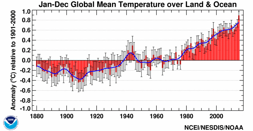
During 2015, the average temperature across global land and ocean surfaces was 1.62°F (0.90°C) above the 20th century average. This was the highest among all 136 years in the 1880–2015 record, surpassing the previous record set last year by 0.29°F (0.16°C) and marking the fourth time a global temperature record has been set this century.
Source: http://www.ncdc.noaa.gov/sotc/summary-info/global/201512
( Note that they link in that quote, to an image which does not exist: http://www.ncdc.noaa.gov/sotc/service/global/global-land-ocean-mntp-anom/201501-201512.png )
In the 2015 Annual State of the Climate report referenced above, NOAA says that the temperature was 1.62°F (0.90°C) above the 20th century average. That’s an important number. While they don’t reference the absolute value of the 20th century average temperature for the globe in that report, we can find it here in the November 2015 State of the Climate Report:

Source: https://www.ncdc.noaa.gov/sotc/global/201511
==========================================================================
UPDATE: WUWT commenter “brian0918” points out that in other reports, NOAA give the 20th century global average temperature as 57°F – That may be they are referring to the 20th century average for the month of November in the initial report I cited, but don’t make it clear in the language used, or it may be a typo. Even so, it is still lower than 62.45°F. I made the corrections in the title and in the body of this post.

==========================================================================
So here is the math for the claims, for 2015, to get the number, we have to add the yearly variation from the 20th century average to it to get the absolute number:
GAT for 20th century = 55.2°F
GAT for 1997 = 62.45°F
GAT for 2015 is 1.62°F + 55.2°F = 56.82°F
In any universe, 56.82°F is lower than 62.45°F by 5.63 degrees Fahrenheit.
======================================================
UPDATE: (using the 57°F 20th century GAT mentioned in comments)
GAT for 20th century = 57°F
GAT for 1997 = 62.45°F
GAT for 2015 is 1.62°F + 57°F = 58.62°F
In any universe, 58.62°F is lower than 62.45°F by 3.83 degrees Fahrenheit.
======================================================
Of course, apologists and NOAA itself will run to their statistical hidey-hole and say that the 1997 value isn’t about the 20th century temperature comparison, but only compared to the “30-year average (1961-1990) of the combined land and sea surface temperatures.”, and therefore the comparison is not a valid one. (Meanwhile NASA GISS uses a 1951 to 1980 baseline for their historical temperature claims today, which is an arbitrary choice) But, I say it doesn’t matter what they say. NOAA is charged with presenting factual evidence in the context of climatic history, and when they make claims of absolute temperature, they need to be darn sure they get it right. Otherwise, the press, supporters of the cause like Seth Borenstein at AP, and the folks at the Washington Post just blindly regurgitate what NOAA says without questioning it.
To give an example of how the media can’t even do basic fact checking anymore, I calculated the GAT for 2015 is 1.62°F + 55.2°F = 56.82°F Simple math, right? Yet somehow, in press reports, that number got transposed to 58.62°F. Just look:
(UPDATE: If the 57F 20th century GAT value is used referenced in updates above, then we get the 58.62 number that is cited – while my math was correct, I relied on the context from the November, SOTC report, which was not clear, I’ve made the appropriate corrections.)
It appears that the source of that 58.62 number in error was Seth Borenstein at the Associated Press, though I can’t tell if he made the error himself, or quoted NOAA. This is what he wrote in the AP story:
NOAA said 2015’s temperature was 58.62 degrees Fahrenheit (14.79 degrees Celsius), passing 2014 by a record margin of 0.29 degrees. That’s 1.62 degrees above the 20th-century average. NASA, which measures differently, said 2015 was 0.23 degrees warmer than the record set in 2014 and 1.6 degrees above 20th century average.
The point to be made here is that NOAA professes to be an expert at telling the public what the temperature is, when so many contradictions and errors creep into what is presented to the public, we should all learn to take what NOAA says, and what the media says with a grain of salt.
When you look at temperature that isn’t biased by continuous adjustments, such as NOAA’s highly questionable fiddling with sea surface temperature data this year, you find that 2015 was not the hottest record at all according to the U.S> Climate Reference Network data, which is a state of the art system designed to need no “corrections” of any kind. 2015 comes in third for the USA:

While that USCRN data only spans a little more than a decade, it is instructive for comparison to claims made. NOAA doesn’t seem to like referencing this state of the art USCRN system in their public reports, preferring instead to rely on their old, messy, error prone, and highly adjusted COOP/USHCN network which has been shown to have significant biases. They claim in their SOTC report from Jan 2016 that it was the 2nd hottest year on record for the CONUS:
In 2015, the contiguous United States (CONUS) average temperature was 54.4°F, 2.4°F above the 20th century average. This was the second warmest year in the 121-year period of record for the CONUS.
Source: http://www.ncdc.noaa.gov/sotc/national/201513
As I’ve said before, NOAA can’t seem to keep historical temperatures static, and thus the claims made referencing them, accurate. They change from month to month, and when there is no firmament to the history they present, why trust them?
Dr. John Christy said it best:
“If you want the truth about an issue, would you go to an agency with political appointees?” Christy said. “The government is not the final word on the truth.”
If NOAA can’t keep a simple claim accurate, such as what the GAT was in 1997 versus 2015, why indeed should we trust them? We shouldn’t, we should question everything, always, because it seems the global temperature is not only nothing more than a statistical construct, it is as fickle as the political wind.
Meanwhile, satellite temperature data, which NOAA and NASA don’t like to use, shows the Earth as third warmest in 2015.
I’ll have more on this story via updates.
UPDATE: Dr Richard Lindzen notes:
MIT climate scientist Dr. Richard Lindzen balked at claims of the ‘hottest year’ based on ground based temperature data.
“Frankly, I feel it is proof of dishonesty to argue about things like small fluctuations in temperature or the sign of a trend. Why lend credibility to this dishonesty?” Lindzen, an emeritus Alfred P. Sloan Professor of Meteorology at the Department of Earth, Atmospheric and Planetary Sciences at MIT, told Climate Depot shortly after the announcements.
“All that matters is that for almost 40 years, model projections have almost all exceeded observations. Even if all the observed warming were due to greenhouse emissions, it would still point to low sensitivity,” Lindzen continued.
“But, given the ‘pause.’ we know that natural internal variability has to be of the same order as any other process,” Lindzen wrote.
Lindzen has previously mocked ‘warmest’ or ‘hottest’ year proclamations.
Once you know you are dealing with a liar there is no point in trying to justify the rubbish they put out.
dealing with a Liar… a US President who has a penchant for narcissism and serial lying, has corrupted the entire executive branch with his flying monkeys. The most troubling aspect is his weaponization of the IRS to harass political foes. That high crime is cause for impeachment and removal on its own. Mr Obama is clearly a sociopath, a pathological liar who lies rather than admit errors and incompetence within himself and his administration.
1. Yes. Once you know you someone is a liar, you cannot take seriously ANY-thing he or she says. You must do independent verification of EVERY statement he or she makes.
2. However, because NOAA has a loud megaphone, one must correct their false assertions, for many will hear them and may be fooled. That this must be done is disgraceful:
AndyG55 (http://wattsupwiththat.com/2016/01/19/20-false-representations-in-one-10-minute-video/#comment-2124575 )
NOAA (as an organization) IS A DISGRACE.
That Anthony Watts, et. al., AND THE SCIENCE GIANTS OF WUWT! must post an article like the above to refute a government organization their tax dollars fund and THEN, on top of that, take valuable time out of their day to refute the scientific inanities and mischaracterizations of science-illiterate disinformation trolls (to prevent their fooling an uninformed reader), is a shame.
J. for many years around 2009, the hubble constant was thought to be something like 75 km/s/Mpc. by 2010, it was about 72±8 km/s/Mpc, and in 2013, the value was computed to be the currently used value: 67.80±0.77
Now, J: note the error bars there – yes indeed, 75 is quite different to 67.8 and well outside the 0.77 dispersion.
My question to you J is the following.
Do you understand why the value was imprecise in the first place? Do you understand why it changed? Do you think that all cosmologists are a pack of lying self-serving dishonest fools attempting to deliberately attempting to mislead the public in the search for what I suppose you think are lucrative and substantial research funds?
I know you’re unlikely to answer any of these questions – what matters to you is what you can pin on the climate scientists, even though every other scientist on the planet actually engages in the EXACT same process.
J. Most all it’s important you refuse to answer this next question:
Do you understand that the iterative refinment of values and quantities is exactly the purpose and function of the scientific method? I ask because you seem so keen to stress scientific illiteracy, yet you are so vehemently objecting exactly to the scientific method – I assume you’re doing it with the full knowledge you are objecting to the scientific method – i would not like to conclude you are scientifically illiterate.
Janice…just remind “it” to read the following link…it thinks Edwin Hubble was to blame…but he’d been dead for 40 years when it launched! hehehehe Subtract the “linkat” part from the URL
linkathttp://people.tamu.edu/~v-buenger/658/Hubble.pdf
caitie,
I would like to try to answer the question: “Do you understand why the value was imprecise in the first place? “, but I need a little more information; What do you mean when you say the initial value/estimate was imprecise? Can/will you elaborate?
.
Why is anyone humoring this troll’s strawman argument?
Track and Field needs to take a lesson from NOAA. Record all winning times in reference to an average, then change the average each year.
every year you get a whole new set of record times, no matter what the real times were.
Baseball, basketball, football should all follow suit. Record the scores in relation to the historical average, and change the average every year. Every year can reach new heights of scoring.
This would really help baseball, where low scoring games are seen as a problem. Make the average for baseball -110, then every baseball game will end up with scores like 113-112. Exactly what you would expect for an exciting basketball game. Think of the fan appeal!
“help baseball, where low scoring games are seen as a problem.”
There’s a simple way to do that: 4-out innings (except the first), and 7-inning games. Games would be more exciting too, with runners in scoring position much more of the time. And games would be fairer, with winning being less dependent on bunching hits together in innings. Cappiche? (sp?)
NASA needs to increase the temperature more as it seems that higher temperatures cause less weather related problems. From a very misleading article (http://www.reuters.com/article/us-disaster-insurance-idUSKBN0UI0XI20160104). The following was in the article which bemoans the increase in damages caused by climate change. A few lines which completely negate the whole tone of the article. If the highest temperatures ever are so dangerous, why is the damage so minimal?
DROP IN CLAIMS, RISE IN DEATHS
The $27 billion in insured damage last year was lower than the $31 billion registered in 2014 and also below the 10-year average of $56 billion, Munich Re said.
Overall damage, including that not covered by insurance, was $90 billion last year, the lowest level since 2009.
In all, 23,000 people were killed in 2015, many in the Nepal earthquake in April. The total compared with 7,700 the previous year, but was well below the 10-year average of 68,000.
The MSM Truth Pyramid:
1) Headline (alarmist)
2) Story (ignore any doubts that scientists use, i.e., downplay words like “may”, “might”, “could” and “if”)
3) Press Release (which an unpaid intern re-wrote a bit to get #2)
4) Appendices (getting closer to the truth, hope nobody cross-references anything)
5) Raw Data (ignored by MSM)
As far as I can tell, Brian is correct about the 57.0 F and the 55.2.
So for 2015, the temperature would then be 1.62 + 57.0 = 58.62.
However 58.62 is still lower than 62.45, but by only 3.83 F and not 5.63 F.
Am I missing something?
No, it simply was that the context surrounding the November report didn’t make it clear that the 20th century GAT was for the month of November, not the entire 20th century. I’ve updated the post with the 57F number, and while the difference is lower, the conclusion is unchanged.
Not just the web archive it’s still on their main website
https://www.ncdc.noaa.gov/sotc/global/199713
I sense a “server error” or an “upgrade” or an “update” or a “routine file pruning” in 3…2…1…
no, just an uncorroborated datapoint.
Compared with other agencies, the above data do not corroborate.
Could you explain why you expect a scientific organisation to report on data that is not corroborated?
caitiecaitie:
Your algorithm has generated this nonsense
Nobody can answer your question unless and until you state
(a) what you mean by “corroborate”
and
(b) how a datum for global average temperature (GAT) could be corroborated.
Or does your program not generate scientific questions?
Richard
caitiecaitie January 21, 2016 at 5:50 pm
Please have your programmer’s twig your algorithm. A true human with a bit of history reading would know that I am implying that the archive on the noaa server will be, as John Hiatt would have it “gone, like a Nixon file, gone, gone away”…
OT.. The 30% DMI sea ice graph has been brought back on line.
Interesting result !!
I know the Arctic sea ice will start to increase now the AMO has changed, but not so soon, surely
15% graphs still show the level about where you would expect it to be, just below 1sd from the mean of the 1981-2000 period.
Can’t wait for KatieKatie to come in and denounce our ability to reason and besmirch our scholarship.
I’m not sciency enough I post often, but I *can* sniff out fraud.
This is fraud, NOAA will go alter that record now.
I have to admit, I do find the hysteria a little.. well.. funny.
Now, what a scientist would do is try to find out if the data are actually reliable – one way of doing that is going to an independent source – and there sure are plenty, NASA, japan etc.
So here is what I suggest sven – first, you’ll have to dismount. I know it’s high, but you can do it.
Next – do the science: go find the data from a different agency. I undersand that the theme on this thread is that there is a conspiracy, a “pal review” etc. etc. etc. , but put paranoid hysteria aside for a moment if you can, and just focus on the job at hand.
Now – the next step is perhaps complex, it requires a little math – In a process like temperature that is explicitly stochastic, you’re justified in obtaining a number of measurements and doing a bit of stats. You dont have to of course, but at the very least you should corroborate your findings with independent data some way.
Here is how the breakdown looks.
NOAA data – shows ~higher temps for 1997
JMA – shows lower temps for 1997
NASA/GIS – shows lower temps for 1997
I find this whole post identical to one of the most dire crimes that even the anti-AGW find objectionable: that of cherry picking the data to make a non-point.
The conclusion is made after analysis of indepentent datasets – this is pretty straightforward and actually scientifically honest – you tend to not bother discussing slightly outlying datapoints in disparate datasets on the grounds they are – well, outliers.
So sven, as I said – the breathless contempt here is symptomatic of the AAGW crew. ANYTHING – anything at all that you can latch on to and wave it around and pretend you have a point. – quotemining is a nice little example I’ve had foist upon me recently.
Meanwhile, not a single person in this entire blog has bothered to acknowledge that not only are temperatures still increasing – i.e. the hiatus was either insignificant, or passed – but the frequency of record-breaking global temps is now on the scale of a handful of years. And yes, that is statistically significant, and yes sven, that is the point.
I suppose what I find most amazing is the sputtering and chortling by people who simply dont get it. They simply dont understand how data are processed, they simply DONT get how and why corroboration of data actually works.
I dont think NOAA is going to change their data at all. Why should they? It’s valid data, it certainly doesn’t put NOAA in awkward position by anyone who understands how science works and data are processed.
Any scientists online like to comment on the usefulness of using external datasest to corroborate findings, and then the validity of conclusions made after the corroboration?
cc,
Your incessant comments are coming at a fast clip, 24/7. That indicates that either you have no life to speak of, or you’re being compensated for being a site pest.
Which?
Your big presumption in all your comments is that the observed warming is not natural. So you are ignorant of the climate Null Hypothesis, which has never been falsified. And Billy Ockham would be snickering at your juvenile belief system, which is preposterous since Planet Earth has falsified it for so many years.
As you’ve been told repeatedly: the onus is on you, to prove, or at least to provide convincing evidence, that global warming is man-made. Since neither you nor any other climate alarmist has been able to produce any such evidence, you deflect. That’s what you’re doing here, and in every other comment you make.
The onus is on you, not on anyone skeptical of your pseudo-science. You fail. So you deflect. Simples.
hi dbstealy,
It’s comforting to continue our dialogue for a second day in a row. What was it you were saying about not having a life to speak of? Anyhow, my diurnal or nocturnal habits are none of your business, nor is how I spend my time. you’re perfectly free to concoct whatever baseless conclusion you wish about all of those parameters – bearing in mind that concocting baseless conclusions is something you abhor – at least, when other people do it.
“the onus is on you, to prove, or at least to provide convincing evidence, that global warming is man-made”
No I dont think so. This is not the substance of my point.
I’m unclear why you feel I have to verify a claim or viewpiont I’m not making. Could you explain why you think there is an onus on people to verify claims they dont make? I’m confused.
Now, you go on to describe “my” science as “pseudoscience” – just quickly, is this a word you can use to describe plots you fabricate in an attempt to appear informed and that you’ve read the literature? Anyhow, I digress – again, this demand confuses me. What of “my” science do you regard as “pseudoscience”? I’ll appreciate you making a direct paste to whatever I’ve said that you’re particularly disturbed about – be careful not to quote-mine, there seems to be a penchant for doing that, of late.
cc,
You continue to falsely assert that I’m “fabricating plots”.
I challenge you to PROVE IT.
If you can’t, you’re bearing false witness. That makes you a serial liar, no?
dbstealy
“I challenge you to PROVE IT.”
sure. Because I enjoy it, I’ll make it a fun demonstration.
Assertion: That dbstealer faked data when asked to show a sample from a specific study?
Result:
You showed a plot – but was it from the study?
Evidence:
0. The plot did not come from the paper – moreover, the models shown in it were not those in the paper, and any other data in it also did not occur in the paper.
1. The box at the top included the name of the authors and the date of the publication.
Conclusion:
Not only did the plot did not come from the paper as I asked, the plot was made to look as if it did.
Further reading:
That the plot was made to look as if it came from the paper, including authors name and publication, implies a deliberate and malicious attempt to deceive. The uncontestable fact is that the plot did not come from the data, nor include data discussed in the paper. The actual origin of the subterfuge is unclear, but irrelevant: either you faked it, or someone did. if someone else did, you were fully cognizant of the fact the plot did not come from the paper (beause you read it, right?).
Final conclusion.
You are either explicit in the generation of the fake plot, or complicit.
QED.
cc writes:
“dbstealer”. I suppose cc will claim that’s a typo. Otherwise, could cc be any more despicable? Based on previous comments, I suppose so.
Now, about the bearing of false witness by the anonymous coward cc, who falsely asserted:
You are either explicit in the generation of the fake plot, or complicit.
As I said, prove it. But you haven’t, because you can’t. So lying is what you did instead. I’ll make a rational, logical case:
First off, you’ve never identified what “plot” you’re referring to. I have posted literally thousands of charts here. Which one got you all spun up? Aside from some WoodForTrees charts, using their database (the only way to make a WFT chart), I have never once produced a chart of my own, or added anything within any chart I’ve ever posted, including any trend lines, commentary, or anything else. Therefore, cc is lying. Do you see that, cc? Everyone else does: you made an explicit accusation that you cannot support. You told a lie, hoping to win an argument.
Every chart I’ve ever posted comes from the thousands of charts I keep in several folders. And every chart I ever posted was produced by others; by folks I don’t know, and whom I do not communicate with. When I see an interesting chart, I simply save it. Takes three clicks. Sometimes four, when the chart is in an article.
Next, cc falsely asserts:
Not only did the plot did not come from the paper as I asked, the plot was made to look as if it did.
As I said, that is nothing but an “assertion”. A baseless opinion, which proves nothing. (I’m enjoying holding ‘cc’s’ feet to the fire because cc has totally failed my challenge, by being unable to prove — or even argue — that I’ve ‘fabricated plots’.) Thus, cc is lying.
Next, cc baselessly asserts:
The uncontestable fact is that the plot did not come from the data, nor include data discussed in the paper.
Uncontestable?? I didn’t even read the paper. I simply posted a chart in response to a comment I read. That isn’t the issue. The issue is cc’s bearing false witness. cc continues the impotent attack:
The actual origin of the subterfuge is unclear, but irrelevant: either you faked it, or someone did. if someone else did, you were fully cognizant of the fact the plot did not come from the paper (beause you read it, right?).
Ah. Now cc the mind-reader isn’t sure if I even read the paper or not. As I stated, I didn’t. And now cc is wavering: either I faked it… or maybe someone else did. But my direct challenge was about cc’s explicit false accusation that I had ‘fabricated’ the ‘plot’ (and I’m still not sure which chart cc is lying about here).
Finally, cc finishes by bearing false witness once again:
Final conclusion.
You are either explicit in the generation of the fake plot, or complicit.
As everyone here can clearly see, that is nothing but a lame and baseless assertion; an opinion, completely unsupported by any facts at all. This obnoxious, pejorative site pest is labeling people as being dishonest — when it’s clearly cc’s psychological projection — imputing cc’s own faults onto others. cc is doing the lying. ‘Bearing false witness’ is what liars do in court. Compared with cc, Pinnoccio is as honest as George Washington.
Over the past nine years I’ve made a point of being as truthful as possible. I’ve said this before cc ever even knew about this site, because I know one thing: if anyone lies here, they always get caught. Now cc has been caught bearing false witness, and the reason is obvious: cc has no credible arguments. cc is just trying to deflect, and make the provenance of a chart the issue. But it isn’t the issue, and as I’ve stated, I have never fabricated a chart of any kind, or ever changed anyone’s chart. I would not post any chart that I thought was not based on good data (unless I’m using, for example, a Mann et al chart to show how they try to scare the public). As I’ve often said, I post charts because they say a lot at a glance, where posting a lot of text makes many readers’ eyes glaze over. As long time readers here know, I like charts.
Whatever chart cc is so spun up about doesn’t matter. cc has tried to re-frame the debate, by stating unequivocally that I have dishonestly fabricated a chart. Thus: “dbstealer”. (I doubt that cc has any real friends, which probably explains cc’s non-stop commenting here.) cc is deflecting, because cc has such a a lame argument.
And now we see cc fumbling around, trying to justify bearing false witness: cc is lying in a failed attempt to win an argument.
cc, you can’t win an argument by calling someone else dishonest, unless you have pretty strong proof. So I’ve posted very strong proof right here, showing that it is you who are lying. You totally failed my challenge to show that I ever ‘fabricated’ what you called a ‘plot’. All you did was emit your baseless opinion, nothing more.
Thus, you failed the challenge. And as I’ve shown here, you are lying — while calling honest folks liars. That’s pretty despicable, cc. You can’t seem to convince a single reader here of your sciency belief system; you turn the scientific method upside down by trying, in effect, to make skeptics prove a negative; you claim you’re not in the alarmist camp, which is risible, and you argue in the most underhanded way possible online, because you can’t make a rational, convincing argument: by claiming other folks are lying.
But’s all made clear here, cc. You’re caught being a serial liar, suffering from acute psychological projection. You have a real mental/emotional problem. But shame on you anyway.
I wish he was being compensated….at least in free toothpaste and mouthwash with which to get the taste of “stupid” out of his mouth after he’s chewed on people like you repeatedly.
CalfieCalfie-“Assertion: That dbstealer faked data when asked to show a sample from a specific study?” (are you asking yourself a question here?) “Result: You showed a plot – but was it from the study?”
What plot and what paper are you crying about? You DO know it’s possible, legal, and a scientifically endorsed practice to plot graphs based upon the data presented in ANY paper (doesn’t have to be your own paper) as long as you credit the data to the authors of the paper and the paper it was cited in. Right?
Its done all the time. Look at some graphs. People plot other people’s data points day in and day out, and there’s always a “source” listed for where the data comes from if that graph is produced outside of a particular paper or data set. Where have you been that you do not know, accept this?
[Note: caitiecaitie is a previously banned commenter. -mod]
“Alastair Brickell”,
You make lots of assumptions. Let me show you how silly they are:
you are here 24×7…
I am retired, and I can spend my free time as I like. What about you, sockpuppet?
My wife is an invalid. I stay close by to take care of her when she needs help. In between calls, I while away the time reading this and other sites. Since I’m stuck at home, what would you suggest?
…and do nothing but attack posters that hold an opinion that isn’t aligned with the WUWT cohort…
In other words, you don’t have sufficiently credible arguments, and you don’t like the view of most commenters here. Your own opinion isn’t aligned with the majority here. But you can post your own opinion any time, so what’s the problem?
Finally, not only am I not being compensated, I’ve donated here whenever asked. You could call it a negative compensation.
Have I laid it out pretty fairly?
[Note: ‘Alistair Brickell’ is a site pest. That’s a fake name. -mod]
Laugh of the Day:
Richard Mol 9:03pm, 1/21.
Of course the last year’s temperature is always the highest in a warming world. That was true in 1997 as well as in 2015. Only a true Doubting Thomas would be sleazy enough to compare the two numbers.
Well, I always ask warmunists: of course the earth is warming. We’re coming out of an ice age, what should it be doing?
Crickets, I tells yah, crickets…
The crickets you hear is caused by the confusion you’ve thrown the other person into. Were you to ask me, I would also stare at you – in my head I would be thinking… “what? can this guy REALLY be completely uninformed of what the data show?”
The answer is no, of course, you are informed. you just ignore it, and that is similarly confounding.
[Note: thread-bombing violates site policy. You have made more than 170 comments in 24 hours. Try to control yourself. -mod]
Apparently you are “uninformed” because the data shows that the earth is warming exactly like it has during all of it’s past interglacial periods. It appears that “It” is the one who is uninformed-
Peer reviewed studies showing climate change today is NOT occurring faster or to higher extents than in the past-
http://www.nature.com/ncomms/2015/151110/ncomms9890/full/ncomms9890.html
Dansgaard et al. (1989); increasingly abrupt changes were seen on further study, Johnsen et al. (1992); Grootes et al. (1993); jumps of Greenland snow accumulation “possibly in one to three years” were reported by Alley et al. (1993), see also Mayewski (1993); five-year steps: Taylor et al. (1997); changes of 2-4°C at Greenland within a single year: Steffensen et al. (2008).
http://www.nap.edu/read/10136/chapter/1 Abrupt Climate Change-Inevitable Surprises
(Ocean Studies Board, Polar Research Board, Board on Atmospheric Sciences and Climate,Division on Earth and Life Studies, National Research Council, NATIONAL ACADEMY PRESS)
https://www.aip.org/history/climate/rapid.htm
“Swings of temperature that in the 1950s scientists had believed would take tens of thousands of years, in the 1970s thousands of years, and in the 1980s hundreds of years, were now found to take only decades.”
Is “it” really uninformed, or is “it” ignoring what ALL the data shows? We shall see.
caitiecaitie January 21, 2016 at 6:36 pm
The crickets you hear is caused by the confusion you’ve thrown the other person into.
No kidding Sherlock. Asking a warmunist to apply a bit of logic confuses them, as you have amply indicated in every post of yours.
Where I am sitting 15,000 years ago in Toronto, Canada was under a few kilometers of ice. That ice is not there now, nor was it there 5,000 years ago or so when the first settlers from Asia finally reached here.
So, again, we are coming out of an ice age. Answer the questions: what should the earth be doing?
Caligula, No, the planet had been cooling for many thousands of years. At the end of the last ‘ice age’ the planet warmed. That is how an ice age ends, the planet warms. And then slowly cools into another ice age. Which is what the planet had been doing. So the Earth should still be cooling now, heading into the next ‘ice age’, but something has changed that.
Why anyone believes that a “global average temperature” number has any useful meaning is beyond me, given the wide range of seasons and micro-environments on this planet.
I always ask the warmunist when this comes up: do you think Canada has an average temperature?
When they say, “sure”, I ask, “and what use could it possibly be to anyone?. Iqualit’s mean temperature for a day averaged with Vancouver’s, averaged with Toronto’s, averaged with Halifax’s…”
You can almost hear the gears grinding as they contemplate a) how hard it would be to actually get all those measurements, b) how useless it is.
When I was younger, I never noticed that being average looking really helped me with girls, either.
And here in Australia the BoM uses just 112 stations to calculate a national average. Rediculous, meaningless and useless, unless you are in to propaganda.
caligula,
I made this comment elsewhere – let me repost it.
I want to determine the way knowledge and performance of students in a school varies over time.
One way I can do that is to make them sit an exam – lets suppose I do that, and pass the same exam to all kids in the school – grade 1 to 6.
Now, to be realistic, the grade 1 kids will probably perform relatively badly. the grade 6 kids much better.
What can I gain from averaging the ensemble? They’re totally different model spaces?!
Well, let’s repeat the test next year. GASP!, the results are different. the average value is different!
Let’s repeat the test, each and every year – ohhhh.. something is happening, the scores are getting slowly higher – what does this mean?
It means that, on average, the students have an increasing performance on the test – well duh! you say!
indeed, it’s pretty obvious this is the case. The next question is – why?
Indeed, I could compose an hypothesis from that conclusion – it might be the quality of teaching – or that the students are learnig the rote answers to the test, or pretty much anything and .. I could test it. Super!, scientific method ftw! Where does it get us? Well, if he naive interpretation is correct, it means the students are becoming more and more academically developed – that’s a useful thing to explore because perhaps I can find out why, and help imporve the academic development of kids in other schools.
See how I took an ensemble mean of disparate populations to arrive at a meaningful conclusion, which then led to more scientific study?
Worked for a long time in one of the dastardly fossil fuel industries, I am an old engineer, one of the areas I did a lot of work in was the buying and selling of properties. When you go to look at a property for sale the seller likes to show you their valuation, hoping you will anchor on that value and work toward that number. My approach and what I expected from my staff – get the raw data, evaluate that data carefully, if something seems out of line look at that information very critically, arrive at your own valuation then critically evaluate the sellers valuation, if these numbers are too far apart make an offer at your valuation and don’t worry about it further. The issue I see with the climate change people is they don’t want to share the raw data, they modify that date to suit their interpretation and refuse to either explain how or why they changed the raw data or didn’t use some of that data. In other words, I don’t care what you think here is the answer and if you don’t like it, you are obviously incompetent, stupid or a tool. Not the way I learned science! (And yeah I always showed a possible purchaser my value, that may have been aggressive, when selling a property and yes there was a lot of anchoring that occurred but I did buy and sell a lot of property)
Joe Romm is not too good on C to F conversion. 🙂
http://thinkprogress.org/climate/2016/01/20/3740962/2015-hottest-year-record/?utm_source=feedly&utm_medium=webfeeds
“the planet is now more than now halfway to the 2°C (1.8°F)”
2C is actually = 3.6F
But 1.8F is halfway to 2C – maybe that’s what he meant with his bizarre mixing of units?
Full release from 1999.
NOAA 99-1
FOR IMMEDIATE RELEASE
Contact: Stephanie Kenitzer or Patricia Viets
1/11/99
1998 WARMEST YEAR ON RECORD, NOAA ANNOUNCES
Global temperatures in 1998 were the warmest in the past 119 years, since reliable instrument records began, the Commerce Department’s National Oceanic and Atmospheric Administration announced today. The previous record high surface temperature was set last 1997. The global mean temperature in 1998 was 1.20 °F (0.66°C) above the long-term average value of 56.9°F (13.8°C). This was the 20th consecutive year with an annual global mean surface temperature exceeding the long-term average.
“The persistent 1997-1998 El Niño, which lingered into the first half of the year, and the unprecedented warmth of the Indian Ocean contributed to this record warm year,” said NOAA Administrator Dr. D. James Baker
Both land and sea surface temperatures were above the long-term average. Sea surface temperatures were 0.92°F (0.51°C) above normal, while the land surface experienced even greater warmth at 1.84°F (1.02°C) above normal. Tropical latitudes (30°N – 30°S) established a new record by a wide margin, averaging 1.76°F (0.98°C) above the long-term mean, 0.68°F (0.38°C) above the previous record set in 1987. The Northern Hemisphere (30°N – 90°N) also set a record at 2.16°F (1.20°C) above mean. The Southern Hemisphere (30°S-90°S) did not experience record heat, although temperatures averaged 0.65°F (0.36°C) above the long-term mean.
Regional and Seasonal Variations in Global Temperatures
An examination of global temporal and regional temperature anomalies reveals many distinct patterns. For instance, while most of the tropical land mass and ocean surface temperatures averaged above normal, a persistent flow off the Indian Ocean brought relatively cool, cloudy weather to equatorial east Africa during the first half of the year. Many areas in Western Europe and North America experienced their warmest February in 100 years. In June, a record-breaking heat wave in central Russia resulted in huge fires. Australia recorded its highest annual mean temperature since high-quality records began in 1910. Canada reported one of its warmest years since 1948.
A rapid reversal in the sea surface temperature anomaly pattern occurred in the eastern equatorial Pacific as warm anomalies (El Niño) transitioned to cold anomalies (La Niña) during the latter half of the year.
Annual temperatures averaged below the 1880 – 1997 mean over northern sections of Eurasia and southern South America. The cold weather in northern Eurasia was accompanied by excessive spring and autumn snow cover. While Europe and northern Asia experienced harsh early winter conditions late in 1998, much of North America had unusually warm autumn weather. Mild conditions in eastern North America came to an abrupt end as a major arctic blast spread south during the last couple weeks of the year.
Temperatures in the United States
The United States average temperature in 1998 was 54.62°F (12.57°C), which placed the year in a virtual tie with1934 as the warmest year in records dating to1895. The average temperature in 1934 was 54.67°F (12.59°C) and the third warmest year on record was 1921 with an average of 54.42°F (12.46°C). Several regional and seasonal records were also set throughout the year. For example, the region from the Northeast to the Great Lakes experienced its warmest January-May. The Southern Plains experienced its warmest July-September while the Far West saw its third warmest. From the Southern Plains to the Gulf Coast, the warmest May-November was established in 1998. The protracted summer heat wave resulted in extraordinary runs of daily temperatures 90°F or hotter in several Texas and Florida cities. In contrast, California and Nevada experienced their second coolest April-June. September monthly anomalies show that nearly two-thirds of the contiguous United States was much warmer than normal.
Global Precipitation
The 1998 global average precipitation anomaly for the land surface was less than 0.1 inches (2.5 mm) above the 1900-1997 mean. However, considerable differences were evident in precipitation departures across latitude bands with an average surplus of precipitation in the majority of the Northern Hemisphere, and a deficit elsewhere. Land areas between 30°N and 55°N averaged 2.31 inches (58.7 mm) above normal, more than the equivalent volume of water flowing through the Mississippi River during an entire year. Precipitation also averaged above normal in the Northern Hemisphere high latitudes (55°N-85°N). Conversely, the equatorial zone (10°S -10°N) averaged 7.18 inches (182.4 mm) below the long-term mean.
The 1997-98 El Niño event was one of the two strongest this century. It was associated with extremely dry conditions and devastating fires in many areas of the world, including Indonesia, eastern Russia, Brazil, Central America and Florida. The El Niño was also associated with extensive flooding in parts of northern Argentina and coastal Peru. The rapid shift to La Niña conditions at mid-year was associated with extremely heavy rains in many parts of Asia. The Indian monsoon season started later than usual, but ended with massive flooding along the Ganges river valley. Devastating late summer flooding developed on the Yangtze River in China, causing massive damage and killing more than 3000 people. Rain in the African Sahel got off to a slow start, but rainfall was greater than normal across much of the region during the latter half of the season.
Although many regions of South Asia received ample rains during the summer monsoon season, the watersheds along the Mekong River of Southeast Asia and the Indus River in Pakistan experienced extensive droughts. Summer heat and dryness plagued the Ukraine, Kazakhstan, and southern Russia. Canada reported one of the ten driest January-November periods since records began in 1948.
Precipitation in the United States
The United States had the fifth wettest year on record in 1998 with a national average of 32.61 inches (828 mm) of precipitation. The wettest year was 1973 at 33.99 inches (863 mm). Considerable regional and seasonal variation in precipitation anomalies occurred throughout the year. For example, the Southeast and Great Lakes regions had their wettest January-March in 1998, and the West had its wettest January-June.
A record dry April-June resulted in drought conditions from the Southern Plains to the Gulf Coast states. The spring and summer heat and drought led to massive wildfire outbreaks in Florida. Late summer and autumn rains from tropical systems helped abate the dry conditions in the South, while drought intensified in the eastern U.S. The region from the central Atlantic Coast to New York experienced the second driest July-November on record.
Natural Disasters
Numerous weather-related natural disasters occurred in 1998. A January ice storm caused widespread power outages in eastern Canada and the northeastern United States. The deadliest Florida tornado outbreak on record occurred the night of February 22. A frontal system moving across the Central Plains spawned 20 tornadoes in Oklahoma on October 4, setting a national record for the most twisters ever during a single day in October. The preliminary annual count of tornadoes observed in the United States was 1239 (the average is 1186).
El Niño contributed to the late start of the 1998 Atlantic Hurricane season which, under the influence of La Niña, ended as one of the deadliest in history with 14 named storms. Three hurricanes and four tropical storms caused billions of dollars of damage to the United States. Hurricane Georges devastated the northern Caribbean in late September. Hurricane Mitch, one of the most powerful Atlantic hurricanes on record, devastated many Central American countries in October, and resulted in a staggering loss of life. In the Pacific, October’s Supertyphoon Zeb inundated the northern Philippines, Taiwan, and Japan. Only eight days later, Supertyphoon Babs struck the Philippines, submerging parts of Manila.
For more information, refer to…
The Global Temperature Anomalies
http://www.ncdc.noaa.gov/ol/climate/research/1998/anomalies/anomalies.html
NOAA’s National Climatic Data Center is the world’s largest active archive of weather data. The preliminary temperature and precipitation rankings are available from the center by calling: 828-271-4800.
NOAA works closely with the academic and science communities on climate-related research projects to increase the understanding of forecasting techniques. NOAA’s Climate Prediction Center monitors, analyzes and predicts climate events ranging from weeks to seasons for the nation. NOAA also operates the network of data buoys and satellites that provide vital information about the ocean waters, and initiates research projects to improve future climate forecasts. The long lead climate outlooks are available on the Internet at: http://nic.fb4.noaa.gov.
The 1998 statistics are available at: http://www.ncdc.noaa.gov/ol/climate/research/1998/ann/ann98.html
You can find the Feb, 1999 version of http://www.ncdc.noaa.gov/ol/climate/research/1998/anomalies/anomalies.html here.
http://web.archive.org/web/19990202052742/http://www.ncdc.noaa.gov/ol/climate/research/1998/anomalies/anomalies.html
Scroll down some and you might notice the annual land temp change from 55.5*F in the 1999 version to 47.3*F more recent link.
“Climate Change” indeed.
This article is worth commenting on. http://arstechnica.com/science/2016/01/thorough-not-thoroughly-fabricated-the-truth-about-global-temperature-data/
It includes the attack on the UAH group
“You can also use some sorcery to try to produce a satellite measurement more representative of the lower half of the troposphere—a technique pioneered by the University of Alabama in Huntsville (UAH) group that runs the other major satellite dataset.”
Text would be fine without the “sorcery”. term..
Also, Carl Mears is apologetic about the RSS work. He basically throws the UAH group under the bus. I saw such a behavior at a CCSP 1.1 Committee meeting in Chicago which I was at. The RSS group presented an error in the UAH data at the meeting without informing Roy or John beforehand. It was clearly an attempt to blindside them (which Tom Karl, the Chair, seemed to be aware of). Roy confirmed the error and showed it was small in just a short time at the meeting. In a later NRC meeting, I similarly heard Tom Karl attack the UAH work. He clearly sees it as a threat to the robustness of his surface temperature data analyses.
Here is some text on Mears comments in the news article.
“Ars asked Carl Mears, who works on the Remote Sensing Systems (RSS) satellite dataset Senator Cruz was pointing to, how he feels about those statements. “Well, I guess I’m annoyed because I feel that they’re misusing the data,” he said. “They’re picking a specific time period that generates the conclusions that they would like be true. If you look at a longer time period, you get a very different conclusion.”
“With that said, both satellite records do show slightly smaller warming trends for the troposphere than our surface records show, which is unexpected. “If you include the uncertainty analysis,” Mears explained, “I think that the data aren’t really good enough to say that it either is or isn’t following what you expect.”
The “no warming in 18 years” claims simply stem from the fact that the warm El Niño conditions around 1998 stand out very strongly in the satellite record, producing a cherry ripe for picking. “Of course if you start riding your bike from the top of a hill, you’re gonna go downhill for a while,” Mears said. By starting in 1998 rather than, say, any year previous, you can draw a flat line to the present. (Since the current El Niño is just as strong, we should see a similar hill appear in the satellite data as that warmth moves poleward from the tropics.)”
“Some of the interannual wiggles are bigger in RSS, and since 1998 or something like that, we’re showing less [warming] than the surface datasets. I suspect that’s at least partly due to a problem in our dataset, probably having to do with the [time-of-day] correction. It could be an error in the surface datasets, but the evidence suggests that they’re more reliable than the satellite datasets,” Mears said.”
“Despite the political rhetoric championing satellite records as a challenge to the reality of human-caused climate change, they actually confirm that reality. “We’ve done numerous papers with Ben Santer from [Lawrence Livermore National Laboratory], where he’s compared the patterns that we see to the patterns that the climate models predict, and we’ve shown that without including greenhouse gas changes in the climate models, you cannot get the amount of warming that we see,” Mears noted.”
The final arbitrator of these issues will be the scientific community. however, John and Roy need to prepare a robust response to these criticisms of Mears (or publicly accept them). That Mears seems to denigrate his own analysis is remarkable. One wonders why he is even funded for that work?
Roger A. Pielke Sr.
‘We’ve done numerous papers with Ben Santer from [Lawrence Livermore National Laboratory], where he’s compared the patterns that we see to the patterns that the climate models predict, and we’ve shown that without including greenhouse gas changes in the climate models, you cannot get the amount of warming that we see’
This comment is classic propaganda, packing a 2-in-1 punch of deception:
1. Set up a strawman: without GHGs, we cannot simulate the amount of warming. Well, so what? Of course GHGs cause warming, and if your simulation doesn’t include them you cannot get warming (or at least not as much as the temperature record says). But who would dispute this point? The question is whether, after adding GHGs, your simulation is close to the temperature record… and it isn’t. There are also numerous papers showing this, though of course not by Mears and Santer.
2. Present something absolutely trivial as somehow remarkable. Again, that one cannot replicate warming without GHGs is just common sense. What is this supposed to prove?
Notice also that the default warmer argument when talking about satellite/ballon data is to point out that there is so much uncertainty around these temps, so one just cannot say for sure whether the models are right or wrong. This is remarkable because after 37 years, the models are showing about 3 times as much warming as the satellites – and this is still not enough to draw conclusions?
Anthony has got it wrong. He is basing his claim on deriving absolute values of the global average temperature, rather than changes over time, and he’s deriving this himself by adding up numbers from different sources many years apart which are not meaningful to compare.
The absolute value of GAT is very uncertain because of issues such as gaps in the global coverage, but the change in GAT is better known because the errors in the absolute value are fairly systematic (ie: if there’s an underestimate in 1997 then it’s fair to assume that there’s a similar underestimate in 2015, for example – as long as you look at the difference between the two, the underestimates in both years cancel out).
These systematic biases will have changed over the years, for example as more historical data gets included, or the techniques for estimating the global numbers from the station data change. So comparing an estimate of absolute GAT from 1997 with a value for 2015 derived using a much more recent estimate of absolute GAT is not comparing like with like.
If you look at NOAA’s own words on this (https://www.ncdc.noaa.gov/sotc/global/201513) they say:
However it is probably fair to say that NOAA should have explicitly given the uncertainty range for their estimate of the 20th Century average GAT. They do say that it is uncertain in their FAQs pages: https://www.ncdc.noaa.gov/monitoring-references/faq/anomalies.php – I found this when looking at the 1998 report (I’d wondered why Anthony didn’t quote the 1998 temperature, as it was even warmer than 1997 – I guess it must have been because NOAA didn’t give an absolute value then, just an anomaly).
So while I’d agree that NOAA could do better in their communication, they are definitely not saying that 1997 was warmer than 2015. The headline of this post is misleading.
RB:
And if the difference in the AV of GAT was not the same? And how would you know? A very curious comment, if I may say so, Richard.
caitiecaitie:
You say
Of course they are “not detailing data that is not corroborated” because they are reporting data that is not corroborated.
Perhaps you would care to “say” how any data for global average temperature (GAT) could be “corroborated”?
Richard
Dick – are you saying that NASA is [obfuscating] the temperature deliberately?
Damn the autocomplete.
Id say they’re simply not detailing data that is not corroborated. That’s not the same thing as obfuscation though, in fact, it’s the only scientifically honest thing to do.
“The absolute value of GAT is very uncertain…”
This is extremely problematic from a modeling perspective. The radiative emission delta from using just the average temps of 62.45 and 58.62 is over 10 Watts/square meter. Of course, the average temp is a transient composite of much higher and much lower temperatures, driving that delta up further, given T^4 dependence. I would estimate the difference in thermal emission between these two “uncertain absolute values” of earth’s temperature therefore rises to around 15 W/m2. In addition, NOAA’s “new” lower average temperature shifts the peak wavelength of emission even farther away from the CO2 primary absorption band near 15 microns, meaning that while much less radiation is emitted, even a smaller fraction of the new value is absorbed in the atmosphere by CO2.
Meanwhile Gavin Schmidt admits on RC that total solar irradiance was underestimated by ~ 3.5 W/m2. Plus, as I’ve pointed out to you, your use of a graybody emission model for deserts (and NASA and NOAA) predicts incorrect retention of energy in the atmosphere of this same order of magnitude. (Paper forthcoming, but it’s pretty objective: quartz emits much more strongly in the atmospheric window)
This, while Kevin Trenberth is publishing estimates of radiative imbalance between 0.5 and 1.0 W/m2.
However, we are told that the change is GAT corresponds to 0.15 C with uncertainty of ~ 0.09 C, and uncertainty of 0.13 C in the year 1853.
Frankly, this is ridiculous. Models cannot accurately project anything, least of all radiative transport fundamental to the concept of warming due to anthro-GHGs, if the absolute temperature values are “very uncertain”. Which brings us to the uncertainty values, which are downright amusing. I doubt you would be able to accurately measure the temperature of one swimming pool over one 24 hour period to within 0.09 C with one sensor. This is coming from someone who uses high-quality thermocouples daily that vary by three times as much under identical, *static* conditions. And if you only had a single thermometer in that swimming pool to work with, you would still have a thermometer density of 2.3 Billion times that with which NOAA is working with in the oceans, if NOAA’s stations were evenly spread. Since most are on land, you are essentially telling us that you are measuring the average temperature of ~ five billion swimming pools over an entire year with a single thermometer, doing this many times over sets of (5 billion) pools that vary in temperature by over 50 C, and can tell us the accurate, average value of change to less than a tenth of a degree. And in the year 1853, with only a bit less precision. Preposterous.
One more thing: water has huge latent heats of fusion and vaporization, as you know. Initializing models at different absolute temperatures will add or subtract an enormous amount of enthalpy in polar regions where water must absorb quite a bit before moving from 0.00 to 0.01 C. And we all know how important the model predictions are at the poles.
0.2 C uncertainty in 1853, rather.
Second typo: the higher GAT from ’97 shifts the peak emission away from 15 microns. Long story short, if your GAT is wrong, your parameterization will be wrong, so your model trajectory will be wrong.
sorry. typo in the
I have made this point numerous times: anomaly is useful for comparing changes overtime in disparate data sets, BUT it must also be reported along with the “average” used to derive it. THAT is the only way you can determine changes between different iterations of the data. The very nature of anomaly causes the interpreted data to be less clear. This doesn’t mean it’s wrong per se, but the inclusion of an “average” shows what internal changes have been made to produce the anomaly number. This wouldn’t be at all important, if the “data” from 50, 60, or 80 years ago weren’t STILL continuously changing. Every temperature product should be required to include and average temperature for every station it uses, for every measuring period. THAT is the only easy way to see changes made from one iteration of the data to the next. It’s easy, and doesn’t affect anomaly at all. And no one will ever do it.
Richard Betts wrote: “So comparing an estimate of absolute GAT from 1997 with a value for 2015 derived using a much more recent estimate of absolute GAT is not comparing like with like.”
That is the point of the article. In 1997 GAT was an apple. In 2015, 1997 GAT had become an orange. In 10 years time 1997 GAT could have turned into a tomato. Which is the correct fruit?
So here is the math for the claims, for 2015, to get the number, we have to add the yearly variation from the 20th century average to it to get the absolute number:
GAT for 20th century = 55.2°F This is the average for the month of November not the annual value
GAT for 1997 = 62.45°F
GAT for 2015 is 1.62°F + 55.2°F = 56.82°F
In any universe, 56.82°F is lower than 62.45°F by 5.63 degrees Fahrenheit.
And the average for November is not the same as the annual average.
“Also note the statement at the top of the 1997 report: Please note: the estimate for the baseline global temperature used in this study differed, and was warmer than, the baseline estimate (Jones et al., 1999) used currently. This report has been superseded by subsequent analyses. However, as with all climate monitoring reports, it is left online as it was written at the time.”
I cannot believe this head post was made ….
[??? .mod]
But according to this source:
https://www.ncdc.noaa.gov/cag/time-series/global/globe/land_ocean/ytd/12/1880-2015.csv
The anomaly for 1997 was 0.51 C (or 0.92 F).
When this number gets added to 57.0 F, we get 57.92 F for 1997 versus 58.62 F for 2015.
So the question now becomes: Were adjustments made over the last 18 years to lower the actual 1997 temperature from 62.45 then to 57.92 today? And if that is indeed the case, the error bars for the 62.45 must have been HUGE! And if their error bars are of the order of 4.5 F, how certain can we be that 2015 has indeed set a record?
The anomaly for 1997 was different than for 2015 because the 30-year-average baseline was different.
For 2015 they used the 20th century average as the baseline. For 1997, they used the 30-year average (1961-1990) as the baseline.
Check this source:
https://www.ncdc.noaa.gov/cag/time-series/global/globe/land_ocean/ytd/12/1880-2015.csv
It shows a single table with
1997 0.51 and
2015 0.90.
Are you saying this single table does not use a common base line?
That single table does use the same baseline. What I’m saying is that in the original 1997 report, they used a different baseline average than they do today – presumable to show more warming, since the 1997 baseline was a 30-year average from 1960-1990, whereas in 2015 the baseline was the average from 1900-2000. Since the latter baseline will be lower, the calculated anomalies will appear higher now than they would’ve using the same baseline from 1997.
I said this above.
http://wattsupwiththat.com/2016/01/21/failed-math-in-1997-noaa-claimed-that-the-earth-was-5-63-degrees-warmer-than-today/#comment-2125866
It may have some bearing.
Werner, the surface record IS out side their own error bars from the 1980s.. Goddard had some posts on this.
It is curious, Steig took a little WAIS warming, and smeared it all over Antarctica. Those in denial of satellites take a little honest questions on some aspects of the methods within the confines of realistic error bars, and attempt to smear then over the entire satellite and weather balloon data sets, when they exist within the error bars and do not change the overall record.
Picking an anomaly relative to a certain base is , well relative and an anomaly. The question is do either UAH or RSS show any year close to as warm as 1998. The answer is no, they do not. Both show 2015 as nowhere near 1998, and both show 1998 as the “warmest year ever” to quote the CAGW phrase.
Both UAH and RSS are ballpark .3 degrees below 1998, both show 2010 and other years as warmer then 2014 and 2015. Schmitt proclaimed a what, 34% chance that 2014 was the hottest year ever based on what.04 degrees. By that measure there is a 100 percent chance that RSS and UAH show that 2015 was not the warmest year ever.
CAGW proponents (Steve Mosher in particular generalizes on this regularly) cannot understand that most skeptics do not object to adjustments in principle, or to modeled results in principle. We do object to the wrong (according to observations) modeled mean being used in predictions of harm, and adjustments that are clearly wrong and unexplained. Examples, they are countless. As for one example of many unexplained adjustments, see this Bill Illis comment… http://wattsupwiththat.com/2015/03/06/can-adjustments-right-a-wrong/#comment-1877173
=======================
“Here are the changes made to GISS temperatures on just one day this February. Yellow is the new temperature assumption and strikeout is the previous number. Almost every single monthly temperature record from 1880 to 1950 was adjusted down by 0.01C.
I mean every freaking month is history suddenly got 0.01C colder. What the heck changed that made the records in 1880 0.01C colder. Did the old thermometer readers screw up that bad?
==========================
http://s2.postimg.org/eclux0yl5/GISS_Global_Adjustments_Feb_14_2015.png
These adjustment are not explained by anyone. A few posts below Bill’s comment directions are given to confirm this.
IMV the entire surface record is FUBAR, Some of the original data is famously lost. The great dropping of thermometers, the movement of stations from rural to urban, the ever changing data and therefore base periods on which anomalies are published, the wrong UHI adjustments…
UHI is worse going from wilderness to village to small town…. http://www.drroyspencer.com/wp-content/uploads/pop-density-vs-rate-of-ISH-station-warming.jpg
…the refusal to adjust to known thermometer errors in early readings because the adjustments would warm the past, the ever increasing homogenization, which in conjunction with the dropping of stations allows any errors to magnify, or spread over ever larger geographical areas, the questionable TOBS bias adjustments, of course the station siting issues, the clear disputes of GISS adjustments from various regions like the Iceland meteorologists disputing those adjustments, Russian scientists disputing the adjustments to Russian data, the Australian controversy and the refusal to provide records and resistance to FOI requests in the US as well, the divergence of the surface from the satellites and from the weather balloons, and from the one US set using only pristine stations, the climate gate emails where scientist openly talk about removing the 40s blip, the decrease in the number of days over 95 F in the US and decrease in the number of stations reporting over 95 degree days in the hottest year ever, the non decline in NH snow coverage, now true for all seasons, the increasing Antarctic sea ice, the cooling southern oceans, I could go on and on, but all suggest the current surface record is F.U.B.A. R..
Thank you! My next post should be of interest to you.
Always [looking] forward to it.
Do not forget that when they switched from liquid in glass to the current electronic devices, they seem to have adjusted for the change in the exact wrong direction.
Anthony,
You are incorrect in your assertion; 2015 is the second warmest year for the U.S. in USCRN, after 2012. Same result for the U.S. as in the NOAA global product.
http://www.ncdc.noaa.gov/temp-and-precip/national-temperature-index/time-series?datasets%5B%5D=uscrn¶meter=anom-tavg&time_scale=ann&begyear=2005&endyear=2015&month=12
December 2015 is the third warmest -month- in the record.
Also, the difference in absolute temperatures reported back in 1997 and today are mostly due to the addition of many more high-latitude stations in GHCN version 3 (and 2 awhile back). Having more coverage in high latitude areas unsurprisingly results in a more accurate and slightly colder global average temperature. To me at least that doesn’t seem like a bad thing, and this whole issue highlights why folks tend to prefer to use anomalies which are less susceptible to bias due to differences in spatial coverage over time.
The contiguous US represents 1% of the Earth’s surface. That should clue you in to why it’s important to look at the global average temperature, not just the US temperature.
Zeke,
Nice deflection. Now, show us how human CO2 emissions caused the warming.
The fact is that global warming has been happening since the LIA. It is rank dishonesty to imply that human emissions are the cause.
[Comment deleted. Repeated violation of site policy. -mod]
cc,
Fine then. Your position is that global warming is natural and not man-made?
Then we’re in general agreement.
db, the Industrial Revolution, hence the burning of large amounts of coal, coincides with the end of the LIA too. So, no, not ‘rank dishonesty to imply’ at all.
Lou Maytrees (replying to dbstealey)
Dead wrong. Even if one (wrongly) assumes the Little Ice Age was a “single valley” of temperatures that reached a minimum in 1650, and “ended” at some mythical “perfect 0.0 global average temperature” in the year 1850, then your “CAGW CO2 induced warming” theory
1. MUST explain WHY the earth’s global average temperature INCREASED from 1650 to 1850,
2. MUST explain WHY the earth’s global average temperature DECREASED from the Medivial Warming Period’s long peak of 1150 – 1350 to 1650’s “valley,
3. MUST explain WHY the earth’s global average temperature increased JUST AS FAST between 1910’s local low to 1940’s local high point (when CO2 was very low compared to today!) as it did between 1970’s local low point and 2000’s local high point (when CO2 levels were much higher than in 1650, 1700, 1750, 1800, AND 1850, 1900, 1950!),
AND
4. it must show WHY global average temperatures remain static (or decreased) for nearly the same period of time between 1880 and 1910, between 1945 and 1975, as they have between 1996 and 2016.
Second. Why do you even believe we have reached the “end” of the Little Ice Age in 1850? We might have, I agree … We are almost as warm as it was in the Medieval Warming Period. We are not yet as warm as in Roman times, and definitely colder than in Minoan times. But why claim 1850 is the magical end of an inconvenient cold period?
RA, it was dbstealey who said “global warming has been happening since the LIA” and since the Industrial Revolution started in the mid 1700s, and the use of coal in smelting even farther back, in the late 1600s, they both tie in perfectly with your (not mine) 1650 – 1850 timeframe. In fact they are perfectly in sync with yours & db’s ‘end of the LIA’.
So your dates answer your own first question about why the global temperature increased from 1650-1850.
The other 3 ?s are non sequiturs that have nothing to do w the Industrial Revolution and the increased burning of coal, etc.
And not sure why you claim the LIA magically ended in 1850 as i never did, only you. And not sure where you get your information on global temps in the MWP but most recent findings show that the MWP was between +.2*C to +.6*C above the ‘norm’, so since we are now, at +1*C, we’re well above that range. (Esper, et al 2012)
Just the guy I need…
Hey Zeke,
I’m trying to locate the one GHCN station I the whole of eastern Africa.
Apparently its in Addis Ababa somewhere
http://www.ncdc.noaa.gov/cdo-web/datasets/GHCNDMS/stations/GHCND:ET000063450/detail
Can you find it and show us all pictures of it?
Thanks.
Something strange going on with WUWT.. I can’t type properly into the reply box.
A script running or something?
Looking for one of the GHCN in East Africa, the one in Addis Ababa
Re: excruciating, one char — per — 5 second (aarrrrgh!) data entry, it happens all the time with me — usually after (have no idea why) I’ve made several comments that day. “Long-running script” is one of the “warnings” I get. I’m guessing it is when the little ad just above the ****** rating line at bottom of main post has a video running in it. (shrug). Powering down, then, re-starting Windows seems to help, but, often, the stuttering data entry problem soon returns.
I’ve started to keep a blank Word doc open and I type in there, lickety split, then, copy/paste into “Leave a Reply” (which seems to take on a distinctly MOCKING tone, by then, lol) box. Sometimes, I have to type: “Ctrl-V” over and over to get the paste to happen, too.
So, now you know. You are not alone. 🙂
Janet, just switched to Firefox, seems to be ok at the moment.
Zeke, there is also one in Jimma, Ethiopia that I can’t find, can you assist please.
@AndyG55, 9.033°, 38.75° would put us about here …
http://s16.postimg.org/5f8xt0uxh/Arada.jpg
Can’t say I can spot an MMTS or elevated white rabbit hutch anywhere but your luck may vary …
gees, no UHI effects there.. perhaps they ought to move it to the airport . 😉
I think there may be a couple more somewhere in the region, these get smeared over most of central Africa.
The real point is that the people using the data from these places should know the positioning and quality of the weather station.
They are using data from site around the world and have ZERO idea of the quality of that data.
And as out esteemed host has shown with his surface station project (someone had to do it and sure as heck NOAA weren’t going to), its a MESS and they really HAVEN’T GOT A CLUE.
The whole surface data mish-mash is one massive white elephant that really needs to be just dumped in the trash where it belongs..
The ads tend to kill most browsers eventually. Since I started blocking them, no more high CPU hogging by the browser.
“AJB January 21, 2016 at 6:00 pm”
WOW! AJB, brings back so many memories. I probably walked/drove past this building several times when I was there. The blue and white clapped out Fiat with the door slightly open is a taxi (All taxi’s are Fiats as Italy tried to colonise Ethiopia in the 30’s – They failed but not before stealing national treasures like a “steele” in Axum. It was returned in 2005 I think) and the drivers are nutters!!! I recall seeing a “taxi” once, it was more of a pickup that had a truck cab on the back. One of the front axles had snapped off, the driver had I assume, taken the failed part to get repaired. But what I found funny was that his passengers were still sitting in the cab!!! “Ï paid my fare, I am not going anywhere until you fix your taxi!”
“AJB
January 21, 2016 at 6:00 pm
Can’t say I can spot an MMTS or elevated white rabbit hutch anywhere but your luck may vary …”
It was probably stolen, dismantled and sold. May have fed someone for a day or two.
Janice, and Andy, it happens to me, usually after numerous posts With some trolls posting what 150 plus comments, usually diverting from the main subject, I am guessing it does not happen to them. Janice, I have gone to your solution before as well, but it is certainly not convenient.
Andy, Pamela,
I found a solution to this. I had to, because it was causing IE to shut down periodically…sometimes deleting long comments as I posted them.
If you are using internet Explorer, open the tool bar at the top and click on ActiveX controls in the Safety tab.
This will stop that problem with long running scripts. But it will also disable flash, so you have to turn that back on if you wish to use any site with flash players.
” I’m trying to locate the one GHCN station I the whole of eastern Africa.”
And Africa is very very big, multiplying this source of errant data for a wide area more than one might think.
IE is a real PITA! Chrome and Firefox are so easy to maintain in comparison (Although I am no fan of Google). I work in IT in large corporate environments (SCCM/SCOM etc etc). We have to continually adjust group policy to account for changes and requirements of IE in a controlled and secure environment. Windows 10? Most corporates are planning to move to it. But me? Nah! I am staying with Windows 7 until 2020 (Middle finger to you M$)!
“Janice Moore January 21, 2016 at 2:45 pm”
There is also a spell check capability in these dialogs (I found it annoying). Now, my spelling is terrible, shocking in fact so I turn this feature off (I have forgotten how to do this BTW) as it slows everything down. You may find out how to turn this feature off but I suspect your spelling is pretty good anyway.
Under Windows 10, if you want to watch a flash player video, you have to enable that in the browser (Windows Edge? Windows Carp more like). Soon as you do that, you lose 20-50% of your available CPU power (It did on my lappy. It ran hot, fan on almost all the time. Consumed more power than before. Could barely touch the bottom left-hand corner of the lappy unit…and then one day it spat the dummy and failed. New lappy).
‘Having more coverage in high latitude areas unsurprisingly results in a more accurate and slightly colder global average temperature. To me at least that doesn’t seem like a bad thing, and this whole issue highlights why folks tend to prefer to use anomalies which are less susceptible to bias due to differences in spatial coverage over time.’
While anomaly data definitely makes more sense know how much temperatures have increased, it’s still remarkable that all this talk about 1ºC more or less is happening without knowing what the absolute temperature is. Surely the effects of warming on Greenland melting, hurricanes, etc etc depend not on anomalies but on absolute temps.
I guess Zeke’s post inadvertently debunked all these ‘X degrees will raise sea level this much’ papers.
Hi Zeke – This is what Mark Albright sent me this morning re the USCRN averages. It agrees with your analysis.
Roger Sr
*********************Following from Mark Albright******************************
I have not worked with the GISS data yet, but over the past 11 years NCDC and CRN69 track each other quite closely after accounting for a mean offset of 0.49 deg F:
CRN 69 NCDC DIFF
————————————-
2009 51.75 52.39 0.64
2008 51.81 52.29 0.48
2013 51.99 52.43 0.44
2014 52.10 52.54 0.44
2010 52.53 52.98 0.45
2011 52.78 53.18 0.40
2005 53.05 53.64 0.59
2007 53.15 53.65 0.50
2006 53.73 54.25 0.52
2015 53.81 54.40 0.59
2012 54.89 55.28 0.39
NCDC averages +0.49 F higher than CRN69 between 2005 and 2015 inclusive. The range of annual mean temperature is about 3 deg F over the 11 years. 2015 was the 2nd warmest out of the past 11 years, but about 1 whole deg F cooler than 2012.
-mark
Hi rpielke,
In addition to a line with the heading, “Following from Mark Albright”, you can set off long quotations within a pair of blockquote and /blockquote tags. (Each within a pair of less-than and greater-than symbols, of course.)
Thanks! Will try that next time.
Doesn’t the disclaimer in the link for 1997 state that NOAA no longer considers the 62.45 degrees Fahrenheit value to be valid, and that it has been superseded by a new report?
“Please note: the estimate for the baseline global temperature used in this study differed, and was warmer than, the baseline estimate (Jones et al., 1999) used currently. This report has been superseded by subsequent analyses. However, as with all climate monitoring reports, it is left online as it was written at the time.”
I’m guessing NOAA would claim that if the 1997 average temperature were to be calculated using the 1999 Jones et al baseline value, then the value would be less than 58.62 °F.
I’m not arguing that it was proper to adjust the baseline, I’m just saying that NOAA states right in the link you are using that the values are no longer considered valid.
None of it is valid. These graphs are 50% data and 50% adjustments based on assumptions made by the people creating the graphs. Especially with such minuscule vertical scales, there is simply not enough reliable historical data for anyone to claim this stuff is accurate.
I understand that, but you can’t really write an article that says “NOAA says the average temperature in 1997 was 62.45 F” when NOAA has a disclaimer on the page saying that they no longer consider the temperature value reported on the page to be accurate. All you can really say is that NOAA makes a lot of adjustments to their temperature data and regularly changes what they say the temperature is/was.
Baselines should only affect anomalies. For example, if I were to measure my body temperature and say it is 37.0 C, no one would think of asking what the baseline it. But if I said a bird had a fever with a temperature 2 C too high, then and only then would you need to know what the 2 C is compared to.
So the 62.45 F should not need to be compared to anything.
I agree. But my guess is that the 62.45 F value was a number that was calculated by adding an anomaly to a baseline, the same way that the value of 58.26 F is calculated by adding an anomaly (1.62) to a baseline (57.0). So if the baseline changes, then when you add the anomaly to the updated baseline you get a new value for 1997.
Again, I’m not saying any of this is right. I’m just saying that 62.45 F is what NOAA said in 1997. Now in 2016 they are no longer saying the 1997 value is 62.45, they are saying it is something else.
The baseline is used for calculating the anomaly, not for the absolute global temperature.
Is there a record anywhere of absolute global temperature values? I mean the report for 2015 doesn’t state an absolute temperature it only gives a baseline and an anomaly. The reader is left to calculate the absolute temperature himself.
I’m not saying any of this is the right way to report climate data. I’m just saying that NOAA probably no longer claims that the average temperature in 1997 was 62.45 F. Now they probably say it was something else.
http://www.ncdc.noaa.gov/cag/time-series/global/globe/land_ocean/ytd/12/1880-2015.csv
According to this link, NOAA now says that the the absolute temperature for 1997 was 14.41 C (13.9 baseline plus 0.51 anomaly). 14.41 C = 57.94 F.
So in 1998, NOAA said the average temperature for 1997 was 62.45 F.
NOAA has since changed their baseline, and they now say that the average temperature in 1997 was 57.94 F.
I’m not saying it was justified for NOAA to adjust their temperature data. but it also isn’t honest to say that NOAA has made a simple math error because the say 2015 was the warmest year and 62.45 F is 3.83 degrees warmer than 58.62 F when NOAA no longer says the temp in 1997 was 62.45 F. They now say it was 57.94 F, which is 0.68 F cooler than what they now say 2015 was.
The only thing we can say is that NOAA now says that 1997 is 4.51 F cooler than what they said it was in 1998.
brownstone: I don’t believe it was a simple math error. More likely it’s a continual shift in methodology, basically rendering all past reports invalid by definition, and making individual reports incomparable with eachother. It’s similar how to the Bureau of Labor Statistics has shifted the definition of “unemployment” over the decades. We use U-3 now, but during the Great Depression it was something closer to U-6. Just as the NOAA has politicians pressuring them to show continual warming, the BLS has politicians pressuring them to show low unemployment. So they’re always tweaking the methodology.
Interesting how the recent “highest temperatures ever!!!” announcement comes on the heels of a “the satellites lie!!!” propaganda video. These “scientists” behave as political operatives. Always trying to manipulate public opinion.
Somehow the graphic in the LAT’s came in at 58.47F
“For the last 12 months the average surface temperature across the globe was 58.47 Fahrenheit, a 0.23-degree increase from 2014’s record-breaking average temperature of 58.24.”
Here: http://www.latimes.com/science/sciencenow/la-sci-sn-2015-hottest-year-20160119-story.html
Yes.
Thank you, Forrest Gardener and Werner Brozek, for the summary and the data expert’s confirmation of it. It was helpful!
#(:))
If the mods will allow, a side note.
(Janice, I hope you saw my reply on that Mann thread. I did not mean my comment as an admonishment.)
Hi, Gunga Din,
I just found it. Thank you for the encouragement to keep on just being me. I’m pretty good at that!
Your words’ plain meaning was admonishment, but! I believe you know what you meant to say FAR better than I no matter what words you used, so, I accept your correction of my reading comprehension.
Okay! That little incident is now behind us.
If you would be so kind, if you see THIS reply, please give a *ping*. Thanks.
Your WUWT ally for truth,
Janice
P.S. And on a FUN thread, such posting as B.G.’s on the Josh cartoon thread that day, and day after day since then, is still: THREAD POLLUTION.
Hi Janice,
Sorry about that. If I ever say anything that sounds like I’m telling you not to have fun on a fun post, please ignore me! 😎
“Steve McIntyre always told us to “watch the pea under the thimble”
Projection.
Moar [sic] ‘red noise’
Prove it, Harry. Prove it.
Harry Twinotter on January 21, 2016 at 3:03 pm
– – – – – – – –
Harry Twinotter,
Steve McIntyre is saying the same thing as “There is a sucker born every minute.” (arguably attributed to P.T.Barnum).
Prove it, well you don’t need science for that nor do you need science for your mother telling you as a young child “Do not take candy from strangers”. N’est ce pas?
John
John Whitman.
Are you being ironic?
I never said anything about “prove it” so you have me there – no comment.
What I was saying is the anti-science (I am not allowed to use the “D” word for – reasons?) people are projecting their own dishonesty onto others.
Harry Twinotter,
Therefore my comment about proving what McIntyre said is unnecessary and your projection comment is certainly un-provable.
John
My tabulation (with 1/10 rounding error)
http://www.ncdc.noaa.gov/sotc/global/199713 30-y avg.(1961-90) =16.50°C (61.76°F)
Avg. 1961-90 Anomaly Absolute
1995 16.50 °C (61.76 °F) + 0.33 °C (0.54 °F) = 16.83 °C (62.30 °F)
1997 16.50 °C (61.76 °F) + 0.42 °C (1.20 °F) = 16.92 °C (62.45 °F)
http://www.ncdc.noaa.gov/oa/climate/research/1998/ann/ann98.html
„Long-term avg.“ Anomaly Absolute
1998 13.8°C (56.9°F) + 0.66 °C (1.20 °F) = 14.6 °C (58.3°F)
http://www.ncdc.noaa.gov/sotc/global/201513 Avg. 20th century = 13.9°C (56.9°F)
Avg. 20th century Anomaly Absolute
1997 13.9°C (56.9°F) + 0.51°C (0.92°F) = 14.4 °C (57.9°F)
1998 13.9°C (56.9°F) + 0.63°C (1.13°F) = 14.5 °C (58.1°F)
2014 13.9°C (56.9°F) + 0.74°C (1.33°F) = 14.6 °C (58.3°F)
2015 13.9°C (56.9°F) + 0.90°C (1.62°F) = 14.8 °C (58.6°F)