Guest essay by David Burton
Bloomberg’s Eric Roston and Blacki Migliozzi are just regurgitating made-up, model-generated nonsense, in place of real data. You want proof? Look at their graph of “greenhouse gases.”
I saved a copy on my web site, here (with four X-axis markers spliced together from four screenshots). Here’s a shrunken version:
![bloomberg_GHGs[1]](https://wattsupwiththat.files.wordpress.com/2015/06/bloomberg_ghgs1.png?quality=75)
Click image for the full-size version:
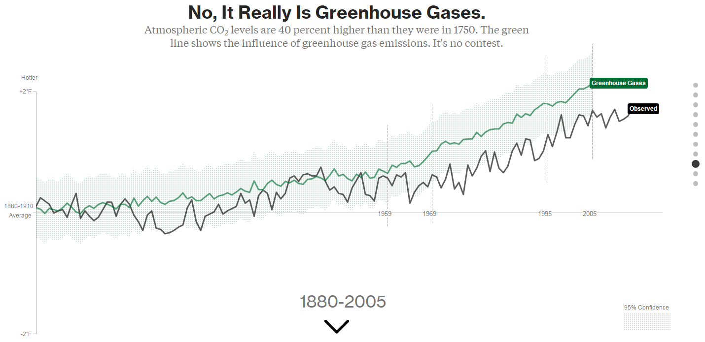
Here’s a close-up of the key part of the full-size version of their graph, showing the period for which we have Mauna Loa CO2 measurement data (March 1958 to present):
![bloomberg_GHGs_cropped[1]](https://wattsupwiththat.files.wordpress.com/2015/06/bloomberg_ghgs_cropped1.png?quality=75)
Compare that to a graph of actual measured CO2 levels since 1958:
![co2_data_mlo[1]](https://wattsupwiththat.files.wordpress.com/2015/06/co2_data_mlo1.png?quality=75)
Reality doesn’t look very much like the Bloomberg graph, does it?
For one thing, Roston & Migliozzi ended their graph with 2005, because GISS gave them old data. That’s convenient, considering the widening divergence between models and reality:
![spencer-73-cmip5-model-fail[1]](https://wattsupwiththat.files.wordpress.com/2015/06/spencer-73-cmip5-model-fail1.png?quality=75)
For another, if you read the “methodology” section of the Bloomberg piece, you’ll discover why Roston & Migliozzi showed no separate scale for their GHG levels. It’s because, despite the “greenhouse gases” label on their graph, they did not actually graph greenhouse gas levels.
That’s right. even though the graph’s caption says, “It Really Is Greenhouse Gases,” they really did not graph greenhouse gases.
Instead, they graphed what GISS’s favorite computer model apparently calculated that temperatures ought to have been, in an alternate reality in which GHG levels increased as they really did, but all other possible causes for climate change remained constant. (That’s the sort of thing they call an “experiment” these days, at NASA GISS. The scientists who made NASA great must be spinning in their graves.)
In other words, their graph just illustrates the assumptions in their own model.
Even so, it’s still obviously very wrong, and here’s why:
First: look at all those zig-zags, up and down, in their graph of GHG levels. Out of the 47 years they graphed since 1958, they show downward-zags in GHG levels for about a dozen of those years.
But there are no downward-zags in the real GHG data. CO2 levels have been monotonically rising at least since 1958 (and almost certainly well before that), and we have excellent, precise measurements since March, 1958.
Likewise, as far as is known, the (distant) second-most-important GHG, CH4 (methane), has not seen any decreases in levels over that time period (though good measurements don’t go back as far as for CO2). CH4 levels plateaued for a while, but they have never dropped, since measurements began.
Supposedly they actually graphed the temperatures which GISS’s ModelE2 model calculated would be caused by GHG forcings alone. But those model-calculated temperatures obviously could not driven solely by GHG levels, because, if they were, they could not decline as GHG levels were continuously increasing. So, at the very least, GISS clearly had other factors in their model driving temperatures, which were conflated with GHGs, which did not remain constant, and which also affected the reported calculated temperatures. If nothing else, they’re were at least driven by pseudo-random number generators (“fake noise”).
In fact, if you examine the source code, that model has lots of pseudo-random number generator calls! ModelE2 consists of about a half-million lines of moldy Fortran code, which it is safe to assume nobody actually understands. They’ve got so many fudge factors, “knobs” and pseudo-random number generator calls in there that they can make it do just about anything at all, but It doesn’t in any sense represent an understanding of the Earth’s climate system.
That means their so-called “experiments” with varying climate inputs are just about useless. Their “experiments” don’t really test anything except their ability to write Fortran code which models their own assumptions.
“With four parameters I can fit an elephant, and with five I can make him wiggle his trunk.”
– attributed to John von Neumann
Second, look at the slope of that green line. Roston & Migliozzi show an essentially constant upward slope in “greenhouse gases” (GHG-derived modelE2-predicted temperatures) for the entire Mauna Loa CO2 record period. But that’s just plain wrong. There was actually a large, sustained acceleration in the rate of CO2 level rise in the 1960s through 1980s.
It would be instructive to compare the first ten years of that record (1959-1969) with the last ten, but since GISS / Roston & Migliozzi ended their graph with 2005 we’ll have to compare to the last ten which they graphed, instead: 1995-2005.
From 1959 (the first full year of Mauna Loa data) to 1969, the annually averaged CO2 level at Mauna Loa increased from 315.98 to 324.63, an average increase of only 0.865 ppmv per year. But from 1995 to 2005 (the last ten years of Bloomberg’s graph), CO2 went from 360.88 to 379.67, an average increase of 1.879 ppmv per year, or more than twice the 1959-1969 rate of rise.
The rate of CO2 rise more than doubled, which is a hefty acceleration, but that acceleration is missing from Bloomberg’s graph.
In fact, they actually show a slightly larger increase for the 1959-1969 period than for the 1995-2005 period. I used WebPlotDigitizer to digitize points from the green (“greenhouse gases”) line of Bloomberg’s graph, for 1959, 1969, 1995 & 2005. The increase from 1959 to 1969 is actually 12% greater than the increase from 1995 to 2005. (I digitized those points before I realized that they hadn’t actually graphed greenhouse gas levels. So, assuming that 1959 represented 315.98 ppmv CO2 and 2005 represented 379.67 ppmv CO2, from the measured graph points I calculated 1969’s CO2 level as 331.70 (compared to the actual level of 324.63), and 1995’s level as 365.54 (compared to the actual level of 360.88). In other words, if that had actually been a graph of greenhouse gas levels, then it would show a 1959-1969 ten year increase of 15.72 ppmv CO2 [compared to the actual increase of only 8.65 ppmv], verses a 1995-2005 ten year increase of only 14.14 ppmv CO2 [compared to the actual 18.79 ppmv]. That made me think of Jeff Foxworthy: If you think GHG levels increased by less from 1995 to 2005 than they did from 1959 to 1969, you might be a Bloomberg subscriber.)
They didn’t really graph GHG levels, they graphed the supposed effect on temperature of GHG levels, but even that wasn’t realistic. The warming effect of CO2 diminishes logarithmically as levels go up, so it is true that an increase in CO2 levels starting from 316 ppmv causes less warming that an increase by the same amount starting from 361 ppmv. But the warming effect is not reduced by nearly as much as the Bloomberg graph indicates.
You can calculate it (very closely) like this: (18.79 / 365.5) / (8.65 / 316) = 1.88 In other words, the 18.79 ppmv ten-year increase in CO2 from 365.5 starting in 1995 should have caused 188% of the warming which was caused by the 8.65 ppmv ten-year increase from 316 ppmv starting in 1959. But the GISS / Bloomberg ModelE2 graph shows only 90% (rather than 188%) of the warming effect from CO2 for the 1995-2005 period, compared to the 1959-1969 period.
There’s obviously something very wrong with their model. (My guess is that they’ve been “tweaking the knobs” to try to minimize the model’s divergence from reality without dialing back climate sensitivity or the importance of CO2, either of which would amount to admitting they were wrong, and anthropogenic CO2 isn’t a catastrophe.)
Third, and most obvious: look at Bloomberg’s supposed “95% confidence interval” for “greenhouse gases.” Do you see it? They have just as much “confidence” for 1880 as they do for 2015!
What nonsense! The truth is that we know almost exactly what all the GHG levels are for recent decades, and we have only very rough estimates for the 1800s and the first half of the 20th century. It is ridiculous to ignore the confidence interval of the supposed driver, when calculating the confidence interval of the supposed effect. But that’s exactly what they obviously did.
graph fights, nice…
it doesn’t take away from the overall conclusion that human-generated CO2 is in greater numbers than every before and is having a profoundly negative effect on the planet, which of course is the point
No, not really.
rofl. quite the contrary lol.
The human emissions of CO2 have accelerated through the roof in the last decade:
http://edgar.jrc.ec.europa.eu/overview.php?v=CO2ts1990-2011
from 22060863.43 ktons in the 1990s to 24586832.08 in 2000 to 33376327.37 ktons 2011
A huge jump this century with no temperature increase this century.
Basically this invalidates the CO2 increasing temperature meme.
On the other side increasing CO2 in the atmosphere from 320 ppm in 1960 to 400 ppm now has ensured that 1 000 000 000 people more have something to eat.
http://www.co2science.org/data/plant_growth/plantgrowth.php
What? Climate change deniers still dare to come out in the open?
[well people such as yourself seem to have no problem staying in the shadows, hiding behind an acronym for a name, all the while calling others hateful names, such as “denier”. So juvenile, wouldn’t you agree, “marinus”? – Anthony Watts]
Oh my god, this blogpost is so messed up, haha! If you don’t know what you’re writing about, just don’t do it 😛
First you write this:
“First: look at all those zig-zags, up and down, in their graph of GHG levels. Out of the 47 years they graphed since 1958, they show downward-zags in GHG levels for about a dozen of those years.
But there are no downward-zags in the real GHG data. CO2 levels have been monotonically rising at least since 1958 (and almost certainly well before that), and we have excellent, precise measurements since March, 1958.”
and then you admit that you understand that they’re not mapping CO2 levels at all:
“They didn’t really graph GHG levels, they graphed the supposed effect on temperature of GHG levels, but even that wasn’t realistic.”
Clearly a very biased or very confused post..
Jakob, they claimed their graph shows just the effect of GHGs. But that cannot possibly be true. Their graph is inconsistent with that claim.
If their graph really showed just the effect on temperature of GHGs, it would have been been monotonically increasing, at least over the last half-century, because GHG levels have been monotonically increasing for considerably longer than that. It also would have shown some acceleration (increase in rate of temperature rise), since the forcing accelerated dramatically. Neither is true in their graph.
What the hell is wrong with you? Even if its ‘alarmist’, which it clearly isn’t, what is the negative side of taking care of the Earth by changing the way we are currently living. How about you put your best sweat pants and loafers on and actually go outside… and that doesn’t mean walk down the the corner store for another 4 liter bottle of mountain dew and a bag of doritos. Go to different countries, talk to people who really know the land like farmers and fishermen, environmentalists studying in the field, wildlife photographers… then see if you still feel the same.
A roll-back of the industrial age, to drastically reduce CO2 emissions, is not “taking care of the Earth,” montyedits. Drastic curbs on CO2 emissions would impoverish billions of people, without any benefit at all to the Earth and its natural plant and animal environments.
“Future generations will wonder in bemused amazement that the early twenty-first century’s developed world went into hysterical panic over a globally averaged temperature increase of a few tenths of a degree and, on the basis of gross exaggerations of highly uncertain computer projections combined into implausible chains of inference, proceeded to contemplate a roll back of the industrial age.”
-Dr. Richard Lindzen (Alfred P. Sloan Professor of Meteorology, Department of Earth, Atmospheric and Planetary Sciences, MIT)
In addition, if it were not for the anthropogenic contribution to CO2 levels, crop yields would be an average of about 20% lower than they currently is, everywhere in the world. Some of that loss could be made up for by cutting down more forests, to put more land under cultivation. (Is that what you want?) But millions of the world’s poorest people, who struggle to find enough food to eat, would face starvation, were it not for the agricultural productivity gains due to anthropogenic CO2.
http://sealevel.info/ScientificAmerican_1920-11-27_CO2_fertilization1_50pct.jpg
s/they is/they are/
(I sure wish we could edit our posts.)