Guest Post by Bob Tisdale
NOAA recently published their State of the Climate Report for May 2015. Under the heading of Global Summary Information, they note:
Note: With this report and data release, the National Centers for Environmental Information is transitioning to improved versions of its global land (GHCN-M version 3.3.0) and ocean (ERSST version 4.0.0) datasets. Please note that anomalies and ranks reflect the historical record according to these updated versions. Historical months and years may differ from what was reported in previous reports. For more, please visit the associated FAQ and supplemental information.
But of course we know the adjustments that led to the new NOAA ERSST.v4 sea surface temperature data (the biggest changes to the NOAA data took place in the ocean portion) are not supported during the global warming slowdown period by the night marine air temperature dataset (HadNMAT2 from the UKMO) that NOAA used for bias corrections. (See post here.) In other words, it appears NOAA overcooked their “improvements”. Oops!
On the NOAA Global Analysis – May 2015 webpage they state under the heading of Temperatures:
The combined average temperature over global land and ocean surfaces for May 2015 was the highest for May in the 136-year period of record, at 0.87°C (1.57°F) above the 20th century average of 14.8°C (58.6°F), surpassing the previous record set just one year ago by 0.08°C (0.14°F). This ties with February 1998 as the fourth highest monthly departure from average for any month on record. The two highest monthly departures from average occurred earlier this year in February and March, both at 0.89°C (1.60°F) above the 20th century average for their respective months.
Somehow I don’t think that will surprise anyone.
Figure 1 is a graph of the new NOAA Pause-Busting global surface temperature data from January 1979 to May 2015.

Figure 1
HOW DOES THE PAUSE-BUSTER DATA COMPARE TO THEIR EARLIER DATA FROM NOAA?
Animation 1 compares the new and old NOAA global land+ocean surface temperature data from January 1979 to April 2015, the last month of the old data. The data tweaking had little impact on the multidecadal warming rate.
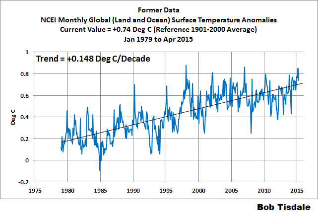
Animation 1
Animation 2 covers the period of January 2001 to April 2015. It shows that NOAA’s tweaking had a noticeable impact during the 21st Century, almost doubling the warming rate. Again, NOAA can’t justify those higher trends with the night marine air temperature data they used as a reference for the bias adjustments in their sea surface temperature data.
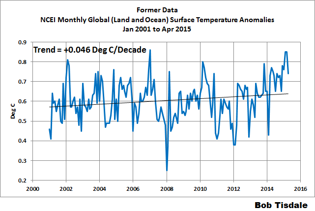
Animation 2
HOW DOES THE PAUSE-BUSTER DATA COMPARE TO THE OTHER GLOBAL DATASETS?
Figure 2 compares the new pause-buster data from NOAA to the global surface temperature products from GISS and UKMO and to the lower troposphere temperature data from RSS and UAH. I’ve used the new Release 6.0 data from UAH in the comparison. The anomalies of all datasets have been referenced to the WMO-preferred base years of 1981-2010.

Figure 2
There are of course differences in how each of the data suppliers handle the polar oceans. As soon as the new NOAA data are available at the KNMI Climate Explorer, I’ll present the comparison using the latitudes of 60S-60N. The new NOAA data should stand out like a sore thumb.
CLOSING
I’ll be using the new NOAA pause-buster data in the future monthly updates, starting next month. In each update from this day forward, I’ll remind everyone that the adjustments that led to the new NOAA sea surface temperature data, where the biggest changes took place, are not supported during the global warming slowdown period by the night marine air temperature dataset (HadNMAT2 from the UKMO) that NOAA used for bias corrections. And as I noted earlier, in other words, it appears NOAA overcooked their “improvements”. Hopefully, others will remind NOAA of that as well.
How do they get away with this? It’s tampering. Period. Full stop. Well, also, it says that they don’t trust their instruments, and neither should anyone. What a load of posteriorly-emitted hooey.
(Another wasted effort by a banned sockpuppet. Comment DELETED. -mod)
How do they get away with it?
The President ordered it.
OK, let’s make this three Mikes in a row 😉
Here is what the HadNMAT2 data that they supposedly used “correct” the SST data looks like.
So SST has a pause, NMAT2 has a pause but “correct” SST using NMAT2 and the pause disappears. Funny that.
as a scientist…
do you understand *anything* about science ?
data is a sacred thing, carved in stone
interpretation is not; esp with large data sets, all sorts of corrections updates and adjsutments are not only common, but *the right thing to do*
as we learn more, we can correct the old data
if, say, you learn that Type J thermocouples manufactured prior to 1950 had a 0.2oC offset compared to later ones, wouldn’t the prudent thing be to correct the data ?
that is how science in the real (not denialist) world works
The obvious problem with your delusion of how things work ‘in the real world’ is that most skeptics actually WORK in the real world. We know you’re lying. We know that if any company got caught playing these games they would get burned.
This isn’t about ‘fixing’ 70 year old data to match current work anymore. The Climate frauds already did that…numerous times. This is them lowering the data from less then 20 years ago, back when they were already riding the Climate gravy train. And again, and again and again. How many times now have they lowered the ‘record high’ temps from 20 years ago? How much had they falsely inflated those temps back then, and why should I believe they’re not doing the same now?
And how many times will they have to reduce 2015 temps in 2030 to keep the lie going?
So, science in the real world consists of revisionism? The ‘super-el Niño’ of 1998 is now no warmer than just another month of May. That’s the science of 1984.
Climate science has become political science. Your example does not apply.
*correction needed*
as a troll…
Scientists generally have a decent knowledge of grammar as it is inherently important to the trade.
We always correctly applied the statistical ground rules and just increased the uncertainty of the data in question. We never changed it, ever. We would go to jail for doing that.
Actually, isn’t it,”our Gav” in his new role
‘,
Climate “scientists” overcooking their results – never, shock horror!
This ‘organisation’ needs to be disbanded, but if the ‘boss’ AKA the little “o”approves of or drives it’s lies, there is only one solution, fire the CEO and board members…good luck America, you are going to need it…
What ever goes up must come down, and the more desperately the data is adjusted the harder it will eventually fall.
James hits the nail on the head. The anthropogenic portion of increasing CO2 does not have the potential energy to create this warming weather pattern variation driven by oceanic/atmospheric teleconnected changes that support and drive that warming. Temperature cannot increase without weather patterns supporting that change. And to change weather patterns takes no small amount of energy. Try moving the jet stream. Try moving an oceanically large warm pool from one place to a different place. Try developing thunderheads with just human sourced CO2 heating. Back of the envelope calculations easily demonstrate something else is at play. Something very large and very powerful. And no it isn’t the changes in the Sun. Not enough energy in that change either.
If the only entities large enough and powerful enough to create this warming pattern are the natural pattern variations in oceanic/atmospheric teleconnections, it will eventually reverse itself to our peril. So enjoy it while it is here. It is no more than a fickle but pleasant high in the terrible ups and downs Earth has yet to throw at us.
Unfortunately, the fast pace of ‘adjustments’ from the observational data concealers seems to indicate that the reversal has already taken place. These ‘scientists’ are digging themselves a hole from which history will not let them escape.
Busting the pause serves the political purposes of the President. He will use it as a justification to sign a new climate treaty, so if the trend they have established only lasts a few months, that’s no problem.
NOAA is just a political entity that serves the will of the left. Don’t try to find a scientific basis for the adjustments because there likely is none.
it isn’t the changes in the Sun. Not enough energy in that change either.
I keep hearing that. But suppose the change in wavelength matters more than energy delivered? Maybe wavelength changes energy absorbed.
but ..
no one said it is CO2
what people are saying is that CO2 increases water at the equator, and the combo of CO2 and water, esp after it gets into the upper atmosphere, where IR photons actually escape, is what does the trick
anyway, why don’t you calculate the area of the earths surface, and see how much energy is in 0.1cal per second per aquare meter….it is a lot of energy
also, you assertion that changes require a lot of energy….unproven; there maybe a a hump between states, but the states maybe roughly iso energetic, so all you need is a blip of energy to get over the hump (I;m using standard lingo for deltaG chemical reactions)
M Simon June 19, 2015 at 10:41 am
I keep hearing that. But suppose the change in wavelength matters more than energy delivered? Maybe wavelength changes energy absorbed.
///////////////////////////////////
As I often suggest to Willis, not all watts are born equal.
Wavelength determines where within the climate system the watt is absorbed. The absorptiion characteristices of EMR by water is wavelength dependent. It may well make a difference (at least in the short term) the depth at which energy is being absorbed by the oceans.
Re: UV and other extreme ends of the infrared band. The energy required to in situ bring temperature up in a stationary oceanic/atmospheric system will tell you where to look for that amount of energy. The following links will help you see that.
The amount of energy in the UV spectrum after it passes through the atmosphere is very small compared to visible light:
http://www.itacanet.org/the-sun-as-a-source-of-energy/part-2-solar-energy-reaching-the-earths-surface/
You can use this link to convert the various measures of energy:
http://www.mhi-inc.com/Converter/watt_calculator.htm
And you can use this link to see Specific Heat and the energy needed to raise a substance 1 degree Celsius. http://www.bickfordscience.com/03-05_State_Changes/PDF/Specific_Heat.pdf
Unfortunately, it only needs to hold up long enough for Obama to ramrod his agenda through.
“… the harder it will fall.”
You’re selling them short. They’re very bright liars and such people can keep a hoax going a very long time.
As long as some people are stupid enough to believe the propaganda and ignore their lying eyes.
As long as the pause buster stands up until after the Paris conference, it will have done what they wanted it to. After that they can bring in a new ‘improved’ version.
“….It’s the Paris agenda,
Normal weather’s no more,
Unprecedented and worst ever,
Watch the scare stories soar;
With factual inaccuracies
The politicians are plying,
As the real world observations
They keep on denying.”
http://rhymeafterrhyme.net/no-warming-pause-now-theres-a-surprise/
In real world Norway is reporting the coldest June since 1923 and a record overnight low was set in the Netherlands in Twente. The MetO forecast for a sizzling Spring in the UK fizzled out and Summer is limping along. Is 2015 the year that the cooling really starts and NOAA’s faked figures will look seriously out of step with reality, and more importantly, public perception?
As Adam Savage from Mythbusters said: “I reject your reality and substitute my own”.
All these data “adjustments”, all the models, all the propaganda and lies are used as substitutes for reality to paint whatever picture and tell whatever kind of story they want. It doesn’t matter if it doesn’t accurately reflect reality because they’ve successfully gotten the sheeple to believe the garbage they’re peddling is reality.
Sure, the house of cards they built is slowly crumbling and will eventually collapse, but before then they have caused and will cause an awful lot of damage.
Their numbers still show it started back in 2000.
Current – The combined average temperature over global land and ocean surfaces for May 2015 was the highest for May in the 136-year period of record, at 0.87°C (1.57°F) above the 20th century average of 14.8°C (58.6°F),
(1) The Climate of 1997 – Annual Global Temperature Index “The global average temperature of 62.45 degrees Fahrenheit for 1997” = 16.92°C.
http://www.ncdc.noaa.gov/sotc/global/1997/13
(2) 2014 annual global land and ocean surfaces temperature “The annually-averaged temperature was 0.69°C (1.24°F) above the 20th century average of 13.9°C (57.0°F). 0.69°C above 13.9°C => 0.69+13.9 = 14.59°C
http://www.ncdc.noaa.gov/sotc/global/2014/13
14.8 >> 16.92 << 14.59
Which number do you think NCDC/NOAA thinks is the record high. Failure at 3rd grade math or failure to scrub all the past. (See the ‘Ministry of Truth’ 1984).
What would it have been if they were still using the semi-adjusted HADCRUT3 version instead of the full-adjusted HADCRUT4.
12 month average anomaly
HADCRUT3 HADCRUT4
Dec 1998 0.55 0.52
Dec 2011 0.34 0.40
Increase/ -0.21 -0.12
The new version increases warming (or rather decreases cooling) since 1998 by 0.09C, a significant amount for a 13 year time span. Whilst the changes should not affect the trend in future years, they will affect the debate as to whether temperatures have increased in the last decade or so.
https://notalotofpeopleknowthat.wordpress.com/2012/10/10/hadcrut4-v-hadcrut3/Decrease
what part of “global” don’t you get ?
I don’t think anyone on our side denies that in a global system, there are a lot of “local” , on a global scale, anomolies; it is the GLOBAL avg that counts
do you know what a zombie argument is ?
This year is likely to be an El Nino year. Thus it is unlikely that NOAA’s recent adjustments will be exposed.
But if 2016/7 turns out to be a La Nina year, and should cooling begin to onset after that (whether because of a change in ocean dynamics/negative periods and/or a quiet sun etc) then they will begin to look out of place.
If the satellite data shows only a modest blip this year 9because of El Nino), a modest reversal next year (because of La Nina) and then no increase in temps through to 2020, one can imagine how the ‘pause’/’hiatus’ will lengthen and how model projections will all be outside their 95% confidence band.
In these circumstances, the satellite data is likely to confirm (or at any rate be consistent with the theory) that it is ocean cycles (particularly strong El Ninos) that drive temperature upwards in step changes, and not manmade CO2.
— Gerry, England
This rather nicely illustrates the decision time coming. For if we state that record low temps are occuring, then we are stating that natural variability is still greater than any putative CO2 forcing. And since both Positivism and Falsificationism have been both mentioned lately — it’s of note that such a record cold temp is sufficient for rejecting the AGW hypothesis under either notion.
The only possible salvage is, of course, to state that globally increased radiative feedbacks cause locally reduced radiative feedbacks; reduced farther than the global increase itself, and in excess of natural variability. But in taking that tack we must discard the global average temperature as wholly uninformative. A bit like trying to check the tire pressure in a car by speaking at length about fuel economy trends of the car itself. That is, it repudiates the utility of any notion of ‘global climate’ or ‘global temperature.’
But in bolting on such an ad-hoc hypothesis, we refute the previous AGW hypothesis and it’s claim as a ‘settled science.’ The ‘consensus’ remains valid, natch. It’s just that we now are stuck stating that 97% — or whatever — of climate scientists believe in the same falsehoods. But necessary to such a salvage is that the heat differences would be increased *regionally*, and so too then would be storm frequency and severity — which simply can’t be found in the data so far as I know. Which again suffices to reject the AGW hypothesis, this time with ad-hoc appendages, under both of Postivism and Falsificationism.
There is always a ‘third way’ that can be attempted with anything, of course. But the third way here is to state that the AGW hypothesis — without or without ad-hoc appendages — is not yet at such a severe point that it’s effects can be clearly shown. But if such is the claim, then it again fails under Positivism — there is no ‘best evidence’ metric satisfied as there is as yet no evidence at all sufficient for that task. A safe harbor can be found in Falsificationism only by repudiating every prior statement of ‘best evidence’ or other uses of Positivism. But in which case we’re simply stating that while it is ‘theoretically possible to falsify the hypothesis’ it has yet to undergo a critical test. That is, there is no legitimacy in stating that it is the One True Hypothesis versus just one of a large set of Wild Ass Guesses.
But that last attempted salvage is even more entertaining as while there is apparently such a strong consensus of Belief amongst Climate Scientists despite any Positivistic evidence there appears to be no consensus whatsoever about what the AGW hypothesis requires. For if it required anything concrete then there would exist a demonstrable falsification test, or point. And yet the only consensus there is that there’s a lack of consensus on when the model (hypothesis) failures violate what the AGW hypothesis requires. And here again, the AGW hypothesis violates the notion of Falsificationism.
Which is not to say that AGW isn’t science, so long as we define Science in just such a way to permit it. But if AGW is not a scientific theory under either of Positivism or Falsificationism, then it is the onus of Climate Scientists to point to whichever Philosophy of Science they require that demonstrates that they have legitimately produced a valid Scientific Theory. And by which means under that philosophy it can be demostrated to be sound, or unsound.
USA and Canada also just endured another colder than norm winter. Great Lakes ice was at 88% March 1. Prior year was at 92% Norm is 52%. True this is just weather but why is only hot weather reported
“Oops! We had it wrong! Warming reduces storms! So all the non-extreme weather proves GW after all. Whew!”
Typo alert:
“where the biggest changes too place,”
took?
Thanks, artwest. Fixed it.
Why do they go and do this in secret, aren’t they all in the game? inc. the Governments.
They could theoretically add +0.5 deg to 2015 and only a few skeptics would know. The general population would totally buy it.
I hope we get another “Climategate” before Paris, because I think your right the general population will buy it. These people totally disgust me, they should be kicked off the trough.
The potential is there. Several people have the files…
The general population, many of which just shivered through the coldest winter on record, with the longest stretch of below freezing temps ever, with icebergs washing ashore in New England, and the ocean frozen into sea ice and slush all the way down past New Jersey…is not buying it.
Not hardly.
It is just not something that people feel comfortable talking about, because of the deplorable tactics used and the media blitz that suppresses information contrary to the CAGW meme.
Most people know BS when they have it hurled at them.
The sea-ice went as far south as the southern Delmarva penninsula just north of the Chesapeake Bay mouth.
If they ever get round to measuring surface temperatures, rather than “surface” temperatures, let me know.
Only thing I’m amazed about, is that as far as is known, they didn’t resort to such tactics long ago. I guess they were afraid of being kicked-out of the scientific community if caught massaging data. It looks like their backers are now so concerned about the collapse of the CAGW propaganda machine, that ostracism is considered an acceptable risk.
Though, BEST data when first published as a graph had the post-2000 section snipped off to avoid revealing the embarrassing bit. The raw data still contained that section, which was probably a reluctant concession to the demands of scientific morals.
What scientific morals, in the climate department?
“I’m here to discuss scientific morals.”
“Oh, I’m sorry; this is climate science. You want Room 12A…”
(With apologies and thanks to Monty Python)
According to animation 1 the trend change in the new NOAA data versus the old data between 1979 and April 2015 is +0.03C/dec. Comparing UAH version 6.0 to the old v5.6 there’s a -0.03C/dec trend change over this same period.
Animation 2 shows that for the period 2001 to April 2015 the trend change in the new NOAA version was +0.05C/dec compared to the old version. In the new version of UAH, the trend change for the period 2001 to April 2015 amounts to -0.09C/dec lower than the old version (it went from +0.07 to -0.02C/dec).
Ignoring the direction of the changes, the recent revisions to UAH are on a similar magnitude to those made to NOAA over the longer term. However, the revisions made to UAH for the shorter period 2001 to April 2014 are around twice the magnitude of those made to NOAA.
Two questions arise:
1) Why no hullabaloo about the much greater UAH v6.0 trend change from 2001?
2) What do these examples tell us about the significance of trends over periods as short as ~15 years?
David R, reply to your question 1, the changes to the UAH TLT data bring the UAH TLT data into line with the RSS TLT data, while the changes to the NOAA data make it a warming outlier during the recent slowdown.
Reply to question 2, Judith Curry summed this up well in a recent post here:
http://judithcurry.com/2015/06/08/improving-climate-change-communication-moving-beyond-scientific-certainty/
Judith wrote:
“This new paper is especially interesting in context of the Karl et al paper, that ‘disappears’ the hiatus. I suspect that the main take home message for the public (those paying attention, anyways) is that the data is really really uncertain and there is plenty of opportunity for scientists to ‘cherry pick’ methods to get desired results.”
Regards
My answer to your question “2) What do these examples tell us about the significance of trends over period as short as ~15 years” would be this:
These examples tell us nothing of importance, they are of some interest but they lack the important piece of data to make a decision about global warming. The missing piece is CO2 data. The IPCC and all the collectors of temperature anomalies data will only plot these alone. But the claim is that warming is due to CO2 increases. If so, they should plot the CO2 data on the same graph. We have reliable CO2 data from Mauna Lua since 1958. So where is the correlation between the increase in temperature anomalies?
Fortunately, some do this as you can find many plots here:
http://www.climate4you.com/
Look at all the temperature anomalies (from any source) vs. CO2 concentrations graphs .
You will see about this:
Phase 1: 1958 to 1977 (or so) : CO2 is increasing, anomalies are decreasing
Phase 2: 1978 to 2003 (or so) : CO2 is increasing, anomalies are increasing, case for CO2 can be made
Phase 3: 2004 to now: CO2 is increasing, anomalies have no trend up or down or if any a slight trend up or down of no statistical significance, so there is no trend. Despite the fact (check the Mauna Lua site), that the yearly rate of increase in CO2 was much higher during these years.
You can draw your own conclusions. Here is what I think.
What is interesting is the public is never told this. Only the increase in temperature anomalies is presented and the claim that a reduction in CO2 will solve the problem.
Now, looking again at the graphs presented at this site, we have about 10 years (Phase 3) of no correlation between the increase in temperature and the increase in CO2, not a very long period, but yet how long a period of yearly increasing temperature anomalies will it take before we can again claim that there is a correlation with increasing CO2? So I look at the graphs again. Phase 1, about 20 years of no correlation, how many years would you say would be needed for the reversal (Phase 2) to be accepted as real?
So in essence the correction by NOAA is irrelevant, it is too small to bring back the correlation with increasing CO2 and it will take many years of increasing temperature anomalies to catch up to increasing CO2 before a correlation is established again. Not that I want to predict anything.
Note: There is also an interesting plot at this site using polynomial fit of CO2 vs. temperature anomalies.
David R.
I was thinking that as well – some of the adjustments made to the UAH dataset are larger than the adjustments made to the NOAA dataset. This has been pointed out on other blogs.
I notice the latest NOAA Global report shows a large difference between global average temperature reported from the UAH and RSS TLT datasets. Carl Meares of RSS did comment on his blog that the surface datasets agree with each other better than the satellite datasets.
Carl Meares of RSS did comment on his blog that the surface datasets agree with each other better than the satellite datasets.
You don’t have to be a rocket scientist to work that one out – just take a look at the collusion that went on in the Climategate emails.
In my opinion, 15 years is a blip wrt short and long term natural weather pattern variations. However, the 15 year period is the length of time given by the modelers. According to their own calculations, any length of time greater than 15 should show warming if their models are to be considered correct.
http://judithcurry.com/2014/12/15/will-a-return-of-rising-temperatures-validate-the-climate-models/
Thank goodness someone came up with a new re-construction that hides the plateau. This previously rejected, now treasured statistical maneuver is lovingly referred to by many climate scientists as Mike’s Nature Trick I believe. On steroids and heroin, downed with a shot of whiskey, whilst dressed in an SS uniform.
http://climateaudit.org/2011/03/29/keiths-science-trick-mikes-nature-trick-and-phils-combo/
Steve: You need to update your post to add the NOAA Ship Trick.
Pamela Gray.
That “15 year period” is a myth – I looked into it a while ago.
If you have any citations to the scientific literature that say otherwise I will have a look.
I am still trying to find information on the % of current IPCC models that have pauses of 15 or more years. I know that statistic lives somewhere in the literature. I will keep looking. Meanwhile there is a lot of noise still happening out there about the length of this pause, even after the slight adjustment up with the latest NOAA reconstructed data set (which will eventually lie in embarrassed silence).
http://www.nature.com/news/climate-change-the-case-of-the-missing-heat-1.14525
AR5 working group1, ch 9, p.743:
“Most simulations of the historical period do not reproduce the observed reduction in global mean surface warming trend over the last 10 to 15 years. There is medium confidence that the trend difference between models and observations during 1998–2012 is to a substantial degree caused by…” [insert kitchen sink].
https://www.ipcc.ch/pdf/assessment-report/ar5/wg1/WG1AR5_Chapter09_FINAL.pdf
These authors seem entirely unable to provide facts and instead use non-scientific qualifiers such as “…most…do not…”. What the hell does “most” mean exactly?
From wikipedia: “Recent findings have cast doubt on the previously-agreed hiatus in the first decade of the 21st Century.[6][7] The new analysis corrects for known biases in ocean temperature measurements and adds new land temperature records, though the new data still shows the warming trend to have been slower than in the previous decades.[8]” https://en.wikipedia.org/wiki/Global_warming_hiatus
Notice that they say the new analysis “corrects” for known biases. If that is true they would have corrected the ship intake measure, not correct everything else to it. The bias IS the ship intake data!
The following link to research suggests that ship intake data should be corrected. And they demonstrate how. Apparently that is not the case anymore? Wonder what the authors of this paper think about that.
ftp://podaac.jpl.nasa.gov/allData/gosta_plus/retired/L2/hdf/docs/papers/1-crrt/1-CRRT.HTM
Every year for the last decade NOAA has predicted that the entire US would be warmer than previously. Over and over again, they predict only warming. Now that cooling is painfully obvious, they ‘predict’ cooling after it happens, not before. But if you look at the maps of all their yearly predictions, it shows only warming.
This has rendered them utterly useless to farmers, for example, who no longer use NOAA information to plan ahead. I use their predictions only for humor.
The release of this version is very brave. If there are any incriminating emails that imply the data was influenced by anything but observations…
Well, Climategate took place just before Copenhagen.
NOAA scientists are very brave.
I’ve often wondered if the climate emails (I refuse to call it ‘climategate’) were released by Russian hackers. Since they have even more of an axe to grind this time, maybe MCourtney will be right. Jeez, that’ll be a first, MCourtney! 🙂
Unlikely the Russians. Russia Today strongly pitches Global Warming. Russia wants the West to stop fracking and mining coal and destroy our economies. The Russian government would not let climatgate emails slow down our rush to suicide…
Bob,
There is no reason to expect that the rise in May relative to last year (and the record level) is due to the new version. Here is a table of the differences between successive May’s since 2000:
The changes are minor compared to the amount (0.08°C) by which May 2015 exceeded May 2014, the previous record in both old and new.
Oh yes, I believe instrument data to be so precise as to make this observation solid as granite. (rolls eyes)
HadNMAT in, hazmat out. (NOAA’s Arc.)
it’s all about reinforcing the Pope’s Encyclical. here’s another example:
16 June: Phys.org: A third of the world’s biggest groundwater basins are in distress
Two new studies led by UC Irvine using data from NASA Gravity Recovery and Climate Experiment satellites show that civilization is rapidly draining some of its largest groundwater basins, yet there is ***little to no accurate data about how much water remains in them.
The result is that significant segments of Earth’s population are consuming groundwater quickly ***without knowing when it might run out, the researchers conclude. The findings appear today in Water Resources Research.
***”Available physical and chemical measurements are simply insufficient,” said UCI professor and principal investigator Jay Famiglietti, who is also the senior water scientist at NASA’s Jet Propulsion Laboratory. “Given how quickly we are consuming the world’s groundwater reserves, we need a coordinated global effort ***to determine how much is left.”…
http://phys.org/news/2015-06-world-biggest-groundwater-basins-distress.html
***how did the above vague observations end up as dire warnings in the world’s MSM?
A third of world’s aquifers are being sucked dry: NASA data – Reuters
New NASA data show how the world is running out of water – WaPo
Study: A Third of Global Groundwater Basins Are Overstressed – New York Times
Many of the world’s water basins are being depleted, studies find – Los Angeles Times
The global warming scam has become a multi-billion dollar industry. All the beneficiaries of that scam realise that as soon as one of them says there is no problem, their research funding dries up. So, what would you do?
Don’t hope for objectivity or honesty. Don’t waste time with facts or counter-arguments. A billion dollar bribe buys a lot of dishonesty.
“The integrity of Science and Truth itself have been jeopardised by the campaign to distort evidence to support man-made global warming.
Scientific method is not natural to most human beings; we are all fallible creatures with our own motives and prejudices. Science based on careful observation and experiment has been replaced by speculation based on politics and computer models”
Even if God intervened and gave advice regarding these folks, you’d just see an updated version of 1 Samual Chapter 8. About 3,000 years ago +/-.
Some today might call it call the Joseph Goebbels Effect of a lie told often enough becomes truth but thousands of years of history proving the “elites” always win. Sometimes I think their all Social Dawinists. This will not end well.
Just honest climate results, that’s all.
But wait, there’s more!!!
Buy this line of BS now, and receive an all expense paid trip to Paris (for us, not you), polar bear extinction, and ocean acidification – all totally FREE!!!*
.
.
.
.
*By free we mean at excruciatingly high taxpayer expense.
Offer not good on WUWT.
????????????
In Figure 1, the data could be divided in to two parts, namely prior to 1995-2000 and after 1995-2000. These two segments present two horizontal fits with a jump at 1995-2000. Year to year variation is a common feature.
Dr. S. Jeevananda Reddy
I don’t see how you get two horizontal fits for the periods 1979-1994 and 2001 – present. Using the latest NOAA data from their site, the trend from Jan 1979 to Dec 1994 is 0.08C/dec. From Jan 1995 to Dec 2000 the trend is actually slightly slower, at 0.07C/dec. Since Jan 2001, the trend in the NOAA data is now +0.13C/dec.
The full trend in the latest NOAA data since 1979 is 0.15C/dec, which is in good agreement with all the other surface data sets and just fractionally warmer than the satellites.
So you take the best quality data you have – reasonably accurate thermometers – and feed it into a black box that uses (we assume) much lower quality data to adjust it.
How do we know it’s lower quality data? Because otherwise you would use that data for your evidence.
And somehow the resulting data is more accurate?
Seriously, are there no climate scientists out there that will call foul on this?
Yes, and you will find many of them here and on other blog sites.
Here is a short list of people with a little bit of education who are willing to call the whole thing a sham, and to do so explicitly and in public:
http://www.petitionproject.org/
I know it is difficult to make definitive statements based on an overview of a situation, but here I go.
If one takes a look at the cryosphere today pictures of the northern hemisphere (see the sea ice pages) and note that vast swathes of Canada/Russia and Alaska are still under snow or ice towards the end of June compared to previous years of no snow and ice, the question is “How hot must the rest of the planet be to counteract this volume of snow and ice? I also thought that the claim was that the warming was due, in part, to warmer Arctic temperatures – really?
Steve T
Thank you SteveT for giving me the opportunity to slip in a question to the experts here on one of the cryosphere today charts , on the sea ice ref page , that i find a bit puzzling.
http://arctic.atmos.uiuc.edu/cryosphere/IMAGES/seaice.anomaly.arctic.png
On the chart there are 4 visually distinguishable sections :
1979- 1997 (approx) : mean positive anomaly , and large variation in max and min both on seasonal basis and year – to year
1997-2007: gradually reducing sea ice , but variations, seasonal and annual are much reduced
2007-2013: constant negative mean sea ice anomaly , but increased variations , like 1979-1997
2013 – present : mean sea ice increasing , and variations , once again , much reduced .
Is this change in he noise which seems visually so obvious what one expects from AGW theory and are the visual observations backed up by proper analysis of the numerical data for the periods mentioned above?
I wonder what that looks like in ice volume rather than extent.
==============
And when those two charts do not look sufficiently worrisome, they can see if the ice thickness chart makes a better fit with the panic mongering of the day.
Hey Steve, I think you missed this:
Note: snow cover data not updating … we hope to have a new data source by July, 2015.
Accepted, hook line and siker, by all alarmists here in Australia. The SBS is pushing that “The Australian Govn’t has accepted The Pope’s challenge.
sorry, but NOAA’s bag of digits do not deserve to be called data any more. Call it a result.
Or a forgery.
Or just bullshit.
It has not deserved to be called data since they began “adjusting” it. Post “adjustment”, we are dealing with an estimate of what the data might have been had they been collected timely from properly selected, calibrated, sited, installed and maintained instruments; or, perhaps, an estimate of what someone believes the data should have been.
It isn’t science any more, it is Data Tayloring. The product being a propaganda cover cloth…
To all three above^:
Yes, yup, and I agree.
It’s incredibly amusing how they claim we know the temperature to point-zero-whatever degrees, then release a new set of data that adjusts the temperatures by more than that amount, and get away with it! We ought to claim the error bars are the deltas between the raw data and the “most adjusted” data set. Every time TPTB mess with the raw data, the error bars would then get worse.
Error bars?
What error bars?
We no have no error bars!
WE DON’T NEED NO STINKING ERROR BARS!
The perform the calculations numerous times using different methods, and thus, by the law of climate statistics, crappy data becomes a highly precise result with 97% confidence level of being so accurate it can be regarded as factual. No one puts error bars on facts.
I found this chart the other day…
Then I went back and found this one on NASA’s page…
http://dsx.weather.com/util/image/w/nasa-may-2015-temp-anoms.jpg?v=at&w=980&h=551&api=7db9fe61-7414-47b5-9871-e17d87b8b6a0
How can May 2015 be hotter than May 2014? It appears that there is a drop from ’14 to ’15 according to their chart.
Why would you use an anomaly chart with a 1951-1980 baseline?
“How can May 2015 be hotter than May 2014? It appears that there is a drop from ’14 to ’15 according to their chart”
Easy. The past was always adjusted up too much, and so has to be adjusted down, and the present is always measured too low and so has to be adjusted up. Every couple of years the entire past gets adjusted lower than it was measured, and the present becomes the warmest ever. Brilliant, really.
The real artistry is achieved with the timing; or speed with which the adjustments are made. Just slightly faster than the speed of smell.
Kenny, there have always been differences between the monthly data from NOAA and GISS.
I have the impression that there are also always differences between monthly data from NOAA and monthly data from NOAA.