Did SNL’s Tommy Flanagan Oversee the New Surface Temperature Data?
By Bob Tisdale and Anthony Watts, commentary from Dr. Judith Curry follows
There is a new paper published the journal Science about the recent slowdown in global surface warming (released from embargo today at 2PM eastern). It is from Tom Karl and others at NOAA’s newly formed NCEI, National Centers for Environmental Information (a merger of three NOAA data centers: NCDC, NODC and NGDC) and from the government-consulting firm LMI. The lead author is Tom Karl, Director of NCEI and Chair of the Subcommittee on Global Change Research (SGCR) of the U.S. Global Change Research Program (USGCRP). The paper is Karl et al (2015) Possible artifacts of data biases in the recent global surface warming hiatus. “Possible” is obviously the key word in the title.
There is a big push by the American Association for the advancement of Science (AAAS) to promote this paper. Here is what they sent out to press contacts days in advance:
Science Press Package
This information is embargoed until:
2:00 PM U.S. Eastern Time, Thursday, 4 June 2015
Check timezone conversions here.
Please cite the journal Science and the publisher, AAAS, the science society, as the source of this information. Please hyperlink to www.sciencemag.org when publishing online.
Summaries of Articles in the 5 June Science
Evidence Against a Global Warming Hiatus?
An analysis using updated global surface temperature data disputes the existence of a 21st century global warming slowdown described in studies including the latest Intergovernmental Panel on Climate Change (IPCC) assessment. The new analysis suggests no discernable decrease in the rate of warming between the second half of the 20th century, a period marked by manmade warming, and the first fifteen years of the 21st century, a period dubbed a global warming “hiatus.” Numerous studies have been done to explain the possible causes of the apparent hiatus. Here, Karl and colleagues focused on aspects of the hiatus influenced by biases from temperature observation networks, which are always changing. Using updated and corrected temperature observations taken at thousands of weather observing stations over land and as many commercial ships and buoys at sea, the researchers show that temperatures in the 21st century did not plateau, as thought. Instead, the rate of warming during the first fifteen years of the 21st century is at least as great as that in the last half of the 20th century, suggesting warming is continuing apace. According to these and other results, the authors suggest the warming slowdown was an illusion, an artifact of earlier analyses.
Article #16: “Possible artifacts of data biases in the recent global surface warming hiatus,” by T.R. Karl; A. Arguez; B. Huang; J.H. Lawrimore; M.J. Menne; T.C. Peterson; R.S. Vose; H.-M. Zhang at National Oceanographic and Atmospheric Administration (NOAA) in Asheville, NC; J.R. McMahon at LMI in McLean, VA.
The abstract of Karl et al (2015) reads (our boldface):
Much study has been devoted to the possible causes of an apparent decrease in the upward trend of global surface temperatures since 1998, a phenomenon that has been dubbed the global warming “hiatus.” Here we present an updated global surface temperature analysis that reveals that global trends are higher than reported by the IPCC, especially in recent decades, and that the central estimate for the rate of warming during the first 15 years of the 21st century is at least as great as the last half of the 20th century. These results do not support the notion of a “slowdown” in the increase of global surface temperature.
Karl et al expand on that highlighted discussion in the text of the paper (our boldface):
It is also noteworthy that the new global trends are statistically significant and positive at the 0.10 significance level for 1998–2012 (Fig. 1 and table S1) using the approach described in (25) for determining trend uncertainty. In contrast, IPCC (1), which also utilized the approach in (25), re-ported no statistically significant trends for 1998-2012 in any of the three primary global surface temperature datasets. Moreover, for 1998–2014, our new global trend is 0.106± 0.058°C dec−1, and for 2000–2014 it is 0.116± 0.067°C dec−1 (see table S1 for details). This is similar to the warming of the last half of the 20th century (Fig. 1). A more comprehensive approach for determining the 0.10 significance level (see supplement) that also accounts for the impact of annual errors of estimate on the trend, also shows that the 1998–2014 and 2000–2014 trends (but not 1998–2012) were positive at the 0.10 significance level.
THE MISDIRECTION
As shown in their Figure 1 (also our Figure 1), Karl et al. (2015) used the periods of 1951 to 2012 and 1950 to 1999 as references for the recent slowdown in surface warming. The IPCC’s 5th Assessment Report serves as the justification for the early-1950s start point for their reference periods. See Chapter 2 and Chapter 9 of AR5 for the IPCC’s brief mention of the slowdown in global surface warming.

Figure 1
Yet the climate model-based projections of a disaster-filled future global surface warming better align with the warming rate of the recent warming period, which began in the mid-1970s, not 1950. See Figure 2, which uses the GISS Land-Ocean Temperature Index data, because the new NCDC data have not yet been released. Keep in mind there was an earlier hiatus that lasted from the early-to-mid 1940s to the mid-1970s.

Figure 2
If NOAA would like to revise their estimates of future global warming to reflect the more benign warming rate of 0.1 deg C/decade from 1950 to 1999, it would be a big step toward their coming to terms with reality.
We illustrate the ever-growing differences between models and data in the monthly global surface temperature (and lower troposphere temperature) update posts. Figure 3 is the model-data comparison from the April 2015 update.

Figure 3
NEW DATA USED
In many respects, the paper is an introduction to a revised global surface temperature dataset from NOAA. For the oceans, it includes their new ERSST.v4 sea surface temperature data. We discussed that new NOAA sea surface temperature data in the post Has NOAA Once Again Tried to Adjust Data to Match Climate Models? (The WattsUpWithThat cross post is here.)
For the land portion, Karl et al. (2015) state:
Third, there have also been advancements in the calculation of land surface air temperatures (LSTs). The most important is the release of the International Surface Temperature Initiative (ISTI) databank (14, 19), which forms the basis of the LST component of our new analysis. The ISTI databank integrates the Global Historical Climatology Network (GHCN)–Daily dataset (20) with over 40 other historical data sources, more than doubling the number of stations available.
ADJUSTMENTS MAKE MOST OF THE WARMING
NCDC has been in the business of adjusting the surface temperature record for quite some time. The modus operandi so far has been to get a new paper published describing what NCDC considers to be a new and improved dataset, and since NCDC’s articles are often peer reviewed by other government employed scientists at NOAA, they often don’t get a critical peer review. Certainly, based on the reports I’ve received over the years, few if any skeptic scientists have ever been asked to review an NCDC paper on a new global temperature dataset and the techniques involved.
Fortunately, it is very easy to divine such adjustments by comparing the raw data and the final adjusted data, as shown in the graph below. Note how the past gets cooler, centered around 1915 and the present gets warmer.
![NCDC%20MaturityDiagramSince20080517[1]](https://wattsupwiththat.files.wordpress.com/2015/06/ncdc20maturitydiagramsince200805171.gif)
On May 2, 2011, NCDC transitioned to GHCN-M version 3 as the official land component of its global temperature monitoring efforts. In November 2011, the GHCN-M version 3.1.0 replaced the GHCN-M version 3. The overall net effect of the transition from GHCN-M version 2 to version 3 is to increase global temperatures before 1900, to decrease them between 1900 and 1950, and to increase temperatures after 1950.
The diagram below exemplify adjustments made by NCDC since May 2008 for two single months (see arrows in diagram above); January 1915 and January 2000.
![NCDC%20Jan1915%20and%20Jan2000[1]](https://wattsupwiththat.files.wordpress.com/2015/06/ncdc20jan191520and20jan20001.gif)
Clearly, with each revision of data, NCDC is making the past cooler and the near present warmer through their adjustment process of the original data. To revisit something said in regards to a previous news story about NCDC’s tendency to adjust data as time goes on, so much so that they can’t even tell us with certainty anymore which month in the past century was the warmest on record, this is still applicable:
“Is history malleable? Can temperature data of the past be molded to fit a purpose? It certainly seems to be the case here, where the temperature for July 1936 reported … changes with the moment,” Watts told FoxNews.com.
“In the business and trading world, people go to jail for such manipulations of data.”
Hold that thought, because NCDC is at it again.
THE IMPACT OF NOAA’S SHIP-BUOY BIAS ADJUSTMENTS DURING THE SLOWDOWN HAVE MADE THEIR NEW SEA SURFACE TEMPERATURE DATASET AN OUTLIER
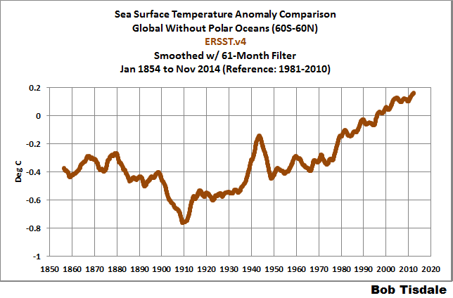
You’ll note in Figure 1 that the biggest changes between the new and old NOAA data during the global-warming-slowdown periods are in the sea surface temperature data, not the land surface air temperature data. Those adjustments are supposed to be justified by ship-buoy biases. See the quotes in the post Quick Look at the DATA for the New NOAA Sea Surface Temperature Dataset, under the heading of SHIP-BUOY BIAS CORRECTIONS IN ERSST.v4.
(Note 1: the buoys being discussed are NOT ARGO floats. The buoys used for sea surface temperature measurements are Surface Drifting Buoys and fixed buoys like the TAO Project buoys. Note 2: the latitudes of 60S-60N were used for the following graphs to avoid any differences in how sea ice is accounted for between the datasets and to be consistent with the two papers that introduced the new ERSST.v4 data. Note 3: the trends shown are for sea surface temperatures. They are not directly comparable to the trends discussed by Karl et al. in the second quote, which were for combined land-plus-ocean data.)
THE UKMO HASST3 data have also been adjusted for ship-buoy biases. For the two slowdown periods presented by Karl et al., Figures 6 and 7 compare the HADSST3 and the new NOAA ERSST.v4 data, both of which have been “corrected” for ship-buoys biases, to the older NOAA ERSST.v3b which had not been adjusted for those biases. During both periods, the bias-adjusted HADSST3 data have a much lower trend than the bias-adjusted NOAA ERSST.v4 data. In fact, the bias-corrected HADSST3 data in both cases is more in line with the older NOAA data than the new.

Figure 6

Figure 7
Some might think that NOAA under the direction of Tom Karl designed their ship-buoy bias adjustments with the sole intent of minimizing the impacts of natural slowdown in surface warming. (Those would be some interesting emails and meeting minutes to read.)
And just in case you’re wondering, the new NOAA ERSST.v4 data are compared to the NOAA and UKMO satellite-enhanced sea surface temperature data in Figures 8 and 9.

Figure 8

Figure 9
As noted in the heading, with their new adjustments, NOAA has created an outlier in their new sea surface temperature dataset. Add that to the curious spike in the late-1930s and1940s that can’t be explained by climate models, which were presented in the post here.
BUT THE WARMING RATES OF NOAA’S OLD AND NEW SEA SURFACE TEMPERATURE DATA ARE THE SAME OVER THE PAST 3+ DECADES
The satellite era of sea surface temperature data started in November 1981. Neither of the NOAA sea surface temperature reconstructions (new or old) utilize the satellite-enhanced data. The original version of the NOAA ERSST.v3 data included satellite data when they were first released in 2008, but the satellite data were removed before the dataset became “official” because they did not meet political agenda of the dataset users, which were only NOAA at that time. The revised dataset was renamed ERSST.v3b. It is ERSST.v3b that Karl et al. are calling the “old” data.
But we can learn something very interesting if we compare NOAA’s ERSST.v4 (new) and ERSST.v3b (old) data during the satellite era. See Figure 10.

Figure 10
The warming rates are the same.
But the new data show a much higher warming rate during the “hiatus” periods, and that means…
TO MANUFACTURE WARMING DURING THE HIATUS, NOAA ADJUSTED THE PRE-HIATUS DATA DOWNWARD
If we subtract the ERSST.v3b (old) data from the new ERSST.v4 data, Figure 11, we can see that that is exactly what NOAA did.

Figure 11
Remember the adjusted data from figures 4 and 5 above? Figure 11 uses the same data subtraction method to determine the difference between the original measured data, and the “new and improved”adjusted data courtesy of government-funded science. It’s the same story all over again; the adjustments go towards cooling the past and thus increasing the slope of temperature rise.
Their intent and methods are so obvious they’re laughable.
It’s like John Lovitz Saturday Night Live character “Pathological liar”, Tommy Flanagan was in charge.
Gee, we need to show more sea surface warming during the hiatus, but we don’t want to increase the trend since about 1982.
 It’s hard to imagine how anyone could take the new NOAA global surface temperature data seriously.
SEA SURFACE TEMPERATURE DATA SOURCE
The sea surface temperature data presented in this post are available from the KNMI Climate Explorer.
Comments from Georgia Tech Climatologist Dr. Judith Curry:
The greatest changes in the new NOAA surface temperature analysis is to the ocean temperatures since 1998. This seems rather ironic, since this is the period where there is the greatest coverage of data with the highest quality of measurements – ARGO buoys and satellites don’t show a warming trend. Nevertheless, the NOAA team finds a substantial increase in the ocean surface temperature anomaly trend since 1998.
In my opinion, the gold standard dataset for global ocean surface temperatures is the UK dataset, HadSST3. A review of the uncertainties is given in this paper by John Kennedy http://www.metoffice.gov.uk/hadobs/hadsst3/uncertainty.html. Note, the UK group has dealt with the same issues raised by the NOAA team. I personally see no reason to the use the NOAA ERSST dataset, I do not see any evidence that the NOAA group has done anywhere near as careful a job as the UK group in processing the ocean temperatures.
I am also unconvinced by NOAA’s gap filling in the Arctic, and in my opinion this introduces substantial error into their analysis. I addressed the issue of gap filling in the Arctic in this recent publication: Curry JA, 2014: Climate science: Uncertain temperature trends. Nature Geoscience, 7, 83-84.
Relevant text:
Gap filling in the Arctic is complicated by the presence of land, open water and temporally varying sea ice extent, because each surface type has a distinctly different amplitude and phasing of the annual cycle of surface temperature. Notably, the surface temperature of sea ice remains flat during the sea ice melt period roughly between June and September, whereas land surface warming peaks around July 1. Hence using land temperatures to infer ocean or sea ice temperatures can incur significant biases.
With regards to uncertainty, in their ‘warmest year’ announcement last January, NOAA cited an error margin in the global average surface temperature anomaly of 0.09oC. The adjustments to the global average surface temperature anomaly is within the error margin, but the large magnitude of the adjustments further support a larger error margin. But they now cite a substantially greater trend for the period 1998-2014, that is now statistically greater than zero at the 90% confidence level.
My bottom line assessment is this. I think that uncertainties in global surface temperature anomalies is substantially understated. The surface temperature data sets that I have confidence in are the UK group and also Berkeley Earth. This short paper in Science is not adequate to explain and explore the very large changes that have been made to the NOAA data set. The global surface temperature datasets are clearly a moving target. So while I’m sure this latest analysis from NOAA will be regarded as politically useful for the Obama administration, I don’t regard it as a particularly useful contribution to our scientific understanding of what is going on.
This is completely out of control. What is NOAA’s value add?
Heh. Negative, no doubt. Aaaand. looks like somebody else knows it…
To wit: “… a merger of three NOAA data centers… ”
Now, slightly less negative (still worth every P.R. penny in the Enviroprofiteer/stalinist’s eyes, NO doubt).
The value add is supposed to be that they are the data stewards of our temperature record. Unfortunately instead of acting with the integrity and objectivity required of data stewards, NOAA leadership is more comfortable in the role of political hacks.
Has anyone ever asked NOAA what the data would look like if no adjustments had been made?
http://www.ncdc.noaa.gov/sotc/service/global/global-land-ocean-mntp-anom/201101-201112.png
minus
http://www.ncdc.noaa.gov/img/climate/research/ushcn/ts.ushcn_anom25_diffs_urb-raw_pg.gif
nope…Here is what they had before anthropogenic causes…

and,,,
a consensus of a different sort…
Think of what the have done to the disparate baselines. The whole record is now nothing but FUBAR. “Oh the tangles webs….
Actually, if you read the paper you are discussing, they include a graph comparing the data with no adjustments to that with adjustments. The truth is a tad… inconvenient :-p
http://s30.postimg.org/gu23oylhd/Screen_Shot_2015_06_04_at_11_19_59_PM.png
Zeke, I am discussing how much the data has changed. The graph of small adjustments only shows a small portion of the overall adjustments. Do you disagree that the graphs I posted are historic data?
Thanks, Anthony, Bob.
This is ridiculous, and menacing. Not laughable.
Andres Valencia,
You are always so encouraging to others here on WUWT. Just wanted you to know you shine — and it shows. “Valencia,” a sweet orange — perfect.
Thanks for being such a good example for the rest of us!
(and “the old country’s” loss was America’s gain — glad you got out! — you have expert witness testimony to share…)
Janice
Thanks, Janice. You are too kind.
Is there any way that these people can be prosecuted for fraud?
Prosecute them for fraud? It would be difficult… The group of people who are funding the fraud are the same group of people who run the court system.
Karl et al 2015 say they used the ISTI database for land temperatures. I’ve been keeping track of the ISTI database. In February I did a duplicate check on their monthly ‘Recommended’ stage 3 database. It is a compiliation of all data they haven’t discarded as obviously in error. 32000+ stations, almost 1.4 million lines of data. I found the database is heavily polluted with duplicate data across stations within an individual country. In some cases more than 10 stations within a single country contain many months of identical data when compared with other in country stations for the same year, though not for all years of their records. e.g. station ‘A’ has the same monthly data as stations “B-K” for 1951-1957, but may all be quite different in other years. In actuality many of the duplications can go on for decades at a time. I wrote the ISTI group back in October pointing out Finland and also Sweden as examples having some records of more than 160 years with 2/3rds of it duplicated at other stations.
Nowhere on the ISTI site can I find a pared down database with all such duplicates removed or any indication of how they would select which station has the correct data. I view that dataset as a work in progress with currently no legitimate reason for its use. I found 73,581 cases of duplicate data of at least 7 months in a year, 26807 of those had 12 months duplicated. Common missing months across stations were not considered duplicates.
Even with removal of duplicate data they would still have to justify which station’s data to retain as not all years are duplicated. I’m very much interested in finding out how they selected station data or if they used the whole dataset. Seems to me it is a fertile ground for finding cherries.
Here is a log. graph of the annual monthly duplications I found when comparing the same year to same year for all combinations of stations within a country. The distribution is terribly skewed from what should be normal.
If the graph doesn’t show here is an alternate URL. http://i58.tinypic.com/sf8k5w.png
Here is a breakdown of the matches.
Annual months matched
0 2277474697
1 13688686
2 197973
3 13289
4 3497
5 1772
6 1418
7 1054
8 1282
9 1649
10 2242
11 3746
12 26807
total years compared 2291418112
Those are identical matches shown above, but due to rounding many stations do not use the 100ths field, I think a more appropriate monthly comparison is +/- 0.05C. Using that for comparison would more than double the matches found.
I don’t know why neither the graph or the link worked. Here is another link.
http://oi58.tinypic.com/sf8k5w.jpg
Let me get this straight. When skeptics say there is bias in the temperature series, AGW scientists say we are full of horse sh**. But when THEY say the temperature series is full of bias, it’s okie dokie.
Okie dokie. I think I understand this.
The UK Guardian website full of the usual “I’ll trust the scientists” comments in response to any criticism of the paper. How easy it now is to lead the sheeple by the nose.
Dr Curry would be taken more seriously if she avoids implying a political conspiracy.
If you cannot see the conspiracy, you’re blind as a bat.
Literally $Billions are shoveled into “climate studies”, just in the U.S. alone — every year! Only the terminally dense can’t see that lots of ethics-challenged scientists will go along with the “dangerous man-made global warming” scam for the easy money.
Organized or not, that’s a conspiracy to defraud the public based on a hoax.
dbstealey,
Back in your box. Don’t you ever tire of the “attack dog” role?
otter,
That’s only how you see it. I see this as giving the counter view for new readers to consider.
If you want to be BFF, just admit what everyone here knows: global warming stopped a long time ago. The alarmist crowd was wrong. Simples.
I move for investigation by the U.S. Department of Justice of and possible prosecution for fraud.
harrytwinotter:
We place dbstealy in his box at our peril.
harry,
don’t you ever tire of playing the donkey role?
Besides, it isn’t a conspiracy. It is people and organizations either acting in what they see is their best interest or perhaps just following orders. But all of this is irrelevant to the most basic point – that Karl 2015 is junk science. If you can’t acknowledge that, then it doesn’t say much about your science literacy.
I’m surprised they haven’t tried to adjust the number of major hurricanes to make landfall in the U.S. over the past decade. Obama and the media would dutifully report the new figures without batting an eye, so why not go for it!
Since it defies credulity that only temperature records before 1950 required downward adjustment and after 1950 only upward adjustments requires explanation. Not an explanation of missing stations, duplicate stations, changes in equipment or recording methodology, moving stations, etc. Those are all generic and do not address the issue.
When “adjustments” themselves have a trend independent of the data, 4 alarm fire type bells start going off. The NOAA needs to respond, if they can’t they must unfortunately be discounted as a viable source of the temperature record.
A date specific explanation is required that addresses one specific point; why data before ~1950 are all adjusted downwards and after ~1950 all adjustments upwards.
Actually the biggest flaw in the paper, and countless others, is the presentation of a “global temperature”. Apparently these fancy schmancy scientists don’t understand what an intensive property is.
The cause of the pause seems to be a natural cycle that has held through two cycles with a period around 64 years, and that shows up in all of the global surface temperature datasets, but more strongly in HadCRUT3 than in any of the others. As I analyzed with a simple attempt at Fourier from an old peak to a modern peak, the latest peak was, to the nearest year, in 2005. The corner between a fast warming trend and a lack thereof, where linear trend lines meet, seems to be anywhere from late 2003 to early 2005, depending on the dataset and how I analyze it. Since HadCRUT3 has had a flat trend since sometime in 2001, the ~2004 corner may be the beginning of a very slight cooling trend. I wish HadCRUT3 was still being determined.
Good to see that WUWT has finally caught up to where Steve Goddard (aka Tony Heller) has been for years …
You might want to check up on WUWT history. E.g.these posts from 2008:
http://wattsupwiththat.com/2008/11/14/the-evolution-of-the-giss-temperature-product/
http://wattsupwiththat.com/2008/07/09/giss-tsdsst-numbers-are-in/
I’ll leave it to you to find the first Steven Goddard post on WUWT.
If the pre-1998 temperatures have been reduced to inflate the post-1998 temperature rise doesn’t that also reduce the pre-1998 temperature rise that is the basis of the entire AGW scare?
Bob, and fellows skeptics, we need to stop playing to the hands of the CAGW-team by accepting their rhetorical trick of calling interpretation of data “adjusted data” or “dataset” etc. Interpretation is what it is. Analysis is also interpretation and the public needs to understand this. The only real data is what Bob calls raw data, rest is simply someone’s interpretation of it. If we would consistently talk of interpretation, the CAGW-team would not get away so easily with their creative interpretations disguised as “new datasets”, “re-analyzed data” etc.
Reblogged this on Norah4you's Weblog and commented:
Please note the best question describing the NOAA/NCDC new corrections on old readings. This quote is from comments below:
Harold
June 4, 2015 at 11:54 am
Is new analysis on old data anything like old wine in new bottles?
and this one:
David Chappell
June 4, 2015 at 3:08 pm
“Using updated and corrected temperature observations…” was the point at which I decided the whole exercise was a waste of time and money.
Here in Sweden as always, Swedes of course “know best” (I may say this, being a Swede myself!)…
Jorden blir bara varmare och varmare, SvD 5 juni 2015
but true story is:
Den 17 maj 2015 hade varje enskild isbjörn 527 kvadratkilometer av Arktis is till sitt förfogande….. I ytstorlek är det mer än 60 kvadratkilometer större än Andorras yta…… 😛
Minns ni påståendet om att Golfströmmen saktar fart. Påstående som kommit gång på gång senaste 10 åren….. Verkligheten en annan: Norwegian observation confirms the Guld Stream has been stable over the past 20 years, wattsupwiththat 2015/05/23
Rewriting data with the excuse “we didn’t know what we were doing the first time” does not instill confidence or credibility.
Might be all that UHI affecting the SSTs
Nothing surprises any more as to the extent so called scientists can succumb to noble cause corruption.
Some wonderful comments on here and other blogs about this piece of malfeasance.Seeing as the FBI are investigation FIFA at the moment, is there any chance they could include these charlatans of the IPCC in the remit.
Thank God for people Anthony,Bob, Judith, and all the other realists. Where would we be without them
I have taken the liberty to parody an old Eddie Arnold/Elvis song written by Hank Cochran,Sheb Wooley and Jack Clement titled “Make the world go away” I hope they dont sue us for copyright
MAKE THE PAUSE GO AWAY
Make the pause go away
Get past readings colder
Say it’s hotter now today
And make the pause go away, make it go away.
Do you remember global cooling
Before icebergs melted away
Climate fraudsters were not fooling
They made the pause go away, made it go away.
Make the pause go away
Get past readings colder
Say it’s hotter now today
Make the pause go away, make it go away.
We are not sorry if we robbed you
We’ll pick your pockets day by day
“I’ll not show you my figures”
To make the pause go away, make the pause go away.
I’ve been commenting on an article written by one of the authors of this study at
http://theconversation.com/improved-data-set-shows-no-global-warming-hiatus-42807
My first comment has been removed, so the thread now begins:
“Michael Marriott logged in via Twitter In reply to Geoff Chambers:
Bwah ha ha ha ha ha”
My crime was apparently linking to WUWT, since the moderators changed the rules some time ago and now ban links to sources they consider as unreliable, though it’s apparently ok to call Watts and Tisdale liars.
“The Conversation” is a site for discussion among academics, financed in the US by some big foundations, and in theUK by a score of universities. The funders might well be embarrassed to find they’re funding a media organisation which practices the crudest form of censorship, by simply banning references to certain sources, particularly when one of those sources is the world’s most popular science blog.
No doubt a lot of ethical rules are being broken there. I’d be interested to have some informed comment on that.
They seem mostly to be a lot of nasty people.
If SST’s really have been rising since 1998, then atmospheric temperatures would follow.
This is a simple matter of physics. We know from satellites that this has not happened.
QED
We could really do with an exposee of this. What do you think?
I’ll give you a short precis if you want
Paul
Sent from Windows Mail
What do you think?
What I think is that the MSM will just cut and paste whatever BS they are fed and the ‘pause’ will be history by next week. I’m sure that some time ago on another WUWT post I suggested that surface temps could fall drastically over the next decade and we would hear nothing about it.
People need to understand that this has nothing to do with instrumentation or science. It is all Politics. Over the coming months (to Paris) every ‘problem’ with ‘global warming theory’ will be dealt with in the ‘scientific literature’. These people are destroying science and they don’t care. They will pay in the future and don’t care what it might cost.
Never mind de-carbonisation, we will be de-scienced by 2050. People will have realised that these fools can be bought cheaper than politicians. Need to re-introduce smoking? Buy a ‘scientist’… all essential vitamins and minerals are to be found there in your hourly smoke. Peer reviewed too!
There is no ‘pause’ because I have removed it by tampering with the evidence. As many have said … If GW were a corporation then practically everyone involved would be facing criminal trial now for fraud.
Imagine investing in a company that can turn a loss into profit by using ‘internal accounting methods’?
Is ‘Climate Science’ Enron is disguise? Would you invest in ‘Climate Science’ if it were a voluntary investment? Would you see them as robbers that were ‘playing’ with the ‘prospectus’.
These crooks make FIFA look good….
Chris
Reblogged this on gottadobetterthanthis and commented:
–
The global-warming alarmists once admitted 15 years would be needed to disprove them. Well, it has been almost 19. They keep scrambling to explain away the results. They keep fudging the data. They keep selling protection from a problem they invented, a problem they cannot even show exists.
Eventually, everyone will forget this round of alarmism, just as they have forgotten all that went before. Still, we are in for a long haul.
Never fail to speak up. You know when they finally come for you, there will be none left to speak the truth at all.
Lonnie E. Schubert:
Unfortunately, the “global warming” in a specified period is a multivalued function with the result that it is true that we are in a pause and true that we are not in a pause, violating the law of non-contradiction. This shortcoming of arguments that are based upon the existence of the “pause” is not readily apparent because unlike a temperature change the “global warming” lacks the properties of a measure. Thus, “global warming” is a misnomer. After decades of study of the global warming phenomenon, the researchers have not really identified what they mean by “global warming.”
I seem to recall another famed scientist (i use that term loosely when referring to him) who created a hockey stick graph and he too used the same deceptive tactics to make the inconvenient MEWP and the RWP disappear.. So now this is acceptable behavior in the government sectors of science as well.. IF the data dont conform to your agenda… create it! They are so bold that they didn’t even try to hide it..
DO these people have even an inkling of how stupid they appear?