Guest Post by Bob Tisdale
This post provides an update of many of the ENSO-related variables we presented as part of the 2014-15 El Niño Series. The reference years for comparison graphs in this post are 2009 and 2014, which are the development years of the last two El Niños. I have not included animations in this post. In their place, I’ve compared present-day maps from the NOAA GODAS website to the same time in 2014.
Because this El Niño is now working at becoming a multiyear event, in an upcoming post, we’ll compare the current event to the 1986/87/88 El Niño, which was the only multiyear El Niño during the satellite and TAO project eras.
Note: In addition to the standard time-series presentations of global, NINO3.4, hemispheric and ocean basin sea surface temperature anomalies, I’ve also added an updated graph of the sea surface temperature anomalies for The Blob to the standard format of the monthly sea surface temperature updates at my website, starting with the April 2015 update.
INTRODUCTION – BOM, JAM AND NOAA ALL AGREE AN EL NIÑO IS TAKING PLACE
Much of last year we were getting mixed signals from the BOM, JMA and NOAA because of the weak El Niño conditions and because the agencies use different metrics to define an El Niño.
Australia’s BOM announced on 12 May 2015 that El Niño thresholds have been reached in the tropical Pacific. See their press release Bureau confirms tropical Pacific now at El Niño levels.
The May 12, 2015 update from the Japanese Meteorological Agency (JMA), which uses NINO3 region sea surface temperatures for their definition of El Niño conditions, was noting that the El Niño conditions have reemerged.
Early in March 2015, NOAA announced El Niño conditions in the tropical Pacific. That announcement was necessary because the 2014/15 event later appeared as a very weak El Niño on NOAA’s Oceanic NINO Index (ONI), having begun in the Sep-Oct-Nov “season”. See Part 23 of the 2014/15 El Niño Series.
NOAA’s May 7, 2015 update for their Multivariate ENSO Index (MEI) stated we’re presently in strong El Nino conditions.
WITH THOSE RECENT ANNOUNCEMENTS COME THE TYPICAL NONSENSE FROM AN ALARMIST SCIENTIST
Yesterday’s BloombergNews article Here Comes Trouble: Forecasters Agree El Niño Is Here contains a remarkable quote from NCAR’s Kevin Trenberth—remarkable because it has no basis in reality (my boldface):
The models based on statistical analysis of the Pacific’s past performance have been “bamboozled,” said Kevin Trenberth, a distinguished senior scientist in the Climate Analysis Section at the National Center for Atmospheric Research in Boulder, Colorado. “What we are seeing is unprecedented, a sort of double El Nino.”
Unprecedented? [Yawn] We only have to look back to the El Niño event of 1986/87/88 to see that “a sort of double El Niño” is not unprecedented. See the NOAA Oceanic NINO Index. The 1968/69/70 El Niño also registers as a multiyear El Niño.
After finding that nonsense, I didn’t have the stomach to go looking for additional alarmist misinformation.
ENSO METRIC UPDATES
This post provides an update on the progress of the evolution of the 2015/16 El Niño (assuming one continues into next year) with data through the end of April/early May 2015. The post is similar in layout to the updates that were part of the 2014/15 El Niño series of posts here. The post includes 17 illustrations so it might take a few moments to load on your browser. Please click on the illustrations to enlarge them.
Included are updates of the weekly sea surface temperature anomalies for the four most-often-used NINO regions. Also included are a couple of graphs of the BOM Southern-Oscillation Index (SOI) and the NOAA Multivariate ENSO Index (MEI).
For the comparison graphs we’re using the El Niño evolution years of 2009 and 2014 (the last two El Niños) as references for 2015. The 2009/10 El Niño was moderately strong, while the 2014/15 event was extremely weak and intermittent.
And since there is another downwelling (warm) Kelvin wave making its way east along the equator in the Pacific, also included in this post are evolution comparisons using warm water volume anomalies and depth-averaged temperature anomalies from the NOAA TOA project website.
Then, we’ll take a look at a number of Hovmoller diagrams comparing the progress so far this year to what happened in both 2009 and 2014.
Last, we’ll compare maps and cross sections (2014 and 2015) from the GODAS website of a number of ENSO-related metrics.
NINO REGION TIME-SERIES GRAPHS
Note: The weekly NINO region sea surface temperature anomaly data for Figures 1 and 2 are from the NOAA/CPC Monthly Atmospheric & SST Indices webpage, specifically the data here. The base years for anomalies for the NOAA/CPC data are referenced to 1981-2010.
Figure 1 includes the weekly sea surface temperature anomalies of the 4 most-often-used NINO regions of the equatorial Pacific. From west to east they include:
- NINO4 (5S-5N, 160E-150W)
- NINO3.4 (5S-5N, 170W-120W)
- NINO3 (5S-5N, 150W-90W)
- NINO1+2 (10S-0, 90W-80W)
As of the week centered on May 6, 2015, the sea surface temperature anomalies for all NINO regions were at or above the 1.0 deg C threshold of moderate El Niño conditions. NINO1+2 region anomalies are about 2.0 deg C, the highest they’ve been since the 1997/98 El Niño. Will we see an East Pacific El Niño this year? They’re typically stronger than Central Pacific El Niños, a.k.a. El Niño Modoki.

Figure 1
Note that the horizontal red lines in the graphs are the present readings, not the trends.
EL NIÑO EVOLUTION COMPARISONS FOR NINO REGION SEA SURFACE TEMPERATURE ANOMALIES
Using weekly sea surface temperature anomalies for the four NINO regions, Figure 2 compares the goings on this year with the 2009/10 and 2014/15 events. All of the NINO regions this year are warmer than during the same times of the reference El Niños. And that makes sense because we’re starting this year in weak El Niño conditions, where we weren’t during the two reference years.

Figure 2
Next week, I’m hoping to get the time to redo these comparisons using the 1986/87/88 El Niño as reference.
THE MULTIVARIATE ENSO INDEX
The Multivariate ENSO Index (MEI) is another ENSO index published by NOAA. It was created and is maintained by NOAA’s Klaus Wolter. The Multivariate ENSO Index uses the sea surface temperatures of the NINO3 region of the equatorial Pacific, along with a slew of atmospheric variables…thus “multivariate”.
According to the most recent Multivariate ENSO Index update discussion, strong El Niño conditions exist:
The updated (March-April) MEI has risen by 0.30 standard deviations to +0.95, for a strongly increased ranking, now crossing over the ‘strong’ El Niño threshold (upper 10%ile).
There’s something else to consider about the MEI. El Niño and La Niña rankings according to the MEI aren’t based on fixed threshold values such as +0.5 for El Niño and -0.5 for La Niña. The MEI El Niño and La Niña rankings are based on percentiles, top 30% for the weak to strong El Niños and the bottom 30% for the weak to strong La Niñas. This is difficult to track, because, when using the percentile method, the thresholds of El Niño and La Niña conditions vary from one bimonthly period to the next, and they can change from year to year.
The Multivariate ENSO Index update discussion and data for March/April were posted back on May 7th. Figure 3 presents a graph of the MEI time series starting in Dec/Jan 1979. And Figure 4 compares the evolution this year to the reference El Niño-formation years of 2009 and 2014.

Figure 3
# # #

Figure 4
EL NIÑO EVOLUTION COMPARISONS WITH TAO PROJECT SUBSURFACE DATA
The NOAA Tropical Atmosphere-Ocean (TAO) Project website includes data for two temperature-related datasets for the waters below the equatorial Pacific. See their Upper Ocean Heat Content and ENSO webpage for descriptions of the datasets. The two datasets are Warm Water Volume (above the 20 deg C isotherm) and the Depth-Averaged Temperatures for the top 300 meters (aka T300). Both are available for the:
- Western Equatorial Pacific (5S-5N, 120E-155W)
- Eastern Equatorial Pacific (5S-5N, 155W-80W)
- Total Equatorial Pacific (5S-5N, 120E-80W)
Keep in mind that the longitudes of 120E-80W stretch 160 deg, almost halfway around the globe. For a reminder of width of the equatorial Pacific, see the protractor-based illustration here.
In the following three illustrations, we’re comparing data for the evolution of the 2015/16 “season” so far (through month-to-date May 2015) with the data for the evolutions of the 2009/10 and 2014/15 El Niños. The Warm Water Volume data are the top graphs and the depth-averaged temperature data are the bottom graphs. As you’ll see, the curves of two datasets are similar, but not necessarily the same.
Let’s start with the Western Equatorial Pacific (5S-5N, 120E-155W), Figure 5. The warm water volume data show the Western Equatorial Pacific began 2015 with noticeably less warm water than during the opening months of 2009 and 2014. Depth-averaged temperature anomalies, though, are now comparable to 2014.

Figure 5
Because we started 2015 in El Niño conditions (or near to them), both warm water volume and depth-averaged temperature anomalies in the Eastern equatorial Pacific (5S-5N, 155W-80W) started and continue to be higher at the beginning of this year than in 2009 and 2014, noticeably higher for the T300 data. See Figure 6.

Figure 6
Across the entire equatorial Pacific, Figure 7, in 2015, warm water volume and depth-averaged temperature anomalies in 2015 are higher than they were in 2009 and 2014.

Figure 7
To head off alarmist claims of unprecedented heat in the equatorial Pacific, I’ve provided Figure 7-Supplement. The 1997/98 El Niño is still the one to beat. The source of the heat for the 1997/98 El Niño was the 1995/96 La Niña, of course.

Figure 7-Supplement
SOUTHERN OSCILLATION INDEX (SOI)
The Southern Oscillation Index (SOI) from Australia’s Bureau of Meteorology is another widely used reference for the strength, frequency and duration of El Niño and La Niña events. We discussed the Southern Oscillation Index in Part 8 of the 2014/15 El Niño series. It is derived from the sea level pressures of Tahiti and Darwin, Australia, and as such it reflects the wind patterns off the equator in the southern tropical Pacific. With the Southern Oscillation Index, El Niño events are strong negative values and La Niñas are strong positive values, which is the reverse of what we see with sea surface temperatures. The April 2015 Southern Oscillation Index value is -11.2, which is a greater negative value than the threshold of El Niño conditions. (The BOM threshold for El Niño conditions is an SOI value of -8.0.) Figure 8 presents a time-series graph of the SOI data. Note that the horizontal red line is the present monthly value, not a trend line.

Figure 8
The graphs in Figure 9 compare the evolution of the SOI values this year to those in 2009 and 2014…the development years of the 2009/10 and 2014/15 El Niños. The top graph shows the raw data. Because the SOI data are so volatile, I’ve smoothed them with 3-month filters in the bottom graph. Referring to the smoothed data, the Southern Oscillation Index this year is ahead of the values in 2009 and 2014.

Figure 9
You may be wondering why the BOM announced an El Niño when the Southern Oscillation Index is not showing El Niño conditions. It may have to do with the recent daily values and their impacts on 30-day running average. See the BOM Recent (preliminary) Southern Oscillation Index (SOI) values webpage. For the past week, SOI values have been very low, reaching into the -40s. This has dropped the 30-day running average below the -8.0 threshold of an El Niño based on the Southern Oscillation Index.
COMPARISONS OF HOVMOLLER DIAGRAMS OF THIS YEAR (TO DATE) WITH 2009 AND 2014
NOTE: The NOAA GODAS website has not yet added 2015 to their drop-down menu for Hovmoller diagrams. For the following illustrations, I’ve used the Hovmolller diagrams available for the past 12 months, deleted the 2014 date and aligned the 2015 data with the other 2 years.
Hovmoller diagrams are a great way to display data. If they’re new to you, there’s no reason to be intimidated by them. Let’s take a look at Figure 10. It presents the Hovmoller diagrams of thermocline depth anomalies (the depth of the isotherm at 20 deg C. Water warmer than 20 deg C is above the 20 deg C isotherm and below it the water is cooler). 2015 is in the center, 2009 on the left and 2014 to the right.
The vertical (y) axis in all the Hovmollers shown in this post is time with the Januarys at the top and Decembers at the bottom. The horizontal (x) axis is longitude, so, moving from left to right in each of the three Hovmoller diagrams, we’re going from west to east…with the Indian Ocean in the left-hand portion, the Pacific in the center and the Atlantic in the right-hand portion. We’re interested in the Pacific. The data are color-coded according to the scales below the Hovmollers.

Figure 10
Figure 10 is presenting the depth of the 20 deg C isotherm along a band from 2S to 2N. The positive anomalies, working their way eastward early in 2014 and 2015, were caused by downwelling Kelvin waves, which push down on the thermocline (the 20 deg C isotherm). You’ll note how, early in 2014, the anomalies grew in strength as the Kelvin wave migrated east. (We should expect the same to happen this year.) That does not mean the Kelvin wave is getting stronger as it traveled east; that simply indicates that the thermocline is normally closer to the surface in the eastern equatorial Pacific than it is in the western portion. Note how there were also three downwelling Kevin waves each in 2009 and 2014. The first in 2009 was much later in the year than in 2014. And the last downwelling Kelvin wave in 2009 was much stronger than the first two, helping to reinforce the evolution of the 2009/10 El Niño so that it peaked at its “normal” season. On the other hand, the strongest downwelling Kelvin wave in 2014 happened early in the year, very early in the “normal” ENSO season.
Will an upwelling (cool) Kelvin wave, which normally follows a downwelling (warm) Kelvin wave, suppress the development of the El Niño this year, as it had last year? Or will an upwelling (cool) Kelvin wave be strong enough to flip the tropical Pacific into La Niña conditions?
Figure 11 presents the 2015-to-date along with the 2009 and 2014 Hovmollers for wind stress (not anomalies) along the equator. The simplest way to explain them is that they’re presenting the impacts of the strengths and directions of the trade winds on the surfaces of the equatorial oceans. In this presentation, the effects of the east to west trade winds at various strengths are shown in blues, and the reversals of the trade winds into westerlies are shown in yellows, oranges and reds. To explain the color coding, the trade winds normally blow from east to west; thus the cooler colors for stronger than normal east to west trade winds. The reversals of the trade winds (the yellows, oranges and reds) are the true anomalies and they’re associated with El Niños, which are the anomalous state of the tropical Pacific. (A La Niña is simply an exaggerated normal state.)

Figure 11
The two westerly wind bursts shown in red in the western equatorial Pacific in 2014 are associated with the strong downwelling Kelvin wave that formed at the time. (See the post ENSO Basics: Westerly Wind Bursts Initiate an El Niño.) Same thing with the three westerly wind busts in 2015: they initiated the Kelvin wave this year. Throughout 2009, there was a series of small westerly wind bursts in the western equatorial Pacific, with stronger ones later in the year. We didn’t see the additional westerly wind bursts later in 2014, which suppressed the evolution of the 2014/15 El Niño.
We’ll need more westerly wind bursts this year, too, in order for this El Niño to continue to develop throughout the year.
Figure 12 presents the Hovmollers of wind stress anomalies…just a different perspective. But positive wind stress anomalies, at the low end of the color-coded scale, are actually a weakening of the trade winds, not necessarily a reversal.

Figure 12
NOTE: There are a number of wind stress-related images on meteorological websites. Always check to see if they’re presenting absolute values or anomalies.
And Figure 13 presents the Hovmollers of sea surface temperature anomalies. Unfortunately, the Hovmoller of sea surface temperature anomalies is delayed a few weeks at the GODAS website. But as we’ve seen in the comparison graphs in Figure 2, the sea surface temperature anomalies of the NINO regions in 2015 are well ahead of those in 2009 and 2014.

Figure 13
GODAS MAPS AND CROSS SECTIONS – LATE MARCH 2014 AND 2015
As opposed to presenting animations from NOAA’s GODAS website of maps and cross sections of a number of metrics, I thought it would be better (more informative) to compare the most recent maps and cross sections from this year to those from the same time last year. So let’s start with the cross sections of temperature anomalies along the equator.
Figure 14 compares the subsurface temperature anomalies along the equator (2S-2N) for the pentads (5-day averages) centered on May 6, 2015 (left) and May 6, 2014 (right). The equatorial Indian Ocean is to the left in both Illustrations and the equatorial Atlantic is to the right. We’re interested in the equatorial Pacific in the center. The illustrations confirm what was shown in the depth-averaged temperature anomaly graphs in Figures 5 and 6. The subsurface temperature anomalies in the western equatorial Pacific are cooler this year than last, but in the eastern equatorial Pacific, they’re warmer this year.

Figure 14
Figure 15 presents global maps of the depth-averaged temperature anomalies to depths of 300 meters (a.k.a. T300 anomalies). Looking at the tropical Pacific as a whole, not just the equator, the downwelling Kelvin wave this year, which definitely appears strong than last year, is traveling eastward into a warmer eastern tropical Pacific than last year. That makes sense because El Niño conditions already exist this year according to NOAA. Also note that the western tropical Pacific is much cooler this year than last. Does this mean that the upwelling (cool) Kelvin wave that follows will be much stronger than the one last year? We’ll have to wait and watch.

Figure 15
Sea surface height anomalies, Figure 16, are often used as a proxy for temperature anomalies from the surface to the ocean floor. They are showing lower sea levels in the western tropical Pacific this year than last and showing that the downwelling Kelvin wave is moving into a warmer eastern tropical Pacific.

Figure 16
The sea surface temperature anomaly maps at the GODAS website lag by a few weeks. Figure 17 shows the sea surface temperature anomaly maps for 2014 and 2015 for the pentads centered on March 19th. The sea surface temperature anomalies along the equatorial Pacific are warmer this year than last, concentrated this year just east and west of the dateline. The eastern North Pacific is also warmer this year, with the remnants of the “blob” and the coastally trapped Kelvin wave(s) from last year.
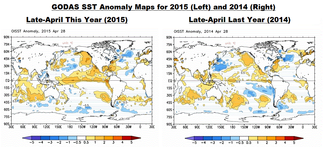
Figure 17
I fear it will take a very strong La Niña to overcome the effects of the “blob” on the North Pacific. Even then, there may have been an upward shift in sea surface temperatures there, which would impact the entire east Pacific. We’ll have to keep an eye on it over the next few years.
EL NIÑO REFERENCE POSTS
For additional introductory discussions of El Niño processes see:
- An Illustrated Introduction to the Basic Processes that Drive El Niño and La Niña Events
- El Niño and La Niña Basics: Introduction to the Pacific Trade Winds
- La Niñas Do NOT Suck Heat from the Atmosphere
- ENSO Basics: Westerly Wind Bursts Initiate an El Niño
Also see the entire 2014-15 El Niño series. We discussed a wide-range of topics in those posts.
WANT TO LEARN EVEN MORE ABOUT EL NIÑO EVENTS AND THEIR AFTEREFFECTS?
My ebook Who Turned on the Heat? goes into a tremendous amount of detail to explain El Niño and La Niña processes and the long-term aftereffects of strong El Niño events. Who Turned on the Heat? weighs in at a whopping 550+ pages, about 110,000+ words. It contains somewhere in the neighborhood of 380 color illustrations. In pdf form, it’s about 23MB. It includes links to more than a dozen animations, which allow the reader to view ENSO processes and the interactions between variables.
Last year, I lowered the price of Who Turned on the Heat? from U.S.$8.00 to U.S.$5.00. And the book sold well.
A free preview in pdf format is here. The preview includes the Table of Contents, the Introduction, the first half of section 1 (which was provided complete in the post here), a discussion of the cover, and the Closing. Take a run through the Table of Contents. It is a very-detailed and well-illustrated book—using data from the real world, not models of a virtual world. Who Turned on the Heat? is only available in pdf format…and will only be available in that format. Click here to purchase a copy.
My sincerest thanks to everyone who has purchased a copy of Who Turned on the Heat? as a result of the 2014-15 El Nino series.
This link might belong on this thread:
Role of El Nino in heat build-up in Indian Ocean
http://www.thehindu.com/sci-tech/science/role-of-el-nino-in-heat-buildup-in-indian-ocean/article6591264.ece
Yes, public broadcaster ABC were touting increased risk of drought El Niño just the other day, along with climate change hysteria. Drought is a safe bet for some point in the future, this is Australia after all, but seeming as we are supposedly already in an El Niño the recent flooding, the cooler than average summer, early snows in the Ozzy Alps and other cooler phenomena appear to be singing the climate in a different tune.
Just goes to show that in a non linear chaotic system nothing provides a predictive “sure thing”
when we see it we will believe it .also read this http://www.9news.com.au/national/2015/05/13/21/24/unusual-weather-stuns-bom-veteran
Thanks Bob for the update. As a farmer in Australia the detailed analysis you provide help me plan for the season. Bad news for us it seems but not all El Niño years are deep droughts. I live in hope that the above average heat in the Indian Ocean may provide extra moisture to counteract the cooler West Pacific and at least give us enough rain to grow a crop, even if it is a poor one.
I know WXMaps has been bouncing round like a fart in a bottle but the current 8-14 days looks interesting
The most annoying thing is all those Channel 10 newscasters saying “unpreeeeecedented”.
The “pre” should be pronounced like the “pre” in president.
Thanks, Bob. As always; a wide perspective of what the ocean is doing.
There have been several articles in the UK press suggesting that because of El Nino, the UK is likely to have a colder and snowier winter tnan normal.
They are bracing the UK citizens for a cold winter even though only a decade or so ago, snow was something that children were not going to see anymore. I guess El Nino did not exist in the early 2000s.
Perhaps this press coverage is to help explain to the citizens why the politico elitist class are so worried in Paris about global warming and CO2 reduction whilst little old folk cannot afford to heat their homes and are dying prematurely because of the cold and unaffordable costs of energy. You have to love these politicians.