Global Warming is real and is definitely caused by human-produced carbon . . . pencil lead, that is.
Guest essay by Ralph Park
Global Warming Theory –
An impressive collection of climate scientists and media / public figures are convinced that global warming is a very real threat. The theory originates in sophisticated climate models that demonstrate rising temperatures driven by rising concentrations of CO2. This theory has been confirmed in observational data from instrumental sources which is presented as “anomaly” data for adjusted surface temperatures. The sudden emergence of an unusual pattern of warming is alarming and coincides with the rapid growth of greenhouse gas concentrations, especially CO2, from fossil fuel burning human activities. This is considered as confirmation that humans are causing global warming.

Figure 1 – Comparison of raw and adjusted Tmax Variations
.
Figure 1 reproduces the global warming effect from adjusted Tmax data from the US Historical Climatology Network (US HCN). Adjusted Tmax data can be compared directly with raw (unadjusted) field measurement data. While a distinct warming effect is clearly evident after 1975, no such trend is present in the raw field data. In fact, the variation pattern in raw Tmax is unremarkable, featuring irregular minor variations about the zero temperature change axis.
As Figure 1 makes clear, adjustments are the dominant factor in the global warming trend. Adjustments are easily separated by calculating the difference between the adjusted and raw datasets:
{Adj(Stn,Yr)} = {Tmax(Stn,Yr)_adj} – {Tmax(Stn,Yr)_raw} (**)
Stn refers to station ID and
Yr refers to the year
Figure 2 illustrates the average adjustment bias incorporated into the data. The warming pattern is clearly evident in the pattern of adjustments..

Figure 2 – Adjustment Bias to US HCN Tmax Data
The adjustments constitute a cooling bias applied to past temperatures. The adjustments are then slowly removed, starting in the 1970s. The obvious intent of adjustments is to create the illusion of a dramatic global warming signal in recent times. The sudden warming coincides with the public alarm over rising CO2 levels. Figure 2 displays the net effect of the adjustment process which is sculpt measurement data to conform with global warming alarm. Statistical profiles for the 1930s and 1990s, Figure 3, demonstrate that the net bias is the result of a sophisticated algorithm designed to disguise systematic bias as a natural phenomena. The net effect is a non-random sculpting of temperatures to show a strong global warming trend.

Figure 3 – Sample Adjustment Statistical patterns.
The “Pause” Dilemma
Those of us in the skeptic / non-official science community always thought the adjustments were misguided and scientifically inappropriate. But we never suspected a purposeful effort to manufacture global warming by adroit use of adjustment algorithms. Nevertheless, we now know that global warming is, indeed, human caused by carbon based pencil lead – figuratively speaking, of course. It is based on sophisticated algorithms that artfully sculpt the datasets to fit the theory. As demonstrated, now, global warming confirmation in US HCN data is purely an artifact of the adjustment algorithms.
This, of course, is not proof that all other official data sources are so flagrantly falsified. However, the US HCN sufficiently extensive and credible enough to demonstrate that global warming is not in evidence for the US continent. It would be difficult to sustain a valid scientific argument for global warming when one of the major continents shows no sign of it.
The problem with the adjustment trick is that a real global warming trend might not happen. That means the removal of the artificial adjustments leads to a future dilemma. If raw Tmax data continues to be unremarkably flat, then discontinuing the biasing results in a global warming pause. Continuing the biasing, on the other hand, would lead to a widening gap over reality that risks penetrating into public awareness.
Pause Theory
So, the best fit “pause” theory is that climate science has temporarily exhausted adjustment rationales. Given the past success in convincing the public, it is quite possible that the official science will simply continue the adjustment process.
__________________________
(**) {Adj(Stn,Yr)} data includes only matching records in both datasets. It does not include “ghost” records that are not in the raw dataset.
Or if if you choose a small enough y axis any graph will look scary. No one I know of says that CO2 had much of an effect on temperature before 1950 or thereabouts, so what 1880 has to do with it I don’t know.
CO2 was ~300 ppm at the end of WWII. It “took off” almost precisely starting 1950. We have added ~30% to the atmospheric CO2 sink since then. HadCRUt4 clocks the warming since then at 0.7C, and considering the microsite issue, that is probably closer to 0.5C.
There have been a roughly equal number of positive and negative PDO years since then, so the natural A/O flux cancels out well. There is also the question of the “unmasking” of aerosols, which has increased the warming trend by ~25%, but we’ll set that aside for now.
So it appears that we are warming at roughly the rate predicted by Arrhenius (1906) of ~1.1C per CO2 doubling, i.e., raw CO2 forcing only, but without any net positive feedback. We may (possibly) double CO2, but there is no way we will ever, ever redouble.
So I would expect total CO2 forcing to top out at under 2C, when we are still suffering what the IPCC quaintly refers to as “net benefis”. Lukewarming. Not only are we not in crisis, but it appears likely we will break out ahead of the game. After all this fuss.
However, 40% added CO2 since 1880 is not chump change and the warming, while not serious, is not nothing. There are vast unknowns, not only in scale, but in the subject matter itself. So an appropriate measure of caution is advised, as always.
You are attributing all warming to human CO2. Unsupportable.
Remind us again how CO2 concentration was measured before the 50’s?
I am considering that natural warming/cooling via PDO roughly balances. We are left with warming at the rate of Arrhenius. That, at least, is a repeatable experiment.
However, this is mild lukewarming and will likely result in net environmental benefit before and as it tops out. A win-win situation. Warming is only a third the rate of the model projections. Yet it is not nothing.
Wrong. 310 at end of WWII. That will make an increased forcing of 0.54 w/m2 after the industrial revolution. about 1/3 of the forcing increase in this century. That increase of forcing did of course have an effect
In case evan does not know it: Hadcrut4 is land-ocean. Microsite issues from the land stations can never reduce that increase by 0.2 deg. For Crutem4 the increase is somethting like 0.8 degrees after the war. And there is no reason to believe that microsite was uninportant earlier.
(Per site policy, please use only one proxy server. Thanks. –mod.)
Termites produce 10 times the total CO2 that man produces. Dosen’t that mean that reductions in our CO2 will have very little effect. No doubt as the world is warming the termite population is increasing.
Sorry “Rooter”, what “forcing” would that be?
The net effect of our radiatively cooled atmosphere is to cool our solar heated oceans.
Don’t tell me you are one of those drivelling warmulonians that believe the oceans would freeze without DWLWIR?
However, 40% added CO2 since 1880 is not chump change
============
In the same time we have changed our land use from 4% of the land surface to 40%. Our cities alone occupy 4% of the land surface.
But of course a 1000% change in land use doesn’t compare with a 40% change in CO2. It must be CO2.
“I am considering that natural warming/cooling via PDO roughly balances. We are left with warming at the rate of Arrhenius. That, at least, is a repeatable experiment.”
————————————————————————————–
It is repeatable, and the affect of ocean cycles is without question, real. However, we are coming out of the little ice age, so a warming mean over the long term is expected, and makes assignment of all the warming since the 1950 to CO2 problematic. This is particularly true considering the long term increase in insolation during this time; made especially true considering that the oceans are primarily charged during the SH summer, and that increased solar energy flux has a very long residence time, and thus can accumulate within the oceans for decades, before being released to the atmosphere.
So, evanmjones and rooter confirms there were no measurements, outside a lab, before the 1950’s. And, that measurements outside the lab AFTER the mid-1950’s shows an increase. What can we learn from that?
Tom Trevor,
Exactly right, and that is the reason they love their tenth- and hundreth-degree charts. Those charts are designed specifically to scare the public into opening its collective wallets. Then these charlatans will ride in on their white horses to save everyone. Only there is no problem. We are simply observing natural climate variability.
The error bars are far wider than 1/100th of a degree, and in almost all cases, wider than a tenth of a degree. So the whole exercise is bogus.
I like trend charts because the temperature doesn’t matter. The slope of the trend proves that human emissions have no discernable effect. I’d tell that to Zeke, but he is so immersed in his 0.1º and 0.01º nitpicking that I would be wasting my time.
However, we are coming out of the little ice age, so a warming mean over the long term is expected, and makes assignment of all the warming since the 1950 to CO2 problematic.
Yes. That is an open and very poorly understood question.
Our cities alone occupy 4% of the land surface.
Not that much, I think. there are vast uninhabited areas. And you really have to compare it with total global surface. Urban growth is a warming factor, but I am not sure how large a factor it is. But (mostly) Chinese soot on Arctic ice, as of recently, does appear to have a big effect, and solving that problem would not affect CO2 in any way.
Then there is the issue of aerosol unmasking, which has been inorreectly, I think, attributed to CO2.
You-all left out the greatest of variables: Completely unknown factors.
“The theory originates in sophisticated climate models that demonstrate rising temperatures driven by rising concentrations of CO2. “
Untrue. The theory originated with Arrhenius in 1896.
“As Figure 1 makes clear, adjustments are the dominant factor in the global warming trend.”
Untrue, and as Mike M says, dishonest. Fig 1 shows ConUS data.
It’s also most unclear what is actually plotted. They obviously (from y-axis labels) aren’t Tmax. Anomaly? relative to what?
“The obvious intent of adjustments is to create the illusion of a dramatic global warming signal in recent times.”
As Zeke, I and others have pointed out, adjustments have a small effect on global averages, and actually lowers trends over the last fifty years. Here is the effect of GHCN adjustment on the global average trend from past years (x-axis) to present:
http://www.moyhu.org.s3.amazonaws.com/pics/trendback.png
It’s small, and post 1960, negative.
Nick Stokes
February 15, 2015 at 8:18 pm
Well, Racehorse, you are both wrong. The atmospheric radiative GHE is not a working theory, it is an unproven hypothesis.
Tyndall showed in 1859 that CO2 could absorb LWIR. And what did he show in 1860? That co2, if heated by surface conduction, or release of latent heat of water vapour condensing, could emit lWIR.
Funny thing, most squealing warmulonians don’t like to mention 1860. I wonder why…?
Oh, that’s right! Radiative gases play over twice the role in cooling our vertically circulating radiatively cooled atmosphere than they do in warming it!
But, but, but what about DWLWIR slowing the cooling of the surface? Whoops! 71% of the surface is ocean and incident LWIR has no effect on the cooling rate of water free to evaporatively cool.
But, but, but the oceans are a near blackbody, surely they would freeze without DWLWIR? No, the oceans are an extreme SW selective surface. Without atmospheric cooling they would heat to 335K or beyond.
It’s all garbage Nicky baby. You lent your support to the biggest lie in the history of human science.
The glue factory, Nicky. The world needs more 3M PostIt notes, and you hanging onto those hooves is just selfish.
There can be no meaningful global warming unless the oceans are warming. Land based temperature data is all but irrelevant, the only significant data set is ocean temps, and prior to ARGO, there is no reliable data on ocean temps (and ARGO is way too short to draw any scientific conclussion).
You have done some experiments showing that LWIR does not heat water that is free to evaporate.
The issue is why, given that this is fundamantal to the theory, have Climate Scientists not carried out experiments showing how water (say at 289K) is heated by DWLWIR being radiated from a source at say 276K (ie., the temperature at low level cloud height of ~2000 metres) positioned say at 5 metres above the water ?
Heck, let’s see the results for water at 289K being heated by DWLWIR radiated from a source say 5m above the water at say 295K
“The theory originates in sophisticated climate models that demonstrate rising temperatures driven by rising concentrations of CO2. “
Untrue. The theory originated with Arrhenius in 1896.
“As Figure 1 makes clear, adjustments are the dominant factor in the global warming trend.”
Untrue, and as Mike M says, not honest. Fig 1 shows ConUS data.
It’s also most unclear what is actually plotted. They obviously (from y-axis labels) aren’t Tmax. Anomaly? relative to what?
“The obvious intent of adjustments is to create the illusion of a dramatic global warming signal in recent times.”
As Zeke, I and others have pointed out, adjustments have a small effect on global averages, and actually lowers trends over the last fifty years.
So, does this mean that using carbon-based products are about as dangerous as eating foods with cholesterol ?
As always, it depends on how much.
Actually, the primary bottom-line result of the CO2 increase is that poor people are now able to eat — food. Do you imagine you can witness poverty by visiting an American slum? Real poverty is more like going purblind from vitamin deficiency and dying at the age of 35.
Eliminating all that is the result of your analogical “cholesterol”.
I suspect you have not seen real poverty and hunger. Even though we grow more food, more and more people simply do not have their own land (People being forced off their lands in Africa for “carbon sequestration” projects) and cannot afford to buy food due to extreme low wages or no work at all and significant increases in prices.
Of course I haven’t. I am one of the lucky ones. But I know it’s there. And I know the only way out is via fossil-fuels (esp. coal). Unfortunately, the CAGW policy folks act as if they had never heard of it, and if their policies are enacted, it will be an unmitigated disaster for the world’s poor.
Fortunately, it’s out of our hands. China and India will develop, whether we pampered pets of the west like it or not, and in my view they not only should, but must.
Fortunately, it’s out of our hands. China and India will develop, whether we pampered pets of the west like it or not, and in my view they not only should, but must.
=============
The danger is a “legally binding treaty”. What happens when a country fails to meet their legally binding obligations? If history is a guide, first we sanctions, then we get war.
The UN climate treaty is sowing the seeds for the next world war.
Well, when you see it you will notice something common across most countries and cultures. Those suffereing don’t care about the “change in climate” (weather, unless it rains), just where the next meal comes from. Begging, theft, environment destruction etc, a cycle that these people want off of and (You can see it in their eyes) dearly want our lifestyle (Go to the shops, pick up some food, bread and milk rather than having to eek out a living from “nature”).
Don’t go down there, its another minefield of incorrect government advice.
“The theory originates in sophisticated climate models that demonstrate rising temperatures driven by rising concentrations of CO2. “
Untrue. The theory originated with Arrhenius in 1896.
“As Figure 1 makes clear, adjustments are the dominant factor in the global warming trend.”
Untrue, and as Mike M says, not honest. Fig 1 shows ConUS data.
It’s also most unclear what is actually plotted. They obviously (from y-axis labels) aren’t Tmax. Anomaly? relative to what?
“The obvious intent of adjustments is to create the illusion of a dramatic global warming signal in recent times.”
As Zeke, I and others have pointed out, adjustments have a small effect on global averages, and actually lowers trends over the last fifty years. Here is the effect of GHCN adjustment on the global average trend from past years (x-axis) to present:
http://www.moyhu.org.s3.amazonaws.com/pics/trendback.png
It’s small, and post 1960, negative.
Those are trend numbers, not temperatures. All that is saying is that the trend is adjusted upwards less now than in the past. But trend is still being adjusted upward. And since there hasn’t been any trend since ~2001, one is led to wonder why there is a continuing upward adjustment at all.
Okay, I don’t actually wonder. I have been elbow-deep in the data (Min, Max, Mean, Raw, Adjusted) and seen what homogenization does to well sited stations. If you didn’t know where to look (i.e., at microsite), you’d never even know there was a divergence in the first place.
Homogenization, applied across varying microsite, will have a very large effect during genuine warming or cooling trends (it exaggerates both). It will have a lesser effect during a flat trend, of course, because microsite does not cause (additional) divergence during a flat trend.
“Homogenization, applied across varying microsite, will have a very large effect during genuine warming or cooling trends (it exaggerates both)”
I think it damps them. Homogenisation tries to pick up events where a change to station conditions occurs. It can make
Type I errors, thinking station changes are natural
Type II errors, treating natural change as artifact and removing them.
Type I errors would not be expected to correlate with real climate change. They require an underlying station event (move etc). But Type II errors will. In times of rapid warming, some sudden warming will be discounted. Likewise with cooling.
The Type I errors are subject to bias, because the underlying events may not cancel. For example, installing a proper Stevenson screen gives a better radiation shield – cooler temperatures. While Type II errors tend to cancel, except to the extent that there is total nett warming, which they will tend to damp.
You can see this with the Iceland data that some people get excited about. There was sudden cooling in the early 1960’s and then a warming in the ’80’s, and again recently. This was quite widespread. Here is the plot of total Arctic adjustment effects:
http://www.moyhu.org.s3.amazonaws.com/trend/breakdown/break4.png
So yes, in early 60’s, some cooling was likely wrongly rejected. But in the 80’s, some warming was rejected, and again recently. The net effect from 1960 to now is nil.
Nick, the net affect is clear and matches your cooling the past and warming the recent data. ?w=640
What was done to this station, was done to many; Now Nick, explain why this stations was adjusted like this…
Yes Evan, and thank you, they are trend numbers only, and when they adjust down a rural station, it is done like this….
https://stevengoddard.wordpress.com/2015/02/11/basic-math-for-academics/
I think it damps them. Homogenisation tries to pick up events where a change to station conditions occurs.
Bad microsite exaggerates trends (up in warming phase, down in a cooling phase). Homogenization via pairwise comparison takes the 20% of well sited “outliers”, which have lower trends either up or down, and makes them match the already-exaggerated trend. That results in even more of a whipsaw than if a straight average is used, not less. This is not dampening.
Zeke Hausfather write:
Can anyone accurately characterize temperature variability during the recent interglacial? If you think you can, tell me how? If you think you can then what do you believe the interquartile range of temperatures to be over the past 10,000 years? I’m looking for a number. What do you base this on?
Are you hanging your hat on proxy reconstructions? Then how do you characterize the measurement errors?
Oh, I think it’s notable (but a bit under 1C).
I am one of the apostates (to both sides) in that I claim the pause is, in a sense, false: We are in a negative PDO; we should be cooling by now, and we’re not. That is the extent of AGW. But the flip side is that fully half the warming during the positive PDO from 1976 – 2007 was entirely natural.
You can’t have it both ways.
Well, as comforting as it is that you “think” it’s notable but under 1C…
In the cold light of day, the on-going food fight called climate science simply does not have enough accurate and (dare I say it) generally accepted data to support all these fancy world shattering theories.
Not being able to agree on foundational data is absurd and has to be awkward for a field of so-called settled science.
Hum, well both the satellite records show some cooling, and we have been ENSO neutral, with, according to Bob T an El Nino of a different sort. So given your recent observations of well sited stations the true record would much more closely resemble the satellite records, and 1998 would still be the high point, and a five year smoothed chart would make 2002 the likely high point. Add in a corrected UHI adjustment, and you likely have global cooling already starting.
The important question is: is it significant? To answer that question you need to be able to characterize the internal variability of the system. Forget, for the moment, about the causes of natural (non-anthropogenic) variability. It doesn’t really matter. What matters is that there seem to be two quasi-stable sates to our climate. One is a glacial state the other is an interglacial state. During each of these states there is some expected variability. If we can’t quantify that variability (and make no mistake, we can’t) then we can’t say that 1C is significant.
One of the problems of modern, big data science is that we (a) obtain the ability to measure something, (b) collect oodles of data over an infinitesimally short period of time and (c) observe a trend in that something. We then assert that the trend is significant without any knowledge of the long-term variability of the thing we are observing. Yes, we have lots and lots of data, but the data is extremely dense over an infinitesimal duration yet incredibly sparse (or non existent) over the time period necessary to properly characterize the internal variability of the system.
Imagine trying to characterize the variability of the stock market over a 10 year period by collecting and analyzing terabytes of data from a 4 minute trading session. There is no doubt that a trend might exist in the data. So what?
It is FREAKING COLD here and getting colder each year!!
Zero warming, significant fall in temperatures even in summer. The cooling is most definitely happening on half of the entire North American continent and getting worse.
Location of polar vortex and the temperature in the US.
http://oi59.tinypic.com/34y18qe.jpg
There appears to be a large contingent of UHI deniers on both sides of the climate debate. I think we need to start classifying the science deniers.
UHI deniers
Data tampering deniers
Solar minimum deniers
Satellite deniers
Warming hiatus deniers
Broken climate model deniers
Climate history deniers
There are many more. Please add to the list.
https://stevengoddard.wordpress.com/2015/02/16/uhi-deniers-2/#comments
Easier to just call them Climate Liars. They do have quite an array of lies from which to choose though.
I want a new denier category — the BIGGEST denier category of them all — for myself:
Average Temperature Denier
Average temperature data are nearly worthless because 99.999% of historical data are unknown, so no one knows what a “normal” average temperature of Earth is.
.
Since no one knows what “normal” is , or even if there is a “normal”, no one knows if the climate is moving toward “normal”, or moving away from “normal”– although we do know the climate is always changing.
Even if it were possible to derive 100% accurate average temperature statistics since 1850, with no adjustments needed at all, then what would we accomplish with these statistics?
Does anyone live in the average temperature?
Does the average temperature cause weather events?
Can we change the average temperature, or would we want to change it?
UHI shows up only slightly in my findings and appears to be statistically insignificant. Sure, cities ARE warmer. But do they warm FASTER?
Microsite, on the other hand is ubiquitous. A well sited urban station will, on average, warm much slower than a poorly sited rural station.
Besides, only ~9% of the USHCN is urban. But well over half consists of poorly sited non-urban stations. (Small towns run the coolest, actually, but the difference is insignificant.)
Microsite is the new UHI. You heard it here first.
Notable doesn’t mean bad. It just means, well, notable. So I therefore . . . note.
And you should bear in mind that not only I am in the very middle of said food fight, but our team is hitting NOAA flat in the face with a very gnarly custard pie.
noted and appreciated, by me at least.
#B^)
…….The theory originates in sophisticated climate models that demonstrate rising temperatures driven by rising concentrations of CO2. ………….
May I correct this ridiculous claim of the models being sophisticated. The models are light years away from being sophisticated. They are in fact so totally facile they do not even attempt to model the natural CO2 cycle let alone the some thirty or so other basic variables used even in normal weather forecasting.
The models also wrongly assume even distribution of CO2 which satellite data proves conclusively is far from being true.
In short there are basic standards engineering applications have to pass for modelling designs for chips and using the QA procedures for these no climate application would get remotely close to passing those for low grade commercial products as sold in the UK pound shop chains let alone the life critical ones that these should by rights be subjected to. After all we have proof that energy taxation forces people into a life style of cold or hunger that Amnesty has rightly rated as unacceptable torture resulting in hundreds of deaths in the UK alone every winter.
May I correct this ridiculous claim of the models being sophisticated.
They are as unsophisticated — and as complicated — as trying to play the entire Eastern Front using Advance Squad Leader rules. They use a bottom-to-top approach, which is always an epic fail when dealing with situation fraught with chaos and just plain unknowns. One little misstep at the start and you are playing crack-the-whip with your data as your error magnifies down the line. Before you know it, you find yourself “adjusting” machine-gun echo fire factors (in this case, aerosols) until your curve fits. Fudge factor, anyone?
At least if you approach the problem from the top down (preferably with a meataxe), you won’t be leaving out clouds and the PDO (and its cousins), which is like trying to simulate the eastern front — without tanks.
Even Lord Monckton (unless I misunderstand him) does not appear to see this basic error in approach. I can make you a climate model on the back of an old envelope that will give you a more complete and rational set of parameters and projections than these multi-billion dollar jobs. The only difference is that I will not be kidding myself as to what we know and do not know.
These are not game theorists. They have not the training. They do not have a handle on the overall. And furthermore, they do not think they need to.
You are not mistaken. In his latest paper, Viscount Monckton tried running to the ERL or effective radiating level argument (he knows he’ll get buried if the tries “two shell” again). Anyone with a $100 IR instrument can see that the ERL is constantly in change and is nowhere near 5 km. Clouds are the strongest IR emitters in our atmosphere, and they emit in 3D not as a layer.
ERL is a load of the freshest and most steaming BS. Sadly Viscount Monckton bought it.
Correct, Konrad.
ERL (effective radiation level) is one of those AGW theoretical constructs, plausible, but falls apart when one refers to the data. Lots of this sort of stuff in this climate hoopla.
Another is the assertion that CO2 warms SST. Even skeptics swallow that one. There’s more.
Agreed, but the scientific community as a whole is not responding to these problems appropriately. First, the entire climate community does NOT see climate as chaotic and they simply don’t CARE what anyone else says. Second, the climate community already considers all data (adjusted whenever appropriate) to be evidence to support the hypothesis and they don’t CARE about actually establishing causality. Third, the climate community doesn’t see any possibility of curve fitting because they believe that their parameters are perfect analogs of the real system with absolutely NO unknown effects.
In short, the entire climate science community sees themselves as “super scientists” – smarter than every other scientist and above the criticism of every other community. This arrogance is almost universal, because it is driven by an environmental ideology so strong that NOTHING overrides it.
There is only one way out of this, as I see it. These folks MUST be criticized for their poor quality work AT EVERY POSSIBLE occasion. People from outside the discipline that have expertise in, for example, data modeling or statistics, MUST get involved and hold climate scientists accountable for their negligence.
Just to be clear, the pause really refers to the lack of predicted warming so it is not just about the temperature but it refers to the discrepancy between the projected and actual warming.
In 2001 the IPCC projected warming of 1.4 to 5.8 over the next century (or perhaps 110 years?)
Therefore the pause is anything closer to no net warming than the IPCC estimate. So less than 0.07/decade would be considered “pausing” whereas above decadal warming above 0.07 should be considered “warming”. And just for completeness, cooling of greater than -0.07/decade would be “cooling”.
So an explanation of the “Pause” can come in two ways:
1. Explaining why the temperature does not show the predicted warming
2. Explaining why the predicted warming did not fit the temperature
Zeke Hausfather
February 15, 2015 at 7:42 pm
And none of them justifiable. As you have already been told: The adjustment of data after the fact is NOT SCIENCE, IT IS FRAUD
Eric Worrall at February 15, 2015 at 7:14 pm demonstrates clearly that the adjustments have created the rise in Temperature over the US.
But the question remains whether the adjustments are justified.
At its simplest the answer is No as the adjustments aren’t fully documented and risk assessed. But that doesn’t add much.
I suggest that the route of the adjustments is a desire to be more accurate.
And that means more believable.
And that means more like other temperature trends.
More like CET.
And thus the CONUS data is tweaked by confirmation bias to match the Black Country – and that tweaks the whole global surface temperature.
Spelling error – “route” should be “root”.
Oh, and it is obvious that the warming in the CET is largely manmade as it is a result of the numerous clean air acts and reduction in particulates over the time the 20th Century de-industrialisation occurred.
That assumes of course that there never was clean air in Britain before now.
(Per site policy, please use only one proxy server. Thanks. –mod.)
Nope, it assumes that there was smog in the Black Country after the industrial revolution and that the clean air acts fixed that in the late 1950s.
The CET is not a proxy – it is a measurement record that dates back to the LIA. It doesn’t extend back before that into the Middle Ages with its pre-industrial air.
Here’s a link that describes the CET.
That NOAA adjustment graph is quite extraordinary. It shows that pretty well all of the warming comes from the adjustments and not from the raw data. By the way, I wonder if the NOAA still shows that graph on its web site, or has it been disappeared?
This is a perfect illustration of scientific corruption on an industrial scale. Yes, adjustments are sometimes justified in order to refine the result and to reject known bad data. But if adjustment on this massive scale is required then the data is completely worthless. To present this hugely adjusted data and to pretend that it represents real world data is fraudulent. If a company behaved like this the directors would very quickly find themselves behind bars.
One problem is that the people who are doing the adjusting are the very same ones who are pushing the global warming scare. Human nature being what it is, I think it’s inevitable that, over the years, a significant amount of bias has corrupted the data.
I have been startled in various conversations with global warming advocates at what appears to be virtually a denial (I hate to use the term but it seems most apt) of classical statistics. The general approach seems to be that statistics is a box of tools out of which one repeatedly pulls devices until a choice finally gives the result one wants. The notion seems alien that the tremendous value of statistics is not that it allows you to claim things from a given set of data, but that it keeps you from claiming things that the data does NOT support. In can be frustrating for physical scientists who are self selected to want to claim things, to prove points and statistics seems always to keep them from doing what they so earnestly desire. In my experience the most powerful set of data that exists is always the unadjusted data and I am not speaking specifically about climate data. Every time one tweaks and adjusts some data one removes some of the original information in the set and injects, usually unwittingly, biases and outside information in the results. For this reason, in experimental science, adjustments to data are often only reluctantly done and even then minimized as much as possible. I once had a truly bracing experience when I pointed out to a climate scientist who had been merrily tweaking data repeatedly and fitting trends that he should evaluate his regression results and look at some diagnostics on the significance of the results. He replied that he “doesn’t do regression analysis” because that was only used for looking at correlation among variables. For this reason, he said, he did not look at Rsquared, F, or p-values. In fact, the tool he was using did not even generate them. He seemed blissfully unaware and even uncaring that the fitting tool he was using was in fact repeatedly doing regressions. He was also unaware of even the most basic warning signs of artifacts such as high leverage outliers. It is hard to know how to productively continue such a conversation. If one tries to point out some basic statistical concepts that might be considered the reaction seems to be anger and combativeness as if suggesting some classical statistics is a personal attack. I remember reading a paper out of curiosity on an adjustment process NOAA uses with the truly frightening name “empirical orthogonal teleconnections” and a rationale for the model was that it “seemed to fare well in terms of explained variance.” With so many sharp tools to play with it is a miracle someone hasn’t been severely injured.
First, please don’t be a paragraph denier. #B^) But I think you are, in the main, correct.
With so many sharp tools to play with it is a miracle someone hasn’t been severely injured.
Ah, but they have been. Very badly. The blood flows freely, and we are seeing that in the recent literature, with 17 out of 18 of the last CO2 sensitivity studies showing significantly less warming projected than the IPCC CMIP5 models.
Call it the “new consensus”, if you will.
“..climate science has ‘exhausted adjustment rationales’”
Hmmm…I dunno about that as there seems to be plenty more adjustment rationales where they’re coming from-
http://www.adelaidenow.com.au/technology/science/scientists-have-discovered-the-12-risks-that-threaten-human-civilisation/story-fni0c0qr-1227221837029
As for this layman I’ll just soldier on maladjusted until the folks in white coats figure it all out.
Ralph Parker,
‘The theory originates in
sophisticated climate models’
sophisticated: slightly overhauled, rotten under the firnis.
they’ll make their ways. left alone.
Can somebody please define “microsites” for me
Microsite is the immediate siting condition within 100 m. of the sensor. It is most relevant within 30 m. The question is whether heat sinks exist within the immediate range of the sensor. No means good. Yes means bad. If over 10% of the area within 30 m. of the sensor is a heat sink (pavement, structures, anomalous bodies of water), that sensor is out of compliance with NWS’ own siting guidelines.
This is not to be confused with UHI, which is a mesosite issue. Urban stations with proper microsite warm significantly slower than rural stations with poor microsite. I find that Urban stations do warm a bit faster than rural, but the difference is not statistically significant.
A further distinction must be made between heat sink and waste heat. Waste heat is like what you get from a venting air conditioner. Heat sink on the other hand does not generate heat directly, but absorbs it during the day and then releases it.
Waste heat may either amplify or dampen (swamp) the trend. Heat sink is not a warming trend bias, per se. Poor microsite is a trend amplifier, and will increase either a warming trend or a cooling trend (what goes up must come down, you know).
The only reason microsite has caused a spurious increase in temperature trend is that there has been real, genuine warming. If it starts cooling significantly, that cooling will be amplified as well. It works both ways. We see a significant exaggeration of the warming trend from 1979 – 2008, but the cooling period from 1998 – 2008 is also exaggerated.
What happens to the historical record graph if we just use the historical record eliminating all the adjustments? What happens if we only allow corrections that are reasonable due to station changes?
For global land, not too much.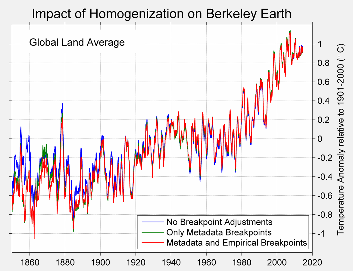
The blue line is no adjustments; the green line is only adjustments that correspond with documented metadata events. The red line is all adjustments.
Well in Oz you’ll run out of Stevenson Screen thermometer records about a hundred years ago and in another 50 you’ll run out of thermometer readings altogether if that helps? Now it’s the year 2015 AD I believe but I seem to have forgotten the original question…?
Excuse my ignorance but exactly what does the station metadata consist of? Does it include temp data other than Tmax/Tmin?
TOBS history, moves, various equipment changes, localized issues, location of equipment vis-a-vis the SRG (helpful for sorting out dots on Google Earth), exposure, various notes, what networks they belong to, etc., etc.
No global warming is not real and it is not a threat.
Whereas I think global warming is real and it is not a threat.
[There] is not, and never has been, a need to adjust data for Time of Observation Bias or TOBS. Zeke claims that pretty much all temperature observations were made in the afternoon prior to 1960, and in the morning after 1960. Who cares? If you are simply recording maximum and minimum temperature at a site using a MAX/MIN thermometer, the TIME THAT YOU TAKE A READING IS COMPLETELY IRRELEVANT.
Further, there are PLENTY of days in the winter (and even during other seasons) when TMAX happens at 12:01 AM and the temperature then falls for the remainder of the day. For example, in much of the Midwest in Winter, it is not at all uncommon to have a temperature of 35F at midnight, and have the temperature fall to -2F by 8:00 AM, after which it stays at -2F for the remainder of that 24 hour period. If you aren’t using a MAX/MIN thermometer, you would probably miss TMAX entirely, regardless of when you took a reading. If you WERE using a MAX/MIN thermometer, it would read TMAX at 35F and TMIN at -2F regardless of when you looked at it.
the TIME THAT YOU TAKE A READING IS COMPLETELY IRRELEVANT.
Unless a change in observation time occurs during your study period, so that one part of the interval is AM-OBS and the other part PM-OBS. Then it is completely relevant, and will wreak havoc on your trends.
And it makes a big difference in terms of offset, in any case.
Why is this so, if a thermometer records maximums?
If you make 365 observations in the course of a year, you will record 365 maximums that that thermometer has experienced in the course of the year.
For US above 90 degree readings it appears to make no difference…
https://stevengoddard.wordpress.com/2015/02/01/it-is-not-the-tobs-stupid/
Why is this so, if a thermometer records maximums?
If you make 365 observations in the course of a year, you will record 365 maximums that that thermometer has experienced in the course of the year.
Okay, I will try to explain TOBS bias. I asked the same question.
I’ll give you an example.
Observation time is 0600 (right around Tmin). On Monday, Temp. is 5C at 6:00, and that is the coldest in the last 24 hours. On Tuesday at 0600, it is 10C. But Tuesday’s Tmin reading is NOT 10C. It is 5C!
Why? Because one minute after the Monday’s observation, the temperature was still 5C. Tuesday’s minimum is the lowest reading within the last 24 hours. So the 10C on Tuesday never even shows up in the record, and 5C shows up for Tmin on both Monday and Tuesday.
Thus the record is artificially cooled. It should by all rights be 5C on Monday and 10C on Tuesday, but instead it is 5C for both days.
For stations whose readings are near Tmax, you get the same phenomenon, but with Tmax rather than Tmin. Thus the record is artificially warmed.
This does not affect trend so much UNLESS the observation time is changed during your given study period. If so, it creates a big step-jump at the point of conversion, so it will affect the trend. If it occurs near the very start or very end of your study period, it matters little. But if it occurs in the middle, the difference is stark.
The pause is evident since 1998, now more importantly what will the future bring?
Every once in a while science reaches a point which I call, THE MOMENT OF TRUTH.
I think that point is now upon us , and by the end of this decade we will know if solar is the main driver of the climate (which I believe 100%) or CO2.
The contrast(low solar (cooling) versus higher co2(warming) ), is now in place for this to play out.
It is a rear opportunity when mother nature will likely reveal which side is correct. We have that distinct possibility now.
In case evan does not know it: Hadcrut4 is land-ocean. Microsite issues from the land stations can never reduce that increase by 0.2 deg. For Crutem4 the increase is somethting like 0.8 degrees after the war. And there is no reason to believe that microsite was uninportant earlier.
Yes, I know Haddy is global. I have always been quite clear that a 60+% exaggeration of land warming does not equate to a 60+% exaggeration of the entire surface trend. But you need to recall that both GISS and Haddy surface stations both extend jurisdiction, as it were, well off the coasts.
Remember the NIWA flap? It was over 7 measly thermometers covering a huge ocean grid, whatever else it wasn’t (although they supposedly had ~100 stations active), nearly all of it ocean. GISS does a 1200km radius. Haddy does 350km. And there are lots and lots of stations on or near coasts.
It would therefore be quite possible for non-compliant microsite to have spuriously pumped up global trends by ~20% or even more. (And even that’s stipulating that the ocean data is up to snuff. But that’s another question.)