Guest Post by Willis Eschenbach
Recently there have been a number of accusations and bad blood involving myself, David Evans, Joanne Nova, Lord Christopher Monckton, and Leif Svalgaard. Now, I cannot speak for any of them, but on my part, my own blood ended up mightily angrified, and I fear I waxed wroth.
However, I see no point in rehashing the past. What I want to do is to return to the underlying scientific questions. In that spirit, I apologize sincerely and completely for wherever I put in “something extra” in the previous discussion. In Buddhism, there’s a concept called “something extra”, and one is enjoined to avoid putting in “something extra”.
It is explained in the following way:
If I say “I am angry” that is simply a true statement.
But if I say “You made me angry”, that is something extra.
So I ask any and all of you to please accept my sincere apologies for whatever what I said that was something extra, so that we can move past this difficult time and get back to discussing the science. Both sides have legitimate grievances, and I am happy to make the first move to get past all of them by apologizing to all of you for whatever my part was in the bad blood. I hope that the other participants accept my apology in the spirit of reconciliation in which it is offered, and that we can move forwards without rancor or recriminations.
Regarding the science, let me go back to the original question, and see what I can do in the way of making my claims in a more Canadian manner. I’ll start by looking at the recent record of the “TSI”, the total solar irradiance:
 Figure 1. Monthly total solar irradiance as measured by the CERES satellite. Vertical blue line shows mid-2004.
Now, if you don’t like the data from the CERES satellite, here’s the SORCE satellite data:
 Figure 2. Daily total solar irradiance as measured by the SORCE satellite. Vertical red line indicates mid-2004. SOURCE
Note what is happening in both graphs after mid-2004 (vertical lines in both plots). As in every solar cycle, the TSI declines somewhat, and bottoms out. Then, it starts to rise again. And by the end of the datasets, in both cases the TSI is higher that it was in 2004.
So what was the scientific dispute all about, the discussion that underlies all of the bad feelings?
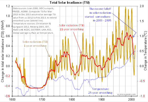
It revolved around the following graph from David Evans, referenced by both Leif Svalgaard and Lord Monckton, showing the basis of his predicted upcoming global cooling :
 Figure 3. David Evan’s graph of TSI (gold line), along with a centered 11-year moving average of the TSI data (red, with dotted blue extension), and a 25 year unspecified smooth of temperature, presumably a trailing average (blue line). (Click to enlarge)
Now, as you can see, the bright red line basically falls off the edge of the earth around 2004. The note says “The recent falloff in solar radiation started somewhere in 2003-2005″.
However, a look at both the SORCE and the CERES data shows no such “falloff in solar radiation”, neither precipitous nor otherwise. In fact, both datasets agree that by 2013 the TSI was well above the level in mid-2004.
Since there is no fall in the underlying data of any kind, why does the red 11-year average line show abrupt cooling starting around 2004?
The answer lies in the various problems with the graph.
• The TSI data is a splice of three datasets, with two of them showing the post-2000 period. This is a huge source of potential error in itself. However, it gets worse.
• One of the spliced datasets is the Lean TSI reconstruction, an outdated dataset that the authors of the reconstruction themselves admit is inaccurate.
• Another is the PMOD dataset. It is known to be reading low by 0.2 W/ms at the solar minimum, introducing a spurious apparently strong recent “cooling” where none exists.
• The 11-year centered average is an extremely bad choice for a filter for sunspot/TSI data. Because the solar cycle varies both longer and shorter than 11 years, at times the 11-year average actually reverses the sense of the data, converting peaks into valleys and valleys into peaks. Look at the period from 1760-1800 in Figure 3, for example. What is happening is that the frequency data is getting strongly aliased into the amplitude data. As a result, the average can end up far from the reality, particularly at the ends of the dataset.
For another example, look at the period just after 1740 in Figure 3. The 11-year average takes a huge vertical jump … but meanwhile back in the real word, the TSI itself is not rising at all. It is falling. Clearly, the large vertical jump in the red line is totally spurious.
• The TSI data has had about 900 days of “data” added to it using an arbitrarily chosen value. This is shown by the blue dots which indicate a continuing drop in the temperature.
So regarding the question of why the red line is acting so strangely, the answer is that we have a perfect storm of spliced data, bad data, arbitrary “data” added to the spliced bad data, and an extremely poor filter choice.
And as a result, the red line doesn’t represent reality in any shape or form. There is no precipitous drop in TSI starting around 2004. It doesn’t exist. Sure, the 11-year average says clearly that there is a huge drop starting around that time … but the actual data says something entirely different, as shown in Figures 1 and 2.
Now, in the heat of the moment Leif described the red line as being “almost fraudulent”. I think this was an over-reaction, but perhaps an understandable one. After all, if the red line were flipped over vertically it would make a lovely hockeystick, and if someone claimed warming was coming based on that hockeystick, people would call them alarmists … and calling someone an alarmist is certainly a close relative of calling them “almost fraudulent”.
However, my guideline is, never ascribe to malice what is adequately explained by error and misunderstanding. So I do not call their red line fraudulent, nor did I do so in the original discussion. Instead, I say that it is an error resulting from a misunderstanding. In any case, let me suggest that we leave out all ascription of motive and intent, that goes nowhere, and that we return to the science.
A more scientifically neutral description of the red line is that it is highly inaccurate and potentially misleading, because the apparent drop starting in 2003-2005 is simply an artifact of a combination of bad data and bad filtering.
Finally, to the degree that David Evans’ model predicts future cooling based on the red line, it is already falsified.
That is what I was trying to say, and I believe (subject to correction) that was what Leif was pointing out as well.
In closing, I will endeavor in this thread to keep my comments on as scientific a basis as possible, to avoid any personal references, and to not ascribe motive or intent. I request that everyone do the same. Many toes have already been stepped on in this discussion. Let’s see if we can simply discuss the science.
My best to all,
w.
VERY IMPORTANT: It is important in general, and in this discussion in particular, that you QUOTE THE EXACT WORDS THAT YOU DISAGREE WITH. Note that this doesn’t mean just referencing their entire comment. Quote the exact words of their comment that you think are in error, and tell us why you think those words are wrong. If you do not quote the exact words that you disagree with, none of us will know what you are referring to … and out of such misunderstandings grows animosity and misunderstanding.
Finally, please don’t delve into the rights and wrongs of what has happened in the previous discussions. I am not interested in the slightest in ascribing blame or responsibility. I have accepted my own responsibility for my own actions and apologized for wherever I was over the line. What I or the others did in the past is a blind alley, so please confine your comments to the science, and as the saying goes, “Let the dead past bury its dead”.
Agnostic: “Dr Evans ought to be given the benefit of the doubt in terms knowing what he is talking about as a respected electrical engineer and modeller.”
There is not doubt to benefit form, this is science. Dr Evans “as a respected electrical engineer” should have questioned himself how he had such a sharp step in the data after passing an 11y low-pass filter.
Santa Baby says: “It’s only the measurable Nature that can and will validate or falsify Evan’s theory.”
If his processing has major flaws, he is wrong even if climate dips anyway. ( N.B. I’m not taking a stance on whether there is a solar signal here, )
gnomish says:
July 17, 2014 at 1:15 am
True.
w.
redcords says:
July 17, 2014 at 1:37 am
With all due respect I do not think your conclusion is correct. The Bode Plot (you do know what a Bode plot is? From long experience?) shows a notch. That means a filter. To make the filter causal (math artifacts can create non-causal filters from sampled data) it needs an 11 year delay. Which is probably significant. Now what in the solar spectrum is delayed 11 years from TSI? Is that “what” possibly the required cause? If not? Dead end.
But we are not there yet. We don’t know if the cat is dead or alive. Yet.
M Simon. “The purpose of the 11 year smoothing is to look for an inflection point. ”
NO, the point of a “smoother” is to _remove_ “inflections” and smooth the data. Nowhere does Dr. Evans suggest that “smoother” is intended to detect inflection points, that’s nuts, you just made it up.
If you want to do that you design some kind of processing that _does_ detect such features, not chose one that spuriously creates them.
Jo Nova says:
July 17, 2014 at 1:22 am
Thanks, Jo. I never said there were errors in the graph. Instead, I said that the Lean data is discredited, that the PMOD data is inaccurate, and that the splicing was bad. However, the graph represents all of that bad data quite accurately.
Whoa, that’s taken out of context … what I actually said was (emphasis mine):
If that degree is zero, fine, glad to hear it … but I didn’t say that the model was based on the red line.
w.
“JoNova
It would surely be a sign of “good spirit” to actually read what we write. Hm?”
It could be caused by human factors?
Like we are unable to see the vase or the two faces at the same time?
http://www.123opticalillusions.com/pages/Facevase.php
Having. been a pilot for over 40 years my life have depended on always having an alternative plan to my ongoing current plan. “My plan is to land safely, if it becomes less safe outside preset parameters I make a go-around.
The same when driving my car. I am going to pass here, but if a car comes head on early around that corner I will stop passing and go back to start. I have the right of way or a green light and will cross if all the cars on red accept my right of way… Etc etc..
They have already an idea how it should be so it’s very difficult to sell your own idea to them?
Greg Goodman said:
“NO, the point of a “smoother” is to _remove_ “inflections” and smooth the data”
The point of a ‘smoother’ is to remove short term ‘noise’ in order to reveal the longer term trends and inflection points in those longer term trends.
Taken to the extreme one can observe Leif’s progressive ‘ironing flat’ of the historical TSI record 🙂
In that case one smooths out everything including the long term trends and inflections therein.
“If you want to do that you design some kind of processing that does detect such features,”
Such as?
Rod says:
July 17, 2014 at 12:42 am
Personally I think TSI is an averaged value of sun output and would be more interested in variations of magnetic field strength.
As far as I understand it, the TSI changes (relatively minor and most likely irrelevant) are a direct product of the solar magnetic activity, but not necessarily representation of it. However, solar magnetic activity impact is measured down here on the earth by the annual number of magnetic storms http://www.geomag.bgs.ac.uk/images/image022.jpg hitting polar regions. That is not all, some of the storms are of same polarity as the Earth’s field, and others of the opposite; polarity is critical for the impact of the interactions. To make things worse (from statistical point of view), geomagnetic storms arrive at 27.2 days rate, while the climate data is presented at the variable monthly rate.
Joanne, a final question before I get some much-needed sleep. At the time of your second post on the mode, some weeks ago now, I asked about out-of-sample tests on the model. You replied that they had already been done.
Are you planning to reveal the results of those tests, and if so, what is the scheduled release date?
Thanks,
w.
M Simon says:
July 17, 2014 at 1:49 am
“With all due respect I do not think your conclusion is correct.”
————-
You’re correct, my mistake:
In their world “correlation does not imply causation” becomes “non-correlation implies causation… and a notch… and a delay… and a Force X… and a nuclear test fudge factor scaled high”.
Willis if you are ever in New Zealand aka Aotearoa aka Land of the Long White Cloud, I would enjoy meeting up with you. And that goes too for Jo and David and Leif and Chrostopher, whose insightful analyses and comments I have enjoyed, whole not always agreeing with, over the last few years. Amongst other things I teach ina course on energy in society, and am always struck by how vulnerable our up and coming leaders are.
TSI is measured by satellites since only 1978 (http://www.pmodwrc.ch/pmod.php?topic=tsi/composite/SolarConstant), this is hardly long enough for any climate related consideration.
All other pseudo-precise W/m2 TSI graphs are reconstruction models, mostly based on reinterpretation of solar spots counts that are made since the 18th century. Spot counts are simple, and therefore an rather accurate story about what the sun has shown of its face.
Analysing the data, the famous 11 year cycle is also intertwined with an approx. 108 years oscillation, although the latter fails on statistical evidence for such a short observation period.
See the graph at: https://db.tt/LXTS9pfx
@Greg
I have been following your comments with great interest Greg. IMO you are doing a pretty good job of making a challenge.
There is not doubt to benefit form, this is science. Dr Evans “as a respected electrical engineer” should have questioned himself how he had such a sharp step in the data after passing an 11y low-pass filter.
Perhaps, but a more detailed look at the period in question:
http://jonova.s3.amazonaws.com/graphs/solar-radiation/tsi/tsi-1950-2014-fig-4.gif
Is simply the result of the recent maxima being much lower. You can argue that (as Willis and Leif do) that the data isn’t correct and that there is no reduction in solar activity, but I can’t see what is wrong with their conclusion given they think the data is alright.
You say “As a result, the frequency data gets aliased into the amplitude data, yielding results that have nothing to do with the actual variations in TSI.”
That is not correct. First, data decimation by averaging does not cause aliasing. Second, the 11 year boxcar is a valid filter function for the intended purpose which is to completely suppress 11 year periodicity with the minimum length impulse response. That other frequencies are not so well dealt with seem to me to be beside the point of the analysis…
Cheers
ho hum on and on we go!
Actually Leif posts graphs showing the reduction in TSI – which is the point on which Dr Evans’ theory rests whether or not you think 11 year smoothers are valid or not:
http://www.leif.org/research/Acrim-Decline.png
“Figure 4. Variations of mean UV spectral irradiance in 3 wavelength bands: FUV, 120–200 nm (left); MUV, 200–270 nm (centre) and NUV,
270–400 nm (right) (respectively, SFUV, SMUV, and SNUV): the monthly means shown in the top panels in black are composites using only
zero-level offset corrections to the raw data (as illustrated by figure 1), whereas those shown in mauve use an additional gain calibration for
the SORCE SIM instrument (as illustrated by figure 3). The mauve curves are also shown by the grey filled areas in the lower panels. The
lower panels also show the best least-squares linear regression fits of the McMurdo neutron monitor GCR counts, M (in orange); the open
solar flux FS (in blue) and F10.7 (in mauve). Correlation coefficients,r (with significance levels in parentheses) with F10.7, FS and M
respectively, for SFUV are 0.95 (99.9%), 0.71 (87.4%) and −0.89 (94.4%); for SMUV are 0.81 (92.9%), 0.80 (92.2%) and −0.89 (94.2%); and
for SNUV are 0.82 (99.6%), 0.83 (89.8%) and −0.87 (99.7%).”
http://pl.tinypic.com/view.php?pic=svj6g5&s=8#.U8Fw91V_suo
http://iopscience.iop.org/1748-9326/5/3/034008/pdf/1748-9326_5_3_034008.pdf
Solar activity drops drastically. The increase corresponds to a decrease of galactic radiation of UV and solar magnetic field fluctuations.
http://cosmicrays.oulu.fi/webform/query.cgi?startday=01&startmonth=06&startyear=2013&starttime=00%3A00&endday=17&endmonth=07&endyear=2014&endtime=00%3A00&resolution=Automatic+choice&picture=on
http://cosmicrays.oulu.fi/webform/query.cgi?startday=01&startmonth=06&startyear=2013&starttime=00%3A00&endday=17&endmonth=07&endyear=2014&endtime=00%3A00&resolution=Automatic+choice&picture=on
There is a more physically meaningful response to solar variations, that is a relaxation response. This is based on the simply model that the further something is out of equilbrium, the quicker it returns. This is the kind of simplistic model that a lot of climate science is based on.
The system response can be calculated as an asymmetrically weighted running average.
Here is what 5y time constant applied to SSN results in , compared to hadSST3.
http://climategrog.wordpress.com/?attachment_id=981
Note that the short term peaks do NOT match solar. The last six intervals span about 53 years, that 8.83y each. Lunar perigee cycle is 8.85.
This is what many of the rather lightweight papers Willis has been highlighting have been mistaking for a solar signal. More to do with expections and bais confirmation it would seem.
If the relaxation model does suggest a possible long term solar response in climate , there is a notable divergence at the end. Someting is propping up global temps despite the decline in solar.
Ironically, this may well be due to major volcanoes:
http://climategrog.wordpress.com/?attachment_id=955
Again, the “nuclear winter” paradigm seems so deeply entrenched in the global psyche that no one seems to have looked beyond this intitial cooling effect of volcanoes. The long term effect is a decrease in opacity of the stratosphere and about 1.8 W/m2 in incoming shortwave.
Just to lighten proceedings a bit;-
An Australian wedding had taken place in the outback ,halfway through the celebrations a guy gets on stage and says to everyone “Ladies and gentleman , I have some bad news , we have run out of beer and it looks like the best man has been caught making love to the bride in his room” At that point he receives a telephone call,, he smiles and says “great news everyone ! The hotel has just received another 20 cases of tinnies (beer) and whats more the bloke has apologised!”
An apology is what it is and I think fair play to the guy who apologises,well done Willis.
Cooling of stratosphere is clearly associated with major eruptions:
http://climategrog.wordpress.com/?attachment_id=902
The impact of the extra SW can also be seen in SH ocean SST. SST is more variable and there it takes about 5y for the sea temp to catch up, but the similarity is clear and the stratosphere shows it to be caused by volcanic events.
http://climategrog.wordpress.com/?attachment_id=988
Reading much of the above suggests the argument over TSI is in the realm of both qualified semantics (‘to the degree that…’), whether or not one believes a set or other of data is useful or not (‘discredited’, ‘inaccurate’, ), whether it has been correctly or justifiably spliced (‘bad splicing,…’.), and whether or not a smoothed trend is justified, and how long the smooth trend should be, and what can be said about it.
To which I say, to the degree that possibly or possibly not discredited data is possibly or possibly not inaccurate and possibly or possibly not badly spliced and possibly or possibly not whether the smoothing is justified in the first place and possibly or possibly not whether any further conclusions can be drawn from this, …………….then all is crystal clear.
Methinks Willis is splitting hairs that don’t need to be split.
Dear Willis
I often learn from you and this site not, always things about science.
You quoted:
In Buddhism, there’s a concept called “something extra”, and one is enjoined to avoid putting in “something extra”.
I am an anonymous poster. as are many here and no doubt we have our reasons?
When you attack an anonymous poster as you do above, are you not putting in something extra, which may have the effect of upsetting those who support and value your work?
Thank you for all you do and enjoy your holiday. Why not accidentally on purpose spill your coffee on your keyboard, it will no doubt dry out by the time you return and allow you now a more relaxing time.
In advance I apologies if my comments are presumptuous.
Take care
Stuart Harmon
One of the real problems exemplified in climate science is the difficulty of separating correlation from similarity. It is far too easy to overly read into data some correlation, when in practice all that one is seeing is some general similarity.
IMO, the Evan’s plot is a classic example of this. Sure there is some similarity between the 11 year TSI smoothing, and the 25 year temp smoothing. But is there really anything more than that? In particular, do the two correlate? When I look at the detail, I would say no. For example, I see instances when they become out of sync, there are some examples when the amount of relative change between the two is not similar etc. In fine detail, correlation begins to breakdown, just like the comparison between CO2 and temp; some similarity but in fine detail, no correlation.
And of course, correlation does not mean causation.
Willis since he runs SORCE ?
“Precise space measurements obtained during the past 20 years imply that TSI varies on the order of 0.1% over the solar cycle (see Figure 1), but with greater variations on a short-term basis. For example, the passage of sunspots over the disk produces 2-4 times that amount. The variation apparently occurs over most time scales, from day-to-day variations up to and including variations over the 11-year solar cycle. How TSI variations are distributed in wavelength is still poorly understood. The largest relative solar variations are factors of two or more at ultraviolet and shorter wavelengths, but the greater total energy available at visible and longer wavelengths makes their small variations of potential importance.”
“The Solar Radiation and Climate Experiment (SORCE) is a NASA-sponsored satellite mission that is providing state-of-the-art measurements of incoming x-ray, ultraviolet, visible, near-infrared, and total solar radiation. The measurements provided by SORCE specifically address long-term climate change, natural variability and enhanced climate prediction, and atmospheric ozone and UV-B radiation. These measurements are critical to studies of the Sun; its effect on our Earth system; and its influence on humankind.”
The SORCE spacecraft was launched on January 25, 2003.