Guest Post by Willis Eschenbach
Recently there have been a number of accusations and bad blood involving myself, David Evans, Joanne Nova, Lord Christopher Monckton, and Leif Svalgaard. Now, I cannot speak for any of them, but on my part, my own blood ended up mightily angrified, and I fear I waxed wroth.
However, I see no point in rehashing the past. What I want to do is to return to the underlying scientific questions. In that spirit, I apologize sincerely and completely for wherever I put in “something extra” in the previous discussion. In Buddhism, there’s a concept called “something extra”, and one is enjoined to avoid putting in “something extra”.
It is explained in the following way:
If I say “I am angry” that is simply a true statement.
But if I say “You made me angry”, that is something extra.
So I ask any and all of you to please accept my sincere apologies for whatever what I said that was something extra, so that we can move past this difficult time and get back to discussing the science. Both sides have legitimate grievances, and I am happy to make the first move to get past all of them by apologizing to all of you for whatever my part was in the bad blood. I hope that the other participants accept my apology in the spirit of reconciliation in which it is offered, and that we can move forwards without rancor or recriminations.
Regarding the science, let me go back to the original question, and see what I can do in the way of making my claims in a more Canadian manner. I’ll start by looking at the recent record of the “TSI”, the total solar irradiance:
 Figure 1. Monthly total solar irradiance as measured by the CERES satellite. Vertical blue line shows mid-2004.
Now, if you don’t like the data from the CERES satellite, here’s the SORCE satellite data:
 Figure 2. Daily total solar irradiance as measured by the SORCE satellite. Vertical red line indicates mid-2004. SOURCE
Note what is happening in both graphs after mid-2004 (vertical lines in both plots). As in every solar cycle, the TSI declines somewhat, and bottoms out. Then, it starts to rise again. And by the end of the datasets, in both cases the TSI is higher that it was in 2004.
So what was the scientific dispute all about, the discussion that underlies all of the bad feelings?
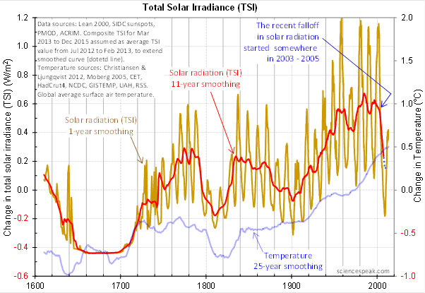
It revolved around the following graph from David Evans, referenced by both Leif Svalgaard and Lord Monckton, showing the basis of his predicted upcoming global cooling :
 Figure 3. David Evan’s graph of TSI (gold line), along with a centered 11-year moving average of the TSI data (red, with dotted blue extension), and a 25 year unspecified smooth of temperature, presumably a trailing average (blue line). (Click to enlarge)
Now, as you can see, the bright red line basically falls off the edge of the earth around 2004. The note says “The recent falloff in solar radiation started somewhere in 2003-2005″.
However, a look at both the SORCE and the CERES data shows no such “falloff in solar radiation”, neither precipitous nor otherwise. In fact, both datasets agree that by 2013 the TSI was well above the level in mid-2004.
Since there is no fall in the underlying data of any kind, why does the red 11-year average line show abrupt cooling starting around 2004?
The answer lies in the various problems with the graph.
• The TSI data is a splice of three datasets, with two of them showing the post-2000 period. This is a huge source of potential error in itself. However, it gets worse.
• One of the spliced datasets is the Lean TSI reconstruction, an outdated dataset that the authors of the reconstruction themselves admit is inaccurate.
• Another is the PMOD dataset. It is known to be reading low by 0.2 W/ms at the solar minimum, introducing a spurious apparently strong recent “cooling” where none exists.
• The 11-year centered average is an extremely bad choice for a filter for sunspot/TSI data. Because the solar cycle varies both longer and shorter than 11 years, at times the 11-year average actually reverses the sense of the data, converting peaks into valleys and valleys into peaks. Look at the period from 1760-1800 in Figure 3, for example. What is happening is that the frequency data is getting strongly aliased into the amplitude data. As a result, the average can end up far from the reality, particularly at the ends of the dataset.
For another example, look at the period just after 1740 in Figure 3. The 11-year average takes a huge vertical jump … but meanwhile back in the real word, the TSI itself is not rising at all. It is falling. Clearly, the large vertical jump in the red line is totally spurious.
• The TSI data has had about 900 days of “data” added to it using an arbitrarily chosen value. This is shown by the blue dots which indicate a continuing drop in the temperature.
So regarding the question of why the red line is acting so strangely, the answer is that we have a perfect storm of spliced data, bad data, arbitrary “data” added to the spliced bad data, and an extremely poor filter choice.
And as a result, the red line doesn’t represent reality in any shape or form. There is no precipitous drop in TSI starting around 2004. It doesn’t exist. Sure, the 11-year average says clearly that there is a huge drop starting around that time … but the actual data says something entirely different, as shown in Figures 1 and 2.
Now, in the heat of the moment Leif described the red line as being “almost fraudulent”. I think this was an over-reaction, but perhaps an understandable one. After all, if the red line were flipped over vertically it would make a lovely hockeystick, and if someone claimed warming was coming based on that hockeystick, people would call them alarmists … and calling someone an alarmist is certainly a close relative of calling them “almost fraudulent”.
However, my guideline is, never ascribe to malice what is adequately explained by error and misunderstanding. So I do not call their red line fraudulent, nor did I do so in the original discussion. Instead, I say that it is an error resulting from a misunderstanding. In any case, let me suggest that we leave out all ascription of motive and intent, that goes nowhere, and that we return to the science.
A more scientifically neutral description of the red line is that it is highly inaccurate and potentially misleading, because the apparent drop starting in 2003-2005 is simply an artifact of a combination of bad data and bad filtering.
Finally, to the degree that David Evans’ model predicts future cooling based on the red line, it is already falsified.
That is what I was trying to say, and I believe (subject to correction) that was what Leif was pointing out as well.
In closing, I will endeavor in this thread to keep my comments on as scientific a basis as possible, to avoid any personal references, and to not ascribe motive or intent. I request that everyone do the same. Many toes have already been stepped on in this discussion. Let’s see if we can simply discuss the science.
My best to all,
w.
VERY IMPORTANT: It is important in general, and in this discussion in particular, that you QUOTE THE EXACT WORDS THAT YOU DISAGREE WITH. Note that this doesn’t mean just referencing their entire comment. Quote the exact words of their comment that you think are in error, and tell us why you think those words are wrong. If you do not quote the exact words that you disagree with, none of us will know what you are referring to … and out of such misunderstandings grows animosity and misunderstanding.
Finally, please don’t delve into the rights and wrongs of what has happened in the previous discussions. I am not interested in the slightest in ascribing blame or responsibility. I have accepted my own responsibility for my own actions and apologized for wherever I was over the line. What I or the others did in the past is a blind alley, so please confine your comments to the science, and as the saying goes, “Let the dead past bury its dead”.
Anthony wrote:
The greater concern is that the post does meet your expectations. That presages a crisis. If there is a justifying subtext to it that the larger audience of which I am a part are not to know about then it is upon you to forgive our voiced rejections as we don’t have, by your choice, the rest of the story. That in itself is an interesting problem in communication. I don’t accept your criticism of my reaction.
I find it hard to compare graphs when the scales are so different (and different, one uses total, the other uses deltas), and when one graph is for 200 years whilst the other two are for 15 years.
That said, I find your argument interesting. Next I go read again what David Evans said and see his take on it. If you have any solutions to the smoothing problem, that would be nice.
Willis: “Now, in the heat of the moment Leif described the red line as being “almost fraudulent”. I think this was an over-reaction, but perhaps an understandable one. ”
Rather than being a reaction, I think that was the comment that created much of the heat. I don’t think it was justified or understandable.
David Evan’s analysis was very poorly done and should be criticised on that basis as you have done here. Accusing him of being “almost fraudulent” was unfounded and inappropriate.
It would be good if David Evans resonded to some of the technical criticism but I don’t see much evidence of that happening. I raised several of these issues over a Jonova’s ( in a non provocative way ) and got no response.
This whole ‘model’ is dead in the water as far as I can see.
The notch filter idea is a misinterpretation of FT analysis and is physically unreal
The ‘nuclear winter’ term is a massive fudge.
The sudden drop is a data processing error.
The initial idea of creating an alternative model, without AGW is a good one. He should probably forget the notch-delay and try again. It should not be too hard to construct something that fits better and GCM output.
Even Scafetta’s curve fitting has proved to be notably better than climate models.
Personally I think TSI is an averaged value of sun output and would be more interested in variations of magnetic field strength, UV ad extreme UV which I feel are more likely to be affecting our climate than straight TSI.
On another note, but relevant to the research topic is that I’ve been reading with interest about the Electric Sun. See:
http://electric-cosmos.org/sun.htm and
http://www.electricuniverse.info/Electric_Universe_theory
Haven’t decided how much I agree with it, but it certainly explains a few things a nuclear sun cannot.
Willis said:
“for sunspot data, the 11-year boxcar smooth is likely the worst possible choice of filters, because it inverts the data part of the time and emphasizes the data the rest of the time. ”
I don’t think David Evans claims it as the perfect solution. He accepts that the delayed thermal response of the Earth system is smeared across 4 to 15 years and he additionally accepts that the length of the solar cycle and hence the ideal length of the smoothing period is also variable.
Other factors are also involved and need to be separated out.
The thing is that around 2003/4 the averaged effect of the changes in TSI from the peak of cycle 23
start to kick in and David’s proposal that the smoothed pattern has some predictive capability will not be falsified for at least another 5 years.
I think you have been making unreasonable demands of the smoothing process at this early stage of its application to the TSI / temperature relationship.
Greg says:
July 17, 2014 at 12:04 am
Like Willis, I think you are expecting too much of the smoothing process.
As you point out, it does produce artifacts in both directions as a by product of the process.
However, where lagging effects are involved, smoothing does help to bring out the timing of longer term inflection points.
It isn’t perfect, especially if the underlying physical processes are themselves variable but it helps.
The smoothing applied by David Evans suggests that around 2003/4 a barrier was crossed which should result in a change in temperature trend around (not precisely at) 11 years later with that change in temperature trend itself being smeared across 4 to 15 years subject to interference from other factors such as ocean cycles that may be in or out of phase with the solar cycle to varying degrees.
It isn’t perfect but it is a legitimate starting point.
“If Willis had followed his own principle of quoting accurately, the bad blood might have been avoided.”
We are all entitled to our own opinions. We all make mistakes, sooner or later. The scientific method is not about making people angry or about bad blood.
Please stick to the scientific argument?
Rod said:
“Personally I think TSI is an averaged value of sun output and would be more interested in variations of magnetic field strength, UV and extreme UV which I feel are more likely to be affecting our climate than straight TSI.”
That is the idea that is emerging but it may involve the entire suite of chemical processes in the atmosphere.
The question then is whether TSI variations are related to wavelength variations at a later date which requires closer consideration of the relationship between TSI and magnetic field strength since the latter seems to be involved in the wavelength variations.
That is where it becomes necessary to try and identify ‘force x’ which David Evans sees as the relevant non TSI solar parameter driving changes in Earth’s climate system.
My view is that force x is the effect of wavelength and particle variations having a different effect on ozone amounts at different heights and at different latitudes.
waxing one’s wroth sounds unnecessarily painful.
“You are just sniping from the sidelines and causing trouble … sorry, not buying”.
Or
You are just shooting chaff and flares to distract or derail the scientific debate.
?
Willis,
As you are well aware I was in the thick of all that as well. I am beyond my anger and owe you an apology.
BTW I’m extremely glad you have looked into the splicing problem Willie Soon pointed out.
you called me quote ‘jerkwagon’.
you called me quote ‘a thief’
you called me boring and ignorant- and if you’re so senile you don’t remember, i’ll happily get you your quotes, verbatim.
now, i can question authority without being a terrorist; i can question a monopoly without being a thief and i can question willis without being an anonymous coward.
you have a long list of apologies owed because of a long list of offenses.
now, i want to know what is your motive for it?
– – – – – – – –
JoNova,
I thank you. It seems that instead of mending fences you have chosen, in your wonderful consistent civil way, a strategy of attempting removal of the fences in the dialog. Good.
Your energy level on the ‘notch’ project inspires.
John
We have graphed smoothed 11 year trends in TSI accurately. Anyone can replicate it.
There are no errors in the graphs.
The graph of smoothed TSI is merely a check to explain why there was a steep fall in the model. The model does not use 11 year smoothing, nor does it use the “red line” as Willis claims (“…David Evans’ model predicts future cooling based on the red line”):. I have explained this before, here on WUWT and to Willis. http://wattsupwiththat.com/2014/07/08/solar-notch-delay-model-released/#comment-1682221
I also said: “The TSI fall was always about 11-year smoothed trends. Leif and (Willis) continue to attack the strawman that it does not exist in monthly or daily data.”
It would surely be a sign of “good spirit” to actually read what we write. Hm?
Rocky says:
July 17, 2014 at 12:24 am
Does Evans have any chance of being correct in the main albeit with some errors in presentation and some errors in the graph ?
Solar scientist Habibullo Abdussamatov (who comes at it from a different direction) seems to think so.
This seems to provide supporting evidence. http://hockeyschtick.blogspot.co.uk/2014/07/analysis-solar-activity-ocean-cycles.html
CO2 is an effect of climate – not a cause. IMO.
Willis, there are 2 issues here:
1. Use of a faulty data set.
2. Use of 11 year smoothing,
On point 1, I am completely agnostic. You may be very well right and that could be a fatal issue for the model and it’s ability to say anything about future temps. I am not convinced either way.
On point 2, you still haven’t made your objections in the context of Dr Evan’s justification. I will allow that you very well be right, but you actually haven’t made a case at all. All you have said that it is inappropriate to use on TSI, but I have read their justification and it seems completely reasonable to me. This is something familiar to me from my line of work and I don’t see why you think it is inappropriate. Furthermore, Dr Evans ought to be given the benefit of the doubt in terms knowing what he is talking about as a respected electrical engineer and modeller. I’m not saying that means he is right, so if you see something that makes you go “hang on – this doesn’t look right” I’d try to get to the bottom of why he has done it. Having “no idea” why he has done it but proclaiming it as inappropriate doesn’t really further discussion.
So, with the greatest of respect, and in the spirit of polite scientific inquiry, I would love for you to characterise what you think Dr Evans is trying to do, or what you think his justifications are for using the 11 year smoothing, and then discuss why you don’t think it is the right way of determining long term trends in TSI. And what method do you think he should have used?
ren says:
July 16, 2014 at 11:51 pm
[snip – this thread isn’t about cosmic rays, but TSI. please post relevant comments only -mod]
I can’t tell what was deleted. But if it was about TSI as measured on earth cosmic rays are likely an influence. Svensmark. And then you have temperatures on earth. Which this thread is also about… If the labeling on the graph is correct.
Willlis
It is good to see you making an apology. I am not taking sides, both sides behavoir left much to be desired.
This is a blog, and people post without the care that they would take, if they were presenting a report or submission for work. Whilst people do not usually preface their comments as such, most comments here are simply an expression of opinion. Sometimes that opinion is backed up by data, and as we all know nearly all the data sets have issues (some serious) and usually there are other data sets which are to more or less extent conflicting, such that the presentation of any data is selective. It always surprises me how firm people are in their comments, since given the poor quality of the available data, the conflicting nature of much of the data, a firm conclussion about almost any issue (or sub issue) would seem impossible.
IMO you are too ready to jump to a conclussion that when someone disagrees with you, they are making an attack on you. That is easy for me to say, since you put yourself up, to be shot down. Rising to the bait, often distracts from the debate, and the comment section then becomes side tracked, rather than focusing on the science. All that I am saying is that (IMO) you need to be more thick skinned, and accept that criticism (sometimes unfounded criticism) and disagreement comes with the territory, and just ignore it and stick to the science. IMO, you are sometimes overly defensive. None of what I say is a personal criticism.
Moving on to this post, I am somewhat surprised by the way in which you have presented some of the data. IMO, I consider that you need to present the TSI data for the period well before 2000.
IF you are presenting data starting at around the year 2000, it appears to me that there is a drop in TSI almost immediately, ie., late 2000/early 2001. The suggestion that the decline is from around 2004, is not a reflection of the data set out in the two plots (figures 1 and 2).
The duration of the data set out in Figures 1 and 2 is too short to allow the reader to gain an impression as to whether anything unusual is happening as from 2000 onwards. One would have to see the data for prior periods to gain an impression as to whether the period post 2000 in some way appears unusual, and even if it was unusual that may not mean that there is anything of significance.
I agree with you that there are issues (significant issues at that) in the way the data is handled and presented in the Evan’s plot (figure 3). In particular, (IMO) it is always very dangerous to rely upon smoothed data, especially if you are looking at the end period of the smoothed data, and seeking to draw a conclusion as to what is happening in the final period of the smoothing.
Evans is using an 11 year smoothing; the final period of the data runs from 2003 to 2014, and he is trying to read something significant from that smoothing in the very final period that he has data for. However, 2004, 2005 and 2006 etc will look different as soon as data comes in for 2015, 2016, 2017 etc.
When the data comes in for say the period up to 2020, (IMO) it is almost certainly going to be the case that the smoothed data post 2000, will then no longer appear as if it has dropped off a cliff.
All of that said, whenever one discusses the influence of solar irradiance, one issue that remains is whether TSI is the relevanat metric. Matters could be much more subtle, such as responses to a change in wavelength distribution within TSI, and/or some coupled response with changes to the Earth’s magnetic field and its distribution (whether it is weakening or strengthening in localised areas of importance over the oceans, or land, the significance of which we do not yet appreciate still less understand).
Personally, I doubt that matters are so simple, and the reason why we cannot detect the presumed response is simply because we do not know or understand all the factors in play, and therefore we do not know what we are looking for.
But if CO2 continues to rise, and if the sun goes through a quiet period (whatever that might mean) and if temperatures do not rise, the case for suggesting that CO2 is the dominant driver of temperature will weaken, and the case that temperatures are driven largely by natural factors will strengthen. One of those natural factors is likely to be the sun, and/or clouds, and of course, it may well be that clouds have an unknown response to solar activity and subtle changes therein…
MikeUK says:
July 17, 2014 at 12:16 am
Exactly. In their world “correlation does not imply causation” becomes “non-correlation implies causation with a notch and a Force X”.
Credit to Willis for this post.
Here is SSN with 11y running mean and 11y triple running mean
http://climategrog.wordpress.com/?attachment_id=983
Note the way the running mean inverts the solar cycle around 1990 !
Once you actually remove the 11y cycle there is just a slow decline.
It’s only the measurable Nature that can and will validate or falsify Evan’s theory.
Earth is a water planet. With so much more Sun energy in the oceans than in the atmosphere and with several ocean cycles spanning from a few years to thousands of years.
And it’s affected by the Sun and clouds in many ways.
Some claim that 90% of climate science is not known or badly known. When we don’t know how climate fundamentally ticks what is the scientific motivations for all the current climate models?
So, with the greatest of respect, and in the spirit of polite scientific inquiry, I would love for you to characterise what you think Dr Evans is trying to do, or what you think his justifications are for using the 11 year smoothing, and then discuss why you don’t think it is the right way of determining long term trends in TSI. And what method do you think he should have used?
The purpose of the 11 year smoothing is to look for an inflection point. Other than that it and the data added to the endpoints are not germane. Did it find the correct (if there was one) inflection point? I think so. The result is the same as Habibullo Abdussamatov (HA) found by different means. Although David gives a range of 2014 to 2018 while HA says definitely 2014.
Jo Nova said:
“The graph of smoothed TSI is merely a check to explain why there was a steep fall in the model. The model does not use 11 year smoothing, nor does it use the “red line” as Willis claims ”
Good point, I’d missed that amongst the wealth of material.
Willis should just have apologised and left it at that rather than trying to explain further.
When two people argue over something that is relatively simple, there is usually some other factor involved.
JoNova says:
July 16, 2014 at 11:50 pm
Joanne, thanks for your reply. Let me take this first link to start with. In discussing TSI at your blog in that link, you say:
If you will note what I said above …
I agree with you that the 11-year boxcar filter drops precipitously around 2004. But as you agree, the data itself doesn’t do any such thing. You dismiss this ugly reality by saying that it is “technically true in a sense” … I don’t understand what “technically true in a sense” even means regarding observational data.


It is true, and undeniably true both technically and in every sense, that the TSI has not fallen since 2003.
Yes, the 11-year boxcar filter shows such a drop … so what? When filtered data disagrees with the unfiltered data, all that means is that you are using the wrong filter for the purpose. Instead of grasping that nettle, in your post you’ve shown that the 11-year boxcar filter makes the same hash out of other sunspot-related datasets. That merely emphasizes the inappropriate nature of the 11-year boxcar filter for sunspot data.
If you’d like another example of this exact same problem involving the 11-year boxcar smooth and sunspot data, take a look at “Sunny Spots Along The Parana River“. There, the authors made the same mistake of using an 11-year boxcar filter, and it made a total hash of their data as well.
Next, at your link you show the following graph:
Using that same data and taking the annual average to match it to your graph in Figure 3 above gives the following:
Now, it is true that the TSI value in 2013 is lower than the peak in 2002 in the PMOD data, by about 0.5 W/m2. However, there are a couple of caveats.
First, both the CERES satellite data and the SORCE satellite data shown above do not exhibit such behavior. The CERES dataset covers the full period from before the previous TSI maximum (which according to the PMOD data was in 2002) to 2013 … but the CERES data only shows a drop of about 0.35 W/m2 from 2002 to 2013.
More to the point, however, take a look at the size of the drop in the PMOD data. It’s about 0.5 W/m2 from 2002 to 2013, significantly larger than the CERES data for that time interval of a drop of 0.35 W/m2.
But that’s not the only problem. In your graph in Figure 3, you’ve spliced in the Lean data. And as a result, the drop in that dataset is no less than about 0.8 W/m2, a drop that is 60% LARGER than the drop in the PMOD data, and more than twice the drop shown in the CERES and SORCE datasets.
This is the problem with using such spliced datasets. You’ve introduced a huge, 0.3 W/m2 drop in the spliced data that is not present in the PMOD data … and of course, that will be reflected as a spurious, erroneous drop in the 11-year average.
And this is only compounded by the fact that the 11-year boxcar filter is making a mess of things because it aliases frequency data into the amplitude data. Again I invite you to look at what it does to the data just after 1740. The data is dropping fast … but the 11-year average is shooting for the sky. Surely you’d agree that that is totally spurious, to have the average hitting the roof while the data is hitting the floor …
So my objections still stand. You’ve used a perfect storm of spliced bad data and a very poorly chosen filter, and it’s given you erroneous results. There is no precipitous drop in TSI as the red line claims, that’s merely the result of erroneous data, poor splicing, and an inappropriate filter.
Regards, and thanks again for your reply,
w.
PS—Regarding the PMOD results, I find the following from the ACRIM website (emphasis mine):