Guest Post by Willis Eschenbach
Recently there have been a number of accusations and bad blood involving myself, David Evans, Joanne Nova, Lord Christopher Monckton, and Leif Svalgaard. Now, I cannot speak for any of them, but on my part, my own blood ended up mightily angrified, and I fear I waxed wroth.
However, I see no point in rehashing the past. What I want to do is to return to the underlying scientific questions. In that spirit, I apologize sincerely and completely for wherever I put in “something extra” in the previous discussion. In Buddhism, there’s a concept called “something extra”, and one is enjoined to avoid putting in “something extra”.
It is explained in the following way:
If I say “I am angry” that is simply a true statement.
But if I say “You made me angry”, that is something extra.
So I ask any and all of you to please accept my sincere apologies for whatever what I said that was something extra, so that we can move past this difficult time and get back to discussing the science. Both sides have legitimate grievances, and I am happy to make the first move to get past all of them by apologizing to all of you for whatever my part was in the bad blood. I hope that the other participants accept my apology in the spirit of reconciliation in which it is offered, and that we can move forwards without rancor or recriminations.
Regarding the science, let me go back to the original question, and see what I can do in the way of making my claims in a more Canadian manner. I’ll start by looking at the recent record of the “TSI”, the total solar irradiance:
 Figure 1. Monthly total solar irradiance as measured by the CERES satellite. Vertical blue line shows mid-2004.
Now, if you don’t like the data from the CERES satellite, here’s the SORCE satellite data:
 Figure 2. Daily total solar irradiance as measured by the SORCE satellite. Vertical red line indicates mid-2004. SOURCE
Note what is happening in both graphs after mid-2004 (vertical lines in both plots). As in every solar cycle, the TSI declines somewhat, and bottoms out. Then, it starts to rise again. And by the end of the datasets, in both cases the TSI is higher that it was in 2004.
So what was the scientific dispute all about, the discussion that underlies all of the bad feelings?
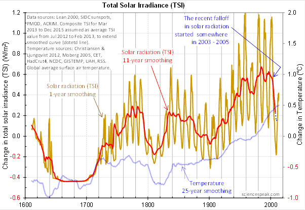
It revolved around the following graph from David Evans, referenced by both Leif Svalgaard and Lord Monckton, showing the basis of his predicted upcoming global cooling :
 Figure 3. David Evan’s graph of TSI (gold line), along with a centered 11-year moving average of the TSI data (red, with dotted blue extension), and a 25 year unspecified smooth of temperature, presumably a trailing average (blue line). (Click to enlarge)
Now, as you can see, the bright red line basically falls off the edge of the earth around 2004. The note says “The recent falloff in solar radiation started somewhere in 2003-2005″.
However, a look at both the SORCE and the CERES data shows no such “falloff in solar radiation”, neither precipitous nor otherwise. In fact, both datasets agree that by 2013 the TSI was well above the level in mid-2004.
Since there is no fall in the underlying data of any kind, why does the red 11-year average line show abrupt cooling starting around 2004?
The answer lies in the various problems with the graph.
• The TSI data is a splice of three datasets, with two of them showing the post-2000 period. This is a huge source of potential error in itself. However, it gets worse.
• One of the spliced datasets is the Lean TSI reconstruction, an outdated dataset that the authors of the reconstruction themselves admit is inaccurate.
• Another is the PMOD dataset. It is known to be reading low by 0.2 W/ms at the solar minimum, introducing a spurious apparently strong recent “cooling” where none exists.
• The 11-year centered average is an extremely bad choice for a filter for sunspot/TSI data. Because the solar cycle varies both longer and shorter than 11 years, at times the 11-year average actually reverses the sense of the data, converting peaks into valleys and valleys into peaks. Look at the period from 1760-1800 in Figure 3, for example. What is happening is that the frequency data is getting strongly aliased into the amplitude data. As a result, the average can end up far from the reality, particularly at the ends of the dataset.
For another example, look at the period just after 1740 in Figure 3. The 11-year average takes a huge vertical jump … but meanwhile back in the real word, the TSI itself is not rising at all. It is falling. Clearly, the large vertical jump in the red line is totally spurious.
• The TSI data has had about 900 days of “data” added to it using an arbitrarily chosen value. This is shown by the blue dots which indicate a continuing drop in the temperature.
So regarding the question of why the red line is acting so strangely, the answer is that we have a perfect storm of spliced data, bad data, arbitrary “data” added to the spliced bad data, and an extremely poor filter choice.
And as a result, the red line doesn’t represent reality in any shape or form. There is no precipitous drop in TSI starting around 2004. It doesn’t exist. Sure, the 11-year average says clearly that there is a huge drop starting around that time … but the actual data says something entirely different, as shown in Figures 1 and 2.
Now, in the heat of the moment Leif described the red line as being “almost fraudulent”. I think this was an over-reaction, but perhaps an understandable one. After all, if the red line were flipped over vertically it would make a lovely hockeystick, and if someone claimed warming was coming based on that hockeystick, people would call them alarmists … and calling someone an alarmist is certainly a close relative of calling them “almost fraudulent”.
However, my guideline is, never ascribe to malice what is adequately explained by error and misunderstanding. So I do not call their red line fraudulent, nor did I do so in the original discussion. Instead, I say that it is an error resulting from a misunderstanding. In any case, let me suggest that we leave out all ascription of motive and intent, that goes nowhere, and that we return to the science.
A more scientifically neutral description of the red line is that it is highly inaccurate and potentially misleading, because the apparent drop starting in 2003-2005 is simply an artifact of a combination of bad data and bad filtering.
Finally, to the degree that David Evans’ model predicts future cooling based on the red line, it is already falsified.
That is what I was trying to say, and I believe (subject to correction) that was what Leif was pointing out as well.
In closing, I will endeavor in this thread to keep my comments on as scientific a basis as possible, to avoid any personal references, and to not ascribe motive or intent. I request that everyone do the same. Many toes have already been stepped on in this discussion. Let’s see if we can simply discuss the science.
My best to all,
w.
VERY IMPORTANT: It is important in general, and in this discussion in particular, that you QUOTE THE EXACT WORDS THAT YOU DISAGREE WITH. Note that this doesn’t mean just referencing their entire comment. Quote the exact words of their comment that you think are in error, and tell us why you think those words are wrong. If you do not quote the exact words that you disagree with, none of us will know what you are referring to … and out of such misunderstandings grows animosity and misunderstanding.
Finally, please don’t delve into the rights and wrongs of what has happened in the previous discussions. I am not interested in the slightest in ascribing blame or responsibility. I have accepted my own responsibility for my own actions and apologized for wherever I was over the line. What I or the others did in the past is a blind alley, so please confine your comments to the science, and as the saying goes, “Let the dead past bury its dead”.
[snip – OK enough of this pissing match, the thread is about mending fences, not bashing heads. Kindly dial it back please, and that’s not just Leif, all of you. – Anthony]
NOTE: Everybody take a time out. I’m closing this thread for awhile because it is just turning into a war of words about other people, not the science at hand.