Guest Post by Willis Eschenbach
Recently there have been a number of accusations and bad blood involving myself, David Evans, Joanne Nova, Lord Christopher Monckton, and Leif Svalgaard. Now, I cannot speak for any of them, but on my part, my own blood ended up mightily angrified, and I fear I waxed wroth.
However, I see no point in rehashing the past. What I want to do is to return to the underlying scientific questions. In that spirit, I apologize sincerely and completely for wherever I put in “something extra” in the previous discussion. In Buddhism, there’s a concept called “something extra”, and one is enjoined to avoid putting in “something extra”.
It is explained in the following way:
If I say “I am angry” that is simply a true statement.
But if I say “You made me angry”, that is something extra.
So I ask any and all of you to please accept my sincere apologies for whatever what I said that was something extra, so that we can move past this difficult time and get back to discussing the science. Both sides have legitimate grievances, and I am happy to make the first move to get past all of them by apologizing to all of you for whatever my part was in the bad blood. I hope that the other participants accept my apology in the spirit of reconciliation in which it is offered, and that we can move forwards without rancor or recriminations.
Regarding the science, let me go back to the original question, and see what I can do in the way of making my claims in a more Canadian manner. I’ll start by looking at the recent record of the “TSI”, the total solar irradiance:
 Figure 1. Monthly total solar irradiance as measured by the CERES satellite. Vertical blue line shows mid-2004.
Now, if you don’t like the data from the CERES satellite, here’s the SORCE satellite data:
 Figure 2. Daily total solar irradiance as measured by the SORCE satellite. Vertical red line indicates mid-2004. SOURCE
Note what is happening in both graphs after mid-2004 (vertical lines in both plots). As in every solar cycle, the TSI declines somewhat, and bottoms out. Then, it starts to rise again. And by the end of the datasets, in both cases the TSI is higher that it was in 2004.
So what was the scientific dispute all about, the discussion that underlies all of the bad feelings?
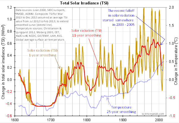
It revolved around the following graph from David Evans, referenced by both Leif Svalgaard and Lord Monckton, showing the basis of his predicted upcoming global cooling :
 Figure 3. David Evan’s graph of TSI (gold line), along with a centered 11-year moving average of the TSI data (red, with dotted blue extension), and a 25 year unspecified smooth of temperature, presumably a trailing average (blue line). (Click to enlarge)
Now, as you can see, the bright red line basically falls off the edge of the earth around 2004. The note says “The recent falloff in solar radiation started somewhere in 2003-2005″.
However, a look at both the SORCE and the CERES data shows no such “falloff in solar radiation”, neither precipitous nor otherwise. In fact, both datasets agree that by 2013 the TSI was well above the level in mid-2004.
Since there is no fall in the underlying data of any kind, why does the red 11-year average line show abrupt cooling starting around 2004?
The answer lies in the various problems with the graph.
• The TSI data is a splice of three datasets, with two of them showing the post-2000 period. This is a huge source of potential error in itself. However, it gets worse.
• One of the spliced datasets is the Lean TSI reconstruction, an outdated dataset that the authors of the reconstruction themselves admit is inaccurate.
• Another is the PMOD dataset. It is known to be reading low by 0.2 W/ms at the solar minimum, introducing a spurious apparently strong recent “cooling” where none exists.
• The 11-year centered average is an extremely bad choice for a filter for sunspot/TSI data. Because the solar cycle varies both longer and shorter than 11 years, at times the 11-year average actually reverses the sense of the data, converting peaks into valleys and valleys into peaks. Look at the period from 1760-1800 in Figure 3, for example. What is happening is that the frequency data is getting strongly aliased into the amplitude data. As a result, the average can end up far from the reality, particularly at the ends of the dataset.
For another example, look at the period just after 1740 in Figure 3. The 11-year average takes a huge vertical jump … but meanwhile back in the real word, the TSI itself is not rising at all. It is falling. Clearly, the large vertical jump in the red line is totally spurious.
• The TSI data has had about 900 days of “data” added to it using an arbitrarily chosen value. This is shown by the blue dots which indicate a continuing drop in the temperature.
So regarding the question of why the red line is acting so strangely, the answer is that we have a perfect storm of spliced data, bad data, arbitrary “data” added to the spliced bad data, and an extremely poor filter choice.
And as a result, the red line doesn’t represent reality in any shape or form. There is no precipitous drop in TSI starting around 2004. It doesn’t exist. Sure, the 11-year average says clearly that there is a huge drop starting around that time … but the actual data says something entirely different, as shown in Figures 1 and 2.
Now, in the heat of the moment Leif described the red line as being “almost fraudulent”. I think this was an over-reaction, but perhaps an understandable one. After all, if the red line were flipped over vertically it would make a lovely hockeystick, and if someone claimed warming was coming based on that hockeystick, people would call them alarmists … and calling someone an alarmist is certainly a close relative of calling them “almost fraudulent”.
However, my guideline is, never ascribe to malice what is adequately explained by error and misunderstanding. So I do not call their red line fraudulent, nor did I do so in the original discussion. Instead, I say that it is an error resulting from a misunderstanding. In any case, let me suggest that we leave out all ascription of motive and intent, that goes nowhere, and that we return to the science.
A more scientifically neutral description of the red line is that it is highly inaccurate and potentially misleading, because the apparent drop starting in 2003-2005 is simply an artifact of a combination of bad data and bad filtering.
Finally, to the degree that David Evans’ model predicts future cooling based on the red line, it is already falsified.
That is what I was trying to say, and I believe (subject to correction) that was what Leif was pointing out as well.
In closing, I will endeavor in this thread to keep my comments on as scientific a basis as possible, to avoid any personal references, and to not ascribe motive or intent. I request that everyone do the same. Many toes have already been stepped on in this discussion. Let’s see if we can simply discuss the science.
My best to all,
w.
VERY IMPORTANT: It is important in general, and in this discussion in particular, that you QUOTE THE EXACT WORDS THAT YOU DISAGREE WITH. Note that this doesn’t mean just referencing their entire comment. Quote the exact words of their comment that you think are in error, and tell us why you think those words are wrong. If you do not quote the exact words that you disagree with, none of us will know what you are referring to … and out of such misunderstandings grows animosity and misunderstanding.
Finally, please don’t delve into the rights and wrongs of what has happened in the previous discussions. I am not interested in the slightest in ascribing blame or responsibility. I have accepted my own responsibility for my own actions and apologized for wherever I was over the line. What I or the others did in the past is a blind alley, so please confine your comments to the science, and as the saying goes, “Let the dead past bury its dead”.
dp says:
July 16, 2014 at 11:20 pm
Oh, please. Now you’re the anonymous expert on apologies. The truth is that I don’t know exactly what it was I said that upset the various players, nor do I particularly care at this late date to try to find out. So I have apologized for whatever it was I said that in their opinion was over the line.
You don’t like that? So what?
It is exactly this kind of rehashing of the details of exactly what I said, and what they said in response, and what I replied, and what they felt, endlessly repeated, that I have no interest in. You keep insisting that I look backwards. Sorry, I’m moving forwards, you can look backwards if you wish.
As to whether I want to know who you are, I have absolutely no interest in you, your name, or your opinions. You are not a participant in either the science nor in the bad feelings, you’re just a snide know-it-all sitting on the sidelines who doesn’t even have what it takes to sign his name to his own words. You can walk away from your words. I can’t. I have to apologize when I’m out of line, and that’s what I’ve done.
Here’s the thing, dp. If I were apologizing to you, your opinion on my apology would be of interest to me. But since I wasn’t, I don’t care in the slightest what you think.
Get with the picture, my friend. This bus in going forwards. Your attempts to sidetrack the discussion into who said what are unpleasant, but ultimately futile. I’m not going there, I’m not interested in who said what back in the past. That just leads to more bad feelings, and I’m not going that direction, so you might as well give it up and GET BACK TO THE SCIENCE.
w.
Figure F10, 7 represents the variation of UV radiation. Clearly a sharp drop in radiation in December 2003.
http://oi57.tinypic.com/jqg961.jpg
This decrease in UV refers to the discussion on the decline of the TSI, in 2003. Sorce has data from 2003 and that’s the problem.
http://lasp.colorado.edu/home/sorce/data/#chart
Please see F 10.7 (respectively UV) and index of the El Niño.
http://oi58.tinypic.com/aze78l.jpg
Santa Baby says:
July 16, 2014 at 11:34 pm
Yep. Simple fact. Buddha said that we always have one choice in life, to dig it or bitch about it. Not in those words, of course, but that was his message. The external circumstances are given, but our own response to those circumstances is … our own.
w.
The part of the spectrum immediately to the left of blue, between 200 and 400 nm is the ultraviolet light (UV). The UV is usually divided into three components, with increasing energy:
UV-A: 320-400 nm
UV-B: 280-320 nm
UV-C: 200-280 nm
http://www.temis.nl/uvradiation/info/figs/fig1-01_sm.gif
During low solar activity decrease of UV radiation and cosmic rays increase progressing in parallel. This is the reason for the strong reaction of the stratosphere for long periods of low solar activity (solar cycles long).
Both of types of radiation are strongly ionizing radiation the ozone layer,
because changes occur in the amount and distribution of ozone in the stratosphere.
Stratospheric waves are then cause changes in circulation in the troposphere.
Us see the excess ozone near the southern magnetic pole.
http://www.temis.nl/protocols/o3field/data/omi/forecast/today_wd.gif
But at an altitude of about 45 km whatsoever lack of ozone in the area of the magnetic pole. This means only one thing: a strong ionization of GCR from 10hPa down.
http://www.cpc.ncep.noaa.gov/products/stratosphere/strat_a_f/gif_files/gfs_t01_sh_f00.gif
http://www.cpc.ncep.noaa.gov/products/stratosphere/strat_a_f/gif_files/gfs_t10_sh_f00.gif
http://www.cpc.ncep.noaa.gov/products/stratosphere/strat_a_f/gif_files/gfs_t100_sh_f00.gif
Thomas says:
July 16, 2014 at 11:23 pm
I love the anonymice who don’t have what it takes to sign their own words, who have never apologized in public and never have a need to since they can just change their alias and walk away …and yet they are somehow experts on apologies, they know what’s in my mind when I write, and they sit on the sidelines and set themselves up as judges of my moral behavior.
In any case, did you miss the part about QUOTE THE EXACT WORDS that you object to?
w.
Willis, I am sorry (I take your attempt at reconciliation on its face) but I still think you are missing the point. As far as I understand it, the TSI is merely an indicator of something else that Evans/Nova that effects climate and that appears when looking at longer term trends indicated by the 11 year smoothing. I also don’t think you have read and fully parsed what it is that they are trying to so and show by the model.
And I also don’t agree that if the direction was reversed and showing a ‘hockey stick’ it would be invalid either. Looking back over the whole of the series you could point to periods where there are steep rises and steep falls. In and of itself that doesn’t say anything remarkable. That’s why Mann tried to eliminate the MWP and the LIA, so that the uptick in the modern era did say something remarkable.
Can I ask you to characterise Dr Evans justification for using an 11 year smoothing and then outline in that context why you don’t agree that is appropriate?
Because for the purposes of understanding what it is they are trying to get at, it is not the 2000s and the relative differences in maxima that are interesting it is the difference between the 90s and the 2000s.
ren says:
July 16, 2014 at 11:35 pm
Thanks, Ren. However, David Evans graph said not one word about UV, Figure F10,7, or the El Nino. So I fear you are way, way off topic. The question is, does the TSI data show a precipitous “recent falloff in solar radiation” as the red line claims … and the answer is a resounding no.
w.
Willis sez:
You involved me and everyone else when you posted your what ever you call it in a public forum. That makes it mine to respond to because you put it under my gaze. No, it wasn’t directed to me, but it was available to me by your hand. So I’m what? Responding? Oh hell yes.
So You’ve had my reaction and you don’t care. Well I’m over that and it doesn’t change anything, of course. That you don’t care means your posting it in a public forum was another meaningless thing to do. I didn’t do that. If your apology were important between you and your antagonists I’d have never known about it, but that is not what you chose to do. So here we are having this conversation about your bad behavior and you are apologizing for something you can’t identify and I am being vilified. I never expected less.
Never the less, I love reading your travelogues. Ok, I’m weak.
We have already responded to most of these points, and in depth:
http://joannenova.com.au/2014/07/the-solar-model-finds-a-big-fall-in-tsi-data-that-few-seem-to-know-about/
http://joannenova.com.au/2014/07/more-strange-adventures-in-tsi-data-the-miracle-of-900-fabricated-fraudulent-days/
In particular see this graph:
http://jonova.s3.amazonaws.com/graphs/solar-radiation/tsi-datasets-ls.gif
All the data and calculations and graphs are available here:
http://joannenova.com.au/2014/07/big-news-ix-the-model/
If Willis had followed his own principle of quoting accurately, the bad blood might have been avoided.
Thanks Jo Nova for responding.
Just a small niggle, you’ve accidentally misspelled Leif’s name in the graph here: http://jonova.s3.amazonaws.com/graphs/solar-radiation/tsi-datasets-ls.gif
[snip – this thread isn’t about cosmic rays, but TSI. please post relevant comments only -mod]
Willis :
Good man Willis. Looks like your vacation is doing you some good.
That little gem of buddhist philosophy can be applied to more than the comments on the “notch-delay”. I hope you will be able to apply it more broadly. 😉
One other thing – could you please, please, please (I am officially ‘begging’ you) stop responding to those who are merely trying to provoke you? Or if you must, with the utmost delicacy? Because then the tone of thread turns into more mud slinging and we have to wade through metres of excremental trying to get to any interesting points you or others make regarding the actual science. What would a Canadian do? 🙂
Window dressing. It isn’t what he does. Love your blog – keep doing it.
“You just want to snipe from the sidelines and cause trouble … sorry, not buying.”
So, that thing about not ascribing motive? How long did that last?
I take your apology as totally serious in intent, but I also think that habits of thought that get us into such situations are easy to apologise for, harder to break.
The real test of whether or not the apology is sincere, is not anybody elses feelings about it, or even your own.
It’s whether or not you stop the behaviour.
You know, the ascribing motive to other people’s words when there is no realistic chance you can possibly know their motives?
Yeah, that thing.
Now, you have a simple choice. You can take my words as “sniping from the sidelines” or you can take them as pertinent advice given in good faith. You have no way of knowing which they’re intended as, but your choice tells your readers about you, not about me or my words.
Agnostic says:
July 16, 2014 at 11:48 pm
I am simply looking at the graph. It doesn’t matter whether the TSI is an “indicator of something else”, because they have misrepresented the TSI as falling precipitously, when it is not doing that.
In addition, the problem is that the longer term trends are NOT indicated by the 11-year smoothing, because it is the wrong filter for the purpose.
Again, not relevant to whether the TSI started to fall precipitously around 2004 as the red line shows.
Agnostic, the problem with “looking back over the whole of the series” is that you are looking at the Lean dataset, which is outdated and known to be wrong. So any conclusions you might draw from it are likely to be wrong as well, garbage in, garbage out.
I have no idea why he chose the 11-year boxcar filter to do the smoothing. I’ve explained why it’s perhaps the worst possible choice—because the period of the signal varies both above and below the period of the filter. As a result, the frequency data gets aliased into the amplitude data, yielding results that have nothing to do with the actual variations in TSI. If you think aliasing the frequency data into the amplitude is acceptable practice, ask any signals engineer …
Read the post again. The PMOD dataset that they are using post-2000 is known to be about 0.2 W/m2 too low at solar minimum. Remember that TSI at solar minimum varies very little, it is only at solar max that there are variations … so a 0.2 W/m2 error at solar minimum translates into a very large, but totally spurious, indicated drop post 2000.
As a result, their spliced-together combination of the faulty Lean reconstruction plus PMOD data with a bias error is USELESS for comparing 1990s with post 2000.
w.
Willis:
Thanks Willis, saved me the effort.
That sudden drop is an artefact of the boxcar, running mean. There is a marked drop in SSN compared to the last cycle but it did nothing to do with 2003. I’m surprised that that some like Dr David Evans, with engineering training, does not question why there is a sudden drop in the data when he has imagines he has removed all the high frequency signal with a low pass filter.
@ur momisugly Stephen Wilde, I suggest you read this explanation of the problem with running average “smoothers”:
http://climategrog.wordpress.com/2013/05/19/triple-running-mean-filters/
Denver C Fletcher says:
July 16, 2014 at 11:57 pm
My apologies. Let me rephrase that to describe his actions:
“You are just sniping from the sidelines and causing trouble … sorry, not buying”.
However … unless he is doing that by accident, then it is what he wants to do, so my remarks were accurate.
Happy now?
w.
Being angry means loosing active control of your brain and going auto. My sister was an expert on this topic and used it actively as a ruler technique.
First she attacks you in a rude way verbally with the object to have the victim loose his mind.
If that did not work she would attack physically until the victim responded physical back.
Then she would fall to the ground crying claiming the “victim” had been very bad to her.
Absurd but it worked for her most of the times and she is still using this technique today 🙂
Willis you should have fallen to the ground crying claiming they had treated you badly?
The sheer intensity of the work done on this blog and Joe Nova’s, etc, etc, is obviously telling, fraying nerves. You guys are world class heros, stop a minute and contemplate that.
I think this question of the display processing of TSI data is a red herring, the real issue is the total implausibility and lack of evidence for a “notch” filter in the climate system.
To establish such a notch you have to demonstrate that global temperatures are responding to oscillations faster than the 11-year cycle, maybe the second harmonic of that cycle (period around 5.5 years).
Heck, people have struggled to show the tiny variations expected from the 11-year oscillations, and the second harmonic is way smaller than that.
The reality is that the high frequency parts of TSI and Temp are just 2 unrelated time series, and David Evans has made a major error in dividing their spectra and claiming that the result is a transfer function.
Another point: global mean temperatures are actually the MEDIAN of all the data, the point halfway up the list after ordering. Solar effects could well be having a measurable effect on tropical temperatures, but at the same time very little effect on the median, because those tropical temps are already in the upper half of the data. Long-term trends will eventually show up in the median as heat flows to the poles, but not the rapid oscillations that David Evans is claiming.
Title of the post: “Mending fences”
So much for that idea …….
Maybe next cycle.
There are cycles, right ?
Does Evans have any chance of being correct in the main albeit with some errors in presentation and some errors in the graph ?
“Sure, the 11-year average says clearly that there is a huge drop starting around that time … but the actual data says something entirely different, as shown in Figures 1 and 2.”
You’ve lost me here.
Peaks and troughs are not really the issue, (we had a similar discussion with regards to peaks and troughs in relation to solar irradiation in a previous post about temperature changes over the LIA (Maunder and Dalton Minimums)); these effects tend to average out because there isn’t enough time for the earth to respond to large magnitude, but short period, irradiance changes.
What happens is that the earth responds to the 8-14 year solar cycle in a manner more akin to momentum in physics, it takes a while for earth temperatures to trend in one direction and once in place tends to follow in such a direction, at least for a period of decades after a peak. Slow ocean heat transfer means there is a lag period to solar changes, data from the past suggests this is of the order of decades.
I cant believe people are still arguing about what is essentially a simple matter. Has average TSI dropped over the last 10 years or so, or hasn’t it?
This argument will keep going round in circles until the extraneous factor of whether there is, and to what length and degree, a lag time in response to TSI changes is recognised, I suspect this factor is the core of the disagreement over TSI.
I was happy before, Willis.
I love this website and I think you guys (all of the parties to this recent contretemps) do great work.
But you dont seem very happy …
Be that as it may, I will go back to lurking and enjoying the scientific discussion.
My sincerest regards to you, sir.