UPDATE: See the correction at the end of the post, which pertained to the discussion of the trend maps in Figures 13 and 14. I’ve crossed out the paragraph between those illustrations that was incorrect. And I’ve corrected a good number of typos in the text and illustrations. Thanks to all who found them.
# # #
OVERVIEW
I have been asked to include Lower Troposphere Temperature (TLT) anomaly datasets in my monthly global temperature updates…ever since I first started those updates a year ago. This post will serve as a reference for the new monthly updates, which will include TLT data.
This post begins with the comparisons of the surface temperature data and the lower troposphere temperature data as they will appear in those update posts. That’s followed by a graph that presents the average of the global surface temperate data with the average of the lower troposphere temperature data. Then we’ll discuss the differences between the RSS and UAH lower troposphere data. That portion of the post includes descriptions of the RSS and UAH lower troposphere data, for those new to those datasets. Those descriptions will be used in the upcoming updates as well.
Next are some interesting similarities and differences between the lower troposphere and surface temperature data, with the data subdivided into land-only and ocean-only subsets. There may be a few surprises there if you’re not intimately familiar with all of the datasets. And finally we’ll compare the trends of the five datasets on a latitude-average (zonal-mean) basis…throwing in the outputs of the climate models stored in the CMIP5 archive to show how poorly the models perform.
STANDARD COMPARISONS
The following four graphs are the comparisons of surface temperature data and lower troposphere temperature data as they will appear in the updates. As you’ll note, I have not made any effort to standardize the data due to the additional volatility of the lower troposphere temperature data. The only changes are my use of the common base years of 1981-2000 for anomalies. The revised text for the updates will read:
The GISS, HADCRUT4 and NCDC global surface temperature anomalies and the RSS and UAH lower troposphere temperature anomalies are compared in the next three time-series graphs. Figure 1 compares the five global temperature anomaly products starting in 1979. Again, due to the timing of this post, the HADCRUT4 data lags the UAH, RSS, GISS and NCDC products by a month. The graph also includes the linear trends. Because the three surface temperature datasets share common source data, (GISS and NCDC also use the same sea surface temperature data) it should come as no surprise that they are so similar. For those wanting a closer look at the more recent wiggles and trends, Figure 2 starts in 1998, which was the start year used by von Storch et al (2013) Can climate models explain the recent stagnation in global warming? They, of course, found that the CMIP3 (IPCC AR4) and CMIP5 (IPCC AR5) models could NOT explain the recent halt in warming.
Figure 3 starts in 2001, which was the year Kevin Trenberth chose for the start of the warming halt in his RMS article Has Global Warming Stalled? Because the suppliers all use different base years for calculating anomalies, I’ve referenced them to a common 30-year period: 1981 to 2010. Referring to their discussion under FAQ 9 here, according to NOAA:
This period is used in order to comply with a recommended World Meteorological Organization (WMO) Policy, which suggests using the latest decade for the 30-year average.

Figure 1 – Comparison Starting in 1979
###########

Figure 2 – Comparison Starting in 1998
###########

Figure 3 – Comparison Starting in 2001
AVERAGE
Figure 4 presents the average of the GISS, HADCRUT and NCDC land plus sea surface temperature anomaly products and the average of the RSS and UAH lower troposphere temperature data. Again because the HADCRUT4 data lags one month in this update, the most current surface data average only includes the GISS and NCDC products.

Figure 4 – Average of Global Temperature Anomaly Products (TLT and Surface)
The flatness of the data since 2001 is very obvious, as is the fact that surface temperatures have rarely risen above those created by the 1997/98 El Niño in the surface temperature data. There is a very simple reason for this: the 1997/98 El Niño released enough sunlight-created warm water from beneath the surface of the tropical Pacific to permanently raise the temperature of about 66% of the surface of the global oceans by almost 0.2 deg C. Sea surface temperatures for that portion of the global oceans remained relatively flat until the El Niño of 2009/10, when the surface temperatures of the portion of the global oceans shifted slightly higher again. Prior to that, it was the 1986/87/88 El Niño that caused surface temperatures to shift upwards. If these naturally occurring upward shifts in surface temperatures are new to you, please see the illustrated essay “The Manmade Global Warming Challenge” (42mb) for an introduction.
STANDARD TLT BOILERPLATE FOR THE MONTHLY UPDATES
The following are the introductions to the two lower troposphere temperature anomaly datasets as they will appear in the monthly updates:
UAH Lower Troposphere Temperature (TLT) Anomaly Data
Special sensors (microwave sounding units) aboard satellites have orbited the Earth since the late 1970s, allowing scientists to calculate the temperatures of the atmosphere at various heights above sea level. The level nearest to the surface of the Earth is the lower troposphere. The lower troposphere temperature data include the altitudes of zero to about 12,500 meters, but are most heavily weighted to the altitudes of less than 3000 meters. See the left-hand cell of the illustration here. The lower troposphere temperature data are calculated from a series of satellites with overlapping operation periods, not from a single satellite. The monthly UAH lower troposphere temperature data is the product of the Earth System Science Center of the University of Alabama in Huntsville (UAH). UAH provides the data broken down into numerous subsets. See the webpage here. The UAH lower troposphere temperature data are supported by Christy et al. (2000) MSU Tropospheric Temperatures: Dataset Construction and Radiosonde Comparisons. Additionally, Dr. Roy Spencer of UAH presents at his blog the monthly UAH TLT data updates a few days before the release at the UAH website. Those posts are also cross posted at WattsUpWithThat. UAH uses the base years of 1981-2010 for anomalies. The UAH lower troposphere temperature data are for the latitudes of 85S to 85N, which represent more than 99% of the surface of the globe.
Update: The March 2014 UAH lower troposphere temperature anomaly is +0.17 deg C. It is basically unchanged (a decrease of about -0.01 deg C) since February 2014.

Figure 5 – UAH Lower Troposphere Temperature (TLT) Anomaly Data
RSS Lower Troposphere Temperature (TLT) Anomaly Data
Like the UAH lower troposphere temperature data, Remote Sensing Systems (RSS) calculates lower troposphere temperature anomalies from microwave sounding units aboard a series of NOAA satellites. RSS describes their data at the Upper Air Temperature webpage. The RSS data are supported by Mears and Wentz (2009) Construction of the Remote Sensing Systems V3.2 Atmospheric Temperature Records from the MSU and AMSU Microwave Sounders. RSS also presents their lower troposphere temperature data in various subsets. The land+ocean TLT data are here. The ocean-only data are here. And the land only data are here. Curiously, on those webpages, RSS lists the data as extending from 82.5S to 82.5N, while on their Upper Air Temperature webpage linked above, they state:
We do not provide monthly means poleward of 82.5 degrees (or south of 70S for TLT) due to difficulties in merging measurements in these regions.
Also see the RSS MSU & AMSU Time Series Trend Browse Tool. RSS uses the base years of 1979 to 1998 for anomalies.
Update: The March 2014 RSS lower troposphere temperature anomaly is +0.24 +0.21deg C. It rose (an increase of about +0.05 deg C) since February 2014.

Figure 6 – RSS Lower Troposphere Temperature (TLT) Anomaly Data
A Quick Note about the Difference between RSS and UAH TLT data
There is a noticeable difference between the RSS and UAH lower troposphere temperature anomaly data. Dr. Roy Spencer discussed this in his July 2011 blog post On the Divergence Between the UAH and RSS Global Temperature Records. In summary, John Christy and Roy Spencer believe the divergence is caused by the use of data from different satellites. UAH has used the NASA Aqua AMSU satellite in recent years, while as Dr. Spencer writes:
…RSS is still using the old NOAA-15 satellite which has a decaying orbit, to which they are then applying a diurnal cycle drift correction based upon a climate model, which does not quite match reality.
I have updated the graphs in Roy Spencer’s post in the following section of this post. (And I’ll link this post to the regular update.)
While the two lower troposphere temperature datasets are different in recent years, UAH believes their data are correct, and, likewise, RSS believes their TLT data are correct. Does the UAH data have a warming bias in recent years or does the RSS data have cooling bias? Until the two suppliers can account for and agree on the differences, both are available for presentation.
[This ends the discussions that will be included in the monthly updates.}
UPDATE OF THE GRAPHS ABOUT THE DIVERGENCE BETWEEN RSS AND UAH GLOBAL TEMPERATURE RECORDS
This section is provided to update the graphs presented in Dr. Roy Spencer’s blog post On the Divergence Between the UAH and RSS Global Temperature Records. Figure 7 compares the RSS and UAH lower troposphere temperature anomalies (base years 1981-2010) for the latitudes used by RSS: 70S-82.5N. The warming rate shown by the UAH TLT data is about 10% higher than the RSS data. The correlation coefficient between the two datasets is high at 0.97.

Figure 7
But as shown in Figure 2 above, during the period from January 1998 to March 2014, the UAH shows a slight warming trend of +0.06 deg C/decade, while the RSS data shows cooling at a rate of -0.05 deg C/decade. We can further illustrate the difference between the two datasets by subtracting the UAH lower troposphere temperature anomalies from the RSS data. See Figure 8.

Figure 8
Once again, as discussed in Roy Spencer’s post, it is believed that the difference is caused by the use of data from different satellites.
You’ll note that I used the same latitudes for the comparisons of RSS and UAH TLT data above in Figure 7 and 8. That was to eliminate any conjecture that the differences between RSS and UAH TLT data are caused by the different portions of the Earth they sample.
OCEAN DATA COMPARISONS
Lower troposphere data are available for the portions of the atmosphere that are only above the global oceans. The surface temperature datasets, on the other hand, use sea surface temperature data for the oceans. So comparisons of sea surface temperature data and lower troposphere data above the oceans are not apples to apples. To further complicate things, the RSS lower troposphere temperature anomaly data are limited to the latitudes of 70S-82.5N, so for the next comparison, the sea surface temperature data and the UAH data are from the Monthly observations webpage at the KNMI Climate Explorer, which allows users to define the coordinates of the desired data. And I’ve limited all of the data to the RSS latitudes. KNMI also provides land masks for the GISS LOTI and UAH TLT data, so we can capture the ocean portions of their datasets for those latitudes. And I’ve included HADSST3 data and ERSST.v3b data for the sea surface temperature portions of the UKMO and NOAA data, respectively.
Even with the differences in the data sources, as shown in Figure 9, the warming rates are quite similar. For the 34+ year term of the TLT data, there is only a 0.03 deg C/decade spread in the warming rates of the ocean data for all 5 datasets. And over that period, the average warming rate is a measly 0.1 deg C/decade.

Figure 9
The lower troposphere temperature anomaly data are definitely more volatile. This is easier to see when the data have been smoothed with 12-month running-mean filters, as shown in Figure 10. The additional volatility is evident in the response to volcanic eruption of Mount Pinatubo in 1991, and in the responses to the strong El Niño and La Niña events.

Figure 10
Keep in mind that El Niños and La Niñas impact surface temperatures in a number of ways: directly by the changes in the surface temperatures of the tropical Pacific and indirectly throughout the rest of the world by changes in atmospheric circulation…and as a result of warm waters left over from El Niño events. TLT data respond differently over the tropical Pacific than sea surface temperatures. The lower troposphere responds to the change in surface temperature of the tropical Pacific but mostly to the changes in evaporation from the tropical Pacific. For example, during an El Niño, the sea surfaces of the eastern tropical Pacific warm. This also results in an increase in evaporation. Warmer water yields more evaporation. As the warm, moist air rises, it cools and condenses, releasing additional heat to the atmosphere.
A couple of years ago, I created an animation of maps of the sea surface temperature anomalies and the lower troposphere temperature anomalies during the 1997/98 El Niño and the 1998-01 La Niña. In it you can watch the lagged responses of the lower troposphere temperatures over the eastern tropical Pacific to the El Niño-caused warming and La Niña-caused cooling of tropical Pacific sea surface temperatures. See the animation here. (The graph on the right does not include TLT data. It includes the sea surface temperatures of the East Indian and West Pacific Oceans, along with scaled NINO3.4 sea surface temperature anomalies, a commonly used ENSO index.) That animation is one of many created for my ebook Who Turned on the Heat? All of the animations are linked to the post here.
Even with the additional volatility of the lower troposphere temperature data over the global oceans, their warming rates are remarkably similar to the warming rates of the surfaces of the global oceans. And for the latitudes of 70S-82.5N, the oceans cover 73% of that portion of the globe. (Land percentages are available through the NOAA NOMADS website here.)
But that’s not the case for the land data.
LAND DATA COMPARISONS
The land surface air temperature data are compared to lower troposphere temperature data above land in Figure 11. Again, the latitudes are limited to those used for the RSS TLT data. I’ve again used the masking capabilities of the KNMI Climate Explorer for the GISS LOTI and UAH TLT data, this time masking the oceans. And for the UKMO and NOAA data, I’ve used CRUTEM4 and GHCN data, respectively. While the spread in the warming rates for the ocean data was only 0.03 deg C/decade, the spread of the warming rates of land surface data is a full 0.1 deg C/decade, with the trends of the land surface air temperature data considerably higher than the lower troposphere temperature data.

Figure 11
I suspect those differences might lead to a few comments about adjustments to the land surface temperature data.
The land-based data for the five datasets are smoothed with 12-month running-average filters in Figure 12. The smoothed TLT data continues to show additional volatility during strong perturbations, but the differences are much smaller than they were for the ocean-based data.

Figure 12
TREND MAPS
Figure 13 presents trend maps for the 5 global temperature datasets. White indicates portions of the globe with no data. GISS has almost complete coverage by infilling areas without data, using the 1200km smoothing. UAH comes in a close second, with data excluded for the small portions poleward of 85N and 85S. The HADCUT4 data only presents anomalies for grids with data; that is, they do not infill missing data like GISS. NCDC also infills over land and oceans, but they appear to exclude data in the polar oceans, where there is sea ice. And RSS does not include data south of 70S or north of 82.5N.

Figure 13
There are differences in the warming patterns from dataset to dataset. It would be interesting to compare the warming patterns from “uncorrected” surface station data to the TLT trends over the continental land masses. Unfortunately, the “uncorrected” surface station data are not readily available in easy-to-use formats.
UPDATE: See the correction at the end of the post regarding the next paragraph
Many persons look at all of the blank grids in the Arctic in the HADCRUT4 data and think the UKMO underestimates the warming there compared to GISS. See Figure 14. The blank grids do not suppress the warming in the HADCRUT4 data, because the blank grids are not included in the average temperature anomaly for a given latitude. In other words, at a specific latitude, the UKMO averages the temperatures of the grids with data, and this indirectly applies the average of the grids with data to those grids without data. It’s an indirect way of infilling.

Figure 14
Note: Someone is bound to look at the trend maps in Figures 13 and 14 and claim (or want to claim) that the UAH warming rate is lower than GISS because UAH excludes the data for 85N-90N. We’ve all seen similar comments around the blogosphere. That last 5-degree latitude band (85N-90N) represents about 0.25% of the surface of the globe. As a reference, plotting the GISS LOTI data for the latitudes of 90S-90N versus 90S-85N (see the graph here) shows the same warming rates. (The difference in the warming rates is measured in thousandths of a deg C/decade.) And the correlation coefficient of the two datasets is 0.99. That additional 5-degree latitude band at the North Pole has no measureable influence on the data during this timeframe.
For HADCRUT4 data, the UKMO now uses data from more surface stations, especially at high latitudes of the Northern Hemisphere, than GISS and NCDC, and than they had with their HADCRUT3 data. See Morice et al (2012) here for the HADCRUT4 data and Jones et al (2012) here for the CRUTEM4 data.
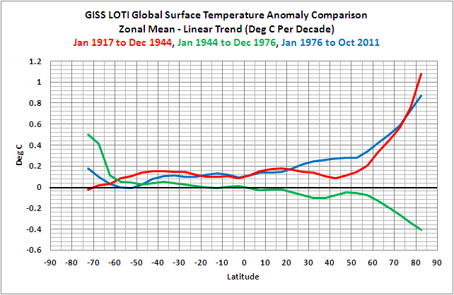
TRENDS STARTING IN 1979 ON A LATITUDE-AVERAGE (ZONAL-MEANS) BASIS
As a result of all of the data from additional surface stations employed by the UKMO for their HADCRUT4 data, the warming rate of the HADCRUT4 data in the Arctic is now comparable to GISS for the period of January 1979 to February 2014. This can be seen the graph of GISS LOTI and HADCRUT4 trends on a latitude-average (zonal-mean) basis in Figure 15.

Figure 15
Note: There is HADCRUT4 data at the southernmost latitude band of 90S-85S. It has a warming rate of about 0.19 deg C/decade. But there is no data for the latitude band of 85S-80S, so EXCEL does not show the last HADCRUT4 data point on the left at 87.5S. (And for the upcoming graphs, the NCDC does include more polar data than shown, but it is sparse, so I left those latitudes blank in the zonal means.)
If you’re not familiar with a trend graph of this type, it’s easy to understand. The units of the vertical (y) axis are the warming and cooling rates (the trends) in deg C/decade. The horizontal (x) axis presents latitude, with the South Pole on the left at -90 (90S), the equator in the middle at zero (0) and the North Pole to the right at 90 (90N). At the equator, the GISS and HADCRUT4 data both show warming rates of about 0.1 deg C/decade. For the latitudes of the Southern Ocean surrounding Antarctica (about 65S-50S) the GISS and HADCRUT4 data both show cooling, with the HADCRUT4 data showing more cooling over the past 34+ years. At the other end of the globe, note how the warming rates increase drastically as we approach the North Pole. That is a classic illustration of the phenomenon known as polar amplification, where the Arctic is warming at a much higher rate than the lower latitudes. Polar amplification is a naturally occurring phenomenon. (We’ve also shown that polar amplification works two ways. That is, there was polar amplified cooling from the mid-1940s to the mid-1970s. See the graph here from the discussion of polar amplification in the post here. Note also in that graph that the polar amplification during the early warming period of the 20th Century was comparable to the recent warming period.)
Figure 16 presents the trends for the five global temperature datasets, for the period of January 1979 to February 2014, on a latitude-average (zonal-mean) basis. Notably, surface temperature datasets show higher warming rates than the lower troposphere temperature data for most of the globe, and that the UAH data are closer to the surface temperature data than the RSS data for much of the globe.

Figure 16
In Figure 17, the UAH lower troposphere trends are compared to the trends of the GISS LOTI data from January 1979 to February 2014. I found it interesting that at some latitudes the UAH TLT data and the GISS LOTI data warmed at the same rates and at other latitudes sometimes the GISS faster or the UAH data warmed faster. All in all, though, for this time period, the global GISS LOTI data warms slightly faster than the UAH TLT data. Refer back to Figure 1.

Figure 17
The trends of the RSS and UAH lower troposphere temperature anomalies are compared in Figure 18. For most latitudes, the UAH data shows faster warming rates than RSS. The exceptions to this are the tropics, and the mid-to-high latitudes of the Southern Hemisphere.

Figure 18
LET’S ADD CLIMATE MODELS TO THE MIX
Since we’re looking at warming (and cooling) rates on a latitude-average basis, we might as well add the average (multi-model ensemble-member mean) of the outputs of the climate models used by the IPCC for their 5th Assessment Report. Those models are stored in the CMIP5 archive. (See the post On the Use of the Multi-Model Mean.) They too are available through the KNMI Climate Explorer. For the comparisons that follow, we’re looking at historical forcings through 2005 and the RCP6.0 scenario afterwards. Figure 19 presents the models (blue dashed line) compared to individual datasets for the period of January 1979 to February 2014.

Figure 19
The models overestimate the warming at most latitudes. The exception is in the high latitudes of the Northern Hemisphere (the Arctic), where the models underestimate the warming shown by the GISS and HADCRUT4 data.
The average of the surface temperature datasets and the average of the TLT data are compared to the average of the models in Figure 20. It’s much easier to see the differences between the data and the model outputs in this form.

Figure 20
And for those interested in how the models performed during the warming slowdown, the trends for the period of January 1998 through February 2014 are shown in Figures 21 and 22.

Figure 21
# # #

Figure 22
During the global-warming-slowdown period (the hiatus) since 1998, the models grossly overestimate the observed warming from about 65S to 60N, almost 90% of the planet. But models underestimate the surface warming at high latitudes in both hemispheres.
Note: The averages include the HADCRUT4 data at 90S-85S, which is why the average at the South Pole is higher than the GISS data shown in other graphs.
CLOSING
I try to anticipate questions or requests. Someone was bound to ask about HADCRUT3 data, which is still being updated by the UKMO. (At least they were through February 2014, as shown here.)
So one more graph: Figure 23 compares the trends of HADCRUT3 data with the newer HADCRUT4 data and with the UAH TLT data, all on a zonal-means basis. The data cover the period of January 1979 to August 2011 (the last month the HADCRUT3 data at the KNMI Climate Explorer, before KNMI stopped updating it.). The update from HADCRUT3 to HADCRUT4 had the greatest impacts at the mid-to-high latitudes of the Northern Hemisphere. In fact, in Maurice et al. (2012) and Jones et al. (2012), they noted that they have added 125 Arctic surface stations, mostly in Alaska, Canada and Russia for the HADCRUT4 data.

Figure 23
Note the differences and similarities of the warming rates of the HADCRUT3 and UAH TLT data north of about 45N…and what the UKMO has done with the upgrade to the HADCRUT4 data at those latitudes. The HADCRUT4 trends fall in line with the UAH data from about 50N to 65N, but then north of 65N the HADCRUT4 data continues to warm at higher rates as they near the pole (almost linearly), diverging from the UAH and HADCRUT3 data.
I’ll let you speculate about that.
SOURCES
For Figure 1 through 6, the data are from the suppliers:
- GISS LOTI data are here
- HADCRUT4 data are here
- NCDC data are here
- RSS TLT data are here, and
- UAH TLT data are here.
For Figures 7 through 23, the data are available in user-defined subsets through the KNMI Climate Explorer, as are the climate model outputs, specifically through their Monthly CMIP5 scenario runs webpage.
UPDATE (CORRECTION)
Above, while discussing the trend maps in Figures 13 and 14, I wrote:
Many persons look at all of the blank grids in the Arctic in the HADCRUT4 data and think the UKMO underestimates the warming there compared to GISS. See Figure 14. The blank grids do not suppress the warming in the HADCRUT4 data because they are not included in the average temperature anomaly for a given latitude. In other words, at a specific latitude, the UKMO averages the temperatures of the grids with data, and this indirectly applies the average of the grids with data to those grids without data. It’s an indirect way of infilling.
The assumption in my description above is that the UKMO averages the data per latitude band, then weights each latitude band by its respective surface area before calculating the global average. That’s how I spot check my trend graphs when I present them on a zonal mean basis. I then compare that result to the trend of the global time series. But that’s not how the UKMO calculates the global HADCRUT4 data.
Nick Stokes corrected me on the thread of the cross post at WattsUpWithThat here and here. Thanks, Nick.
The UKMO describes how they calculate the HADCRUT4 data here. They write (my boldface):
Values for the hemisphere are the weighted average of all the non-missing, grid-box anomalies in each hemisphere. The weights used are the cosines of the central latitudes of each grid box. The global average for CRUTEM4 and CRUTEM4v is a weighted average of the Northern Hemisphere (NH) and Southern Hemisphere (SH). The weights are 2 for the NH and one for the SH. For CRUTEM3 and CRUTEM3v, the global average is the average of the NH and SH values.
Bottom line: Nick Stokes was correct that the UKMO uses a method other than I described above. But that does not assign the average temperature anomaly for a hemisphere to the grids without data. Because the UKMO is weighting the data by latitude, they are in effect assigning the latitude-weighted average (not the average) for the Northern Hemisphere data to all of the grids in the Arctic without data, where the weighting is a function of the surface-area percentage of the latitude bands.
Example: We’ve been looking at graphs of trends on a zonal-mean (latitude average) basis and the topic of discussion has turned to the Arctic. As a reference, see Figure 23 above for the HADCRUT4 trends for the period of January 1979 to February 2014. In Figure 24, I’ve weighted those trends by the percentage of the surface area at given latitudes. Also shown are the weighted averages per hemisphere, because UKMO weights them separately in HADCRUT4.

Figure 24
In the Arctic (north of 65N), the weighted average would suppress the relative warming in grids without data between 65N and 75N, but at those latitudes there are now fewer grids without data in the HADCRUT4 data. See Figure 14. On the other hand, north of 75N, the weighted average would exaggerate the relative warming, where there are more open grids. Or am I overlooking something?
To put this all in perspective, the Arctic represents only 5% of the surface area of the globe.
Figure 15 is a bit hockey-stick ish. 😉
Thank you Bob, very informative post
“The blank grids do not suppress the warming in the HADCRUT4 data, because the blank grids are not included in the average temperature anomaly for a given latitude. In other words, at a specific latitude, the UKMO averages the temperatures of the grids with data, and this indirectly applies the average of the grids with data to those grids without data. It’s an indirect way of infilling.”
Bob, I agree with the second part (mostly), and I think it is an important observation. Whenever you calculate a mean of data, you implicitly assign a value to missing data. If you just leave it out, you assign to it the mean of what you have.
But that is exactly what does suppress the trend. Missing polar regions are assigned the value of the global mean of existing (mostly non-polar) data. But they are warming faster than the global mean. The assigned value does not reflect this. I discussed that here.
There are some wrinkles. I don’t think it is true that “at a specific latitude, the UKMO averages the temperatures…”. I think they average each hemisphere separately without regard to latitude. That mans that in effect they assign the hemisphere average to missing data. Averaging latitude bands would be better.
Figure 3 caption is wrong, copy/paste error from figure 2. 2001 not 1998.
Nice round up of the data Bob.
It would be informative to have lower stratosphere data too, which is often overlooked except by those digging deeply.
http://climategrog.wordpress.com/?attachment_id=902
This is particularly important to understanding lower climate because it shows a clear step change after the major volcanoes in the record. In fact it is incredibly stable apart from those distruptions.
Now if TLS is changing , it means that there is a change in the LW and/or SW radiation passing though it and that implies a change in “forcing” on the lower climate.
One likely explanation is ozone removal. Osone blocks UV so less ozone would mean lower TLS and warmer TLT ….
Whatever the explanation this is something that should not be overlooked. One thing it was not due to was a step change in global atmospheric CO2 !!
Feel free to copy that graph is you like. TLS is not going anywhere fast. No point in updating that every month.
Greg says: April 28, 2014 at 3:57 am
“One thing it was not due to was a step change in global atmospheric CO2”
Ozone depletion is a likely factor. But stratospheric cooling as a result of CO2 has been expected at least since Roble and Dickinson 1989. Basically, outgoing IR has to match, long-term, incoming solar. Warming increases total emission through the atmospheric window. So GHG emission from TOA has to actually decrease. That can only happen if it gets colder. It gets colder because the supply of IR warmth from below is hindered.
I just published the preliminary sea surface temperature anomalies for April 2014. Weekly sea surface temperatures across the equatorial Pacific are elevated, and for the NINO3.4 region, they’re very close to El Niño conditions.
http://bobtisdale.wordpress.com/2014/04/28/preliminary-april-2014-sea-surface-temperature-sst-update/
Gotta go. Be back later to answer questions about this post.
Nick…l your a smart chap.
What actual evidence do we have that the poles are warming faster than the data shows ? Isn’t this an unsupported assumption ?
Couldn’t I just state due to the increased Antarctic ice extent and the recovery in artic ice I’m going to assume the poles are cooling quicker than the rest of the globe thus cool the global data sets.
Why is my assumption that the poles are cooling and more valid that your assumption that poles are warming.
If we don’t have data, we just don’t have the data. Assumptions usually makean ass out of you and me…..
Examining the differences between datasets is important and we have recently released a new update (below) which investigates the differences between CW2014 and GISS – as well as CRU vs GHCNv3.
Here is the 27-page report:
http://www-users.york.ac.uk/~kdc3/papers/coverage2013/update.140404.pdf
This work is summarized in the following website as well:
http://www.skepticalscience.com/how_global_warming_broke_the_thermometer_record.html
The evidence presented suggests that the use of GHCNv3 leads to a cool bias in the GISS temperature record. We suspect that the next version of GHCN will resolve these issues with its increased spatial coverage.
Nick Stokes says: “But that is exactly what does suppress the trend. Missing polar regions are assigned the value of the global mean of existing (mostly non-polar) data.”
Are you sure that the UKMO does not average zonally first, Nick? Then perform a weighted average of the latitude bands.
I am not sure that many people live north of latitude 60 degrees N, where most of the warming seems to have taken place, but I am sure they are grateful for every bit of extra heat they can get.
Is the near Arctic tail wagging the dog of global temperature trends? If so, shouldn’t we be trying to figure out what has been happening there? CO2 is obviously not to blame, so there has to be a fundamental change happening in weather patterns up there – but what has caused it?
“The lower troposphere responds to the change in surface temperature of the tropical Pacific but mostly to the changes in evaporation from the tropical Pacific. For example, during an El Niño, the sea surfaces of the eastern tropical Pacific warm. This also results in an increase in evaporation. Warmer water yields more evaporation. As the warm, moist air rises, it cools and condenses, releasing additional heat to the atmosphere.”
To be clearer: that “additional heat” released through condensation is the same heat needed to evaporation and now missing to the ocean heat load.
But air is not water, i.e. the same amount of energy changes the temperature of the two matters very differently.
There is no straight line trend, its a curve. The data above does not show a decadal trend. A best fit curve would probably show zilch, nada ect…No offense meant.
Bob,
“Are you sure that the UKMO does not average zonally first, Nick? Then perform a weighted average of the latitude bands.”
I believe not. Here they say
“Values for the hemisphere are the weighted average of all the non-missing, grid-box anomalies in each hemisphere. The weights used are the cosines of the central latitudes of each grid box.”
And in work for this post I was able to produce the NH+SH average trend exactly by averaging their grid results that way. I get slightly higher value with a global average (rather than NH+SH).
JustAnotherPoster says: April 28, 2014 at 4:27 am
“What actual evidence do we have that the poles are warming faster than the data shows ? Isn’t this an unsupported assumption ?”
Well, first there is UAH. Cowtan and Way (Fig 1) show that Arctic trends, 1997-2012, are much higher than elsewhere. That’s measured data.
You can see it here too. This is a map showing the trends of individual surface locations (land and SST). It is shaded between obs, but you can see that Arctic locations have high trends (you can select the time period).
It’s also what I was trying to show in this post. If you simply infill with latitude averages, instead of global averages, you get a much higher global trend.
Just speculating, but I would look at particulate/albedo changes in extreme arctic areas as a major warming culprit. Notwithstanding the increase in Asian CO2 emissions, particulates have to be far worse if my personal experience of Asian air pollution has any validity.
Nick Stokes says: “I believe not. Here they say ‘Values for the hemisphere are the weighted average of all the non-missing, grid-box anomalies in each hemisphere. The weights used are the cosines of the central latitudes of each grid box.'”
Yes, Nick, I stand corrected. However, because of the weighting, the polar regions have much less of an impact on the average than the rest of the Northern Hemisphere. And because of the weighting, the weighted average of the Northern Hemisphere data suppresses the warming of the empty grids in the lower latitudes of the Arctic (where data are more plentiful and there are fewer empty grids) but exaggerates it for the empty grids at high latitudes (where data are less plentiful and there are more blank grids):
Now, somewhere you likely have the trends of HADCRUT4 data calculated on a latitude-average basis, in 5-deg latitude bands. So please check the following. For this post, I have calculated the trends for each 5 deg latitude band for the period of January 1979 to February 2014. The results are shown in Figure 23. Later, I’ll post them as a table. Weighting those trends by latitude, I come up with a global HADCRUT4 linear trend of 0.154 deg C/ decade. While if I look at Figure 1 above, the HADCRUT4 data trend, based on the time series data comes in at 0.153 deg C decade. Doesn’t appear to make much difference.
But I’ll correct the post this evening.
drives me crazy…….warming instead of returning to normal
If you guys want to see just how silly and stupid global warming really is…
instead of looking at those exaggerated graphs
…try to find it on a red line alcohol thermometer
This is what global warming looks like plotted on a alcohol thermometer………..
http://suyts.files.wordpress.com/2013/02/image266.png
Nick Stokes says: “Well, first there is UAH. Cowtan and Way (Fig 1) show that Arctic trends, 1997-2012, are much higher than elsewhere. That’s measured data…”
UAH and HADCRUT in Cowtan and Way (Figure 1) in the Arctic are data. The other two are infilled or a reanalysis of the Arctic, not data, where data do not exist.
Robert Way provides a link to his own paper – Cowtan & Way – and to another one on Skeptical Science, where he appears to be on the team. The latter refers to the interesting assumptions.
“It looks likely that the rapid warming of the Arctic has broken the thermometer temperature record in two different ways – firstly by violating the assumption that unobserved regions of the planet warm at a broadly similar rate to observed regions, and secondly by violating the assumption that neighbouring regions of the planet’s surface warm at a similar rate.”
Unless my eyes deceive several of the graphs in Bob Tisdale’s excellent post belie at least the second of these assumptions, assuming that the neighbouring regions are broad enough to be defined by latitude. Of course, on a smaller scale the assumption has never been true – one only has to look at the long term temperature records of, say, downtown LA and the Valleys.
As to the first assumption, I thought that the whole idea of replacing HADCRUT 3 with HADCRUT 4 was because the unobserved polar regions were warming at a faster rate than the neighbouring observed regions and the previous interpolations did not provide for this additional warming.
Can someone please explain how Cowtan & Way got included in a discussion involving arctic temperatures? I thought their “computations” were shown to be “less than factual” and only belonged to sites such as Sceptical Science? Have their work been re-evaluated since I last read about them?
Latitude. I agree, it’s absurd – and a huge shock to people who have heard about ‘global warming’, but don’t know just how little temps have changed, or how little CO2 there actually is in the atmosphere (or should I say, our contribution?). Do you have the raw data for your graph (from GISS) as I would like to see it in degrees C? (for my own website). Thanks.
harry says: “Figure 3 caption is wrong, copy/paste error from figure 2. 2001 not 1998.”
Corrected, thanks.
Bob,
“Now, somewhere you likely have the trends of HADCRUT4 data calculated on a latitude-average basis, in 5-deg latitude bands. So please check the following. “
I calculated them here for the period 1997-2012. I’ve rerun the calc for 1979-2012 and appended them here. Unfortunately it’s late here, and I didn’t have time to get the extra year of data to 2/2014, but it should be close. There is a table of global trends below.
The trends you mention are the red curves, that I’ve called HAD 4 Lat. I did them by infilling with the latitude average, so it’s a band calc. You can click the buttons to see seasonal results. The x-axis is sin(latitude) so it reflects the HAD area weighting (and true area).