I was advised of a recent paper that studies the impact of the Atlantic Multidecadal Oscillation on global surface temperatures since 1900. (Thanks, Anthony.) The paper is Chylek et al. (2014) The Atlantic Multidecadal Oscillation as a dominant factor of oceanic influence on climate. The paper is flawed in some respects, but many skeptics will agree with it because it questions the value of climate model projections.
First, for those new to the topic of the Atlantic Multidecadal Oscillation (AMO) refer to the NOAA Frequently Asked Questions About the Atlantic Multidecadal Oscillation (AMO) webpage and the posts:
- An Introduction To ENSO, AMO, and PDO — Part 2
- Multidecadal Variations and Sea Surface Temperature Reconstructions
The abstract of Chylek et al (2014) reads:
A multiple linear regression analysis of global annual mean near-surface air temperature (1900–2012) using the known radiative forcing and the El Niño–Southern Oscillation index as explanatory variables account for 89% of the observed temperature variance. When the Atlantic Multidecadal Oscillation (AMO) index is added to the set of explanatory variables, the fraction of accounted for temperature variance increases to 94%. The anthropogenic effects account for about two thirds of the post-1975 global warming with one third being due to the positive phase of the AMO. In comparison, the Coupled Models Intercomparison Project Phase 5 (CMIP5) ensemble mean accounts for 87% of the observed global mean temperature variance. Some of the CMIP5 models mimic the AMO-like oscillation by a strong aerosol effect. These models simulate the twentieth century AMO-like cycle with correct timing in each individual simulation. An inverse structural analysis suggests that these models generally overestimate the greenhouse gases-induced warming, which is then compensated by an overestimate of anthropogenic aerosol cooling.
One flaw is easy to spot. Did you see it? We’ll discuss it later in the post.
The Summary and Discussion of the paper includes statements that every skeptic could agree with (my boldface):
A multiple linear regression model that uses the set of explanatory variables composed of radiative forcing due to anthropogenic greenhouse gases and aerosols, solar variability, volcanic eruptions, and ENSO accounts for 89 ± 1% of the global annual mean temperature variance. When AMO is added to the set of explanatory variables, the fraction of explained temperature variance increases to 94%. Just two explanatory variables (GHG and AMO) still account for 93% of the temperature variance. The improvement of the regression model by including the AMO is highly statistically significant (p<0.01). For comparison, the CMIP5 ensemble mean of all simulations accounts for 87% of the observed temperature variance.
Our analysis suggests that about two thirds of the late twentieth century warming has been due to anthropogenic influences and about one third due to the AMO. This is a robust result independent of the parameterization of the anthropogenic aerosol radiative forcing used or of the considered regression model, as long as the AMO is among the explanatory variables.
An inverse structural analysis shows that all considered climate models (GFDL-CM3, HadGEM-ES, CCSM4, CanESM2, and GISS-E2) overestimate GHG warming that is then compensated by an overestimated aerosol cooling. The overestimates are especially large in models with an indirect aerosol effect. In these models a strong aerosol effect generates the AMO-like 20th century temperature variability. The apparent agreement with the observed temperature variability is achieved by two compensating errors: overestimation of GHG warming and aerosol cooling. This raises a question of reliability of these models’ projections of future global temperature. The inverse structural analysis underscores the significance of the AMO-like oscillation and therefore the need to establish its origin and to better simulate it in future climate models.
Let’s look at the AMO before discussing the obvious flaws in the paper.
DOES THE AMO CONTRIBUTE ABOUT ONE-THIRD TO LATE 20th CENTURY WARMING?
For this part of the discussion we’ll look at global and North Atlantic sea surface temperature anomalies during the recent warming period (Figure 1). Then remove North Atlantic sea surface temperature anomalies from the global data (Figure 2).
Chylek et al. (2014) used GISS Land-Ocean Temperature Index (LOTI) data as their global surface temperature dataset. GISS now includes NOAA’s ERSST.v3b sea surface temperature data for the ocean portion, so we’ll use that sea surface temperature dataset for consistency. And we’ll start the recent warming period in 1975, to also be consistent with Chylek et al. (2014).
Figure 1 compares global and North Atlantic sea surface temperature anomalies, from January 1975 to February 2014. The surface of the North Atlantic more than doubled the warming rate of the surface of the global oceans.

Figure 1
The North Atlantic and the Baltic and Mediterranean Seas represent about 12.4% of the surface of the global oceans. See the table in the NOAA NGDC (National Geophysical Data Center) webpage here. (That’s a great reference, BTW. You may want to add it to your favorites.) To determine the sea surface temperatures of the global oceans excluding the North Atlantic for Figure 2, the North Atlantic data was weighted by 12.4% and subtracted from the global data. As shown, the global sea surface temperature data have a warming rate since 1975 that’s about 33% higher than the warming rate of the global data excluding the North Atlantic.

Figure 2
These basic results are in line with the findings of Chylek et al (2014)…if we assume that the global land surface air temperatures proportionally amplify the global and North Atlantic sea surface temperatures. But that’s unlikely since about 68% of continental land surfaces are in the Northern Hemisphere. It, therefore, seems likely that Chylek et al (2014) have underestimated the contribution of the AMO to the warming since 1975.
CHYLEK ET AL. OVERLOOKED THE MULTIDECADAL VARIATIONS IN THE NORTH PACIFIC
Now, I do realize Chylek et al. (2014) was about the impact of the Atlantic Multidecadal Oscillation, but…
In the post Multidecadal Variations and Sea Surface Temperature Reconstructions, we showed that the sea surface temperatures of the North Pacific also have multidecadal variations, and that they vary in and out of synch with the sea surface temperatures of the North Atlantic. See Figure 3. Note: the data illustrated for the North Pacific do not represent the PDO (Pacific Decadal Oscillation) data.

Figure 3
As a result, the sea surface temperatures of the Northern Hemisphere have very clear multidecadal variations…that the climate models stored in the CMIP5 archive, not too surprisingly, are unable to simulate. See Figure 4, which is Figure 15 from the post An Odd Mix of Reality and Misinformation from the Climate Science Community on England et al. (2014).

Figure 4
The upswing since the 1970s in the multidecadal variations of the North Pacific sea surface temperatures also would have contributed to the warming.
COMMENTS ON THE DATASETS USED BY CHYLEK ET AL.
As noted earlier, Chylek et al. (2014) use GISS Land-Ocean Temperature Index (LOTI) data for their study. So one would think they would use subsets of that dataset for their ENSO and AMO indices. If that’s what you assumed, your assumption would have been wrong.
Chylek et al. describe the ENSO and AMO datasets they used:
The annual average ENSO index is obtained by averaging monthly data from http://jisao.washington.edu/data/cti, and the Atlantic Multidecadal Oscillation (AMO) index is an annual average of smoothed monthly values provided by the NOAA. A detailed description on how the AMO is calculated can be found at the NOAA website http://www.esrl.noaa.gov/psd/data/timeseries/AMO/.
Let’s start with their chosen ENSO index. It’s an unusual dataset, at best. It’s the Cold Tongue Index from JISAO. It’s based on the ICOADS sea surface temperature database, not a reconstruction, and the ICOADS data for the Cold Tongue Region has been adjusted in an unusual way to account for the Folland and Parker (1995) findings (the bucket corrections).
The JISAO Cold Tongue Index is not based on the sea surface temperature dataset employed by GISS for their Land-Ocean Temperature Index (LOTI) data. As a reminder, the sea surface temperature dataset now used by GISS is NOAA’s ERSST.v3b.
The JISAO Cold Tongue Index uses the sea surface temperature anomalies of the Cold Tongue Region (6S-6N, 180-90W), so the data for that region is similar (but not the same as) the more commonly used ENSO index that’s based on the sea surface temperature anomalies of the NINO3.4 region (5S-5N, 170W-120W).
BUT, and this is a big but, for their Cold Tongue Index, JISAO also subtracts global sea surface temperature anomalies from the sea surface temperature anomalies of the Cold Tongue Region. According to JISAO:
The global mean SST anomaly is subtracted from the CTI in order to remove a step jump at the onset of World War II when the composition of the marine observations largely changed from bucket to engine intake measurements (Barnett 1984, Folland and Parker, 1995), and to lessen the secular trend in the time series that has been associated with global warming (Zhang et al. 1997).
As a reference, “the secular trend in the time series” of sea surface temperatures for the equatorial Pacific depends on the reconstruction. Since 1900, the ERSST.v3b-based NINO3.4 sea surface temperature anomalies show warming, while the Kaplan data for the region show cooling and the HADISST data basically show no trend at all. See the left-hand graph in Figure 5. The average of the reconstructions shows no warming of sea surface temperatures for the NINO3.4 region since 1900, as shown in the right-hand cell of Figure 5.

Figure 5
Subtracting the global data from the sea surface temperature data of the cold tongue region, of course, biases the JISAO Cold Tongue Index data warm in the early decades and cool in the later decades, which imposes a long-term negative trend on the JISAO Cold Tongue Index data. On the other hand, as noted above, the ERSST.v3b sea surface temperature data for the Cold Tongue Region shows a positive trend. See Figure 6.

Figure 6
Basically, in their regression analysis, Chylek et al. are trying to determine the impact of the sea surface temperatures of the Cold Tongue Region on global surface temperatures, but the JISAO Cold Tongue Index data has been modified by global sea surface temperatures.
Bottom line: by using the JISAO Cold Tongue Index instead of the ERSST.v3b-based data for the region, Chylek et al. are creating the need for greenhouse gases to explain more of the warming in their regression analysis. Considering the ENSO index is scaled drastically as a result of the regression analysis, it’s not a major effect, but it would change their results slightly. Chylek et al. may have used this alternative ENSO index to be conservative in their contribution of the AMO.
There is, of course, another problem with including ENSO data in a regression analysis. We’ll discuss that in the next section.
For the Atlantic Multidecadal Oscillation data, Chylek et al. (2014) use the NOAA ESRL Atlantic Multidecadal Oscillation (AMO) data. Curiously, Chylek et al. claim to have used the “annual average of smoothed monthly values”. The “smoothed monthly values” of the ESRL AMO data have been smoothed with a 121-month running-mean filter. I suspect Chylek et al. used the smoothed data because there is a strong ENSO component in the “raw” AMO data, and they did not want to duplicate the ENSO signal. Or maybe they were interested only in the multidecadal component of the AMO data and not the annual component. Whatever the reason, using the smoothed data in a regression analysis is odd.
The ESRL AMO data is based on the Kaplan sea surface temperature dataset, not the NOAA ERSST.v3b data used in the GISS LOTI data. The Kaplan and ERSST.v3b versions of the North Atlantic data are quite different, and, subsequently, their AMO data are different. See Figure 7. For the ERSST.v3b version of the AMO data, I followed the AMO recipe from the NOAA ESRL, then smoothed the monthly data, and converted it to annual averages.

Figure 7
By using the NOAA ESRL AMO data instead of the AMO based on the North Atlantic sea surface temperature data used by GISS, Chylek et al. (2014) underestimated the impact of the AMO on global surface temperatures. Since 1975 the ERSST.v3b-based AMO data (used in the GISS product) have a higher warming rate (about 25% higher) than the AMO data from NOAA ESRL. See Figure 8. Again, this shows that the results of Chylek et al. may be conservative.

Figure 8
CHYLEK ET AL. TREAT ENSO AS NOISE, NOT AS A PROCESS
The fatal flaw in Chylek et al. is their inclusion of an ENSO index in their multiple regression analysis. They’re assuming that an ENSO index represents the processes of El Niño and La Niña events and all of their aftereffects. But, as I’ve stated before, using an ENSO index as a proxy for ENSO—and its aftereffects—is like trying to do the play-by-play of a baseball game from an overhead view of home plate. You’re only seeing one small portion of the processes and aftereffects of ENSO.
Over the past 5 years, we’ve discussed in numerous posts that it is impossible to determine the long-term effects of ENSO on global surface temperatures through linear regression analysis. For those new to this topic, the following is a reprint of a portion of the post Rahmstorf et al (2012) Insist on Prolonging a Myth about El Niño and La Niña. In it, I’ve changed “Rahmstof et al. (2013)” to “Chylek et al. (2014)” and changed the illustration numbers, but I have not updated the graphs. I’ve also made a few clarifications and they are bracketed.
[Start of Reprint.]
IT IS IMPOSSIBLE TO REMOVE THE EFFECTS OF ENSO IN THAT FASHION
Chylek et al. (2014) assume the effects of La Niñas on global surface temperatures are [the] proportional to the effects of El Niño events. They are not. Anyone who is capable of reading a graph can see and understand this.
But first: For 33% of the surface area of the global oceans, the East Pacific Ocean (90S-90N, 180-80W), it may be possible to remove much of the linear effects of ENSO from the sea surface temperature record, because the East Pacific Ocean mimics the ENSO index (NINO3.4 sea surface temperature anomalies). [That is, the sea surface temperatures of the East Pacific warm and cool proportionally to the ENSO index during El Niño AND La Niña events.] See Figure 9. But note how the East Pacific Ocean has not warmed significantly in 30+ years. A linear trend of 0.007 deg C/decade is basically flat.

Figure 9
However, for the other 67% of the surface area of the global oceans, the Atlantic, Indian and West Pacific Oceans (90S-90N, 80W-180), which we’ll call the Rest of the World, the sea surface temperature anomalies do not mimic the ENSO index. We can see this by detrending the Rest-of-the-World data. Refer to Figure 10. Note how the Rest-of-the-World sea surface temperature anomalies diverge from the ENSO index during four periods. The two divergences highlighted in green are caused by the volcanic eruptions of El Chichon in 1982 and Mount Pinatubo in 1991. Chylek et al. are likely successful at removing most of the effects of those volcanic eruptions, using an aerosol optical depth dataset. But they have not accounted for and cannot account for the divergences highlighted in brown [by using an ENSO index].

Figure 10
Those two divergences are referred to in Trenberth et al (2002) Evolution of El Nino–Southern Oscillation and global atmospheric surface temperatures” as ENSO residuals. Trenberth et al. write:
Although it is possible to use regression to eliminate the linear portion of the global mean temperature signal associated with ENSO, the processes that contribute regionally to the global mean differ considerably, and the linear approach likely leaves an ENSO residual.
Again, the divergences in Figure 10 shown in brown are those ENSO residuals. They result because the naturally created warm water released from below the surface of the West Pacific Warm Pool by the El Niño events of 1986/87/88 and 1997/98 are not “consumed” by those El Niño events. In other words, there’s warm water left over from those El Niño events and that leftover warm water directly impacts the sea surface temperatures of the East Indian and West Pacific Oceans, preventing them from cooling during the trailing La Niñas. The leftover warm water, tending to initially accumulate in the South Pacific Convergence Zone (SPCZ) and in the Kuroshio-Oyashio Extension (KOE), also counteracts the indirect (teleconnection) impacts of the La Niña events on remote areas, like land surface temperatures and the sea surface temperatures of the North Atlantic. See the detrended sea surface temperature anomalies for the North Atlantic, Figure 11, which show the same ENSO-related divergences even though the North Atlantic data is isolated from the tropical Pacific Ocean and, therefore, not directly impacted by the ENSO events.

Figure 11
There’s something blatantly obvious in the graph of the detrended Rest-of-the-World sea surface temperature anomalies (Figure 10): If the Rest-of-the-World data responded proportionally during the 1988/89 and 1998-2001 La Niña events, the Rest-of-the-World data would appear similar to the East Pacific data (Figure 9) and would have no warming trend.
Because those divergences exist—that is, because the Rest-of-the-World data does not cool proportionally during those La Niña events—the Rest-of-the-World data acquires a warming trend, as shown in Figure 12. In other words, the warming trend, the appearance of upward shifts, is caused by the failure of the Rest-of-the-World sea surface temperature anomalies to cool proportionally during those La Niña events.

Figure 12
[End of Reprint]
For updated versions of East Pacific data in Figure 9 and the Rest-of-the-World data (Atlantic, Indian and West Pacific Oceans) in Figure 12, see the most recent sea surface temperature update here.
Now, before you go off half-cocked and think manmade greenhouse gases fuel El Niño events, the ocean heat content data for the tropical Pacific and basic ENSO dynamics contradict that assumption. If this topic is new to you, see the illustrated essay “The Manmade Global Warming Challenge” [42mb] and the post Untruths, Falsehoods, Fabrications, Misrepresentations.
The processes that fuel and drive El Niño and La Niña events, and their aftereffects, are discussed in much more detail in my ebook Who Turned on the Heat? – The Unsuspected Global Warming Culprit: El Niño-Southern Oscillation. That book is only available in pdf format and it’s introduced in the post here. It is on sale for US$5.00 here.
ON THE HADGEM2-ES AMO SIMULATION
Chylek et al. (2014) cited Booth et al. (2012) Aerosols implicated as a prime driver of twentieth-century North Atlantic climate variability a couple of times, including:
A strong aerosol effect explains why the AMO-like behavior is reproduced with a correct timing in each individual simulation by these models. This interpretation agrees with Booth et al. [2012] who state that the twentieth century Atlantic temperature variability in the HadGEM-ES model is due to an aerosol effect.
The findings by Booth et al. were disputed by Zhang et al. (2013) Have Aerosols Caused the Observed Atlantic Multidecadal Variability? Issac Held has an overview of those papers in his post Atlantic multi-decadal variability and aerosols.
Figure 13 is a model-data comparison of the HADGEM2-ES simulation of the AMO (using historic and RCP6.0 forcings), along with the ERSST.v3b-based version of the AMO. I used the NOAA ESRL recipe for the calculating AMO, but started the trends of the data and the model ensemble mean in 1861 to accommodate the HADGEM2-ES models. The detrended data and model mean were then smoothed with 121-month running-mean filters. (See the post here for why we look at the model mean.) As illustrated, the ensemble member mean of the HADGEM2-ES does a pretty poor job of capturing the long-term strength and frequency of the ERSST.v3b-based Atlantic Multidecadal Oscillation.
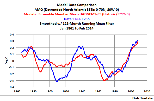
Figure 13
Just in case you’re concerned that the UKMO may have relied on the HADSST3 version of the AMO for their tuning, refer to Figure 14. The long-term performance is not much better.

Figure 14
And to further illustrate one of the flaws in the claim by Booth et al. that the AMO is a result of aerosol forcings, the NODC vertically averaged temperature data for the depths of 700-2000 meters suggest that part of the AMO may result from changes in Atlantic Meridional Overturning Circulation (AMOC), inasmuch as the data appear to show an exchange of heat between the top 700 meters of the North Atlantic and the depths of 700-2000 meters. See Figure 15.

Figure 15
As a reference, Figure 16 compares the NODC’s vertically averaged temperature data for the depths of 0-700 meters and 0-2000 meters for the North Atlantic, along with the calculated data for 700-2000 meters. The logic for using 41.6% for the 0-700 meter data (as its portion of the 0-2000 meter data) is discussed here.

Figure 16
A COUPLE OF ADDITIONAL COMMENTS
Although the multidecadal variations in the sea surface temperatures of the North Atlantic extend into the tropical South Atlantic (see Figure 17), the Atlantic Multidecadal Oscillation is primarily a Northern Hemisphere phenomenon. It seems odd that Chylek et al. did not present the impact of the AMO on Northern Hemisphere surface temperatures, in addition to its impact on global temperatures.

Figure 17
And, I don’t believe Chylek et al. (2014) noted this, but the sea surface temperature data for the North Atlantic indicate the AMO may have peaked(emphasis on the may), though it’s a little early to tell. The sea surface temperature data for the North Atlantic show sea surfaces there have warmed very little over the past 11 years. See Figure 18. Then again, global sea surface temperatures have cooled in that time.

Figure 18
CLOSING
I’m sure when you study Chylek et al. (2014) you’ll note other points you might not agree with. I’ve addressed things I noticed.
Chylek et al. (2014) has a number of problems. They used ENSO and AMO indices from datasets that are not part of, and are significantly different than, the GISS global land+ocean surface temperature data they used as a reference. Then again, based on their methods, their use of the JISAO Cold Tongue Index data and the NOAA ESRL AMO data likely resulted in conservative estimates of the contribution of the AMO…but are we looking for conservative estimates of natural variability.
Ocean heat content data and satellite-era sea surface temperature data indicate that ENSO acts as a chaotic, sunlight-fueled, recharge-discharge oscillator, with El Niño events serving as the discharge phase and La Niña events serving as the recharge and distribution phase…and that ENSO; acting as a naturally occurring, sunlight-fueled process; is capable of raising global sea surface temperatures and tropical Pacific ocean heat content with no apparent influence from manmade greenhouse gases. By including an ENSO index in their multiple regression analysis, Chylek et al. made the assumptions that ENSO is only noise in the global surface temperature record and that ENSO does not contribute to the long-term warming trend. That, of course, is contradicted by data.
Most skeptics would agree with Chylek et al questioning the reliability of climate model predictions of future global surface temperatures. And there are many other ways to show the flaws in climate models. For example:
- CMIP5 Model-Data Comparison: Satellite-Era Sea Surface Temperature Anomalies
- Models Fail: Land versus Sea Surface Warming Rates
- IPCC Still Delusional about Carbon Dioxide
SOURCE
Data for the graphs in this post are available from the KNMI Climate Explorer.
if the earth goes from ice age to ice age then any short term trendline needs to be compared to that timescale? its unlikely to even register?
reports on 33 years of data trying to claim its climate trends then not contextualising within the ice age cycle is trying to achieve what? A decontextualized headline?
the fatal flaw for me is the timescale.
not sure how much question there is taking any credence from predictions from unvalidated models that cannot recreate the past? Would anyone rely on the predictions and readings from an unvalidated air traffic control model put into real time that had already proved it could not recreate previous patterns?
basically how hard is it to prove warming during an inter glacial warming period? The surprise would be if it was cooling? The problem for the co2ers is that they have to prove EXTRA warming caused by co2 made by man. But no evidence exists. Even the link is suspect.
Given man made co2 from industrialisation is finite even that will end.
AR5 TS:
• Different global estimates of sub-surface ocean temperatures have
variations at different times and for different periods, suggesting
that sub-decadal variability in the temperature and upper heat
content (0 to to 700 m) is still poorly characterized in the historical
record. {3.2}
• Below ocean depths of 700 m the sampling in space and time is
too sparse to produce annual global ocean temperature and heat
content estimates prior to 2005. {3.2.4}
• Observational coverage of the ocean deeper than 2000 m is still
limited and hampers more robust estimates of changes in global
ocean heat content and carbon content. This also limits the quantification
of the contribution of deep ocean warming to sea level
rise. {3.2, 3.7, 3.8; Box 3.1}
• Based on model results there is limited confidence in the predictability
of yearly to decadal averages of temperature both for the
global average and for some geographical regions. Multi-model
results for precipitation indicate a generally low predictability.
Short-term climate projection is also limited by the uncertainty in
projections of natural forcing. {11.1, 11.2, 11.3.1, 11.3.6; Box 11.1}
John Bills: Thanks for the quotes from the IPCC AR5 Technical Summary. Your timing is great. I’m presently writing a introductory chapter about ocean heat content data for my new book and you’ve saved me the time of looking for those quotes again.
Does this not seem to have obvious parallels with:
http://wattsupwiththat.com/2014/03/11/death-blow-to-barycentrism-on-the-alleged-coherence-between-the-global-temperature-and-the-suns-movement/
This brings back memories. About seven years ago, after switching from believer to skeptic (ironically, it wasn’t a skeptic site that did it, but reading the IPCC TAR for myself), I did a very primitive spectral analysis of State College, PA temperatures (they had a 100-yr-plus record of highs and lows easily accessible online – perfect for an amateur to play with). According to my results summary, my first pass got the best fit from a sine wave of period 64.5 years, which by eyeball appears to be in the ballpark of the NOAA ESRL AMO (figure 7 above). Will have to go back and revisit the data and see if that holds up for the actual AMO, plus see how many mistakes I made the first time around – hopefully I won’t make any of them this time around, but can make entirely new ones ;-).
Minor typo, “indicate that ENSO acts a chaotic”::”indicate that ENSO acts as a chaotic”.
The use of the AMO- Index is not very clever to attribute the internal variablitiy due to the heat transport in the north atlantic because it’s infected with forcing. Remeber: the AMO is a detreded timerseries and the north atlatic bassin as a whole is of course also forced. The source of variability is not the AMO ( it’s part of a response) but the AMOC. When you look at Fig.7 here:http://water.columbia.edu/files/2011/11/Seager2009Forced.pdf you’ll see, that the SST of the subpolare gyre is reflecting only the variabilty of AMOC and not the forcing. So it’s a better choice to use the timeseries of SST 50-65N; 50W-10W for attributing the variability of the north atlantic.
Would I be correct in saying that it looks as if the AMO is hold the temperature up (flat) and when that turns to it’s cold phase ‘Global temperature’ will fall.?
Whether the AMO or the AMOC or something else is the ultimate cause of the multi-decadal temperature cycles, the AMO index is a good representation of that cycle, whatever it is.
Use it because it works.
Don’t use it if you are a global warming advocate, because it takes away many cherry picking opportunities.
AMO looks global to me. It is a mode of variability occurring globally and of course it’s slightly different in different geographic regions. Here it is compared with the HADSST SH (detrended, just like the AMO index):
http://www.woodfortrees.org/plot/esrl-amo/plot/esrl-amo/trend/plot/hadsst3sh/detrend:0.72/plot/hadsst3sh/detrend:0.72/trend
At the outset you asked readers to work out what is wrong with the methodology. I spent about ten minutes doing that and concluded that multicollinearity (http://en.wikipedia.org/wiki/Multicollinearity) would be a problem because all the datasets are generated by underlying phenomena that are in some way related. To come to this conclusion, I really do not have to know a great deal about climatology and oceanography, more or less what I knew from Geography 100, the basic course.
You mentioned that the land masses of the Northern hemisphere account for 68% of the total of all the Earth’s landmasses. Well the NH oceans account for 1.5 times as much area as the NH landmasses, while the SH oceans account for about 4.4 times as much area as the SH land masses. From a statistical point of view we are not drawing our date from homogeneous populations.
I therefore see technical issues in using regression analysis for this analysis. But this strikes me as no different from most studies of climate by people whose grasp of probability and statistics is slight to non-existent. This was the problem with the hockey stick and it is the problem with almost every analysis of time series data..
For a start, did anybody test the data for stationarity? Did anybody check for autocorrelation? Don’t bother to answer because we know that the answer is no. What we are not certain about is whether the analysts know what multicollinearity, autocorrelation and stationarity signify for the validity of inferences drawn from the data.
Sorry, but neither the original paper and this analysis act even as a brief candle or a walking shadow. They signify nothing more about climate past present or future that is not already visible in the raw data to a naive eyeball..
As for myself, if the cool phase of the AMO in combination with its partner in the PDO can account for the pause, why then cannot the warm phase of these oscillations have accounted for most of what was mistakenly believed to be anthropogenic global warming?
I cast my fortunes with Beenstock, Reingewertz, and Paldor, an Israeli group who at least used respectable statistical procedues. They concluded,
“We have shown that anthropogenic forcings do not polynomially cointegrate with global temperature and solar irradiance. Therefore, data for 1880–2007 do not support the anthropogenic interpretation of global warming during this period.”
Reference: Beenstock, Reingewertz, and Paldor Polynomial cointegration tests of anthropogenic impact on global warming, Earth Syst. Dynam. Discuss., 3, 561–596, 2012.
URL: http://www.earth-syst-dynam-discuss.net/3/561/2012/esdd-3-561-2012.html
Bob,
Thanks for your continued devotion, expertise, and hard work in understanding and conveying the role of the multidecadal ocean oscillations in global warming and cooling.
Great Presentation … but quite frankly … I really wish EVERYONE in the Climate Community would stop all this “anomaly” crap!! IMO, it is nothing more than a step removed from reality. What is wrong with using the TEMPERATURE!! Why must every paper, every graph be expressed in anomaly??
If the picture cannot be convincing using the real data … then the picture is not worth looking at.
Frederick Colbourne: I spent about ten minutes doing that and concluded that multicollinearity (http://en.wikipedia.org/wiki/Multicollinearity) would be a problem because all the datasets are generated by underlying phenomena that are in some way related.
That problem was addressed by the authors. they do not report s.e. s or p-values, only the R^2 values, thus avoiding the worry over stationarity of the residual process. It is unusual for a paper to be published with such a narrow use of statistics, but the main point of the paper, AMO is more important than others have realized, and their use of backward elimination, really do not require much more.
Bob Tisdale, thank you for the report:
It, therefore, seems likely that Chylek et al (2014) have underestimated the contribution of the AMO to the warming since 1975.
Their main point for their audience is that AMO has been underestimated up til now, so I do not see that as a major flaw. You could be right, but this is clearly not the last word on the matter.
Let’s start with their chosen ENSO index. It’s an unusual dataset, at best. It’s the Cold Tongue Index from JISAO. It’s based on the ICOADS sea surface temperature database, not a reconstruction, and the ICOADS data for the Cold Tongue Region has been adjusted in an unusual way to account for the Folland and Parker (1995) findings (the bucket corrections).
There is not much evidence in the published literature one ENSO index is better than another for modeling climate.
The extract that you bolded is represented clearly in their abstract: An inverse structural
analysis suggests that these models generally overestimate the greenhouse gases-induced warming, which is then compensated by an overestimate of anthropogenic aerosol cooling.
CHYLEK ET AL. TREAT ENSO AS NOISE, NOT AS A PROCESS
The fatal flaw in Chylek et al. is their inclusion of an ENSO index in their multiple regression analysis. They’re assuming that an ENSO index represents the processes of El Niño and La Niña events and all of their aftereffects. But, as I’ve stated before, using an ENSO index as a proxy for ENSO—and its aftereffects—is like trying to do the play-by-play of a baseball game from an overhead view of home plate. You’re only seeing one small portion of the processes and aftereffects of ENSO.
Actually, Chylek et al treat the ENSO as a covariate, or regressor. Undoubtedly it would be worthwhile if a better representation of ENSO had been shown to be better, say lagged variables from diverse regions of the Pacific Ocean (c.f. Willis Eschenbach’s multivariate time series plots in his “Power Stroke” post), but it isn’t likely based on published evidence like this paper that they would in total add more than 5% to the total variance explained.
From their introduction: In this note we show that the observed annual mean global temperature variability is captured more fully by a regression model when the AMO is added to the set of explanatory variables. Considering a compromise between accuracy and complexity, the minimal regressionmodel that accounts for 93% of the observed annual mean global temperature variance contains only two explanatory variables: anthropogenic greenhouse gases
(GHG) and the AMO. Adding all other predictors increases the fraction of accounted for global temperature variance to 94%.
Your detailed analyses show that the authors are basically correct, but probably not sufficiently accurate. AMO is “a” dominant contributor, and a complete model will have some difficulty explaining much more than 94% of the variance; they do not have parameter estimates (regression coefficients) to two significant figures. The most important thing that the authors have not shown is that, all things considered, GHGs are necessary; only that replacing them in a regression model while maintaining a high R^2 value will require more work. This is of a piece with Vaughan Pratt’s model of a few months ago, but he presented an ad hoc model of the residual of the GHG effect, but these authors have presented measured covariates in place of the ad hoc residual.
This is from the FAQ section of the NOAA page about the AMO. The question was about the impact of the AMO on climate. This was part of the answer…..
“It alternately obscures and exaggerates the global increase in temperatures due to human-induced global warming”.
There is a fundamental difference between the effects on the climate of the anthropogenic forcings and the AMO. The AMO creates an energy imbalance that Negates or reverses the effect of each phase of the AMO. so when the AMO is warming the oceans the TOA energy imbalance is positive with more energy outgoing than incoming {because emissions == temp4}, but when the AMO is in a cooling phase the energy imbalance is negative at TOA so that the cooling is negated and things warm again.
By contrast the anthropogenic forcings create a TOA imbalance that drives the warming further. As another poster has noted the AMO modifies the anthropogenic trend, reducing the trend during cooling phases and increasing the trend during warming phase.
But it is incapable of changing the total amount of eventual warming or have much effect on the timing of that process.
The same is true for the ENSO cycle. What were historically cooling phases of these natural variations are now not-warming-quite-as-fast phases because pf the co2 induced TOA energy imbalance measured by observation.
Cheylek has produced a number of recent papers challenging the ‘settled consensus’ including two different ways to estimate lower ECS, both of which got attacked by the ‘establishment’. Bob, you should contact him about doing a joint follow up paper incorporating your additional insights. The more there is on attribution (CO2 versus natural variation), the weaker the CAGW claims become.
Measurements of Sea Surface Temperature by bucket did not cease at the beginning of WWII. I know this, because I used a bucket in many different sea and oceans during the 1970s. Merchant shipping tended to use engine intake temps as crews got smaller, and are probably almost universally used now as merchant ships have a crew of two and a dog, and it’s the dog that’s on watch when the brown stuff hits the rotating ventilator. The rubber “buckets” and shielded (from whacking into ship’s sides) thermometers are probably hellishly expensive nowadays anyway. They are subject to loss (I can vouch for this, having lost one or two :)) but the thing is, they were not suddenly replaced by an inferior method in 1939.
Deanster says:
March 14, 2014 at 6:29 am
Great Presentation … but quite frankly … I really wish EVERYONE in the Climate Community would stop all this “anomaly” crap!! IMO, it is nothing more than a step removed from reality. What is wrong with using the TEMPERATURE!! Why must every paper, every graph be expressed in anomaly??
If the picture cannot be convincing using the real data … then the picture is not worth looking at.
——————————————————————————————————-
Agreed. If actual temps were used and compared/plotted in the range humans experience on a yearly basis it would just look, over the last 150 years (and over 350 years in the case of the CET ) as practically a flat straight line. GW and AGW is a storm in a teacup.Or as we say here- two fifths of bugger-all.
@- FrankK
“GW and AGW is a storm in a teacup….”
An unfortunate choice of phrase perhaps given the floods, storms and extremes seen recently. {grin}
http://www.nature.com/nature/journal/v436/n7051/full/nature03906.html
“My results suggest that future warming may lead to an upward trend in tropical cyclone destructive potential, and—taking into account an increasing coastal population—a substantial increase in hurricane-related losses in the twenty-first century.”
You can plot temperatures if you want. Doesn’t alter the picture much, just changes the labels to the left.
CET with a yearly filter rather than using Anomalies.
http://climatedatablog.wordpress.com/cet/
El Niño–Southern Oscillation index as explanatory variables account for 89% of the observed temperature variance. When the Atlantic Multidecadal Oscillation (AMO) index is added to the set of explanatory variables
The derivative of AMO equals ENSO (almost) so adding AMO is just counting ENSO twice. AMO is a result, the integral of ENSO, not a cause.
http://virakkraft.com/Nino34-AMO-deriv.png
Izen says:
…given the floods, storms and extremes seen recently…
Izen, how can we get it into your head that those are LOCAL climate events that you’re cherry-picking. Extreme GLOBAL weather events are just not happening. Tornadoes, Hurricanes, etc., are not becoming more numerous.
Further, financial losses are no proxy for the prevalence of extreme weather events. Infrastructure that was built using non-union labor and inexpensive materials are a thing of the past. Now these projects are more expensive, and insurance companies have a vested financial interest in claiming higher losses. So, enough with that bogus metric.
Finally, anyone who writes, ““My results suggest…” is referring to a model, not to the real world. People like that are much more likely to get published than someone who tells the boring truth: that there is nothing either unusual or unprecedented happening globally to the weather or the climate. As Bob makes clear in his thoroughly researched article, we are observing various cycles. CO2 has nothing measurable to do with global temperatures or weather events. AGW really is a storm in a teacup.