Guest Post by Kip Hansen
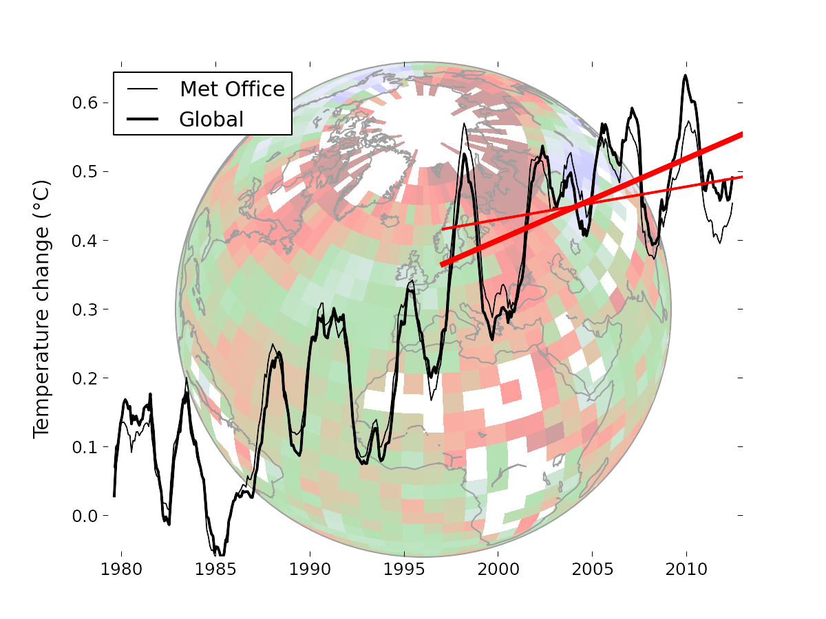
There are a lot of good, in-depth technical discussions of Cowtan and Way 2013, Coverage bias in the HadCRUT4 temperature series and its impact on recent temperature trends. This is not one of them. In this post, I only hope to demonstrate a trick I learned when a young man, when I was a semi-professional performing magician. It is meant to be fun even though is makes a very valid and necessary point. I will use C&W 2013’s results graphic from their Media Summary:

Caption: “Temperature data from the Met Office (thin lines) compared to the optimal Cowtan and Way (2013) global reconstruction (thick lines). The straight red lines indicate the trend over the past 16 years in the respective data. The background image illustrates the coverage of the Met Office data, with colours indicating geographical temperature trends. The Arctic is warming much faster than the rest of the planet.”
It is followed by the statement:
“The temperature change for any individual year is not very large (and less than the Met Office uncertainty estimates), but together they make a significant difference to recent temperature trends. This highlights the danger of drawing conclusions from trends calculated over short periods.”
As in all good performances of the Magician’s Art – you may have failed to notice that the trick has already taken place. You can read the amazement in the MSM and on the climate blogs – they are all agog at the marvelousness of it. Even their detractors [for the most part, there are exceptions] and the skeptical, see clearly that a low bias in determining missing surface temperature values in the Arctic has caused Global Temperatures to be understated.
Now, please, I make no claims as to the intentions of Cowtan and Way. I only claim to illustrate a simple little point using their recent paper’s abstract and their kindly provided background materials.
It is considered worse-than-poor-form to show how a magic trick is done, either before or after it is performed. But in this case I must – it is the point of this essay.
C&W state explicitly above “This highlights the danger of drawing conclusions from trends calculated over short periods.” Well, of course it does. In the world of performing magic, in the old style, patter, the words spoken by the performer, supplied a great deal of the distraction and misdirection required to make the magic acts work. This bit, used by C&W, is “the denial” — in which the performer formally and explicitly denies that he is going to do something to trick the audience, even at the very moment that he does that exact thing.
If I were performing a similar trick, as a stage magician, you would have heard me say something along the lines of
“Dear friends, you all know that the acts of magic I perform are all tricks – many of you don’t really believe in Magic. You may think I’ll attempt to distract you while fooling you in some way. Rest assured, this is not so….I invite you to watch closely my every move. You may find there is magic after all. Look, there is nothing up my sleeve, nothing in my hat. [Carefully exaggeratedly displaying sleeve and hat] Now, look at this beautiful silk scarf [magician spreads it for all to see, then tosses the three foot square of brilliant red silk high into the air, following with his eyes]. Nothing in there either.”
Note: The manual for this card trick calls for the Magician to switch the deck of cards that has been previously inspected by the dupe, by this method: While displaying the scarf, the magician sweeps the inspected deck of cards into the hidden black well built into the table with the left hand and dropping in its place a new deck, palmed from wherever is convenient. All of this while pointing at the red scarf with the right hand, following the path of the flying scarf with his eyes and an exaggerated tilt of his head. The new deck, of course, contains cards in the carefully pre-arranged order required by the magician for the trick at hand.
Some magicians call this move “the follow”, others simply “the distraction”. The audience’s eyes will follow the scarf, look where the magician points, and look where he looks. I have never had even the most skeptical audience (not even ‘tweenage boys) catch me at this.
Having read a half-dozen or more blog posts on C&W 2013, and hoping to understand it better, I followed links to their Background materials. The instant I saw the graph above, I exclaimed out loud to my wife “Look, they’ve used the old ‘Look at the red scarf’ trick!” (I repeat, I have no information or opinion on whether or not they have done this intentionally.)
Here’s the graphic without the “red scarves”:

Now what do you see?
What we don’t see is what C&W claim: “Temperature data from the Met Office (thin lines) compared to the optimal Cowtan and Way (2013) global reconstruction (thick lines). The straight red lines indicate the trend over the past 16 years in the respective data.”
Quite honestly, you don’t see such a trend or differences in such trends because there is no reason to look at this graph in that particular way and their claim honestly is not clearly demonstrated by their graphic or their work. The two trend lines are the red scarves. Both trend lines are the same trick, in reality, but for their desired effect, the one they want you to focus on is thicker and bolder, to highlight the difference in slope over 16 years. Yet, their whole work is a new calculation of global temperatures using their new technique for evaluating missing data points in spatial coverage of the Arctic, over a 33 year period. They have caused you too look at the red scarves (supplied trend lines) and not the whole graphically presented data set.
And, that, my friends, is the trick using The Red Scarf Follow, C&W got us to see something that without the trick, we would not have seen at all and to not see the rest of what they have done.
[That’s it, Magic Fans….the rest is a bit of commentary on what shows in the graph without the red scarves.]
Here’s what I see in their findings, you may see something different:

[***Image modified 26 Nov 2013 adding in starred blue box: h/t comment from Bill_W ]
From 1979 to around 2005 or 2006, the new technique does not produce anything different than what we already had. Sometimes their data is a few hundredths of a degree higher, sometimes a few hundredths of a degree lower. If it had been any closer a match, I, for one, would have called foul….it would have been suspicious that a major change in the method would produce exactly the same results. There are no signs of a long-term bias—warm or cool—in the Met Office data compared to their new Global.
In 2005, 2006, and the first part of 2007 there seems to be some discernible differences, still in the one or two hundredths of a degree range, which disappear for a year or more beginning what looks like mid-2007 and lasts until 2009 (the right edge of the yellow box). There is something definitely different in the last few years of the data.
What that difference is, I don’t know, nor do I have any idea why it is different and only in those last few years……but it seems highly unlikely to me that a long-standing cool-biasing methodological error (regarding infilling or not of Arctic data) at the MET OFFICE becomes visible only in the last few years of a 33 year data set.
# # # # #
Moderation Note: This is not a technical thread, and has almost nothing to do with Global Warming, Climate Change, or Arctic temperatures, in-filled, ‘kriged’ or not. It is simply an observation and follows from my recent essays on trends in general. I will follow comments and answer questions on amateur magicianship but not on climate issues. I would like to see your thoughts on what you see in the graph, sans trend lines.
=============================================================
*** Addendum (26 Nov 2013): Moved up from comment by Bill_W: “There should be another box around the 1998-2001 region [added in blue in image above – kh]. There the new data is lower while in the more recent data it is higher. So the slope changes due to changes at each end in the 16 year time frame. The 16 year period also starts around the year 1998. This is ironic given how often that argument has been used to minimize the pause.” My reply was “Very perceptive ==> That is a good point and I did miss it. Their finding a ‘Met Office warm bias’ in the 1998-2002 period brings the [left]-hand side of their bold trend line down, increasing the slope to the raised ‘Met Office cool biased’ end years.” The combination of the two creates the oft-seen Climate Science graphical “trick” == The Pivot == cool the past and warm the present to make a rising temperature trend. ***
================================================================
Related articles
- Curry on the Cowtan & Way ‘pausebuster’: ‘Is there anything useful [in it]?” (wattsupwiththat.com)
- Cowtan & Way off course (wattsupwiththat.com)
- Cotwan and Way 2013 (climateaudit.org)
- Could the Perspectives of Cowtan and Way Negate RSS’s 17 Year Pause? (Now Includes all October Data except Hadcrut) (wattsupwiththat.com)
- Curry on the Cowtan & Wray ‘pausebuster’: ‘Is there anything useful [in it]?” (wattsupwiththat.com)
- Why The Global Warming ‘Pause’ Hasn’t Gone Away (wattsupwiththat.com)
I’ll note that their chosen interval 1997-2012 leads to extreme excursions on either ends of two series that otherwise seem to agree well, with little difference between them. These excursions are acknowledged by C&W as associated with anomalous weather patterns.
In any case, it is well understood that linear regression weights points near the edge more than points at the center, so having selected end points that are just past two extreme events, it is not surprising that the slope found with C&W is significantly different than the slope found with HADCRUT. This comment applies to both series… you’ve amplified the noise and found a desirable result, so you report on it.
I don’t describe this as a magicians trick, more like the result of motivated thinking and credulousness on the part of otherwise critical examiners like Nick to accept this interval without question, whereas in any other context he would have been all over it.
Reply to michael hart November 20, 2013 at 8:08 pm: “that most excellent little book “How to Lie with Statistics”, by Darrell Huff.” I actually have a paperback copy, found in a fourth-hand bookstore years ago. I keep it next to my paperback pamphlet of the US Constitution from the Boy Scouts.
Reply to RoHa November 20, 2013 at 8:28 pm: “Were you a prestidigitator or a thaumaturge?” Thaumaturge, for sure (though I had to look it up 🙂
For our dear readers:
thau•ma•turge ‘THôm??t?rj/ noun 1. a worker of wonders and performer of miracles; a magician.
prestidigitation (pr s t -d j -t sh n). n. 1. Performance of or skill in performing magic or conjuring tricks with the hands; sleight of hand.
I once knew a chap that could prestidigitate your socks off, performing coin manipulation at close quarters (across a store counter). Absolutely fabulous. He never made a dime at it though and eventually ended up a computer repair geek.
Reply to jono1066 November 21, 2013 at 12:05 am “….what to do with all these stupid bunny rabbits and the 2 white doves, though I have to admit the the flowers came in handy.” Thanks for the good belly laugh.
Reply to Monckton of Brenchley November 21, 2013 at 12:59 am: “This post is a delight. I’m adding the graphs to my growing collection of global warming data fiddles.” I am honored to be of some small service.
Reply to Ursus Augustus November 21, 2013 at 1:24 am: Quite right, see my earlier post The Button Collector at http://tinyurl.com/mhggy9j
Reply to Paul Homewood November 21, 2013 at 2:28 am: “What I see, without the trend lines, is that temperatures are still flat since 2001.” Glad to see someone respond to my invitation to let me know what they see!
Reply to Bill_W November 21, 2013 at 6:41 am: “… There should be another box around the 1998-2001 region. There the new data is lower while in the more recent data it is higher. So the slope changes due to changes at each end in the 16 year time frame….” Very perceptive ==> That is a good point and I did miss it. Their finding a ‘Met Office warm bias’ in the 1998-2002 period brings the [left]-hand side of their bold trend line down, increasing the slope to the ‘Met Office cool biased’ end years.
Maybe the bold red line could be a sine wave beginning in ‘ 80 and extended to ’20. Still a nice thought KH.
Oops — that old right-hand/left-hand thing.
In my “Reply to Bill_W November 21, 2013 at 6:41 am:……
That is a good point and I did miss it. Their finding a ‘Met Office warm bias’ in the 1998-2002 period brings the left-hand side of their bold trend line down, increasing the slope to the ‘Met Office cool biased’ end years.”
If it is a global trend, not a regional one, then leaving the Arctic out completely for all time will show the warming of the planet. It will not show the total warming quantum, but it will show the trend. If the trend is regional in nature, but spreads its effects out globally or simply computationally, then you must keep the Arctic in to get the net “global” effect.
The more effort spent on regional, i.e. the Arctic or the central US/tornado alley or a one-tornado event in the Philippines, or on a “regional” time period, in order to maintain the global, IPCC narrative, the less confident I am that any but a fraction of the past 150 year history is human-related.
The magician’s trick works because the trick is in the detail, not the general. There is no magic – what one might call “regional” in another view. By focusing in on the Arctic, we are drawn by the human desire to see the whole in the part, to the emotional state in which we expect to see horrendous things happening everywhere. As in the magic trick, in which nothing particular happens outside of the slight-of-hand, the global-sans-Arctic is pretty bland. You have to struggle and misrepresent (as in extreme weather statements) to find the unusual and dangerous trends.
In other fields one talks of “red herrings” and “bait-and-switch”. There are a number of diversionary, rhetorical devices to win arguments without requiring truthfulness or representational science.
Reading the SkS discussion on Climate Audit shows that Robert Way was an SkS regular and probably has his name on that paper because he did a lot of the grunt work of sifting through abstracts. Although a good scientist should refuse to have his name on a paper that is so flawed, by my guess he did do a lot of the work on it and so should get credit for that. Robert Way is a young scientist who still needs a publication list in order to get his foot in the door of academia. One shouldn’t hold such an authorship against him, or assume he agreed with all of the conclusions.
What I see in the graph are the two slightly different curves – one thin, not showing visible rise in the 2nd half of the last decade, and one thick, showing a rise where you’ve put the rectangles at the third picture.
But when we are talking about the distraction tricks just an instant question which occurs to me: how on earth a seaice grows with a temperature rise (underestimated, in-filled, ‘kriged’… or not)?
Has it really nothing to do with the Arctic temperatures (here I mean the real ones) or you have distraction-tricked yourself being too consumed with the magic techniques to not really see what you show in the very meaning and general context?
Reply scarletmacaw November 21, 2013 at 8:07 am: “Robert Way is a young scientist who still needs a publication list in order to get his foot in the door of academia. One shouldn’t hold such an authorship against him,…” I admire your magnanimity — if only the CliSci blogs could reflect more of this spirit.
Is the arctic so fragile that a temperature increase of 0.2% to 0.3 % since preindustrial times is causing its destruction ? It is highly improbable. There have been numerous reports in the past long before the satellites went up documenting how conditions change quickly just as we see today. Antarctic ice defies your warmism junk science spiel.
One of the most glaring omissions on all the climate graphs here and in the media is a lack of balance and context. All temperature records have to be seen over a min of several thousand years to get any kind of trend. 1979 to the present day is not a trend…it is a snapshot.
The various graphs available showing our Holocene make good reading for anyone without an AGW agenda,
The bottom line is we have been warming for circa 16,000 years since the end of the last Ice Age and cooling from the Climatic Optimum for 10,000 years.
To claim the last 30 years is a trend to CAGW is laughable.
scarletmacaw: “One shouldn’t hold such an authorship against him, or assume he agreed with all of the conclusions.”
“Just because he claimed credit for it, he shouldn’t share the blame.” It’s real easy here, if you think it’s problematic, don’t sign off on it. If you do sign off on it, you own it.
Interesting that they cooled down the 1998 El Niño and massively increased temperatures just at the very end. If I wanted to artificially exaggerate a trend line I’d do the same thing.
Here in New Zealand we’re awaiting the arrival of a great wall of Antarctic ice…. I’m not sure whether that, or Robert Way, terrify me more.
Talking about ‘Red Scarf Trick’, has anyone else noticed how Nick Stokes tends to jump in near the start of threads with comments vaguely related to the thread, receives appropriate abuse, makes a few replies and then disappears to another thread.
Now I would normally admire a commenter jumping in to the ‘Lions Den’, but it does beg the question why someone with ‘different views’ is so interested that they spend so long watching for new threads so they can jump in at the start.
Maybe he is a closet skeptic at heart and secretly wants to come over to the ‘Dark Side’? Go on, it’s far more fun than being a Scrooge and telling everyone we are “killing the polar bears” and “our children aren’t going to know what snow is”!
I believe having a sphere, the earth, in the graphic also gives an optical illusory effect of bending, or at least adds to the busyness of the graphic to distract.
You want serious?
I have a biased view because my day is spent looking at price charts, drawing trend lines and sometimes comparing different contract months/spreads to detect whether the front month is stronger or weaker than back months.
The 2 different temperature graphs you provided, if they were commodities, let’s say the darker line was December crude oil/front month and the lighter line was March 2014 Crude/back month, One can see that darker red line clearly leading strength, starting in 2005.
On these graphs, I see a very long and bullish uptrend(higher highs-higher lows). The uptrend is clearly losing(falling) momentum and stochastics/relative strength indices are dropping even as values increase. These divergences are strong signals that a top is in or is near but there is still a (weakening) uptrend with flattening slope. It looks like a rounding top. The pattern is only confirmed by a lower low, which based on this chart, would be a drop below the 2008? low.
http://www.investopedia.com/terms/r/roundingtop.asp
If I were trading a market based purely on a chart that looked like this(and ignoring weather which is what I normally use) I would consider it a selling set up but this particular place dangerous to sell because we are close to support from the previous low. However, with the extreme divergence and loss of momentum, I would NOT buy and would only play the short side and would be more inclined to sell a price chart that represented a market’s price with the light red line.
The technical indicators/lines for a commodity and those for a global temperature have this in common: They only tell you how the market(temperature) has acted up to this point based on every factor there is added up and plotted on a graph.
There is a difference. A global temperature graph knows absolutely nothing/zero about what temperatures will be like next month. It is a pure measure of just one thing with no emotions(assuming the data is good). A commodity/stock price will reflect traders emotions and anticipation for the future. In this way, it actually projects the future based on what the market anticipates and traders positions today(if they think prices will continue higher, they are buying more and dialing in a higher expected price because of it, so when momentum falls, it suggests the market/traders have become less bulllish. When global temperature momentum falls, it means the sum total of forcing that was putting upward pressure on the temperature is getting weaker.
Fundamentally, with CO2 increasing greatly, it means either other offsetting factors are growing stronger than CO2 or that CO2 was not the main driver to begin with.
Both the dark and light red lines are saying the same thing. The dark red line, however is holding more bullishness, especially since 2005. The light red line was close to taking out the 2008 low recently but the dark red line stayed well above it.
The darker line(with the Arctic) obviously shows up better.
I will add one big fat thought to this analysis. The front month often leads to the upside in a bull market, as could be the case here with the dark red line if it were the front month. When the market turns and becomes a bear market, the front month will usually then lead on the way down. So, if one were convinced that these price indicators were advertising an imminent shift to a downtrend, selling the front month(dark red line) would carry the most profit potential as it would be expected to fall the fastest/lead the way down(lose the most price value) when prices drop.
So, if we break the global temperature uptrend line(s) decisively lower, as you all know, the Arctic would likely lead the way down.
An aggressive trader looking for the first signs to get short at the highest price might be willing to use the recent cold in the Arctic to sell(with this a sign of the leader turning down), risking to new highs on the chart/graph.
Nick:
“Is your point that the divergence is recent? Bob Tisdale and Steve McIntyre have noted that. But Arctic Winter Warming is strongly linked to melting sea ice. And there has been a lot of melting since 2005.”
page 53. very interesting
http://www.star.nesdis.noaa.gov/star/documents/meetings/CDR2010/talks/DayOne/Zou_C.pdf
Reply Gary Pearse November 21, 2013 at 10:17 am: “I believe having a sphere, the earth, in the graphic also gives an optical illusory effect of bending, or at least adds to the busyness of the graphic to distract.”
The sphere, with the redness concentrated at the top, is the thing that is supposed to help us understand that the Arctic is ‘warming faster’ than the rest of the planet.
The actual temperatures of the Arctic are available at this useful web page provided by the Danes ==> http://ocean.dmi.dk/arctic/meant80n.uk.php Flipping through the years shows that things have pretty much remained the same, with almost all of the “warming” consisting of the coldest parts of the year being less cold, but always well below freezing.
Reply to Mike Maguire November 21, 2013 at 10:20 am: Whew! Now that’s a heavy duty analysis of an analogy! Where I saw the Red Scarf Follow, you see financial market signals. I admit to being nearly entirely ignorant of the field myself and have a financial manager (maybe someone like yourself) to steer my pittance of a retirement fund through the vagaries of the markets.
Reply to Mosher re Zou: Page 53 states, in part, “Before 1998, temperature trend is flat, corresponding to slow melting trend.”
What is your opinion as to why a flat temperature trend (no change in temperatures) would produce the obvious trend of slow melting? or produce any melting at all, for that matter?
Seems odd to me, unless the pre-1998 melting trend is not caused by the pre-1998 temperature.
What do you think?
(PS: Don’t ask me, I have no idea and no opinion….besides, you’re the one who brought it up.)
My understanding is the HADcrut temperature includes adjustments for urbanisation etc that make historical (pre 1960?) temperatures appear cooler than the raw data. Surely this introduces uncertainty into any discussion about the significance of trends shown in this data and what were the ten warmest years and other such comparisons.
I keep reading that the ten warmest years recorded are since 1998 but given the adjustments made above I would be absolutely amazed if this were not the case. It would have been just as reasonable to adjust current temperature record data downwards.
Janice Moore says:
November 20, 2013 at 9:53 pm
…
(Re: 8:02pm.) Ahem, that little face turned on its side:
#(:))
OR
((:)#
Ah. I thought it meant happy despite a bad hair day. 😉
Reply to Janice and Duster:
” #(:)) OR ((:)#
is supposed to be a girl with a bow on her head… . Representing, oh, hm, I just wonder? (smile)”
I hilariously misread Janice’s original statement to say “a girl with a bowl on her head”.
eGads!
REPLY: “a girl with a bowl on her head”…that’s this one: ](:))
-Anthony
If 2010 keeps getting hotter I will need to double check to make sure I didn’t die of heat stroke back then!
Thanks for the vague nod in my direction, Mr. Hansen and Duster — at least, I now know my comments weren’t invisible.
~(:)) (ponytail, today, heh)