Guest post by Paul Homewood

http://www.guardian.co.uk/environment/2013/mar/27/climate-change-model-global-warming
The Mail on Sunday ran an article by David Rose a couple of weeks ago, pointing out just how woeful most climate models had been in predicting global temperatures in the last decade or so. Added to other media reports in recent months, the public at large, at least in the UK. are now gradually becoming aware that temperatures have flatlined for several years.
Desperate to counter this, the Guardian have reported on some work by Myles Allen, Professor of Geosystem Science at Oxford University. They report:-
Forecasts of global temperature rises over the past 15 years have proved remarkably accurate, new analysis of scientists’ modelling of climate change shows.
The debate around the accuracy of climate modelling and forecasting has been especially intense recently, due to suggestions that forecasts have exaggerated the warming observed so far – and therefore also the level warming that can be expected in the future. But the new research casts serious doubts on these claims, and should give a boost to confidence in scientific predictions of climate change.
The paper, published on Wednesday in the journal Nature Geoscience, explores the performance of a climate forecast based on data up to 1996 by comparing it with the actual temperatures observed since. The results show that scientists accurately predicted the warming experienced in the past decade, relative to the decade to 1996, to within a few hundredths of a degree.
The forecast, published in 1999 by Myles Allen and colleagues at Oxford University, was one of the first to combine complex computer simulations of the climate system with adjustments based on historical observations to produce both a most likely global mean warming and a range of uncertainty. It predicted that the decade ending in December 2012 would be a quarter of degree warmer than the decade ending in August 1996 – and this proved almost precisely correct.
The new research also found that, compared to the forecast, the early years of the new millennium were somewhat warmer than expected. More recently the temperature has matched the level forecasted very closely, but the relative slow-down in warming since the early years of the early 2000s has caused many commentators to assume that warming is now less severe than predicted. The paper shows this is not true.
These claims raise a number of issues, but let’s start by looking at the actual numbers. Plotted below are the annual HADCRUT4 anomalies, (based on y/e August, in line with Allen’s workings).

The decade averages, as indicated by the red lines, have increased from 0.196C to 0.467C, so on the face of it, Allen’s prediction was spot on. But we need to delve a little deeper.
1) Let’s start by making a general observation. The Guardian suggest that the results of this one model somehow vindicate climate modelling in general. This is clearly a nonsense, as we will see later, as is their claim that it “should give a boost to confidence in scientific predictions of climate change”
2) The article also talks about “the relative slow-down in warming since the early years of the early 2000s”. This is more nonsense – warming has not “slowed down”, it has stopped.
3) The first thing to notice about Allen’s prediction is just how low it was, compared with most other models. His forecast of 0.25C warming in 16 years equates to about 1.5C/century, well below other predictions. We’ll compare a couple later.
4) His starting point, the 10 years ending 1996 were, of course, affected by Pinatubo. The years 1992-94 were about 0.15C lower than the years before and after, so it is reasonable to assume the decadal average was about 0.04C lower as a result. In other words, about a sixth of Allen’s prediction of a 0.25C increase is no more than a rebound from Pinatubo.
5) As there was warming between 1986 and 1996, the temperatures at the end of that decade were already higher than the decadal mean. The average of 1995/96 was 0.07C higher than the decadal mean. In other words, part of Allen’s predicted increase between 1996 and 2012 had already occurred before 1996.
6) By the time the paper was written in 1999, Allen, of course, already knew that temperatures had climbed significantly since 1996, with the average of 1997 and 98 being 0.46C. Remember that his model predicted a figure of 0.45C for the decade to 2012, (0.196C + 0.250C).
I wonder why we were not told then that there would be no net warming for the next 13 years?
7) Although the model has, fortuitously, accurately predicted the temperature to 2012, this does not mean that it has been validated. The lack of warming for at least 10 years is a significant feature, and any model that fails to predict this cannot be said to be validated. It is ludicrous to posit that it “should give a boost to confidence in scientific predictions of climate change”.
8) As I mentioned, many other models forecast much more rapid rates of warming. The Met Office’s decadal forecast in 2007, for instance, which predicted global temperatures in 2012 would be 0.60C higher than 1996.

http://notalotofpeopleknowthat.wordpress.com/2013/02/06/met-office-decadal-forecast2007-version/
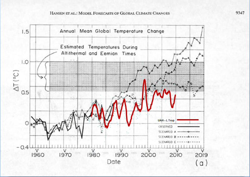
9) Or Hansen’s famous 1988 model, that predicted more than a degree of warming, even under Scenario B.

http://i90.photobucket.com/albums/k247/dhm1353/Climate%20Change/HansenvUAH.png
Conclusion
Contrary to the Guardian’s claims, Myles Allen’s work does not indicate vindicate climate modelling in general, nor does it inspire confidence in current predictions.
Furthermore, Allen’s work fails to explain why temperatures have flatlined in the last ten years, and why his original model did not predict it. More importantly, it has nothing to say about what this pause means for temperatures during the next decade.
But you would not expect to hear any of this from the Guardian.
Ian says:
April 1, 2013 at 12:17 pm
http://www.bbc.co.uk/news/science-environment-21991487
The very same thing is happening in the Arctic over recent years, but it is not expanding the sea ice there.
The difference between the two is quite simple and that is the ocean circulation isolates Antarctica from warmer currents and energy from the mid latitudes etc. The Arctic ocean has warm currents feeding into it all the time originated from tropical based oceans. The AMO is part of this process and the warmer it is the more energy reaches the Arctic basin and reduces sea ice.
Antarctica is a classic example of CO2 having very little / no affect on temperatures in a polar region. The CO2 affect on polar regions is only exaggerated because of the mechanism I have described earlier that only occurs in the Arctic.
Finally climate change is doing this and doing that can literally mean anything and does not distinguish between natural or unnatural. If they mean global warming that mention it, but they can’t do that because there hasn’t been any.
This is unbelievably bad. If you look at the graph in the Guardian article, you can see that the prediction is already out by about a tenth of a degree, after just over ten years.
The red line, indicating actual temperatures, is a ten year mean, so it effectively removes the recent non-warming. By chance, the prediction and the red line just happen to meet. Change the smoothing period and they no longer meet.
In ten years, all they have to do is increse the smoothing to a twenty year mean, and the lines will still accurately meet.
Fortunately the graph also shows the annual measurements over the period of the prediction (the yellow diamonds). Using the Mark One detector (the human eye) the trend over this period looks flat. And the everage of these points puts the current temperature at around one tenth of a degree below the prediction.
To summarise:
1. The two graphs meet at the moment only because of the smoothing they chose to apply.
2. The annual data shows that the prediction is already one tenth of a degree too high, after just over ten years.
In other words, his prediction is wrong, just like the others. The only difference is that maybe it isn’t quite so wrong as the others.
In a few years it will be interesting to add the additional annual data to that graph.
Chris
@ur momisugly Gail, very interesting, I particularly appreciate the point about ‘looking for a fast change in a huge system’, as the article I read that predicted a solar driven cooling trend speculated that the oceans were buffering a down tick.
I’m shocked that the world bank is funding so much coal! I can’t say I disapprove, it’s much better than putting brakes on development as that leaked paper might lead to. And apparently the downsides on air quality are at least mildly offset by the nitrogen and carbon fertilizing vegetation. It would be nice to get away from coal (and if warmers were serious they’d be funding gas and/or nuclear at massive rates to displace coal in developing countries) but it’s still a lot better for people than burning wood.
I have come to the conclusion that we all have a little blame global warming and its consequences and guilt even more politicians who do not slow down.
http://www.globalwarmingweb.com/