Guest Post by Willis Eschenbach
Over at Roy Spencer’s excellent web site, Dr. Roy has a post up showing a sea surface temperature (SST) anomaly calculated from AMSR-E, TMI, and WindSat. Here’s his post of the results:
 Figure 1. Global Microwave Sea Surface Temperature Update for Feb. 2013: -0.01 deg. C
Regarding these results, Dr. Roy says:
The anomalies are computed relative to only 2003-2006 because those years were relatively free of El Nino and La Nina activity, which if included would cause temperature anomaly artifacts in other years. Thus, these anomalies cannot be directly compared to, say, the Reynolds anomalies which extend back to the early 1980s.
So I figured I’d give him a hand by using the same 2003-2006 monthly anomaly baseline for the Reynolds Optimal Interpolation (OI) sea surface temperature, so we could have a longer dataset, and to see how his results compare to the Reynolds OI data.
I started by datapointing Dr. Roy’s data. I digitized it, and entered it into Excel.
Then I downloaded the Reynolds SST data (actual, not anomalies) from KNMI for the same area of the planet, 60°N to 60°S. Finally, I figured the monthly averages for the 2003-2006 period, and subtracted them from the Reynolds actual data to give the anomalies. Figure 2 shows the results:
 Figure 2. Reynolds OI and Spencer Microwave SST measurements.
Not much to say, except that Dr. Roy’s results agree pretty well with the Reynolds OI data, and that there’s been no significant increase or decrease in SST in the last 15 years or so …
All data and calculations are here as an Excel spreadsheet.
My best regards to everyone,
w.
Willis, thanks for the comparison. I wondered about it but was too lazy to do what you have done.
Nice one Willis. Another flatline.
So the Godzillian gigajoules of ‘missing heat’ hiding down in the Mariana Trench haven’t had any effect yet? (/sarc).
Willis,
From your recent posts, you must still be retired.
As an “outsider” when and why did this habit of calling the variation from mean value an “anomaly” start ? Surely you expect there to be variations, so there is nothing anomalous about them. Was this started by the AWG crowd to make the lay reader think “there is something wrong” ?
Does anybody have an overlay that shows sea surface temperature and HadCRUT, GissTemp, and others? I’d like to see how the data compares over time.
It’s a travesty. Maybe it was never there.
Thanks Willis, yet again.
Barry Cullen says:
March 6, 2013 at 9:28 am
I wish, but no … just self-employed, and still building houses.
That’s in part why this post is so short …
w.
Why only from 60N to 60S?
I appreciate the results are pleasing as they relate to the levelling seen in the surface temperature data of the last 16 years, but I know from working in higher latitude waters how dramatically different polar waters are from subtropical waters. For example, the boundary between the dark bottle green waters of the Labrador Current and the azure blue waters of North Atlantic Drift (Gulf Stream) is very visible on most occasions. The collision coincides with the foggiest region of the world south of Newfoundland.
Surely, if you are going to use the word ‘global’ you must include the regions from 60N and 60S to the Poles. It is especially important because the IPCC claim warming will be greater in those latitudes. Milankovitch also acknowledged the importance of changing obliquity of the ecliptic in these latitudes.
more soylent green! says:
March 6, 2013 at 9:39 am
Does anybody have an overlay that shows sea surface temperature and HadCRUT, GissTemp, and others? I’d like to see how the data compares over time.
Is this what you wanted? If not, you can start with this and add or delete as you wish.
http://www.woodfortrees.org/plot/hadcrut3gl/from:1997.33/trend/plot/gistemp/from:2001.33/trend/plot/wti/from:2000.9/trend/plot/hadsst2gl/from:1997.1/trend/plot/hadcrut4gl/from:2000.8/trend/plot/hadcrut3gl/from:1997.33/plot/gistemp/from:2001.33/plot/wti/from:2000.9/plot/hadsst2gl/from:1997.1/plot/hadcrut4gl/from:2000.8/plot/rss/from:1997/plot/rss/from:1997/trend/plot/uah/from:2008.5/plot/uah/from:2008.5/trend
Willis writes,
“Dr. Roy’s results agree pretty well with the Reynolds OI data, and that there’s been no significant increase or decrease in SST in the last 15 years or so …”
The “or so” part is not true. The increase in Reynolds SST (your data) appears not significant if you pick 1998 as the start year, or 1996, 1997, or 2000. But it is significant if you pick 1999, 2001, 2002, or 2003 as start years (or anything before 1996). This leads into that whole discussion about cherry picking, and why it’s a poor way to draw conclusions.
And here for comparison is the latest SST data from the UK Hadley Centre
Just a simple question. Based on Bob Tisdale’s articles, The warming/colling waters of ENSO seem to migrate based on various ocean currents, and that latent heat from El Nino takes quite a while to dissipate. If true, then how can anyone assume that certain years are “relatively free” of ENSO contamination? Maybe I’m missing something.
But Willis, where are the hockey stick temperatures? I thought all that ‘missing heat’ was swirling around in the sea?
Mike, Jim and Al won’t be pleased at all 😉
I would think it’s because much of the ocean near the poles is covered with ice at least for part of the year, so the water temperature is missing for months at a time there, and that time varies from year to year.
Let’s see, run the checklist:
1. Willis
2. Ocean temperatures
3. Nothing significant happening globally (no sign of global warming)
Yup, we’re about ten posts from the first commenter with some version of “Well Willis, if you were smart and/or educated enough to understand the uncertainties/error margins and/or properly compute the (statistics, trends, differentials) then You would know the real truth is…”
Bonus points for bringing up the ARGO data and trying to reduce his obvious glaring overwhelming ignorance of how the floats operate and the quality of those results, and for mentioning how the truth of the oceans is clearly revealed by Levitus 2012, of which perhaps someday Willis will make the tremendous personal sacrifice of someday schlepping down to the public library often enough that perhaps he could review and acquaint himself with that fine scholarly peer-reviewed expert document.
Gneiss says:
March 6, 2013 at 10:04 am
I was being quite conservative. If you adjust for autocorrelation using the method of Nychka, there’s been no significant increase in the Reynolds SST database since just after the beginning in 1981.
Cherry picking? Sorry, no way, I don’t engage in that kind of thing. The problem is the autocorrelation of the SST database is very, very high (0.94). As a result, we expect it to contain quite wide swings compared to a random walk … and that’s exactly what it’s done. The lowest p-value for the entire period is 0.048, barely significant at the weak level (p less than 0.05), and that is the only significant value for the entire dataset. If we start with the second month, the p-value is already rising, it’s 0.502, not significant, and it just gets worse from there.
So yes, what I said is not only true for the last 15 years—it’s true for the whole Reynolds dataset.
w.
more soylent green! says:
March 6, 2013 at 9:39 am
Does anybody have an overlay that shows sea surface temperature and HadCRUT, GissTemp, and others? I’d like to see how the data compares over time.
MSG,
The nearest I can suggest is the following graphs from the excellent http://www.climate4you.com
http://www.climate4you.com/images/HadSST3%20GlobalMonthlyTempSince1979%20With37monthRunningAverage.gif
http://www.climate4you.com/images/HadCRUT4%20GlobalMonthlyTempSince1979%20With37monthRunningAverage.gif
http://www.climate4you.com/images/GISS%20GlobalMonthlyTempSince1979%20With37monthRunningAverage.gif
Ole Humlum has deliberately chosen the same timescale for each graph for ease of comparison. Elsewhere he has a combined graph of HadCRut3 and SST but for the Tropics only.
Hope this helps. There is a mass of info on the site.
From Willis Eschenbach on March 6, 2013 at 9:51 am:
Obviously it is past time for you to combine your skills and main passions, and design and build houseboats.
You’re in California, you have a ready market willing to accept a houseboat as the ultimate hedge against future rising world oceans, even if they currently live ten miles inland. Because after the rise they expect to be on the shoreline.
The fun part is working in “rocket stove” heaters, for cooking, and for driving a boiler for propulsion and electricity generation. Then they can immediately recycle cardboard packaging, paper, scrap wood, driftwood. Very Green.
How far away from the coast do you have to be moored at night for California to not charge resident taxes?
Tom_R says:
March 6, 2013 at 10:53 am
Tim Ball says:
March 6, 2013 at 10:01 am
Why only from 60N to 60S?
I would think it’s because much of the ocean near the poles is covered with ice at least for part of the year, so the water temperature is missing for months at a time there, and that time varies from year to year.
In their microwave sounding product RSS don’t include any areas where there is surface ice because of interference with the signal I would assume that RSS restrict the use of this data for the same reason.
I am looking for a chart that would show how well or how poorly the various global temp datasets correlated, especially and divergence with SST.
I think that’s what the link you provided gives me, but I haven’t had any time to look at it in depth.
Thanks
Tim Ball says:
March 6, 2013 at 10:01 am
Thanks, Tim, sorry I missed your question. I agree with you.
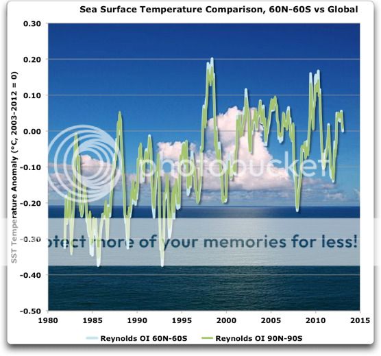
However, to some degree, it’s a difference that doesn’t make a big difference. This is because there’s not a whole lot of ocean near the poles, only about 10% of the area.
In any case, here’s the difference:
As you would expect, adding more data decreases the variance, particularly in this case as the temperature of the water near the ice doesn’t vary much. Other than that, though, there’s little difference between the two—correlation is 0.9956 …
Regards,
w.
kadaka (KD Knoebel) says:
March 6, 2013 at 11:02 am
I’m not clear what this “checklist” is supposed to represent … other than your ideas. Totally unclear, sorry. Am I supposed to have said there’s no sign of global warming? If so, over what time period? Or is that your claim?
Useless.
Whose post are you talking about, and why on earth aren’t you QUOTING or LINKING to whatever you’re on about? This is just a pathetic attempt at character assassination.
You are the first person to discuss either Argo or Levitus on this thread, which is about the Reynolds and the Spencer SST measurements … so I have to ask, are you drunkblogging? Have you posted this on the wrong thread? What does the Argo data have to do with this thread?
As to Levitus, if you have a page number and a quote I’m happy to discuss exactly what you are referring to. At present, your pointing at the entire document and saying that the answer to all mysteries is in there somewhere is useless handwaving and political posturing.
If you object to my words, QUOTE THEM and tell me exactly where I’m wrong. Don’t bother me with your bullshit checklists and vague claims, that kind of thing is as useless as a trailer hitch on a bowling ball.
I know you can do much better than that whole meaningless farrago, KD.
All the best,
w.
Willis writes,
“I was being quite conservative. If you adjust for autocorrelation using the method of Nychka, there’s been no significant increase in the Reynolds SST database since just after the beginning in 1981.”
Your adjustment increases the standard errors so much that nothing is significant over this time frame. The regression trends remain the same. As does the visually obvious increase in that graph.
Why not take a modern approach and model autocorrelation directly? Doing so gives a different result.
more soylent green! says:March 6, 2013 at 9:39 am
“Does anybody have an overlay that shows sea surface temperature and HadCRUT, GissTemp, and others? I’d like to see how the data compares over time.”
Here is one. You can add or remove data as you wish.
Sorry, link got messed there. Hope this works.