Guest Post by Willis Eschenbach
Anthony Watts, Lucia Liljegren , and Michael Tobis have all done a good job blogging about Jeff Masters’ egregious math error. His error was that he claimed that a run of high US temperatures had only a chance of 1 in 1.6 million of being a natural occurrence. Here’s his claim:
U.S. heat over the past 13 months: a one in 1.6 million event
Each of the 13 months from June 2011 through June 2012 ranked among the warmest third of their historical distribution for the first time in the 1895 – present record. According to NCDC, the odds of this occurring randomly during any particular month are 1 in 1,594,323. Thus, we should only see one more 13-month period so warm between now and 124,652 AD–assuming the climate is staying the same as it did during the past 118 years. These are ridiculously long odds, and it is highly unlikely that the extremity of the heat during the past 13 months could have occurred without a warming climate.
All of the other commenters pointed out reasons why he was wrong … but they didn’t get to what is right.
Let me propose a different way of analyzing the situation … the old-fashioned way, by actually looking at the observations themselves. There are a couple of oddities to be found there. To analyze this, I calculated, for each year of the record, how many of the months from June to June inclusive were in the top third of the historical record. Figure 1 shows the histogram of that data, that is to say, it shows how many June-to-June periods had one month in the top third, two months in the top third, and so on.
 Figure 1. Histogram of the number of June-to-June months with temperatures in the top third (tercile) of the historical record, for each of the past 116 years. Red line shows the expected number if they have a Poisson distribution with lambda = 5.206, and N (number of 13-month intervals) = 116. The value of lambda has been fit to give the best results. Photo Source.
The first thing I noticed when I plotted the histogram is that it looked like a Poisson distribution. This is a very common distribution for data which represents discrete occurrences, as in this case. Poisson distributions cover things like how many people you’ll find in line in a bank at any given instant, for example. So I overlaid the data with a Poisson distribution, and I got a good match
Now, looking at that histogram, the finding of one period in which all thirteen were in the warmest third doesn’t seem so unusual. In fact, with the number of years that we are investigating, the Poisson distribution gives an expected value of 0.2 occurrences. In this case, we find one occurrence where all thirteen were in the warmest third, so that’s not unusual at all.
Once I did that analysis, though, I thought “Wait a minute. Why June to June? Why not August to August, or April to April?” I realized I wasn’t looking at the full universe from which we were selecting the 13-month periods. I needed to look at all of the 13 month periods, from January-to-January to December-to-December.
So I took a second look, and this time I looked at all of the possible contiguous 13-month periods in the historical data. Figure 2 shows a histogram of all of the results, along with the corresponding Poisson distribution.
 Figure 2. Histogram of the number of months with temperatures in the top third (tercile) of the historical record for all possible contiguous 13-month periods. Red line shows the expected number if they have a Poisson distribution with lambda = 5.213, and N (number of 13-month intervals) = 1374. Once again, the value of lambda has been fit to give the best results. Photo Source
Note that the total number of periods is much larger (1374 instead of 116) because we are looking, not just at June-to-June, but at all possible 13-month periods. Note also that the fit to the theoretical Poisson distribution is better, with Figure 2 showing only about 2/3 of the RMS error of the first dataset.
The most interesting thing to me is that in both cases, I used an iterative fit (Excel solver) to calculate the value for lambda. And despite there being 12 times as much data in the second analysis, the values of the two lambdas agreed to two decimal places. I see this as strong confirmation that indeed we are looking at a Poisson distribution.
Finally, the sting in the end of the tale. With 1374 contiguous 13-month periods and a Poisson distribution, the number of periods with 13 winners that we would expect to find is 2.6 … so in fact, far from Jeff Masters claim that finding 13 in the top third is a one in a million chance, my results show finding only one case with all thirteen in the top third is actually below the number that we would expect given the size and the nature of the dataset …
w.
Data Source, NOAA US Temperatures, thanks to Lucia for the link.
Willis Eschenbach
Dice: more than one. Die: singular.
And a single die has an expectation (null hypothesis) of a uniform distribution on tosses (each face equally likely), not a Gaussian distribution as seen with multiple dice.
So I have a null hypothesis, actually several … where is the problem? If you test against multiple independent distributions, no problem at all – those are indeed multiple hypotheses.
A mathematical distribution is not a “smoothed version” of a given dataset. It is if it is wholly generated from the dataset. As was your Poisson distribution. As were my spline fit, and any number of possible skewed Gaussians that can be generated by least square fits to the observations.
And – none of those provide a null hypothesis, an independent distribution (a critical requirement!) that can be checked against the observations to see if the observations meet that null hypothesis, or whether it can be rejected. All you have been able to conclude is that the data looks like a curve generated from the data. Which tells us very little indeed, and has nothing whatsoever to do with Masters or Tamino or Lucia actually performing hypothesis testing.
If you cannot recognize the limits of stating that the data looks like a curve generated from the data, of agreeing with a tautology, there’s very little I can say.
Willis,
To compare monthly deviations, I think you need to determine how a particular deviation in one month translates into a deviation in the next month then determine the probable positive deviantion range in the leading month that would result in a top range temperature in the following month. You also need to determine the probability of the preceding month’s deviation. You also need to determine the probabilty of the preceding month’s deviation.
Looking at just the relative position of the temperatures with regard to the normal range of a given month seems to be comparing apples and oranges as it’s not clear how much of a temperature rise in the preceding month is needed to produce a similar in the next let alone its probability of occurring not to mention the arbitrainess of the monthly divisions with respect to temperature.
I may also depend on which months you are considering. If you look at the data from National Climate Data Center, the most stable months (i.e., least deviation) are July and August. The least stable are February or March. A top excursion in January seems less likely to end in the top readings for February while one in June perhaps more so in July’s record. But without knowing how much is translated from one to the next, you will have difficulty in determining the probabilities. Your analysis appears to be treating each month as if they had equal variance.
It might be better to view the problem as a pulse moving through the months with some decay.
Phil. says (emphasis mine):
July 13, 2012 at 3:25 pm
Gosh, if all we know is that the die is loaded and we know nothing else, then how about you bet on the number 6 coming up and I’ll bet on the number 2 coming up … what’s that? You don’t want to bet? I thought all we knew was that the die was loaded, why isn’t that a fair bet?
Obviously, it’s not a fair bet because as a result of our analysis, we not only know that the die is loaded, we know exactly how it is loaded.
And as a result, we can calculate the correct odds that the next throw will be a 6, which we could not do until we analyzed the results. So we know much more than your simplistic “the die is loaded”.
And that’s all I’ve done here. I’ve analyzed the results so that I can calculate the correct odds for various outcomes.
w.
KR says:
July 13, 2012 at 4:29 pm
You test the observations to see if they have a normal distribution, and you claim that’s legitimate. I agree, it is.
I test the results to see if they have a normal distribution, and you claim that that is a forbidden operation, that it is some kind of “fit” to the data, that it is a tautology, that it is just a “smoothed curve” … why?
What is the difference between you testing the observations to see if they are normal, and me testing the results to see if they are normal? Why is one a “tautology” and not the other?
That’s the question I keep asking and asking, and you keep not answering. What is the difference?
Thanks,
w.
Phil., commenting on Willis’s interpretation of within top 1/3 of historical record, says
Not so, If the temperature rises monotonically, every month sets a new record and 100% of observations are in the top third of their historical record (which does not include any future values).
Under the null hypothesis of no trend, you’d expect 4.333, but Willis isn’t making that assumption.
Willis, you say:
The equivalent of the NCDC / Jeff Masters analysis in this case is to say:
If the die were unbiased, with equal probability of throwing any of the six numbers, then the probability of seeing over 2,500 instances of 2 and 3 while also seeing fewer than 500 instances of 6 in a total of 10,000 throws is about 1 in a gaziliion. The implication is that the die is clearly biased.
It seems to me that the equivalent of your analysis is to say:
The above is a ridiculous straw man. Nobody serious claims the die is not biased. The question is: is the occurrence of over 2,500 2s and 3s, and less than 500 6s a grossly improbably event, as claimed. Let’s look at the actual data. So you draw a histogram of the outcomes and notice that they look uncannily like a Poisson distribution. You fit a Poisson distribution to the outcomes and find that the fit is indeed astonishingly close. All standard statistical tests show the distribution is consistent with Poisson and not with alternatives such as equal probabilities or binomial.
On the basis of having fitted a Poisson curve to the data, you conclude that not only is finding over 2,500 instances of 2 and 3 while fewer than 500 instances of 6 NOT a highly improbable event, it is an EXPECTED event given the characteristics of this die.
Your analysis does not address the issue of whether or not the die is biased. And it is clearly tautologous.
Am I wrong?
And as a result, we can calculate the correct odds that the next throw will be a 6, which we could not do until we analyzed the results.
Yes. So, having fitted a Poisson curve to the historical record, you can calculate the odds that the NEXT 13 months will be all in the top tercile. What you cannot do is make any statement about the existing data to which the distribution was fitted.
If you want to do this properly, you could fit a Poisson distribution to the data set up to and including May 2011, and then use it to calculate the probability that the next 13 months would be a 13-month hot streak.
Peter Ellis says:
And that probability is, apparently, 2.6 out of 1374, or 1:528. So Willis would presumably be quite happy to enter into a bet that the 13 month period ending July 2012 will NOT contain all 13 months in the top 1/3 of their historical distributions. I will generously offer to bet at odds of only 50:1. $50 to me if July 2011 to July 2012 contains 13 top-tercile months; $1 to Willis if it doesn’t. Willis would you take this bet? Your analysis says you should.
If one assumes temperature variation has been a random walk from July 1894 to June 2012,, it would have been more appropriate to apply the arcsine rule rather than the possson distribution.
http://journals.ametsoc.org/doi/abs/10.1175/1520-0442%281991%29004%3C0589%3AGWAAMO%3E2.0.CO%3B2
Willis Eschenbach – This has been a very interesting discussion, despite the frustration various folks have felt with each others views.
(1) What you have done with your Poisson distribution (and I with my spline fit, skewed Gaussian, etc) is properly known as descriptive statistics. They describe the data, which can be in and of itself very useful – where is the mean, the median, the mode? Skew and kurtosis? In many cases these descriptions can be used in further investigation.
(2) Inferential statistics involves looking at data which has some level of stochastic variation, and using the statistics to draw some additional conclusions, such as likelyhoods of _future_ occurrences given the observations. That does, I’ll note, require using statistics that actually describe the physical process under discussion, and as previously discussed there are several reasons why Poisson statistics are a poor match. These, however, are statistical predictions, not hypothesis testing.
(3) What Masters did went one step further – testing against a null hypothesis. He compared observations to a separate, independent distribution function, his null hypothesis of non-trending climate, and considered the odds of the observations occurring under that reference distribution. Based on the extremely low odds he (with errors he has since acknowledged due to not considering autocorrelation), he concluded that observations reject the null hypothesis quite strongly. No surprise there, we know that the climate is trending/warming, it’s an interesting but fairly minor item to note that we’ve had a 13 month period in the upper tercile in a warming climate.
Descriptive statistics can be very useful in hypothesis testing – comparing the descriptive statistics of your observations to statistics of your null hypothesis description. But they are not in and of themselves sufficient for a hypothesis test. You must have an independent reference distribution and/or statistic to compare to. Hence your discussion of your descriptive statistics is apples/oranges wrt Masters – you’re not discussing the same issue at all.
What you have in essence discussed comprises variations on “the descriptive statistics describe the observations quite well” – that’s the tautology. You have not investigated whether or not an independent reference distribution is supported or rejected by the observations, which is what Masters/Tamino/Lucia have done.
Again – descriptive statistics are quite useful. For example, trying multiple statistics (binomial, Poisson, Gaussian, etc) to investigate an unknown process – something I do quite frequently to establish the relative levels of Poisson and Gaussian noise in a system. And you can do hypothesis testing between various functions to make those distinctions. However, you have not performed anything like the test Masters did, and your work says exactly nothing about the likelyhood of this 13 month event given a non-trending climate.
Nicely done. It’s good to see a graphical representation of why Jeff Masters is wrong.
Nigel Harris says:
July 13, 2012 at 11:59 pm
Phil., commenting on Willis’s interpretation of within top 1/3 of historical record, says
No, for the ones near the end of the series the results will be the same as if the whole series had been chosen, i.e. 4.333. In fact once you’ve reached about 100 months in the end effect should have disappeared so you should still get 4.333 from there on.
Not so, If the temperature rises monotonically, every month sets a new record and 100% of observations are in the top third of their historical record (which does not include any future values).
Under the null hypothesis of no trend, you’d expect 4.333, but Willis isn’t making that assumption.
Willis doesn’t understand what he’s doing at all so leave his analysis out of it.
In the example you pose Poisson processes don’t apply, the probability of being in the top third is 1 and every 13 month period in the record satisfies the the requirement so the PDF is a single spike at 13. A Poisson process requires that p be small, a Poisson distribution has a mean and variance equal to N*p! For a process where the trend is small compared with the fluctuation and there is no autocorrelation a Poisson process might apply in which case 4.333 is the appropriate mean, anything else means that one of the conditions has not been met and it’s not Poisson.
KR says:
July 14, 2012 at 7:51 am
Thanks as always for your clear and interesting response, KR.
I used the June-to-June statistics to draw an additional conclusion, which was the likelihood of finding 12-of-13 in the full dataset, despite there being no occurrences of 12-of-13 in the June-to-June dataset.
And if I were given the problem last year, before it occurred I could have told you the likelihood of finding 13-of-13 in the future. Not only that, but in both cases my calculations would have been quite accurate.
So your claim, that I’m doing “descriptive statistics”, doesn’t agree with the facts. I am clearly drawing additional conclusions and inferences about the likelihood of future events.
You say that this requires statistics that “actually describe the physical process under discussion, and as previously discussed there are several reasons why Poisson statistics are a poor match.”
First, statistics are never perfect, no real distribution is ever a pure perfect Poisson distribution. But they don’t need to be perfect, they only need to be a good enough match to reality for whatever purposes we plan to put them to.
Yes, as I have said, these results can’t be a true Poisson distribution because any result over 13 is folded back in, that is to say, it is counted as a lower number. That affects about 1/1000 of the results … ask me if I care. Statistics don’t need to be perfect, only good enough for the task at hand.
By the same token, it is not necessary that they “actually describe the physical processes”. Take my example of the loaded die … are you claiming that I have to know the exact physical processes that lead to the results, that I have to know did they load the die with mercury or lead, or are they using an iron load plus a magnet, before I can use the analysis of the results?
The loaded die is an excellent example of how you can use an analysis solely of the results, with no idea of the physical processes, to draw inferences about the likelihood of future occurrences. If I have the results I described above, I can calculate with good accuracy the likelihood that I will throw a row of three sixes in the next 100 throws … how is that not using an analysis solely of the results to predict the likelihood of future occurrences?
So while I am aware of the difference between inferential and descriptive statistics, your claim that analyzing results (as I have done) is only and always descriptive statistics, and cannot be inferential statistics, underestimates the power of the “black box” type of analysis.
For a discussion and an example of the strength of the “black box” type of analysis, where we don’t know the physical processes, you might enjoy my earlier post, “Life Is Like a Black Box of Chocolates“.
My best to you,
w.
Willis Eschenbach says:
July 13, 2012 at 4:09 pm
Thanks for the answer, KR. With the die, the null hypothesis is that the outcome has the form of a Gaussian distribution. As you point out, we can reject that hypothesis.
No it’s a uniform distribution, which we can reject.
My null hypothesis is that this outcome has the form of a Poisson distribution. I am testing how likely the observations are given that particular reference distribution. I have not been able to reject that hypothesis.
Actually you have conclusively rejected that hypothesis! The Poisson process for the number of successes out of 13 tries (success being in the top third) requires that the mean is 4.333, you have demonstrated that it is not, therefore the distribution isn’t the result of a Poisson process and one of the requirements has not been met, so as in the case of the die the hypothesis is rejected. As someone pointed out up-thread there is a modification to Poisson which allows for persistence (Conway-Maxwell-Poisson) but that is not a very simple case to apply.
This one does resemble a Poisson distribution, to a very good degree, both in aggregate and also each and every one of the 12 monthly subsamples. Not only that, but the theoretical value for lambda (the mean of the observations) is almost identical to the value for lambda I get from an iterative fit, which strongly supports the idea that the data very, very closely resembles a Poisson distribution.
Absolutely not, this is your fundamental error, the theoretical value for lambda is 4.333, not the value you get for curve-fitting your data, which despite your protestations is all you’ve done. You’ve shown that the experimental distribution resembles the distribution you’d expect from a Poisson process for the number of successes out of 13 tries (success being in the top ~40%), oops!
In fact, it strikes me that you should be able to use the difference between the mean, and lambda determined by an iterative fit, to do hypothesis testing for a Poisson distribution … but I digress. I do plan to look into that, however.
Is it actually a Poisson distribution? It can’t be, because a Poisson distribution is open ended. What happens is that the very final part of the tail of the Poisson distribution is folded back in, because a run of 14 gets counted as a run of 13. However, this is only about one thousandth of the data, and for the current purposes it is a third-order effect that can safely be ignored.
Actually a run of 14 would be counted as 2 runs of 13 the way you do it. In fact if you had a dataset with enough events to have some longer runs you’d start to see a spike at a value of 13. There’s a good chance that at the end of this month this will happen. That’s why you limit the analysis to June-June so that won’t happen!
Willis Eschenbach says:
July 14, 2012 at 10:51 am
And if I were given the problem last year, before it occurred I could have told you the likelihood of finding 13-of-13 in the future. Not only that, but in both cases my calculations would have been quite accurate.
You would (based on your faulty analysis) have predicted about a 1 in 500 chance, how would the actual occurrence this year have validated that?
Willis Eschenbach says:
July 13, 2012 at 3:35 pm
Phil. says:
July 13, 2012 at 2:46 pm
Nigel Harris says:
July 13, 2012 at 2:22 pm
People,
The fact that Willis’s distributions have a mean around 5.15 instead of the “expected” 4.33 is (as he explained to me in a comment above) has nothing to do with distribution shapes or fat tails. It’s because he didn’t do the analysis that you think he did. His definition of a month that is “in the top third of its historical record” is a month that is in the top third of observations that occurred *prior to* (and presumably including) that point in the record.
A truly bizarre way to do it!
That’s what “in the historical record means”, it means you’re not comparing them to future years. There’s no other way to do it than to compare it to the historical record that existed at that point, unless you want to compare events that have actually occurred with events that haven’t happened.
No it doesn’t, it means comparing it to the totality of the record, as correctly stated by Masters:
“Each of the 13 months from June 2011 through June 2012 ranked among the warmest third of their historical distribution for the first time in the 1895 – present record.”
So perhaps you should repeat your analysis using the correct procedure, although I suspect that won’t change things much. When you did it your way how did you deal with the first year?
Willis Eschenbach says:
July 13, 2012 at 3:35 pm
Some clarification, please: You are using the same threshold throughout for the upper 1/3, based on the statistics of the entire data set, are you not? The discussion makes it sound like you have a variable threshold, and I would agree that would be curious and questionable.
Phil. says:
July 14, 2012 at 10:38 am
The distribution in Willis’ histogram is Poisson-like, but the data are correlated in time, and the distribution is skewed from the ideal. Whether a more appropriate distribution model would increase or decrease the probability of a 13 month streak or not has not been assessed by anyone here that I have seen, but if past states are positively correlated with the current state, I would expect an increase.
Phil. says:
July 14, 2012 at 11:59 am
It is important to remember that Masters’ miniscule probability is unenlightening because, under the premises, it is trivial – it applies an a priori statistic to an ex-post facto observation. It is the equivalent of dealing out a deck of playing cards, and then noting that the odds were an incredible one in 52! that you would have dealt that particular order. A singleton observation does not establish a trend.
Bart says:
July 14, 2012 at 1:09 pm
Phil. says:
July 14, 2012 at 11:59 am
It is important to remember that Masters’ miniscule probability is unenlightening because, under the premises, it is trivial – it applies an a priori statistic to an ex-post facto observation. It is the equivalent of dealing out a deck of playing cards, and then noting that the odds were an incredible one in 52! that you would have dealt that particular order. A singleton observation does not establish a trend.
I think you should read what Masters actually said, you appear to misunderstand him.
It’s more like dealing 4 aces from a pack (shuffled of course) and commenting on how long it would be before you could expect such a hand again.
KR says:
July 13, 2012 at 9:14 am
KR, I realized that I had only half-answered this objection. You are right that you cannot use a single-sample K-S test to compare a sample to a reference distribution if the parameters of the reference distribution are determined from the data. Here’s how I use a two-sample K-S test to get around that.
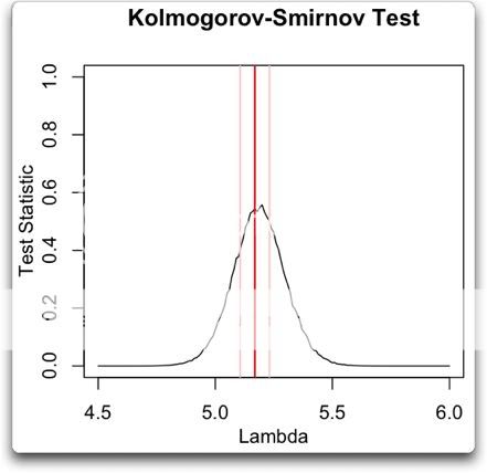
I sweep the K-S test across a host of random Poisson distributions with different lambdas. Then I graph up the results. Here’s that graph:
What I have done is started with a lambda of 4.5. I generated 1,000 random poisson values with a sample length of 1374, which is the length of the dataset of “warmest of 13” results. Then I performed a K-S test of the results versus each of the 1,000 random datasets. I averaged the 1,000 results, and that is the point on the black line directly above the “4.5” on the “Lambda” axis. I repeated this over and over, increasing lambda by 0.01 each time, until I reached lambda = 6.
Then I graphed up the results. I added the mean of the actual “warmest-of-13” dataset (red), and lines representing plus/minus the standard error of the mean.
This particular dataset is right smack in the middle of the range of Poisson distributions that the K-S test fails to reject. It’s not on the outskirts, it is right at the peak rejection, exactly where a Poisson distribution should be.
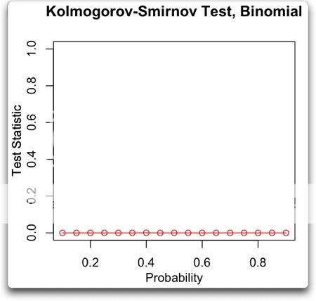
Now, you’d think going in (or at least I’d think) that you would get a binomial distribution from this procedure. And indeed, this is the assumption under which Masters made his calculations. But here’s a K-S sweep testing the binomial distribution:
Note that the K-S test firmly rejects the null hypothesis that the results have a binomial distribution, no matter what the probability. So the problem with Jeff Masters’ analysis is not that he used the wrong percentage in his calculations. It is that for whatever reasons it is not a binomial process.
KR, note that this is another kind of inference that one can draw by analyzing the results, an inference about how to actually use the observations to calculate the odds. In this case, it shows that calculating the odds using a binomial calculation won’t work.
Anyhow, that’s how I do the K-S test without using reference parameters generated from the data …
Now, I’m the first one to admit that I don’t understand why the results should have a Poisson distribution, it’s still a black box to me. As I said, I’d expect a binomial distribution, and indeed I’ve tried a variety of modified binomial distributions, but with a uniform lack of success.
Again, let me say that it is obvious that this is not a “real” Poisson distribution, that is to say a Poisson distribution generated from independent stationary uncorrelated occurrences. But as far as I can tell it is statistically indistinguishable from a Poisson distribution, both in toto and for each month when subsampled by month. The Poisson two-sided dispersion test fails to reject, both in toto and for each month when subsampled by month. Lambda from an iterative fit is only three-tenths of a percent different from the mean. I can’t find a single test to show that it is not a Poisson distribution.
As a result, we are justified in using Poisson statistics to describe it and to draw inferences from it.
We do the same thing all the time. We observe a phenomenon, and we want to find out if it is the result of some unknown gaussian normal process. So we subject it to a variety of statistical tests, and if it passes them all, despite not understanding the details of the underlying process we assume it is normal and proceed to draw inferences under that assumption.
w.
Bart says:
July 14, 2012 at 12:56 pm
The threshold is always the same. It is the upper third of all observations previous to the month in question. So if a given month is November, the question is whether that month in the upper third of all previous Novembers? See my comment above.
If you don’t do it that way, then as months are added to the dataset, the entire results dataset will change beginning to end, and so you have constantly changing results … and soon this latest June-to-June will not have 13 months in the warmest third. I can’t see any justification for comparing months to future months, or for having a dataset of results that changes root and branch every month, so I only used historical months.
It is of the same nature as a “trailing average”, a calculation involving only previous months and not future months.
w.
Willis Eschenbach says:
July 14, 2012 at 2:40 pm
Now, you’re confusing me even more. It’s always the same, but it isn’t?
What I would like to see is a statistic where, for each month over the entire data set, you compute the range of temperatures, divide it into three bins, and assign the threshold to be the lower level of the top bin. That will be the threshold for that month, to be applied uniformly to all the data.
If, as you suggest, doing that will eliminate any stretch of 13 months, then we’ve never had a stretch of 13 months in the top 1/3 in the first place, and what precisely is the entire controversy about?
Willis, of course one can convert a poisson distribution to an approximate binomial distribution if you divide the time interval into subintervals such that either one or zero “hits”occurs in each subinterval: and treat them as a Bernoulli trial: with p=Lambda*t/n. If n is large (and p small), the difference (all but) disapears. The Poisson can be used to estimate the Binomial when n is large and p small. I don’t suppose this is much use to you, but interesting perhaps
Given that June 1895 to June 2012 was 1405 months, and assuming monthly temperature changes constitute a random walk comparable to a coin flip,,
http://journals.ametsoc.org/doi/pdf/10.1175/1520-0442%281991%29004%3C0589%3AGWAAMO%3E2.0.CO%3B2
Arcsine rule no 1 gives
P =( 4/pi) arcsin (a^0.5), where a is the fraction of time in the lead enjoyed by the loser.
The probabilty that the loser is in the lead 13 months or less is about
(4/3.14159)* arcsin ( (13/1405)^0.5) = 0.002, or about 1 in 500.
Given a random walk, the last 13 temperatures in a row out of a 1405 month walk is not so easy to compute, but the standard deviation in temps for 1405 months is equal to
the standard deviation for 1 month *(1405^0.5) = 37.48 times the deviation for 1 month.
That means, from a random walk of 1405 months, you can expect an average spread of
37.48 units from low to high.
Using arcsine law 2, the probability of finding the firs maximum at 2K or 2K+1 is the same as the probability that the loser wil lead 2K/2N of the time, which was worked out with equation 1.
With the last 13 months, the standard deviation will be sqrt (13/1405 ) * 37.48,= 3.61, much LESS than
12.49 , which would be the top 1/3 of all temperatures. 12.49/3.61 gives 3.45 standard deviations, The probability the one of the last 13 month’s temperatures drops below +12.49 SDs less than 1%..
Assuming that monthly temperature changes act as a random walk, the probability that one of the
last 13 months contains a record high ( or record low), would be greater than 0.002., significantly greater than 1 in 1.6 million. Given that the eastern Us makes up about 3% of Earth’s land surface, the probability that SOME area on earth would experience such a warm streak in the last 13 months is greater than 0.002/0.03 = 6.7%., not significant at the 5% level.
Given that the last 13 months contain a record high (or record low), the probability that ANY month
in that 13 month period is more than (37.48/3) BELOW(above) that maximum high(minimum low), is less than 0.01. I believe my computation significantly UNDERESTIMATES the probability
of all of the last 13 months are all in the top 1/3 of all monthly temperatures for the last 1405 months.
Willis Eschenbach – Masters (and Tamino, and perhaps with the best approach Lucia) have asked the question “How likely are the observations given a non-trending climate”. You have not – you lack that null hypothesis. That, and that alone, means your post does not relate to the question you tried to discuss. You have only compared descriptive statistics to descriptive statistics, not a null hypothesis and the probabilities of the observations given that hypothesis, as I stated in my last post.
Apples and oranges, two different discussions.