Guest Post by Willis Eschenbach
The Argo floats are technical marvels. They float around below the surface of the ocean, about a kilometre down, for nine days. On the tenth day, they rise slowly to the surface, sampling the pressure, temperature, and salinity as they go. When they reach the surface, they radio home like ET, transmit the data from the instrumental profiles, and they drop back down into the eternal darkness for another nine days. The first Argo floats were put into the ocean in the year 2000. In 2007, the goal of 3,000 floats was achieved.
In “Krige the Argo Probe Data, Mr. Spock“, I discussed some issues with the Argo floats. Then in “Decimals of Precision” I discussed and strongly questioned the outrageous error claims made by the Argo researchers. They say that we can detect a temperature change with an error of 0.004°C per year in the top 1,800 metres of the ocean. I say no way, not yet.
In a comment on that thread, I posted a graphic showing the current distribution of the Argo floats, shown below as Figure 1.
 Figure 1. Distribution of Argo floats as of February 2012. SOURCE
At that time I remarked on the distribution, saying:
However, I do see one place that they are not covering, and strangely, it is a crucial location—the intertropical convergence zone (ITCZ). Surface water around the ITCZ is heated. When it is heated it expands, which creates a gravitational trend downhill towards both poles. As the surface water is heated and moved polewards, it is replaced with deep oceanic water from below. So I’d say your suspicions are correct for at least that area.
In the Pacific, the ITCZ is generally found roughly ten degrees or so North of the Equator. You can see the blank area in Figure 1 just above the Equator. My speculation was that the blank area was not a random occurrence. So … I set out to take a look at where the Argo floats have sampled and where they haven’t sampled. I didn’t realize what I was getting into.
It’s a dang nuisance to get all the Argo files. They are available at the Global Argo Data Repository. The problem is that there have been over 8,000 individual Argo floats … and the rocket scientists at NOAA have decided to make the data available as one file per float, eight thousand individual files … grrr …
So I thought it might be of interest to describe how I went about getting the data. I haven’t gotten all of it, at the moment I’m somewhere between 5,000 and 6,000 files downloaded.
The first step in the process is to get the URL addresses of all of the files, which are shown on the web page at the link given above. To get the text of the URLs, remember that these are all listed in the “source” file that created that web page. Under the “View” menu (on the Mac, at least) you have a choice called “View Source”. This “source file” is a text file that contains the HTML information on how to make up the page, including all of the URLs of all the links on the page.
So … the first file listed on the web page is “IF000550”. I searched the source file for that, it’s at the start of the table. A similar search for “9018420”, the last file listed on the page, found me the end of the table.
I copied all of that information from the start to the end of the table from the “Source” document, and pasted it into a text processor. The end of an HTTP address is marked by the close code “”. I did a global search for that phrase, and replaced them all with a carriage return (“^p” in Microsoft Word). That left the text broken into short sentences suitable for pasting into Excel.
So I copied all of the resulting text, and pasted it into Excel. From there, it was easy to sort the lines. I wanted lines containing addresses that looked like
http://www.nodc.noaa.gov/argo/data/coriolis/7900073.tgz
These are the files with the actual float-by-float temperature profiles. I sorted them out, there were about 8,500 of them or so.
That gave me the list of all of the URLs of the files I was interested in. I saved those as a comma-delimited file, and opened it using the computer language “R”.
Using R, I was then able to automate the download process, having the computer download the files one after another. The one thing you need to do is leave gaps in your file requests. If you just request one file after another with no pause, you may get mistaken for a denial-of-service (DOS) attack on their server. So I put in a half second pause in after every five downloads. This adds about 12 minutes on 8,000+ downloads, not bad.
So that’s how I’m doing it. Once I get it all downloaded, I’ll put it together in some more reasonable format and stick it back out on the web, so people won’t have to go through that madness for the data.
In any case, I have downloaded the coordinates of all of the temperature profiles ever done by any Argo float. Remember that I started out on this hegira to see if my eye were good, and if there was a sampling inconsistency in the Pacific just above the equator.
Figure 2 shows how many samples have ever been taken everywhere in the global ocean. There have been a total of about 890,000 Argo temperature profiles taken to date. Sounds like a lot … but the ocean is a huge place. I began by counting the number of observations per gridcell on a 1° x 1° grid basis. I then standardized them by area as the number of temperature profiles taken per 10,000 square km. I picked this size for a couple of reasons. First, it’s close the area of a 1° x 1° gridcell at 40° North. This reduces distortion of the counts. And second, it’s a square which is a hundred kilometres (about sixty miles) on a side, so it can be easily visualized. It is a huge expanse of ocean.
 Figure 2. Number of temperature profiles ever taken by Argo floats in various areas of the ocean. Percentages in the second row refer to the percentage of the total ocean area having that number of temperature profiles. Percentages in the third row refer to the percentage of the ocean area from 60°N to 60°S having that number of temperature profiles. Click on image for larger version.
So … what are we looking at in Figure 2? We are seeing which areas of the ocean are better sampled, and which are more poorly sampled.
The red areas are those parts of the ocean which have never been sampled at all by Argo floats. In some cases, such as the area around Indonesia, or the east side of the bottom half of South America, it is because the ocean is shallow there. Up north it’s because of ice. And down south? It seems the currents don’t carry the floats down that far. This makes sense because the cold surface waters are sinking around Antarctica and flowing north in that region, carrying the submerged floats with them away from Antarctica.
In other areas, such as off the westernmost point of South America and the area on the western side of South Africa, the cause for the lack of samples seems to be the local upwelling in the areas. Presumably, since the water is radiating outwards at depth as well as at the surface, the floats are moved away from that area.
The areas in orange, another 10% of the global ocean, have only ever been sampled from just once to eight times. So a quarter of the ocean has either never been sampled, or has been sampled less than eight times per 10,000 sq. km, since the beginning of the Argo program in 2000.
In other words, a quarter of the global ocean has been sampled less than once a year per 10,000 sq. km. by Argo floats … yet they claim an error of only a few thousandths of a degree in the global average.
To get around part of this problem, sometimes the Argo data is used solely from 60° north of the Equator to 60° south. This eliminates some of the problem, but there is still 8% of that ocean area from 60°N/S that has never been sampled at all. How can they possibly claim to know the temperature of that huge volume of ocean to within ± 0.004°C, when 8% of it has never been sampled at all, much less adequately sampled? Another 8% of the ocean 60°N/S is sampled on the order of once a year … again, nowhere near adequate for the claimed accuracy.
What else can we see? There are areas which are way oversampled compared to the rest (cyan color, more than 96 measurements/10,000 sq km), places where it is clear that the floats tend to “get stuck”. These include the ocean around Japan, parts of the Mediterranean, the Bay of Biscay off France, the south tip of Greenland, the northern Indian Ocean, and the Gulf of Alaska. It appears that the Argo floats get trapped in these bays, corners, and dead ends. Presumably the wind is driving them onshore when they are at the surface, and they move offshore when they are at depth. This keeps them in the same area, leading to the large number of samples.
Finally, the hunch that started me on this quixotic quest is confirmed. There is indeed a band which is only infrequently sampled just above the Equator in the Pacific. There have been many more samples taken just above and below that band. The infrequently sampled area is also the area where the El Nino upwelling occurs. I hardly take this as a coincidence.
CONCLUSIONS
• The sampling of the oceans is by no means as uniform as I had expected. Part of the ocean is undersampled, sometimes badly so, compared to other areas. Half of the global ocean has been sampled less than 20 times per 10,000 sq. km, and 14% has never been sampled by Argo floats at all.
• Even when we look at just the area from 60°N/S, half the ocean has been sampled less than 24 times per 10,000 sq. km, and 8% is unsampled.
• The area of the El Nino phenomenon is a critical area for the regulation of planetary heat loss. Oceanic heat content in this area can change quite rapidly. However, parts of it are woefully undersampled.
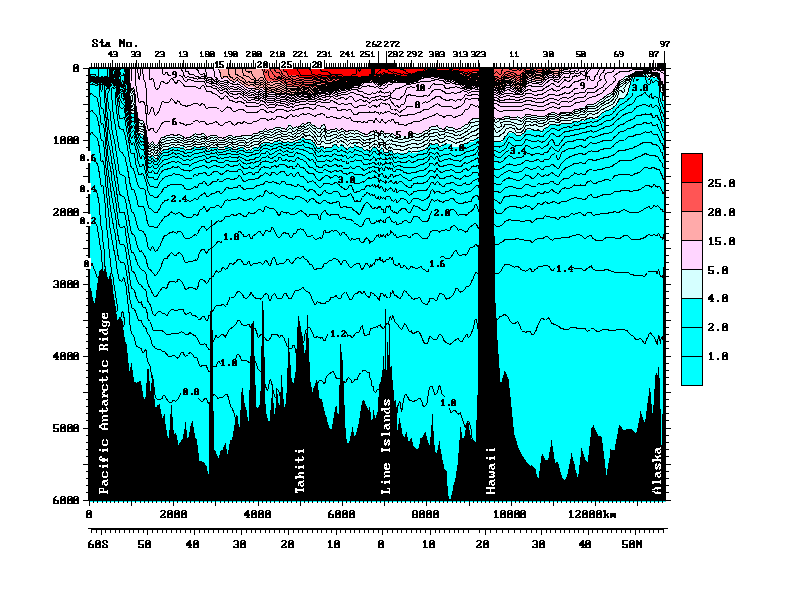
• Finally, the older Argo floats sample either down to 1,000 metres, and intermittently go to 1,500 metres depth. The newer ones go down to 1800 metres. Which is quite deep, about a mile down. But the estimates of oceanic heat storage include the whole ocean. Figure 3 shows a pair of transects from Antarctica (on the left) to Hawaii, and then Hawaii to Alaska on the right, to give some sense of scale.
![]() Figure 3 (Figure 10 from cited source.) North/South Pacific transect at 150°W. ORIGINAL CAPTION: Vertical section of potential temperature (°C) along 150°W from data collected in 1991-1993 as part of the World Ocean Circulation Experiment. Data north of Hawaii were collected in 1984 (Talley et al., 1991). Potential temperature is the temperature a parcel of water would have if moved to the sea surface with no change in heat content, and is lower than measured temperature since temperature increases when water is compressed due to the high pressure in the ocean. Source and Image
Figure 3 (Figure 10 from cited source.) North/South Pacific transect at 150°W. ORIGINAL CAPTION: Vertical section of potential temperature (°C) along 150°W from data collected in 1991-1993 as part of the World Ocean Circulation Experiment. Data north of Hawaii were collected in 1984 (Talley et al., 1991). Potential temperature is the temperature a parcel of water would have if moved to the sea surface with no change in heat content, and is lower than measured temperature since temperature increases when water is compressed due to the high pressure in the ocean. Source and Image
The Argo floats operate mostly in the warmer area up top of Figure 3, above the lower thermocline (light blue). Average depth in this entire transect is much deeper than that, about 5,000 metres. So the Argo floats are measuring less than a quarter of the water in this part of the Pacific basin. Makes the whole question of oceanic heat content kinda iffy.
Anyhow, that’s my first look at the question of the float distribution. I have some other projects in mind once I get the data downloaded. I’ve been downloading while the Super Bowl has been on, I’m up to 6,000 files downloaded, only 2,500 or so to go … but tomorrow is Monday, it’s back to my day job in construction pounding nails, that slows the science down. I just want to find someone to pay me for my research. Where are Exxon and the Koch Brothers when I need them?
My best to everyone,
w.
PS: I was quite happy with my map. It’s the first one I’ve done of a 1° x 1° grid. I found that to get it to print properly, I could use one dot per 1° x 1° gridcell. But to make it work, I had to size the dot by the cosine of the latitude. Took me a while to figure out how to do that in “R”, I’m kind of an R klutz, I only learned it a few years ago. But I made it work.
You could try a Bonferroni correction to your grid
Willis, you need to get with the program. In order to maximize the visual impact, all maps in Climate Science must be rectangular, with the cosine of the latitude effect ignored.
/sarc
tallbloke says:
February 6, 2012 at 11:48 am
Interesting find, tallbloke, thanks for that. I have no idea. However, if you look at the “waterfall plots” at the Argo site, you’ll see that they have not removed bad temperature data …
All the best,
w.
Excellent work, Willis!
Perhaps one of the several responses and comments will get you to a site and system though which you can get *ALL* of the data (none removed) and in a single file that you can really work with, and not have your computer booked for … hours? … with scripted procedures to just *capture* the data. Better to be able to work on the data, instead.
Now, that said, how about bringing in the Statistician to the Stars (William Briggs, http://wmbriggs.com/blog/?cat=1) to get some real expert statistical information on the uncertainty/reliability.
Somewhere there must be data on how these machines are calibrated or not, how often, etc. That’s critical info. With more than just 3,000 floats in the [vast] ocean, I can’t imagine they are being picked up with any regular frequency. In fact, how they don’t just become floating junk eventually, would be a really good question…
As always, nice work Willis. You deserve a medal for your ability to perform sanity checks on “big climate”.
Mark N says:
February 6, 2012 at 11:51 am (Edit)
Thanks, Mark. There are a couple upsides to being a builder. Today, for example, I’m shingling a roof. So I’m up and down the ladder, humping bundles of shingles and rolls of tarpaper up ten feet to the roof. So the first advantage is, it keeps me young. One thing I’ve learned. When your age exceeds sixty, if you slow down … you stop. So I don’t have to pump iron, I pump wood instead.
The other upside is some of my best ideas come in the middle of nailing in a stud or framing an opening or the like. It gives time for my unconscious to mull it over.
So I suspect that if someone paid me to sit down all day, that might not be the best of things …
w.
You should submit Fig 2 to Josh Willis. If he doesn’t already know it I’m sure he’ll be keen to see it. You may also get a reply he seems keen to talk with Pielke Snr. on the subject.
Nice work BTW
The ARGO floats will drift away from upwelling areas and tend to congregate in downwelling areas of the ocean.
This, over time, will cause a substantial warm bias as upwelling areas are colder than downwelling areas at least away from the poles. I would hope that they adjust for this bias.
I recall a study that showed a surprisingly large change in the volume/rate of upwelling off the coast of Morroco. A factor of 2 or 3 over a few years. This indicates another source of warm bias if the ARGO data uses historical rates of upwelling/downwelling to adjust.
Truly outstanding work Willis.
Hi, there.
I am commenting here because comments are closed on the original post, the one about the NASA “pothole” on the trend to higher sea levels:
sea level was going up at about 3 mm per year. In the last year it fell about 6 mm. So that’s a change of about a centimetre of water that NASA says has fallen on land and been absorbed rather than returned to the ocean. But of course, the land is much smaller than the ocean … so for the ocean to change by a centimetre, the land has to change about 2.3 cm.
To do that, the above map would have to average a medium blue well up the scale … and it’s obvious from the map that there’s no way that’s happening. So I hate to say this, but their explanation doesn’t … hold water …
I came across your post because I’ve been researching sea level rise for a job I’m on. I thought the GRACE map looked a little screwey too. I was able to copy the image, and register it to a graticule in my GIS. Then I reprojected it to a different map, one that distorts area less. (The one they use is a Platte Carre, not a Mercator, though they are related.) I was able to convert the image pixel values to a scale that was proportional to the values they show on their map. Then took the sum of all the values, essentially adding up the ‘height’ of each pixel to get a sum of the excess water mass on the land. Did the same for the areas of dryness.
Then I added them together to get a value for net-wetness. I took that value, for the land, and distributed it over the area of the seas to get a value that would represent the sea level drop to account for the net wetness on the land.
My operations are a bit crude since I don’t have endless time, and the data I’m working with are low resolution, but I wanted to see what I got. I got a sea level drop of about 2.24 mm, which is less than half of what needs to be accounted for according to the graph.
Now, this is hardly conclusive, but it does rather undermine the claim that the drop has been explained satisfactorily. I wonder if they did this calculation?
If I have time, I’m going to do it again, more slowly…
Cheers.
Willis, I am in awe at the work involved with handling those 8,000 files. Thank you for a very good article.
The analysis of the distribution and accuracy of the ARGO results is very well set out and thought provoking. How do you find the time to do all this and write so many of articles as well?
Willis, Many thanks for putting in the considerable effort required to carry out this excellent work. Fascinating initial results. I had myself looked at downloading Argo data, but was put off by the 8000+ individual files. I very much look forward to your making a collation of the data available in a user-friendly form.
Willis,
Well done on an important scientific endeavor. I look forward to reading more about your discoveries as regards Davy Jones’ Locker.
ntesdorf says:
February 6, 2012 at 2:15 pm (Edit)
Thanks, ntesdorf. I started the argo project after work on Friday by finding out where the files were located. At 8:30 PM on the 3rd of February (Friday evening) I saved my first copy of the program in R that would download the files and eventually do the plotting. I started with the 8,500 index files, because they held all the location information. I had them downloaded by about 3 AM on Saturday morning, my normal bedtime.
I worked on it over the weekend, and I published the above results at about 2 am on Monday the sixth. So the whole project was conceived and completed in one weekend, about two and a half days …
These days it’s not enough to be good. You need to be good and fast …
w.
Willis,
For an encore, how about attempting to figure out: “How many thermometers do I need to measure the temperature of a football field to 0.004C?”
A vastly simplified question compared to “How many for a 60mi x 60mi box?”
The answer is “A hell of a lot more.” The articles relied upon for accepting such spotty coverage in the surface stations involves assuming both unchanging weather and climactic patterns.
The error bars are simply bogus, and all of the ‘point source measurements’ are better treated as proxies than as actual gridcell measurements.
Willis!
I am surprised you did not catch Hansen’s favorite “Mercator-projection-does-not-equal-square-area” map results earlier. 8<)
I see others above have noted that the 0-8 degree "band" above the equator across the Pacific is strangely "void" of the very mobile buoys….. Other than that glaring void, the remainder seem to be fairly uniformly and randomly distributed in the open ocean. (A few hot spots, just as in bays and gulfs and seas however.)
But is there another problem (?) lurking beneath the graphic.
I am a simple analog type of guy, so I "measured" the Pacific on my globe using a cm tape at the lower edge of each 10 degree latitude band.
0-10 lat, Borneo to Columbia, 22.2 cm
10-20 lat, Philippines to Guatemala, 18.0 cm
20-30 lat, China coast to Mexico (near 15 deg north), 15.5 cm
30-40 lat, Japan to Los Angeles, 11 cm
40-50 lat, Japan to Victoria (BC), 8.2
50-60 lat, Kamchat. Pennisula to BC, 5 cm
Thus, over a spherical "area' differing by a factor of 4 (22 cm^2 to 5 cm^2) the number of "dots" seems to be the same on a Mercator projection….. Does that not throw off the assumptions of even coverage w/r to water temperature?
Great effort Willis,
I am just a little confused about the original caption on Fig 3.
Sure,water is slightly compressible, at 4km down and at 40 MPa, there is a 1.8% decrease in volume (Wikipaedia). My understanding of water compressibility is that it involves a phase change,this would occur at 4deg C,density is linear until that point.
So does compressibility and heating really involve Argo probes at 1km to 1.5km depth ?
Here is a video of the Argo and its launch etc.
[youtube=http://www.youtube.com/watch?v=1aMEDxQxItU&w=405&h=320]
The Asia Pacific Data Research Center appears to have what you want in one file for each level and it appears to be updated monthly:
http://apdrc.soest.hawaii.edu/projects/Argo/
You probably want the data from this page:
http://apdrc.soest.hawaii.edu/projects/Argo/data/profiles/?F=2
which is explained here:
http://apdrc.soest.hawaii.edu/projects/Argo/data/profiles/Read_me
So, for the zero level data you could do this in R:
download.file(“http://apdrc.soest.hawaii.edu/projects/Argo/data/profiles/Argo_TS_0000.dat.gz”,”Argo_TS_0000.dat.gz”)
argodata <- read.table(gzfile("Argo_TS_0000.dat.gz"))
for an answer to the question you actually want to know; what is the accuracy of the system?, you have the data to test it. Use their own averaging algorithm from 4-6 buoys to establish the estimated temperature of a location where you know there is a float.
If a rosette of buoys can’t accurately predict the temperature of a measurement in the center, then you can work out how good the system actually is and the 95% CI. Making the rosettes larger will give you a plot of buoy density vs sampling area.
The region free of floats is the equatorial counter current. A river of cold water that flows beneath the surface, near the equator, in direction opposite to the prevailing trade winds.
Sailors have speculated for years about harnessing this current using a para-anchor, to circumnavigate the globe at the equator from west to east.
RACookPE1978 says:
February 6, 2012 at 4:23 pm
Did you read the post? That gap was the reason I investigated the question …
And no, it’s not “randomly distributed”. The floats stay away from Antarctica, and the westernmost point of South America. There’s a band from southern Africa across the the South Atlantic to South America that is undersampled. There’s plenty to learn.
No, for that kind of thing you just “area average”. It’s a weighted average based on area. Typically people use the cosine of the mid-latitude of the band of interest to weight the data.
I used that to convert from the number of temperature profiles per 1° x 1°, to a common measure of profiles per 100,000 square km.
w.
DocMartyn say
for an answer to the question you actually want to know; what is the accuracy of the system?, you have the data to test it. Use their own averaging algorithm from 4-6 buoys to establish the estimated temperature of a location where you know there is a float.
———-
It’s not clear to me that this process is sufficient to determine accuracy.
Since the buoys are carried by currents each with different temperatures I have not been able to convince myself that there is no potential for sampling error. This would prejudice accuracy.
On the other hand a potential problem is not necessarily a real problem. I think I need to look at the literature to get a better understanding of the ifs buts and maybes.
Alan S Blue says
The answer is “A hell of a lot more.” The articles relied upon for accepting such spotty coverage in the surface stations involves assuming both unchanging weather and climactic patterns.
———-
Not much weather and climate where those buoys are.
For reference, it went something like this:
The first line extracts all the href-ed URLs from the HTML file and converts them into a script using curl to download them. The second line runs the script. Eight hours later, you’ve downloaded all the files.