Guest Post by Willis Eschenbach
The Argo floats are technical marvels. They float around below the surface of the ocean, about a kilometre down, for nine days. On the tenth day, they rise slowly to the surface, sampling the pressure, temperature, and salinity as they go. When they reach the surface, they radio home like ET, transmit the data from the instrumental profiles, and they drop back down into the eternal darkness for another nine days. The first Argo floats were put into the ocean in the year 2000. In 2007, the goal of 3,000 floats was achieved.
In “Krige the Argo Probe Data, Mr. Spock“, I discussed some issues with the Argo floats. Then in “Decimals of Precision” I discussed and strongly questioned the outrageous error claims made by the Argo researchers. They say that we can detect a temperature change with an error of 0.004°C per year in the top 1,800 metres of the ocean. I say no way, not yet.
In a comment on that thread, I posted a graphic showing the current distribution of the Argo floats, shown below as Figure 1.
 Figure 1. Distribution of Argo floats as of February 2012. SOURCE
At that time I remarked on the distribution, saying:
However, I do see one place that they are not covering, and strangely, it is a crucial location—the intertropical convergence zone (ITCZ). Surface water around the ITCZ is heated. When it is heated it expands, which creates a gravitational trend downhill towards both poles. As the surface water is heated and moved polewards, it is replaced with deep oceanic water from below. So I’d say your suspicions are correct for at least that area.
In the Pacific, the ITCZ is generally found roughly ten degrees or so North of the Equator. You can see the blank area in Figure 1 just above the Equator. My speculation was that the blank area was not a random occurrence. So … I set out to take a look at where the Argo floats have sampled and where they haven’t sampled. I didn’t realize what I was getting into.
It’s a dang nuisance to get all the Argo files. They are available at the Global Argo Data Repository. The problem is that there have been over 8,000 individual Argo floats … and the rocket scientists at NOAA have decided to make the data available as one file per float, eight thousand individual files … grrr …
So I thought it might be of interest to describe how I went about getting the data. I haven’t gotten all of it, at the moment I’m somewhere between 5,000 and 6,000 files downloaded.
The first step in the process is to get the URL addresses of all of the files, which are shown on the web page at the link given above. To get the text of the URLs, remember that these are all listed in the “source” file that created that web page. Under the “View” menu (on the Mac, at least) you have a choice called “View Source”. This “source file” is a text file that contains the HTML information on how to make up the page, including all of the URLs of all the links on the page.
So … the first file listed on the web page is “IF000550”. I searched the source file for that, it’s at the start of the table. A similar search for “9018420”, the last file listed on the page, found me the end of the table.
I copied all of that information from the start to the end of the table from the “Source” document, and pasted it into a text processor. The end of an HTTP address is marked by the close code “”. I did a global search for that phrase, and replaced them all with a carriage return (“^p” in Microsoft Word). That left the text broken into short sentences suitable for pasting into Excel.
So I copied all of the resulting text, and pasted it into Excel. From there, it was easy to sort the lines. I wanted lines containing addresses that looked like
http://www.nodc.noaa.gov/argo/data/coriolis/7900073.tgz
These are the files with the actual float-by-float temperature profiles. I sorted them out, there were about 8,500 of them or so.
That gave me the list of all of the URLs of the files I was interested in. I saved those as a comma-delimited file, and opened it using the computer language “R”.
Using R, I was then able to automate the download process, having the computer download the files one after another. The one thing you need to do is leave gaps in your file requests. If you just request one file after another with no pause, you may get mistaken for a denial-of-service (DOS) attack on their server. So I put in a half second pause in after every five downloads. This adds about 12 minutes on 8,000+ downloads, not bad.
So that’s how I’m doing it. Once I get it all downloaded, I’ll put it together in some more reasonable format and stick it back out on the web, so people won’t have to go through that madness for the data.
In any case, I have downloaded the coordinates of all of the temperature profiles ever done by any Argo float. Remember that I started out on this hegira to see if my eye were good, and if there was a sampling inconsistency in the Pacific just above the equator.
Figure 2 shows how many samples have ever been taken everywhere in the global ocean. There have been a total of about 890,000 Argo temperature profiles taken to date. Sounds like a lot … but the ocean is a huge place. I began by counting the number of observations per gridcell on a 1° x 1° grid basis. I then standardized them by area as the number of temperature profiles taken per 10,000 square km. I picked this size for a couple of reasons. First, it’s close the area of a 1° x 1° gridcell at 40° North. This reduces distortion of the counts. And second, it’s a square which is a hundred kilometres (about sixty miles) on a side, so it can be easily visualized. It is a huge expanse of ocean.
 Figure 2. Number of temperature profiles ever taken by Argo floats in various areas of the ocean. Percentages in the second row refer to the percentage of the total ocean area having that number of temperature profiles. Percentages in the third row refer to the percentage of the ocean area from 60°N to 60°S having that number of temperature profiles. Click on image for larger version.
So … what are we looking at in Figure 2? We are seeing which areas of the ocean are better sampled, and which are more poorly sampled.
The red areas are those parts of the ocean which have never been sampled at all by Argo floats. In some cases, such as the area around Indonesia, or the east side of the bottom half of South America, it is because the ocean is shallow there. Up north it’s because of ice. And down south? It seems the currents don’t carry the floats down that far. This makes sense because the cold surface waters are sinking around Antarctica and flowing north in that region, carrying the submerged floats with them away from Antarctica.
In other areas, such as off the westernmost point of South America and the area on the western side of South Africa, the cause for the lack of samples seems to be the local upwelling in the areas. Presumably, since the water is radiating outwards at depth as well as at the surface, the floats are moved away from that area.
The areas in orange, another 10% of the global ocean, have only ever been sampled from just once to eight times. So a quarter of the ocean has either never been sampled, or has been sampled less than eight times per 10,000 sq. km, since the beginning of the Argo program in 2000.
In other words, a quarter of the global ocean has been sampled less than once a year per 10,000 sq. km. by Argo floats … yet they claim an error of only a few thousandths of a degree in the global average.
To get around part of this problem, sometimes the Argo data is used solely from 60° north of the Equator to 60° south. This eliminates some of the problem, but there is still 8% of that ocean area from 60°N/S that has never been sampled at all. How can they possibly claim to know the temperature of that huge volume of ocean to within ± 0.004°C, when 8% of it has never been sampled at all, much less adequately sampled? Another 8% of the ocean 60°N/S is sampled on the order of once a year … again, nowhere near adequate for the claimed accuracy.
What else can we see? There are areas which are way oversampled compared to the rest (cyan color, more than 96 measurements/10,000 sq km), places where it is clear that the floats tend to “get stuck”. These include the ocean around Japan, parts of the Mediterranean, the Bay of Biscay off France, the south tip of Greenland, the northern Indian Ocean, and the Gulf of Alaska. It appears that the Argo floats get trapped in these bays, corners, and dead ends. Presumably the wind is driving them onshore when they are at the surface, and they move offshore when they are at depth. This keeps them in the same area, leading to the large number of samples.
Finally, the hunch that started me on this quixotic quest is confirmed. There is indeed a band which is only infrequently sampled just above the Equator in the Pacific. There have been many more samples taken just above and below that band. The infrequently sampled area is also the area where the El Nino upwelling occurs. I hardly take this as a coincidence.
CONCLUSIONS
• The sampling of the oceans is by no means as uniform as I had expected. Part of the ocean is undersampled, sometimes badly so, compared to other areas. Half of the global ocean has been sampled less than 20 times per 10,000 sq. km, and 14% has never been sampled by Argo floats at all.
• Even when we look at just the area from 60°N/S, half the ocean has been sampled less than 24 times per 10,000 sq. km, and 8% is unsampled.
• The area of the El Nino phenomenon is a critical area for the regulation of planetary heat loss. Oceanic heat content in this area can change quite rapidly. However, parts of it are woefully undersampled.
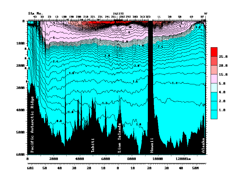
• Finally, the older Argo floats sample either down to 1,000 metres, and intermittently go to 1,500 metres depth. The newer ones go down to 1800 metres. Which is quite deep, about a mile down. But the estimates of oceanic heat storage include the whole ocean. Figure 3 shows a pair of transects from Antarctica (on the left) to Hawaii, and then Hawaii to Alaska on the right, to give some sense of scale.
![]() Figure 3 (Figure 10 from cited source.) North/South Pacific transect at 150°W. ORIGINAL CAPTION: Vertical section of potential temperature (°C) along 150°W from data collected in 1991-1993 as part of the World Ocean Circulation Experiment. Data north of Hawaii were collected in 1984 (Talley et al., 1991). Potential temperature is the temperature a parcel of water would have if moved to the sea surface with no change in heat content, and is lower than measured temperature since temperature increases when water is compressed due to the high pressure in the ocean. Source and Image
Figure 3 (Figure 10 from cited source.) North/South Pacific transect at 150°W. ORIGINAL CAPTION: Vertical section of potential temperature (°C) along 150°W from data collected in 1991-1993 as part of the World Ocean Circulation Experiment. Data north of Hawaii were collected in 1984 (Talley et al., 1991). Potential temperature is the temperature a parcel of water would have if moved to the sea surface with no change in heat content, and is lower than measured temperature since temperature increases when water is compressed due to the high pressure in the ocean. Source and Image
The Argo floats operate mostly in the warmer area up top of Figure 3, above the lower thermocline (light blue). Average depth in this entire transect is much deeper than that, about 5,000 metres. So the Argo floats are measuring less than a quarter of the water in this part of the Pacific basin. Makes the whole question of oceanic heat content kinda iffy.
Anyhow, that’s my first look at the question of the float distribution. I have some other projects in mind once I get the data downloaded. I’ve been downloading while the Super Bowl has been on, I’m up to 6,000 files downloaded, only 2,500 or so to go … but tomorrow is Monday, it’s back to my day job in construction pounding nails, that slows the science down. I just want to find someone to pay me for my research. Where are Exxon and the Koch Brothers when I need them?
My best to everyone,
w.
PS: I was quite happy with my map. It’s the first one I’ve done of a 1° x 1° grid. I found that to get it to print properly, I could use one dot per 1° x 1° gridcell. But to make it work, I had to size the dot by the cosine of the latitude. Took me a while to figure out how to do that in “R”, I’m kind of an R klutz, I only learned it a few years ago. But I made it work.
Many thanks for doing this work, Willis, a genuinely exciting read. The kind of excitment scientists experience when making truly unexpected discoveries from real experimental data.
corporate message says:
February 6, 2012 at 7:36 am
WIllis,
“The explanation that the floats are moved out of upwelling or downwelling zones – could that be said to be “moved at a comparatively increased velocity” in those zones” ? Wouldn’t that mean both incoming and outgoing would just be moving more quickly, rather than “moving them out” ?”
I think that up-welling will always result in movement out since the up-welling is caused by surface water moving away rapidly dragging lower levels after it.
It’s amazing that some of them have found their way to Black sea. Or were some released in the Black sea or the Mediterranean? [assuming they haven’t been captured by fishing boats etc.]
Good work.
Willis
do the floats have a clock – time – column in the data?
Could you select, pick, a bunch of the ones in cyan, and do a map over time? Displacement over a year? That should resolve part of your query?
“What else can we see? There are areas which are way oversampled compared to the rest (cyan color, more than 96 measurements/10,000 sq km), places where it is clear that the floats tend to “get stuck”. These include the ocean around Japan, parts of the Mediterranean, the Bay of Biscay off France, the south tip of Greenland, the northern Indian Ocean, and the Gulf of Alaska. It appears that the Argo floats get trapped in these bays, corners, and dead ends. Presumably the wind is driving them onshore when they are at the surface, and they move offshore when they are at depth. This keeps them in the same area, leading to the large number of samples.”
If those bouy are left alone to float around, don’t they express a bias towards the ocean circulation? should they be mapped with some doppler correction (W-East/N-S))?
Someone also question de altimeter, or rather the depth/time opportunity of the sample.
Lots of data difficult to correct or to spread …
Great work Willis, I agree with your previous precision work on these buoys. Your comment that the up-welling moves the buoys away from an area, moves me to assume they tend to congregate in down-welling areas. One might assume there is a temperature differential between the two. I see two scenarios, one the up-wellling is warmer waters rising, I would be surprised if this is happening. Second, ocean bottom topography plus currents and surface wind drive the upwelling, meaning colder water surfaces. I see room for a large bias towards warmer measurements if the upwelling is colder.
Stunning work, bravo!!
And the article shows the nature of the Argo measurements in fine detail , thankyou.
K.R. Frank
I live in Hamburg Germany, nearby were I work is a Company that sells scientific instruments, today in my lunch hour I passed by and asked, I would liked to measure the temperature of a closed room of 50 m2 to a degree of 0.005 degrees C , how much will the instruments cost ?
Answer
a very unusual request,
this would require a special order, but, I would think that, on past experience between $150,000 and $200,000 .
I asked why so expensive, reply, to measure a room that large would require many duplicate instruments to get the degree of accuracy you require !
John Marshall says:
February 6, 2012 at 3:07 am
620,000ft ??
Any idea what causes the blue line in the Pacific at 10 N latitude? It seems to extend into the Atlantic too.
Tom says:
February 6, 2012 at 3:10 am
Thanks, Tom. My script finally downloaded all 8,595 files, so I have them all at this point.
w.
If there are (possibly) currents in different directions at different depths, presumably the ARGO is not measuring a true profile because each reading could be at a different location relative to the surface position. Is there any way to measure position when so far under water? The GPS system relies on signals from satellites, and presumably their signal does not go far underwater.
IanM
My thanks to all for their comments. Argo is a fascinating experiment, and it is yielding is a very interesting dataset, one that will provide grist for many mills.
The data is in typical shape for a government project, unfortunately, NOAA seems little better than NASA or the CRU in that regard. As near as I can tell, other than “QC” quality check fields for the data points, there has been little quality control over the data. Some of them, for example, come up with a “404” error, no data file.
However, compared to the total number of data points the bad data is small. Do be aware, however, that a few of the data points are in places like the middle of Africa …
As I mentioned, when I get time I’ll collate these files into something a little easier to handle than 8000 individual data files … seems like these guys learned their data curation chops from Phil Jones.
Finally, this is what I love the most about climate science—there is so much new out there left to discover. The real beauty of the field is that the science is so very far from settled …
w
Some good videos of the evolution of the Argo float distribution are located here.
w.
Mike H….
The rock under continents at comparable depths is quite hot. Presumably because of heat from the interior of the earth. The depths of the ocean aren’t cold just because they are in the shade. I believe there is an understanding that the cold of the depths comes from deep currents descending at the poles. I’d just like to suggest that more heat escapes from polar regions than may be accounted for. Also the calculation of warming due to greenhouse gases using stefan-boltzmann theoretical temp vs. observed temp that one often sees in these debates may be off if one integrates the cold of the deep ocean into what is thought of as the surface temp of the earth.
Speedy says:
February 6, 2012 at 4:17 am
Might be 20,000 feet , I think 62,000 feet is beyond the Vulcan ceiling.
The Vulcan ceiling depended a lot on the fuel load and the air temperature. I think that FL620 was probably achievable for a relatively light Vulcan. An interesting book (and timely too) on the Vulcan is “Vulcan 607” by Rowland White.
Willis you are a workhorse! Thanks for your unpaid labors.
I am not so concerned regarding the undersampling and oversampling problems. They are a cautionary note for the researchers. I am much more concerned with the conclusions drawn from such data. Error band of 0.004 deg C?? They are just jerking your chain (I hope). GK
Vulcan B2 service ceiling given as 60 k ft so 62 k in good conditions seems more than reasonable. Number of aircraft have service ceilings set by de-compression safety issues rather than airframe limits usually set to 55 kft
Pauls
Who claims the 0.001 degree temperature measurement accuracy for Argo floats.? How is that claim verified? What is the claimed accuracy for depth/location measurement? How is that number verified? How are temp/depth/ location measurements transmitted? What is the accuracy of these transmissions, ie, data recording process? What process is used to evaluate overall accuracy of nine day up/down cycle measurements/transmission/drift/ calibration data collection?
Claude Harvey said “As always, your tenacity is a wonder to behold.”
Amen to that. WOW. You definitely spell Anal-retentive WITH the hyphen. 🙂
HankHenry says:
February 6, 2012 at 10:12 am
Mike H….
The rock under continents at comparable depths is quite hot. Presumably because of heat from the interior of the earth. The depths of the ocean aren’t cold just because they are in the shade. I believe there is an understanding that the cold of the depths comes from deep currents descending at the poles. I’d just like to suggest that more heat escapes from polar regions than may be accounted for. Also the calculation of warming due to greenhouse gases using stefan-boltzmann theoretical temp vs. observed temp that one often sees in these debates may be off if one integrates the cold of the deep ocean into what is thought of as the surface temp of the earth.
=======
Could be of interest here:
http://www.usatoday.com/weather/antarc/sun/2001-01-30-katabatic-winds.htm
“f you could dive to the seafloor anywhere in the world, from the Caribbean to the north Atlantic, you’d find water from the coast of Antarctica, said Gerd Wendler, a Fairbanks professor who studies the connection between the cold wind and the cold water.
“Seventy five percent of all the bottom water, wherever you are, comes from Antarctica,” Wendler said in his thick, German accent. “It’s a very small area of Antarctica and it’s directly connected with these katabatic winds and the sea ice.””
…
Well done Willis, any chance of you getting interested in the AIRS data…?
The index page for the repository tells us that:
“Argo data made available through the repository is a translation of original Argo with information removed. ”
Translation? information removed?
Does anyone know where the metadata containing details of these intriguing terms is kept?
We know Josh Willis had problems with ‘bad buoys’ which showed strong cooling in the early days, and it seems a term was introduced to cope with the apparent downtrend iin the dataset as a whole which ‘couldn’t be really happening’ – according to AGW orthodoxy. So where are the details of these ‘adjustments’?
HankHenry and Mike H: As HH says, land temperature increases with depth. In some deep mines, the ground is so hot that the operator must not get off his ride-on machine. This is right out of my field, but it seems there should be figures for the heat flow, calculated from the temperature gradient and the thermal conductivity of the ground. I can’t see a reason why the heat flow per square mile should be different under an ocean or under a continent. I imagine that the heat contribution from below must be much smaller than that from above, or we would not be so concerned with albedo and Boltzmann’s Constant. But over an area of two thirds of the Earth’s surface, there must be a lot of heat transferred to the oceans from below. I wonder if anything is to be learned from a possible temperature rise in these deep currents as they move away from the poles and are warmed from below along the way? Or does mixing muddy the waters, so to speak?
Willis,
Have you been able to identify the area for the very large adjustment in ARGO last year that Bob Tisdale reported? NODC only reported it was due to “issues”, but I don’t recall anything specific.
My faith in ARGO has waned since reading your posts on it.
Just wanted to say great work, shame the day job holds you back.