Guest Post by Willis Eschenbach
The Argo floats are technical marvels. They float around below the surface of the ocean, about a kilometre down, for nine days. On the tenth day, they rise slowly to the surface, sampling the pressure, temperature, and salinity as they go. When they reach the surface, they radio home like ET, transmit the data from the instrumental profiles, and they drop back down into the eternal darkness for another nine days. The first Argo floats were put into the ocean in the year 2000. In 2007, the goal of 3,000 floats was achieved.
In “Krige the Argo Probe Data, Mr. Spock“, I discussed some issues with the Argo floats. Then in “Decimals of Precision” I discussed and strongly questioned the outrageous error claims made by the Argo researchers. They say that we can detect a temperature change with an error of 0.004°C per year in the top 1,800 metres of the ocean. I say no way, not yet.
In a comment on that thread, I posted a graphic showing the current distribution of the Argo floats, shown below as Figure 1.
 Figure 1. Distribution of Argo floats as of February 2012. SOURCE
At that time I remarked on the distribution, saying:
However, I do see one place that they are not covering, and strangely, it is a crucial location—the intertropical convergence zone (ITCZ). Surface water around the ITCZ is heated. When it is heated it expands, which creates a gravitational trend downhill towards both poles. As the surface water is heated and moved polewards, it is replaced with deep oceanic water from below. So I’d say your suspicions are correct for at least that area.
In the Pacific, the ITCZ is generally found roughly ten degrees or so North of the Equator. You can see the blank area in Figure 1 just above the Equator. My speculation was that the blank area was not a random occurrence. So … I set out to take a look at where the Argo floats have sampled and where they haven’t sampled. I didn’t realize what I was getting into.
It’s a dang nuisance to get all the Argo files. They are available at the Global Argo Data Repository. The problem is that there have been over 8,000 individual Argo floats … and the rocket scientists at NOAA have decided to make the data available as one file per float, eight thousand individual files … grrr …
So I thought it might be of interest to describe how I went about getting the data. I haven’t gotten all of it, at the moment I’m somewhere between 5,000 and 6,000 files downloaded.
The first step in the process is to get the URL addresses of all of the files, which are shown on the web page at the link given above. To get the text of the URLs, remember that these are all listed in the “source” file that created that web page. Under the “View” menu (on the Mac, at least) you have a choice called “View Source”. This “source file” is a text file that contains the HTML information on how to make up the page, including all of the URLs of all the links on the page.
So … the first file listed on the web page is “IF000550”. I searched the source file for that, it’s at the start of the table. A similar search for “9018420”, the last file listed on the page, found me the end of the table.
I copied all of that information from the start to the end of the table from the “Source” document, and pasted it into a text processor. The end of an HTTP address is marked by the close code “”. I did a global search for that phrase, and replaced them all with a carriage return (“^p” in Microsoft Word). That left the text broken into short sentences suitable for pasting into Excel.
So I copied all of the resulting text, and pasted it into Excel. From there, it was easy to sort the lines. I wanted lines containing addresses that looked like
http://www.nodc.noaa.gov/argo/data/coriolis/7900073.tgz
These are the files with the actual float-by-float temperature profiles. I sorted them out, there were about 8,500 of them or so.
That gave me the list of all of the URLs of the files I was interested in. I saved those as a comma-delimited file, and opened it using the computer language “R”.
Using R, I was then able to automate the download process, having the computer download the files one after another. The one thing you need to do is leave gaps in your file requests. If you just request one file after another with no pause, you may get mistaken for a denial-of-service (DOS) attack on their server. So I put in a half second pause in after every five downloads. This adds about 12 minutes on 8,000+ downloads, not bad.
So that’s how I’m doing it. Once I get it all downloaded, I’ll put it together in some more reasonable format and stick it back out on the web, so people won’t have to go through that madness for the data.
In any case, I have downloaded the coordinates of all of the temperature profiles ever done by any Argo float. Remember that I started out on this hegira to see if my eye were good, and if there was a sampling inconsistency in the Pacific just above the equator.
Figure 2 shows how many samples have ever been taken everywhere in the global ocean. There have been a total of about 890,000 Argo temperature profiles taken to date. Sounds like a lot … but the ocean is a huge place. I began by counting the number of observations per gridcell on a 1° x 1° grid basis. I then standardized them by area as the number of temperature profiles taken per 10,000 square km. I picked this size for a couple of reasons. First, it’s close the area of a 1° x 1° gridcell at 40° North. This reduces distortion of the counts. And second, it’s a square which is a hundred kilometres (about sixty miles) on a side, so it can be easily visualized. It is a huge expanse of ocean.
 Figure 2. Number of temperature profiles ever taken by Argo floats in various areas of the ocean. Percentages in the second row refer to the percentage of the total ocean area having that number of temperature profiles. Percentages in the third row refer to the percentage of the ocean area from 60°N to 60°S having that number of temperature profiles. Click on image for larger version.
So … what are we looking at in Figure 2? We are seeing which areas of the ocean are better sampled, and which are more poorly sampled.
The red areas are those parts of the ocean which have never been sampled at all by Argo floats. In some cases, such as the area around Indonesia, or the east side of the bottom half of South America, it is because the ocean is shallow there. Up north it’s because of ice. And down south? It seems the currents don’t carry the floats down that far. This makes sense because the cold surface waters are sinking around Antarctica and flowing north in that region, carrying the submerged floats with them away from Antarctica.
In other areas, such as off the westernmost point of South America and the area on the western side of South Africa, the cause for the lack of samples seems to be the local upwelling in the areas. Presumably, since the water is radiating outwards at depth as well as at the surface, the floats are moved away from that area.
The areas in orange, another 10% of the global ocean, have only ever been sampled from just once to eight times. So a quarter of the ocean has either never been sampled, or has been sampled less than eight times per 10,000 sq. km, since the beginning of the Argo program in 2000.
In other words, a quarter of the global ocean has been sampled less than once a year per 10,000 sq. km. by Argo floats … yet they claim an error of only a few thousandths of a degree in the global average.
To get around part of this problem, sometimes the Argo data is used solely from 60° north of the Equator to 60° south. This eliminates some of the problem, but there is still 8% of that ocean area from 60°N/S that has never been sampled at all. How can they possibly claim to know the temperature of that huge volume of ocean to within ± 0.004°C, when 8% of it has never been sampled at all, much less adequately sampled? Another 8% of the ocean 60°N/S is sampled on the order of once a year … again, nowhere near adequate for the claimed accuracy.
What else can we see? There are areas which are way oversampled compared to the rest (cyan color, more than 96 measurements/10,000 sq km), places where it is clear that the floats tend to “get stuck”. These include the ocean around Japan, parts of the Mediterranean, the Bay of Biscay off France, the south tip of Greenland, the northern Indian Ocean, and the Gulf of Alaska. It appears that the Argo floats get trapped in these bays, corners, and dead ends. Presumably the wind is driving them onshore when they are at the surface, and they move offshore when they are at depth. This keeps them in the same area, leading to the large number of samples.
Finally, the hunch that started me on this quixotic quest is confirmed. There is indeed a band which is only infrequently sampled just above the Equator in the Pacific. There have been many more samples taken just above and below that band. The infrequently sampled area is also the area where the El Nino upwelling occurs. I hardly take this as a coincidence.
CONCLUSIONS
• The sampling of the oceans is by no means as uniform as I had expected. Part of the ocean is undersampled, sometimes badly so, compared to other areas. Half of the global ocean has been sampled less than 20 times per 10,000 sq. km, and 14% has never been sampled by Argo floats at all.
• Even when we look at just the area from 60°N/S, half the ocean has been sampled less than 24 times per 10,000 sq. km, and 8% is unsampled.
• The area of the El Nino phenomenon is a critical area for the regulation of planetary heat loss. Oceanic heat content in this area can change quite rapidly. However, parts of it are woefully undersampled.
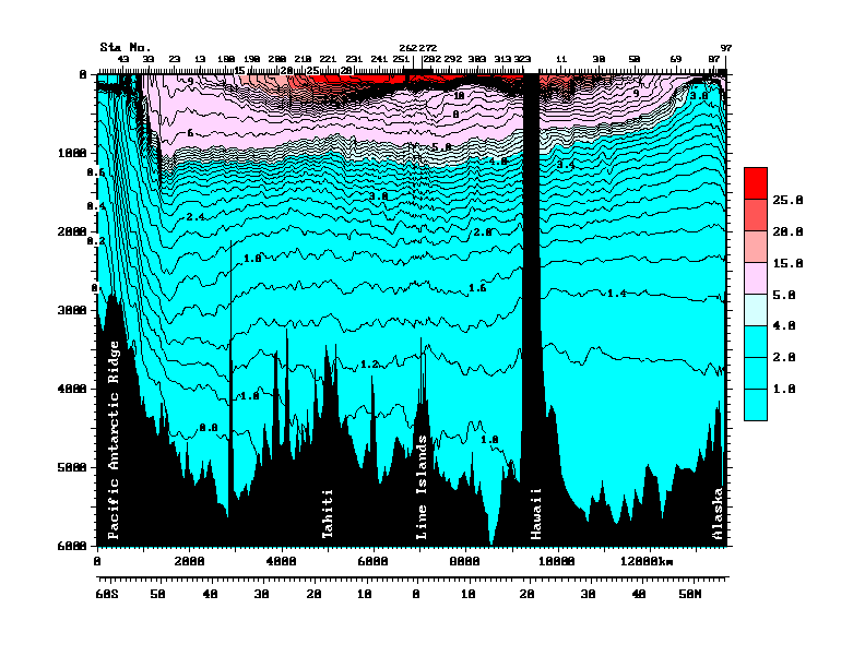
• Finally, the older Argo floats sample either down to 1,000 metres, and intermittently go to 1,500 metres depth. The newer ones go down to 1800 metres. Which is quite deep, about a mile down. But the estimates of oceanic heat storage include the whole ocean. Figure 3 shows a pair of transects from Antarctica (on the left) to Hawaii, and then Hawaii to Alaska on the right, to give some sense of scale.
![]() Figure 3 (Figure 10 from cited source.) North/South Pacific transect at 150°W. ORIGINAL CAPTION: Vertical section of potential temperature (°C) along 150°W from data collected in 1991-1993 as part of the World Ocean Circulation Experiment. Data north of Hawaii were collected in 1984 (Talley et al., 1991). Potential temperature is the temperature a parcel of water would have if moved to the sea surface with no change in heat content, and is lower than measured temperature since temperature increases when water is compressed due to the high pressure in the ocean. Source and Image
Figure 3 (Figure 10 from cited source.) North/South Pacific transect at 150°W. ORIGINAL CAPTION: Vertical section of potential temperature (°C) along 150°W from data collected in 1991-1993 as part of the World Ocean Circulation Experiment. Data north of Hawaii were collected in 1984 (Talley et al., 1991). Potential temperature is the temperature a parcel of water would have if moved to the sea surface with no change in heat content, and is lower than measured temperature since temperature increases when water is compressed due to the high pressure in the ocean. Source and Image
The Argo floats operate mostly in the warmer area up top of Figure 3, above the lower thermocline (light blue). Average depth in this entire transect is much deeper than that, about 5,000 metres. So the Argo floats are measuring less than a quarter of the water in this part of the Pacific basin. Makes the whole question of oceanic heat content kinda iffy.
Anyhow, that’s my first look at the question of the float distribution. I have some other projects in mind once I get the data downloaded. I’ve been downloading while the Super Bowl has been on, I’m up to 6,000 files downloaded, only 2,500 or so to go … but tomorrow is Monday, it’s back to my day job in construction pounding nails, that slows the science down. I just want to find someone to pay me for my research. Where are Exxon and the Koch Brothers when I need them?
My best to everyone,
w.
PS: I was quite happy with my map. It’s the first one I’ve done of a 1° x 1° grid. I found that to get it to print properly, I could use one dot per 1° x 1° gridcell. But to make it work, I had to size the dot by the cosine of the latitude. Took me a while to figure out how to do that in “R”, I’m kind of an R klutz, I only learned it a few years ago. But I made it work.
Hi Willis, Thanks for an interesting article.
On the error of 0.004°C per year. I suspect this is the rated accuracy of the Argo thermometer
and not the accuracy of the sampling of the oceans. Its the sort of thing that some climate scientists seem to do. Statistics not being their strength ;-).
/ikh
OK well, that’s very nice but you do know that the second you report something “The Cause” doesn’t like (and it may already be too late), you now you’ll be accused of hacking and stealing the data, right? Since it wasn’t officially presented on the page as specific downloadable files? You had to go in and do a bunch of those computery HTML thingys and other hacky acronym stuff like URLs and PB&J to get the files. Yeah, you might want to buy a cheap, used laptop, put the data there and then hand that to the police when they show up to collect it for their investigation.
A bit more accurate than a bucket on a rope thrown over the side every 6 hours (90 miles travelled) and an apprentice shoving a mercury thermometer in it then trying to remember the number as he runs back up 5 flights to the bridge. They claim accuracy to 2 decimal places for the results of that exercise.
Keith Gordon says:
February 6, 2012 at 4:03 am
Can anyone explain if that pressure heat relationship happens in the ocean why could it not in the atmosphere.
__________________________________________________________
The short aswer is ‘yes.’ There is an interchange between gravitational potential energy and kinetic energy, the latter affecting temperature.
The terminolgy “heat content” should be “thermal energy content” because total thermal energy includes potential energy, whereas using the term “heat content” leads to potential energy being overlooked. In any event, heat is not energy: rather it is energy in transit.
Tony Mach says:
February 6, 2012 at 4:07 am
Hi Willis, I share you concerns about the ARGO floats, especially I think the precision claim (“to detect a temperature change with an error of 0.004°C per year in the top 1,8000 metres of the ocean”) seems ludicrous to me.
Years ago I worked for an instrumentation company that developed borehole instruments for measuring physical properties such as resistivity, radioactivity and temperature.
Temperature was tricky for several reasons. First, the sensor (a small thermistor) was so small you had to mount it onto something larger just to work with it (we used a needle). They were so sensitive (+/- 0.0001oC) that we could only “log” the borehole in the down direction, once a day because the probe would disturb the natural gradient. We easily achieved sensitivities of +/-0.001 degrees C as did others (see e.g. Alan Beck of UWO or Pat Killeen of the GSC).
The thermistors were inexpensive and easy to work with so I would believe the Argos can easily measure to the claimed gradient. But they are not good at absolute temperature. I calibrated them using an accurate thermometer (+/- 0.5 o C) and a temperature bath (from 1 to 50 o C). We ended up selling a number of these systems to Japan for hot-spring exploration. It was a tough task as we were forced to sample the hot baths as well. But somebody had to do it.
Duh!
wget -m http://www.nodc.noaa.gov/argo/floats_data.htm
The data will be in ./www.nodc.noaa.gov/argo/data/gts
Some nice Argo animations here
http://www.argo.ucsd.edu/Argo_movies.html.
As I undrestand it they drift with current. I can only assume then that no one float of the several thousands deploy ever measures the same place twice? So over years several individual floats actually cover the same spot grid referenced continually building up a historty profile?
I surpised though that although each float is left to move with currents that somehow they still all seem to disperse around the worlds oceans.
I would be interested in how they quantify/handle calibration and systematic errors in so many instruments – and indeed how they ensure the calibration does not drift with time.
Keith Gordon says on February 6, 2012 at 4:03 am:
“Can anyone explain if that pressure heat relationship happens in the ocean why could it not in the atmosphere.”
=======
No Keith, I do not believe anybody can explain that one. – All I know is that no-one can blame “Global Warming” on rising “Atmospheric Pressure”
Willis,
Try this bit of Perl to download the files:
#!/usr/bin/perl

use File::Basename;

use LWP::Simple;

use strict;

my $webloc = "http://www.nodc.noaa.gov/argo/";

my $content = get($webloc . "floats_data.htm");

my @files = ($content =~ /href=\"([^"]+?tgz)\"/g);

foreach my $file (@files) {

    print "$file\n";

    getstore($webloc . $file, basename $file);

    sleep(.5);

}
I am no expert but……. The water characteristics of the western coasts of South Africa and California are very similar, primarily due to the Coriolis effect. Both bodies of up-welled water move towards the equator but veering away to the west. Wind direction and strength are major factors which move surface water away thus dragging up very cold water from below. No floating device will remain in these conditions without rapidly moving away. The up-welling brings with it minerals which feed the kelp, which feed the bacteria, which feed the plankton, which feed the pelagic fish which you will find in a can on your local supermarket shelf. The kelp is the real root of matters and it will not thrive without that very strong up-welling of cold mineralised water. Hence on my side (eastern) of the African continent there is no giant kelp since the Coriolis effect goes in the wrong direction.
The whole of the deep ocean is refrigerated! Where does the energy to do that come from? It makes one think about the meaning of the earth’s *surface* temperature. Factoring in the deep ocean it’s clearly not the oft quoted 14 degree C.
I just think these floats are brill and while I appreciate you looking hard at the data, Willis, a bit of recognition for the job they are doing seems in order. This is still an order of magnitude (or two) better than anything done before in the ocean and – I would guess – in the atmosphere. Can you imagine 3,000 radiosonde balloons going up and down every 10 days?
Willis, great post. You make all this look so easy.
I do have an idea for your next venture. Now that you have all of the buoy data with dates and locations (i.e., the hard part), how about animating the track of the buoy’s? You could call it “Dance of the Argos”. Hey, If Al Goracle can get away with animation in a documentary and winning an Academy Award, maybe you would have a chance. Have a catchy musical score to go along with the dance, Nutcracker Ballet theme.. Just wondering….
Carry On…
@Speedy
“Might be 20,000 feet , I think 62,000 feet is beyond the Vulcan ceiling.”
Having read the book “Skunk Works” a couple of times it is clear that whatever the Vulcan ceiling is claimed to be, it is a lie. A lot of disinformation about aircraft performance is loosed on the public.
The AVRO Arrow could perform well beyond what the pilots were allowed to demonstrate. The ‘failure to perform’ was used as an excuse to kill it.
Interesting how the ARGO arrow is in the opposite position: claims for precision greatly exceed their reality.
Willis, it would be helpful if you included a little dicsussion of the difference between accuracy and precision, first of the numbers from an individual float, then how those are translated into a global picture. What happens to precision and accuracy as the errors are propagated during translating when projecting pinpoint measurements over the surface is the core issue. We will all benefit from some elucidation.
It is also surprising that these buoys do not all end up in the same gyre like all that plastic in the central Pacific Gyre.
HankHenry says:
“The whole of the deep ocean is refrigerated! Where does the energy to do that come from?”
Correct me if I’m wrong, but cold is a lack of energy. I would suspect it would be a case of getting the heat DOWN to those depths to warm it.
Just my 2 cents…
Willis
Very interesting article. You say;
‘The areas in orange, another 10% of the global ocean, have only ever been sampled from just once to eight times. So a quarter of the ocean has either never been sampled, or has been sampled less than eight times per 10,000 sq. km, since the beginning of the Argo program in 2000.”
The Argo data has more holes than a colander which is exactly what I found when looking at historic SST’s. The 5 degree grid cells only required a single reading per year for that to be come the data that can then be extrapolated into surrounding grids.
http://judithcurry.com/2011/06/27/unknown-and-uncertain-sea-surface-temperatures/
Couple that with the fact that historic data is taken from such an inconsistent depth-buckets could record anything from the water 6 inches below the surface to several yards- AND the fact that they relied on the temperature being taken immediately the bucket was drawn on the ship, and the data must be seriously questioned. It is worse the further back in time you go-in effect the SSTs between 1850 and around 1960 are virtually useless, except in very limited regional areas and within very tight time scales.
I think we are beginning to see the same with the Argo data which is, as you point out, woefully inaccurate and comprises such a small sampling gathered over such a limited time scale that the idea they can claim the accuracy mentioned ought-like tree rings-to be refuted by other climate scientists.
I think that there is a fundamental problem with suspect data from key fields being treated as irrefutable and highly reliable evidence. However if you removed all the uncertain information out there the science would look even less robust than it currently does.
Look forward to Part two of your Argo investigation
tonyb
John Marshall says:
“It is also surprising that these buoys do not all end up in the same gyre like all that plastic in the central Pacific Gyre.”
I would suspect that the plastic that is in the pacific is floating on the surface and therefore is in what would be a stable cycle. Where the ARGO buoys are constantly submerging for days at a time, then surfacing and submerging again. Different currents can be at play at differing depths.
Have a look at the area around north of Indonesia and then at this web page.
http://www.geoscience-environment.com/es551/indexsunda.html
You will see that the area not sampled is only about 120 meters (400 feet) deep.
The colour coding is a little difficult to read, but the Indo-Pacific Warm Pool and points east do not seem so well sampled as some areas that are less important.
The north Atlantic and the north Pacific are also not so well sampled. What would be interesting is to know how much the float actually float north and south and east and west.
Does the time profile of temperatures also have coordinates that change with time.
This is very interesting work. Well done.
Climate Review: I
by Bob Carter
February 6, 2012
——————————————————————————–
In a major three part series Professor Bob Carter covers the most important events which influenced the climate debate in 2011. Quadrant Online publishes the first part today and the remaining two parts will be published during the coming week.
——————————————————————————–
2011, and the Unlucky Country finally gets a carbon dioxide tax
http://www.quadrant.org.au/blogs/doomed-planet/2012/02/climate-review-i
One missing dimension: time. The files cover 12 years of collection. Are we to assume the ocean has not changed in 12 years? So the total coverage is far less per year. What does the ocean map look like on a yearly basis?
Like MMTS and Stevensons, how are these things calibrated? What is the match between floats?
And how fast do the floats rise? There has to be a lag in readings as it takes some finite amount of time for the temperature sensor to respond to change. If the float comes up very slowly, the effect is small. But within 0.004 degrees? Suspicious indeed!
WIllis,
The explanation that the floats are moved out of upwelling or downwelling zones – could that be said to be “moved at a comparatively increased velocity” in those zones” ? Wouldn’t that mean both incoming and outgoing would just be moving more quickly, rather than “moving them out” ?
Nicely done Willis. You’ve contributed something of real value here, even the other Willis, (Josh Willis) hasn’t done this.
It seems the real movement of the ARGO floats is due to currents at their hover depth. That is where they spend the most time. So if they spend most of their time at 1800m then the currents at 1800 meters should be the determining factor for their movement profile. Though I suppose if they pass into a very large current at shallower depths or at the surface when they take a profile, that could overwhelm all the time they spend in the depths. (darn those integral dv/dt components!)
In the upwelling zones, does anyone know what the depth of the cold water counter-current is? If we aren’t seeing many ARGOs in those zones, that would suggest it is deeper than 1800 meters.