I have been asked to present this for review by readers here, and to solicit critical comments for the purpose of improving the presentation. Moderators please remove any off-topic comments and commenters please stick to the issues of review. – Anthony
[…]
Now, about the climate science:
‘‘It’s unchallengeable that CO2 traps heat and warms the Earth and that burning fossil fuels shoves billions of tonnes of CO2 into the atmosphere,”
“But where you can get challenges is on the speed of change.”
— Professor John Beddington
The British government’s chief scientific adviser, John Beddington, has called for more openness in the global warming debate. He said climate scientists should be less hostile to sceptics who questioned man-made global warming. He condemned scientists who refused to publish the data underpinning their reports. He also said public confidence in climate science would be improved if there were more openness about its uncertainties, even if that meant admitting that sceptics had been right on some hotly disputed issues.
“I don’t think it’s healthy to dismiss proper scepticism. Science grows and improves in the light of criticism. There is a fundamental uncertainty about climate change prediction that can’t be changed.” [As reported in The Australian“i. Other reports were similar.]
I would like [the two speakers] to address the specific issue of the deleted data in reconstructed temperature graphs.
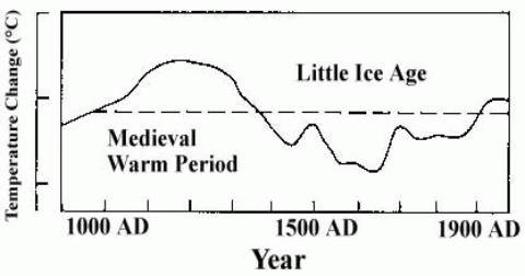
The issue is as follows: In their third report (“TAR”), the IPCC published the following graphii:

This is a graph of several temperature proxies, with the instrumental temperature record from around 1900 added. What it shows is that temperatures had been declining fairly steadily for nearly 1000 years, but then suddenly shot up in the 20th century.
It has now been discovered that some of the data series had been truncated in the graph. The result of these truncations was to make the data series look more consistent and therefore convincing. (NB. I make no statement about intent.). If the data series had not been truncated, the end result would have been very differentiii:

The two red segments are the truncated data. These two segments and the dotted curve connecting them are a single data series “Briffa-2000”1. Note that the first downward segment of the black graph (instrumental temperature) has also been deleted in the version used by the IPCC.
The extreme divergence between the “Briffa-2000” proxy and the instrumental temperature record shows that this proxy is completely unreliable (the “divergence problem”). To delete segments from the graph – especially without a prominent explanation – is bad scientific practice. Contrary to claims by various climate scientists, the deletions were not disclosed in the TAR. Nor was the “divergence problem” discussediv. As Professor Richard A Muller of University of California, Berkeley, has said “You’re Not Allowed to Do This in Science“v.
Was the “Briffa-2000” data series the only unreliable proxy data series? It seems not. Phil Jones’ 1999 “Climategate” email indicated that other proxy data series had been truncated to “hide the decline“vi.
It has been argued that this “hide the decline” graph (aka the hockey-stick) is not important in the overall scheme of things, ie. in climate science as a whole. Gavin Schmidt put it this way on RealClimate.com, “if cherry-picked out-of-context phrases from stolen personal emails is the only response to the weight of the scientific evidence for the human influence on climate change, then there probably isn’t much to it.“vii.
Unfortunately, the “hide the decline” graph is much more important than that. In the fourth IPCC report (“AR4”), the effect of solar variation on climate is discussed. Theories such as Henrik Svensmark’s are dismissed as “controversial” and then ignoredviii. Consequently, solar variation is included in the climate models purely as the direct climate forcing from total solar irradiation (TSI). Since variations in TSI are quite small, in percentage terms, the climate models allow only for small temperature changes from TSI changes.
Such small temperature changes are quite consistent with the “hide the decline” graph, because that graph shows only small temperature changes prior to the 20th century. If the IPCC had persisted with their original estimate of earlier temperatureix …

… then the climate models would have been unable to replicate the temperature changes in either the MWP or the LIA, because the total effect of all natural factors (including TSI variation) allowed for in the models is far too small. If the climate models were unable to replicate the MWP and LIA, then they would lack credibility, and any scientific conclusions based on the models could be disregarded.
But it gets worse.
With the “hide the decline” graph representing global temperature, the climate modellers had only one factor which could give a sudden upward movement in temperature in the 20th century – CO2. This was the only factor whose pattern changed significantly then and only then. The IPCC analysis is based on “equilibrium climate sensitivity” (ECS), which is defined as the equilibrium change in the annual mean global surface temperature following a doubling of the atmospheric equivalent carbon dioxide concentrationx. The way ECS was arrived at was to map the 20th-century temperature rise to the increase in CO2 concentration : “Estimates of the climate sensitivity are now better constrained by observations.“xi.
The IPCC and the climate modellers still had a problem: the scientific studies on CO2, and the physical mechanism by which it warmed the atmosphere, gave an ECS which was far too low. But the discrepancy was explained by climate feedbacks. A climate feedback is defined as follows: “An interaction mechanism between processes in the climate system is called a climate feedback when the result of an initial process triggers changes in a second process that in turn influences the initial one. A positive feedback intensifies the original process, and a negative feedback reduces it.“xii
This leads us to clouds. The IPCC state repeatedly that they do not understand clouds, and that clouds are a major source of uncertainty. For example: “Large uncertainties remain about how clouds might respond to global climate change.“xiii There are many statements along these lines in the IPCC report. Now simple logic would lead one to think that clouds would be a negative feedback:- as CO2 warms the oceans, the oceans release more water vapour, which forms clouds, which have a net cooling effect (“In the current climate, clouds exert a cooling effect on climate (the global mean CRF [cloud radiative forcing] is negative).“xiv).
But the IPCC report claims that clouds are a massive positive feedback: “Using feedback parameters from Figure 8.14, it can be estimated that in the presence of water vapour, lapse rate and surface albedo feedbacks, but in the absence of cloud feedbacks, current GCMs would predict a climate sensitivity (±1 standard deviation) of roughly 1.9°C ± 0.15°C (ignoring spread from radiative forcing differences). The mean and standard deviation of climate sensitivity estimates derived from current GCMs are larger (3.2°C ± 0.7°C) essentially because the GCMs all predict a positive cloud feedback (Figure 8.14) but strongly disagree on its magnitude.“xv.
The IPCC provide no mechanism, no scientific paper, to support this claim. It comes in some unspecified way from the climate models themselves, yet it is acknowledged that the models “strongly disagree on its magnitude“.
So, to sum up, the situation is that the “hide the decline” graph leads to nearly all of the 20th-century warming being attributed to CO2, thanks to a factor (clouds) which is not understood, is not explained, and comes from computer models which strongly disagree with each other. The inevitable conclusion is that without the “hide the decline” graph, the clouds “feedback” as described in the IPCC report would not have existed.
Now, returning to Gavin Schmidt’s comment. When he talks about “the weight of the scientific evidence for the human influence on climate change“, a very large part of that evidence is the IPCC report and everything that references it. But as I have just shown, the IPCC report itself relies for its credibility on the “hide the decline” graph. In other words, the entire structure of mainstream climate science depends on a single work which is itself based on methods which are “not allowed” in science.
So of course there are, in Professor Beddington’s words, challenges on the speed of change. If the MWP, which was of course completely natural, was about as warm as today, then it is entirely reasonable to suppose that natural factors are largely responsible for today’s warm temperatures too, and that the speed of change from CO2 has been grossly overstated by the IPCC.
Mike Jonas
References:
1 There are number of different versions of this graph, in the various IPCC reports and elsewhere, where different versions of the proxy data have been used.
viii http://www.ipcc.ch/pdf/assessment-report/ar4/wg1/ar4-wg1-chapter2.pdf para 2.7.1.3
ix http://climateaudit.files.wordpress.com/2008/05/lambh23.jpg (I could not provide a link to this graph in an IPCC web page, because earlier IPCC reports are no longer linked there. http://www.ipcc.ch/publications_and_data/publications_and_data_reports.shtml)
xi http://www.ipcc.ch/pdf/assessment-report/ar4/wg1/ar4-wg1-chapter9.pdf Executive Summary.
xiii http://www.ipcc.ch/pdf/assessment-report/ar4/wg1/ar4-wg1-ts.pdf para TS.6.4.2
The updated document is now here:
http://members.westnet.com.au/jonas1/Question1ForReview.pdf
I need to re-word the question, and add thanks to everyone here.
Thanks for all the comments so far, I hope some will be a little bit satisfied by the changes. I’m going to have to send the document soon.
Mike Jonas,
Why don’t you update the *original* IPCC graph’s temperatures up to present? Oh wait, that won’t fit into the story you’re trying to tell. That graph you presented was european temperature only and was ended prior to the vast majority of the warming, speaking of hiding the “incline”.
Also the original truncation of Briffa’s dataset was because there were only 8 series which went back to 1400 out of a total of more than 100. Please stop your insinuations without even addressing this. Let us consider the following graph:
http://treesfortheforest.files.wordpress.com/2010/05/ghcn_global_temp_area_1961-1990_5x51.png
Are scientists hiding the decline by using data only after the sample size is high and the spatial distribution high? Of course not. Just another example of an attempt to crucify scientists without any real search for the real answer. The fact that the sample size issue wasn’t addressed in this post makes me very suspicious of your intentions.
Over at the Air vent and CA Nick Stokes and I have both brought up this issue and no one has been able to answer it effectively. Do you show the reconstruction when it uses only 8 proxies back to 1400 while knowing that makes the data unreliable? Of course it is a *trick* right to use data only when there is enough for confidence in the result. Sickening.
Mike Jonas,
Offering up your piece to us is appreciated.
Since you said this piece of yours is part of a longer work, then you may have in other parts of your book different ways of looking the ‘hide the decline’ to weave a more comprehensive argument about it. So, it is hard without knowing the context of this piece to your larger work.
Somewhere in your larger work or in this piece you might consider addressing the root epistemological issue on AGW by CO2.
The root epistemological issue wrt AGW by CO2 is whether there are any observationally supported reasons to think there is something that needs explaining based on our knowledge about the current & past behavior of the earth system (including its atmosphere) on any timescale.
If the set of observationally supported reasons is empty, then AGW by CO2 would then be epistemologically empty. That is the strongest argument I can imagine. It is the conclusion that I am asymptotically approaching; to wit AGW by CO2 is an epistemological non-starter. If this is the case, as I am slowly concluding, then the AGW by CO2 position just hangs suspended in a vacuum with no support except by faith.
GOOD LUCK on you longer piece, I hope it is a book to add to my skeptical (aka independent thinker) bookshelf.
Long live the climate science renaissance! It appears to have increasing momentum.
John
I haven’t read all of the comments about this article, but it seems that most of them deal with the tree ring issue. The article was criticized because it claimed that the tree ring divergence issue was ignored, and clearly it was not.
There are many glaring errors in this paper. It seems that the iconic graph of Central England temperatures was introduced into the mix, as if it were a northern hemisphere graph in conflict with the reconstruction of Northern Hemisphere temperature done by Mann and others. The IPCC in one of its old reports mistakenly attributed this graph to the northern hemisphere, on one page, but in the text of the report, it was correctly attributed to Central England. This was corrected long ago, but some people who argue the case against the Hockey Stick like to perpetuate this error, because it makes their case. Since Central England is not the Northern Hemisphere, the failure of the models to validate this graph does not prove anything. In fact there are many papers in which models give an Northern Hemisphere Temperature simulation which lines up pretty well with a number of different proxy reconstructions, and also s
how the unprecedented rise of temperature in the late 20th century. Here is one example. There are others as well.
http://www.geos.ed.ac.uk/homes/tcrowley/crowley_science2000.pdf
Another topic that was discussed was clouds, which are justifiably mentioned as the main source of uncertainty. The author says,
“So, to sum up, the situation is that the “hide the decline” graph leads to nearly all of the 20th-century warming being attributed to CO2, thanks to a factor (clouds) which is not understood, is not explained, and comes from computer models which strongly disagree with each other. The inevitable conclusion is that without the “hide the decline” graph, the clouds “feedback” as described in the IPCC report would not have existed…”
There is plenty of data which supports a positive feedback mechanism for clouds. It is discussed with references in the following link:
http://www.skepticalscience.com/clouds-negative-feedback-intermediate.htm
A number of different sources of data are compare cloud behavior and GCM’s and find that positive feedback used in the models agrees with the data.
Theo Goodwin says:
Sigh, more reading comprehension issues. No I said:
Which means, if you need me to translate it for you, that holding your hands over your eyes will not make it go away. I am not saying that IPCC cited literature is good, gold-standard, or the truth, I am simply saying that Mike Jonas does not make a logical point. Whether you agree that the thousands of papers in support of AGW are valid, truthful, or scientific is irrelevant to the point being made, because they constitute evidence. They do not all crumble or need to be withdrawn because of this recent discovery of malfeasance. A few of the paleoproxy papers do and that’s the sum of it. Some of the models may need some minor tweaks, but perhaps none at all.
So my point, which I made earlier is that Mike Jonas is WRONG in his conclusion and has not made his case, logically. He has not made a valid, logical, cogent argument. He has dismissed without discussion a huge body of work he disagrees with. He may be right about AGW or he may be wrong, BUT HE HAS NOT MADE HIS CASE.
It appears that simply because you agree with his point of view, you are unable to understand criticism of his work or a logical discussion. In another place and time I invented the phrase which is appropriate now (and spreading a bit on the ‘net, but I swear I came up with it), I can explain it to you, but I can’t understand it for you.
‘Jim D says:
March 28, 2011 at 7:11 pm
I haven’t checked all the comments, but I didn’t notice anyone picking up the error of the assumption that increased water vapor leads to increased clouds. There is only an obvious relation between clouds and relative humidity, not water vapor content. Unless relative humidity is sustained, cloud cover will decrease leading to a positive feedback. Many assume RH stays constant, but I believe that is an equilibrium state, and in the current state of oceans warming less than land, RH may decrease at first even as water vapor increases globally.
I think Dessler’s 2010 study is observational proof of a positive cloud feedback that was omitted here, and should be mentioned in a review of the subject so as not to look like cherry-picking.’
Hay, Jim D, are you saying a lack off Clouds are a “Positive cloud feedback”? When I started my search about “CO2 drives the climate” “theory”, I thought that hypothesis stated “Positive cloud feedback” was caused by an increase in high altitude clouds which trapped more heat leading to a run a way atmosphere in which we would burn to a crisp.
Robert says: “Why don’t you update the *original* IPCC graph’s temperatures up to present?”
I don’t care where the graph goes next.
Robert says: “Also the original truncation of Briffa’s dataset was because there were only 8 series which went back to 1400 out of a total of more than 100. Please stop your insinuations without even addressing this.”
About your graph: The coverage isn’t too good before 1860, but they chose to leave it in. Fine. But here’s a funny thing: the data from 1860 to about 1900, for which there was good coverage, didn’t look anything like the instrumental data for that period. No, they didn’t chop the proxy data there, they chopped the instrumental data. They might have had a perfectly good reason for doing that, but if they didn’t say what they had done or why, then how are we supposed to assess it. Like Professor Richard A Muller said “You’re not allowed to do this in science”.
jeez – you say the IPCC report references hundreds if not thousands of reports. So it does. But nearly all of them address areas that do not impact on my argument, so are irrelevant. In particular, not one of those papers AFAICT address the specific clouds issue that I address.
Mike Jonas,
“I don’t care where the graph goes next.”
Well at least you make your bias clear.
Regarding your other commentary:
Firstly the Areal Fraction from the graph shows that data prior to 1880 does not cover more than 0.5 areal fraction so that is why it is preferable to use datasets only from 1880-1990 onwards.
Muller is not a good source for information on this subject. He has demonstrated quite clearly that his expertise is not on the real issues at play here:
http://www.skepticalscience.com/Muller-Misinformation-1-confusing-Mikes-trick-with-hide-the-decline.html
My discussion was regarding Briffa’s curve that you claim shows that he deleted inconvenient data pre-1550. I have commented extensively at CA on the issue but here is a synopsis:
Pre-1500 data does not have a good spatial distribution with 87% of the data being from 2/5 of the regions and 13% coming from the remaining 3/5 regions. This is displayed here:
http://www.skepticalscience.com/pics/Sites.png
Briffa et al (2001) describe their decisions on their reconstruction here:
More evidence supporting my interpretation from Briffa 2001
“Bias might be introduced in cases where the spatial coverage is not uniform (e.g., of the 24 original chronologies with data back to 1500, half are concentrated in eastern Siberia) but this can be reduced by prior averaging of the chronologies into regional series (as was done in the previous section)… Eight different methods have been used… They produce very similar results for the post-1700 period… They exhibit fairly dramatic differences, however, in the magnitude of multidecadal variability prior to 1700… highlighting the sensitivity of the reconstruction to the methodology used, once the number of regions with data, and the reliability of each regional reconstruction, begin to decrease. The selection of a single reconstruction of the ALL temperature series is clearly somewhat arbitrary… The method that produces the best fit in the calibration period is principal component regression…
“…we note that the 1450s were much cooler in all of the other (i.e., not PCA regression) methods of producing this curve…”
The summary is that they chose the reconstruction which best fit the calibration period and this method resulted in a warmer 1450s than other methods produced. End of story. You should of read the papers first methinks…
The ‘fixing’ of the surface temperature record using tree ring data is just the tip of the iceberg. There is no climate sensitivity to CO2, nor is there any equilibrium climate state, on any time scale. The empirical assumption that CO2 must cause climate change is the first fundamental error. The second is trying to ‘prove’ it.
The questions that need to be addressed are:
What is the surface temperature record really measuring?
Why does it vary?
The Instrument Record component of the hockey stick plot is derived from the meteorological surface temperature record (MSAT). This is the air temperature measured in an enclosure placed at ‘eye level’ 1.5 to 2 m above the ground. Historically the daily maximum and minimum temperatures were recorded using Six’s thermometer.
The minimum MSAT is essentially a measure of the bulk temperature of the air mass of the ambient weather system as it passes over the measurement station. When combined with a measurement of the local humidity it may be used to provide an indication of the local lapse rate of the air mass. This means that long term changes in the minimum average MSAT are a measure of changes in the bulk air mass of the prevailing weather systems. The heat capacity of a column of air of 1 square meter cross section, extending upwards 10 km to the tropopause has a heat capacity of approximately 8 MJ. Over the last 50 years, the atmospheric concentration of CO2 has increase by about 70 ppm. This has produced an increase in the downward ‘clear sky’ LWIR flux at the surface of 1.2 W.m.-2. This result is based on independent, and reliable radiative transfer calculations using the HITRAN database. This corresponds to a cumulative daily flux of 0.1 MJ.m-2.day-1. Such a small increase flux cannot cause a temperature rise of 1 C in the weather air mass when the flux is added to the daily flux balance at the surface.
The maximum MSAT is the maximum air temperature produced at the MSAT thermometer as the air warmed by the surface below the thermometer mixes convectively with the cooler air above. The surface temperature is determined by the short term balance of the solar heating, moist convection and net LWIR emission from the surface. The air heating also depends on the wind speed and the local terrain. Under full summer sun conditions, the solar flux may reach 25 MJ.m-2.day-1. The surface temperature can reach 50 C and the maximum MSAT temperature may reach 30 C. The 0.1 MJ.m-2.day-1 increase in flux from 70 ppm of CO2 corresponds to less than 5 minutes of sunlight or the evaporation of a film of water ~46 micron thick over an area of 1 m2. In addition, the surface flux has to heat a subsurface volume with well defined thermal properties. The heat capacity of the surface is approximately 1.5 MJ.m-3 over land and 4 MJ.m-3 for water. Furthermore, the penetration depth of the LWIR radiation from CO2 into water is less than 100 micron, so there can be no ocean heating effects from an increase of 0.1 MJ.m-2.day-1 from CO2. This is overwhelmed by the wind drive fluctuations in the surface evaporation.
Clearly it is impossible for the observed increase in CO2 concentration to have had any effect on the observed surface temperature record. Most weather systems form over the oceans and the long term trends in MSAT, particularly minimum MSAT are a measure of the changes in ocean surface temperature along the approach path of the prevailing weather systems. In addition, there are well known urban heat island effects that cause weather station bias effects. Furthermore, the averaging techniques used to generate the climate instrument record have never been published in full. The methods used for ‘homogenization’ have been questioned and in some cases, such as in Australia and New Zealand they have been shown to be in serious error.
The underlying trend in the Instrument Record in the hockey stick is really just ocean surface temperatures. The rates of evaporation of H2O and the isotopes HDO and D2O have different temperature dependences, so the delta18 isotope ratio may be used with care as a proxy for ocean surface temperature. Therefore, it is not unreasonable to use the delta 18 proxy to probe changes in surface temperature before the start of the MSAT record. However, it is well established that tree ring data may not be a representative temperature proxy because of tree canopy heating and other effects. Such data should not be used without cross references to other proxy data. Loehle did not include any tree ring proxy data and his results showed a clear Medieval Warming Period and Maunder Minimum. The IPCC also contradicts its previously published data that clearly shows a Medieval Maximum.
The assumption of any relationship between the observed increase in CO2 concentration and the MSAT Instrument Record or any other climate temperature proxies is invalid. Such an assumption is a violation of the basic Laws of Physics, including the First and Second Laws of Thermodynamics. There is no ‘average climate equilibrium state’ on any time scale. The hockey stick plot should never have been published any peer reviewed journal and should not have been included in the IPCC reports. Furthermore it should not be used to ‘calibrate’ the ‘radiative forcing constants’ used in the IPCC climate simulation models. Every single result ever published using radiative forcing assumptions is invalid. The ‘surface temperatures’ that are ‘predicted’ by radiative forcing are ‘equilibrium temperatures’ that are not even physically measurable climate variables. There is simply no climate sensitivity to CO2 at the observed atmospheric concentrations. All of the observed climate change can be explained in terms of variations in ocean surface temperature once other bias effects such as UHI and ‘averaging’ are accounted for. Climate change can only be explained by the non-equilibrium accumulation of solar energy in the oceans.
References
Clark, R, Energy and Environment 21(4) 171-200 (2010), ‘A null hypothesis for CO2’
Clark, R. ‘CA Climate Change is Caused by the Pacific Decadal Oscillation, Not by Carbon Dioxide’, SPPI Sept 16 th 2010, http://scienceandpublicpolicy.org/originals/pacific_decadal.html
Clark, R. ‘What surface temperature is your model really predicting?’, http://hidethedecline.eu/pages/posts/what-surface-temperature-is-your-model-really-predicting-190.php
Andel, Van N., Energy and Environment 21(4) 225-237 (2010), ‘Tropical rainstorm feedback’
Eschenbach, W., Energy and Environment 21(4) 201-200 (2010), ‘The thunderstorm thermostat hypothesis’
Gilbert, W. C., Energy and Environment 21(4) 263-276 (2010), ‘The thermodynamic relationship between surface temperature and water vapour concentration in the troposphere’
Helliker, B. R. & S. L. Richter, Nature 454 511-514 (2008), ‘Subtropical to boreal convergence of tree leaf temperatures’
Loehle, C. & J. H. McCulloch, Energy and Environment 19(1) 93-100 (2008), ‘Correction to: A 2000 year global temperature reconstruction based on non tree ring proxies’
Robert:
Please be sensible.
The divergence proves that
(a) the proxy data for global temperature is wrong
or
(b) the thermometer-derived data for global temperature is wrong
or
(c) both the proxy data for global temperature and the thermometer-derived data for global temperature are wrong.
Any paper that pretends otherwise denies logic, science and veracity.
And, no, the scientific method does not allow the selecting of parts of two different artifacts and stitching those parts together in an attempt to pretend the resulting construct provides useful information. In other words, the Piltdown Man and the Hockey Stick graphs are the same type of attack on science.
So, stop trying to make excuses for the Hockey Stick graphs: no excuses are – or can be – acceptable to scientists.
Richard
>>
Consequently, solar variation is included in the climate models purely as the direct climate forcing from total solar irradiation (TSI). Since variations in TSI are quite small, in percentage terms, the climate models allow only for small temperature changes from TSI changes.
<<
I have just a minor nit-pick. You should see an actual measurement series of the TSI seen here (http://lasp.colorado.edu/sorce/data/tsi_data.htm).
The TSI averages out to about 1361 W/m^2 instead of the usual 1367 W/m^2 or 1368 W/m^2 quoted in various references.
The Earth is in an elliptical orbit so it moves closer to and farther away from the Sun during the year. The TSI goes from about 1408 W/m^2 during the December-January time frame (when the Earth is closest to the Sun) to about 1316 W/m^2 during the June-July time frame. That gives a 92 W/m^2 variation during the year or about 6.7%. They usually average this over the whole sphere, so one-fourth is about 23 W/m^2.
They also normalize the day-to-day variation to 1 astronomical unit which is the average Sun-Earth distance. The plot of this averages around 1361 W/m^2, but it does vary by 1 or 2 W/m^2.
Jim
As a matter of routine, I hereby confess that I am an old retired bureaucrat in a field only remotely related to climate, with minimal qualifications and only half a mind.
For Mike Jonas
Take the above seriously. You can take this horse to water and he will drink. But am I, perhaps, representative of the intended audience?
To business: Carbon Dioxide. You say: “The IPCC analysis is based on “equilibrium climate sensitivity” (ECS) which is defined as “the equilibrium change in the annual mean global surface temperature following a doubling of the atmospheric equivalent carbon dioxide concentration.” (To me, this looks like y is proportional to x.) You then explain how it was calculated and then adjusted by climate feedback to fit data. Then, you say “This is where clouds enter the equation”. Now this causes me difficulty. It appears from the next sentence that the IPCC moved on to consider clouds. So a sentence, or quote, explaining how the IPCC came to talk about clouds would help me more what you have written. You then go on to show that the IPCC cannot use clouds to explain the actual climate sensitivity we have. OK.
However, I would have preferred you to attack the ECS concept rather than allow it to stand and attack clouds as an appropriate qualifying factor. Why do we need an ECS if we have to modify it out of all recognition? Is it not true that we do not know that Carbon Dioxide has caused the temperature increase, or what else might have been involved – solar winds, sunspots, volcanoes, clouds, GHGs, water vapour etc, etc.?
My apologies if this has been dealt with in the preceding posts or if it is nonsense. I’m no peer.
Mike Jonas,
Thanks for your response.
“wrt #4 – I have now found the first IPCC report online”
I have never been able to find the 1st IPPC report online ( I thought they may be hiding it). I have my own paper coy but it would useful to have a link to an online version. Where is it?
Don K says:
March 27, 2011 at 11:46 pm
I think it’s relevant to ask about ice core data. If I understand it correctly, it has become more and more clear over the past decade or so that Antarctic and Greenland ice data shows that CO2 and temperature to track reasonably well, but the CO2 concentration lags the temperature by 600 years or so.
1. Why is this not evidence that past temperature changes were not driven by CO2?
2. If the temperature upswing wasn’t driven by CO2, what did cause it?
3. If, as a reasonable person who is not one of R Gates’ “professionals”, might conclude, temperature increases, release CO2 or inhibit the uptake of CO2 or both, where in the ice core records is the dramatic temperature change that the increased CO2 should have provoked.
—————
When the Earth comes out of an ice age, the warming is not initiated by CO2 but by changes in the Earth’s orbit. The warming causes the oceans to give up CO2. The CO2 amplifies the warming and mixes through the atmosphere, spreading warming throughout the planet. So CO2 causes warming AND rising temperature causes CO2 rise.
Mr. Gates, there are stated rules for proxies. The most detailed of which are EPA methods concerning the destruction efficiency of Hazardous Waste Incinerators. Let’s just say they involve correlation curves and proved accuracy and leave it at that.
.
If your proxy calculation does not show proper correlation over your calibration period, you have two and ONLY two options. You can recalibrate your proxy, or you can discard it. If after recalibraiton, the data still doesn’t match, then your proxy calculation has been disproven.
.
Terminating the series to hide the fact that the data doesn’t match is fraudulent, and if an industry test had done that on a compliance test, the EPA would have the engineer in jail for fraud. Why should the same standards not apply to the IPCC?
Sometimes it’s at knee level.
check out Roy Spencer’s site, there were some posts in January 2011 on just this topic: cloud feedback.
He deals with why all GCMs assume +ve and why nature suggests -ve feedback.
I won’t repeat it in detail, best to read it. It’s not trivial to understand but is thorough.
I would also suggest anyone interested in knowing the scientific basis for using an assumed +ve f/b go to the Met Office web site and email them a question about it.
They do reply but will wriggle like a skewered eel on this one, so be VERY brief and specific to they cannot get away with replying to something else instead or missing the point.
AFAICS , there is zero justification for using a +ve feedback other than the fact this makes incomplete models more closely follow the data over a subjectively selected period (later 20th c.).
Adjusting parameters in a model so as to get the output to fit the test data is nothing other than to introduce a fiddle factor. This alone gives the lie to all the claims about “the basic science” on which they claim to base their models.
We should at least let them understand that we are watching and are not too stupid see the tricks.
I would suggest that this article is rather over-playing the significance of the dodgy graph. Models are primarily fitted to last 150 yrs data with last 50 (before 2000) given most importance. This period relies on thermometer readings not tree rings.
The major importance of the trick and the graph is in selling “unprecedented” and run away global temps to the general public.
Most people are incapable of understanding anything beyond a simple graph. The hockeystick is dramatic and worked a treat.
Re Roy Clark:
Another way to relate the CO2 effect is relate it to the sunshine, rather than it’s ability to vaporize water per square meter per day…
The additional 1.2W/m^2 are almost 0.5% of the effect of the sun (1/4 of the 1.36kW/m^2 due to the shape of the earth).
This additional effect is real and there and not neglectible!
However a bit up this thread I estimated a direct effect from the 3.7W/m^2 for a doubling of CO2 to produce about 0.7K warming (less if you agree with Nasif, that the earth is not a blackbody for that spectrum)
So, it is real, it is there, but it is not dominating the global temperature trends unless tremendous feedback are involved.
Jim Masterson – noted, thx.
Ecclesiastical Uncle – I’ll try to clarify that logic. I don’t want to attack the ECS concept, as that would get mired instantly – even though I don’t think it’s valid. I’m trying to put forward a simple end-to-end argument that addresses the core of AGW. ie, deals with the response “but the weight of evidence says otherwise”.
Bomber – FAR WG1 is http://www.ipcc.ch/ipccreports/far/wg_I/ipcc_far_wg_I_full_report.pdf
It seems to be on a very slow server and sometimes doesn’t load (for me). I’ve now got it downloaded – 30mb. The MWP graph is Figure 7.1(c), Page 202
The overview is supposed to be http://www.ipcc.ch/ipccreports/far/IPCC_1990_and_1992_Assessments/English/ipcc-90-92-assessments-overview.pdf but it gives “file not found”.
I haven’t tried WG2, WG3: http://www.ipcc.ch/ipccreports/far/wg_II/ipcc_far_wg_II_full_report.pdf, http://www.ipcc.ch/ipccreports/far/wg_III/ipcc_far_wg_III_full_report.pdf
P. Solar says: “Adjusting parameters in a model so as to get the output to fit the test data is nothing other than to introduce a fiddle factor.”
They state this clearly in the IPCC report – but they call it “parametrization”.
P. Solar says: “I would suggest that this article is rather over-playing the significance of the dodgy graph.”
I really don’t think so. This is something I’ve been thinking about for quite a while. Frustrated with the way arguments with AGWers and 3rd-parties go (“but the weight of evidence says otherwise”), I searched for the absolute core of the AGW case, so that I could explain exactly where the “weight of evidence” went wrong. Most arguments – say, “it has warmed this fast before” or “temperature rises before CO2” or “there’s no troposphere hot-spot” – get a standard response. Whole books have been written and just get ignored. But the AGW camp have gone to extraordinary lengths to protect the hockey-stick. To my mind, that tells me I’m on the right track. [PS. Don’t get me wrong on this. I’m not doing any original work, I’m just trying to put together an end-to-end argument from the existing material.]
P. Solar – to clarify: Yes the models give recent temperatures most importance, but they need to fit past temperatures reasonably well in order to have credibility. That’s where having no MWP is so important. Because they downplay all natural factors, the models can’t fit a warm MWP. So I have to establish that (a) the hockey-stick is shaky and (b) the way they fit recent temperatures is shaky. Everything else flows from that. I haven’t explained things well, but I’m still working on it. Everyone here has helped.
SteveE says:
“When the Earth comes out of an ice age, the warming is not initiated by CO2 but by changes in the Earth’s orbit. The warming causes the oceans to give up CO2. The CO2 amplifies the warming and mixes through the atmosphere, spreading warming throughout the planet. So CO2 causes warming AND rising temperature causes CO2 rise.”
___
Thank you. Somebody else here gets it. But I would only add the word “Usually”, at the beginning of your statement, for most, but not all glacial/interglacial periods are necessarily related the Milankovtich cycles. Periods of strong volcanic activity, for example, very likely ended the Snowball Earth period 700 MYA, it which case it was the extreme amount of CO2 emitted that broke this extreme ice age period.
Theo Goodwin says:
March 28, 2011 at 6:48 pm
Would you please stop trying to change the topic? The topic is what Jones, Mann, Briffa, and The Team did in creating the hockey stick that they foisted upon an unsuspecting world. There is a subtopic about the tree ring data. That subtopic is: what did Briffa do as he rejected his own data in permitting the creation of the hockey stick? Briffa has never explained his behavior. Focus on that.
____
Briffa has explained his behavior quite thoroughly and it is incorporated into the 4th IPCC report (as I gave thorough links to yesterday). Truncation of the tree-ring data is NOT a secondary issue at all, for to include the pre-1550 data or the post-1960 data would have changed the shape of the “hockey stick” on some level. Understanding tree-ring data, and all the other proxy temperature data is at the core of an accurate understanding of this issue, and to not discuss it in detail makes any papers talking about the accuracy or inaccuracy of the “hockey stick” meaningless.
R. Gates:
At March 29, 2011 at 4:19 pm you corectly, rightly and accurately say;
“Understanding tree-ring data, and all the other proxy temperature data is at the core of an accurate understanding of this issue,”
Yes! And the divergence of the tree ring indications of temperature from the thermometer-derived indications of temperature post 1940 proves that
(a) the tree-ring-derived indications of global temperature are wrong
or
(b) the thermometer-derived indications of global temperature are wrong
or
(c) both the tree-ring-derived indications of global temperature and the thermometer-derived indications of global temperature are wrong.
There, that is a complete understanding of the issue. So, nothing more needs to be said unless and until there is an explanation of which of (a), (b) or (c) is true.
Richard