UPDATE: for those visiting here via links, see my recent letter regarding Dr. Richard Muller and BEST.
I have some quiet time this Sunday morning in my hotel room after a hectic week on the road, so it seems like a good time and place to bring up statistician William Briggs’ recent essay and to add some thoughts of my own. Briggs has taken a look at what he thinks will be going on with the Berekeley Earth Surface Temperature project (BEST). He points out the work of David Brillinger whom I met with for about an hour during my visit. Briggs isn’t far off.
![]()
Brillinger, another affable Canadian from Toronto, with an office covered in posters to remind him of his roots, has not even a hint of the arrogance and advance certainty that we’ve seen from people like Dr. Kevin Trenberth. He’s much more like Steve McIntyre in his demeanor and approach. In fact, the entire team seems dedicated to providing an open source, fully transparent, and replicable method no matter whether their new metric shows a trend of warming, cooling, or no trend at all, which is how it should be. I’ve seen some of the methodology, and I’m pleased to say that their design handles many of the issues skeptics have raised and has done so in ways that are unique to the problem.
Mind you, these scientists at LBNL (Lawrence Berkeley National Labs) are used to working with huge particle accelerator datasets to find minute signals in the midst of seas of noise. Another person on the team, Dr. Robert Jacobsen, is an expert in analysis of large data sets. His expertise in managing reams of noisy data is being applied to the problem of the very noisy and very sporadic station data. The approaches that I’ve seen during my visit give me far more confidence than the “homogenization solves all” claims from NOAA and NASA GISS, and that the BEST result will be closer to the ground truth that anything we’ve seen.
But as the famous saying goes, “there’s more than one way to skin a cat”. Different methods yield different results. In science, sometimes methods are tried, published, and then discarded when superior methods become known and accepted. I think, based on what I’ve seen, that BEST has a superior method. Of course that is just my opinion, with all of it’s baggage; it remains to be seen how the rest of the scientific community will react when they publish.
In the meantime, never mind the yipping from climate chihuahuas like Joe Romm over at Climate Progress who are trying to destroy the credibility of the project before it even produces a result (hmmm, where have we seen that before?) , it is simply the modus operandi of the fearful, who don’t want anything to compete with the “certainty” of climate change they have been pushing courtesy NOAA and GISS results.
One thing Romm won’t tell you, but I will, is that one of the team members is a serious AGW proponent, one who yields some very great influence because his work has been seen by millions. Yet many people don’t know of him, so I’ll introduce him by his work.
We’ve all seen this:
It’s one of the many works of global warming art that pervade Wikipedia. In the description page for this graph we have this:
The original version of this figure was prepared by Robert A. Rohde from publicly available data, and is incorporated into the Global Warming Art project.
And who is the lead scientist for BEST? One and the same. Now contrast Rohde with Dr. Muller who has gone on record as saying that he disagrees with some of the methods seen in previous science related to the issue. We have what some would call a “warmist” and a “skeptic” both leading a project. When has that ever happened in Climate Science?
Other than making a lot of graphical art that represents the data at hand, Rohde hasn’t been very outspoken, which is why few people have heard of him. I met with him and I can say that Mann, Hansen, Jones, or Trenberth he isn’t. What struck me most about Rohde, besides his quiet demeanor, was the fact that is was he who came up with a method to deal with one of the greatest problems in the surface temperature record that skeptics have been discussing. His method, which I’ve been given in confidence and agreed not to discuss, gave me me one of those “Gee whiz, why didn’t I think of that?” moments. So, the fact that he was willing to look at the problem fresh, and come up with a solution that speaks to skeptical concerns, gives me greater confidence that he isn’t just another Hansen and Jones re-run.
But here’s the thing: I have no certainty nor expectations in the results. Like them, I have no idea whether it will show more warming, about the same, no change, or cooling in the land surface temperature record they are analyzing. Neither do they, as they have not run the full data set, only small test runs on certain areas to evaluate the code. However, I can say that having examined the method, on the surface it seems to be a novel approach that handles many of the issues that have been raised.
As a reflection of my increased confidence, I have provided them with my surfacestations.org dataset to allow them to use it to run a comparisons against their data. The only caveat being that they won’t release my data publicly until our upcoming paper and the supplemental info (SI) has been published. Unlike NCDC and Menne et al, they respect my right to first publication of my own data and have agreed.
And, I’m prepared to accept whatever result they produce, even if it proves my premise wrong. I’m taking this bold step because the method has promise. So let’s not pay attention to the little yippers who want to tear it down before they even see the results. I haven’t seen the global result, nobody has, not even the home team, but the method isn’t the madness that we’ve seen from NOAA, NCDC, GISS, and CRU, and, there aren’t any monetary strings attached to the result that I can tell. If the project was terminated tomorrow, nobody loses jobs, no large government programs get shut down, and no dependent programs crash either. That lack of strings attached to funding, plus the broad mix of people involved especially those who have previous experience in handling large data sets gives me greater confidence in the result being closer to a bona fide ground truth than anything we’ve seen yet. Dr. Fred Singer also gives a tentative endorsement of the methods.
My gut feeling? The possibility that we may get the elusive “grand unified temperature” for the planet is higher than ever before. Let’s give it a chance.
I’ve already said way too much, but it was finally a moment of peace where I could put my thoughts about BEST to print. Climate related website owners, I give you carte blanche to repost this.
I’ll let William Briggs have a say now, excerpts from his article:
=============================================================
Word is going round that Richard Muller is leading a group of physicists, statisticians, and climatologists to re-estimate the yearly global average temperature, from which we can say such things like this year was warmer than last but not warmer than three years ago. Muller’s project is a good idea, and his named team are certainly up to it.
The statistician on Muller’s team is David Brillinger, an expert in time series, which is just the right genre to attack the global-temperature-average problem. Dr Brillinger certainly knows what I am about to show, but many of the climatologists who have used statistics before do not. It is for their benefit that I present this brief primer on how not to display the eventual estimate. I only want to make one major point here: that the common statistical methods produce estimates that are too certain.
…

We are much more certain of where the parameter lies: the peak is in about the same spot, but the variability is much smaller. Obviously, if we were to continue increasing the number of stations the uncertainty in the parameter would disappear. That is, we would have a picture which looked like a spike over the true value (here 0.3). We could then confidently announce to the world that we know the parameter which estimates global average temperature with near certainty.
Are we done? Not hardly.
Read the full article here
I certainly hope their research goes far enough back to capture a full PDO cycle. My personal opinion is that any such project would need to go back to at least 1920 or so in order to capture temperatures over a full cycle and to put things into proper perspective.
Leif Svalgaard says:
March 6, 2011 at 10:05 am
His method, which I’ve been given in confidence, and agreed not to discuss
is somewhat disturbing. Smacks a la Corbin or worse. One may hope that the method would eventually be disclosed, otherwise it may be time for a FOIA.
FOIA is probably not applicable here. This effort is funded by foundations, including Charles Koch, of the Koch brothers, Bill Gates, and the Novim foundation and others.
It is a kind of inside job. Muller’s daughter, the CEO of his consulting firm, which does a lot of work for oil companies, is in charge of administration, and Rhode who was recently his graduate student, and worked at the Novim foundation, is the chief scientist on the project.
Despite that, it could end up being a legitimate effort. We will have to see what methods they use to analyse the data.
The Satellite data analysis of the troposphere, and the various surface temperature records seem to get pretty much the same results, so personally I don’t expect to see much of a difference between what they show and what has already been published.
I kind of wish Steve McIntyre was working on this project. At the least, I hope these people make all of their work available so McIntyre can check it (if he of course, wants to).
Atmospheric temperature is NOT equal to or proportional to atmospheric energy content.
Its nice to know these are warm fuzzy statisticians – but if they are using the incorrect metric what does that prove? Apart from the fact that they are as ignorant of enthalpy as ‘climate scientists’?
Now if they were using the measure of humidity also taken at the observing stations to come up with some integral of enthalpy and thus daily energy content that might be better. But atmospheric temperature proves little and is just used because it was what was measured.
As Logan says: March 6, 2011 at 9:11 am BEST would be far better off starting with ARGO metrics – they are measuring something that is directly proportional to energy content. It is imbalance in global energy content that is the problem that needs measuring.
At the end of the day, all I ask is that the science is done right, without political bias, and in a reproduceable & transparent manner. That way, if tough decisions need to be made, they can be made with confidence. To date, this simply hasn’t been the case. This sound like a significant step in the right direction & I applaud Anthony & others for supporting it. As for the
As for Romm et al , their lack of support is further evidence they could care less about the science & are only concerned about their own politics. They are their own worst enemy because the public can easily see the case I just laid out here.
Thanks Antony,
Any idea when we all get to see the result? The result is going public immediately rather than waiting to be peer-reviewed? I recall a previous post said it would be out by end of Feb.
Ian W says:
March 6, 2011 at 1:53 pm
No kidding. It doesn’t matter how good your statistics are, if you’re using the wrong formula to do the actual averaging you are getting garbage out.
Mark
eddieo says:
March 6, 2011 at 12:21 pm
The big step forward with this project will be that the data and method will be published and available for inspection and critique.
Like GISS and RSS?
eadler says:
March 6, 2011 at 1:15 pm
If there is a difference, it will be seen in the period preceding the satellite data. And there is a meaningful chance of this.
Even if this effort suggests the true peak surface temperature was more often found in the 1930s, it doesn’t really prove much of anything. But it could shine a cold skeptical light on the assertion that the last decade is unusually warm. This could be earth shaking.
Let’s see the ocean data- and by comparison to that, devise proxies from surface temperatures, and see what that tells us.
For sceptics to give support for this project could turn out to be grasping the poison chalice.
It could polish the tarnished reputations of the original AGW crowd.
When this reappraisal delivers a value for a late 20th century warming that broadly agrees with the official ‘consensus’,then it can be said that for all their obstructive secrecy and dubious methodology,Mann,Jones et al., were right,,,,,,,,,,nobody will remember how they got their results,just that they have been independantly confirmed.
Will the BEST project make any correction for the UHI effect? Or at least separate data from rural and urban stations?
Jordan @9:46am says “It would be very interesting to see what the BEST project will do to appraise the issues surrounding compliance with the Nyquist-Shannon Sampling Theorem. In both space and time.”
With many (most) distributions of data, compliance with Nyquist sampling theorem is NOT required.
For example, I can sample the power consumption of your house at random intervals of around once per hour. Even if you have many appliances that go on and off for intervals much shorter than an hour, after acquiring once per hour samples over several months, the statistics of instantaneous power usage of the samples will approach the actual statistics of true power usage. The sampled average power consumption will rather rapidly converge with the actual power consumption.
Nyquist sampling rate is only needed if I desire to estimate a point by point time history of instantaneous power usage.
This simple example should give a hint as to what is and what isn’t dependent upon high sampling frequency. I’ll leave it to others to comment upon specific distributions such as non-stationary stochastic ergodic processes.
Here we go again! For the umpteenth time, it does not matter if you discover that the earth is warming (it probably is), or cooling (it probably has been for 10 years or more and will continue to do so), or the same (as what?).
Keep your eye on the pea under the thimble.
It is the REASON for change.
I think maybe you cede a step too far when saying that you will accept the results because the approach has promise. Saying that you will take the results very seriously and give them a great deal of credence would be a better posture, I think.
That the approach has promise is no guarantee either that it is correct, or that indeed adequate data yet exists in any form to come to a “certain” conclusion. (And 95% confidence, notwithstanding the incessant touting of same by the IPCC CRU-Krew, is a few sigmas short of confidence, btw.)
So regardless of the outcome, distrust and verify.
I will second Anthony’s support for the BEST project. It’s what we’ve been calling for since 2007. From my contact with them, I’ll say that they have addressed all the concerns that I was working on, and the description of their method gives me a
a great deal of confidence.
More details ( if allowed) after my visit.
A prediction? we will know what we know now. the world is warming. The uncertainty bars will WIDEN. current methods underestimate the certainty (see briggs) we’ve known this for a long while, but the climate science community has resisted this.
UHI. with improved metadata you have a positive chance of actually finding a UHI
signal. It wont make the warming disappear.
.
Quite apart from the physical issue of enthalpy vs. temperature measurements, the outstanding issue in the land-station data is the time-dependent bias introduced into the records by intensifying urbanization/mechaniztion. So far, there is no indication how BEST will cope with that near-ubiquitous problem. Instead, we only hear irrelevant talk of using more stations and extracting signals from noise, as if these were the main obstacles to reliable estimation. “Global” results are not likely to change materially if only such tangential issues are resolved. The clerical task of compiling averages is, after all, quite trivial. It will be interesting to see how the academic BEST team, which lacks anyone with practical field experience, handles the very-much-nontrivial bias in the data base itself.
Ian W says:
March 6, 2011 at 1:53 pm
Atmospheric temperature is NOT equal to or proportional to atmospheric energy content.
Its nice to know these are warm fuzzy statisticians – but if they are using the incorrect metric what does that prove? Apart from the fact that they are as ignorant of enthalpy as ‘climate scientists’?
Now if they were using the measure of humidity also taken at the observing stations to come up with some integral of enthalpy and thus daily energy content that might be better. But atmospheric temperature proves little and is just used because it was what was measured.
As Logan says: March 6, 2011 at 9:11 am BEST would be far better off starting with ARGO metrics – they are measuring something that is directly proportional to energy content. It is imbalance in global energy content that is the problem that needs measuring.
Unfortunately the ocean heat is quite difficult to measure. A lot of corrections have been needed recently. Sampling the top 700M of ocean, worldwide, is not a piece of cake.
In fact if you look at the surface temperature record and ocean heat graph they have shown fairly parallel increases :
http://bobtisdale.blogspot.com/2009/10/nodc-corrections-to-ocean-heat-content.html
http://data.giss.nasa.gov/gistemp/graphs/Fig.A2.gif
Daily maximum and/or minimum temperatures are not the appropriate metric for the analysis of the global energy status, or its long or short term budget. It matters little how closely the temperature record matches reality or how much adjustment it has been subject to in order to confirm the IPCC’s remit. It remains the wrong metric.
At the following site, there are huge differences in the slopes of the graphs between GISS and Hadcrut and the satellite data from 1998 on.
http://hidethedecline.eu/pages/posts/status-on-global-temperature-trends-216.php
I would be very interested to see Frank Lansner’s graph of the new set from 1998 on when it is ready to see which of the above is closest. As well, I will be curious if 1998 is the warmest modern year or 2010.
@Juraj V. Mar 6, 2011 at 8:43 am:
Juraj, as I understand it, the BEST study will include all the stations and will take the siting of the stations into account (hopefully with a more accurate UHI adjustment than the 0.15C that Chang’s Chinese study led CRU to).
The bigger issue may be that they will publish (as I understand it) their data and methodology. If done, this will allow for sorting out the rural stations, either using the BEST methods or a method one thinks might be superior.
This study might allow us all to get past the “Great Dying Off of the Met Stations” issue. If it also gives solid data and transparent adjustments, those issues can be gotten past, too.
It is, of course, the consensus here that those three issues were never dealt with, and that dealing with them may turn out to make skepticism passé. Our bet is that BEST will show CRU to be dead wrong. Predictions like, “You’re wrong, suckah!” is what science is all about. Such antagonism is supposed to lead to better efforts , with their better results – and that is what we have all been yearning for.
Must be one hell of an idea if it makes Mr Watts go “DOH!” 🙂
” Theo Goodwin says: March 6, 2011 at 11:27 am
The BEST project is an attempt to revive the meme of scientific consensus. ”
Time will tell if they are attempting to revive scientific consensus or the scientific method. We can only hope for the latter and hold their feet to the fire if they don’t. That is the role of a skeptic. The fact that they know the likes of M&M are going to go over things with a fine tooth comb makes me give the BEST project the benefit of the doubt for now.
Charlie A wrote with high confidence:
“For example, I can sample the power consumption of your house at random intervals of around once per hour. Even if you have many appliances that go on and off for intervals much shorter than an hour, after acquiring once per hour samples over several months, the statistics of instantaneous power usage of the samples will approach the actual statistics of true power usage. The sampled average power consumption will rather rapidly converge with the actual power consumption.”
Time sampling at stations is not random. Spatial placement of stations is not random; they are placed near places where people live (and therefore expand). Weather flying over a station is not a white noise. True statistics and spectral limits of these processes are largely unknown. Total duration of random sampling must be much longer than the lowest period of weather-climate events, which is about a time between ice ages, if not much longer. In short, the simple example of sampling appliance power without formulating all necessary assumptions about statistical properties of the process and sampling gives a good example why the surface temperature numerology is so screwed.
Regarding the BEST project, the best these academics can do is to define proper measuring methodology. However, given that the sampling at one point of boundary layer of the tree-dimensional turbulent temperature field is no proxy for anything related to energy imbalance, even finest method will produce unphysical garbage.
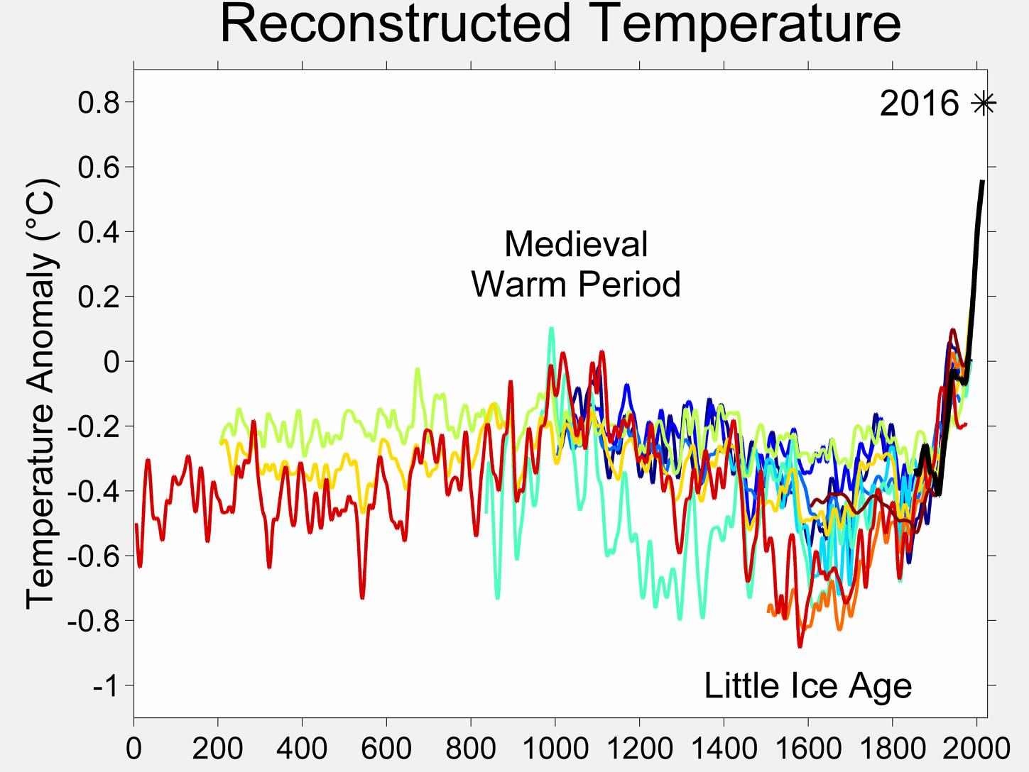
If you check the sources for that Reconstructed Temperature chart, at least 6 of the 10 papers were from Hockey Team members, and the eleventh curve is Hadley CRU.
I disagree with those who claim the project is a waste. One of the fundamental, legitimate complaints of the skeptics has been that both the data base from which the purported AGW signal has been statistically teased and the methods of teasing out that signal are suspect. This project promises to expose both to the light of day for all to see. Let the chips fall wherever they fall in the pursuit of truth for its own sake! Arguments for or against AGW are farts in a whirlwind without a dependable, common point of departure. This project has the potential to provide that common point. What AGW proponents and skeptics do with that common point is another matter entirely.