New SDO images show CMEs exploding from the Sun ripples like clouds do on Earth. It looks a lot like this photo, showing the well known Kelvin-Helmholtz instability.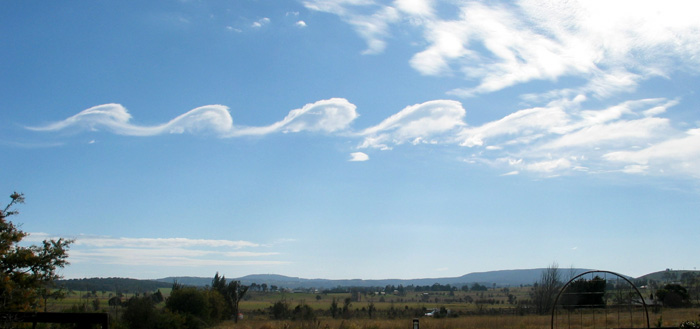
===============================================================
 experiment on NASA’s Solar Dynamics Observatory (SDO)") From the University of Warwick:
From the University of Warwick:
Physicists, led by a researcher at the University of Warwick, studying new images of clouds of material exploding from the Sun have spotted instabilities forming in that exploding cloud that are similar to those seen in clouds in Earth’s atmosphere.
These results could greatly assist physicists trying to understand and predict our Solar System’s “weather”.
The researchers, led by of the Centre for Fusion Space and Astrophysics, at the University of Warwick’s Department of Physics, made their discovery when examining new images of clouds of material exploding from the Sun known as coronal mass ejections (CMEs). These images were provided by the Atmospheric Imaging Assembly (AIA) experiment on NASA’s Solar Dynamics Observatory (SDO). SDO was been launched last year and provides unprecedented views of the Sun in multiple temperatures.
The new SDO/AIA observations provided images of coronal mass ejections in the extreme ultra violet at a temperature that was not possible to observe in previous instruments – 11 million Kelvin. On examining these images the Warwick researchers spotted a familiar pattern of instability on one flank of an exploding cloud of solar material that closely paralleled instabilities seen in Earth’s clouds and waves on the surfaces of seas.
 experiment on NASA’s Solar Dynamics Observatory (SDO)")
When observed these Kelvin-Helmholtz (or KH) instabilities appear to roll up into growing whirls at boundaries between things moving at different speeds, for instance the transition between air and water or cloud. The difference in speeds produces the boundary instabilities.
Similar conditions can occur when one looks at the magnetic environment of the path of these coronal mass ejections as they travel through the solar corona. The difference in speed and energies between the two creates the very similar KH instabilities that we can observe in clouds.
While KH instabilities have been predicted or inferred from observations as happening within the solar system’s weather this is the very first time they have been directly observed in the corona. What makes this observation even more interesting is that the instabilities appear to form and build on one flank of the CME. This may explain why CMEs appear to bend and twist as these instabilities build, and cause drag, on one side of the cloud. This effect will be the next focus for the University of Warwick led research team.
University of Warwick researcher Dr Claire Foullon said:
“The fact that we now know that these KH instabilities in CMEs are so far only observable in the extreme ultra violet, at a temperature of 11 million Kelvin, will also help us in modelling CME behaviour”
“This new observation may give us a novel insight into why these CMEs appear to both rotate, and be deflected away from following a simple straight path from the surface of the Sun. If the instabilities form on just one flank they may increase drag one side of the CME causing it to move slower than the rest of the CME.”
Dr Foullon and her co-researchers have outlined their observations and detailed modelling of how they believe this phenomenon occurs in a paper just published in Astrophysical Journal Letters entitled Magnetic Kelvin-Helmholtz Instability at the Sun by Dr Claire Foullon, Erwin Verwichte, Valery M. Nakariakov Centre for Fusion, Space and Astrophysics, Department of Physics, University of Warwick; Katariina Nykyri, Department of Physical Sciences, Embry-Riddle Aeronautical University, Daytona Beach, Florida; and Charles J. Farrugia, Space Science Center and Department of Physics, University of New Hampshire, Durham, New Hampshire.
The preprint is available at:
http://www.warwick.ac.uk/go/foullon/publications/foullon_preprint_apjl_2011.pdf
vukcevic says:
February 6, 2011 at 10:36 am
I maintain an up to date higher resolution Polar Field graph
Considering the uncertainty in the hard to measure polar fields, higher resolution does not make much sense. Stick with the ‘official’ Wilcox graph.
Just The Facts says:
February 6, 2011 at 10:19 am
Anyway, I am planning to add a few plots on the Sun’s Magnetic Field to the WUWT Solar Page: http://wattsupwiththat.com/reference-pages/solar-images-and-data-page/
I was thinking of adding this one;
http://wso.stanford.edu/gifs/Polar.gif
Is good.
this one; http://wso.stanford.edu/gifs/Tilts.gif
To complicated to interpret and theoretically dubious.
and this one; http://www.leif.org/research/Livingston%20and%20Penn.png
Is updated whenever Livingston sends me data, so is good
but now after looking at this; http://www.vukcevic.talktalk.net/L&P1.htm
The ‘alternative’ trend line has no basis and the data is to uncertain to allow any more than a simple linear ‘trend’.
and this; http://www.landscheidt.info/images/livingston.png
although it clearly shows the decline of the magnetic field, it is incorrect to connect the data points with a line as the points from from unrelated spots.
We also have the North;
http://wso.stanford.edu/gifs/north.gif
and South;
http://wso.stanford.edu/gifs/south.gif
any value in including these?
I think I am going to add a new Magnetic Field section at the bottom of the WUWT Solar Page, does anyone have any anything else they think should be included in this section?
Leif Svalgaard says:
February 6, 2011 at 10:46 am
but now after looking at this; http://www.vukcevic.talktalk.net/L&P1.htm
The ‘alternative’ trend line has no basis and the data is to uncertain to allow any more than a simple linear ‘trend’.
Agree with this 100%, I recognized the “real” trend line as misleading as soon as I saw it. That downward dip reminds me of a misleading graphic similar to the one below which was used quite often after the 2008 La Nina as “proof” of an imminent drastic cooling which would continue.
http://static.safehaven.com/authors/hoye/13044_j.png
Leif Svalgaard says:
February 6, 2011 at 10:46 am
“and this; http://www.landscheidt.info/images/livingston.png”
although it clearly shows the decline of the magnetic field, it is incorrect to connect the data points with a line as the points are from unrelated spots.
And the ‘moving average’ is meaningless as the data points are not equidistant in time. Talking about ‘bad science’…
Just The Facts says:
February 6, 2011 at 11:08 am
We also have the North; and South;
any value in including these?
No, as they are also shown in blue and red on the official Wilcox plot.
Leif Svalgaard says: February 6, 2011 at 10:46 am
“http://wso.stanford.edu/gifs/Tilts.gif
To complicated to interpret and theoretically dubious.”
The measure itself is theoretically dubious?
Mr. Alex says: February 6, 2011 at 11:17 am
Agree with this 100%, I recognized the “real” trend line as misleading as soon as I saw it. That downward dip reminds me of a misleading graphic similar to the one below which was used quite often after the 2008 La Nina as “proof” of an imminent drastic cooling which would continue.
Now Mr. Alex,
You are talking a bit of a nonsense, if you did consider the subject properly than you would have realised your misplaced confidence in the Catastrophic Solar Failure, as L&P strait line trend is projecting and Dr.S. is using it as a rather inadequate fig leaf.
Enjoy your world of make-believe, but I suggest do not put your shirt either on the Catastrophic Solar Failure or on the Catastrophic Anthropogenic Warming.
I’ve added Wilcox’s Polar Field Strength and Leif’s L&P chart to the WUWT Solar Page:
http://wattsupwiththat.com/reference-pages/solar-images-and-data-page/
Here are good summaries of all of the products available from the Wilcox Solar Observatory (WSO), Stanford University;
http://wso.stanford.edu/
and Leif’s website;
http://www.leif.org/research/
let me know if there is anything else that should be on the WUWT Solar Page.
Re the circular clouds – those look like either the smoke trails generated by someone doing aerobatics or by skywriting.
Even skywriters need to practice their handwriting… 🙂
Just The Facts says:
February 6, 2011 at 12:21 pm
“http://wso.stanford.edu/gifs/Tilts.gif
Too complicated to interpret and theoretically dubious.”
The measure itself is theoretically dubious?
Yes, as it assumes the solar magnetic field is a dipole, which it is not.
http://www.leif.org/research/Model%20Polar-Sector%20Solar%20Magnetic%20Fields.pdf
Leif Svalgaard says: (February 6, 2011 at 10:24 am )
Ed Mertin says: (February 6, 2011 at 10:03 am)
Looking back, was there any hint of L&P during solar cycle 23 ramp up?
Yes, but not for cycles prior to SC23:
http://www.leif.org/research/F107-SSN-divergence.png
————————————————————————-
We live in interesting times.
And thanks, Leif.
Just The Facts says:
February 6, 2011 at 12:21 pm
“http://wso.stanford.edu/gifs/Tilts.gif
Too complicated to interpret and theoretically dubious.”
The measure itself is theoretically dubious?
Yes, as it assumes the solar magnetic field is a dipole, which it is not.
And that the HCS is tilted which it is not:
http://www.leif.org/research/HCS-Movie-hi.gif
A more correct description would be the ‘latitudinal extent of the warps of the HCS caused by the solar sector structure’
There are other ways of measuring contrast, darkness and magnetic strength of solar regions. We can use the pixel darkness measured in the green band taken from the SOHO Continuum image that allows full coverage (when working) of all regions and this method is not subject to corruption via an increasing speck ratio.
When using this method it shows SC24 is behaving normally, we are having less spots and a greater frequency of spotless days but the magnetic strength is still rising towards solar max. This has been a reliable method up until last month, but SOHO now looks to be having some problems.
Graph HERE.
Geoff Sharp says:
February 6, 2011 at 3:12 pm
this method is not subject to corruption via an increasing speck ratio.
The L&P effect is precisely the increasing speck ratio…
we are having less spots and a greater frequency of spotless days but the magnetic strength is still rising towards solar max.
So, you think that the ratio of visible spots to magnetic field is decreasing. This is, again, just the L&P effect. There is, of course, a selection effect that you must take into account: as the smallest spots [with the weakest fields] are becoming invisible, you’ll tend to pick out progressively larger spots as time goes by. Livingston’s data stand on their own and are not biased by anything. The strongest argument for L&P is the discrepancy with the F10.7 measurements.
Geoff Sharp says:
February 6, 2011 at 3:12 pm
There are other ways of measuring contrast, darkness and magnetic strength of solar regions. We can use the pixel darkness measured in the green band taken from the SOHO Continuum image that allows full coverage
Yet over the interval covered by your graph you only show 62 points. During that time there were ~2000 spots of which L&P observed 280 [they only have telescope time and good weather about 1/7 of the time at best]. Even allowing for the same spot being counted several times as it marches across the disk you clearly are not covering nearly ALL spots. Perhaps you only count active regions [of which there were ~160] and only pick the biggest spot in each. Either way, a biased count and not full coverage.
Leif Svalgaard says:
February 6, 2011 at 3:52 pm
The L&P effect is precisely the increasing speck ratio…
It feels like groundhog day again. If L&P were just telling us that there are more specks then no one would argue, nor would anyone be interested in the so called “effect”. But unfortunately they are telling us that “sunspots will disappear by 2015” because of what they wrongly record appears to show a decline in magnetic strength. But their method is flawed because they measure every speck in a region, which because of the increased speck ratio has to drag the total value down by an incorrect ratio. We have seen this with unipolar groups where the large main spot is magnetically very strong but the small specks surround the main spot get the same weighting, thus dragging down the real figure. I measure the whole region and look at its overall darkness, the specks still affect the overall value but do not skew the figure as in L&P’s case.
Since June last year there has been a regime change. Unipolar groups are dominating. These groups are very strong and long lived magnetically and are recording similar values as groups measured at SC23 max. There is no reduction in magnetic gauss strength but this is being missed by the L&P method.
So there is no reduction in magnetic strength as we ramp up to the weak SSN solar max. What we are seeing is the normal process of grand minima, the magnetic strength follows the normal cycle but the total spot count is down. You are invoking some strange mysterious “effect” to cover for the fact that you did not pick this grand minimum.
The strongest argument for L&P is the discrepancy with the F10.7 measurements.
This is rubbish and only works when you manipulate the F10.7 data. Do we have to go over this ground again?
Yet over the interval covered by your graph you only show 62 points. During that time there were ~2000 spots of which L&P observed 280
As you know I measure the whole region. This is the correct way. Solanki was smart when doing his measurements before SC23 by only measuring the larger spots. L&P should have continued this method.
Geoff Sharp says:
February 6, 2011 at 5:51 pm
What we are seeing is the normal process of grand minima, the magnetic strength follows the normal cycle but the total spot count is down.
Apart from the fact that we have never observed a grand minimum magnetically, what you describe is just what the L&P effect is.
You are invoking some strange mysterious “effect” to cover for the fact that you did not pick this grand minimum.
I’m simply reporting measurements by the most experience solar observer in the wold.
“The strongest argument for L&P is the discrepancy with the F10.7 measurements.”
This is rubbish and only works when you manipulate the F10.7 data. Do we have to go over this ground again?
We can, but I doubt it will make any difference to you. The [very small 1%] adjustment of the F10.7 due to the relocation of the Canadian observatory has no discernible effect on the ratio. You can see the agreement between the two observatories here: http://www.leif.org/research/SHINE-2010-Microwave-Flux.pdf . The directors of both the Canadian and the Japanese observatory agree with this. In fact the discrepancy was first noted by Ken Tapping http://lasp.colorado.edu/sorce/news/2010ScienceMeeting/doc/Session6/6.03_Tapping_F10.7.pdf
As you know I measure the whole region.
then you missed two thirds of them.
Leif Svalgaard says:
February 6, 2011 at 7:00 pm
then you missed two thirds of them.
No, I have measured every SC24 region that has passed the Layman’s speck threshold. This is far more efficient than a 1/7th sample following incorrect principles, and uses the Solanki method.
How do you account for the upward trend in my graph? The data is pure and simple.
That cloud formation is clearly a warm front coming in. 😉
Geoff Sharp says:
February 6, 2011 at 7:30 pm
No, I have measured every SC24 region that has passed the Layman’s speck threshold.
of the 162 regions you picked the 62 largest ones. There is your bias.
The data is pure and simple.
The data is biased by the cherry picking.
Leif,
This looks to be an important issue.
I am not in a position to judge between yourself and Geoff Sharpe.
But obviouly at least one of you is clearly wrong.
I trust that you will pursue this issue to a firm conclusion.
There is much at stake, not just the physics but vital issues relating to the future of industrialisation.
If you are correct, then we will see (at least a temporary) end to sunspots by 2015.
If Geoff is correct, then it is likely that we are already on the downward path to a much cooler period ahead, if not a new ice age (little or not so little).
AusieDan says:
February 6, 2011 at 7:46 pm
This looks to be an important issue.
It is, and so should be approached in a scientifically correct way, uncolored by agenda and wishful thinking.
But obviouly at least one of you is clearly wrong.
I trust that you will pursue this issue to a firm conclusion.
The sun will decide in a few years time. So far, it is firmly on the side of L&P. That can change tomorrow.
If you are correct, then we will see (at least a temporary) end to sunspots by 2015.
The original figure ‘2015’ was based on fewer data points. The actual time is probably a few years further in the future.
If Geoff is correct, then it is likely that we are already on the downward path to a much cooler period ahead, if not a new ice age (little or not so little).
There was no grand minimum in the 1800s, and it is not proven that a grand minimum [if indeed we are heading into one: the Eddy Minimum] changes the Sun’s output enough to cause serious climate effects:
http://www.leif.org/research/Does%20The%20Sun%20Vary%20Enough.pdf
Lief,
One of the things about climatology that I find most unsatisfactory, is the constant movement of goals and even of definitions of how goals are to be scored.
By this I meant the constant movement of thermometers and of the introduction of new methods which are not consistant with, nor reconciled with, well established traditional methods.
Now I am not a stick in the mud, looking back with rose coloured glasses.
Real improvements are fine and are to be encouraged, but they must be run alongside the older methods for a considerable number of decades, before undue reliance can be placed upon the newer technologies.
That is simply because of the chaotic natue of climate and the very long length of its cycles, which must be fully understood before true conclusions can be drawn.
The traditional method of sunspot counting has a very long history and one that has a reasonable correlation with multi century changes in the climate.
Correlation does not indicate causation, but we are just entering a period when a major test can be carried out.
Why abandon this for the S&P method which has no similar pedigree and just at this critical juncture in the cycle?
Lief, one final point,
Forgive me if I have entered this debate and you have already covered this question.
If S&P are correct, what happens to sunspots after 2015?
Are they dead and gone forever?
Or will they just go into [hibernation] for a century or two?
I presume that you do not think that would impact the earthly weather in any fashion.
Am I correct with this last supposition?