
Guest post by Thomas Fuller and Tony Brown
When we separate what scientists have actually said from what messages are carefully prepared and communicated to us through the media, one thing jumps out to the most casual of readers.
Some marketing strategists reduced the information content of the messages given to the public and introduced popular symbols to indicate what they wanted us to believe was threatened by climate change.
For over 5 years we have been bombarded with images of polar bears, hurricanes, flooded cities, icebergs calving, drought-stricken deserts, and the like. Perhaps the most symbolic representation wasn’t even a picture, but a PowerPoint slide of paleoclimatic temperature reconstructions now famous as the Hockey Stick Chart.
Those symbols all have one thing in common. They were mistakenly used. As has been cataloged here and elsewhere, these ‘signature’ issues were either blown out of proportion or presented falsely.
Polar bears, like all large mammals that haven’t had the good fortune to be domesticated, have a shaky status on this planet–but that status does not appear to have very much at all to do with climbing temperatures. They survived higher temperatures in the past, and their population is rising–and would be rising even more quickly if we quit shooting them, that being the major cause of polar bear deaths.
There is no historical trend in either the frequency or intensity of hurricanes, as Roger Pielke Jr. has pointed out in academic publications. And yet global warming has been blamed for specific storms, such as Hurricane Katrina, in a manner that is frankly antithetical to the principles of science.
And so it is with icebergs calving (a completely normal and mechanical reaction to ice accumulation that happens whether temperatures are rising or falling), droughts (which were worse in the past) and all the other symbolic climate porn photography inflicted upon us.
Yesterday I wrote about sea level rise, and attempts to measure ice loss in Antarctica via satellite. And again, it is very clear that the results of scientific work are being hijacked in an attempt to push a scary message at us. The analysis of gravimeter measurements start with guesses and inferences, and the result is presented with a huge margin of error, and amounts to less than 1% of the annual ice loss Antarctica experiences every year.
Commenter TonyB went to the trouble of cataloging the difficulties inherent in sea level measurements. By rights it should be posted here as an article. I’ll paste it in at the bottom of this piece–and I will wager most readers will think it is more informative than my words above it.
But before I turn the stage over to TonyB, I want to make a couple of points:
First, it should be obvious that the manipulation of the messages isn’t coming from scientists. It is too professional, too slick and ultimately too wrong. This is a professional, coordinated media strategy using calendars with press schedules and release dates, a well-stocked photo library and a rapid response team that shoves new releases out the door in response to news events or skeptical messages that seem to be gaining traction.
Second, and really most important, all of the messages have very serious flaws in the narratives that accompany the pictures they ship out. And it is the exposure of these flaws that has crippled the climate change political movement, far more than criticism or political opposition.
If climate change or global warming is now a declining motivation for political and economic action, and it may well be, the reason is not Monckton or Morano. It is not even more measured criticism coming from McIntyre and Watts. Nor is it corrective science administered by both Pielkes.
It is their own butchery of the facts behind the images they decided we needed to see that hamstrung their movement. If they have been defeated in the first series of battles (in what I predict will be a 30-year war), they done it to themselves.
Here’s Tony–read on!
No problem. I was going to work this up into an article on sea levels one of these days although someone must have already posted an article here on this fragile part of a fragile science.
“We are being bamboozled by science which likes to have a nice graph to explain everything, unfortunately the real world is more complicated than that. Global sea levels are -like global temperatures-a nonsensical artifact dreamt up in a computer laboratory where satellite records are tacked on to manufactured and highly incomplete historic records from selected tide gauges.. Modern Sea level rises- where happening- are not being seen in context as another of those regular cycles that stretch back much further than the satellite records or tide gauges into the depths of recorded time.
This is the latest IPCC assessment which confirms sea level calculations from 1993 are by satellite.(page 5 onwards)
Link1
http://www.ipcc.ch/pdf/assessment-report/ar4/wg1/ar4-wg1-spm.pdf
The sea level calculations rely on an enormous number of variable factors including pressure, location, tides, warmth of oceans, structures, storms, wave heights, surges, stasis, location of the gauge/sensor, slope of the underlying strata etc. The accuracy of measurements is said to be 3cm (10 times the level of the alleged annual rise) but in reality is often vaguer than that because of the inherent difficulties of measuring. Observed real world sea levels generally simply do not show the rate of increase suggested by the IPCC (although this varies enormously from place to place for reasons cited above)
Link 2 The document below was written by many of our old friends including Phil Jones and Mike Hulme-page 19 gives the sea level data
http://ukclimateprojections.defra.gov.uk/images/stories/trends_pdfs/Trends_section1&2.pdf
The information for historic sea levels was ‘extended’ from a paper by one of the scientists at Proudman
Link3
http://www.pol.ac.uk/ntslf/products.php
Link 4 This is reconstruction of sea level data from 1700 of three extremely incomplete Northern Hemisphere records from which IPCC extrapolate their figures, take them to be a global figure and splice them on to the satellite records
Link 5 .
http://www.pol.ac.uk/psmsl/author_archive/jevrejeva_etal_1700/
These three are taken to represent global figures since 1700-much data missing and subsequently interpolated.
Amsterdam from 1700 (Van Veen 1945)
Liverpool since 1768 (Woodworth 1999)
Stockholm since 1774 (Ekman 1988)
It says there are differences even in the same ocean basin between tide gauges of up to plus or minus 6cm rendering their use for a global record to be irrelevant
Link 6
http://www.pol.ac.uk/psmsl/author_archive/jevrejeva_etal_1700/2008GL033611.pdf
pdf from 1700 link
6cm margin of error from tide gauges in same ocean basin
Both the following sites give a good description of the satellite process-which is being constantly refined but doesn’t get more extremely accurate as the inherent flaws in measuring capabilities can’t be fully resolved no matter how many satellite passes are made.
Link 7
http://www.tos.org/oceanography/issues/issue_archive/issue_pdfs/15_1/15_1_jacobs_et_al.pdf
Link 8
http://jchemed.chem.wisc.edu/Journal/Issues/1999/dec/abs1635.html
The following sites deals with problems of satellite accuracy and data;
Link 9
http://www.ocean-sci.net/5/193/2009/os-5-193-2009.html
Link 10
This with reliability
http://www.climateaudit.org/?p=859
Link 11
http://lightblueline.org/satellite-tracking-sea-levels-set-launch
The UK Environment Agency -where possible like to use physical tide gauges as well when developing flood defence schemes, which are both visually observed or can send data electronically. Best of all is gathering information from local people such as the Harbour master or those who work the fishing boats and who know what is really happening.
The following link leads to a graph produced by the Dutch Govt sea level organisation- and confirm sea levels are stable and are somewhat lower than during the MWP. (This won’t stop them reacting to the IPCC by raising sea defences)
Link 12
http://www.climateaudit.org/?p=61
Link 13
We have much observational evidence of historic sea levels (p162 on-including a map in the following link)
Ancient Greek explorer Pytheas traveled to Iceland and not only discovered the frozen seas lying one days journey beyond, but was the first to quantify the moons action as being responsible for tides, and took physical measurements of heights. Sea level heights are generally said to be lower today than back in the Roman warm period and Mwp.
Sea castles in the UK built in the 11th century are now above the sea level entrances which ships used to re-supply them.
This links leads to a 1913 book on Harlech castle-one such building which is now high and dry-nothing to do with stasis or deposition, but that sea levels are lower now than when it was built 1000 years ago. Suggest readers select the b/w pdf
Link 14
http://www.archive.org/details/merionethshire00morr
Extract
“In 1409 an attack was made upon Harlech, led by Gilbert and John Talbot for
the King; the besiegers comprised one thousand well armed soldiers and a big siege train. The besieged were in the advantageous situation of being able to receive their necessary supplies from the sea, for the waves of
Cardigan Bay at that time washed the base of the rock upon which the castle stands. Greater vigilance on the part of the attacking force stopped this and the castle was surrendered in the spring of the year.
A remarkable feature of the castle is a covered staircase cut out of the rock, defended on the seaward side by a looped parapet, and closed above and below by small gatehouses. This was the water-gate of the fortress,
and opened upon a small quay below.”
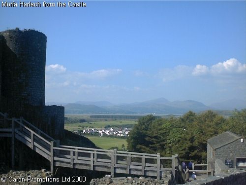
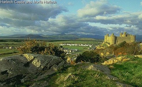
Link 15 The following pictures show the current location of the sea.
http://westwales.co.uk/graphics/morfaharlech.jpg
Link 16
Sea in far distance from Harlech castle
http://westwales.co.uk/graphics/harlech.jpg
and this
Link 17
http://www.buildmodelcastles.com/html/castle_history.html
very good item about Harlech
Link 18
http://www.walesdirectory.co.uk/Castles/Harlech_Castle.htm
Sea levels AND temperatures were higher in the MWP and the Roman warm periods and presumably other extended warm periods (the period 1700 to 1740 is looking increasingly comparable to today).
The worlds leading sea level expert Professor Morner has called the IPCC figures ‘a lie.’ Google ‘The greatest lie ever told’
Morner says: “The mean eustatic rise in sea level for the period 1850-1930 was in the order of 1.0-1.1 mm/year,” but that “after 1930-40, this rise seems to have stopped (Pirazzoli et al., 1989; Morner, 1973,2000).” This stasis, in his words, “lasted, at least, up to the mid-60s.” Thereafter, “the record can be divided into three parts: (1) 1993-1996 with a clear trend of stability, (2) 1997-1998 with a high-amplitude rise and fall recording the ENSO event of these years and (3) 1998-2000 with an irregular record of no clear tendency.” Most important of all, in his words, “There is a total absence of any recent ‘acceleration in sea level rise’ as often claimed by IPCC and related groups.”
He concludes: “When we consider past records, recorded variability, causational processes involved and the last century’s data, our best estimate of possible future sea-level changes is +10 +/- 10cm in a century, or, maybe, even +5 +/- 15cm.” See also Morner (1995); INQUA (2000).”
I am inclined to agree with Professor Morner that sea level is not really doing very much generally (with exceptions either way in some places)
Link 19
http://www.publications.parliament.uk/pa/ld200506/ldselect/ldeconaf/12/12we18.htm
The above link dissects the data and states that a rise by 2100 of 5cm is possible…. plus or minus 15cm!
Morner stresses (as I do) that observational data contradicts the theoretical interpolated and massaged data that is used by the IPCC.
John Daly also had a good handle on all this.
Link 20
http://www.john-daly.com/deadisle/index.htm
The sea level is not rising at the rate suggested-it has stumbled in recent years according to many local gauges (what is global sea level supposed to mean with a million kilometres of coastline?)
To reach a 1 metre increase by 2100 means an average of nearly 11mm a year (only 90 years remaining). There is simply no evidence to show this is happening.
We must stop looking at just a few years of data as ‘proof’ of rising levels , and instead view things in a historic context, whilst retaining a great deal of scepticism at the notion you can create a highly accurate global figure in the first place, or that tacking dubious satellite data on to even more dubious tide gauge data is any way to create a worthwhile measurement .
I had intended to cover historic sea levels as a companion to my ‘arctic ice variation through the ages’ series.
Thomas Fuller http://www.redbubble.com/people/hfuller
anna v & E.M.Smith,
Thank you, thank you, thank you! I’m so glad it is not just me. I positively squirm when I read the term ‘forcing’.
Verity Jones and E.M Smith
We seem to be the exception. Look at the last entry in wattsup
It is forcing forcing forcing all the way.
Yes, I get itchy and break out in hives with all this forcing terminology, which means I cannot judge the merits of the article 🙁 . Merits there may be, as there were merits in the calculations of epicycles when principles and units were fuzzy long ago.
D Caldwell says: September 7, 2010 at 9:47 pm
“…good science is not a matter of a consensus of opinion… Consensus is not scientific proof and the results of computer simulations are not the same as actual observed data.
Ok D, apologies if I have belaboured a point with you. I agree that computer simulations of climate represent an ambitious project.
Consensus has been wrong is not the same as consensus is wrong. If consensus is built upon dogma regardless of contrary evidence you have a point. If consensus is developed through a rigorous examination of evidence by multiple parties it is probably robust. Suppose I were to accept that a tiny cabal of evil scientists had hijacked the entire process in recent years. How should I treat the many paleo papers that pre-date 1980? They still point to the same overall conclusion. As does radiative physics from the turn of the previous century. As does analysis from many disparate fields well removed from East Anglia. It may be worth considering.
I think Thomas has it about right. The NGOs certainly have the motivation to push AGW no matter what – their worldview and funding are at stake – and their media types would have the wherewithal to do that pushing. No doubt some scientists (and journos and politicians) have colluded. No doubt others have seen benefits for themselves, and been happy to go with the flow. Result is distortion and exaggeration, disastrous for all sorts of reasons. Let’s face it: there is only a little doubt that there is some measure of human-caused climate change. Obviously, no one knows quite what this will mean in the future. Even if there really were no human factors at all, natural changes will still create problems for someone, somewhere. On the other hand, the potential results of ambitious reactions to the scare stories as are scary as the stories themselves – and most likely ineffectual. Many people – from all sides of the argument – have suggested that the best thing to aim for is small-scale initiatives that will have benefits irrespective of how things eventually pan out. I think it’s difficult to disagree with this. Trouble is, such a low-key message easily gets lost in the fog created by the spin merchants. In short, darn those NGOs for unleashing a monster (out of a molehill).
If Professor Morner is the “worlds leading sea level expert” he’s hiding the fact well because I don’t see much evidence of a strong publication record.
anna v says:
September 7, 2010 at 10:47 pm
How about ‘robust forcings’?
For more, click on Categories in the sidebar, then on Sea Level.
HR says:
September 8, 2010 at 2:21 am
“If Professor Morner is the “worlds leading sea level expert” he’s hiding the fact well because I don’t see much evidence of a strong publication record.”
Presumably you were being ironic?
Even wikipedia acknowledges his publication rcord and expertise despite intervention by William Connely.
tonyb
HR
Sorry, omitted the link ref Prof Morner
http://en.wikipedia.org/wiki/Nils-Axel_M%C3%B6rner
tonyb
AnnaV
I also fully agree with you and it irritates me too .
Those distinctions between “forcings” and “feedbacks” only confuse matters more .
The units are wrong , the concepts feel wrong , the distinctions feel artificial .
Why those people don’t use a consistent and simple vocabulary that has imposed itself in physics during more than 300 years is beyond me .
The right vocabulary should speak of internal and external forces and of flows (of energy , momentum , mass) through boundaries .
Does one talk about gravitational “forcings” and rotational “feedbacks” ? No .
Neither “forcings” nor “feedbacks” are necessary .
Roy Spencer explains it in his book, The Great Global Warming Blunder. The consensus has mixed up forcings with feedbacks and cause with effect. Here’s a recent WUWT thread on his paper on the matter:
http://wattsupwiththat.com/2010/08/28/congratulations-finally-to-spencer-and-braswell-on-getting-their-new-paper-published/
“Tiny cabal.” It’s a go-along/get-along mass movement (greenism), with a tiny cabal of zealots at its core. I.e., persons who entered the field of climate science in recent decades tended to do so because they wanted to “make a difference” along the lines of regulating CFCs, acid rain, air pollution in general, and (post 1985 or so) global warming. If that wasn’t their initial motivation, they were indoctrinated in “right thinking” in school. It would never occur to 80% of them to produce anything that might be used to defend any producer of “industrial emissions”; he is their designated Black Hat whom it is their mission to control.
Their policy-driven mindset is evident from comments they make in private when pressed on the weakness of the scientific case for CAWG: They say (according to Christy, I think it was) things like, “Well, we have to move away from fossil fuels eventually anyway and we need to move to renewables” or “We need to conserve energy and reduce our dependence on foreign oil” or “Shouldn’t we reduce all of mankind’s emissions-impact on the planet?”
“Evil.” They aren’t cartoon-character villains–that’s a strawman. They’re noble-cause corruptionists.
Rising temperatures, yes, but not to positive feedbacks (aka climate sensitivity); so they don’t point to the same thing at all.
Are you talking 1896 or 1906?
These analyses are often flawed or unjustified, as has been argued on many skeptic sites. The retreat of glaciers isn’t a phenomenon of recent origin, for instance, and they had retreated even further in earlier warm periods.
The term I was familiar with prior to encountering climatology was “drivers,” not “forcings.” The term was evidently chosen for its emotional impact; i.e., its use is evidence of a propagandistic motivation in “climate science.”
Surely there must be some ocean facing sheer rock cliffs that were marked or staked for tide levels during the great age of exploration? Perhaps Columbus, Magellan, Vespucci etc. I would be stunned to learn that there is not a single reliable mark that has survived somewhere.
How about the Rock of Gilbraltar? The awesome amount of history that sailed passed it through the ages, did anyone leave anything there remotely useful?
I don’t have links to 1600s, Blade, but there’s a link in this article, Link 20, that shows a sea level marker cut into rock at Port Arthur, Tasmania in 1841.
Blade says:
September 8, 2010 at 4:42 am
“Surely there must be some ocean facing sheer rock cliffs that were marked or staked for tide levels during the great age of exploration?”
This one is in Tasmania
http://news.bbc.co.uk/1/hi/sci/tech/467007.stm
If the truth be known, scientists are a rather selfish and cowardly lot. They do not take unpopular positions on much of anything. So if it’s ‘popular’ to be green, or warmist, or anti-this, or anti-that, or pro-X, or pro-Y, one should not be surprised to hear a few of the less intelligent ones are on the chicken-dinner circuit with the ultra-liberal elite (and their adoring Hollywood Supper Stars), or that most of the others are hiding in their labs and offices –under a table or desk– and busy doing something nobel-worthy for their Alma Mater and the kids they are trying so hard to brainwash to the “CAUSE”.
@tonyb says:
September 8, 2010 at 3:15 am
“Sorry, omitted the link ref Prof Morner
http://en.wikipedia.org/wiki/Nils-Axel_M%C3%B6rner
tonyb”
Ah, another of Connelly’s smearing articles? Does anyone expect us to believe a word in Wikipedia on such topics?
Scooper says:
September 7, 2010 at 9:51 am
Really interesting article about rises in sea level with a touch of irony. The initial article talks about the misuse of photographs to sex-up a topic and I’m sad to say this is what has happened with your photographs of Harlech Castle. The pictures which you use to explain how far the see is away from the Castle are taken at an angle which points approximately NNW and includes much salt marsh towards the estuary with Mt Snowdon in the background. Facing due West from the Castle is the shortest route to the sea and much closer that suggested by the photographs linked here. It’s still quite a way from the base of castle rock to the sea these days and it must have been been awesome to have seen the whitewashed castle next to the sea when originally constructed.
Cherry-picked pictures, eh?
Well give the level of sea level rise in mm that it would take to raise the level to where it was.
I live by the sea half the time, and the coast is rocky.
There are promontories that show water level marks up 6 meters from where the sea is now. Unfortunately the area is earthquake prone. The last earthquake sank the earth in places a meter or so. How could one disentangle all these? Maybe an older earthquake had raised the land for all I know.
One thing for sure though, the sea lake side was opened by the Corinthians around 500BC, and a queue was built where the ships could tie . Ships at the time were like boats now. The queue rocks still survive in part of the periphery, and they are still above water . In high tides and wind drives they get covered. One can live with this 2500 year change, earthquakes and all.
Tim Clark
Please see my reply to scooper at 4.08.
Looking at my large scale ordnance survey map I would say the sea is getting on for close to three quarters of a mile away, but the exact point would depend on whether the tide is in or out. Its a very big beach.
When I selected it I thought I was writing an article not judging a photo competition. 🙂
tonyb
Tim Clark
tonyb says:
September 8, 2010 at 8:03 am
When I selected it I thought I was writing an article not judging a photo competition. 🙂
Scooper is a pretty demanding art critic. I was satiring Scooper quibbling over a few mm. ;~D
Tidal records for Liverpool, UK from 1768 to 1996 can be found here;
http://www.psmsl.org/data/longrecords/lpool.annual.mhw.fig1.grl
The site is the UK organisation for ‘The Permanent Service for Mean Sea Level’
Other interesting info on their main site + links. However, remember the uk is tilting, west up & east down. Looks like they are supplier of data to IPCC. Are there any surveyors out there who have looked at SL changes over time? What adjustments, if any, are made when surveying? The benchmark is located at Newlyn UK and can be seen here;
http://www.pol.ac.uk/ntslf/tgi/ntobs.html
Roger Knights says: September 8, 2010 at 4:00 am
Roy Spencer explains it in his book, The Great Global Warming Blunder. The consensus has mixed up forcings with feedbacks and cause with effect.
Hi Roger. I can only hope that Dr Spencer is correct and that climate sensitivty is at the lower end of the scale. I have my doubts. This post is about unfairly representing the significance and meaning of scientific endeavour. As his most recent paper (2010) is relatively new, lets await some critical scrutiny before throwing out the scores of papers before it.
Skepticism needs to cut both ways. I oppose the use of routine bear footage to falsely portray environmental “catastrophe” too. From a previous post I spoke of the “boundary between environmental hyperbole and scientifically informed judgment”. It interests me that Thomas Fuller states “their population is rising–and would be rising even more quickly if we quit shooting them, that being the major cause of polar bear deaths” without any attempt at attribution. The reader is left to assume that AGW is not a factor in their survival, but perhaps the bear population is rising because of recently enforced hunting restrictions, or better census methods are counting more of a stable population, or more are observed near human habitat as food sources elsewhere decline? I wouldn’t know and I wouldn’t assume any of the above without checking a number of sources first.
Thanks to anna v, Tom Vonk, E.M.Smith and Verity Jones about the use of the words forcing and feedback. The warmist scientists prefer people to accept this “scientific” terminology because it actually captures you into their way of thinking. I thought I would add my thoughts on a related issue – the global average temperature.
There are many locations where warming has not occurred. These are constantly reported for America, UK and in New Zealand where I live. Chiefio can probably quote hundreds. I am told by warmistas that I cannot look at individual sites and must look at the global average data. This is what I want to take issue with. Why must I only look at the global average?
If CO2 is a well mixed gas, and IPCC tells me it is, then if the physics are correct every site must show warming without exception. How can CO2 heat some locations and not others. We are not talking weather here because it is the long term record for these sites – in other words the site specific climate.
Gravity works at that site. If CO2 “forcing” is a physical law, it would also work at that site. So if there are sites of cooling (or constant temperature), what is the physical law operating there? If scientists cannot explain this, then they actually don’t know what they are talking about. And I think skeptics are letting the “climate scientists” off too lightly by agreeing to an average of 1.2F per doubling without identifying the laws which dictate this and the exceptions. If the explanation is to be sulphates (or something similar) which cancel out warming, then I expect research to be undertaken to establish the local source of sulphates at those sites which are not availbale at other sites.
I compare this to a hospital ward which asks nurses to report only on the average temperature of the patients as being more important than reporting those over 100F. Reporting the average conceals the important data.
Alan
1. Tom Fuller says:
September 7, 2010 at 11:17 am
Tom, I have no knowledge of these groups but I have lived long enough to realize that our culture has evolved from one that everyone read printed works and were people were exposed to ideas in great depth in print form; into a culture that mostly relies on visual icons and video and sound bites for information. The problem is that visual images have no content. Our minds cannot retain a large array of visual images compared to what we remember from what we have read or have written. By choosing the icons carefully the environmental groups or the mainstream media sources can tell their simplistic stories with pictures based on the notion that one picture is worth a 1000 words. Unfortunately, 1000 words are a “drop in the bucket” compared to what is the real depth and weight of the issue including both sides of the issue. Quick answers substitute for complete and detailed answers to nagging problems. For example congress passed a major medical plan before anyone read the bill. Has any read it since? We had assurances that they could vote for the plan before it was written or read by anyone. No one read it!
The icons and video and sound bites are all that is left of journalism. Now the media competition depends upon pictures rather than words. Get the pictures first! Words mean something but pictures don’t have meaning because the content of the message is missing. The 1000 words are missing. As a result political action groups or the mass media can use the images to mean what they say it means. A stranded polar bear symbolizes rising oceans when polar bears can swim. Pictures can be changed in their meaning depending upon the interpreter or can be doctored. The meanings of words are less apt to be changed although the context can alter meaning when combined with other words. Unfortunately the shading of the meaning can be used to hide the real message. If enough is written, the issue becomes clearer. An issue like climate change cannot be explained with a picture of a polar bear on an ice floe. If we were able to tally the words presented on WUWT over the last year by both primary authors, links to other written sources, and comments by contributors to a given BLOG, 1000 words is orders of magnitude too low. As yet there is no agreement on the issue but over the last 3 three year it is becoming clearer.