By Steven Goddard,
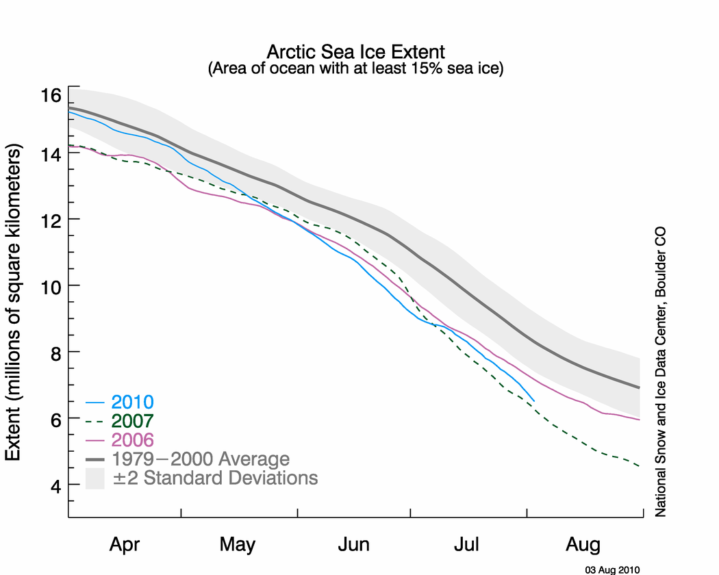
NSIDC published their sea ice news yesterday, and this one is definitely worth a read. Yesterday I pointed out that the graph below seems to be inconsistent with other data, including NSIDC maps.

http://nsidc.org/images/arcticseaicenews/20100804_Figure2.png
The problem is that the 2010 curve appears too close to 2007. Other data sources have the spread much larger, and NSIDC’s own maps show a larger spread. The area of green below represents regions of ice present in 2010, but not present in 2007. As of today, NSIDC maps show 10% more ice in 2010 than the same date in 2007.

Walt Meier from NSIDC responded with this remark :
4. Our sea ice maps are not an equal area projection. Thus one cannot compare extents by counting grid cells – this is probably the reason for the 7.5% vs. 3% discrepancy. Steve has been alerted to this issue in the past, but seems to have forgotten it.
What Dr. Meier seems to have forgotten is that pixels further from the pole in a polar map projection represent larger areas. Thus a correction would slightly increase the discrepancy, not decrease it. Sadly, DMI stopped updating their graphs two days ago – so I am no longer able top do comparisons between DMI 30% concentration and NSIDC 15% concentration. Their most recent graph shows 2010 well above 2007, and close to 2006.

Another data source – JAXA. The gap between 2010 and 2007 has been decreasing in NSIDC 15% concentration data, but has been increasing in JAXA 15% concentration data.


———————————————————————————————————————-
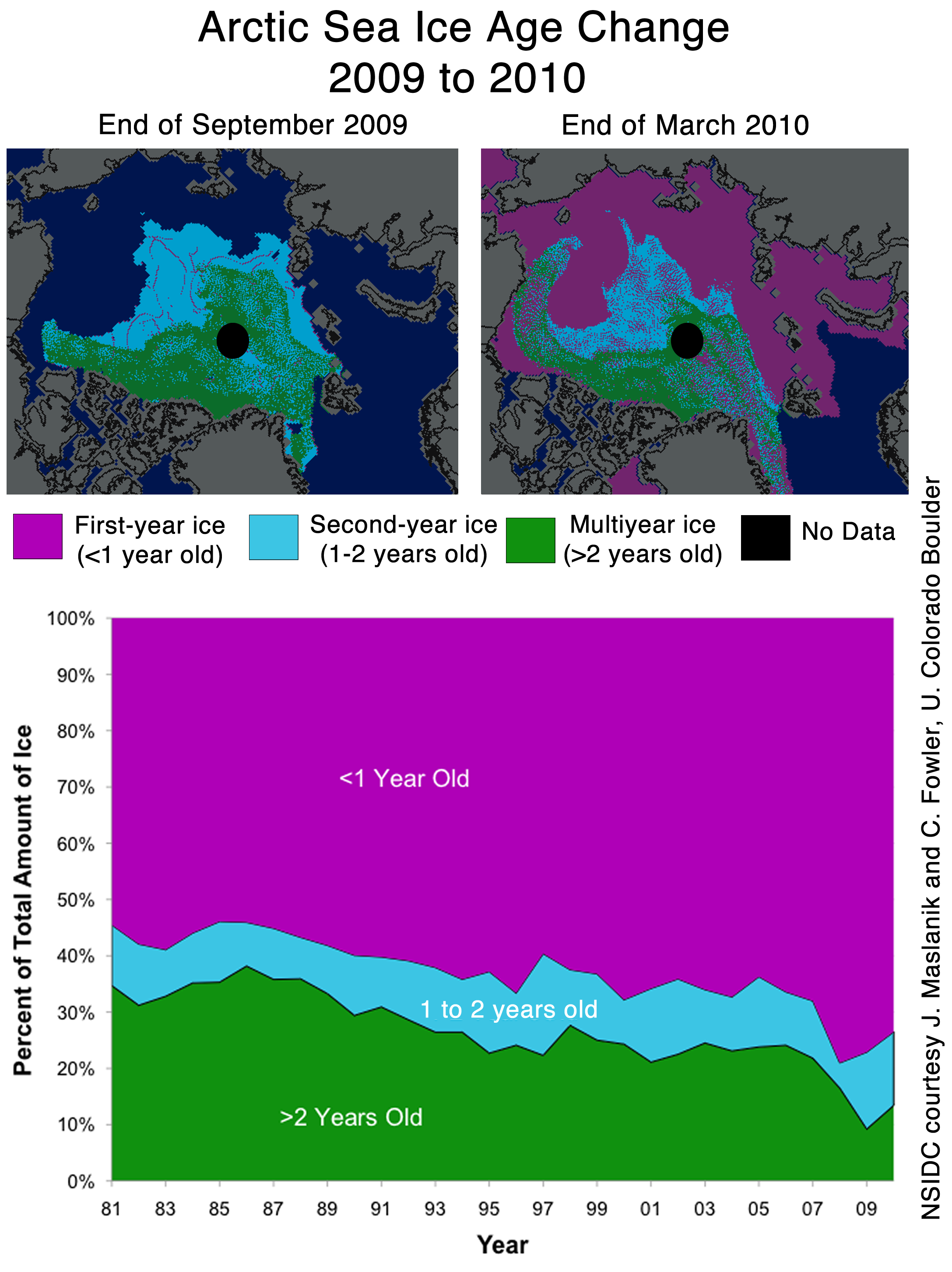
The next item which caught my attention is the discussion of multi-year ice.
Older, thicker ice melting in the southern Beaufort Sea
This past winter’s negative phase of the Arctic Oscillation transported old ice (four, five, and more years old) from an area north of the Canadian Archipelago. The ice was flushed southwards and westward into the Beaufort and Chukchi seas, as noted in our April post. Ice age data show that back in the 1970s and 1980s, old ice drifting into the Beaufort Sea would generally survive the summer melt season. However, the old, thick ice that moved into this region is now beginning to melt out, which could further deplete the Arctic’s remaining store of old, thick ice. The loss of thick ice has been implicated as a major cause of the very low September sea ice minima observed in recent years.
The blink comparator below shows the changes in multi-year ice between the end of March and the end of July.

The multi-year ice has largely survived the summer so far. Pixel counts show that ice greater than two years old has dropped by 11%, and ice between one and two years old has dropped by 4%. (These numbers are slightly low because of the distortion described above.) Most of the ice lost has probably been transported out the Fram Straight near Greenland, rather than melted in situ. The ice in the Beaufort Sea has split and moved north and west.
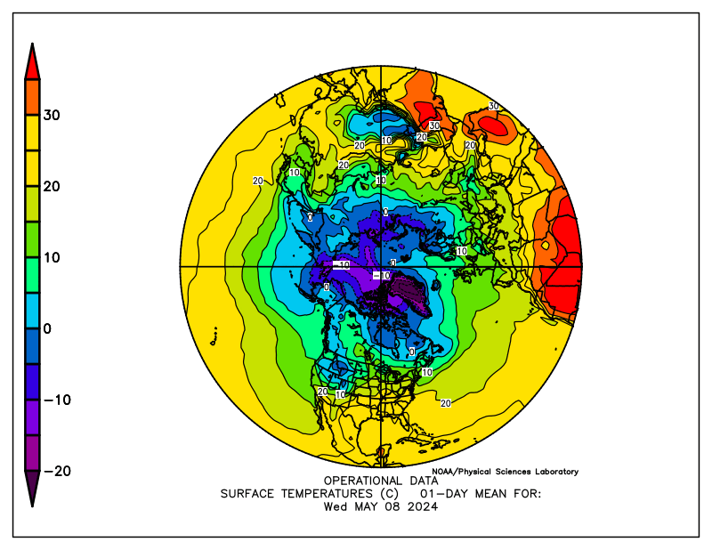
What about the future? The remaining multi-year ice in the Beaufort Sea is largely contained in areas which have dropped below freezing, and are forecast to remain below freezing for the next two weeks. The image below blinks between multi-year ice and current temperatures. Blue indicates below freezing temperatures.

The NCEP forecast below shows freezing temperatures over the ice for most of the remainder of the Arctic summer.

http://wxmaps.org/pix/temp2.html
It appears that the vast majority of the multi-year ice will survive this summer – just as it did in the 1970s and 1980s. The language in the NSIDC article seems to indicate that something fundamental has changed. I don’t see much evidence of that. In fact, given the large amount of 1-2 year old ice, we should see an increase in the amount of MYI next year.
Ice age data show that back in the 1970s and 1980s, old ice drifting into the Beaufort Sea would generally survive the summer melt season. However, the old, thick ice that moved into this region is now beginning to melt out, which could further deplete the Arctic’s remaining store of old, thick ice. The loss of thick ice has been implicated as a major cause of the very low September sea ice minima observed in recent years.
And no mention of the record high ice extent in Antarctica.

http://nsidc.org/data/seaice_index/images/s_plot_hires.png
I have alerted Dr. Meier to most of these issues by E-mail.
Discover more from Watts Up With That?
Subscribe to get the latest posts sent to your email.
stevengoddard says:
August 5, 2010 at 6:37 pm
Billy Liar
Please propose a physical mechanism whereby the water heats underneath compact ice
REPLY: Steve, some have suggested undersea volcanoes as a potential source of heat beneath Arctic ice. NSIDC published their opinion on this a while back:
http://nsidc.org/arcticseaicenews/faq.html#volcanoes
….I find it unlikely, but wouldn’t mind seeing some data on this from another source! Some credible scientists have mentioned sub-polar geological forces in past posts and
papers.
Steve, you seem to be assuming that the NSIDC polar map is as a photo taken directly above the North Pole at an infinite distance, so that longitudes are displayed as shorter away from the pole. I would assume it to be a polar projection with static longitude scale, i.e., if it was extended to the equator, the equatorial lands would be far too large.
Even if you are right, that does not explain the discrepancy. At 75°a polar projection with static longitude scale will only introduce a small error (cos (15°) = 0.966). The difference noted is far greater. Those running NSIDC can presumably do elementary trigonometry and should not be using this as an excuse.
It doesn’t make any difference what projection is used. All of the ice is close to the pole, and any error introduced by the projection is probably less than the measurement error of the ice – which is the real issue. The pixel aspect ratio argument is just a distraction.
NSIDC predictions and analysis true or false? In less than one month the actual facts will be known, the minimum is near now and all the projections and predictions and models will be tested by actual reality.
Who will be right and who will be proven wrong, who was accurate and who was guided by ideology. NOAA has a north pole cam taking pictures and they used to have an external temperature reading which has disappeared, the website although still alarmist in nature seems to have been edited and information that was available at the start of the melt season is no longer there(can anyone confirm?).
I do not believe that NOAA and NSIDC would stoop as low as to deceive and lie and cheat, yes they might garnish the truth and allow themselves to view reality through the lens of their beliefs but outright fraud? I think not.
However, IF their corporate predictions are proven to be wildly inaccurate and misleading then as with the UK met office their reputation will take a battering, a battering which will take some time to repair. I find it hard to believe that the NSIDC would throw away their reputation by fiddling a graph which may be proven wrong in such a short time.
I don’t know how much time stevengoddard has spent with sea ice but I can assure you that ice forms from the top down and melts from the bottom up.
Unfrozen water contains energy until it freezes. That energy moves toward colder areas melting the ice above, When the energy lost to the colder atmosphere above exceeds the energy from below more ice forms. That is the way water to ice and ice to water works on any body of liquid water. pg
rbateman
A photograph of the earth taken from above the north pole at a long distance away would approximate the distortion as 1/sin(latitude.)
At 75N, the distortion would be only 3%. At 30N, the distortion would be 200%. At 1N the distortion would be 5700%.
Well, to answer my own damn question about sub-Arctic volcanoes:
http://wattsupwiththat.com/2008/06/25/surprise-explosive-volcanic-eruption-under-the-arctic-ice-found/
I KNEW I had read about this on some authoritative site or another! Thanks, Anthony!
My apologies to Eric Flesch — I misspelled his name on my previous post.
P.G. Sharrow
Why do you think Julienne refers frequently to surface melt ponds seen in the Modis imagery?
JAXA shows 2010 10% higher than 2007. The same number I measure from NSIDC maps.
So what’s up with the NSIDC graph?
There have been several comments about stratification and temperature. One needs to remember that the vast bulk of the water in the oceans is indeed very cold. Except for the surface waters in the Arctic and Antarctic regions rthe coldest water in the oceans generally is at the bottom. What warm water there is is generally a thin surficial skin.
The water at the base of the ocean is not just cold (mostly below 3 deg c) but is also rather dense (i.e. very salty and this means significantly more salty than the the rest of the ocean).
The very cold temperature and high density/salinity of the deepest water in the oceans is controlled by surface processes in areas where the surface of the sea freezes during winter. When the surface freezes the ice has low salinity, i.e. it rejects most of the salt. So the water touching the ice must accept the salt that is rejected by the freezing process. Because there is so much salt in the water next to newly formed sea ice it is not only very dense, but also very cold. The greater the salinity the colder the freezing temperature of the water. So the water can get to about -2.2 deg C or so before it freezes under a cover of floating sea ice. As this water accumulates it sinks to the ocean floor. The sinking of this ultra cold high-salinity water helps to drive the deep level circulation patterns of the global ocean. These processes are well known and have been mapped out in detail going back over 10’s of thousands of years.
There is plenty of scientific literature on the stratification of water in the oceans which you can find if your interest levels are sufficiently high. If you do so you will find that there is not much truely warm water beneath the Actic Ice. Its only the surface skin (a few tens of metres over much of the oceans) that carries much heat and not much of the surface skin makes it into the Arctic Basin.
rbateman says:
August 5, 2010 at 9:20 pm
Eric Flesch says:
August 5, 2010 at 6:50 pm
The phenomenon of limb foreshortening is well understood, being practiced daily by those who measure sunspot area.
eg: g 2010 08 04 14 27 32 11093 15 137 23 222 10.35 353.40
where sunspot 11093 was near the limb (foreshortened) and was measured in appearance as 15 Umbra and 137 whole spot.
Upon correction for foreshortening, the umbra was calculated at 23 and whole spot at 222 (if seen from directly above, which it was not).
Therefore, the same pixel that represents X area at the north pole is going to represent much greater area as the radius from the pole increases, while the image is centered above the pole.
A simple empirical experiment with a sphere and a marking pen will suffice to drive the point home.
==============================
Repeated here for effect.
HaroldW says: [If the above stereographic is correct, then Eric Fleisch is incorrect when he states that “pixels away from the North Pole represent smaller area than pixels at the North Pole.” From the dA equation above, area per pixel decreases as one departs from the map center (North Pole in this case).]
Harold, did you mean to say “correct” instead of “incorrect”, as your second sentence agrees with my quote in your first sentence. This is like the King of Hearts (in Alice in Wonderland) who said “That’s very important!” and was immediately corrected by his advisor: “Unimportant, your majesty means, of course!”, with which the King readily agreed and was then seen to be tapping on his fingers whilst mumbling “important … unimportant … important … unimportant”, etc.
Major lakes “turn over” annually, including the Great Lakes. Any reason that this behavior is not also represented in the relatively confined waters of the Arctic? Any Argo data available to confirm or deny? Is “upwelling” the oceanic equivalent of “turnover”?
stevengoddard says:
August 5, 2010 at 9:20 pm
I don’t think anyone is “lying.”
We all are subject to conformational bias though, aren’t we?
===================================
Well said and very apropos.
To err is human…..
Chris
Norfolk, VA, USA
RockyRoad says:
So you’re saying the cold, dense, heavy water stays in the upper level, while the warm, expansive, lighter water stays in the lower levels? And both are moving subject to tides and earth’s rotation yet stay in equilibrium? Does not your model defy that common force called gravity? All it takes is one small vertical perterbation, and the two horizons start to trade places. After that, there’s no stopping them. Admittedly I have no data to support my idea yet logic can be a magnificient, overpowering force.
Water under 4 deg C becomes LESS dense as it approaches 0 deg C, sea water with it’s high salinity goes a few deg below 0 before freezing, as well. This means that the LIGHTER coldest water will naturally float on top, near the ice.
Billy Liar says:
August 5, 2010 at 6:21 pm
I don’t think temperatures of around freezing above the surface of the ice (in summer) are the most important. I think that what goes on below the ice gets the upper hand in summer. It melts away from below.
Just a hunch.
You’re right, of course.
Don’t listen to people that have no time to read scientific papers:
http://www.see.ed.ac.uk/~shs/Climate%20change/Data%20sources/Perovic%20ice%20cover.pdf
There are autonomous ice mass balance buoys (IMB) – these buoys are equipped with a datalogger, satellite transmitter, barometer, acoustic rangefinders placed above the ice surface and below the ice bottom, and a thermistor string extending from the surface through the snow and ice into the upper ocean. These numerous IMB’s observed rapid bottom melting in the Beaufort Sea in 2007 – in the month
of August, bottom melting averaged 4 cm per day and reached maximum values of 11 cm per day in the last week of August. (As Julienne Stroeve put it in one thread – “sometimes the sea ice just runs out of thickness” – and you get open water. )
Bottom melt is due to the ocean temperature, not the air temperature, or the suns radiation (which does more surface melting than the air temperature). The sun warms up the exposed Arctic water, and the warm water diffuses hundreds of kilometers under the ice pack during the melt season. It’s the cold water that sinks, not the warm water.
Here’s another scientific paper analyzing ice mass balance buoy data:
http://adsabs.harvard.edu/abs/2008AGUFM.U13C0074P
Results during the summer of 2008 showed considerable spatial variability in the amount of surface and bottom melt. In the vicinity of the North Pole the amounts of surface and bottom ablation were comparable to values observed in recent years. Modest (less than 0.5 m total) amounts of melting were observed north of Greenland. Melting in the Southern Beaufort Sea was quite large, with 0.85 m of surface melt and more than 1 m of bottom melt. Reduced ice concentration in this region led to a buildup of solar heat in the upper ocean. This absorbedsolar heat was released gradually and also through abrupt episodes when peak bottom melt rates exceeded several cm per day.
This is why large areas of water are opening up in and north of the Beaufort Sea, for example:
http://img844.imageshack.us/img844/9859/arclatestlarge201008050.png
and why large areas of the Arctic will continue melting over the next 6 weeks, regardless of “cold air temperatures”.
I’ve also looked at the saltiness issue. It doesn’t make much difference at all, there is no stratification according to salt content, it is all close enough to the same that it makes little difference. Temperature is, by far, the dominant factor.
Ocean water is going to have a minimum salt content and, after a certain threshold is reached, it no longer becomes an issue. There are larger differentials where fresh water is strongly flowing into the ocean as in the Amazon outflow, but other than this particular area, saltiness does not have to be taken into account.
Anu,
As usual, you forgot to use my complete quote : “Please propose a physical mechanism whereby the water heats underneath compact ice.”
When the ice is very compact (as it is this summer) it is difficult for the water below it to warm – because no sunlight reaches the water.
And don’t confuse surface meltwater with open ocean. Use satellite imagery instead of error prone microwave reflections to get a clear picture.
There is no longer a large Antarctic area/extent
http://arctic.atmos.uiuc.edu/cryosphere/IMAGES/seaice.recent.antarctic.png
Also, I wonder if the northern route on the NW passage will be open this year?
http://ice-glaces.ec.gc.ca/Ice_Can/CMMBCTCA.gif
Andy
Eric Flesch says:
August 5, 2010 at 10:01 pm
I can see this is going to be difficult for you.
What you see on the map at 75N is apparent area when looking down at the Pole.
It’s precise area is greater than what is shown.
If you apply correction to decrease the area, you have committed an error.
If the correction applied by NSIDC is to decrease the apparent area, then the correction is wrong.
That would account for a 7% discrepancy at that (75N) latitude.
Eric Flesch says:
August 5, 2010 at 8:02 pm
Steve, you seem to be assuming that the NSIDC polar map is as a photo taken directly above the North Pole at an infinite distance, so that longitudes are displayed as shorter away from the pole. I would assume it to be a polar projection with static longitude scale, i.e., if it was extended to the equator, the equatorial lands would be far too large. If my reading is right, you are weighting the pixels in the wrong direction, thus doubling the error beyond if you did not weight them at all. That would indeed account for the gap from 3% to 7.5%, so I suspect this is what is happening.
—–
I was not sure of NSIDC’s map and whether it was the same as the map in the post, so I compared the one in the post to the NSIDC map found on the Sea Ice Page by overlaying and aligning them on Photoshop and they are essentially the same. (I assume that Steve is using this NSIDC map for his pixel counting.) Next, I compared the NSIDC map to Google earth by carrying a print screen of the approximate Google Earth center axis that matches the presentation axis of the earth for the NSIDC map (it isn’t the earth’s axis) and overlaid the NSIDC map. The coastlines pretty much matched up.
Now, with earth in the same orientation in Google as the NSIDC, I measured the distance between latitudes using the ruler tool and no matter which two I chose, whether from 90 to 85 through 55 to 50, I was essentially given the same distance — approx 345 miles.
From this, it’s pretty certain that a pixel nearest the axis of the NSIDC map is going to represent a smaller — and more accurate — area of the earth than a pixel at the furthest reaches of the map. Now I can probably investigate further and determine a a table of adjustment factors for pixels counted between certain latitudinal intervals to adjust for the fact the NSIDC map is not equal projection, as NSIDC stated, but I’d have to brush up with books I haven’t used in 35 years, so suffice it to say a pixel at the furthest reaches from the presentation axis of the earth used on the NSIDC map represent a larger portion of the earth’s surface than ones next to the axis.
If my original assumption is correct, I’d also note that I’ve seen, over time, many comments arguing the area differences based on the earth’s axis as the general starting point reference for accurate representation of area. This is not applicable with NSIDC, since the earth’s axis is not their map center so the pixels nearer, say, the Chukchi Sea is further out of proportion by an axis shift of at least 700 miles or about 10 degrees of latitude.
This increasing area representation might be better understood if one envisions a globe of the earth with a sheet of paper with a grid of pixels perpendicular to any axis of the globe you choose. The area of the earth each pixel represents is defined by extending the rectangle vertically down to where it intersects the globe. As you move away from the axis on the paper the area represented by each pixel increases.
AndyW
Temperatures have turned very cold over the Northwest Passage region. Don’t look for much melt there any time soon.
AndyW says:
August 5, 2010 at 10:55 pm
Better have a 2nd look at that graphic of Antarctic Sea Ice Anomaly.
The average is the brown number. The present measurement is the blue number.
The present measurement is greater than the average, or positive.
The red number is the positive anomaly reading, currently rising once again at 0.893M km2.
From looking at the geometry of the projection, my conclusion is that the stereographic projection causes areas away from the poles to appear larger than they really are. The projection causes both distances between parallels and distances along parallels to be plotted longer than on the original sphere. Therefore I’d say that pixels far from the pole cover a smaller area than pixels near the pole.