By Steven Goddard,
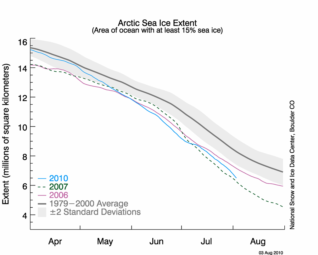
NSIDC published their sea ice news yesterday, and this one is definitely worth a read. Yesterday I pointed out that the graph below seems to be inconsistent with other data, including NSIDC maps.

http://nsidc.org/images/arcticseaicenews/20100804_Figure2.png
The problem is that the 2010 curve appears too close to 2007. Other data sources have the spread much larger, and NSIDC’s own maps show a larger spread. The area of green below represents regions of ice present in 2010, but not present in 2007. As of today, NSIDC maps show 10% more ice in 2010 than the same date in 2007.

Walt Meier from NSIDC responded with this remark :
4. Our sea ice maps are not an equal area projection. Thus one cannot compare extents by counting grid cells – this is probably the reason for the 7.5% vs. 3% discrepancy. Steve has been alerted to this issue in the past, but seems to have forgotten it.
What Dr. Meier seems to have forgotten is that pixels further from the pole in a polar map projection represent larger areas. Thus a correction would slightly increase the discrepancy, not decrease it. Sadly, DMI stopped updating their graphs two days ago – so I am no longer able top do comparisons between DMI 30% concentration and NSIDC 15% concentration. Their most recent graph shows 2010 well above 2007, and close to 2006.

Another data source – JAXA. The gap between 2010 and 2007 has been decreasing in NSIDC 15% concentration data, but has been increasing in JAXA 15% concentration data.


———————————————————————————————————————-
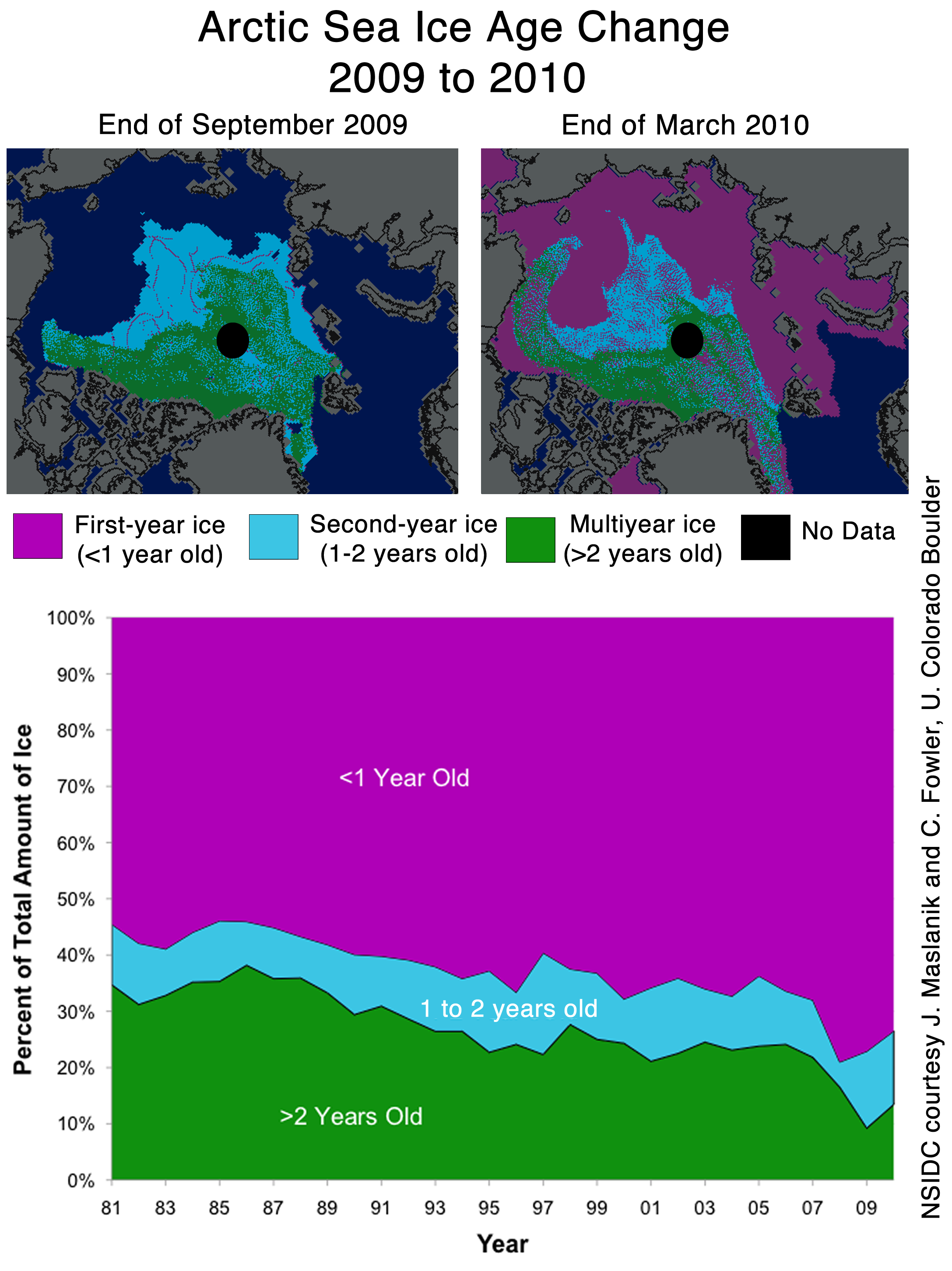
The next item which caught my attention is the discussion of multi-year ice.
Older, thicker ice melting in the southern Beaufort Sea
This past winter’s negative phase of the Arctic Oscillation transported old ice (four, five, and more years old) from an area north of the Canadian Archipelago. The ice was flushed southwards and westward into the Beaufort and Chukchi seas, as noted in our April post. Ice age data show that back in the 1970s and 1980s, old ice drifting into the Beaufort Sea would generally survive the summer melt season. However, the old, thick ice that moved into this region is now beginning to melt out, which could further deplete the Arctic’s remaining store of old, thick ice. The loss of thick ice has been implicated as a major cause of the very low September sea ice minima observed in recent years.
The blink comparator below shows the changes in multi-year ice between the end of March and the end of July.

The multi-year ice has largely survived the summer so far. Pixel counts show that ice greater than two years old has dropped by 11%, and ice between one and two years old has dropped by 4%. (These numbers are slightly low because of the distortion described above.) Most of the ice lost has probably been transported out the Fram Straight near Greenland, rather than melted in situ. The ice in the Beaufort Sea has split and moved north and west.
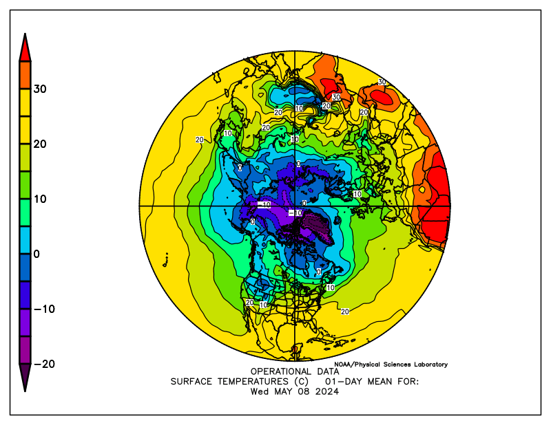
What about the future? The remaining multi-year ice in the Beaufort Sea is largely contained in areas which have dropped below freezing, and are forecast to remain below freezing for the next two weeks. The image below blinks between multi-year ice and current temperatures. Blue indicates below freezing temperatures.

The NCEP forecast below shows freezing temperatures over the ice for most of the remainder of the Arctic summer.

http://wxmaps.org/pix/temp2.html
It appears that the vast majority of the multi-year ice will survive this summer – just as it did in the 1970s and 1980s. The language in the NSIDC article seems to indicate that something fundamental has changed. I don’t see much evidence of that. In fact, given the large amount of 1-2 year old ice, we should see an increase in the amount of MYI next year.
Ice age data show that back in the 1970s and 1980s, old ice drifting into the Beaufort Sea would generally survive the summer melt season. However, the old, thick ice that moved into this region is now beginning to melt out, which could further deplete the Arctic’s remaining store of old, thick ice. The loss of thick ice has been implicated as a major cause of the very low September sea ice minima observed in recent years.
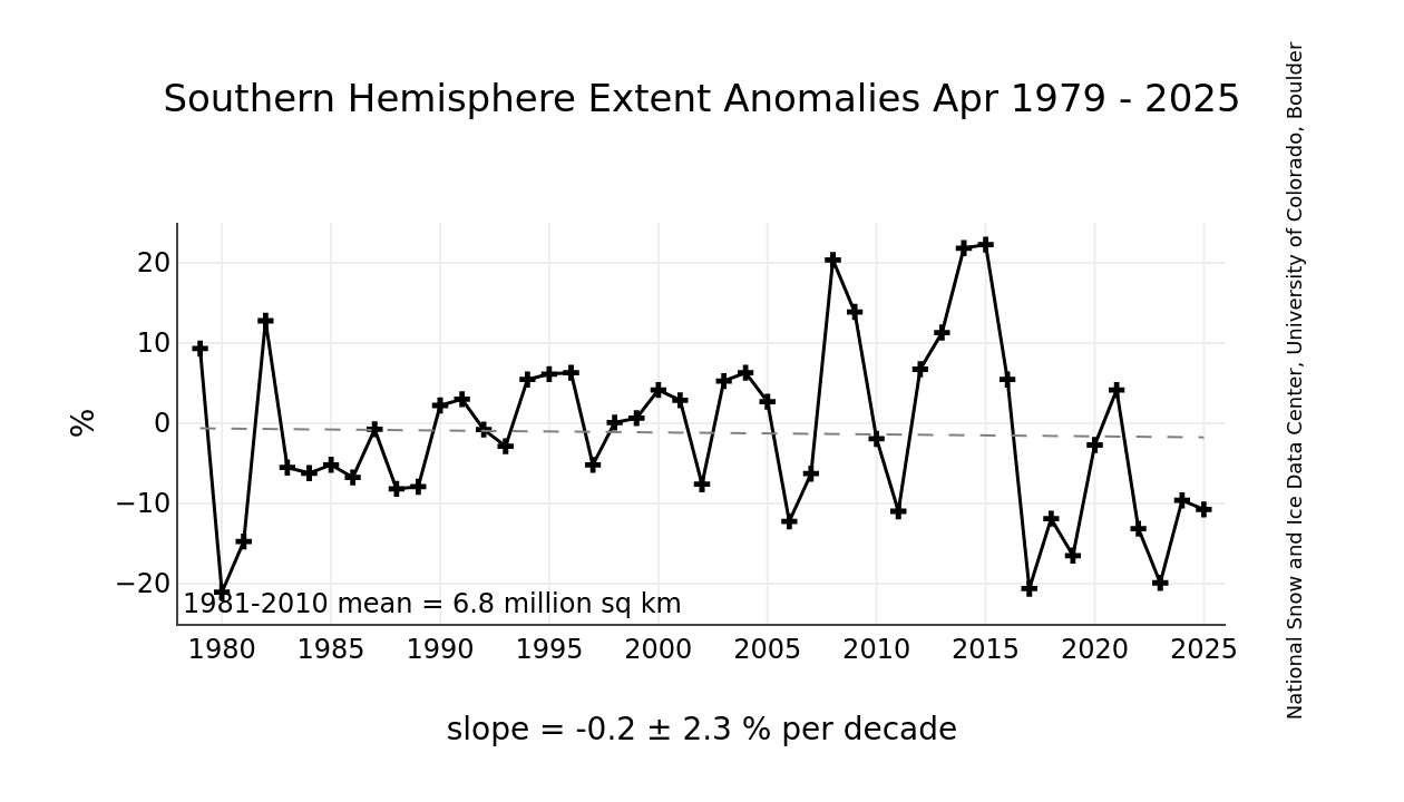
And no mention of the record high ice extent in Antarctica.

http://nsidc.org/data/seaice_index/images/s_plot_hires.png
I have alerted Dr. Meier to most of these issues by E-mail.
Maybe the next hot topic after minimum is reached will be how far into negative anomaly will temperatures go from the La Nina.
Sorry, that equation should be 100m*2C*specific heat/latent heat (=100*2*4000/200,000=4).
Eric Flesch:
Here’s a projection with scale shown, which appears to match the NSIDC map.
http://www.arctic.ac.uk/images/polar_projection.jpg
Which I think means that your are correct regarding the direction of the distortion.
“Looks like DMi has updated” – indeed. I was informed a couple of hours ago by DMI (Gorm Dybkjær who was previously (favo[u]rably) mentioned here?) that a minor technical ‘glitch’ had been corrected this morning.
steveta_uk says:
August 6, 2010 at 3:49 am
Here’s a projection with scale shown, which appears to match the NSIDC map.
http://www.arctic.ac.uk/images/polar_projection.jpg
__________________________________________________________-
That is a great map to compare to this one
http://www.heritage.nf.ca/exploration/vmap.html
“[A] Late 16th century world map based on Icelandic writings.
This map by Sigurd Stefánsson, a schoolmaster who taught at Skálholt, dates from the 1500s. The western hemisphere place names were derived from information contained in old Icelandic writings. Although the original map has not survived, this reproduction was published in 1706 by Torfæus from ‘Gronlandia Antiqua.'”
The pixel distortion argument is nothing but a distraction and a diversion. The effect is minor at high latitudes and does not account for the large discrepancy. Something else is going on.
If the data from satellites passing over the Arctic is capable of misinterpretation to the extent under discussion here, then how can we rely on the temperature data produced by satellites to measure the warming or otherwise of the surface of Earth?
If the State servants who propound alarmist conclusions have egos as large as some who post so eloquently here, then I suspect the whole gamut might well be described as much ado about nothing.
However, many pleasant hours can be spent here monitoring the ebb and flow of argument earnestly and politely put forward, on all the topics that Anthony choses to feed us.
Angels and pinheads anyone?
Has anyone revised the 1979-2000 average?, could you get an older average?
rbateman said:
August 5, 2010 at 11:01 pm
“Better have a 2nd look at that graphic of Antarctic Sea Ice Anomaly.
The average is the brown number. The present measurement is the blue number.
The present measurement is greater than the average, or positive.
The red number is the positive anomaly reading, currently rising once again at 0.893M km2”
———
I know it is still positive but it has halved recently, I fully expect it to be near normal again around or just after maxima and the melt season starts.
Andy
Steve,
How do you know that – have you calculated it? You may want to brush up on your geometry if you think correction for a geographic projection is not important in a comparison. If you’re not willing to do it, send me your pixel data (lat/long) and I’ll calculate it. By my estimation, the scale factor of pixels at 70 degrees latitude is 3%. There’s your difference right there!
Or you can read about it yourself: http://nsidc.org/data/polar_stereo/ps_grids.html, keeping in mind that:
map scale factor = ( 1 + sinΦ_0 ) / ( 1 + sinΦ )
where Φ_0 is the map projection latitude, and Φ is the latitude of interest.
“Daily Updated Time series of Arctic sea ice area and extent derived from SSMI data provided by NERSC” uses 15%. Their charts don’t appear to agree with NSIDC and they are using a 12 month vs 5 month time frame.
http://arctic-roos.org/observations/satellite-data/sea-ice/ice-area-and-extent-in-arctic
Matt
Look at the map. There is a lot more ice in 2010 than there was in 2007.
http://climateinsiders.files.wordpress.com/2010/08/nsidcaugust032010vs2007.png?w=510&h=344&h=344
Specifically, ice is covering large areas of the East Siberian Sea which were not covered in 2007. This is not rocket science.
No, but this is science. If you want to claim that there’s something wrong or dishonest about the 3% difference in NSIDC ice extents, you’re going to have to do better than telling me to ‘look at the map and eyeball it.’
I have a question, as I am not knowledgeable in this area at all, although I don’t believe in man-made global warming, I try to look at both sides. I do however get confused. I went to accuweather and there is a man who runs a blog on global warming. I will link his article below on this topic. Does your points dispute anything that they say? I do thank you for your time.
http://www.accuweather.com/blogs/climatechange/story/34647/expert-opinion-on-arctic-sea-i-1.asp
Matt
If you believe that pixel distortion is significant, feel free to do the math. You are the one who is concerned about it.
Matt
Has it occurred to you that your 3% distortion is going in the wrong direction? Pixels at 70N would be weighted heavier than pixels at 90N.
We have already been through this entire discussion on other recent threads, and I don’t have any inclination to repeat it here.
Arctic-ROOS, Jaxa, DMI, and the actual extent maps all agree there is significantly more ice in 2010 than 2007 (on the order of 10%). The NSIDC graph is the outlier amongst all the rest of the data, so clearly it is not a “pixel” argument or “you can’t just tell us to eyeball it”. Its pretty obvious there is a solid consensus amongst all the data with the one lone exception being the NSIDC graph.
However, if you look at today’s NSIDC graph, it appears to be diverging from 2007 again, though still closer than the other data sources.
Sean says:
August 6, 2010 at 8:39 am
Sean, your reference is to studies that just happened to coincide with a warm area of the Arctic this past winter (west coast of Greenland). I don’t think you can use it to understand the entire Arctic. This has been born out by the fact that the melting has not been anything out of the ordinary so far.
Thanks Richard M. Much appreciated.
Steve,
You’re the one complaining that the NSIDC plots are different than your analysis of the map – so the onus is on you to demonstrate that. If you’re not going to compare them correctly, then I’m going to keep being skeptical of your results.
And you’re wrong about the pixel count. The actual number of square meters will be larger than the calculated number of pixels. The ‘scale factor’ equation I used applies like this: Δprojected = scale_factor × Δearth
I’ll walk you through this: Using the equation I posted before, @ur momisugly 70N I get a scale_factor of 1.03. So 1 projected length unit = 1.03 earth length units. Now lets say for the sake of argument that 1 pixel at the pole equals 1 km^2. So from this relationship, for a pixel at 70N, we get 1 pixel = 1.07 km^2.
So lets pretend all the difference of ice occurs at 70N, and you find a difference of 100 pixels. The equivalent loss in m^2 is therefore 107 km^2, or a larger number than you originally estimated.
Steve, you aren’t using their raw data, you’re using a processed data product as input.
The bigger distortions probably come from the manipulation that they do to get the raw data onto pixels on that projection. Yes, their data is manipulated in that image. You’ve caught the fact that anyone taking raw data and creating a graphical projection of it like that inherently manipulates the data.
Pixel counting images like this is a stupid trick to try to impress the masses.
Matt-
Your calculation re the scale factor is correct.
There is a table of the scale factors for the stereographic projection in here (pg 172):
http://pubs.er.usgs.gov/djvu/PP/PP_1395.pdf
Matt
The excess ice in 2010 is (of course) at lower latitudes. So any correction would increase the weighting of those pixels and therefore increase the difference between 2010 and 2007.
Matt,
We went through all of this yesterday. You are not presenting any new information or ideas.