By Steven Goddard,
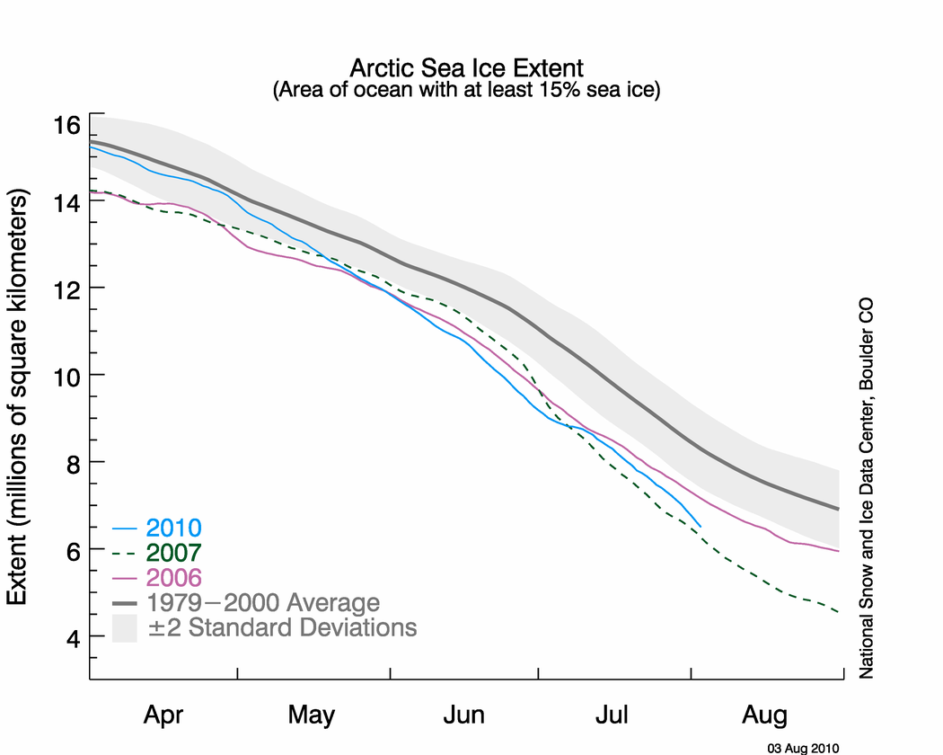
NSIDC published their sea ice news yesterday, and this one is definitely worth a read. Yesterday I pointed out that the graph below seems to be inconsistent with other data, including NSIDC maps.

http://nsidc.org/images/arcticseaicenews/20100804_Figure2.png
The problem is that the 2010 curve appears too close to 2007. Other data sources have the spread much larger, and NSIDC’s own maps show a larger spread. The area of green below represents regions of ice present in 2010, but not present in 2007. As of today, NSIDC maps show 10% more ice in 2010 than the same date in 2007.

Walt Meier from NSIDC responded with this remark :
4. Our sea ice maps are not an equal area projection. Thus one cannot compare extents by counting grid cells – this is probably the reason for the 7.5% vs. 3% discrepancy. Steve has been alerted to this issue in the past, but seems to have forgotten it.
What Dr. Meier seems to have forgotten is that pixels further from the pole in a polar map projection represent larger areas. Thus a correction would slightly increase the discrepancy, not decrease it. Sadly, DMI stopped updating their graphs two days ago – so I am no longer able top do comparisons between DMI 30% concentration and NSIDC 15% concentration. Their most recent graph shows 2010 well above 2007, and close to 2006.

Another data source – JAXA. The gap between 2010 and 2007 has been decreasing in NSIDC 15% concentration data, but has been increasing in JAXA 15% concentration data.


———————————————————————————————————————-
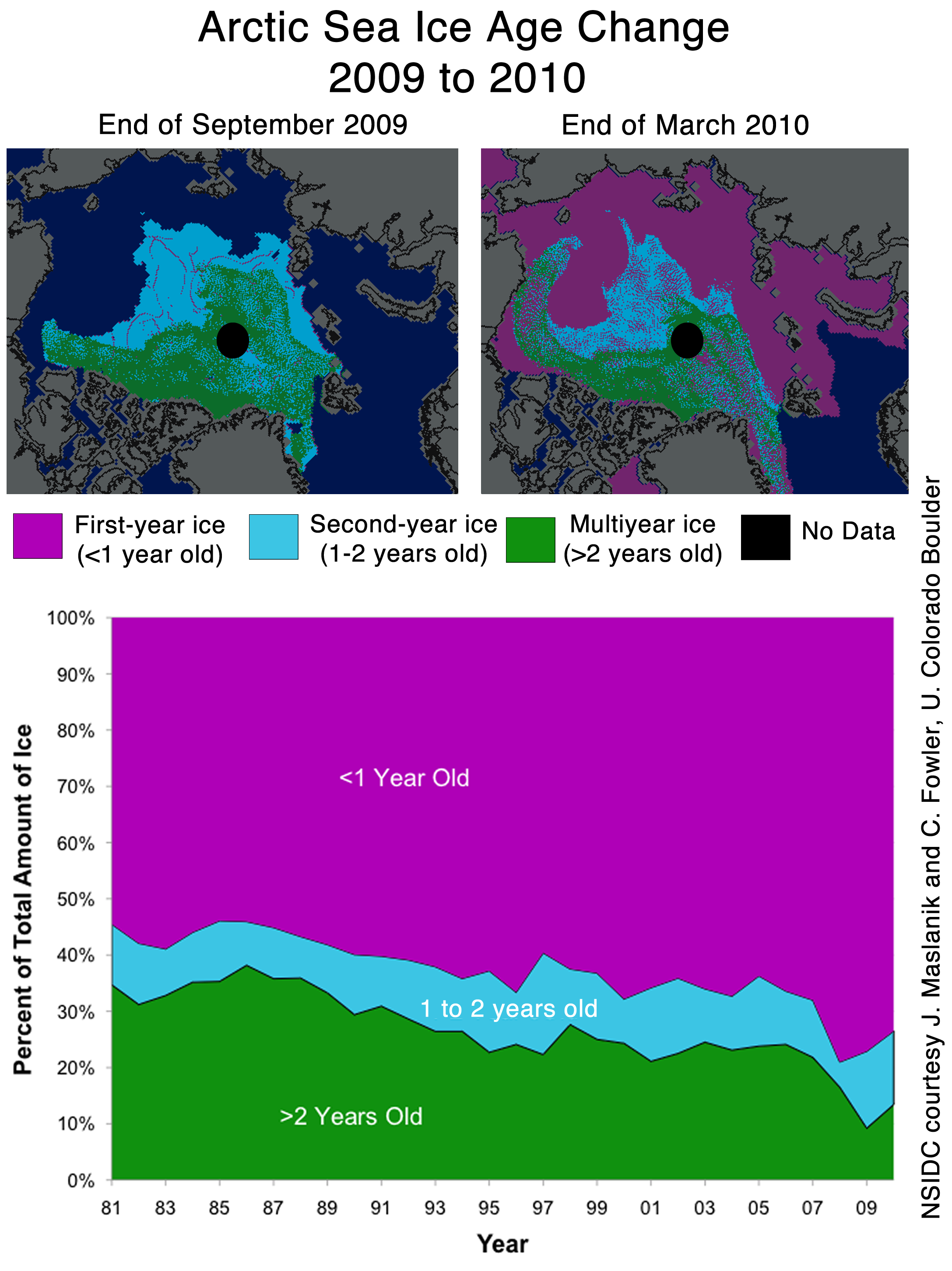
The next item which caught my attention is the discussion of multi-year ice.
Older, thicker ice melting in the southern Beaufort Sea
This past winter’s negative phase of the Arctic Oscillation transported old ice (four, five, and more years old) from an area north of the Canadian Archipelago. The ice was flushed southwards and westward into the Beaufort and Chukchi seas, as noted in our April post. Ice age data show that back in the 1970s and 1980s, old ice drifting into the Beaufort Sea would generally survive the summer melt season. However, the old, thick ice that moved into this region is now beginning to melt out, which could further deplete the Arctic’s remaining store of old, thick ice. The loss of thick ice has been implicated as a major cause of the very low September sea ice minima observed in recent years.
The blink comparator below shows the changes in multi-year ice between the end of March and the end of July.

The multi-year ice has largely survived the summer so far. Pixel counts show that ice greater than two years old has dropped by 11%, and ice between one and two years old has dropped by 4%. (These numbers are slightly low because of the distortion described above.) Most of the ice lost has probably been transported out the Fram Straight near Greenland, rather than melted in situ. The ice in the Beaufort Sea has split and moved north and west.
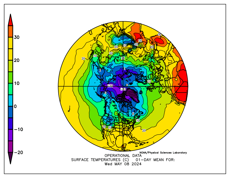
What about the future? The remaining multi-year ice in the Beaufort Sea is largely contained in areas which have dropped below freezing, and are forecast to remain below freezing for the next two weeks. The image below blinks between multi-year ice and current temperatures. Blue indicates below freezing temperatures.

The NCEP forecast below shows freezing temperatures over the ice for most of the remainder of the Arctic summer.

http://wxmaps.org/pix/temp2.html
It appears that the vast majority of the multi-year ice will survive this summer – just as it did in the 1970s and 1980s. The language in the NSIDC article seems to indicate that something fundamental has changed. I don’t see much evidence of that. In fact, given the large amount of 1-2 year old ice, we should see an increase in the amount of MYI next year.
Ice age data show that back in the 1970s and 1980s, old ice drifting into the Beaufort Sea would generally survive the summer melt season. However, the old, thick ice that moved into this region is now beginning to melt out, which could further deplete the Arctic’s remaining store of old, thick ice. The loss of thick ice has been implicated as a major cause of the very low September sea ice minima observed in recent years.
And no mention of the record high ice extent in Antarctica.

http://nsidc.org/data/seaice_index/images/s_plot_hires.png
I have alerted Dr. Meier to most of these issues by E-mail.
stevengoddard says:
“Pixels near the pole are perpendicular to the “camera” – so are seen as their correct area. As you move towards the equator, the earth curves away, each pixel area covers a much larger area of the earth’s surface.
So pixels further from the pole represent have to be weighted more than pixels near the pole.”
Here is a link to the projection used for the NSIDC sea ice data:
http://nsidc.org/data/polar_stereo/ps_grids.html
It’s a polar stereographic projection. The projection plane they use is 70 degrees latitude- not the pole!
That means there is no area distortion at 70 degrees. North of 70, areas are compressed (so each pixel covers a bigger area than actual). South of 70, areas are expanded (so each pixel covers a smaller area than actual).
Depending on the exact shape of the ice, and the relative proportions of ice above and below 70 degrees, counting pixels can give you very different results for the exact same ice area.
Dr. M is correct- Counting pixels just does not work.
Eric Flesch (August 5, 2010 at 10:01 pm)
Eric, that’s the second apology I owe you tonight. You’re absolutely correct, again. [I suspect that sentence came out wrong because I originally wrote the sentence about Steve Goddard’s claim contrasting it to yours, and then changed it because the sentence had become too tortuous — rather like this one.] I just messed up, no two ways about it.
And I think you’re being quite magnanimous in comparing me to royalty. Correct — incorrect — correct — incorrect — which sounds better?
(aside) Moderator, any chance of editing my post at 9:22 — striking out “Fleisch” and “incorrect”, replacing them with “Flesch” and “correct” resp.? If you can, thanks.
Chris V
Everyone counts one form of pixels or another – and in fact NSIDC teaches image pixel counting to their students. Pixel distortion is not the cause of the discrepancy.
REPLY: Pixel counting is used in many areas of science where imaging is involved. For example to estimate biomass:
A chromaticity-based technique for estimation of above-ground plant biomass
Tomasel, F.G.1,3*Paruelo, J.M.2,3Abras, G.4Ballarín, V.4Moler, E.4
1Departamento de Física, Facultad de Ingeniería, Universidad National de Mar del Plata, Juan B. Justo 4302, 7600 Mar del Plata, Argentina; 2IFEVA and Cátedra de Ecología, Facultad de Agronomía, Universidad de Buenos Aires, Av. San Martín 4453, 1417 Buenos Aires, Argentina 3Research Scientist of the Consejo National de Investigaciones Científicas y Técnicas (CONICET) 4Departamento de Ingeniería Electrónica, Facultad de Ingeniería, Universidad National de Mar del Plata, Juan B. Justo 4302, 7600 Mar del Plata, Argentina
ABSTRACT
Abstract. This paper presents a new and simple technique to derive quantitative estimates of green or dry biomass using colour information from digital pictures. This pixel-counting technique is based on the association of particular plant material with a representative region on a two-dimensional colour space, and applies to cases of non-overlapping canopies. The efficacy of the method is demonstrated using sets of samples obtained from both field and laboratory studies. It is shown that application of the proposed approach results in a highly linear relationship between pixel count and foliar area for both green and non-green material [r = 0.99 (p < 0.001)]. Analysis of images from a short-grass steppe shows a high correlation between pixel count and measured values of green biomass [r = 0.95 (p < 0.001)]. The method outlined here allows for a substantial improvement in the speed of sample evaluation to estimate biomass both in the field and in the laboratory. It also provides a non-destructive alternative to monitor plant cover and biomass in open canopies.
================
Weather Forecasting System Based on Satellite Imageries Using Neuro-fuzzy Techniques
(3) The Institute of Systems Science, National University of Singapore, 25 Heng Mui Keng Terrace, 119615 Singapore
Abstract
We have built an automated Satellite Images Forecasting System with Neuro-Fuzzy techniques. Firstly, Subtractive Clustering is applied on to a satellite image to extract the locations of the clouds. This is followed by Fuzzy C-Means Clustering which operates on the next satellite image, seeded with the cloud clusters of the previous image. With the matching of cloud clusters across successive images, cloud cluster velocities are deduced. Using a Generalized Regression Neural Network, we interpolate the cloud cluster velocities over the whole area of interest. Finally, the linear forecasting scheme then moves each cloud pixel in that satellite image according to the velocities of the past hour.
============
Navigation-related structural change in the hippocampi of taxi drivers
Image Analysis Method 2: Pixel Counting.
The three-dimensional images from the 16 taxi drivers and a precisely age-matched sample of 16 normal controls taken from the 50 used in the VBM analysis were submitted for region-of-interest-based volumetric measurement of both hippocampi by using a well established pixel-counting technique (12, 13).
======================
In all cases, the imager provided numeric data that became an image, the image was then pixel counted. It is no different with a satellite data image. Pixel counting is an accepted technique in many areas of science, engineering, and even in manufacturing product quality control. – Anthony
Chris V: excellent find of the website. The germane point is not that 70N is their projection plane — that just twiddles the distortion. No, the germane point is their “SSM/I Polar Spatial Coverage Maps” which shows that they do indeed use static longitude scale, i.e. the displayed distance between latitudes is the same, for all latitudes. Thus Steve’s premise that the map corresponded to a bird’s eye of the North Pole from infinity is wrong, and he has been adjusting in the wrong direction, as I previously described.
There is a lot more ice in 2010 than 2007. Period.
http://climateinsiders.files.wordpress.com/2010/08/nsidcaugust032010vs2007.png
stevengoddard-
If you want to count pixels to determine areas, you have go back to the equations for the map projection, and then apply an adjustment to each pixel depending on it’s longitude.
Sorry, but there’s no way around this.
I have no idea how much error your method produces, but until you do the math, you don’t know either.
Walt Meier from NSIDC responded with this remark : 4. Our sea ice maps are not an equal area projection. Thus one cannot compare extents by counting grid cells – this is probably the reason for the 7.5% vs. 3% discrepancy. Steve has been alerted to this issue in the past, but seems to have forgotten it.What Dr. Meier seems to have forgotten is that pixels further from the pole in a polar map projection represent larger areas. Thus a correction would slightly increase the discrepancy, not decrease it.
If the first map isn’t equal area, then it must be a gnomic projection, in which case pixels <grammar> farther </grammar> from the pole would represent smaller, not larger areas. This is much the way equator-centered Mercator projections make Greenland look so large. I don’t know that Dr Meier is right about it not being an equal area projection, though.
stevengoddard-
My criticism is not against pixel counting per se; it’s just not appropriate for what you’re using it for here.
To put it another way, the scale varies significantly across the NSIDC map- increasing away from the pole. Just changing the shape of the ice will give you different areas when calculated using the pixels.
Eric Flesch-
I have a bit of a map fetish…
“Sadly, DMI stopped updating their graphs two days ago – so I am no longer able top do comparisons between DMI 30% concentration and NSIDC 15% concentration” – I sent a mail to DMI this morning, asking for the reason why their 2010-plot hasn’t been updated since 3. August(?) No reply yet.
[snip]
[reply] Too much attribution of motive. Try a rewrite. RT-mod
NSIDC data is in a polar stereographic projection…it is true 25km around 70 latitude
It’s always like this when Climatologists or Meteorologists start talking about Cartography. An ice extent map on a non-equal area projection is completely useless. Polar projections can be whatever you wish them to be, the choice of central point is unrelated to the distortion. An azimuthal projection with central point on the North Pole will only exhibit the effect described by Anthony if it is a Stereographic or Gnomonic projection; Equidistant, Equal-Area or Orthographic projections will produce the exactly opposite effect.
Mathematical Cartography should feature heavily on any Climate or Meteorology superior course.
Anthony –
Nobody’s arguing against pixel counting – however, one must be sure to do the pixel counting accurately, while keeping units in mind.
In essence, Steve is reporting a 7% difference in the counts of square pixels. But he’s comparing this with the difference from the NSIDC plot which is in square km. So if he were to accurately convert square pixels to square km (not a 1:1 conversion), he will likely find the percent differences from the area projection and NSIDC plot will be much closer.
Sorry – wrote this too early in the morning. Second paragraph, first sentence in my last post should read: ‘In essence, Steve is reporting a 7% difference in the counts of square pixels compared to the number of square km.’
Clearly a comparison of apples to oranges.
Isn’t it the water temps that really count?
AFAIK, icesheets melt from the bottom up, rather than from top down.
Do we have a reliable reading of the actual water temperatures in said areas, and can we compare them to the water temps there in former years?
There would appear to be a case to suggest that your measurers from Boulder are required to show some difficulties ahead.
I use the word ‘required’ with care………….
Don’t know if this has been mentioned yet, but at the bottom of the NSIDC August 4th update is a link to the July SEAC update;
“The July Outlook for arctic sea ice extent in September 2010 shows some notable adjustments from the June Outlook, with both downward and upward revisions from last month.
Downward revisions reflect in part rapid ice loss observed during June together with the presence of the Arctic Dipole Anomaly (DA), which promotes clear skies, warm air temperatures, and winds that push ice away from coastal areas and encourages melt. Upward revisions reflect the slowdown of ice loss during the first two weeks of July and a change in atmospheric conditions to cooler, cloudier weather.
The July 2010 Sea Ice Outlook Report is based on a synthesis of 17 individual pan-Arctic estimates using a wide range of methods: statistical, numerical models, comparison with observations and rates of ice loss, composites of several approaches. Two contributors to the outlook represent “public” contributions.
Including all contributors, the individual Outlook values for September 2010 range from 1.0 to 5.6 million square kilometers, with a mean of 4.6 +/- 1.10 million square kilometers. Excluding the outlier of 1.0 million square kilometers by one of the public contributors gives a range of 4.0 to 5.7 million square kilometers, with a mean of 4.8 +/- 0.62 million square kilometers. This is below the 2009 minimum of 5.4 million square kilometers and just slightly above the 2008 minimum of 4.7 million square kilometers. Only three of the Outlook contributions give a value equal to or above the long-term linear trend line (5.6 and 5.7 million square kilometers, respectively). All of the estimates remain significantly below the 1979-2007 average of 6.7 million square kilometers, and six estimates indicate a new record minimum.
The spread of Outlook contributions suggests about a 29% chance of reaching a new September sea ice minimum in 2010 and only an 18% chance of an extent greater than the 2009 minimum (or a return to the long-term trend for summer sea ice loss). 53% of the Outlook contributions suggest the September minimum will remain below 5 million square kilometers, representing a continued trend of declining sea ice extent.”
http://www.arcus.org/search/seaiceoutlook/2010/july
If you look at the Cryosphere today maps in the WUWT sea ice pages the comparison between the 22/7/07 and 22/7/10 maps clearly show that the 7/10 ice extent is far greater. When one looks at the 03/08/10 picture nothing much seems to have changed in two weeks other then a bit of thinning. The pixel count issue is a red herring since the variances from year to year occur at roughly the same latitude. These pictures certainly seem to match the DMI graph.
Something fundamental has changed.
http://wattsupwiththat.com/2010/06/01/the-ice-who-came-in-from-the-cold/
The strong annual signal that Willis noted.
As we both agreed, if real, the NULL hypothesis is challenged.
DMI graph updated again, tracking 2009 trend.
http://ocean.dmi.dk/arctic/icecover.uk.php
“And no mention of the record high ice extent in Antarctica.”
Why should they? These people have an agenda. The media hardly ever reports of the ‘loss’ in the Arctic then balances it with record ice extent in Antarctica, i.e. nothing to shout about. Globa sea ice is unchanged over the past 30 years. Yet we get manufactured alarm about something that has happened numerous times in the past.
Looks like DMi has updated.
A question for Dr Meier: WHY are your sea ice extent maps not equal area? Doesn’t extent = area?
stevengoddard says:
August 5, 2010 at 9:17 pm
“The Arctic Ocean is stratified with layers of different densities due to the amount of dissolved salts. The more dense water stays near the bottom, and the less dense water stays near the top.”
That’s quite correct, but consider, how do the salinity differences arise? From the freezing and melting of ice.
Warm salt water passes under the ice, melting some of it. This simultaneously cools the water (which would make it sink) and dilutes it (which keeps it afloat despite the cooling). This “melting” continues until the temperature of this water layer is -2C. I put “melting” in quotes because the ice is only truly melting so long as the temperature is above 0C; between 0C and -2C it is dissolving into the solution. Thus you are correct in implying that a layer of cold water insulates the ice from the warmer layers, and that these layers mix only weakly. However, in order for this mechanism to function at all, some melting of the ice must take place. It ameliorates the melting from underneath. It does not eliminate it.
If the depth of the chemocline is ~100m, as an earlier poster suggested, then the sea water could melt the equivalent of ~4m of ice from underneath in its passage across the arctic (100m*latent heat/specific heat). That 100m seems rather deep to me, and the linked gif would seem to suggest a figure less than 50m, though on the other hand the gradation of temperature below would imply that there is also a fair bit of mixing and the chemocline is not a hard boundary. Either way, this mechanism has the capacity to remove several metres of ice, which is far from trivial.
This is the 5th Arctic post this week, though one was about James Hansen’s Arctic temps and not ice. Close to 700 comments altogether. I suppose if you thought Arctic ice wasn’t worth blogging about you would see by now that people are paying attention to global warming predictions, Arctic ice being one of them.