By Steve Goddard
I like to watch the sea ice graphs as much as anyone, and have wondered how much value they have in forecasting the summer minimum. So I researched it a bit and discovered that their predictive power this early in the melt season is very poor. The DMI graph below highlights the problem:

http://ocean.dmi.dk/arctic/icecover.uk.php
Note that 2006 had the highest summer minimum, yet was lowest most of the winter and through part of the spring. The graph below shows the rsquared correlation between relative monthly ranking and September ranking, and indicates poor correlation prior to August 1.

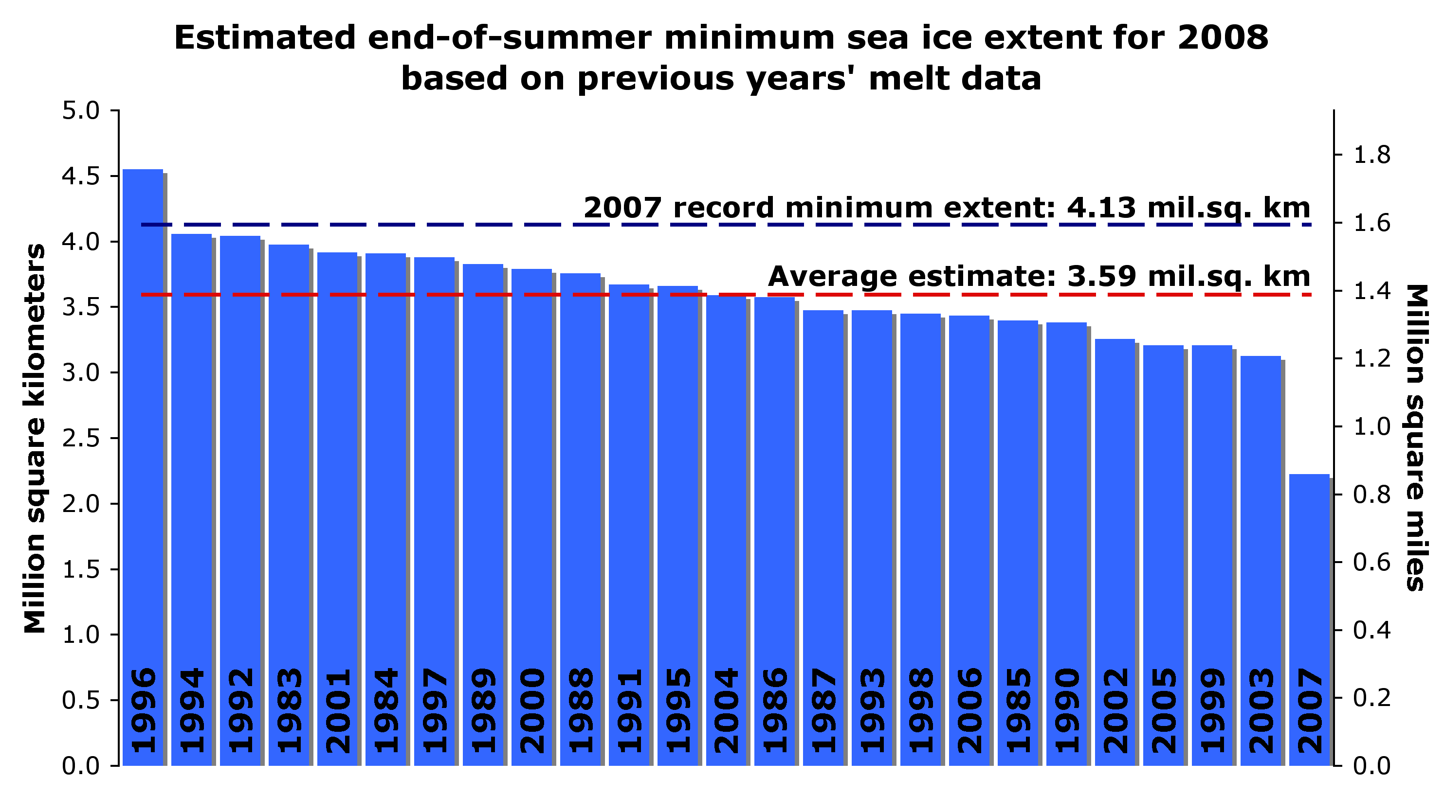
Conclusion: Prior to August 1, the graphs tell us just about nothing about how the summer minimum is likely to turn out. The fact that April, 2010 had the highest extent in the DMI record tells us little or nothing about the summer minimum. There are too many dependencies on ice thickness and summer weather to make a meaningful prediction based solely on the extent graphs. NSIDC has used other methods of prediction, and done poorly – such as this forecast of a record low made in May, 2008.

http://nsidc.org/images/arcticseaicenews/200805_Figure4.png
The Barrow Ice Observatory has studied the relationships between cloud cover and ice breakup date, and found some correlation, seen below. They believe breakup occurs after the ice has received 700 MJ/m² of solar energy. A sunny summer means an earlier breakup date. A cloudy summer means the ice will break up later. The three earliest breakup years occurred in 2002, 2003, and 2004. The last two years were among the latest.

It is also interesting to note how dirty the snow and ice is around Barrow. No doubt this is a contributing factor.

http://seaice.alaska.edu/gi/observatories/barrow_webcam
Discover more from Watts Up With That?
Subscribe to get the latest posts sent to your email.
A curiosity is that May/June and Dec/Jan seem to have the smallest inter-annual variation. These are near maximum and minimum points for insolation, but not temperature. Any speculation on why the variances gets so small?
It is an indicator of wind water currents and cloudiness? So they actual lines are very crooked. It must mean th ice is relevant in terms of general ranges but in detail, ignore it. We also have very few years of estimates gathered.
Gary
In June, the amount of ice is tightly constrained by the land surrounding it in the Arctic Basin and Hudson Bay.
“Any speculation on why the variances gets so small?”
I’ll take a stab at it Gary.
Even though there can be differences in max and min, when you look at the big picture…
……..they don’t mean squat
“It is also interesting to note how dirty the snow and ice is around Barrow”
Dirty how, and dirty why?
Is all arctic ice so dirty?
Local dirt, or transported dirt?
Looks like local dirt.
Ice breakup also depends on wind direction and strength. I witnessed a strong downslope wind clearing the ice from Northstar Bay and Wolstenholmfjiord at Thule in a few hours in July 1962.
I used to live in Boston and had a driveway to keep clear in the winter. Shovel early, shovel often.
Solar effects are very significant — get enough snow off the driveway that sun can get through the rest and warm the asphalt, and you’ll have dry pavement shortly after the next decent sunny hour or two. Just need to make sure meltwater from elsewhere doesn’t run across the cleared patch — it will freeze into a thin skating rink overnight.
If there’s dirt & sand mixed into the snow (common among crap kicked up by plows), it tends to concentrate on top of snow as the snow melts, which in turn accelerates the melting as it concentrates. I imagine you’ll get the same effect from soot.
What happened to albedo and water temp as factors. The AGW theorists used the reduced albedo in 2007 to predict increased ocean warming and the death spiral for arctic ice. I guess if it doesn’t spiral down inexorably, then it doesn’t spiral up either with increased extent. Perhaps there is some correlation of melt slope and freeze-up slope with El Nino-La Nina? What do you think, Steve?
The Next Big Thing to look for is what hapens at that second time tick in June – the summer solstice. That’s when the potential insolation for the high latitudes will be at maximum and the albedo effect most critical for the Arctic Ocean. So far on this record there has been little change at that stage from year to year. If there is a major departure one way or the other over the next two months the ocean surface will be receiving significantly more (less) solar radiation.
Caveats: There are obvious uncertainties in the ice cover numbers as given, and even after the radiation hits the water intricate feedback loops come into play.
That the maxima and minima have little correlation with each other is obvious once one notices that around 1 June, all years are very tightly bunched together. On the 1st of June, there is very little difference in ice extent from one year to another regardless of what the current year’s maximum extent was or what the prior year’s minimum was. In short, the graphs have absolutely no predictive skill at all, they are simply a reflection of what was and what is, not any indication of what things will be.
In fact, 15% ice extent is more an indication of storms rather than temperature. The more storms you have, the more the ice can get broken up and scattered. This can increase the 15% extent figure while actually breaking up the ice pack. The DMI 30% number is, in my opinion, a more accurate indication of the health of the ice pack and that number even more tightly bottlenecks at around 1 June than the 15% number does.
http://ocean.dmi.dk/arctic/icecover.uk.php
So why is the snow so dirty?
I wonder what thet hump is in june, in the JAXA plot. DMI doesnt have the june-hump.
It is also interesting to note how dirty the snow and ice is around Barrow. No doubt this is a contributing factor.
Watching the webcam video series (recommended), you can see the snow gets a lot dirtier when the underlying dirt roads start to come open due to plowing or spring melt. Don’t have that problem in Houston because all our roads are paved.
Gary says:
A curiosity is that May/June and Dec/Jan seem to have the smallest inter-annual variation. These are near maximum and minimum points for insolation, but not temperature. Any speculation on why the variances gets so small?
Those are the nodes between the high and low points on the curve. To change the nodes much within our fixed one-year oscillation frequency, you’d have to shift the max and min ice dates, or alter the slope of the curve between max and min.
Nice post Steve. Like any season of the year, each arctic ice season can be considered as weather, not climate, and the character of any individual melt season can’t be predicted from short term seasonal charts. However, longer term charts do have more robust predictive value, especially when used in combination with highly refined sea ice models. I would direct readers attention to three specific web sites. First, my favorite chart for looking at the long term state of arctic sea ice:
http://arctic.atmos.uiuc.edu/cryosphere/IMAGES/sea.ice.anomaly.timeseries.jpg
If you study this graph you do see the longer term downtrend in arctic sea ice. This is predicted by AGW models, however, some of those models predicted sea ice gone by 2100 or so, and that date has been moved forward to between 2030 and 2050. But models do not predict the exact sea ice extent for any given year– despite the pronoucement by one scientist of an ice free arctic by 2013. The “recovery” of the arctic sea ice in 2008/2009 was encouraging, if that was all that one looked at. Though no direct link as been found, I would relate this quasi-recovery almost entirely to:
1. The La Nina of that time period
2. The long and deep solar minimum of that same period
But more predictive of long term arctic sea ice is the volume of ice present, not extent. As we’ve seen from March’s “bump up” in extent, followed by a similar “bump down” in April-May, sea ice extent is highly variable. But volume, which measures sea ice in three-dimensions is far more important a predictor of future sea ice conditions, and the best chart we currently have for that is here:
http://psc.apl.washington.edu/ArcticSeaiceVolume/images/BPIOMASIceVolumeAnomalyCurrent.png
Yes, this is a model, but if you read the page it explains the validity of the model, and while I think it has some minor flaws, I do think it is telling the general direction of arctic sea ice volume very well. Such negative volume anomaly shows that the predictions of general arctic sea ice models of declining arctic sea ice year-to-year seem to be valid. For more on the best of the sea ice models. go here:
http://oceans11.lanl.gov/trac/CICE
So in general, Steve is quite right, this years sea ice chart early in the melt season has very little predictive value for where we’ll be at September’s minimum, but my prediction of 4.5 million sq. km. based on IJIS/JAXA (less than 2008/2009 but more than 2007) is not based on the current chart, but is based on:
1. The end of the solar minimum
2. The negative AO index that brought warm temps to the arctic this winter and kept multi-year ice relatively thin (lower volume). Areas such as the Barants sea were especially warm this winter, and that is of course, exactly where we’ve seen such a dramatic melt already this spring.
3. The general declining arctic sea ice volume on a historic basis (as shown in the chart referenced above.
The fact that we are currently below 2008 & 2009 means nothing and wasn’t the basis for my prediction as I made my prediction of the 4.5 million sq. km. summer low during the March “bump” up, when the 2010 ice was way more than 2008/2009 levels for the same period…
I am curious as to why the graph was ammended to exclude the 2003 maximum that shows up in the original graph available from [url=http://www.ijis.iarc.uaf.edu/en/home/seaice_extent.htm]IJIS[/url] it gives the appearance that 2010 had the highest ever maximum but it is surpassed by 2003.
graph
[url]http://www.ijis.iarc.uaf.edu/seaice/extent/AMSRE_Sea_Ice_Extent.png[/url]
So the real question is…what drives Arctic cloud cover? It appears to be another indicator that Roy Spencer is right: it is the cloud cover that is in control of the temperature and ice, not the temperature controlling the ice and the cloud cover, as most of the AGW crisis climate community insists.
We need to learn more about cloud cover and what regulates it. More specifically, we need to determine a mean cloud cover for regions and the globe, then determine the factors that make it more or less cloudy. Initially, it seems likely that it is the ever present ocean circulations that are driving cloud cover, with perhaps a cosmic ray factor involved.
Quick question. When you look at the IJIS graph then there is a little blip just before the start of June where the extent of sea ice increases for a short time. Can anyone tell me why this is?
Steve – below is your March 31, 2010 post. I may be getting the wrong impression, but you certainly seemed more positive about this data set when the graph was going up. Time will tell what the minimum ice extenct will be for 2010 and, as the NSIDC trend shows, it will most likely indicate a minimum extent well below the 1979-2000 marker used by the study.
Arctic Sea Ice about to hit ‘normal’ – what will the news say?
By Steven Goddard and Anthony Watts
Barring an about face by nature or adjustments, it appears that for the first time since 2001, Arctic Sea ice will hit the “normal” line as defined by the National Snow and Ice Data Center (NSIDC) for this time of year.
NSIDC puts out an article about once a month called the Sea Ice News. It generally highlights any bad news they can find about the disappearance of Arctic ice. Last month’s news led with this sentence.
In February, Arctic sea ice extent continued to track below the average, and near the levels observed for February 2007.
But March brought good news for the Polar Bears, and bad news for the Catlin Expedition and any others looking for bad news. Instead of ice extent declining through March like it usually does, it continued to increase through the month and is now at the high (so far) for the year.
If it keeps this trend unabated, in a day or two it will likely cross the “normal” line.
stevengoddard says: “…In June, the amount of ice is tightly constrained by the land surrounding it in the Arctic Basin and Hudson Bay.”
Duh.
Arctic Sea-ice melt makes no difference to sea-level but has now for some years become the flag waver for ‘proving’ Global Warming and quite illogically used as a popular ‘proof’ that it is all man made. But this is one of several hostages to fortune that can be found in the tabloid science of Global Warming hysteria. As normal fluctuations produce upswings as well as downswings in the extent of Arctic ice public scepticim will grow.
But be warned. The AGW crowd already have their excuses all prepared. If Arctic ice shows another uptick this year it will all be down to the Iceland volcano. Without that volcano there would have been so much less ice and we would all have been so much warmer, honest.
crosspatch
If the maximum is related to cold winter temperatures. then it will also affect the minimum – because the ice will be thicker. The fact that area is fairly constant in June doesn’t tell you anything about thickness.
DMI (30%) and NSIDC (15%) are tracking each other very closely.
u.k.(us)
I flew over Greenland during the late summer 2007 Armageddon, and the ice was filthy for many miles on the western side. Dirty snow/ice plays a big part in Arctic melting.
Winter sea ice extent has NOTHING to do with the end-of-summer ice extent. Scientists who work on sea ice have known this for years. Nice to see Steve finally realizes it as well. So then what’s up with the constant postings that the ice is recovering when you realize that it doesn’t depend on the winter ice extent?
That is the dirtiest I have seen the snow around Barrow. Wonder if the volcanic eruption in Iceland has resulted in more soot deposited this spring. Could also be related to earlier snow melt over the land and winds transporting dust over the ice. Either way, dirty snow speeds up melt…
Steve, there are several papers that discuss sea ice prediction and what variables give the most predictive skill. Winter ice extent is not one of them. Ice thickness and summer circulation patterns remain the main drivers defining the September ice extent, and since summer circulation patterns cannot be well-predicted, there really is no way of knowing right now what the summer ice extent will be. But model simulations do show that as the ice cover continues to thin, summer circulation becomes less important as a predictor variable. Might be good in your post to discuss some of these factors and reference some of the papers written on this topic…