by Willis Eschenbach
People keep saying “Yes, the Climategate scientists behaved badly. But that doesn’t mean the data is bad. That doesn’t mean the earth is not warming.”

Darwin Airport – by Dominic Perrin via Panoramio
Let me start with the second objection first. The earth has generally been warming since the Little Ice Age, around 1650. There is general agreement that the earth has warmed since then. See e.g. Akasofu . Climategate doesn’t affect that.
The second question, the integrity of the data, is different. People say “Yes, they destroyed emails, and hid from Freedom of information Acts, and messed with proxies, and fought to keep other scientists’ papers out of the journals … but that doesn’t affect the data, the data is still good.” Which sounds reasonable.
There are three main global temperature datasets. One is at the CRU, Climate Research Unit of the University of East Anglia, where we’ve been trying to get access to the raw numbers. One is at NOAA/GHCN, the Global Historical Climate Network. The final one is at NASA/GISS, the Goddard Institute for Space Studies. The three groups take raw data, and they “homogenize” it to remove things like when a station was moved to a warmer location and there’s a 2C jump in the temperature. The three global temperature records are usually called CRU, GISS, and GHCN. Both GISS and CRU, however, get almost all of their raw data from GHCN. All three produce very similar global historical temperature records from the raw data.
So I’m still on my multi-year quest to understand the climate data. You never know where this data chase will lead. This time, it has ended me up in Australia. I got to thinking about Professor Wibjorn Karlen’s statement about Australia that I quoted here:
Another example is Australia. NASA [GHCN] only presents 3 stations covering the period 1897-1992. What kind of data is the IPCC Australia diagram based on?
If any trend it is a slight cooling. However, if a shorter period (1949-2005) is used, the temperature has increased substantially. The Australians have many stations and have published more detailed maps of changes and trends.
The folks at CRU told Wibjorn that he was just plain wrong. Here’s what they said is right, the record that Wibjorn was talking about, Fig. 9.12 in the UN IPCC Fourth Assessment Report, showing Northern Australia:
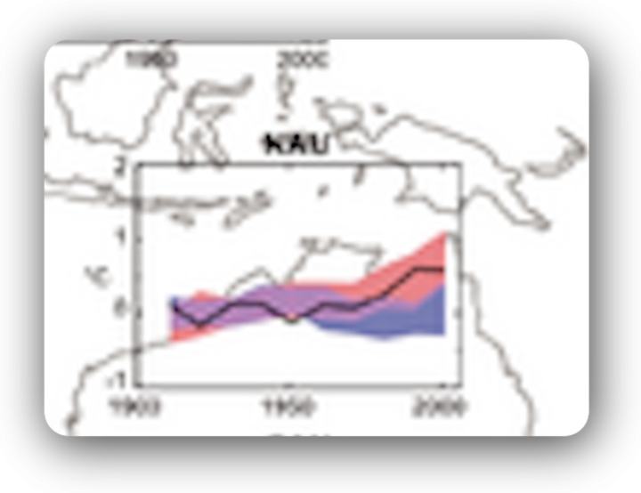
Figure 1. Temperature trends and model results in Northern Australia. Black line is observations (From Fig. 9.12 from the UN IPCC Fourth Annual Report). Covers the area from 110E to 155E, and from 30S to 11S. Based on the CRU land temperature.) Data from the CRU.
One of the things that was revealed in the released CRU emails is that the CRU basically uses the Global Historical Climate Network (GHCN) dataset for its raw data. So I looked at the GHCN dataset. There, I find three stations in North Australia as Wibjorn had said, and nine stations in all of Australia, that cover the period 1900-2000. Here is the average of the GHCN unadjusted data for those three Northern stations, from AIS:
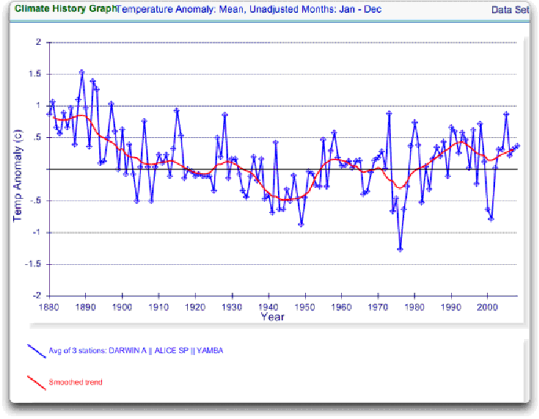
Figure 2. GHCN Raw Data, All 100-yr stations in IPCC area above.
So once again Wibjorn is correct, this looks nothing like the corresponding IPCC temperature record for Australia. But it’s too soon to tell. Professor Karlen is only showing 3 stations. Three is not a lot of stations, but that’s all of the century-long Australian records we have in the IPCC specified region. OK, we’ve seen the longest stations record, so lets throw more records into the mix. Here’s every station in the UN IPCC specified region which contains temperature records that extend up to the year 2000 no matter when they started, which is 30 stations.
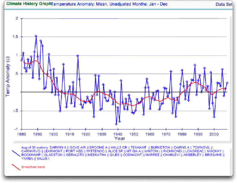
Figure 3. GHCN Raw Data, All stations extending to 2000 in IPCC area above.
Still no similarity with IPCC. So I looked at every station in the area. That’s 222 stations. Here’s that result:
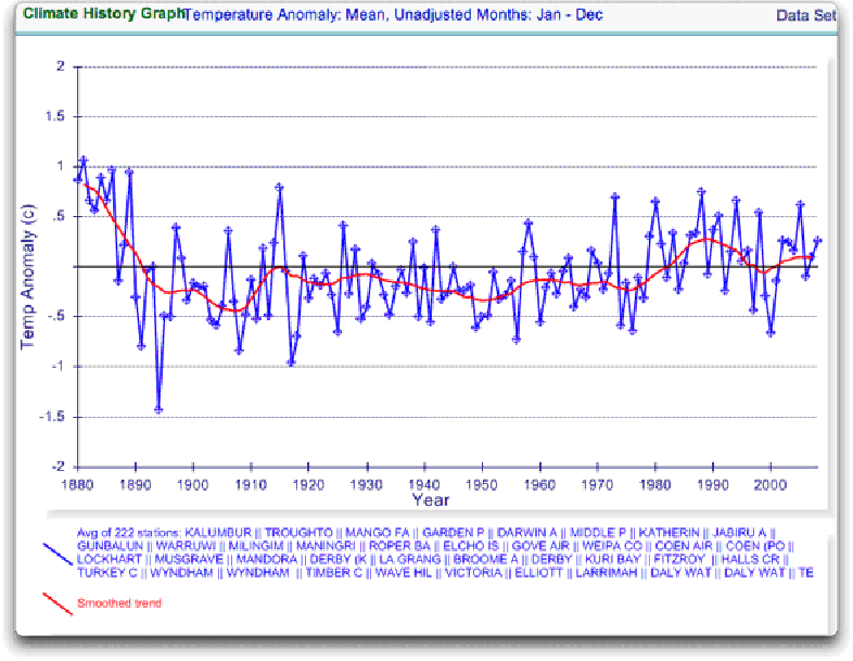
Figure 4. GHCN Raw Data, All stations extending to 2000 in IPCC area above.
So you can see why Wibjorn was concerned. This looks nothing like the UN IPCC data, which came from the CRU, which was based on the GHCN data. Why the difference?
The answer is, these graphs all use the raw GHCN data. But the IPCC uses the “adjusted” data. GHCN adjusts the data to remove what it calls “inhomogeneities”. So on a whim I thought I’d take a look at the first station on the list, Darwin Airport, so I could see what an inhomogeneity might look like when it was at home. And I could find out how large the GHCN adjustment for Darwin inhomogeneities was.
First, what is an “inhomogeneity”? I can do no better than quote from GHCN:
Most long-term climate stations have undergone changes that make a time series of their observations inhomogeneous. There are many causes for the discontinuities, including changes in instruments, shelters, the environment around the shelter, the location of the station, the time of observation, and the method used to calculate mean temperature. Often several of these occur at the same time, as is often the case with the introduction of automatic weather stations that is occurring in many parts of the world. Before one can reliably use such climate data for analysis of longterm climate change, adjustments are needed to compensate for the nonclimatic discontinuities.
That makes sense. The raw data will have jumps from station moves and the like. We don’t want to think it’s warming just because the thermometer was moved to a warmer location. Unpleasant as it may seem, we have to adjust for those as best we can.
I always like to start with the rawest data, so I can understand the adjustments. At Darwin there are five separate individual station records that are combined to make up the final Darwin record. These are the individual records of stations in the area, which are numbered from zero to four:

Figure 5. Five individual temperature records for Darwin, plus station count (green line). This raw data is downloaded from GISS, but GISS use the GHCN raw data as the starting point for their analysis.
Darwin does have a few advantages over other stations with multiple records. There is a continuous record from 1941 to the present (Station 1). There is also a continuous record covering a century. finally, the stations are in very close agreement over the entire period of the record. In fact, where there are multiple stations in operation they are so close that you can’t see the records behind Station Zero.
This is an ideal station, because it also illustrates many of the problems with the raw temperature station data.
- There is no one record that covers the whole period.
- The shortest record is only nine years long.
- There are gaps of a month and more in almost all of the records.
- It looks like there are problems with the data at around 1941.
- Most of the datasets are missing months.
- For most of the period there are few nearby stations.
- There is no one year covered by all five records.
- The temperature dropped over a six year period, from a high in 1936 to a low in 1941. The station did move in 1941 … but what happened in the previous six years?
In resolving station records, it’s a judgment call. First off, you have to decide if what you are looking at needs any changes at all. In Darwin’s case, it’s a close call. The record seems to be screwed up around 1941, but not in the year of the move.
Also, although the 1941 temperature shift seems large, I see a similar sized shift from 1992 to 1999. Looking at the whole picture, I think I’d vote to leave it as it is, that’s always the best option when you don’t have other evidence. First do no harm.
However, there’s a case to be made for adjusting it, particularly given the 1941 station move. If I decided to adjust Darwin, I’d do it like this:
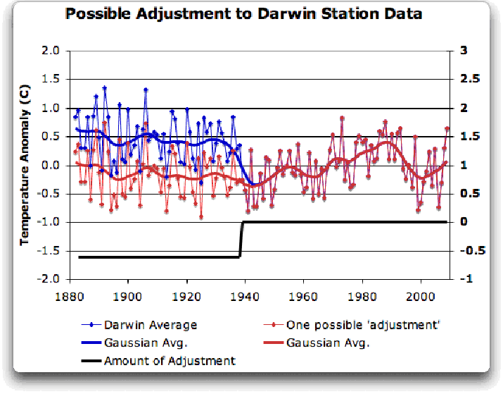
Figure 6 A possible adjustment for Darwin. Black line shows the total amount of the adjustment, on the right scale, and shows the timing of the change.
I shifted the pre-1941 data down by about 0.6C. We end up with little change end to end in my “adjusted” data (shown in red), it’s neither warming nor cooling. However, it reduces the apparent cooling in the raw data. Post-1941, where the other records overlap, they are very close, so I wouldn’t adjust them in any way. Why should we adjust those, they all show exactly the same thing.
OK, so that’s how I’d homogenize the data if I had to, but I vote against adjusting it at all. It only changes one station record (Darwin Zero), and the rest are left untouched.
Then I went to look at what happens when the GHCN removes the “in-homogeneities” to “adjust” the data. Of the five raw datasets, the GHCN discards two, likely because they are short and duplicate existing longer records. The three remaining records are first “homogenized” and then averaged to give the “GHCN Adjusted” temperature record for Darwin.
To my great surprise, here’s what I found. To explain the full effect, I am showing this with both datasets starting at the same point (rather than ending at the same point as they are often shown).
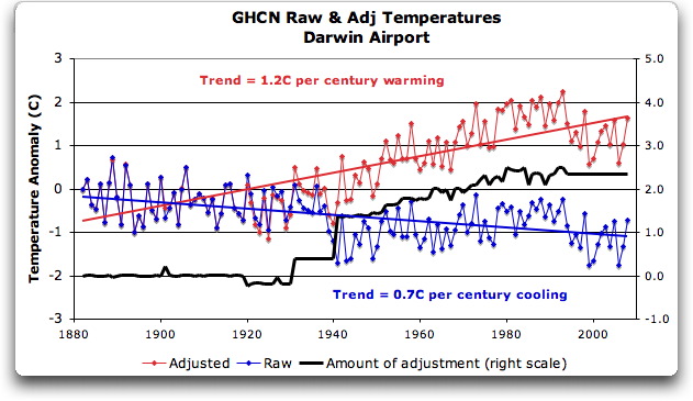
Figure 7. GHCN homogeneity adjustments to Darwin Airport combined record
YIKES! Before getting homogenized, temperatures in Darwin were falling at 0.7 Celcius per century … but after the homogenization, they were warming at 1.2 Celcius per century. And the adjustment that they made was over two degrees per century … when those guys “adjust”, they don’t mess around. And the adjustment is an odd shape, with the adjustment first going stepwise, then climbing roughly to stop at 2.4C.
Of course, that led me to look at exactly how the GHCN “adjusts” the temperature data. Here’s what they say
GHCN temperature data include two different datasets: the original data and a homogeneity- adjusted dataset. All homogeneity testing was done on annual time series. The homogeneity- adjustment technique used two steps.
The first step was creating a homogeneous reference series for each station (Peterson and Easterling 1994). Building a completely homogeneous reference series using data with unknown inhomogeneities may be impossible, but we used several techniques to minimize any potential inhomogeneities in the reference series.
…
In creating each year’s first difference reference series, we used the five most highly correlated neighboring stations that had enough data to accurately model the candidate station.
…
The final technique we used to minimize inhomogeneities in the reference series used the mean of the central three values (of the five neighboring station values) to create the first difference reference series.
Fair enough, that all sounds good. They pick five neighboring stations, and average them. Then they compare the average to the station in question. If it looks wonky compared to the average of the reference five, they check any historical records for changes, and if necessary, they homogenize the poor data mercilessly. I have some problems with what they do to homogenize it, but that’s how they identify the inhomogeneous stations.
OK … but given the scarcity of stations in Australia, I wondered how they would find five “neighboring stations” in 1941 …
So I looked it up. The nearest station that covers the year 1941 is 500 km away from Darwin. Not only is it 500 km away, it is the only station within 750 km of Darwin that covers the 1941 time period. (It’s also a pub, Daly Waters Pub to be exact, but hey, it’s Australia, good on ya.) So there simply aren’t five stations to make a “reference series” out of to check the 1936-1941 drop at Darwin.
Intrigued by the curious shape of the average of the homogenized Darwin records, I then went to see how they had homogenized each of the individual station records. What made up that strange average shown in Fig. 7? I started at zero with the earliest record. Here is Station Zero at Darwin, showing the raw and the homogenized versions.
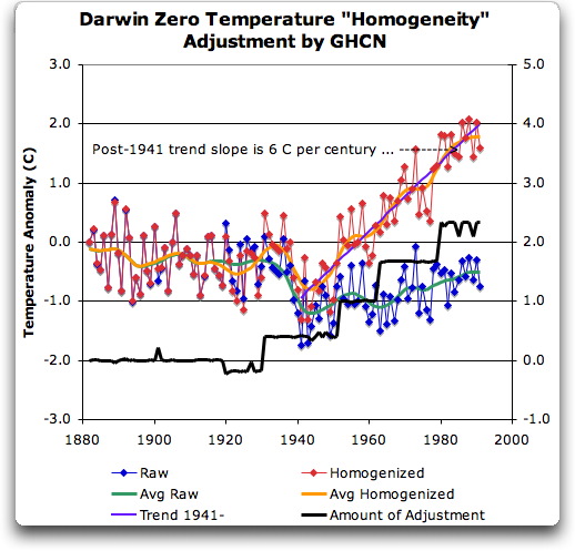
Figure 8 Darwin Zero Homogeneity Adjustments. Black line shows amount and timing of adjustments.
Yikes again, double yikes! What on earth justifies that adjustment? How can they do that? We have five different records covering Darwin from 1941 on. They all agree almost exactly. Why adjust them at all? They’ve just added a huge artificial totally imaginary trend to the last half of the raw data! Now it looks like the IPCC diagram in Figure 1, all right … but a six degree per century trend? And in the shape of a regular stepped pyramid climbing to heaven? What’s up with that?
Those, dear friends, are the clumsy fingerprints of someone messing with the data Egyptian style … they are indisputable evidence that the “homogenized” data has been changed to fit someone’s preconceptions about whether the earth is warming.
One thing is clear from this. People who say that “Climategate was only about scientists behaving badly, but the data is OK” are wrong. At least one part of the data is bad, too. The Smoking Gun for that statement is at Darwin Zero.
So once again, I’m left with an unsolved mystery. How and why did the GHCN “adjust” Darwin’s historical temperature to show radical warming? Why did they adjust it stepwise? Do Phil Jones and the CRU folks use the “adjusted” or the raw GHCN dataset? My guess is the adjusted one since it shows warming, but of course we still don’t know … because despite all of this, the CRU still hasn’t released the list of data that they actually use, just the station list.
Another odd fact, the GHCN adjusted Station 1 to match Darwin Zero’s strange adjustment, but they left Station 2 (which covers much of the same period, and as per Fig. 5 is in excellent agreement with Station Zero and Station 1) totally untouched. They only homogenized two of the three. Then they averaged them.
That way, you get an average that looks kinda real, I guess, it “hides the decline”.
Oh, and for what it’s worth, care to know the way that GISS deals with this problem? Well, they only use the Darwin data after 1963, a fine way of neatly avoiding the question … and also a fine way to throw away all of the inconveniently colder data prior to 1941. It’s likely a better choice than the GHCN monstrosity, but it’s a hard one to justify.
Now, I want to be clear here. The blatantly bogus GHCN adjustment for this one station does NOT mean that the earth is not warming. It also does NOT mean that the three records (CRU, GISS, and GHCN) are generally wrong either. This may be an isolated incident, we don’t know. But every time the data gets revised and homogenized, the trends keep increasing. Now GISS does their own adjustments. However, as they keep telling us, they get the same answer as GHCN gets … which makes their numbers suspicious as well.
And CRU? Who knows what they use? We’re still waiting on that one, no data yet …
What this does show is that there is at least one temperature station where the trend has been artificially increased to give a false warming where the raw data shows cooling. In addition, the average raw data for Northern Australia is quite different from the adjusted, so there must be a number of … mmm … let me say “interesting” adjustments in Northern Australia other than just Darwin.
And with the Latin saying “Falsus in unum, falsus in omis” (false in one, false in all) as our guide, until all of the station “adjustments” are examined, adjustments of CRU, GHCN, and GISS alike, we can’t trust anyone using homogenized numbers.
Regards to all, keep fighting the good fight,
w.
FURTHER READING:
My previous post on this subject.
The late and much missed John Daly, irrepressible as always.
More on Darwin history, it wasn’t Stevenson Screens.
NOTE: Figures 7 and 8 updated to fix a typo in the titles. 8:30PM PST 12/8 – Anthony
Top marks to MikeF (12:45:43) : for pointing out that the following logic:
gg:
I have calculated the bias of adjustment for the *entire* CRU dataset. You find the result here. In short: there is no bias and no smoking gun.
Nick Stokes (03:53:25) :
gg (00:09:11) :
Congratulations. You seem to have done the calculation here that should have been done long ago. Not just one station, but all the stations plotted as a distribution of trend change induced by the adjustment. And if I’m reading it right, it’s symmetric. Adjustments are just as likely to be up as down, if you look at the whole set.
is fairly laughable.
Firstly, this condition becomes valid only when testing whether there was a trend FOR THE ENTIRE PLANET.
Even so, there still remains the question of whether all the adjustments (all over the world) were uniformly rigorous and of adequate quality? Evidence is now emerging that the probability of that being so is not very high.
This probabilistic aspect (by definition also contributing to confidence in any perceived trend) would no doubt get left right out of estimations of statistical degree of confidence in the trend. I can recall no discussion of this issue (as a contributor to confidence) in IPCC supporting reports.
Furthermore, this condition (of symmetry in the set of all adjustments) cannot, by definition, be made to apply to subsets of the whole database. One only needs to ask the question what happens when only certain important subsets of the entire CRU database e.g. regions are considered?
Is the test for bias of adjustments applied there as well (as it should rightly be)?
A good example would be some of the statistical work on regional temperature trends which went into 2008 CSIRO/BOM ‘Drought Exceptional Circumstances Report’. Again I can recall no discussion of this aspect of the Australian data in the above report.
In other words, where are the assessments of level of confidence in the adjustments metadata?
JohnV (12:25:46) :
“” You should read Giorgio’s study — he looked at the impact of the biases on the *trend*. To use your words, he looked at the “pivoting of the biases”.””
I know that’s what he claims, but I don’t think his analysis was thorough enough to have truly considered “trends” over time.
Still trying to get something.
In 1941, they moved the temperature gauge from a post office to an airport, where it remains today. (T / F)
They did no “adjustment” for this move. (T / F)
>”But I digress”
You certainly do, and it is a really bad strategy to engage in this kind of silliness. Trying to draw some lesson from the abbreviation of a URL? It’s a bit rich of you to fling accusations around that scientists are somehow cheating, when your “method” consists of attempting to read someone’s mind based on the URL of an article. That’s just divination or augury, crossed with ad-hominem; it’s certainly not anything based on observation or experiment.
Now to the actual substance of your rebuttal:
>”This might make sense if there were any “dramatic change in 1941″. But as I clearly stated in my article, there is no such dramatic change.”
>”LOOK AT THE DATA. There is no big change in January of 1941″
Ok, then what precisely did you mean by presenting a graph featuring this?
http://img152.imageshack.us/img152/5830/hereitiswhatdidyouthink.png
If you don’t understand that this sharp edge is what the guy was talking about, you simply haven’t understood nor rebutted what he was actually talking about, you’ve attacked some other line of argument that he didn’t present. Natty move, rhetorically speaking, but not actually relevant.
>”And you give your article the URL “trust_scientists””
No, he didn’t, and I can hardly believe you’re making such an issue over something so ridiculous. The URL was “given” by the requirements of HTTP: you can’t have a question mark in a URL. If it had been “trust_scientists%3f” how would that have changed your argument? Would you still have had one? You can’t prove facts about the historical truth of temperature records by use of sarcasm, that’s merely a populist appeal for support on emotive rather than rational grounds.
So: you missed the main point of the rebuttal, admitted it was correct and you were wrong about the other parts, and engaged in some childish wordplay and sarcasm. Do you have an actual defence, though? The main point: that you have cherry-picked one single outlying statistical fluctuation from a huge body of data, and present it as if it were the exemplar of all of the data, while simultaneously ignoring the fact that the statistical mechanisms are designed precisely to cope with and smooth out error variances over the entire corpus.
That, sir, is a pointless, meaningless, and in fact deceitful enterprise.
Something of interest among the e-mails. Don’t know if it pertains.
Hey, Jakarta is about the same latitude.
But hey, according to Aust. BOM metadata lists right now (December 2009) there simply is no Darwin data pre-January 1885.
So, sometime between July 2005 and December 2009 BOM have discarded 16 years of 19th century Darwin data. Curiouser and curiouser.
Just like; sometime after 1961 BOM ‘discarded’ at least 30-odd years of pre-Jan 1957 Oenpelli data.
Darwin: 12.4 deg. S ; 130.8 deg. E
Jakarta: 6.8 deg. S; 147.1 deg. E
Oh hey, Oenpelli: 12.3 deg. S ; 133.1 deg. E
Anyway, not to worry.
As gg and Nick Stokes have assured us – these adjustments all balance out. It’s all kosher. Honest Injun. Why would they lie to us?
Pssst, wanna buy a used car?
So Mr Eschenbach is not a scientist, but rather an amateur. No problem with being an amateur, however you need to make an effort to understand how science works. This is possible, and some people managed to reach the level of being regarded as a scientist.
How does Mr Eschenbach reply to
http://www.economist.com/blogs/democracyinamerica/2009/12/trust_scientists
Mr Eschenbach, if you have any new research, could you please try to publish first to a reputable journal (such as nature) and then make it public?
The ground that the denialists are standing on gets smaller, as it is flooded progressively.
It makes one think that the whole denialist fracas has more to with incompetence rather than malice.
As many have pointed out Darwin was bombed heavily in WW2. It should be noted that as a consequence there was a very large upgrade to the airport becoming an airbase. This was reversed in the post war period this could have produced a rise after 42 and a fall after 46 due to urban heat island effects of the airport/airbase its self. When I was there on an army exercise in the early 90’s there were grassed areas with what looked like old foundations.
Also WW2 defences included many structures, air craft and sand bag walls that can both protect the Stevenson screen from wind and afternoon sun, these can change the temperature but they are not good reasons for permanent changes. Your argument stands.
PS On war, Has anyone looked at whether weather men operating weather stations under occupation keep accurate records or mess with them hoping to mess up the enemy? I believe some French under German occupation sent one set of weather data to the Germans and one to the resistance. I can’t prove it. It was only one line in a documentary about free French resistance collecting vital weather data for the British but it should be asked. The 40’s were quite warm in some places but could those numbers have been understated or over stated in some cases? The same goes for many colonies in the 59’s and 60’s. Does the GHCN assess this? How would we check that their not using this as a excuse to move data up and down? Hope fully I’m wrong but data from war zones sounds a little doubtful to me.
Is it possible to detect a signal of 1 degree per century from data which has had adjustments 7 times greater added to it?
I’m no scientist but my logic says no.
steve
>year adjustment reason mildura
<1989 -0.6 move to higher ground
<1946 -0.9 move to airport
<1939 +0.4 new screen
<1930 +0.3 move from park
1943 +1.0 pile of dirt near screen
1903 +1.5 temporary site
1902 -1.0 problems with shelter
1901 -0.5 problems with shelter
1900 -0.5 problems with shelter
1892 +1.0 temporary site
1890 -1.0 detect
As the following are rounded to the nearset 0.5 of a degree i interpret the margin of error as = +- 0.2 degrees for each adjustment.
Compounded for each adjustment makes the data totally useless to detect global warming at the current consensus rate of 1 degree per century.
1943 +1.0 pile of dirt near screen
1903 +1.5 temporary site
1902 -1.0 problems with shelter
1901 -0.5 problems with shelter
1900 -0.5 problems with shelter
1892 +1.0 temporary site
1890 -1.0 detect
It is suggestive that the Darwin temperature has suffered the fate of the rest of the world to conform with the political opinion that the world is warming up from our present glacial one. In their perverted reasoning that is a bad thing but indicative that they are ignorant of past climates and the fossil record of past life extinction events. Climates have seldom been benign for extended periods of time as evidenced by the fact that 98+% of all species that have ever lived are now extinct. No mass extinctions have ever been attributed to our planet becoming too warm. All this villification of Greenhouse Gases of which carbon dioxide is an insignificant member, is the equivalent of “biting the hand that feeds you.” These stupid AGW zealots do not realize we need a warmer world. As long as we have ice in our polar regions we are at risk of slipping back into another major glaciation event. Lets face reality. We are still in a glacial climate, the Pleistocene. We are in the 5th interglacial period of a glaciation cycle that began only 1.75 million years ago and we do not know whether we have reached the end of the cycle or not. Weather is a geologic process that man has not the power to control. He can micromanage it for short terms at a trememdous cost, but ineffective in the longer term. Are you sure now that maintaining our ice capped poles are worth expending our last dime on?
“we’re going to run out of fossil fuel anyway, so why not find something better for that reason alone, …?”
Here’s a three-part solution I endorse, spelled out in a book called “Prescription for the Planet: The Painless Remedy for Our Energy & Environmental Crises,” whose details are outlined in the first reader-review, by G. Meyerson:
This book is a must read for people who want to be informed about our worsening energy and ecology crisis. Before I read this book, I was opposed to nuclear power for the usual reasons: weapons proliferation and the waste problem. But also because I had read that in fact nuclear power was not as clean as advertised nor as cost competitive as advertised and was, moreover, not a renewable form of energy, as it depends upon depleting stocks of uranium, which would become an especially acute problem in the event of “a nuclear renaissance.” Before I read this book, I was also of the opinion that growth economies (meaning for now global capitalism) were in the process of becoming unsustainable, that, as a consequence, our global economy would itself unravel due to increasing energy costs and the inability of renewable technologies genuinely and humanely to solve the global transport problem of finding real replacements for the billions of gallons of gasoline consumed by the global economy, and the billions more gallons required to fuel the growth imperative. I was thus attracted to the most egalitarian versions of Richard Heinberg’s power down/relocalization thesis.
Blees’ book has turned many of my assumptions upside down and so anyone who shares these assumptions needs to read this book and come to terms with the implications of Blees’ excellent arguments. To wit: the nuclear power provided by Integral Fast Reactors (IFR) can provide clean, safe and for all practical purposes renewable power for a growing economy provided this power is properly regulated (I’ll return to this issue below). The transportation problems can be solved by burning boron as fuel (a 100% recyclable resource) and the waste problem inevitably caused by exponential growth can be at least partially solved by fully recycling all waste in plasma converters, which themselves can provide both significant power (the heat from these converters can turn a turbine to generate electricity) and important products: non toxic vitrified slag (which Blees notes can be used to refurbish ocean reefs), rock wool (to be used to insulate our houses–it is superior to fiber glass or cellulose) and clean syngas, which can assume the role played by petroleum in the production of products beyond fuel itself. Blees’s discussion of how these three elements of a new energy economy can be introduced and integrated is detailed and convincing. Other forms of renewable energy can play a significant role also, though it is his argument that only IFRs can deal with the awesome scale problems of powering a global economy which would still need to grow. Tom’s critique of biofuels is devastating and in line with the excellent critiques proferred by both the powerdown people and the red greens (John Bellamy Foster, Fred Magdoff); his critique of the “hydrogen economy” is also devastating (similar to critiques by Joseph Romm or David Strahan); his critique of a solar grand plan must be paid heed by solar enthusiasts of various political stripes.
The heart of this book, though, really resides with the plausibility of the IFR. His central argument is that these reactors can solve the principal problems plaguing other forms of nuclear power. It handles the nuclear waste problem by eating it to produce power: The nuclear waste would fire up the IFRs and our stocks of depleted uranium alone would keep the reactors going for a couple hundred years (factoring in substantial economic growth) due to the stunning efficiency of these reactors, an efficiency enabled by the fact that “a fast reactor can burn up virtually all of the uranium in the ore,” not just one percent of the ore as in thermal reactors. This means no uranium mining and milling for hundreds of years.
The plutonium bred by the reactor will be fed back into it to produce more energy and cannot be weaponized due to the different pyroprocessing that occurs in the IFR reactor. In this process, plutonium is not isolated, a prerequisite to its weaponization. The IFR breeders can produce enough nonweaponizable plutonium to start up another IFR in seven years. Moreover, these reactors can be produced quickly (100 per year starting in 2015, with the goal of building 3500 by 2050)), according to Blees, with improvements in modular design, which would facilitate standardization, thus bringing down cost and construction lead time.
Importantly, nuclear accidents would be made virtually impossible due to the integration of “passive” safety features in the reactors, which rely on “the inherent physical properties of the reactor’s components to shut it down.” (129)
Blees is no shill for the nuclear industry and is in fact quite hostile to corporate power. He thinks that these IFRs must be both run and regulated by a globally accountable, international and public body of experts. Blees has in mind a global energy democracy in which profit would play minimal if any role. Blees realizes that democratizing energy in this way, including technology sharing, will be fought by vested interests. But he thinks that the severity of the climate crisis will persuade people of the necessity of global public ownership over energy resources. My greatest disagreements with this book focus on the scale of conflict that would emerge around such proposals. Blees’ energy democracy is a great idea, but I doubt the ruling elites would go for it no matter how much sense it makes. Blees is banking on the unique character of the climate crisis to convert a significant sector of our elites to humanity’s cause and not their class interests. Let’s hope he’s right, but I’m less optimistic that this revolution will be as “painless” as Blees suggests.
That said, Blees’s solutions make possible the kind of relatively clean growth I did not think was possible under current global regimes. Still, if such a new energy regime as Blees proposes can solve the climate crisis, this is not to say, in my opinion, that a growth regime is fully compatible with a healthy planet and thus a healthy humanity. There are other resources crucial to us–the world’s soils, forests and oceans come to mind–that a constantly expanding global economy can destroy even if we recycle all the world’s garbage and stop global warming.
Before I read this book, I did not think contemporary global capitalism could sustain itself for long, due to its pathological inequity and its seeming inability to solve the energy and ecological challenge. Blees’ book seems to offer immediate solutions to our energy and ecology problems while breathing new life into some kind of growth economy–whether that economy can rightly be called capitalist given its commitment to energy democracy and democratic planning is a question, perhaps, for Blees’s next book.“
Here’s the Amazon link:
http://www.amazon.com/Prescription-Planet-Painless-Remedy-Environmental/dp/1419655825/ref=sr_1_1?ie=UTF8&s=books&qid=1236568501&sr=1-1
This document published by CSIRO in 2008 on Processed Climate Data for Timber Service Life Prediction Modelling has many graphs of interest – in particular mean annual dry AND wet bulb temperature data for 132 Australian sites. Incidentally, it also identifies a significant number of Northern Territory sites where data was supposedly collected back into the early decades of the 20th century but for which records can no longer be accessed via BOM.
It is interesting to note that at the resolution scale of the graphs of annual dry and wet bulb temperature of all these sites in this document there are hardly any sites where any upward trend over the 32 year period 1965 – 1997 post can be discerned (at say the 1 C level) in BOTH dry and wet bulb temperatures.
The lack of a national trend in wet bulb temperatures over this 30 year plus late 20th century period is particular interesting. Perhaps the wet bulb temperature database has largely escaped ‘homogenization’ (;-).
http://www.timber.org.au/resources/ManualNo1-ClimateData.pdf
steve bunn (09:20:56)
Your missing what the notation means. All in your list are adjustments for one year only – no cumulative effect, and very little effect on trend. Only the top four in your first list affected more than one year.
Steve Short (21:10:53) :
In other words, where are the assessments of level of confidence in the adjustments metadata?
GHCN does not use metadata. It’s a change detection algorithm. That’s why, for example, it did not put a break exactly at 1941. The calc put it somewhere else.
The point of Giorgio’s analysis is that it generalises what Willis has done. He reported that Darwin’s adjustment added 1.9 C/century to the trend. GG has shown what happened to the other 6735 stations. Some went up, some down. 575 stations went up more than Darwin. That puts it in the upper tail. But in fact the tail contains mostly short records, where just one adjustment changes the trend a lot. Darwin is a real outlier among long data series.
Hey, DaveK (00:03:55) ,
You say:
It is you who have difficulties with comprehension here. The step change in your graph is in corrected data, as well as in correction that had been applied to the data. Raw data has no such change. Why would someone applied step change to data that doesn’t show any need for it? I guess you have to be “certified climate scientist” ™ or “official climate scientist helper” ™ to understand that (which one are you?)
Nick Stokes (14:23:11) :
Steve Short (21:10:53) :
In other words, where are the assessments of level of confidence in the adjustments metadata?
GHCN does not use metadata. It’s a change detection algorithm. That’s why, for example, it did not put a break exactly at 1941. The calc put it somewhere else.
There are essentially two types of adjustments as I see it:
(1) the adjustments made by the host country wherein the data originates. This may include a mix of judgements adjustments based on site changes etc.
(2) the change detection algorithmic adjustments done by GHCN etc.
Both of these types of these (retrospective) adjustments introduce an added reduced probability (below 100%) of inferred trends, global, meridional, regional etc being ‘real’.
My question is:
Where are are the studies which have attempted to evaluate the ‘efficacy’ (= level of confidence) of such adjustments (both types) against (say):
* Datasets which were not originally included – being ‘other less conventional sources’ e.g. mines, mission stations, large ranches, etc.
* Datasets which have been discarded for obscure reasons by national agencies. This seems to have been quite common in Australia for example – particularly in the post-1980 period – I’m starting to rack up a whole list now.
* More recent/alternative/improved algorithmic treatments e.g. humidity, pan evaporation…
* Modern satellite and sonde records.
Why can’t the ‘science’ of temperature trends over the last century or so we are being asked to implicitly accept produces its own body of (yes peer reviewed) QC/QA studies?
Everywhere I look one can easily detect signs of sloppy or dodgy retrospective corrections (in the homogenized datasets of GHCN and CRU) , and even with BOM whole chunks of now retrospectively missing data (yet referenced previously!!!) which would presumably have been ideal ‘fodder’ for regressions and algorithmic correction schemes.
IPCC should have established a whole section devoted just to the science of data handling and the maintenance of proper standards of core/key data manipulation from the outset. A sort of Quality Control Department.
IMO, given the implications of this madness of crowds (?) ‘paradigm’ it’s not good enough and as a scientist I suspect even you know it Nick. I’m tired of the weasel word diversions and apologetics for this flawed process now flooding the blogs.
You haven’t made any comment on the ‘Brisbane problem’. Another outlier?
Ah, comments are moderated, so thats why you seem to have so much support.
The paranoia shown here woulkd be funny if it was not sop serious.
If you hgad any balls at all you would allow unmoderated comments.
I’ve done a cursory analysis of the adjustment trends in GHCNv2 using different methods. It generally agrees with gg’s results.
That being said, it’s still possible for the adjustment process to introduce bias. Why? Because both gg and I analyzed the cumulative effect of the adjustments on the mean. However, the global average does not weight all stations equally. They are gridded. Therefore, the most remote stations have a greater effect than stations in densely measured areas. These remote stations are also going to be the most difficult to adjust because of the lack of nearby reference stations. So it is possible that the adjustment process could cause biases in this specific subset that would effect the gridded global average.
Personnally, I don’t think a problem will be found there, but I lack the tools to analyze it at that level, so I can’t confirm it. If someone else wants to try, we can move on to more likely sources of error.
My current line of inquiry is to look into the records that were dropped in the adjustment process. By my count, it’s about 28% of records after 1850, but that doesn’t tell the whole story. Between 1988 and 1995, the number of adjusted stations dropped 76% due to a general loss of stations, however loss of dropped stations was ‘only’ 52%. Because of that, every year thereafter there are more dropped stations than adjusted ones.
The thing that bugs me is that the dropped stations exhibit different average trends than the adjusted stations (raw or otherwise). Now, I don’t discount that the data from these stations may appear unreliable by someone’s measure, but in the quest for data quality, we may be unrepresenting entire regions of the globe and those instruments may be saying something different than the networks in the richer areas. Honestly, I don’t know. It’s going to take me a while to sort this out.
Does anyone know if there’s ever been a sensitivity analysis regarding which stations are dropped and which are adjusted?
Geoff Sherrington has found the historical metadata for this site. Turns out, it was online, after all.
I don’t see that he’s posted it here yet, so if I may, it’s in the alladj file here
ftp://ftp2.bom.gov.au/anon/home/bmrc/perm/climate/temperature/annual/
In case anybody is still confused, the GHCN does not use this metadata when it does homogenisation, but the ABoM does its own independent homogenisation, and it does consider the metadata.
So now, not only can we compare the results of the two different homogenisations, but we can see what sorts of actual physical things the GHCN statistical method is trying to sniff out.
Street (17:19:05) :
“My current line of inquiry is to look into the records that were dropped in the adjustment process. By my count, it’s about 28% of records after 1850, but that doesn’t tell the whole story. Between 1988 and 1995, the number of adjusted stations dropped 76% due to a general loss of stations, however loss of dropped stations was ‘only’ 52%. Because of that, every year thereafter there are more dropped stations than adjusted ones.
The thing that bugs me is that the dropped stations exhibit different average trends than the adjusted stations (raw or otherwise). Now, I don’t discount that the data from these stations may appear unreliable by someone’s measure, but in the quest for data quality, we may be unrepresenting entire regions of the globe and those instruments may be saying something different than the networks in the richer areas. Honestly, I don’t know. It’s going to take me a while to sort this out.
Does anyone know if there’s ever been a sensitivity analysis regarding which stations are dropped and which are adjusted?”
Exactly. As IPCC never bothered to put a data Quality Control system in process, how would they (or us) know the probabilistic effects (on confidence in any trend, up or down) of dropping all that data?
Yet, they still have the front to say they know there was 0.6 C rise over the 20th century ‘with a high degree of confidence”.
I also wonder about the rate ‘data dropping’ after 1998?
Just for interest, spaghetti graph of Darwin at
http://i260.photobucket.com/albums/ii14/sherro_2008/DARWIN_SPAGHETTI_2.jpg?t=1260775310
I have about 3 more series that might be added. The more spag, the merrier.
Needs to be bigger to appreciate the subtleties.
GISS unadjusted is yellow diamonds. KNMI is adopted from GISS adjusted. Need I say more? Like 3 degrees C of separation?
All from the one original set of obs.
carrot eater (20:13:35) :
You might add that I have questioned how you know that USA bodies receive raw data from the BOM Australia, as you asserted elsewhere. Until you can prove that, the jury has to stay out.
For Nick Stokes, here we go again. I’ll show you my marbles if you show me yours first, because you stated
“Darwin is a real outlier among long data series.”
You tell me what you base this vague statement on and I’ll post some graphs that differ from your comment. Over to you.
It strikes me as being a bit strange that they use Darwin figures for their stats, and then rave on about the Antactic ic Ice Cap melting.
Requies a great leap of imagination?
Steve Short …
Yet, they still have the front to say they know there was 0.6 C rise over the 20th century ‘with a high degree of confidence” … … ….
… That no-one have the gall to question it?