 Understanding Climategate’s Hidden Decline
By Marc Sheppard The American Thinker
Close followers of the Climategate controversy know that much of the mêlée surrounds an email in which Climate Research Unit (CRU) chief Phil Jones wrote about using “Mike’s Nature Trick” (MNT) to “hide the decline.” And yet, 17 days and thousands of almost exclusively on-line op-eds into this scandal, it still seems very few understand exactly which “decline” was being hidden, what “trick” was used to do so, and why Jones’s words have become the slogan for the greatest scientific fraud in history.
As the mainstream media move from abject denial to dismissive whitewashing, CRU co-conspirators move to Copenhagen for tomorrow’s UN climate meeting, intent on changing the world as we know it based primarily on their now exposed trickery. Add yesterday’s announcement of a UN investigation into the matter, which will no doubt be no less corrupt than those being investigated, and public awareness of how and why that trick was performed is now more vital than ever.
So please allow me to explain in what I hope are easily digestible terms.
First and foremost — contrary to what you’ve likely read elsewhere in the blogosphere or heard from the few policymakers and pundits actually addressing the issue, it was not the temperature decline the planet has been experiencing since 1998 that Jones and friends conspired to hide. Certainly, the simple fact that the email was sent in November of 1999 should have allayed any such confusion.
In fact, the decline Jones so urgently sought to hide was not one of measured temperatures at all, but rather figures infinitely more important to climate alarmists – those determined by proxy reconstructions. As this scandal has attracted new readers to the subject, I ask climate savvy readers to indulge me while I briefly explain climate proxies, as they are an essential ingredient of this contemptible conspiracy.
Truth be told — even reasonably reliable instrumental readings are a relatively modern convenience, limiting CRU’s global measured temperature database to a start date somewhere in the mid-19th century. That’s why global temperature charts based on actual readings typically use a base year of 1850 or somewhere thereabouts.
And yet — most historical temperature charts, including the one Al Gore preached before in An Inconvenient Truth, go way back to 1000 AD. That’s where proxies come in.
While historical documents (e,g, ship’s logs, diaries, court and church records, tax rolls, and even classic literature) certainly provide a glimpse into past temperature trends, such information is far too limited and generalized to be of any statistical value. So climate scientists have devised means to measure variations in such ubiquitous materials as lake sediments, boreholes, ice cores, and tree rings to evaluate past temperature trends.
They then employ complex computer programs to combine such “proxy” data sampled throughout a region to plot that area’s annual relative changes in temperature hundreds or even thousands of years prior. By then combining the datasets, they believe they can accurately reproduce hemispheric and global temperature trends of the previous millennia.
And while reconstructions — as past temperature interpretations from proxy data are called — can differ greatly from one source to another, those generated by the CRU have often been accepted as the de facto temperatures of the past.
Largely because the UN’s Intergovernmental Panel on Climate Change (IPCC) proclaims them to be.
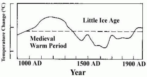
Warmist Public Enemy Number One: The Medieval Warming Period
It’s important to understand that early analyses of these “proxies” clearly demonstrated that three radical temperature shifts occurred within the past millennium, as do many contemporary studies. Indeed, the years 900-1300 AD were labeled the Medieval Warming Period (MWP), as global temperatures rose precipitously from the bitter cold of the previous Dark Ages to levels several degrees warmer than today. The Little Ice Age, a sudden period of cooling, then followed and lasted until the year 1850. And then began the modern warming period, which was by no means unique and appears to have ended with the millennium itself.
Originally, even the IPCC accepted that pre-20th century analysis. In fact, the 1990 First Assessment Report used this schematic IPCC 1990 Figure 7c (courtesy of Climate Audit) to represent last millennium’s dramatic temperature swings.

But this image of a fluid climate system subject to abrupt and natural up-and-downturns made unprecedented 20th century warming about as marketable as Florida swampland. And opportunists who depended on the aberrance of post-industrial revolution warming in order to condemn and control mankind’s CO2 emissions soon recognized that perhaps the LIA but most certainly the MWP simply had to go.
And as many of these hucksters were closely connected to the IPCC – both sender and recipient names on those illuminating CRU emails include many of its editors, lead authors and contributors — that task was far less daunting than one might imagine.
Proxies, Tricks and Hockey Sticks
The first step was taken in the 1995 Second Assessment Report, when the above Figure 7c was replaced with a 1993 reconstruction from RS Bradley and Phil Jones himself that used 1400 AD as its base – effectively wiping the MWP off the radar-screen.
But it wasn’t until the 2001 Third Assessment Report (TAR) that the MWP simply vanished. This multi-proxy reconstruction of Northern Hemisphere temperature anomalies appeared in chapter 2, page 134, of the Working Group 1 (WG1) report [PDF].

IPCC 2001 WG1 Fig 2.20
Of course, the first thing you’ll notice is that both the MWP and LIA have indeed disappeared. In fact, temperatures appear to trend downward throughout the millennium until a sharp jump upward last century. But if you look closer, you’ll also notice that the “reconstructed” series terminate in 1980. What forms the dramatic blade to the hockey stick shape (yes, this is indeed the famous “Hockey-Stick” graph) is instead the distal segment of the 1902 to 1999 instrumental data series.
Mann has recently claimed that the available proxy data ended in 1980, but even his coconspirators at RealClimate admit that’s nonsense. The truth is that the proxy data was scrapped because unlike those measured, reconstructed temperatures showed a marked decline after 1980. And, as the chart plotted temperature anomalies against what the plotters selected as the “normal” period and temperatures of 1961 to 1990, the reconstruction would have been quite unremarkable otherwise. So at the 1980 mark, the actual post-1980 measurements were actually attached to the truncated proxy series to create the illusion they were one.
The figure below, found on the same page of the WG1 report reveals this trick more clearly. This chart plots the original 4 reconstructions used: 2 from Mann et al, 1 from Jones et al and 1 from Briffa et al. Notice how all but the first series continue to trend downward around 1960 while instrumental readings begin to trend upward? And even that series ends abruptly in 1980.

IPCC 2001 WG1 Fig 2.21
So not only did conspirators cherry-pick the one series of the four that approximated measured temperatures the longest, they also terminated that series at the point that it too, began to trend down. They then joined it to the actual 1980-1999 temperatures to “hide the decline” in the final product, as that decline created an inexplicable divergence between the reconstructed and measured temperatures. The existence of which challenges the entire series dating back to 1000 AD.
Remember, all of the temperatures prior to 1850 were estimated by computer algorithms and no actual readings exist to prove or disprove those figures. So a relatively short window of opportunity exists to test the programs against observations. Had 20th century measured temperatures continued to align with those recreated as smoothly after 1960 as they did previously, then the programmers could declare their code and hence their millennial temperatures sound. But the divergence, if allowed to stand, instead revealed serious design flaws in the proxy reconstructions. Which suggests that just as the decline was dealt with through trickery, so was the MWP.
And it seems that each time the trick was used, its involvement would be more deeply concealed.
Every multi-volume IPCC Assessment has been accompanied by a relatively brief and highly-politicized Summary for Policymakers (SPM). This synopsis invariably commands the bulk of the media and political attention. Here’s the version of the graph depicted prominently on page 3 of the 2001 TAR SPM [PDF], the only version of the report most policymakers and reporters would ever actually see. Notice how they further obscured their chicanery by omitting the series defining legend and the “1988 instrumental value” declaration:

IPCC 2001 SPM Fig 1b
And despite the fact that the only confirmable segment of the series failed that very test, which should have declared the entire series null and void, the chart’s caption informed policymakers that:
“the rate and duration of warming of the 20th century has been much greater than in any of the previous nine centuries. Similarly, it is likely that the 1990s have been the warmest decade and 1998 the warmest year of the millennium.”
And it’s this highly fraudulent version that has become the poster child of the equally fraudulent Anthropogenic Global Warming (AGW) movement.
Thanks in large part to the trick that hides the decline.
Trick or Cheat
Now we’ll take a closer look at exactly what Jones meant when he wrote that he had “just completed Mike’s Nature trick of adding in the real temps to each series for the last 20 years (ie from 1981 onwards) and from 1961 for Keith’s to hide the decline.”
Why did Jones refer to the ruse as “Mike’s Nature Trick?”
As die-hard Hockey Team opponents and fans alike already know – the original 600-year version of the now infamous “Hockey-Stick” graph was dubbed MBH98 because it first appeared in the Michael Mann, Raymond Bradley and Malcolm Hughes paper Global-Scale Temperature Patterns and Climate Forcing Over the Past Six Centuries [PDF], originally published in the science journal Nature in 1998. And “Mike’s Nature Trick” received its dubious designation among CRU insiders for the very same reason.
As to the rest of the sentence — It seems Jones was working on a cover chart for a forthcoming World Meteorological Organization report [PDF], WMO Statement on the Status of the Global Climate in 1999, when he wrote the email. As the graph would incorporate one reconstruction of his own plus one each from Michael Mann and Keith Briffa, he was informing them that he had used the trick on Mann’s series at the same 1980 cutoff as MBH98, but found it necessary to use 1960 as the cutoff on the Briffa series.
And what I uncovered in the source code told the tale why. While Mann used multiple proxy sources, Briffa’s reconstructions were based solely on a property of annual tree ring growth known as maximum latewood density (MXD). And the MXD-only-driven plots began to diverge from actual temperatures as early as 1960. In fact, while many of CRU’s programs are designed to exclude all data after 1960 for later manual splicing with instrumental data, others employ “fudge factors” to force the generated plot to more closely adhere to measured temperatures as far back as 1930.
And as you’ll soon see, Jones’s admitted use of MNT took it to an entirely new level of fraud.
Here’s the original reconstruction, with the three proxy and measured temperature (black) series intact:

Notice how Briffa’s series (green) begins to trend sharply downward around the mid-20th Century. Jones’s series (red) soon follows but less sharply and then begins to trend higher. Mann’s (blue) appears to flatten out around the same year that Jones’s begins to fall. Meanwhile, all three have broken with the measured rising temperatures of the late 20th Century.
Now take a look at the chart actually published by the WMO, with all three proxy series having been surreptitiously subjected to MNT:

Since the release of CRU’s FOI2009, alarmists have continued their claim that there’s nothing deceptive about the “trick” and that it has been openly discussed in scientific journals like Nature since 1998.
But I defy anyone to compare the above chart – the one Jones wrote he had applied MNT to – to the unadulterated version above it, and tell me there’s been no deception committed. At least with MBH98, a sharp eye might recognize the ruse. Here — there is no indication given whatsoever that the graph represents an amalgam of proxy and measured temperatures. This, my friends, is fraud.
And I hope that those investigating the fraud will carefully consider this explanation of his WMO cheating given last week by Jones: [my emphasis]
“One of the three temperature reconstructions was based entirely on a particular set of tree-ring data that shows a strong correlation with temperature from the 19th century through to the mid-20th century, but does not show a realistic trend of temperature after 1960. This is well known and is called the ‘decline’ or ‘divergence’. The use of the term ‘hiding the decline’ was in an email written in haste. CRU has not sought to hide the decline. Indeed, CRU has published a number of articles that both illustrate, and discuss the implications of, this recent tree-ring decline, including the article that is listed in the legend of the WMO Statement figure. It is because of this trend in these tree-ring data that we know does not represent temperature change that I only show this series up to 1960 in the WMO Statement.”
And they’ll immediately recognize the dishonest denial they’re dealing with when they read the WMO Statement figure from the inside cover Jones referred to:
“Northern Hemisphere temperatures were reconstructed for the past 1000 years (up to 1999) using palaeoclimatic records (tree rings, corals, ice cores, lake sediments, etc.), along with historical and long instrumental records. The data are shown as 50-year smoothed differences from the 1961–1990 normal. Uncertainties are greater in the early part of the millennium (see page 4 for further information). For more details, readers are referred to the PAGES newsletter (Vol. 7, No. 1: March 1999, also available at http://www.pages.unibe.ch) and the National Geophysical Data Center (http://www.ngdc.noaa.gov).”
Even if MNT had been explained as Jones claimed — which it wasn’t — just how was the observer expected to differentiate the reconstructed from the actual data? And good luck finding that newsletter.
Spin it anyway you want – Mike’s Nature Trick is Phil’s WMO cheat.
More Tricks of the Charade
While suddenly the most famous, Mike’s is not the only in CRU’s bag of tricks.
Many of the programs I reviewed contained routines to exclude proxy data that demonstrated poor correlations with local temperature, which of course explains why CRU’s 19th through mid-20th century proxy temperatures appeared to be observationally accurate. Others “estimated” values for missing data.
And then there’s the Yamal matter – also a popular subject of the CRU emails.
In an October 5th email to climatologist Tom Wigley, Jones took issue with a piece I had written that day exposing the lies in CRU-based UN climate reports, which included a section on Keith Briffa’s mistreatment of Polar Ural data in order to exaggerate 20th century warming. That email prompted the reply from Wigley — now familiar to AT readers — in which he admitted it was “distressing to read that American Stinker item,” before offering to help Briffa, who “does seem to have got himself into a mess,” write an “explanation” for his deceitful cherry-picking of Yamal peninsula data.
Indeed, Keith’s Yamal Trick also “fudged” proxy reconstructions, not by overwriting them with instrumental data ala Mike, but rather by underhandedly stacking the actual dataset with trees hand-picked to assure his predetermined outcome. Yet both methods intentionally corrupted reconstruction results for the same devious purpose — to skew late 20th century temperatures higher in order to artificially create the dreaded hockey stick effect.
Now, you might be wondering why all this fuss is being made over late 20th century temperatures when even we realists accept that they did rise until 1998. Hopefully, you now understand why the divergence between proxy and measured temperatures betrays a potential serious flaw in the process by which temperatures are reconstructed from tree-ring density. And that any reconstruction demonstrating such a flaw-revealing divergence should be dismissed outright, not presented as policy fodder.
But there’s another issue at stake here.
Anthony Watts has surveyed over 75% of the 1200-plus U.S weather stations from which national temperatures are accumulated. Most of those were found to be inaccurate by more than 2°C, largely due to being located within 10 meters of an artificial heating source. In fact, less than 10% met strict placement guidelines set forth by the National Oceanic and Atmospheric Administration. Not to worry — NOAA claims it has methods to “adjust” for such bias, including the use of “smoothing” adjustments to “homogenize” station data to that of surrounding stations.
Unpublished computer programs artificially adjusting the data — what could possibly go wrong with that?
Would you be shocked to learn that at ICCC 3, Watts told us he had calculated such adjustments to raw temperature data between 1940 and 1999 to be 0.5°F to the positive? That accounts for almost one half of the 1.2°F warming over the last century.
And that’s here in America. Try to imagine what kind of shenanigans might be going on elsewhere in the world.
Consequently, even the “instrumental” temperatures the CRU crooks were fudging their results to align with were likely themselves fudged. So they were pumping the incline while hiding the decline.
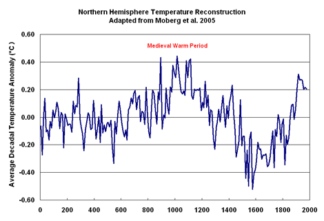
Hold the Fudge and the MWP won’t budge
In a June 2003 email to Jones and company, Mann discussed the notion of expanding CRU charts to 2 millennia, in an effort to ‘try to “contain” the putative “MWP.”’ No deception in that, I suppose. Of course, an honest 2000 year reconstruction, such as this one from CO2Science.org, adapted from a 2005 Moberg et al. temperature history derived from tree-rings and lake and ocean sediments, would actually emphasize rather than “contain” the MWP:

Any questions why Mann and friends work so diligently to “contain” (hide) the MWP?
As you can see, the post-LIA warming that began around 1850 is neither unprecedented nor spectacular. And certainly not worth rewiring the economic circuitry of the planet over.
And the CRU/IPCC reconstructions have been counterfeited for the express purpose of hiding that very fact.
After all, the stakes are enormous – perhaps trillions of dollars and unquestionably every American’s personal liberties. Tomorrow, over 20,000 delegates from 193 nations will gather in Copenhagen to craft an agreement which would not only force American power consumption to levels equal to those of about 1910, but would also have us pay reparations for an imaginary “climate debt” we’ve accumulated by building the world’s greatest economy of all time. That debt is based on the amount of CO2 our financial growth has purportedly pumped into the atmosphere, which, according to the conclusions of the IPCC, based largely upon reports from the CRU, has selfishly imperiled the planet by inducing climate change.
Of course, asking Americans to pay reparations based on the claim they’ve done harm to other nations by spoiling the climate is like asking me to pay damages to my neighbor based on his claim that he can’t sell his house because my great-grandmother’s ghost is haunting it.
As many have known and Climategate has proven, either would be equally preposterous.
But at least belief in ghosts is only marginally inspired by fraud.

Sponsored IT training links:
Join HP0-D07 online training program to successfully pass 642-415 and 650-393 exam.
Oh and I’m sorry but I find this behavior from a purported “scientists” reprehensible. And grounds alone to throw the whole stinking lot of climate “scientists” and their peer reviewers in s-can.” This isn’t science – it is out and out fraud. On our dollars.
Akira Shirakawa (11:12:54) :
“By the way, BBC made a list on their website about arguments to use against skeptics’.”
I hope a thread will be created here to respond point by point to each of their rebuttals. Many of our counter-counterpoints have already been written and posted in diverse places, and the BBC’s list will have the virtue of motivating us to collect them in one place.
Maybe each of their “counters” could be given a separate thread, and all of the threads either “pinned” or posted under a separate “Counterpoints” tab?
==========
Regarding the hockey stick, here’s Monckton’s long paper describing the shenanigans behind protecting it from criticism and “verifying” it, followed (pages 16-29) by summaries of 21 published papers that provide evidence of warming during the MWP. (Ten papers deal with Europe and the North Atlantic, eleven scientific papers address the period elsewhere on the planet.) Each summary occupies about half a page and contains a graph that illustrates key data points.
http://scienceandpublicpolicy.org/monckton/what_hockey_stick.html
Charlie Martin put out a good article on Pajamas. I would recommend it for your friends. My wife has asked many questions since reading it and I’ve been talking about this for weeks!
http://pajamasmedia.com/blog/fast-facts-about-climategate/
ralph (14:46:59) :
Mr Griffin MEP
Scathing!
🙂
The MWP is key. All the rest doesn’t matter as far as the science goes, but, of course, is damaging to the AGW cause. I think that a do-over of the last 160 years won’t change much even if done openly and correctly. So, one should concentrate on the MWP. Perhaps some pastoral imagery showing Vikings in Greenland might be an antidote to swimming polar bears looking for ice floes.
You had me until the reparations paragraph. To a lawyer, that is an exceedingly bad analogy.
Assume you and I are neighbors. A heavy rainfall occurs and I divert water from my home that thereafter spills onto your property flooding your home. It wasn’t my fault the rain fell, nor that gravity pulled the water onto your property and caused you damage. If, but for my diverting water to save my home, the water would not have caused you damage, I have in saving myself caused you harm. Law would have me pay you reparations.
If indeed our industrial production has caused others harm, then law would grant a remedy to injured others. I think this is the logical/legal thread underpinning the Carbonhagen Party.
Ordinarily the aggrieved party has the burden of proving injury, causation, and damages.
Until now, the warmist orthodoxy seemed to have a basis for alleging injury. They alleged a prima facie case for causation, CO2, the source of which is plausible — huge manmade CO2 emissions spike and rising CO2 levels.
Damages are speculative. In the U.S., speculative damages are not awarded to plaintiffs.
For example, one could plausibly argue that the reason African nations have by and large failed to cease camping out instead of building microchips or writing computer programs is due to lack of infrastructure and education, not because of U.S. CO2 emissions. The lack of infrastructure and education being due not for failure of the U.S. to pay millions and billions in foreign aid to such countries, but because the leadership in those recipient countries has failed to utilize the U.S. resources as intended. E.G., the ability of Yasser Arafat to amass a fortune in the billions while under house arrest in Palestine is indeed impressive until one begins to account for the $900 million annually paid to the PLO by the U.S. Perhaps a few of those dollars were retained by Arafat instead of building infrastructure?
The issue, then, is really why are other countries less prosperous than the U.S.? For warmists the answer is that the U.S. is too adept at burning hydrocarbons. Discerning the real answer is only slightly less complex than creating a 100% accurate to two decimal places global temperature proxy for the last 5 million years.
Leif Svalgaard (21:15:24) :
“The MWP is key.”
We have to restore the Medieval Warm Period.
And as you’ll soon see, Jones’s admitted use of MNT took it to an entirely new level of fraud.
I’m not expert but isn’t this true for another reason (maybe more important) — according to MBH98, MANN et al in MBH98 only were fidddling back to 1400 ie AFTER the MWP and essentially flattened the LIA. Jones was now doing something similar all the way back to 1000 so he could flatten out the MWP as well now as well as fixing up the 1900-1995 period as the software seems to do.
Leif Svalgaard (21:15:24) :
Vikings off the coast of Greenland in bikinis may be more frightening than drowning polar bears.
vigilantfish (10:43:40) :
I don’t have a scientific example, but Tim Donaghy, an ex-NBA referee is definitely a good social example. I don’t think that there has ever been such a big officiating scandal swept under the carpet. It is bigger than the Black-Sox, for sure. Sports radio out.
Marsh wrote: “This isn’t fraud at all. The post 1960s decline in temperatures is false whichever way you look at it, so “hiding the decline” is substituting bad data for good. For it to have been fraud he would have had to do it the otherway round – replace good data with bad.”
You don’t get it, Marsh, even though it was carefully spelled out for you. The problem is simple: If the tree ring data is not good after 1960, why is it good before 1960? Why trust one set of data and not the other one? They come from the same trees, no? The fact that there is a divergence is highly suspect, to say the least. Either tree ring data is unreliable or the actual temperature sensors are faulty (heat island effect probably). You can’t use both for your graph and therein lies the fraud.
This is not rocket science, man. It’s really elementary stuff. You must be a climate scientist because you are condescending to the public who pays for your funding. Your argument is truly lame. Think about it.
Akira Shirakawa (11:12:54)
Here’s a study published 4 March 2009 that counters the BBC counter in regard to the MWP. A link to the complete study follows the abstract.
_____________________________________
A. J. Chepstow-Lusty et al. Putting the rise of the Inca Empire within a climatic and land management context
Abstract
The rapid expansion of the Inca from the Cuzco area of highland Peru produced the largest empire in the New World between ca. AD 1400–1532. Although this meteoric rise may in part be due to the adoption of innovative societal strategies, supported by a large labour force and standing army, we argue that this would not have been possible without increased crop productivity, which was linked to more favourable climatic conditions. A multi-proxy, high-resolution 1200-year lake sediment record was analysed at Marcacocha, 12 km nor th of Ollantaytambo, in the heartland of the Inca Empire. This record reveals a period of sustained aridity that began from AD 880, followed by increased warming from AD 1100 that lasted beyond the arrival of the Spanish in AD 1532. These increasingly warmer conditions allowed the Inca and their predecessors the opportunity to exploit higher altitudes from AD 1150, by constructing
agricultural terraces that employed glacial-fed irrigation, in combination with deliberate agroforestry techniques. There may be some important lessons to be learnt today from these strategies for sustainable rural development in the Andes in the light of future climate uncertainty.
_______________________
http://www.clim-past-discuss.net/5/771/2009/cpd-5-771-2009.pdf
Hopefully politicians in the key countries have realised that the combination of peak oil and the unstable cauldron of the Middle East is so potentially dangerous as to warrant an accelerated shift to alternative, non-oil sources of energy irrespective of climate change, which then becomes a convenient cover for this strategic shift.
ralph (14:46:59) :
.
**** Stop Press ****
Mr Griffin MEP has been appointed as EU representative to the Copenhagen climate conference.
http://www.telegraph.co.uk/earth/copenhagen-climate-change-confe/6683385/BNP-leader-Nick-Griffin-will-represent-Europe-at-Copenhagen-climate-change-summit.html
Strangely enough, Mr Griffin is the most climate-sceptic denier in the entire EU parliament, as his speech here demonstrates.
I find this choice of the marxo-socialist EU quite strange. Are there ‘denier’ elements within the EU who would like to say something, but dare not, and so they want Mr Griffin to speak on their behalf??
They have brought him on board to discredit the skeptic camp. He is a proto fascist racist with a criminal record for holocaust denial.
Leif Svalgaard (21:15:24) :
The MWP is key.
Spot on Leif. The acronym MWP occurs 91 times in the email cache. The word Medieval 51 times.
That’s nearly 10% of all the emails and is a reflection of the fact that the hockey jockey’s know the reality of the MWP is fatal to their hype-othesis.
Perhaps some pastoral imagery showing Vikings in Greenland might be an antidote to swimming polar bears looking for ice floes.
Got anything in the family album? 🙂
Re; Akira Shirakawa (11:12:54) + BBC.
1. Ocean warming (since 1880, even according to ‘UHI adjusted’ NASA), is far less than land (why?).
http://data.giss.nasa.gov/gistemp/graphs/Fig.A4.lrg.gif
2. Forget 1998, since 2001, warming has stopped despite ever increasing CO2.
http://www.woodfortrees.org/plot/uah/plot/uah/from:2001/trend/plot/esrl-co2/from:1980/normalise
3. The MWP was world-wide.
http://joannenova.com.au/2009/12/fraudulent-hockey-sticks-and-hidden-data/
4….. (I’ll leave the rest to others, if they wish)
David Reese (10:30:33) :
DeBilt is sill in v2.mean back to 1706. Grep “633062600000”. There a quite a few more in there that go back 150+ years.
Al Gore’s Holy Hologram (11:41:17) :
You now have options to do just that and avoid funding the BBC.
The tax isn’t a BBC tax it is effectively a tax on the ability to watch moving pictures in your home. Watching only SKY or even YouTube still requires a licence.
OT but the formal decision by the BBC to not report contrary evidence will hopefully come back to bite them in a big way. They simply had no right to decide what is or is not science.
If you look at the FOI related mails you see the pattern. Jones doesn’t want to abide, he convinces UEA FOI people then they all go together to convince the ICO. At no stage were other opinions sought.
(from the “FROM SEESAW TO WAGON WHEEL” report)
No prizes at all for guessing who “some of the best scientific experts” were.
Hey.. we invited Enron Directors to our seminar and they say reports of a scandal have no basis in fact.
The bong fuelled meetings over at the BBC “Science and Environment” love fest may soon come to an abrupt end. A sad loss to “journalism”.
In a real world you would get the front page ! But in today’s world it would ruin the bean feast. I personally am convinced that 60/70% of those in Copenhagen would agree with you,
but why rock the boat, the girls are going to be FREE !
Valkyries in bikinis would less frightening, unless there was a battle going on.
vigilantfish (17:27:06) :
Lucy Skywalker (15:05:17) :
Vigilantfish, have you looked up Klyashtorin re fish stocks relating to solar cycles?
Hi Lucy:
No I am not familiar with Klyashtorin’s work with solar cycles and fish, but am aware of a couple of early 20th century scientists who saw links between fish abundance and solar cycles. That work pretty much died down and I was not aware that anyone else had been looking at it – I will eagerly look up your suggestion. Thanks for the tip.
Have a dig around in this: http://www.fao.org/docrep/005/y2787e/Y2787E00.HTM
Question for Steve McIntyre or anybody who has looked more closely.
Have any papers looked at the divergence problem from the other end? What I mean is rather than asking why the trees don’t match the instruments, asking why the instruments don’t match the trees.
It is just that the period of divergence is around what I would call a controversial period in v2.mean. Around 1950 a lot of stations join and at the time a lot of duplicate years appear. Then around 1990 a lot of stations disappear and so do duplicate years.
Sorry if this is “old ground” but I couldn’t find much written about it on the net and I don’t currently have access to ppv science.
>>I notice a couple posters above are confusing
>>the discipline of dendrochronology with Mann
>>et al’s dendroclimatology
Not so.
If temperature does not control tree-ring size, and other local effects are exert a greater influence, then how can you compare and overlap tree rings from different trees to form a contiguous series of rings back into history??
As I said, if tree-rings are not sensitive to temperature/weather/climate, then it is not only dendroclimatology that falls flat on its face, but so does dendrochronology too.
,
>>Is that Mr Griffin as in Nick Griffin of the BNP? Eeek.
>>Please tell me its not who I think it is.
>>I really do not want to be associated with Nick Griffin.
>> Mr Griffin’s EU Global Warming speech:
>> http://www.youtube.com/watch?v=8-DEz2fXPrM
I believe so.
But do you not see this as two sides of the same coin? The whole AGW project is socialist/liberal/marxist inspired, and so they will denigrate anyone who is right wing, just as much as they will denigrate sceptics.
That is why everyone is labeled as ‘Deniers’ (with obvious connotations).
It is odd that something as global and cross-party as climate has become a party-political issue, but it has. And as far as I can see it has become party-political because AGW IS A POLITICAL CRUSADE – and we need to see it and judge in in that light.
.
This ( Marc Sheppard’s) is the best explanation of the issue I’ve seen.
The ‘decline’ tells us that there are 2 possibilities.
1. The observations are wrong
2. The proxy reconstruction is wrong.
They could, of course, both be wrong but the proxy reconstructions are likely to be the most unreliable.
Leif Svalgaard (21:15:24) : is right. The Met Office data, whatever it’s reliability, is largely irrelevant. It will almost certainly show an increase in global temperatures. Sceptics should not get bogged down with arguments about the reliability of the data. There’s a good chance that that particular argument will be lost. It’spossibly worth asking questions about the pattern of the warming, e.g. why is the rate of warming in 1915-1945 period pretty much the same as it was in the 1975-2005 period. But the key question concerns the uniqueness of modern day warming. Mann, Jones et al argue it is unique or ‘unprecedented’.
The public are confused about the issues so they need to be made clear which means that focus needs to be on the MWP and the efforts to show that it was a a real and widespread event.
Thanks for that.
That is very clear.