By Joseph D’Aleo, AMS Fellow, CCM
In this recent post, we discussed the problems with recent data that showed the argument presented by the EDF’s millionaire lawyer playing clueless environmentalist on Lou Dobbs Tonight that this will be the warmest decade is nonsense. This claim was well refuted and Al Gore’s credibility disassembled by Phelim McAleer, of the new documentary Not Evil, Just Wrong that challenges the lies and exaggerations (totalling 35) in Al Gore scifi horror comedy film, An Inconvenient Truth. 9 were serious enough for a UK judge to require a disclaimer itemizing them be read whenever, the movie was shown in the schools.
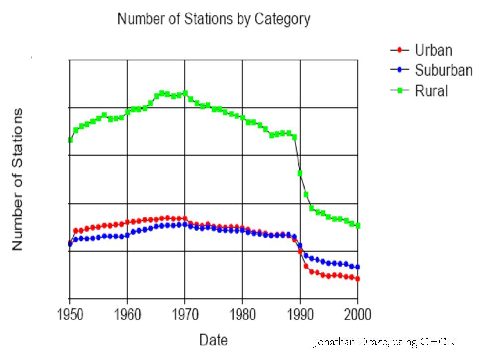
The world’s climate data has become increasingly sparse with a big dropoff around 1990. There was also a tenfold increase in missing months around the same time. Stations (90% in the United States which has the Cadillac data system) are poor to very poorly sited and not properly adjusted for urbanization. Numerous peer review papers suggest an exaggeration of the warming by 30%, 50% or even more. The station dropout can be clearly seen in the two maps below with the number of station going from over 6000 to just 1079 from April 1978 to April 2008.


See the big gaps in the recent data in Canada, Greenland, Africa, South America, parts of western Asia, parts of Australia.
SEE FOR YOURSELF
Take this test yourself to see how bad a shape the global data base is. Look for yourself following these directions using the window into the NOAA GHCN data provided by NASA GISS here.
Point to any location on the world map. You will see a list of stations and approximate populations. Locations with less than 10,000 are assumed to be rural (even though Oke has shown that even a town of 1,000 can have an urban warming of 2.2C).
You will see that the stations have a highly variable range of years with data.
Try and find a few stations with data that extends to 2009. To see how complete the data set is for that station, click in the bottom left of the graph Download monthly data as text.
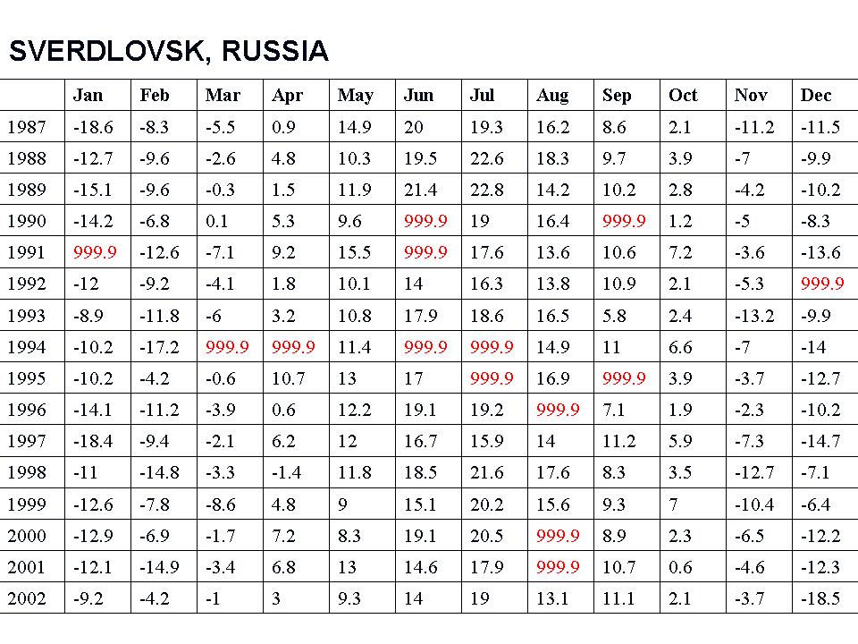
For many, many stations, you will see the data set in a monthly tabular form has many missing data months mostly after 1990 (designated by 999.9).

See larger image here
This required the data centers to estimate data for the grid box for that location with other stations nearby (homogenization). In the 2008 plot above only 1079 stations were used. NASA went to locations within 250 km (155 miles) to find data for the grid boxes. For grid boxes without stations within 250 km, they are left blank, thus the large gaps.
Most of the stations that dropped out were rural. More of the missing data points are having their missing months filled in with more urban data in the grid boxes.

See larger image here
WUWT Volunteer John Goetz created this video that shows the worldwide dropout of weather stations:
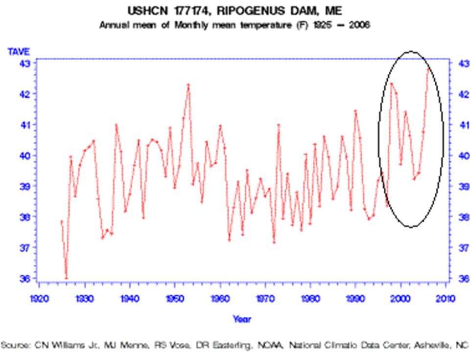
One example of how good or bad this works is from Maine. Volunteers completed surveys of the United States Historic Climate Network (USHCN) temperature stations in Maine for Anthony Watts surface station evaluation project. The survey determined that every one of the stations in Maine was subject to microclimate or urbanization biases. One station especially surprised the surveyors, Ripogenus Dam, a station that was officially closed in 1995.

See larger image here
Despite being closed in 1995, USHCN data for this station is publicly available until 2006! (GISS stopped in 1995)
Part of the USHCN data is created by a computer program called “filnet” which estimates missing values. According to the NOAA, filnet works by using a weighted average of values from neighboring stations. In this example, data was created for a no longer existing station from surrounding stations, which in this case as the same evaluation noted were all subject to microclimate and urban bias, no longer adjusted for. Note the rise in temperatures after this before the best sited truly rural station in Maine was closed. GISS does display this station that did incorporate the “filnet” data input for missing months although as noted they stopped its plot in 1995 which NOAA extended artificially to at least 2006.
How can we trust NOAA/NASA/Hadley assessment of global changes given these and the other data integrity issues? Given that Hadley has destroyed old original data because they were running out of room in their data cabinet, can we ever hope to reconstruct the real truth?
As one of our scientist readers noted: “Well, the 999.9s you showed me today sure opened my eyes…the ramifications are stunning. I knew about the drop-off of stations before but never that existing station reports are so full of gaps or that they’re getting temperature readings from “ghost” stations. This is, as you have said, GARBAGE. See PDF here.
Aligner: I think you just used http://data.giss.nasa.gov/gistemp/station_data/ with different settings for the “Data set” menu. You can get the original data or the combined data or the homogenized data by choosing different settings.
Syl(20:35:58) quoting Lord Monckton and connecting dots:
But this is just false, and ridiculous. If it were true, we would have an Ice Age within days. Lindzen said no such thing. What he claims is that the correlation of change in flux with change in SST is positive (ERBE) instead of negative (GCMs), and that is where he gets the lower sensitivity.
Syl (20:35:58) :
Your error is that the temperature in K is always positive. The sinusoidal modulation is overlaid on that.
DaveE.
I’ve gone fishing at the Ripogenus Dam a few times in the 1990’s. I think my cousin the climatologist would be a bit surprised to hear that the site stopped being used for GISS. I know U Maine – Orino’s geology, hydrogeology, climatology, and related departments regularly did field expeditions to the lake as there is a boom house there owned by Boston U that U Maine students use for field studies there (the fishing in the lake is fantastic).
It seems to me like those of us who are fans of the surfacestations.org project should organize a new network of independent weather stations properly sited in locations that will remain undeveloped for long periods, like public parks.
Hi to all and especially Lucy Skywalker.
Thanks for the contact. I am very happy to help with the work on historic weather stations information in the UK. As stated in my earlier statement, a cursory study of the Ross on Wye weather data going back to 1850 show very little change in temperature. I have downloaded 48 full scap pages of numbers. I would like some help turning these into meaning full graphs etc.
Other than ‘Astateofdenmark’ I think that I must be the only person in the UK that is challenging the climate warming lobby.
It is so bad in the UK that at Manchester University they tried to classify any one challenging global warming as suffering with mental illness!!!!
The reason I am studying the climate information is that I was tired of just listening to people telling me what I have to do to combat global warming. When I searched for the raw data on global warming I found it decidedly difficult to find a web site that did. If you go onto the official English Met office and look at global warming you find the usual statements of ‘ It is happening so get over it ‘ attitude. The same is also on the Royal society web site where they spend most of their energies dismissing the anti global warming arguments. There is no graphs or raw figures or scientific information to back up their position.
If there is anyone in the UK willing to continue with promoting the information found on this web site please contact me on james.brisland@mail.com
Thanks
“The scientists of the world are conspiring to fool us about global warming!”
Quite a hypothesis (again), Joe.
http://ossfoundation.us/projects/environment/global-warming/myths/station-drop-out
Read about GISTemp here:
http://data.giss.nasa.gov/gistemp/
I guess station dropouts have caused rapid warming in the Arctic and a tremendous buildup of heat in the oceans since 1950? There does seem to be a strong correlation.
See: http://www2.sunysuffolk.edu/mandias/global_warming/modern_day_climate_change.html
Finally, the oceans cover 70% of the surface. How much urbanization on the ocean surfaces has caused their temperatures to be artificially heated? 🙂
A good article about how surface temps are measured can be found here:
http://www.yaleclimatemediaforum.org/2008/04/common-climate-misconceptions-global-temperature-records/
Mizen2
You are completely mistaken in your understanding, as there are many thousands of people in the UK actively challenging climate change theory at all levels of society, including govt and scientific forums. Even the BBC has now recognised something is going on, partly due to a huge amount that is going on behind the scenes. Only some of this is manifested in forums such as this.
The Global temperature figures worldwide back to 1850 are highly slanted and disguise the fact that many individual datasets show cooling in that period as well, of which an increasing number are now falling into a 30 year trend due to the last ten years cooling.
Various people are already working on these dubious datasets and there may be duplication of effort. Please visit the EM Smith website by just googling
“Chiefio” I am also working on these datasets.
Catastrophic climate change has been mainly politically driven since 2003 and I hope to publish a major article on this aspect shortly.
You are by no means alone.
tonyb
Scott Mandia,
in one of your links Gavin says: “station dropping out doesn’t affect the trends at all (you can do the same analysis with only stations that remained and it makes no difference)”. Gavin is confident that he can get the temperature correct even if there is 1200 km between stations.
I do not quite understand this statement. How many more stations can be dropped out before the trends will be affected? How it is possible that September 2009 GISSTemp can show almost all Greenland 0.5 to 4 degrees hotter than normal (with the 1200 km smoothing radius) when the 250 smoothing radius shows that there was NOT ONE single station used for the whole Greenland in September 2009 (in GISSTemp)?
I would think that Greenland temperature trends should be very important for global temperature trends and monitoring climate change in general.
Jari (05:25:10) :
Of course it can be done Jari!
Everyone knows that the climate in the Shetlands or southern Norway is identical to that at Lands End 😉
DaveE.
John Finn (00:32:02) : Again, this is 1. Highly misleading and 2. Meaningless.
OF COURSE starting in 1992, right after Pinatubo, will elevate the trends, and because the response of the UAH data is greater, it will be elevated more.
But “agreement” means nothing, sense it is quite clear that the LT should warm more.
So let me explain what I did. First, I took the UAH and Hadley data, put them on the same baseline, detrended them, calculated the coefficient of a OLS best fit of the residuals of one to the other, then used that to adjust the original UAH data to the implied surface data. This resulted in a trend of about .09 degrees per decade, while the trend in Hadley was a little more than .15 degrees per decade. I would say that it is probably more accurate to say that the bias was something like .06 degrees per decade.
Scott Mandia (04:07:16) : Did Joe ever say that the bias in the record caused all the warming? No, he didn’t. So why are you devoting energy to tearing down that strawman.
DaveE (06:25:32) :
Jari (05:25:10) :
Of course it can be done Jari!
Everyone knows that the climate in the Shetlands or southern Norway is identical to that at Lands End 😉
DaveE
Hey, I live around 1200kms from the Alps in the South Of England so I will just nip out and do some skiing as our climate is the same as Val’ d’isere.
Tonyb
@ur momisugly timetochooseagain (07:07:22)
Joe claims:
Numerous peer review papers suggest an exaggeration of the warming by 30%, 50% or even more. without citing them, of course.
He also posted awhile back about UHI and applied his land-based UHI correction to the oceans. Huh?
Joe may not have explicitly stated how much warming he thinks UHI has caused but he is strongly implying that it is significant.
The problem with his arguments is that UHI is, for the most part, insignificant.
RSS (0.18 C per decade) and UAH (0.14 C per decade) satellite-only derived temperatures show about 0.16 C per decade of warming since 1979, and GISS and HadCRU which use both surface data and satellite data show 0.16 C per decade. Where is the UHI?????
Urban heat island effects are real but local, and have not biased the large-scale trends. A number of recent studies (see IPCC 2007 Chapter 3) indicate that effects of urbanization and land use change on the land-based temperature record are negligible (0.006ºC per decade) as far as hemispheric- and continental-scale averages are concerned because the very real but local effects are avoided or accounted for in the data sets used.
Joe has a conclusion and is looking for data to support it – not scientific method at all.
Watch “The Day After Tomorrow”. Dennis Quaid explained it all.
The raw versus the cooked:
Who needs that old musty data anyway? As noted in Patrick J. Michaels’ essay, “The Dog Ate Global Warming,” we still have Phil Jones’ “Value-ADDED” versions. What more do you want?!
Alfred E. Newman could have handled this issue.
What? Me worry?
TonyB and DaveE,
yes, it is quite amazing how uniform the temperature is over large areas. And in Greenland you do not need even one thermometer to get accurate data for the whole island.
And of course the biggest warming signal is in the Arctic where there is not much measured temperature data anymore. Maybe when even more stations are dropped the smoothing radius can be increased to 6 378 km and we use only one thermometer to measure global warming…
[youtube=http://www.youtube.com/watch?v=RVT6o6LUxmw&hl=en&fs=1&]
Scott Mandia (08:33:57) : The papers he refers to are:
Block, A, Keuler, K., Schaller, E., 2004, Impacts of anthropogenic heat on regional climate patterns, Geophysical Research Letters, 31, L12211, DOI:10.1029/2004GL019852
de Laat, A.T.J., and A.N. Maurellis (2006). “Evidence for Influence of Anthropogenic Surface Processes on Lower Tropospheric and Surface Temperature Trends.” International Journal of Climatology 26:897—913.
Kalnay, E., Cai, M., Impacts of urbanization and land-use change on climate, 2003, Nature, 423, 528-531
Karl, T.R, 1995: Critical issues for long-term climate monitoring. Climate Change, 31, 185.
McKitrick, R.R. and P.J. Michaels (2007), Quantifying the influence of anthropogenic surface processes and inhomogeneities on gridded global climate data, J. Geophys. Res., 112, D24S09, doi:10.1029/2007JD008465.
McKitrick, R and P. J. Michaels (2004). “A Test of Corrections for Extraneous Signals in Gridded Surface Temperature Data” Climate Research 26(2) pp. 159-173. “Erratum,” Climate Research 27(3) 265—268.
Pielke Sr., R.A., C. Davey, D. Niyogi, S. Fall, J. Steinweg-Woods, K. Hubbard, X. Lin, M. Cai, Y.-K. Lim, H. Li, J. Nielsen-Gammon, K. Gallo, R. Hale, R. Mahmood, S. Foster, R.T. McNider, and P. Blanken, 2007: Unresolved issues with the assessment of multi-decadal global land surface temperature trends. J. Geophys. Res., 112, D24S08, doi:10.1029/2006JD008229
Pielke Sr., R.A. J. Nielsen-Gammon, C. Davey, J. Angel, O. Bliss, N. Doesken, M. Cai., S. Fall, D. Niyogi, K. Gallo, R. Hale, K.G. Hubbard, X. Lin, H. Li, and S. Raman, 2007: Documentation of uncertainties and biases associated with surface temperature measurement sites for climate change assessment. Bull. Amer. Meteor. Soc., 88:6, 913- 928.
Among others:
http://icecap.us/images/uploads/US_AND_GLOBAL_TEMP_ISSUES.pdf
“RSS (0.18 C per decade) and UAH (0.14 C per decade) satellite-only derived temperatures show about 0.16 C per decade of warming since 1979, and GISS and HadCRU which use both surface data and satellite data show 0.16 C per decade. Where is the UHI?????”
First, the LT should warm more than the surface, second, the Satellite datasets are not equal, RSS clearly has a spurious step in 1992, third, I have no clue where you get your UAH rate but it does not accord with the file, which gives a rate of 0.13 per decade, and finally, YES Joe has made mistakes on this issue, I was one of those who pointed them out, but that does NOT mean that the surface data do not have a serious issue-they almost certainly do.
“”” bob paglee (14:36:52) :
George E. Smith 13:26;58 states:
The drop out of rural data points is critical here.
For me, the most accurate way of measuring global temperature, free of UHI effects, is to SOLELY use rural stations.
This article shows either a cunning plan since 1990 to artificially drive the ‘global warming’ agenda, or a rather fortuitous series of events which happened to make such an agenda more likely to apparently fit the hypothesis. “””
Bob, Absolutely nothing contained in the “”” — “”” above is anything I said. Those are simply cut and pastes from womeone else I was citing.
Virtually everything I post here is either something I clipped from someone else, or is my own words (including typos); and it is easy to separate them. I always use “”” — “”” as a format to refer to someone elses work. thats three double quotes followed by three spaces; then the cited text, then three spaces, and the closing three double quotes.
I do that so there is no question as to what I say (which is in plain text without quotes), and what is something I am lifting from another author.
For a large fraction of the postings at WUWT, I cannot distinguish who said what. So use Italics or some other font trick to delineate cited information; but there’s no guarantee that formatting survives everybody’s browsers.
So bottom line; if you do in fact agree with that first sentence as you say; you are agreeing with what somebody else said; not something that I said. My position on what otherws say should be apparent from what I add to their stuff that I lifted.
You can’t delineate citings from self comment by simply doing a paragraph spacing. Good writing would do that just for clarity anyway.
George
Scott Mandia (08:33:57) :
RSS (0.18 C per decade) and UAH (0.14 C per decade) satellite-only derived temperatures show about 0.16 C per decade of warming since 1979, and GISS and HadCRU which use both surface data and satellite data show 0.16 C per decade. Where is the UHI?????
1.8 C/century, 1.4 c/century, and 1.6 c/century, respectively. Where is the positive feedback???????
“”” George E. Smith (10:42:57) :
“”” bob paglee (14:36:52) :
George E. Smith 13:26;58 states:
The drop out of rural data points is critical here. “””
Re above.
Bob, there isn’t; and there cannot be, any “optimum” mixture of “urban” versus “rural” temperature measuring stations.
First of all remember that what GISS and Hadcrut, UAH and RSS report are NOT global temperatures; they are anomalies, which means some machinations have already been performed on whatever the thermometer siad at the time it was read.
BUT! If you wanted to measure the true average global surface Temperature; it is a simple 8th grade science project to figure out how to do that. By “surface” Temperature, I mean the Temperature at the boundary between the contiguous atmosphere, and that which is not atmosphere; usually either oceans (73%) or land (27%).
1) Divide the surface up into cells; each with some cell area.
2) Read the Temperature from a thermometer in the center of each cell.
3) Multiply the Temperature by the cell area.
4) Sum all the Temperature*Area products.
5) Divide the total of those products by the total surface area of the Earth.
The result is the true global average temperature, at that instant when all the thermometers were simultaneously read.
6) Repeat 1-5 periodically for say a whole year.
7) Take the average of all of the results from 6.
The result is the annual mean global surface temperature.
PROVIDED; that the size of the cells is such that the single temperature reading from the cell center, is truly representative of the temperature over that cell area; and provided that the process is repeated often enough to follow any cyclic variations in those temperatures.
The strict rules for adequacy of either the cell size or the reading frequency are set down in the general principles of Sampled Data System theory, and in particular the Nyquist Sampling Theorem.
Now notice I said this was an 8th grade science project; but if you read what I actually wrote; I said the project was to figure out HOW to do that; certainly NOT to actually try doing it; because the resources required to do it are actually beyond our capabilities; we don’t have enough thermometers on eqarth to actually carry out the task.
Well we don’t; but Gaia does. Every single atom or molecule, is one of Gaia’s thermometers. Each registers its local temperature directly in the form of the average energy per degree of freedom, that that atom or molecule has.
Gaia takes everyone of those into account in deciding what the climate should be; and she always gets the right answer because her sampling strategy is impeccable.
There’s no chance we can equal her performance; but we sure should be able to doa heck of a lot better than we do.
Where UHIs create problems is not that they give an incorrect temperature reading; but that the reading obtained is erroneously applied to adjacent areas for which it is not a valid temperature reading.
The fallacy that seems to go unrecognized, is that for a given set of actual real thermometers that are used ; let’s say to obtain GISStemp results; the prevailing process (AlGorythm) that is used seems to record a relatively continuous, and well behaved function; and the values cnage relatively smoothly from time to time. That lulls us into believing those results are real.
Well they actually are real results for GISStemp; whatever that is (Hansen knows).
What they are not, is a real representation of the temperature of the earth; just the values of GISStemp.
Hansen; might just as well be averaging the phone numbers in the Manhattan Telephone directory, and reporting the changes, as they from time to time republish that.
An exercise he gets paid to do; but which has no underlying scientific basis for doing.
George
John Finn (00:32:02) : Again, this is 1. Highly misleading and 2. Meaningless.
There’s nothing misleading about it. I chose 1992 because that’s round about the time of the reduced number of stations.
OF COURSE starting in 1992, right after Pinatubo, will elevate the trends, and because the response of the UAH data is greater, it will be elevated more.
There’s no “OF COURSE” about it. I accept the effect of Pinatubo will increase the trend but it’s not obvious that the UAH trend has been more affected than the Hadley trend. I”m not arguing about the magnitude of the trend I’m arguing about the similarity. Like it or not the trends are similar. (UAH shows slightly more warming). In fact if you adjust GISS and Hadley monthly anomalies to the satellite base period (1979-98) you’ll find they’re quite consistent with the satellite anomalies.
e.g
GISS Sept anomaly is +0.65 but relative to the 1979-98 base period the anomaly is +0.45, so we have
UAH +0.42
GISS +0.45
RSS +0.48
But “agreement” means nothing, sense it is quite clear that the LT should warm more
Separate argument.
John Finn (12:22:40) : “There’s nothing misleading about it. I chose 1992 because that’s round about the time of the reduced number of stations.”
Bull. It is absolutely misleading.
“There’s no “OF COURSE” about it. I accept the effect of Pinatubo will increase the trend but it’s not obvious that the UAH trend has been more affected than the Hadley trend.”
B.S. again, the response to Pinatubo is much greater in the UAH record:
http://www.woodfortrees.org/plot/hadcrut3gl/mean:12/offset:-.15/from:1991/to:1996/plot/uah/mean:12/from:1991/to:1996
“Separate argument.”
You are trying to separate the arguments so that no one can criticize your sacred cow.
Like it or not, using non cherry picked and manipulative comparisons, you are just wrong, the surface clearly has a warm bias.
@ur momisugly Andrew (10:28:16) :
Thank you for the extensive information. Joe should try to publish this in a journal instead of presenting it at The Heartland Institute conferences which are not taken seriously.
Joe’s article does a bit of cherry-picking, does it not?
At the end of the day (decade) we are still left with the following conclusions:
1) All 4 data sets show a warming climate in the past three decades.
2) They are fairly close in agreement with warming rates (one cannot just throw out RSS because they do not like the results).
3) Joe suggests that there is a serious enough UHI bias that we cannot use this data for policy decisions.
4) There is literature that shows UHI and no UHI but the data from point #1 doesn’t show UHI.
5) There is a plethora of actual observed effects of rapid climate change if we choose to ignore surface data. Shall we ignore those also?
@ur momisugly Tim Clark (11:10:36) :
One cannot use a present day decadal rate and multiply it by 10 to get a century rate. The feedbacks are coming – you should not assume that the climate reacts to increased GHGs rapidly. The oceans are buffering the effect quite a bit. The models also show that much of the wamring will be in the later parts of this century.
About 1/2 of the CO2 has been added since the 1970s. The warming and feedbacks are coming, unfortunately.
When a new religion takes over, the most important thing to do is preempt or hide (destroy) all old records that might be contrary to their teachings. Is this happening to the published temperature records? I believe many of the stations, not published, are still being recorded. ( see mizen2 (03:51:19) :above) especialy in rural areas. Thank god for inertia in record keeping. Maybe these need to be privately collected and published, as they are no longer wanted by the powers that be.
Airport temperature recordings are about worthless for weather or climate record purposes.
“The warming and feedbacks are coming, unfortunately.”
No it isn’t. Would that it were. Heat can’t hide except in cartoons.