By Joseph D’Aleo, AMS Fellow, CCM
In this recent post, we discussed the problems with recent data that showed the argument presented by the EDF’s millionaire lawyer playing clueless environmentalist on Lou Dobbs Tonight that this will be the warmest decade is nonsense. This claim was well refuted and Al Gore’s credibility disassembled by Phelim McAleer, of the new documentary Not Evil, Just Wrong that challenges the lies and exaggerations (totalling 35) in Al Gore scifi horror comedy film, An Inconvenient Truth. 9 were serious enough for a UK judge to require a disclaimer itemizing them be read whenever, the movie was shown in the schools.
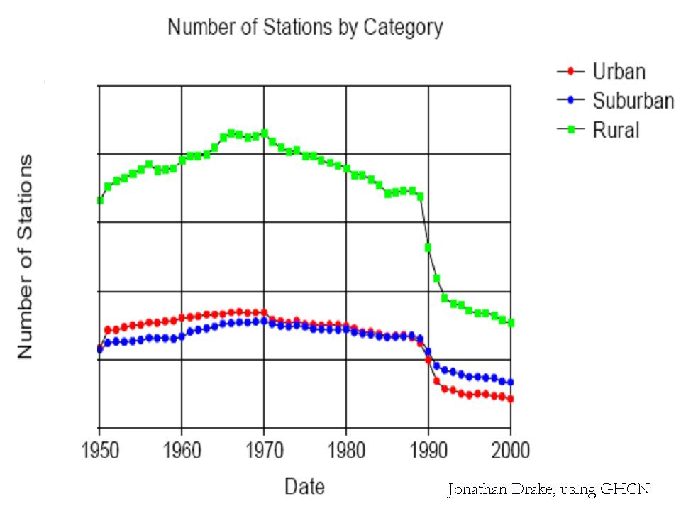
The world’s climate data has become increasingly sparse with a big dropoff around 1990. There was also a tenfold increase in missing months around the same time. Stations (90% in the United States which has the Cadillac data system) are poor to very poorly sited and not properly adjusted for urbanization. Numerous peer review papers suggest an exaggeration of the warming by 30%, 50% or even more. The station dropout can be clearly seen in the two maps below with the number of station going from over 6000 to just 1079 from April 1978 to April 2008.


See the big gaps in the recent data in Canada, Greenland, Africa, South America, parts of western Asia, parts of Australia.
SEE FOR YOURSELF
Take this test yourself to see how bad a shape the global data base is. Look for yourself following these directions using the window into the NOAA GHCN data provided by NASA GISS here.
Point to any location on the world map. You will see a list of stations and approximate populations. Locations with less than 10,000 are assumed to be rural (even though Oke has shown that even a town of 1,000 can have an urban warming of 2.2C).
You will see that the stations have a highly variable range of years with data.
Try and find a few stations with data that extends to 2009. To see how complete the data set is for that station, click in the bottom left of the graph Download monthly data as text.
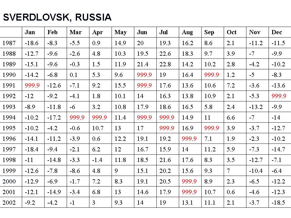
For many, many stations, you will see the data set in a monthly tabular form has many missing data months mostly after 1990 (designated by 999.9).

See larger image here
This required the data centers to estimate data for the grid box for that location with other stations nearby (homogenization). In the 2008 plot above only 1079 stations were used. NASA went to locations within 250 km (155 miles) to find data for the grid boxes. For grid boxes without stations within 250 km, they are left blank, thus the large gaps.
Most of the stations that dropped out were rural. More of the missing data points are having their missing months filled in with more urban data in the grid boxes.

See larger image here
WUWT Volunteer John Goetz created this video that shows the worldwide dropout of weather stations:
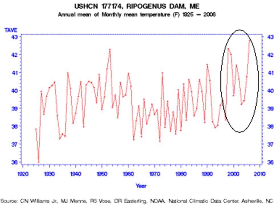
One example of how good or bad this works is from Maine. Volunteers completed surveys of the United States Historic Climate Network (USHCN) temperature stations in Maine for Anthony Watts surface station evaluation project. The survey determined that every one of the stations in Maine was subject to microclimate or urbanization biases. One station especially surprised the surveyors, Ripogenus Dam, a station that was officially closed in 1995.

See larger image here
Despite being closed in 1995, USHCN data for this station is publicly available until 2006! (GISS stopped in 1995)
Part of the USHCN data is created by a computer program called “filnet” which estimates missing values. According to the NOAA, filnet works by using a weighted average of values from neighboring stations. In this example, data was created for a no longer existing station from surrounding stations, which in this case as the same evaluation noted were all subject to microclimate and urban bias, no longer adjusted for. Note the rise in temperatures after this before the best sited truly rural station in Maine was closed. GISS does display this station that did incorporate the “filnet” data input for missing months although as noted they stopped its plot in 1995 which NOAA extended artificially to at least 2006.
How can we trust NOAA/NASA/Hadley assessment of global changes given these and the other data integrity issues? Given that Hadley has destroyed old original data because they were running out of room in their data cabinet, can we ever hope to reconstruct the real truth?
As one of our scientist readers noted: “Well, the 999.9s you showed me today sure opened my eyes…the ramifications are stunning. I knew about the drop-off of stations before but never that existing station reports are so full of gaps or that they’re getting temperature readings from “ghost” stations. This is, as you have said, GARBAGE. See PDF here.
Discover more from Watts Up With That?
Subscribe to get the latest posts sent to your email.
RE: Barry L. (14:53:56) :
I like how Canada doesn’t show any stations…… but wait…
how come there is some of the most signifigant warming going on in the Hudsons Bay area??
http://global-warming.accuweather.com/GHCN_GISS_HR2SST_1200km_Anom09_2009_2009_1951_1980.html
IS THIS WARMING JUST INFILL???? anyone? Bueller?
——————–
This one is likely correct. We had one of the warmest Septembers in history. Temperatures were frequently around 30 C (not F) during the month with many stations setting records. Lots of sun as opposed to a fairly wet summer. October is correcting that. We had snow on Friday and minimums are below freezing this week and maximums just above freezing in southern Manitoba. The late warm spell delayed the leaves turning color. The green ash in our yard did not turn yellow. The leaves just started falling off. I expect toi have leves falling on the snow this fall.
Paul (09:20:06) :
>on the “number of stations” over time and by category graph – what is the y axis?
Click the PDF at the end of the article.
I don’t know if anyone mentioned it yet, but there was also another problem with some stations. The previous month’s data would be re-reported as the current month’s data. That can go unnoticed in tropical areas and even in higher latitude regions in summer or winter but it happened in the fall at some locations in Finland and Russia and at least one other place and was noticed. Going back through the record it was discovered that it had happened several times in the past.
I believe there was a post here on that as well but it has been a long time ago.
So, where does the satelite data fit in?
TonyB: Hm. You’re saying that it’s due to taking stations offline in Eastern Europe and elsewhere in ’93? But there’s only a small drop in the number of stations between ’92 and ’93; the main plunge takes place from ’89 to ’92. THAT’S what I’m curious about, not the much smaller dip you’re referencing. Does anyone know what caused that?
“If you cannot measure it, you cannot control it.” –Dr. Pierre R. Latour, P.E. chemical engineering and control engineering.
This is a fundamental principle of process control that applies equally to a thermostat as to an entire world’s air temperature.
Pofarmer (18:51:27) : Satellites generally refer to the LT data from UAH and RSS. GISS does not use those, because it is trying to get a “surface temperature” metric. However, GISS uses
Reynolds, R.W., N.A. Rayner, T.M. Smith, D.C. Stokes, and W. Wang 2002. An improved in situ and satellite SST analysis for climate. J. Climate 15, 1609-1625, doi:10.1175/1520-0442(2002)0152.0.CO;2.
For Sea Surface Temperature, using sattelite based estimates of SST in the later years of the record. These are, again, distinct from the LT data, which are bulk atmospheric.
Hmm … an odd thing just happened. Thought I’d look at some data that ought to be as good as it gets instead so (with future NAO changes half in mind too) I chose Valentia Observatory.
This site is on the south west tip of Ireland right in the face of the gulfstream, in a rural location, well maintained and pretty renowned – all as noted by John Daly years ago (God rest his soul). To check out the location, see satellite view on Google Maps.
So, about 6:30pm UK time I fetch the data. Confusingly, six datasets with IDs covering periods as follows:
621039530000 1880-1991
621039530001 1949-1990
621039530002 1961-1990
621039530003 1961-1990
621039530004 1961-1980
621039530005 1987-2009
I begin by looking at the first and see the other columns. Thinking these must be averages I check out the four quarters and what I assume is the annual (metANN) by averaging the months just as a sanity check to see what I’m dealing with here. They’re not derived from the month columns so I decide the whole lot must come from daily observations at a minimum and would therefore not tie up precisely anyway. I take a break for food, etc.
On return I look at the overlaps and, since all files contain different entries, I decide they probably relate to different instruments that have been introduced/retired over time. Just to check I had the dates and ID numbers right (renamed from default station.txt) I have another look at the WEB site at around 01:00am.
Whoa! Now there is only ONE dataset. 621039530005 has been replaced and the others are not shown. This file now says it covers 1880-2009 (actually 1881-2009 internally).
A quick look reveals the figures in the old files do not tie up with those in the new one. For years since 1987 (which only appear in the last old and new file) some monthly values are different and additional 999.9 entries have appeared. I have not looked at previous years in detail yet.
Whatever is going on here? It suggests things are being re-worked before our very eyes and possibly being derived from base data elsewhere. If there’s a simple explanation I’m not aware of, please let me know. Anthony, if you want the files (old and new) drop me an email with instructions on how to get them to you.
PoFarmer:
“So, where does the satelite data fit in?”
I think you already know the answer, but unlike the surface stations, the satelite data is scrutinized in every detail for any possible error. That is how data should be analyzed and we welcome it.
I honestly do not care one way or the other if the Earth is warming or cooling.
All I care about is the integrity of the raw data and honest analysis, no matter where it may lead.
But from an “old fart” that has been working with weather satellites since 1972, I kinda trust that data when properly processed.
Oh, how wish the world could be made aware of Anthony Watt’s surface station work !!
TerryBixler (09:55:43) :
It seems that the goal is not to measure temperature but to stop measuring temperature.
They certainly have some explaining to do.
Nick Stokes (17:27:43) : Have you ever seen GISS’s record suddenly arbitrarily change noticably due to new data? I haven’t, and that’s my basis.
Incidentally, surely the interpolation’s reliability is dubious when the underlying climates of two areas are very different? Much of interior Africa is interpolated from the Coasts-that’s like measuring the temperature in Kansas as a mean of San Francisco and Raleigh.
Anyway, the point is, there are areas of very low data availability on a regular basis.
Tracking satellites since 1972?
Yup, weather satellites did not suddenly appear around 1979 like some people would like you to believe. That is the time when satellite data analysis became somewhat reliable and was archived in an official way.
Back at the Fernbank Science Center in Atlanta George, I was tracking and obtaining weather satellite images in 1972. Rude and crude, since you had to use a circular slide rule to compute the location of the satellite at one minute intervals as it passed over your location, but it was possible to obtain a decent APT image.
Scientific Atlanta donated the satellite equipment that I was using and it was based upon a Polaroid camera and a Tektronic oscilloscope to create the image, one scan line at a time. The operator had to track the antenna manually, according to the locations as calculated with the circular slide rule.
Using the Emory university IBM 360 computer, I soon learned how to program computers to calculate the satellite positions. The rest is a rather interesting personal history.
Do I trust the satellite derived temperature data? ABSOLUTLY!
DaveE (11:14:59) :
That and this…
It seems that some sort of law is being broken with this change of data at GISTemp.
It also seems that there should be full openness, a willing openness also, by GISTemp employees of before and after data, the methods for the change, and most importantly, the reasons for the change.
Anything but willing openness creates suspicions.
let’s connect a couple of dots here…
From Monckton’s piece linked by Ed Scott (13:23:32) there is re Lindzen…
“The clincher is Professor Richard Lindzen’s meticulous recent paper demonstrating – by direct measurement – that the amount of radiation escaping from the Earth’s atmosphere to space is many times greater than the UN’s models are all told to believe. From this, the world’s most formidable atmospheric physicist has calculated that a doubling of CO2 concentration, expected over the next 150 years, would cause 0.75 C (1.5 F) of warming, at most: not the 3.4 C (6 F) that the UN takes as its central estimate.”
So the planet is radiating more longwave radiation to space than the models calculate.
George E. Smith (13:47:20) may have the reason why. From his comment…
“But consider the long wave infra-red radiation emitted from the surface. That varies about as the 4th power of the temperature. And if you take the 4th power of a sinusoidal function, oand integrate it over a full cycle, you will get an always positive offset, that depends on the amplitude of the cyclic variation, relative to the average or DC temperature. For typical daily temperature ranges from max-min, that offset is significant; and when you consider the cyclic temperature range for the annual cycle through four seasons, the underestimate of total emitted LWIR is quite significant; and failure to properly calculate it (by using average temperatures), always underestimate the global emittance, which leads to an over estimate of the mean global temperature required to balance the total solar insolation.”
So the temperature series are not reflective of true average temperature, which is more serious than mere weather noise, and thus the calculation of radiative emission is underestimated.
Or am I looking in the wrong wheelhouse?
Pofarmer (18:51:27) :
“So, where does the satelite data fit in?”
You know, I think at also depends on how the satellites calculate ‘average’ temperature.
It’s still possible we’re comparing apples and oranges not just average temps at the surface vs average temps in the lower troposphere.
Steve Huntwork (19:47:51) : According to:
http://www.uah.edu/News/climatebackground.php
The MSU’s started in November 1978-with TIROS-N
How bad is the data? It is a joke that anyone thinks they or others are doing science with it. There are 33 stations listed within ~130 mi of me in western Colorado, only one of which is listed as current to 2009. Many, 22, go back 100 years or more. One, Collbran is listed as active, 1900-1999. Funny thing is, I surveyed that site earlier this year, and the folks there are still dutifully recording data. Between cherry-picking what stations to count, and UHI effects, there is nothing to believe about the data, or even the capacity to measure a 0.7° change. Correlation may not be causation, but this stinks of something other than anthropogenic CO2: http://i27.tinypic.com/14b6tqo.jpg
Correct with the Microwave Sounding Unit data starting in 1978. However, when it comes to polar ice or cloud induced albedo, that data has been available over a longer period of time.
I got involved with the MSU using the DMSP satellites prior to the first Gulf War with Iraq. By the time that war started, the software had been perfected and was able to obtain accurate upper-air weather conditions behind enemy lines.
This is when I learned to respect the MSU satellite products, because they work.
It seems that the September 2009 map shows more stations than the April 2008 map. Have the number of stations increased from 2008? Where can I find a list of those stations which are reporting temperature data until 2009?
timetochooseagain (19:46:22): Steve Huntwork (17:45:12):
Again, let me make my main point, which is that the plot shown in the head post for April 2008 is not current, and exaggerates the missing posts. I found out more of its provenance. Bob Tisdale showed the plot, as it appears here, in a post dated 20 May 2008. That means it came out within a few days of the end of the data period, and would certainly have data omitted from stations yet to report. Many more stations are shown in the current version.
I’m agreeing with TTCA about the smallness of subsequent adjustments, although his basis is anecdotal. In the initial global average, missing stations would be interpolated. The small adjustment shows that, on average, the interpolation is unbiased.
Hansen and Lebedeff (1987) have a lot to say about the distribution of GISS stations. They deal with the issue of correlation of adjacent stations – see their Fig 3.
Andrew (09:52:02) :
Based on UAH data I calculate that the Hadcrut data has a warming bias of about .07 degrees per decade over the period that the two records overlap.
Could you explain what you’ve done? The reason I ask is that since ~1992 the Hadley and UAH trends have been very similar (UAH slightly warmer than Hadley).
UAH v Hadley since 1992
http://www.woodfortrees.org/plot/hadcrut3vgl/from:1992/offset:-.2/plot/uah/from:1992/plot/hadcrut3vgl/from:1992/offset:-.2/trend/plot/uah/from:1992/trend
you know, there are so many words have been already said about the problem of global warming and temperature that it seems to be nothing new anymore. A person kills the planet by itself. and all these talks are just attempts to do something. but everything stays the same.
Jari: This is the list of stations actually used: http://data.giss.nasa.gov/gistemp/station_data/station_list.txt.
But that list includes a lot of stations not reporting anymore, you’ll have to look them up here: http://data.giss.nasa.gov/gistemp/station_data/ to find out when they stopped reporting.