
Art courtesy Dave Stephens
Foreword by Anthony Watts: This article, written by the two Jeffs (Jeff C and Jeff Id) is one of the more technically complex essays ever presented on WUWT. It has been several days in the making. One of the goals I have with WUWT is to make sometimes difficult to understand science understandable to a wider audience. In this case the statistical analysis is rather difficult for the layman to comprehend, but I asked for (and got) an essay that was explained in terms I think many can grasp and understand. That being said, it is a long article, and you may have to read it more than once to fully grasp what has been presented here. Steve McIntyre of Climate Audit laid much of the ground work for this essay, and from his work as well as this essay, it is becoming clearer that Steig et al (see “Warming of the Antarctic ice-sheet surface since the 1957 International Geophysical Year”, Nature, Jan 22, 2009) isn’t holding up well to rigorous tests as demonstrated by McIntyre as well as in the essay below. Unfortunately, Steig’s office has so far deferred (several requests) to provide the complete data sets needed to replicate and test his paper, and has left on a trip to Antarctica and the remaining data is not “expected” to be available until his return.
To help layman readers understand the terminology used, here is a mini-glossary in advance:
RegEM – Regularized Expectation Maximization
PCA – Principal Components Analysis
PC – Principal Components
AWS – Automatic Weather Stations
One of the more difficult concepts is RegEM, an algorithm developed by Tapio Schneider in 2001. It’s a form of expectation maximization (EM) which is a common and well understood method for infilling missing data. As we’ve previously noted on WUWT, many of the weather stations used in the Steig et al study had issues with being buried by snow, causing significant data gaps in the Antarctic record and in some burial cases stations have been accidentally lost or confused with others at different lat/lons. Then of course there is the problem of coming up with trends for the entire Antarctic continent when most of the weather station data is from the periphery and the penisula, with very little data from the interior.
Expectation Maximization is a method which uses a normal distribution to compute the best probability of fit to a missing piece of data. Regularization is required when so much data is missing that the EM method won’t solve. That makes it a statistically dangerous technique to use and as Kevin Trenberth, climate analysis chief at the National Center for Atmospheric Research, said in an e-mail: “It is hard to make data where none exist.” (Source: MSNBC article) It is also valuable to note that one of the co-authors of Steig et al, Dr. Michael Mann, dabbles quite a bit in RegEm in this preparatory paper to Mann et al 2008 “Return of the Hockey Stick”.
For those that prefer to print and read, I’ve made a PDF file of this article available here.
Introduction
This article is an attempt to describe some of the early results from the Antarctic reconstruction recently published on the cover of Nature which demonstrated a warming trend in the Antarctic since 1956. Actual surface temperatures in the Antarctic are hard to come by with only about 30 stations prior to 1980 recorded through tedious and difficult efforts by scientists in the region. In the 80’s more stations were added including some automatic weather stations (AWS) which sit in remote areas and report the temperature information automatically. Unfortunately due to the harsh conditions in the region many of these stations have gaps in their records or very short reporting times (a few years in some cases). Very few stations are located in the interior of the Antarctic, leaving the trend for the central portion of the continent relatively unknown. The location of the stations is shown on the map below.

In addition to the stations there are satellite data from an infrared surface temperature measurement which records the temperature of the actual emission from the surface of the ice/ground in the Antarctic. This is different from the microwave absorption measurements as made from UAH/RSS data which measure temperatures in a thickness of the atmosphere. This dataset didn’t start until 1982.
Steig 09 is an attempt to reconstruct the continent-wide temperatures using a combination of measurements from the surface stations shown above and the post-1982 satellite data. The complex math behind the paper is an attempt to ‘paste’ the 30ish pre-1982 real surface station measurements onto 5509 individual gridcells from the satellite data. An engineer or vision system designer could use several straightforward methods which would insure reasonable distribution of the trends across the grid based on a huge variety of area weighting algorithms, the accuracy of any of the methods would depend on the amount of data available. These well understood methods were ignored in Steig09 in favor of RegEM.
The use of Principal Component Analysis in the reconstruction
Steig 09 presents the satellite reconstructions as the trend and also provides an AWS reconstruction as verification of the satellite data rather than a separate stand alone result presumably due to the sparseness of the actual data. An algorithm called RegEM was used for infilling the missing data. Missing data includes pre 1982 for satellites and all years for the very sparse AWS data. While Dr. Steig has provided the reconstructions to the public, he has declined to provide any of the satellite, station or AWS temperature measurements used as inputs to the RegEM algorithm. Since the station and AWS measurements were available through other sources, this paper focuses on the AWS reconstruction.
Without getting into the detail of PCA analysis, the algorithm uses covariance to assign weighting of a pattern in the data and does not have any input whatsoever for actual station location. In other words, the algorithm has no knowledge of the distance between stations and must infill missing data based solely on the correlation with other data sets. This means there is a possibility that with improper or incomplete checks, a trend from the peninsula on the west coast could be applied all the way to the east. The only control is the correlation of one temperature measurement to another.
If you were an engineer concerned with the quality of your result, you would recognize the possibility of accidental mismatch and do a reasonable amount of checking to insure that the stations were properly assigned after infilling. Steig et. al. described no attempts to check this basic potential problem with RegEM analysis. This paper will describe a simple method we used to determine that the AWS reconstruction is rife with spurious (i.e. appear real but really aren’t) correlations attributed to the methods used by Dr. Steig. These spurious correlations can take a localized climactic pattern and “smear” it over a large region that lacks adequate data of its own.
Now is where it becomes a little tricky. RegEM uses a reduced information dataset to infill the missing values. The dataset is reduced by Principal Component Analysis (PCA) replacing each trend with a similar looking one which is used for covariance analysis. Think of it like a data compression algorithm for a picture which uses less computer memory than the actual but results in a fuzzier image for higher compression levels.

While the second image is still visible, the actual data used to represent the image is reduced considerably. This will work fine for pictures with reasonable compression, but the data from some pixels has blended into others. Steig 09 uses 3 trends to represent all of the data in the Antarctic. In it’s full complexity using 3 PC’s is analogous to representing not just a picture but actually a movie of the Antarctic with three color ‘trends’ where the color of each pixel changes according to different weights of the same red, green and blue color trends (PC’s). With enough PC’s the movie could be replicated perfectly with no loss. Here’s an important quote from the paper.
“We therefore used the RegEM algorithm with a cut-off parameter K=3. A disadvantage of excluding higher-order terms (k>3) is that this fails to fully capture the variance in the Antarctic Peninsula region. We accept this tradeoff because the Peninsula is already the best-observed region of the Antarctic.”
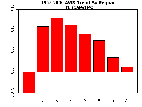
Above: a graph from Steve McIntyre of ClimateAudit where he demonstrates how “K=3 was in fact a fortuitous choice, as this proved to yield the maximum AWS trend, something that will, I’m sure, astonish most CA readers.”
K=3 means only 3 trends were used, the ‘lack of captured variance’ is an acknowledgement and acceptance of the fuzziness of the image. It’s easy to imagine that it would be difficult to represent a complex movie image of Antarctic with any sharpness from 1957 to 2006 temperature with the same 3 color trends reweighted for every pixel. In the satellite version of the Antarctic movie the three trends look like this.

Note that the sudden step in the 3rd trend would cause a jump in the ‘temperature’ of the entire movie. This represents the temperature change between the pre 1982 recreated data and the after 1982 real data in the satellite reconstruction. This is a strong yet overlooked hint that something may not be right with the result.
In the case of the AWS reconstruction we have only 63 AWS stations to make the movie screen, by which the trends of 42 surface station points are used to infill the remaining data. If the data from one surface station is copied to the wrong AWS stations the average will overweight and underweight some trends. So the question becomes, is the compression level too high?
The problems that arise when using too few principal components
Fortunately, we’re here to help in this matter. Steve McIntyre again provided the answer with a simple plot of the actual surface station data correlation with distance. This correlation plot compares the similarities ‘correlation’ of each temperature station with all of the 41 other manual surface stations against the distance between them. A correlation of 1 means the data from one station is exactly equal to the other. Because A -> B correlation isn’t a perfect match for B->A there are 42*42 separate points in the graph. This first scatter plot is from measured temperature data prior to any infilling of missing measurements. Station to station distance is shown on the X axis. The correlation coefficient is shown on the Y axis.

Since this plot above represents the only real data we have existing back to 1957, it demonstrates the expected ‘natural’ spatial relationship from any properly controlled RegEM analysis. The correlation drops with distance which we would expect because temps from stations thousands of miles away should be less related than those next to each other. (Note that there are a few stations that show a positive correlation beyond 6000 km. These are entirely from non-continental northern islands inexplicably used by Steig in the reconstruction. No continental stations exhibit positive correlations at these distances.) If RegEM works, the reconstructed RegEM imputed (infilled) data correlation vs. distance should have a very similar pattern to the real data. Here’s a graph of the AWS reconstruction with infilled temperature values.
Compare this plot with the previous plot from actual measured temperatures. Now contrast that with the AWS plot above. The infilled AWS reconstruction has no clearly evident pattern of decay over distance. In fact, many of the stations show a correlation of close to 1 for stations at 3000 km distant! The measured station data is our best indicator of true Antarctic trends and it shows no sign that these long distance correlations occur. Of course, common sense should also make one suspicious of these long distance correlations as they would be comparable to data that indicated Los Angeles and Chicago had closely correlated climate.
It was earlier mentioned that the use of 3 PCs was analogous to the loss of detail that occurs in data compressions. Since the AWS input data is available, it is possible to regenerate the AWS reconstruction using a higher number of PCs. It stood to reason that spurious correlations could be reduced by retaining the spatial detail lost in the 3 PC reconstruction. Using RegEM, we generated a new AWS reconstruction using the same input data but with 7 PCs. The distance correlations are shown in the plot below.

Note the dramatic improvement over that shown in the previous plot. The correlation decay with distance so clearly seen in the measured station temperature data has returned. While the cone of the RegEM data is slightly wider than the ‘real’ surface station data, the counterintuitive long distance correlations seen in the Steig reconstruction have completely disappeared. It seems clear that limiting the reconstruction to 3 PCs resulted in numerous spurious correlations when infilling missing station data.
Using only 3 principal components distorts temperature trends
If Antarctica had uniform temperature trends across the continent, the spurious correlations might not have a large impact in the overall reconstruction. Individual sites may have some errors, but the overall trend would be reasonably close. However, Antarctica is anything but uniform. The spurious correlations can allow unique climactic trends from a localized region to be spread over a larger area, particularly if an area lacks detailed climate records of its own. It is our conclusion is that is exactly what is happening with the Steig AWS reconstruction.
Consider the case of the Antarctic Peninsula:
- The peninsula is geographically isolated from the rest of the continent
- The peninsula is less than 5% of the total continental land mass
- The peninsula is known to be warming at a rate much higher than anywhere else in Antarctica
- The peninsula is bordered by a vast area known as West Antarctica that has extremely limited temperature records of its own
- 15 of the 42 temperature surface stations (35%) used in the reconstruction are located on the peninsula
If the Steig AWS reconstruction was properly correlating the peninsula stations temperature measurements to the AWS sites, you would expect to see the highest rates of warming at the peninsula extremes. This is the pattern seen in the measured station data. The plot below shows the temperature trends for the reconstructed AWS sites for the period of 1980 to 2006. This time frame has been selected as this is the period when AWS data exists. Prior to 1980, 100% of AWS reconstructed data is artificial (i.e. infilled by RegEM).

Note how warming extends beyond the peninsula extremes down toward West Antarctica and the South Pole. Also note the relatively moderate cooling in the vicinity of the Ross Ice Shelf (bottom of the plot). The warming once thought to be limited to the peninsula appears to have spread. This “smearing” of the peninsula warming has also moderated the cooling of the Ross Ice Shelf AWS measurements. These are both artifacts of limiting the reconstruction to 3 PCs.
Now compare the above plot to the new AWS reconstruction using 7 PCs.

The difference is striking. The peninsula has become warmer and warming is largely limited to its confines. West Antarctica and the Ross Ice Shelf area have become noticeably cooler. This agrees with the commonly-held belief prior to Steig’s paper that the peninsula is warming, the rest of Antarctica is not.
Temperature trends using more traditional methods
In providing a continental trend for Antarctica warming, Steig used a simple average of the 63 AWS reconstructed time series. As can be seen in the plots above, the AWS stations are heavily weighted toward the peninsula and the Ross Ice Shelf area. Steig’s simple average is shown below. The linear trend for 1957 through 2006 is +0.14 deg C/decade. It is worth noting that if the time frame is limited to 1980 to 2006 (the period of actual AWS measurements), the trend changes to cooling, -0.06 deg C/decade.

We used a gridding methodology to weight the AWS reconstructions in proportion to the area they represent. Using the Steig’s method, 3 stations on the peninsula over 5% of the continent’s area would have the same weighting as three interior stations spread over 30% of the continent area. The gridding method we used is comparable to that utilized in other temperature constructions such as James Hansen’s GISStemp. The gridcell map used for the weighted 7 PC reconstruction is shown here.

Cells with a single letter contain one or more AWS temperature stations. If more than one AWS falls within a gridcell, the results were averaged and assigned to that cell. Cells with multiple letters had no AWS within them, but had three or more contiguous cells containing AWS stations. Imputed temperature time series were assigned to these cells based on the average of the neighboring cells. Temperature trends were calculated both with and without the imputed cells. The reconstruction trend using 7 PCs and a weighted station average follow.

The trend has decreased to 0.08 deg C/decade. Although it is not readily apparent in this plot, from 1980 to 2006 the temperature profile has a pronounced negative trend.
Temporal smearing problems caused by too few PCs?
The temperature trends using the various reconstruction methods are shown in the table below. We have broken the trends down into three time periods; 1957 to 2006, 1957 to 1979, and 1980 to 2006. The time frames are not arbitrarily chosen, but mark an important distinction in the AWS reconstructions. There is no AWS data prior to 1980. In the 1957 to 1980 time frame, every single temperature point is a product of the RegEM algorithm. In the 1980 to 2006 time frame, AWS data exists (albeit quite spotty at times) and RegEM leaves the existing data intact while infilling the missing data.
We highlight this distinction as limiting the reconstruction to 3 PCs has an additional pernicious effect beyond spatial smearing of the peninsula warming. In the table below, note the balance between the trends of the 1957 to 1979 era vs. that of the 1980 to 2006 era. In Steig’s 3 PC reconstruction, moderate warming that happened prior to 1980 is more balanced with slight cooling that happened post 1980. In the new 7 PC reconstruction, the early era had dramatic warming, the later era had strong cooling. It is believed that the 7 PC reconstruction more accurately reflects the true trends for the reasons stated earlier in this paper. However, the mechanism for this temporal smearing of trends is not fully understood and is under investigation. It does appear to be clear that limiting the selection to three principal components causes warming that is largely constrained to a pre-1980 time frame to appear more continuous and evenly distributed over the entire temperature record.
| Reconstruction |
1957 to 2006 trend |
1957 to 1979 trend (pre-AWS) |
1980 to 2006 trend (AWS era) |
| Steig 3 PC |
+0.14 deg C./decade |
+0.17 deg C./decade |
-0.06 deg C./decade |
| New 7 PC |
+0.11 deg C./decade |
+0.25 deg C./decade |
-0.20 deg C./decade |
| New 7 PC weighted |
+0.09 deg C./decade |
+0.22 deg C./decade |
-0.20 deg C./decade |
| New 7 PC wgtd imputed cells |
+0.08 deg C./decade |
+0.22 deg C./decade |
-0.21 deg C./decade |
Conclusion
The AWS trends which this incredibly long post was created from were used only as verification of the satellite data. The statistics used for verification are another subject entirely. Where Steig09 falls short in the verification is that RegEM was inappropriately applying area weighting to individual temperature stations. The trends from the AWS reconstruction clearly have blended into distant stations creating an artificially high warming result. The RegEM methodology also appears to have blended warming that occurred decades ago into more recent years to present a misleading picture of continuous warming. It should also be noted that every attempt made to restore detail to the reconstruction or weight station data resulted in reduced warming and increased cooling in recent years. None of these methods resulted in more warming than that shown by Steig.
We don’t yet have the satellite data (Steig has not provided it) so the argument will be:
“Silly Jeff’s you haven’t shown anything, the AWS wasn’t the conclusion it was the confirmation.”
To that we reply with an interesting distance correlation graph of the satellite reconstruction (also from only 3 PCs). The conclusion has the exact same problem as the confirmation. Stay tuned.

(Graph originally calculated by Steve McIntyre)
True!
” ‘Tis a dream devoutly to be wished.”
Jeff, to be honest, it’s my climate challenged older brother, so I get nowhere without extreme effort!:} Is there a reason for not using your names?
David,
Thanks for your comments. This response is a bit long-winded, but here are my reasons for anonymity. These are my thoughts alone and don’t in anyway claim to speak for Jeff Id.
The paper attracted my attention due to almost immediate 180-degree shift on Antarctica seen in the popular press. Overnight it went from Antarctica is cooling but we expected that, to Antarctica is warming just like we thought it would. Virtually no questions aside from the Trenberth quote regarding how the paradigm could completely change. The pronouncement was that this was the new reality.
Unlike the paper’s authors, all of the work discussed in the article was done on my own time without any compensation. The authors of this paper are well-paid (as they should be for their experience and education) using public funding to perform research that will ultimately shape government policy. That policy will affect the quality of our lives whether we individually consent or not. The studies that shape the policies need to be transparent, verifiable and sound.
I am employed in private industry. My employer has the same right to transparency in my work that I would expect from those employed by the public. I don’t withhold methods, or provide vague descriptions when clarification is requested. I often have to present my finding in design review presentations where the company and the customer’s experts are brought in to judge if I did my job correctly. If I made a mistake, it isn’t pleasant to have it exposed in an auditorium with as many as 100 people watching. Because of that, I strive to be cautious in my work and not venture into areas where I am not confident of my findings. When pressed with hard questions, I answer them honestly or admit I don’t know. One thing I never do (and would be reprimanded if I did) is demand to know the name and credentials of those asking the questions before I decide to answer. My employer thinks it is important for them to question my work, if want to be able to continue to pay my mortgage, I answer them.
Unfortunately, climate science is heavily politicized. Those who dare question the AGW orthodoxy are vilified on environmental extremist and left-wing websites. My last name isn’t common. A few minutes googling around and you are looking at satellite photos of my home. If I were being paid six-figures to look into this, I might accept that as the cost of doing business. I’m not, so I don’t.
I will gladly supply all of the back up documentation (R and Matlab scripts, Excel workbooks, etc.) to those who have a true interest in following up on this. I can be reached though Jeff Id’s site. If those associated with the paper would like to privately discuss this (as opposed to public sniping on blogs), I have no problem using my real name.
If you’ll put up a separate tip jar for the costs for an ad, I’ll ding it periodically.
@Pierre-Luc (07:27:02) : http://droitemonde.blogspot.com/2009/03/une-autre-mauvaise-nouvelle-pour-nos.html
Merci Pierre-Luc pour votre lien affiché sur WUWT. C’est tres chaud, n’est pas?
Avec un sarc/> 😎
All:
The following is correspondence I have had with Nature magazine. I have still not had a reply.
Please note that Nature refuses to publish anything that has appeared in the public domain and, therefore, I have not submitted the matter of this correspondence publicly before. However, the amount of time since I first asked the questions makes clear that Nature – which I remember from times past was a serious scientific journal – is not willing to address the issue. Therefore, I am now posting the correspondence here in hope of providing the information widely, and the correspondence is to be published in ‘Energy and Environment’.
Richard
Letter to Nature 24 February 2009
Dear Sirs:
A month has passed since I sent you the letter that I copy below. It asks for necessary explanation of the methodology used by Steig et al. to conduct work that they reported in Nature (ref. Nature v457 Issue 7228, pp 459-462, 22 Jan.2009).
You replied saying:
In a message dated 24/01/2009 10:59:56 GMT Standard Time, feedback@nature.com writes:
Thank you for contacting us. We acknowledge receipt of your question.
Since then I have heard nothing from you, and I have found no mention of the matter in subsequent editions of Nature.
I find it strange that you have not provided answers to the questions in my letter (copied below). The paper by Steig et al. was used by Nature as a ‘cover story’, and Nature issued a press release to announce the paper’s publication, but I have questioned the methodology of that paper. And it would require very little effort by the paper’s authors to answer my questions if there are valid answers to my questions. Importantly, as my letter (copied below) explains, the paper by Steig et al. cannot be considered to be a work of science until my questions have been answered because – at present – the reported methodology of that work is based on circular reasoning.
So, I am writing this message as a strong request that a valid answer to my questions now be provided. If no such answers are forthcoming then I will address the problem in another journal.
Regards
Richard S Courtney
Letter submitted to Nature 24 January 2009
Dear Sirs:
Steig et al. report (Nature v457 Issue 7228, pp 459-462, 22 Jan.2009) assert they have shown “that significant warming extends well beyond the Antarctic Peninsula to cover most of West Antarctica” by interpolation of data from a few surface stations and by adjusting satellite telemetry data.
The supplementary information to their paper includes the following:
“Accuracy in the retrieval of ice sheet surface temperatures from satellite infrared data depends on successful cloud masking, which is challenging because of the low contrast in the albedo and emissivity of clouds and the surface. In Comiso (ref. 8), cloud masking was done by a combination of channel differencing and daily differencing, based on the change in observed radiances due to the movement of clouds. Here, we use an additional masking technique in which daily data that differ from the climatological mean by more than some threshold value are assumed to be cloud contaminated and are removed. We used a threshold value of 10°C, which produces the best validation statistics in the reconstruction procedure.”
The above quotation says Steig et al. removed all “satellite infrared data” data that were 10 or more °C from the “climatological mean”. This raises interesting questions that warrant answer before the findings of Steig et al. should be accepted; viz.
How did Steig et al. know the “climatological mean” when that is the parameter they were trying to determine?
And if they knew it then why did they need to determine it?
Importantly, why did peer review of the paper by Steig et al. fail to obtain clarification of such a fundamental point concerning the validity of the used methodology?
Regards
Richard S Courtney
From: Richard S Courtney
88 Longfield
Falmouth
Cornwall
TR11 4SL
United Kingdom
Tel: +44 01326 211849
email: RichardSCourtney@aol.com
How Wattsup can lie and get away with it:
http://www.davidsuzuki.org/about_us/Dr_David_Suzuki/Article_Archives/weekly03060901.asp
Why does the public often pay more attention to climate change deniers than climate scientists? Why do denial arguments that have been thoroughly debunked still show up regularly in the media?
Some researchers from New York’s Fordham University may have found some answers. Prof. David Budescu and his colleagues asked 223 volunteers to read sentences from reports by the Intergovernmental Panel on Climate Change. The responses revealed some fundamental misunderstandings about how science works.
Science is a process. Scientists gather and compare evidence, then construct hypotheses that “make sense” of the data and suggest further tests of the hypothesis. Other scientists try to find flaws in the hypothesis with their own data or experiments. Eventually, a body of knowledge builds, and scientists become more and more certain of their theories. But there’s always a chance that a theory will be challenged. And so the scientists speak about degrees of certainty. This has led to some confusion among the public about the scientific consensus on climate change.
What Prof. Budescu and his colleagues found was that subjects interpreted statements such as “It is very likely that hot extremes, heat waves and heavy precipitation events will continue to become more frequent” to mean that scientists were far from certain. In fact, the term very likely means more than 90 per cent certain, but almost half the subjects thought it meant less than 66 per cent certain, and three quarters thought it meant less than 90 per cent.
REPLY: Thanks for the kind words “CCPO”. Unfortunately yours is mostly the angry opinion of a coward. You denigrate, hurl insults, and make labels much like our good friend Tenney. But you do so from behind the safety of a fake internet name. You even hide behind a proxy. At least have the courage to address the posting directly, using your own name, rather than to hide behind cowardice. I wonder though, as a teacher, do you say the same sorts of things to your students when they question things? Try not to be so angry all the time, it does little good here.- Anthony
And, today, Mar 18, comes from NSF a press release on the ANDRILL program, a $20 million(US, plus $10 million from other govts) Antarctic core drilling boondoggle which has resulted in a preliminary report more full of “coulds”, “shoulds”, “mights” “projected to occur”and “models indicate” than a Madoff sales pitch. Somebody tell me what it all means.
Science is a process. Scientists gather and compare evidence, then construct hypotheses that “make sense” of the data and suggest further tests of the hypothesis. Other scientists try to find flaws in the hypothesis with their own data or experiments…………..
..Hello..This is the end to the result, conclusive science would take 100’s of years. i thank you for your insight, i plead that year heart finds the Son of God, Jesus the christ, because of you..people will believe not in man but in Gods will with his creation. Thanks for the infooo heres mine…aplusraingutter@gmail.com