It has been 10 years since the super El Niño of 1998 helped to spike global temperatures dramatically. Now since it appears we are in the opposite phase, I thought it would be interesting to look at the 10 year trend from January 1998 to January 2008.
Here’s a link to a 2-minute video called “The El Niño Factor”. Bob Tisdale points out to me this interesting graph: (slightly modified the key placement to fit the image in this blog)

Here’s the link to the Webpage that’s the source of the data for the above graph.
Now let me be clear that a 10 year trend period is not typical for climate analysis. Typically a 30 year period is used to establish a climate baseline. For example, NOAA publishes climate summaries for cities in the USA based on 30 year periods. I’m not trying to do anything to compare to the last 30 or even the last 100 years. I’m simply curious about what the trend looks like since the last big El Niño event in 1998 now that we are in a La Niña. Of course this may upset some folks, and I’ll probably get the usual invective hurled at me and furious scribblings on other blogs refuting this as “He’s doing it wrong”, but I think looking at what has happened globally between a large a large El Niño and La Niña is both interesting and useful.
To do this, I used the same global temperature anomaly datasets that I’ve used for the last few posts I made on the subject of global temperature anomalies. I created a new file, using all four global metrics, with only the last 10 years of data, which you can inspect here: 4metrics_temp_anomalies_1998-20081.txt
Here are the four charts of global temperature anomalies, note that there are links to each original organizations data source below each graph. Click each image to get a full sized one.
University of Alabama, Huntsville (UAH) Dr. John Christy:

Reference: UAH lower troposphere data
UAH shows a slightly positive anomaly trend of 0.028°C for the last ten years.
Remote Sensing Systems of Santa Rosa, CA (RSS):

Reference: RSS data here (RSS Data Version 3.1)
RSS shows a slight negative anomaly trend of -0.01°C for the 10 year period. This may have to do with the fact that RSS reported an anomaly for January 2008 that was twice the size than what UAH reported (-0.08 for RSS, -0.044 for UAH) owing to a different methodology of the satellite data preparation.
UK’s Hadley Climate Research Unit Temperature anomaly (HadCRUT) Dr. Phil Jones:

Reference: above data is HadCRUT3 column 2 which can be found here
description of the HadCRUT3 data file columns is here
The HadCRUT land-ocean global anomaly data shows a slight trend of 0.017°C for the last ten years. Surprisingly, it is lower than the trend of 0.028°C for the UAH satellite data.
NASA Goddard Institute for Space Studies (GISS) Dr. James Hansen:

Reference: GISS dataset temperature index data
And finally we have the NASA GISS land-ocean anomaly data showing a ten year trend of 0.151°C, which is about 5 times larger than the largest of the three metrics above, which is UAH at 0.028°C /ten years.
Given some of the recent issues Steve McIntyre has brought up with missing data at NASA GISS, it also makes me wonder if the GISS dataset is as globally representative as the other three.
UPDATE: The answer as to why the GISS data diverges so much may be found in the 2005 summary on the GISTEMP website, (h/t Barry H.) Here is a relevant excerpt:
Our analysis differs from others by including estimated temperatures up to 1200 km from the nearest measurement station (7). The resulting spatial extrapolations and interpolations are accurate for temperature anomalies at seasonal and longer time scales at middle and high latitudes, where the spatial scale of anomalies is set by Rossby waves (7). Thus we believe that the remarkable Arctic warmth of 2005 is real, and the inclusion of estimated arctic temperatures is the primary reason for our rank of 2005 as the warmest year.
I’m not sure the “remarkable Arctic warmth” is real, especially since the disappearance of arctic sea ice during that time has been linked not to warmer temperatures, but to wind patterns by other researchers at NASA. The sea ice “melt” as proxy for increased arctic temperatures doesn’t seem to be connected. Further, a NASA satellite AVHRR image shows the high latitudes near the south pole getting colder, except in areas where volcanic activity is known to exist.
A recent comment from Carl Smith came with an animated graphic showing how that 1200 km spatial extrapolation looks when compared to a 250 km block, which is also used in GISS analysis. Carl writes “Bear in mind that the data in a 250km ‘block’ is in many cases from a single station, especially in remote areas, so is really just a minuscule dot on the map. Note how little real polar region data there is in the 250 km map, whereas in the 1200 km map the polar regions appear to be well covered.”
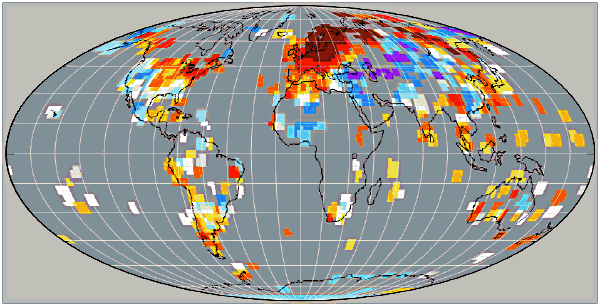
As a creator and purveyor of meteorological measurement technology I have never been a fan of “extrapolated” data. It is not a confidence builder to know that data for something so important has been either extrapolated or estimated, especially when there are so few stations in the high latitudes, as evidenced by the Historical Station Distribution study by John Goetz.
By treating the NASA GISS data as being an outlier due to that data confidence difference, and by taking a “3 out of 4 approach” in looking at the plotted trends, one could conclude that there has not been much of a trend in global temperature anomalies in the past ten years.
A point about the POES satellites. They are NOT in polar orbits. The inclination is about 98 degrees, meaning that they do not come closer to the poles than about 82 degrees north or south. I suppose they can cover areas a bit closer to the poles by using off-nadir measurements at the cost of lower quality data and more complex data interpretation.
As for surface data there is actually a weather station at the South Pole and one or two more stations above 80 degrees south. The North Pole has never had a weather station except for a brief period in 1937 when the Papanin expedition was there. There is definitely no weather stations north of 83 north for the simple reason that there is no land closer to the pole anywhere. If the Alert station on Ellesmere land is still operating it is probably the northernmost in the World (about 82 degrees). There are few, if any, other operating stations north of 80 degrees.
So in essence: there are almost no reliable weather data south of 82 degrees south, and none at all north of 82 degrees north.
REPLY: Well we have another one of those “truth is stranger than fiction” moments. Soemthing named a Polar Operational Environmental Satellite doesn’t actuallly get close to the poles…even though NOAA itself calls them “Polar Orbiting Satellites” on their web page for them:
http://www.oso.noaa.gov/poes/
whooda thunkit?
Here is the coverage map for POES:
http://www.met.fsu.edu/explores/CurrCD/CURRCD-FINAL/Appendix/Ap4-POEScoverage.jpg
For those of you in love with straight line trends, you might like to wander over to William Briggs lastest essay “You cannot measure a mean”.
http://wmbriggs.com/blog/
Anthony,
I am surprised by your exchange by your exchange earlier in this blog with Lee. I view it as uncharacteristic of you to speculate needlessly – albeit graciously — when you could have waited. Not only did you speculate, but you also were not aware of what had been quite well established in the literature — that only the GISS dataset purports to measure the Arctic Ocean temperatures. (Perhaps it would be more accurate to say that GISS projects Arctic Ocean temperatures rather than interpolates them. On one hand the GISS method could be credible because of the recent melts in the Arctic. On the other hand, there are apparently other reasons for the melt besides higher temperature, and the weather stations used to measure and project temperatures in the extreme North seem to have been influenced by exhausts and other human phenomenon.)
If I remember correctly, Lee also points out that GCM was used to help adjust satellite measurements. I believe that RSS used it quite some time ago in their attempts to further refine effects of orbital decay and deviation. Christy apparently did not necessarily accept that these further adjustments were necessary for his UAH measures – he had previously made adjustments for orbital decay – but he expressed no concerns about the RSS adjustments because they were within the error bars of measurement.
Meanwhile, the quote from Wikipedia misses an important point: If trends in satellite and land temperatures indeed converge, then the Global Climate Models are invalidated. The theory behind the GCMs is that troposheric temperatures will warm faster than the earth’s surface. Ironically, if the pro-AGW crowd would accept that the GISS and Hadcrut trends are overstating surface trends (due to UHI), then they would win the argument about the GCMs’ validity, and the argument would move to discussion if the trend is significant and then if warmer is indeed harmful on balance. Yet, as the IPCC points out, observations at this point in time do not entirely match the model’s outputs and either the models are somewhat off or the observations are somewhat off. They tend to believe the latter since the troposphere is not observed to be warming faster than the surface.
REPLY We all have our days. See the thread on UAH/RSS sat data:
http://wattsupwiththat.wordpress.com/2008/03/08/putting-a-myth-about-uah-and-rss-satellite-data-to-rest/
Lots of good things came from the exchange even though the exchange itself was messy.
Boy, did this discussion ever take off fast! Where was I when it began?
Jumping into the fray, allow me to say this about the back and forth over the meaning of trends in the data, and whether or not we can say anything meaningful about trends as short as, or shorter, than a decade. First, IPCC and others, have made the discussion of the historical record all about trends. So it is natural to want to parse the data and see what it really says about “trends.” And in truth, there is so much cyclical variation in the data (giving rise to serial correlation) that ferreting out trends that are “statistically significant” is an heroic task. While I imagine that Anthony has simply fit an OLS trend line to the data (and thus has not controlled for serial correlation), there’s not a doubt in my mind that Anthony’s basic point is valid. In the past ten years, it is highly likely that the temperature trend is not significantly different than zero.
In fact, when the entire history of the satellite period (1979 onwards) is analyzed rigorously, none of the four metrics Anthony is blogging about have trends that are significantly different than zero. I’ve always wondered why more attention hasn’t been given to using ARIMA to analyze the data. I know about Ross McKitrick’s paper, and I imagine that there are others, but given the continual attention made to “trends” I’m still surprised. So I took a quick stab at throwing something together this afternoon. Results in the next post.
I’m not going to go too far into the details right now. I’ll just post links to a couple of pics.
http://i28.tinypic.com/28cpoqs.jpg
http://i25.tinypic.com/r7vfxi.jpg
Just a couple of quick observations about what we’re looking at. First, the images plot seasonal differences in Anthony’s “metrics,” not the anomalies themselves. Besides some obvious analytical advantages, these seasonal differences are what started all of this in the first place, i.e. the change from January 2007 to January 2008. Second, the first plot is based on an analysis of the average of the two satellite series, and the second plot is based on an analysis of the average of the two land_sea series. Third, in each, I’ve computed and put on the images the historical and projected “trends” (back to anomalies now, not seasonal differences). Astute observers will note that the historical trend for the satellite series is noticeably lower than the historical trend for the land_sea series, which is not what we expect to see under the AGW hypothesis.
Finally, the forecast models were based on 1979 through 2006 so we could see how the model performed in the final year and a month of the available data. The forecast period then runs out another 12 months, to 2009:1. During the 12 months of purely forecasted data, the trends in the anomalies are negative for both series.
While none of the “trends” in this Q&D analysis are “statistically significant,” January 2008 did indeed fall outside the 95% confidence interval for a forecast based on the models. So something “significant” did indeed happen, and we cannot deny that by hiding behind the “noise” in the data.
REPLY: Basil, you are welcome to create a guest post on this if you wish. Just let me know via comments and I’ll set you up.
Why is the GISS data for 1998 so low? That’s exactly why GISS data trends up so much more than the others. 1998 is not like the others.
BTW, I expect when 1998 drops off the 10 year trend, the decadal trend will likely go up for all metrics.
Lee,
Well, what you see is what we got, i.e. the month of January 2008 was outside the predicted range. By itself, of course, one observation falling outside of the predicted range might not be particularly “significant” (in the sense of “meaningful”). But it didn’t just fall outside the range. It fell well outside the range. It will be interesting to see if that continues.
Meanwhile, Anthony, give me a couple of days to pull things together in more polished format. You’ve got my email.
Basil
Anthony,
You do great work here, but best of all, your work resonates with the general public. Not everyone is a professional grad student or an environmental zealot with a doctorate. The common folks are busy with their lives, raising their kids, paying the mortgage and are lucky to have a few minutes of spare time. They don’t have the time to learn about proxies or dendro or the ins and outs of microwave sounding units. But they do understand that a temperature sensor next to an air conditioner exhaust isn’t right. They also understand that the AC unit probably wasn’t there 60 odd years ago.
That is why the true believers are running scared and are spending enormous amounts of energy attacking you. If you can be shown to be wrong on some technical detail, then they will claim all of your work is in question. Even if that doesn’t work, at least they tie up large amounts of your time with endless questions and circular reasoning. Your patience in dealing with them is truly amazing, but I fear they are accomplishing their goals. They are not trying to learn, but to obfuscate. Cast not your pearls…
A daily check of Arctic temperatures revealed that since last October the temperatures in the high Arctic (Ellesmere Island) have consistently been minus 30 to minus 50 deg C. It is minus 41 ‘as we speak’, not a lot of melting , in fact none in the last 6 months with a hell of a lot of ice freezing going on.
Where are those, including Gore and Suzuki “when we really need them” who have been so concerned about the Arctic melt and the imminent demise of the polar bears? Why are they not at “ground zero” (Ellesmere Island ) to see for themselves the conditions? Why too are they not cheering now that the polar bears have been ‘granted a reprieve’?
The basis for Kyoto, the IPCC and “the carbon games” are being shredded.
If anyone should be jailed as a result of supposed AGW and the lack of action arising from thereof, it should be Suzuki for his fear mongering and attempts at causing mass hysteria.
A very interesting site and well put arguments. As a lay person who started from a neutral and concerned position over global warming I regret that I see the same positions from the opposite sides. One side from the doubters who put up relevant data and facts.The other from the “warmists” who then accuse them of knowing nothing and misleading the rest of us (who also know nothing) but who then decline to reply with relevant facts. “I dont have time”. I may not be a scientist but I am able to judge based on balance of probabilities and facts presented and as far as I am concerned the case for global warming has most certainly not been made.
Pardon my ignorant questions, but I was impressed with Lee’s point about confidence intervals. Since I had Hansen et. al 1999 on hand, I searched and found his error bars on one graph.
The confidence interval, according to the text, had to do with spatial temperature measurements, i.e., that in many cases the use of data from one station could be used over large spaces (interpolation?). I did not find an expression of confidence for the aggregate set of measurements and adjustments, but, maybe this was described in an earlier government funded study that is not available on the government sites.
Since I am only a casual observer I won’t personally trouble Dr Hansen for copies of his old, unavailable papers.
Perhaps someone can take a look at Hansen 1999 and explain the error expression.
Also, Dr Hansen speculates on a “smoking gun” in section 11.1.3. Did we achieve his speculated 0.05 deg C average increase within 2 to 3 years after 1999 relative to 1951-1980?
The paper is interesting reading, and I wouldn’t want to be the one to make sense of thousands of temperature readings, knowing that there were probably HUI problems, and who knows what other errors creep into the mix.
Sorry if this post is a bit off topic.
Hi all,
I’ve used Satellite Took Kit to show a one day passage of NOAA 18 by the north pole.
http://www.flickr.com/photos/24537036@N02/2324711796/
NOAA 18 is in a 98.8 degree inclined orbit, which is a Sun Synchronous Orbit (not polar). This orbit uses the oblatness of the earth to cause the orbit to rotate about the pole once per year, keeping the sun angle constant. This way, every passage of the equator occurs at the same local sun “time” every orbit, every day, all year. We set these up, for example, as 10 a.m. descending node orbits, or maybe 2 p.m. ascending node orbits…etc. These can drift with time if propellant is not used to maintain the orbit altitude. At 800+ km for these SATs, this effect is pretty small, but not negligible over lifetime.
So, NOAA 18 only goes up to 81.2 degrees latitude, with the instrument seeing a 3.3 degree field of view. Since this is a nadir pointing instrument, you will only see slightly north of the 81.2 degrees.
I guess they didn’t want to call the program SSOES, even though the satellites are not polar. Polar orbits are by definition inclinations of 90 degrees, taking the spacecraft directly over the poles. If the satellites were in this orbit, the time of day would vary for the each passage, so that might complicate the temperature measurements.
Hope this was helpful….
Have you ever heard of winter? Do you understand that no climate scientist in the world would claim that the arctic won’t freeze over in the winter, when it is night for months, receives no direct solar energy at all?
I’ve posted a reply: 4 of 4 Global Metrics Show Agreement in Trends. The Reader’s Digest version: the analysis done for this post is not wrong, but it’s misleading.
I would claim that a ten year trend is probably dominated by things besides any possible “climate change” types of things. For example, the El Nino La Nina cycle as opposed to any changes due to things like CO2, CH4, etc. But I would also claim that a ten year trend is not meaningless, it simply shows other things. For example, all four metrics show ranges of 0.6 C or more over ten years. That shows us that the “natural variation” is at least that large. So, what the ten year trend shows is, discerning an effect of something like 1.2 C over a century, amid natural variation of 0.6C (or more) per decade, requires very accurate data. And a very good understanding of the atmosphere and oceans. I’m not real sure we have those.
Anthony,
Thanks for a great website. As a casual observer just jumping into things, I have a few comments/questions about what I have read:
1. Atmoz says that he proves that a five year trend is meaningless and then goes on to say that you need to use 13 years or greater to determine an accurate trend. He bases this on the fact that there is a positive slope in the overall temperature readings and conducting 5 year trends on the data results in almost equal number of negative trends as positive – because of the positive trend over the temperature data then you can not have an almost equal number of negative trends as positive trends (my words not his). He in turn does an analysis of number of positive trends against the number of sampling years to prove that when you get close to 13 years you get approx 70% positive trends. I do not agree with that argument. You only need two data points to make a trend and 5 years of data have plenty of data points. Comparing the number of positive trends to negative trends does not prove that a 5 year trend is meaningless. I assume if he did an analysis of the magnitude of the trends he would find that the 5 year positive trends are of higher magnitude then the negative trends there by resulting in positive temperature gradient over the sampled data. It is about the magnitude of the trend not the number of positive or negative trends.
2. Atmoz talks about “noise”. The bigger your time interval the less the “noise” impacts your trends. Data is data; I do not understand the concept of “noise”. Do they use this to discount data? A more in-depth discussion of “noise” would be great.
3. I have a question about Temperature Anomalies (the basis for all this discussion). How are they determined? This may be a simple question, but in previous posts people have stated that the baseline does not matter when you are looking at trends. When you are measuring an anomaly, I think it does. Depending on where you measure this anomaly from (i.e. the baseline) will have a huge impact on the data.
REPLY: Your questions are good ones, but I’m in between locations at the moment. Perhaps our readers can help with the answers until I can join back in?
Lee,
Thanks.
I am still unclear where the 310.14K or 37C (I am using your example to illustrate the baseline and understand this is not the baseline used for the analysis in the post) comes from in the analysis of the measured temperature anomalies? How did they determine the best temperature for the 310.14K/37C (if this represents the baseline in which the anomaly is measured)? That baseline could change based on data sets and would very much so change the resulting trends. Am I missing something?
Lee,
Sorry for the second post.
In your post you are talking about changing the temperature scale not the baseline. Of course the anomaly will not change between K and C. But the baseline is the temperature they consider normal and the anomaly is the difference between the normal temperature and the measured temperature i.e. anomaly. How did they determine the normal temperature? Hope this clears up my question.
**********We have three metrics that supposedly don’t have polar data, UAH, RSS, HadCRUT, (I’m still out on UAH waiting to hear from Christy) and one the that does have polar data, GISS, but it is “interpolated”.*******
Interpolated (or, more accurately, extrapolated — since there is no data point at the pole) values cannot be accurately called “data”. Stuff like this should never be used without lots of caveats and explanations on the method of extrapolation and how sensitive the results are to the algorithm and parameters used, and how (if at all) it has been verified. For example, is the ice melt taken as a proxy of temperature, or are the wind effects accounted for — and what is the confidence interval of the accounting, and how is it arrived at?. How sensitive are the values to errors in one or a small number of neighboring stations? Strange that Lee seems OK with accepting the extrapolation method without question — do you know more than you are saying, or is it just what you would like to believe?
I invite anyone to extrapolate any random stock price time series using polynomials and bet a bunch of money on it — this should bring home the difference between extrapolated values and data.
Regarding 1: See also Stoat, where actual statistical significance is calculated.
Regarding 2: This Wikipedia article on signal-to-noise ratio may help.
Atmoz,
Thanks for the response. Both of the links do not tell me anything. I understand signal-to-noise. What is the signal and what is the noise as it is in reference to your post? I can not accept that it is noise, when there is no explanation of what you mean. For a long term warming trend may say something different to a 5 year trend, but to say they are meaningless is a little disingenuous. You can compare the rate of change over 5 year periods (i.e. trends) and it is not meaningless. The link to Stoat does not provide any additional statistical analysis, just shows me what you show. Because a trend does not match the overall trend, the does not make is meaningless, it may make it less significant than a longer time interval (Stoat says this). But if you want to look at the 5 year trend, say 2003 to 2008, and the magnitude of the trend (i.e. slope is significantly larger that prior analysis) it would be significant.
Oldengineer
Good post.
Sheaks3:
The signal is ‘global warming’, which I have modelled as a linear trend plus some arbitrary bias. In this zeroth order model, everything else is noise.
Stoat does contain additional statistical analysis because my post contains none. I never compute whether a trend is statistically significant. In general, I’ve only recieved good remarks about that post, and it was aimed at people without much experience with statistics. Hence my referring to ‘meaningless’ trends as opposed to ‘insignificant’ trends.
Consider a time series of length T with a red-noise spectrum and a linear trend over the entire period of zero. In general, for a random time series of length t < T the trend will still be near zero, but will not be exactly zero. The change in trend will be positive about 50% of the time; it will be negative about 50% of the time. I am not a statistician, so don’t ask me to prove this.
Now consider the temperature time series I provided in the blog post. It clearly has some trend leading to warmer temperatures in recent years. However, when I looked at the percentage of the trends greater than zero, it was only near 50%, the same as our null hypothesis. Thus I concluded that the results from 5 year trends were meaningless; I did not conclude they were statistically insignificant, which is a must stronger statement.
How did they determine the normal temperature? Hope this clears up my question.
Sheaks3, since we know the normal temperature of the human body (in Lee’s example), I assume you’re asking how the normal temperature of the planet was determined. And, IMO, that really is the crux of the entire debate — what is normal? Who determines it, and how is it determined? Since I’m probably the most math/physics/statistics challenged individual on this blog, I’d love to hear a scientific answer to those questions.
On a related topic, I asked the following questions on another blog a couple weeks ago:
<blockquote?If you were King of the World and had complete control over everything and everyone; what past climate would you try to emulate, what would you do to get there, and what evidence do you have that the policies you would enact would, in fact, achieve the desired results?
I only got one serious taker, and here was his answer (quite good, actually):
Re-education camps, hell. I’m for shootin’ ’em.
Au contraire! I can beat ANYONE at that claim.
Watch this: 2+2=fish
See!
REPLY: Teach a man to add, and he can fish for a day. Teach a man to multiply fish and he can eat for a lifetime.
I’m just a humble mechanical engineer who does a lot of measurement & calibration so I make no claim to be a climate expert. But I am negatively astonished to discover that there is an argument going on here about “interpolated data” for the polar region. Data is something you actually physically measure; an interpolation is a guess. I don’t care how clever or esteemed the climate scientist in question is, a guess is a guess and imho has no place being included in a data set. As for the argument about the length of the period used for calculating the trend…. give me strength. Who cares? You can find what you want to find by picking the start point that appeals to you.