by Ross McKitrick
A number of authors, including the IPCC, have argued that climate models have systematically overstated the rate of global warming in recent decades. A recent paper by Millar et al. (2017) presented the same finding in a diagram of temperature change versus cumulative carbon emissions since 1870.

The horizontal axis is correlated with time but by using cumulative CO2 instead the authors infer a policy conclusion. The line with circles along it represents the CMIP5 ensemble mean path outlined by climate models. The vertical dashed line represents a carbon level where two thirds of the climate models say that much extra CO2 in the air translates into at least 1.5 oC warming. The black cross shows the estimated historical cumulative total CO2 emissions and the estimated observed warming. Notably it lies below the model line. The models show more warming than observed at lower emissions than have occurred. The vertical distance from the cross to the model line indicates that once the models have caught up with observed emissions they will have projected 0.3 oC more warming than has been seen, and will be very close (only seven years away) to the 1.5 oC level, which they associate with 615 GtC. With historical CO2 emissions adding up to 545 GtC that means we can only emit another 70 GtC, the so-called “carbon budget.”
Extrapolating forward based on the observed warming rate suggests that the 1.5 oC level would not be reached until cumulative emissions are more than 200 GtC above the current level, and possibly much higher. The gist of the article, therefore, is that because observations do not show the rapid warming shown in the models, this means there is more time to meet policy goals.
As an aside, I dislike the “carbon budget” language because it implies the existence of an arbitrary hard cap on allowable emissions, which rarely emerges as an optimal solution in models of environmental policy, and never in mainstream analyses of the climate issue except under some extreme assumptions about the nature of damages. But that’s a subject for another occasion.
Were Millar et al. authors right to assert that climate models have overstated recent warming? They are certainly not the first to make this claim. Fyfe et al. (2013) compared Hadley Centre temperature series (HadCRUT4) temperatures to the CMIP5 ensemble and showed that most models had higher trends over the 1998-2012 interval than were observed:
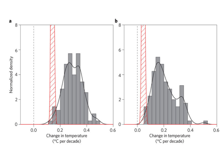
Original caption: a, 1993–2012. b, 1998–2012. Histograms of observed trends (red hatching) are from 100 reconstructions of the HadCRUT4 dataset1. Histograms of model trends (grey bars) are based on 117 simulations of the models, and black curves are smoothed versions of the model trends. The ranges of observed trends reflect observational uncertainty, whereas the ranges of model trends reflect forcing uncertainty, as well as differences in individual model responses to external forcings and uncertainty arising from internal climate variability.
The IPCC’s Fifth Assessment Report also acknowledged model over-estimation of recent warming in their Figure 9.8 and accompanying discussion in Box 9.2. I have updated the IPCC chart as follows. I set the CMIP5 range to gray, and the thin white lines show the (year-by-year) central 66% and 95% of model projections. The chart uses the most recent version of the HadCRUT4 data, which goes to the end of 2016. All data are centered on 1961-1990.
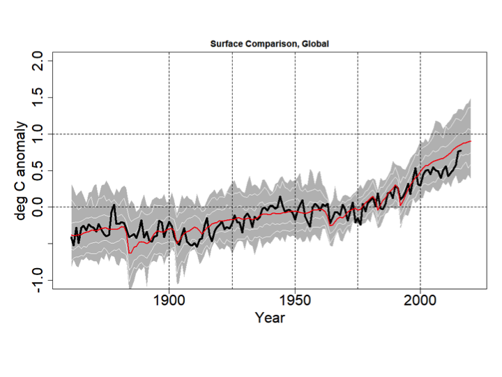 Even with the 2016 EL-Nino event, the HadCRUT4 series does not reach the mean of the CMIP5 ensemble. Prior to 2000 the longest interval without a crossing between the red and black lines was 12 years, but the current one now runs to 18 years.
This would appear to confirm the claim in Millar et al. that climate models display an exaggerated recent warming rate not observed in the data.
Not So Fast
Zeke Hausfather has disputed this in a posting for Carbon Brief. He presents a different-looking graph that seems to show HadCRUT4 and the other major data series lining up reasonably well with the CMIP5 (RCP4.5) runs.

How does he get this result?
Hausfather isn’t using the CMIP5 runs as shown by the IPCC; instead he is using data from a different archive that modifies the outputs in a way that tilts the post-2000 model trends down. Cowtan et al. (2015) argued that, for comparisons such as this, climate model outputs should be sampled in the same way that the HadCRUT4 (and other) surface data are sampled, namely using Surface Air Temperatures (SAT) over land, Sea Surface Temperatures (SST) over water, and with maskings that simulate the treatment of areas with missing data and with ice cover rather than open ocean. Global temperature products like HadCRUT use SST data as a proxy for Marine Air Temperature (MAT) over the oceans since MAT data are much less common than SST. Cowtan et al. note that in the models, SST warms more slowly than MAT but the CMIP5 output files used by the IPCC and others present averages constructed by blending MAT and SAT, rather than SST and SAT. Using the latter blend, and taking into account the fact that when Arctic ice coverage declines, some areas that had been sampled with SAT are replaced with SST, Cowtan et al. found that the discrepancy between models and observations declines somewhat.
Figure 4 in Cowtan et al. shows that the use of SAT/SST (“blended”) model output data doesn’t actually close the gap by much: the majority of the reconciliation happens by using “updated forcings”, i.e. peeking at the answer post-2000

.Top: effect of applying Cowtan et al. blending method (change from red to green line)
Bottom: effect of applying updated forcings that use post-2000 observations
Hausfather also uses a slightly later 1970-2000 baseline. With the 2016 El Nino at the end of the record a crossing between the observations and the modified CMIP5 mean occurs.
In my version (using the unmodified CMIP5 data) the change to a 1970-2000 baseline would yield a graph like this:
 The 2016 HadCRUT4 value still doesn’t match the CMIP5 mean, but they’re close. The Cowtan et al. method compresses the model data above and below so in Zeke’s graph the CMIP5 mean crosses through the HadCRUT4 (and other observed series’) El Nino peak. That creates the visual impression of greater agreement between models and observations, but bear in mind the models are brought down to the data, not the other way around. On a 1970-2000 centering the max value of the CMIP5 ensemble exceeds 1C in 2012, but in Hausfather’s graph that doesn’t happen until 2018.
Apples with Apples
The basic logic of the Cowtan et al. paper is sound: like should be compared with like. The question is whether their approach, as shown in the Hausfather graph, actually reconciles models and observations.
It is interesting to note that their argument relies on the premise that SST trends are lower than nearby MAT trends. This might be true in some places but not in the tropics, at least prior to 2001. The linked paper by Christy et al. shows the opposite pattern to the one invoked by Cowtan et al. Marine buoys in the tropics show that MAT trends were negative even as the SST trended up, and a global data set using MAT would show less warming than one relying on SST, not more. In other words, if instead of apples-to-apples we did an oranges-to-oranges comparison using the customary CMIP5 model output comprised of SAT and MAT, compared against a modified HadCRUT4 series that used MAT rather than SST, it would have an even larger discrepancy since the modified HadCRUT4 series would have an even lower trend.
More generally, if the blending issues proposed by Cowtan et al. explain the model-obs discrepancy, then if we do comparisons using measures where the issues don’t apply, there should be no discrepancy. But, as I will show, the discrepancies show up in other comparisons as well.
Extremes
Swanson (2013) compared the way CMIP3 and CMIP5 models generated extreme cold and warm events in each gridcell over time. In a warming world, towards the end of the sample, each location would be expected to have a less-than-null probability of a record cold event and a greater-than-null probability of a record warm event each month. Since the comparison is done only using frequencies within individual grid cells it doesn’t require any assumptions about blending the data. The expected pattern was found to hold in the observations and in the models, but the models showed a warm bias. The pattern in the models had enough dispersion in CMIP3 to encompass the observed probabilities, but in CMIP5 the model pattern had a smaller spread and no overlap with observations. In other words, the models had become more like each other but less like the observed data.

(Swanson Fig 2 Panels A and B)
The importance here is that this comparison is not affected by the issues raised by Cowtan et al, so the discrepancy shouldn’t be there. But it is.
Lower Troposphere
Comparisons between model outputs for the Lower Troposphere (LT) and observations from weather satellites (using the UAH and RSS products) are not affected by the blending issues raised in Cowtan et al. Yet the LT discrepancy looks exactly like the one in the HadCRUT4/CMIP5 comparison.

The blue line is RSS, the black line is UAH, the red line is the CMIP5 mean and the grey bands show the RCP4.5 range. The thin white lines denote the central 66% and 95% ranges. The data are centered on 1979-2000. Even with the 2016 El Nino the discrepancy is visible and the observations do not cross the CMIP5 mean after 1999.
A good way to assess the discrepancy is to test for common deterministic trends using the HAC-robust Vogelsang-Franses test (see explanation here). Here are the trends and robust 95% confidence intervals for the lines shown in the above graph, including the percentile boundaries.
UAHv6.0 0.0156 C/yr ( 0.0104 , 0.0208 )
RSSv4.0 0.0186 C/yr ( 0.0142 , 0.0230 )
GCM_min 0.0252 C/yr ( 0.0191 , 0.0313 )
GCM_025 0.0265 C/yr ( 0.0213 , 0.0317 )
GCM_165 0.0264 C/yr ( 0.0200 , 0.0328 )
GCM_mean 0.0276 C/yr ( 0.0205 , 0.0347 )
GCM_835 0.0287 C/yr ( 0.0210 , 0.0364 )
GCM_975 0.0322 C/yr ( 0.0246 , 0.0398 )
GCM_max 0.0319 C/yr ( 0.0241 , 0.0397 )
All trends are significantly positive, but the observed trends are lower than the model range. Next I test whether the CMIP5 mean trend is the same as, respectively, that in the mean of UAH and RSS, UAH alone and RSS alone. The test scores are below. All three reject at <1%. Note the critical values for the VF scores are: 90%:20.14, 95%: 41.53, 99%: 83.96.
H0: Trend in CMIP5 mean =
Trend in mean obs 192.302
Trend in UAH 405.876
Trend in RSS 86.352
The Tropics
In addition to the above comparison, if the treatment of Arctic sea ice is the major problem, there should be no issues when confining attention to the tropics. Also, since models project the strongest response to GHG warming in the tropical LT, this is where models and observations ought best to agree.
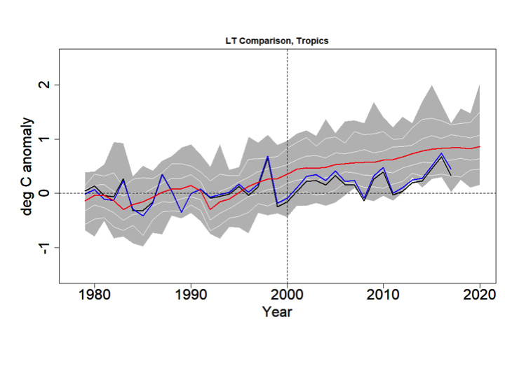
Again the blue line is RSS, the black line is UAH, the red line is the CMIP5 mean, the grey bands show the RCP4.5 range and the thin white lines denote the central 66% and 95% ranges. The data are centered on 1979-2000.
Trends:
UAHv6.0 0.0102 C/yr ( 0.0037 , 0.0167 )
RSSv4.0 0.0139 C/yr ( 0.0085 , 0.0193 )
GCM_min 0.0282 C/yr ( 0.0199 , 0.0365 )
GCM_025 0.0277 C/yr ( 0.021 , 0.0344 )
GCM_165 0.0281 C/yr ( 0.0207 , 0.0355 )
GCM_mean 0.0289 C/yr ( 0.0209 , 0.0369 )
GCM_835 0.0296 C/yr ( 0.021 , 0.0382 )
GCM_975 0.032 C/yr ( 0.0239 , 0.0401 )
GCM_max 0.0319 C/yr ( 0.023 , 0.0408 )
H0: Trend in CMIP5 mean =
Trend in mean obs 229.683
Trend in UAH 224.190
Trend in RSS 230.100
All trends are significantly positive and the models strongly reject against the observations. Interestingly the UAH and RSS series both reject even against the (year-by-year) lower bound of the CMIP5 outputs (p<1%).
Finally, Tim Vogelsang and I showed a couple of years ago that the tropical LT (and MT) discrepancies are also present between models and the weather balloon series back to 1958.
Summary
Millar et al. attracted controversy for stating that climate models have shown too much warming in recent decades, even though others (including the IPCC) have said the same thing. Zeke Hausfather disputed this using an adjustment to model outputs developed by Cowtan et al. The combination of the adjustment and the recent El Nino creates a visual impression of coherence. But other measures not affected by the issues raised in Cowtan et al. support the existence of a warm bias in models. Gridcell extreme frequencies in CMIP5 models do not overlap with observations. And satellite-measured temperature trends in the lower troposphere run below the CMIP5 rates in the same way that the HadCRUT4 surface data do, including in the tropics. The model-observational discrepancy is real, and needs to be taken into account especially when using models for policy guidance.
Still a problem with HADCRUT. As it oversimplifies the past temperatures to eliminate the 1940-75 cooling, and has the 1930’s cooler than the 1990’s, it is like Zeno’s paradox. If one accepts Zeno’s definition of movement, one has no way out of the paradox.
zeno had infinitely small feet, though. right?
He also had infinitely short time intervals. ds/dt remained constant.
@Trebla;
That is the clay base on which the paradox stands. The paradox ignores the arrow’s velocity. The listener is ensnared by the description so that he/she imagines they are carrying the arrow toward the target and each time they move the arrow it’s the same time interval, as if the arrow blinked out of existence and reappeared 1/2x closer, but each iteration taking the same interval of perceived time. Sorry Zeno, no paradox for you!!
Zeno evokes great fear in all white Americans, who are rightly all known as zenophobes.
I don’t know her shoe size, but I was never afraid of Xena.
I think it reasonable to base climate sensitivity off of satellite UAH and weather balloon data sets, as any GHG warming at the surface from GHG MUST be the result or affect of these troposphere warming as shown in data sets, WHICH per IPCC theory should run 20 percent warmer then the surface.
So a simple 20 percent reduction of UHA and weather balloon data sets gives you the GHG caused surface warming warming.
Which means yes, the models are much worse then we thought!
In affect the above essentially means there is zero GHG caused surface warming.
You mistakenly put a question mark at the end of the title to this piece.
Model means, updated with revised forcings after the fact and with new ways of interpretation, and temperature constructs, also modified after the fact. And then we are supposed to be amazed they cross over every so often.
It would be funny if global energy policy wasn’t being driven by it.
It would be funny if progressives would not have used it to get more power to enslave the population.
https://youtu.be/HlTxGHn4sH4
…they are overstating past cooling
policy guidance?
lh4.ggpht.com/_5XvBYfxU_dM/TKz5VkTht0I/AAAAAAAAOI8/vrVord0751g/Alfonso%20Bedoya%20as%20Gold%20Hat-8×6.jpg
There can be no question that the models are wrong and it isn’t even necessary to compare model outputs to reality. All you need to do is look at the methodology behind the modelling and recognize that it’s about as far away from best practices as you can get.
The other red flag is that the outputs of the model vary so much after only minor changes to the initial conditions.
The first test I apply to any model of a causal physical system is to vary the initial conditions, run the model until a steady state is achieved and make sure that it ALWAYS arrives to the same steady state independent of initial conditions. If the answers are wildly different, then it can only mean a modelling error.
Isn’t that what a chaotic system does? Change the initial conditions and a completely different outcome is produced. The IPCC itself declared that the climate is chaotic. You can’t model chaos.
There is some dispute about whether the climate is actually chaotic though. Our climate clearly has some non-chaotic elements – seasons for example – and it seems to be limited in plenty of ways, when a truly chaotic system should not be limited.
Trebla,
Not the climate. The climate is a causal system that does not exhibit random LTE states given the same incident forcing power. There is only one possible LTE state and the apparent chaos is only in the path from one LTE state to another consequential to changing input forcing power (weather) and not in what that ultimate LTE state will be.
Seasons are representative of our planet’s position, hemispheric angle towards the sun and the resulting solar influence. Seasons’, by themselves, are not climate; no more than the sun is climate.
You are quite likely correct that climate is not chaotic.
Chaos means a complete lack of order. i.e. Events are not dependent upon preceding events nor are following events dependent upon the current event.
Obviously, neither weather or climate are chaotic in that sense.
Sheer complexity of weather and climate coupled with mankind’s utter lack of detailed knowledge conveys the misconception that climate is chaotic.
@peonix44
“chaotic” doesn’t mean without any regularities, doesn’t means a complete lack of order. Quite the opposite, in fact: a system lacking any order isn’t chaotic. seasons ARE chaotic (you never know precisely when they start or finish, for instance), you just know that they fellow on order.
Another example of a chaotic but not lacking order system: your heartbeats.
Chaos has nothing to do with “lack of detailed knowledge”, either. A system doesn’t turn from chaotic to non chaotic just by better knowledge. God DOES play dice, despite Einstein.
@co2isnotevil
Chaotic systems are perfectly deterministic, all of them. So your argument, even if it were true (it isn’t, but, still…), wouldn’t disprove the chaotic nature of climate.
Currently we know that the climate system has chaotic elements within it but it also has confounding ‘noisy’ inputs, e.g. solar events, volcanic events, cosmic events (cosmic rays, meteorites, cosmic dust, etc.,) though all these may be linked in other chaotic ways.
Our chaotic systems appears to be less than perfectly chaotic!
The upshot is we have a climate system which has a bunch of loosely coupled feedback elements that mostly act in non-linear ways, while being affected and affecting some elements’ behavior within less than perfect chaotic subsystems. And all this is only for the elements we have observed and approximated (or more often roughly estimated) so far, there may well be others elements that we have not assessed yet. (Electric and magnetic fields might be a place to start!).
Therefore in truth our climate system can not be judged to be truly chaotic or deterministic at this time.
Unless someone knows the climate equation that proves this wrong I can not see how it can be otherwise.
paqyfelyc.
Yes, the averages of a chaotic systems are completely deterministic, but how it gets to that average is not and this is precisely my point. You can’t model the climate by predicting the chaos (as GCM’s attempt to do), but instead you need to predict the resulting average behavior and SB and COE are all you need to do this.
You are absolutely wrong about predicting when seasons start and end. Mankind has understood how to do this since at least when Stonehenge was built. Without the ability to know when to plant crops we would still be living in caves and using stone tools.
One other point is that heartbeats only go chaotic during cardiac arrhythmias and not when the heart is functioning normally.
The Farmers Almanac started in 1818 and has been predicting weather longer than any body else.
co2,
To echo what paqyfelyc stated, chaotic does not mean random (if by random we mean some mysterious event that has no cause). There’s no such thing as random, in reality. Everything is deterministic. There are just some systems with too many variables to predict outcomes without actually solving them. Our climate is one such. The fact that it doesn’t veer wildly off into extremes does not mean it’s not chaotic.
But, in general, this merely semantics. I agree completely with your point at large. That is, that modeling the climate does not need to start by following each potential chaotic path. (We’re a long way from both the understanding of the variables, and the processing power necessary to get there in this manner.) As you argued in your post, find the boundary conditions and, using clearly defined principles, model the end-states. This is how we do in the nuclear industry when modelling, for example, core thermodynamics. I would suggest that those who don’t understand this are simply not familiar with solving things through the numerical approach.
Thus, the point is, we can obtain reasonable results for narrowly constrained scenarios by approaching the atmospheric problem through a “simpler” approach than the GCMs currently employ. We’re not really interested in where rain will fall, or what pressure fronts will develop where, we just want to understand (at least in today’s politically charged world) the transient temperature response of our atmosphere to changes in its constituent parts.
Note: This opinion and $6 will get you a cup of coffee in Seattle.
rip
No one can seriously connect the turbulence of air created by a butterfly in the Amazon to a hurricane anywhere. Yet cause and effect with modern technologies are what meteorologists use to predict short term weather. Like a gypsy with a crystal ball that’s cloudy and cracked, the computer models start with CO2 information that is unproven in nature to produce the results of a lab experiment. When the higher percentage of CO2 in a tube totally blocked light from exiting should have given a clue of cooling by reflecting light from penetrating through the atmosphere as first predicted. Was changed to warming by trapping heat from escaping. The effects of Carbon Dioxide in the Ocean’s exchange with the atmosphere were not even known to exist when the hypothesis was created. Nor the effects of what a greener planet by the increasing CO2 would create in atmospheric changes. The simplest explanation of Earth is that like a Heat Punp where a source of heat (the Sun) heats at one point (in the Earth that would be our Equator) where it cools at the other end (our Poles) that then travels back to the other end (our Equator). But throwing in multiple conditions like volcanoes, Earths rotation and Wobble, the Earth Core Magnetic Poles moving, the Solar Minimum and Maximum changes, the Magnetic changes to Earth created by other Planets and their Orbits and our 3 moon’s effects where they are at a given time, Solar Flares, Solar Magnetic Reversals…all amount to a Chaotic Environment that no predictions could come close.
Even if a model could tell you precisely and exactly what the global average temperature will be for any specific year in the future, you still couldn’t possibly tease out of that result exactly what the weather or climate will be like where you live.
But you could make much more money in a single year than the richest men on Earth gained in their whole life.
If climate models worked, even slightly (for instance, with a mere 10% increase in probability of successful prediction over current common knowledge) the simulators would lead all fortune index.
They don’t.
Conclusion…
This may be off subject in some ways. But this thought triggered when reading the article. While CO2 has increased and warming has not over the past 18+ year’s. What other gases have increased or decreased with CO2’s increase? The perspective being that GHG like CO2 increase has been offset by non-GHG cooling aerosols or just increases of neutral gases like Nitrogen and Oxygen by volume to the same or above that of increased CO2. With increased CO2 causing a notable greening and the population of fauna increased since the industrial age other gases have increased from volcanic and other natural and human sources. This is not to say that solar activities are not the main driver of weather/climate because they are, but an increase of all atmospheric gases effect how the solar activities penetrate the volume. Thoughts?
Whenever you burn coal, you remove oxygen (creating CO2).,Whenever you burn gas, you remove oxygen (creating CO2 and H20).
In addition one gets relatively minor quantities of other gases/substances most of which are joined with oxygen, and of coarse some particulate matter all of course depending upon how clean the process is.
But the volume of Earth;s atmosphere is very large so whilst oxygen is being depleted, in percentage terms it is very small.
We are creating a lot of water vapour 24/7 all year long, but I have never seen data on how much water vapour we put into the atmosphere, on a daily basis. The IPCC is not (yet) interested in controlling water vapour.
Oxygen gets used up when CO2 forms. So CO2 is up by 0.01% over 150 years. O2 is down by 0.01%. The rest is unchanged.
You do realize that there are different levels to our atmosphere and just because surface levels show increased CO2 and reduced Oxygen that each level has different compositions of gases. That natural and human created sources add other elements that combines with Oxygen and depletes it too. Our atmosphere has been increasing in volume of all elements and combinations thereof as well as dust and ash suspension. This means the Solar Radiation is penetrating through more volume retained by the Ionosphere that is effected by the strength of the Magnetosphere that protects us from the Solar Radiation. The rapid movement of the Magnetic Poles in the last decade changes how the Atmospheric Equator is more off camber to the Axis Equator than it was previously. These are issues not in the equations when discussing climate change.
If the % CO2 went up, the other gases went down,in total, at least.
This is a valid question & that’s an unhelpful & trivial answer given CO2 is such a tiny %age (0.04%) of atmosphere.
I’m no atmospheric scientist, but I’d guess the atmosphere is so massive that major changes happen slowly in reaction to temperature/seasons, various types of absorption or outgassing, geologic (volcanic) activity, and man-made pollution. Different gasses probably have different latency, leverage (aka sensitivity) and “critical event thresholds” (we’re learning CO2 models are wrong).
The terms “major changes”, “slowly” and “critical even thresholds” remain undefined; all this is pretty embarrassing for a “settled” science.
It seems the claim is that when allowed to adjust their answers after the test has been marked, they can get better answers. I guess that makes them feel good about themselves but it still means their initial answers were wrong, and it still means the models that they have been pushing don’t reflect reality until they adjust them to look more like reality – or alternative, till they adjust reality to look more like the models.
Hindsight is always 20/20. This reminds me of market analysis experts. When asked to explain the last 30 years of market variability they will give very detailed, thorough answers for every dip and spike. When asked what will happen over the next few years you get a blank stare and more or less an up or down arrow response. I put climate science at about the same level as market prediction at this point.
I can tell you what markets will do over the next 30 years, but just to ensure I don’t distort the markets, I prefer to delay my answer approximately 360 months.
Joseph Murphy
Hindsight isn’t always 20/20 – try getting an explanation of what caused (or ended) the American1929 Great Depression.
Economics is simply psychology with mathematics (not to be confused with a real science).
Are Climate Models Overstating Warming?
Yes!!!!!!!
A hot topic.
Even using Zeke’s fake graph, the 2016 El NIno is still just below the model line, whereas the 1998 El Nino was way above.
This proves clearly that the models have grossly overestimated temps since 1998
Yep. Almost all of the models do this. The 2016 El Niño should spike above the top of the 2σ range, not toward the model mean. The models are running so hot that the most anomalous year in the past 60 years barely reaches the “business-as-usual” line.
And this “hotness” is entirely post-2000. The 1998 El Niño spikes to the top of the 2σ range (P02.5), right where it should be…
Even if the surface data are FUBAR before 1979, the overlap with the satellite record is reasonably accurate.
I do not agree…
http://www.woodfortrees.org/plot/gistemp/from:1979/offset:-0.43/mean:12/plot/hadcrut4gl/from:1979/offset:-0.29/mean:12/plot/rss/offset:-0.10/mean:12/plot/uah6/mean:12
Is this a trick question?
No, but i’s turning out to be a pretty tricky answer.
I just remind about the KISS principle: Keep It Simple for Stupid. The IPCC simple climate model is:
dT = CSP * RF (1)
CSP is the climate sensitivity parameter and its value according to IPCC is 0.5. Eq. (1) is can be used to calculate the climate sensitivity according to IPCC: CS = 0.5 * 3.7 =1.85 C. In AR5 IPCC reports that the CS = 1.9 +/- 0.15 C. In AR5 there is Table 9.5 where is tabulated the CS of 30 GCMs. The average value of CS of these 30 GCMs is 1.8 C. The same result by the GCMs and by the simple model. The reason is that GCMs use the very same eq. (1) for calculating CO2 effect.
The CO2 emissions have been at the same level of 10 GtC/y during the last 5 years without the Paris climate agreement. IPCC has also used eq.(1) for calculating the warming values of its scenarios even for RCP8.5.
The conclusion: we have a very simple climate model, which is applicable for the CO2 concentration increase up to 1370 ppm (RCP8.5) and it is surely enough for the next 100 years.
What is the error of this IPCC’s model in the end of 2016? According to NOOA the RF was then 2.34 W/m2 which means the warming of 1.24 C. It is 50 % higher than the average temperature of the 2000s (a temperature pause) which is 0.85 C.
This can be answered best not by forcings or GASTbut by tropical troposphere temperature differences between 3 types of observations (sat, radiosonde, reanalysis) and CMIP5 models. Why there? Because the tropical troposphere according to ‘settled science’ should produce the greatest warming. The difference is ~3x! The analysis and resulting conclusions are contained in John Christy’s publicly available congressional testimony from 29 March 2017.
Same hearing where Judith Curry slammed Michael Mann’s verbal testimony lie about never calling anyone a denier, when he explicity called Judith one in his written testimony for that same hearing. A YouTube moment for the ages, as the hearing was televised. Highly recommended 17 seconds worth of viewing.
Indeed! Per the ” settled science” the GHG induced surface warming is 20 percent LESS then the troposphere warming.
Thus 20 percent less then this….
Is not much…
The climate cult needs challenged on this propaganda. They need to present the model runs for today on what they ‘believe’ the temperatures will be 10 years from now and then that prediction should be archived. I’ve had enough of their revisionist predictions.
That was already effectively done by CMIP5. In 2012 (per the ‘experimental protocol), model parameters were tuned to best hindcast from YE 2005 back three decades (required submission 1.2). Then initialized Jan 1 2006 and projected forward beyond 2100. To date, all but one of the 32 models and their 102 archived runs were grossly wrong from 2006 to now, as McKitrik points out in his post here. The sole exception is Russian INM-CM4 (only one run) which has higher ocean thermal inertia, lower water vapor feedback, and because of both also low CO2 sensitivity. And using which, we could cancel the CAGW alarm.
You can already write the CNN headlines about how those naughty Russian models are corrupting American purity.
If the models are wrong, the entire multi-trillion dollar CAGW edifice collapses into dust.
naive. For the multi-trillion dollar CAGW edifice to collapse into dust, you need politicians to know that the people know that the models are wrong, and will push them out of office if they hold CAGW. Whereas large segment of the population still believe in the “settled science”.
Propaganda works, you know, and it takes a awful lot to push a believer into disbelief. So much so that most of them will die with their youth beliefs.
so, unless we quickly get a real hard cooling, chance are the CAGW business will keep growing for years
“Apples with Apples
The basic logic of the Cowtan et al. paper is sound: like should be compared with like.”
Totally agree. Let’s see model results compared to surface temps by hemisphere, continent, gridcell, land, ocean, etc. Tropics is a start.
What this discussion is really about , Is whether with the benefit of hindsight and manipulated data are climate models able to be interperated in a way to be said to have predicted the past. If it can be said that they can have predicted the past then one may be able to conclude it may be able to predict the future.With global temperatures requiring so much guesswork because so much of the globe is covered by water ( where observations are sparse) and even on land extrapolations are needed climate alarmist fanatics despite using every trick in the book are unable to replicate reality with their models.
How about the conclusion that either their is no correlation between CO 2 and temperature or that there are other factors at play that are so influential that there is no meaningful correlation between the two. Whichever it is it is absolutely clear that climate models should not form the basis of government policy going forward and maybe some of the warmists may eventually concede that they were totally wrong and not only is action on climate change not as urgent as expected but actually not relevant at all. Also pigs may fly soon.
Heck … is the 90 day overstating warming … is the 10 day forecast overstating warming?
Complete lies as usual from WUWT
do you want a dummy, or your nappy changed?
In the near future, Mann, Gore, Hansen, Schmidt, etal will either need to go away or complete their lies (which means they will be caught in the lie). If’n you want to hang your hat on their incomplete lies till then, go right ahead..
Good to know that Barry Kelly(?) feels climate models HAVE INDEED BEEN ACCURATELY TRACKING ACTUAL TEMPERATURES, even though, you know, they haven’t.
I consider myself to be well and thoroughly refuted.
NOT.
The thirty odd different models don’t even agree with one anther. If the average of these models were to somehow happen to match reality, it’s blind luck.
Blind luck isn’t science.
Ristvan above refers to a hilarious 178 second exchange between Curry and Mann. Here’s the link. Enjoy!
This was just classic.
A very masterful analysis Ross McKitrick!
Without contesting all of the foibles of climate models and assumptions, you demonstrate the fallacy of alarmist claims.
A classic “allow them all the rope they need to hang themselves.”
Zeke and the others are still just waving their hands.
Well done, Ross!
If the IPCC “model spread” doesn’t produce the desired result then simply change the models selected and, voilà, by the magic of climate science you can arbitrarily change the result in the desired direction. It is a scientific joke from the start.
The models will run based on their input data. Which is itself a model based on a set of assumptions making it a wholly theoretical exercise.
We see people producing works on the small differences in a temperature anomaly and then running complex models and feeling important.
That’s was theorists do in general.
There’s no harm in it as long as they play behind closed doors.
I’ve just been reading Antifragile by Nicholas Nassim Taleb and he fell into a similar fallacy about the risk of climate change. I was surprised.
We really do not know how temperatures have changed apart from some broad strokes which by definition are an order or two orders of magnitude greater than the resolution needed to check climate change theory. In fact demanded by it.
What is wrong with people?
You always check how good your input data is before processing. Same as your food. Same as your sound recordings. Otherwise all you get is GIGO.
And possibly Scooter.