Guest Post by Bob Tisdale
*Or Maybe the GISS Land-Ocean Temperature Index is Redundant.
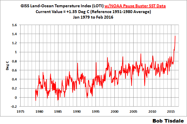
In the post Alarmism Cranked Up to Absurd Level, we discussed the misleading media reports about the temporary February 2016 El Niño-related uptick in monthly global surface temperature data from the Goddard Institute of Space Studies. There have been numerous new same-topic news articles since NOAA released its February 2016 global temperature data a few days ago. The NOAA/NCEI data show an uptick similar to the one we recently saw with the GISS data. See Figure 1. (A similar graph of the GISS data is here.)

Figure 1
(Data can be found here.)
Let’s focus on the AP story Beyond record hot, February was ‘astronomical’ and ‘strange’ by Seth Borenstein. It begins:
WASHINGTON (AP) — Earth got so hot last month that federal scientists struggled to find words, describing temperatures as “astronomical,” ”staggering” and “strange.” They warned that the climate may have moved into a new and hotter neighborhood.
Let’s see to whom Seth Borenstein attributes the “astronomical,” ”staggering” and “strange.”
“Astronomical” comes from NOAA’s Jessica Blundel. The AP article reads:
“The departures are what we would consider astronomical,” Blunden said. “It’s on land. It’s in the oceans. It’s in the upper atmosphere. It’s in the lower atmosphere. The Arctic had record low sea ice.”
The “staggering” comes from NOAA’s Deke Arndt, Chief of the Climate Monitoring Branch, at their National Center for Environmental Information (NCEI):
Scientists at NOAA’s National Centers for Environmental Information in Asheville, North Carolina, were astonished by the “staggering” numbers, said Deke Arndt, the centers’ global monitoring chief.
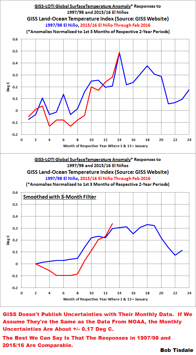
One wonders why NOAA’s scientists were “astonished” or consider the uptick “staggering” and “astronomical” when the 2015/16 El Niño has been compared in strength to the 1997/98 El Niño for many months. See NOAA’s Oceanic Nino Index, which is their “official” metric for monitoring the strengths, timings and durations of El Niño and La Niña events. It only takes a quick comparison graph, Figure 2, to show that there were comparable responses in global surface temperatures to both strong El Niños.

Figure 2
What many readers of that article are likely finding “astonishing” and “staggering” is that NOAA’s scientists weren’t aware that global surface temperatures were going to respond as they have, given that there was a similar uptick in global surface temperatures in response to the similarly sized 1997/98 El Niño. If the scientists had been aware, they wouldn’t have been astronomically astonished.
Notes about Figure 2: It compares the responses of global surface temperatures to the 1997/98 and 2015 El Niño events. The data have been normalized to the first 3 months of their respective first years. The normalization was done so that we can easily compare, visually, the responses of global surface temperatures to the two comparably sized strong El Niño events. This is not an attempt to hide the fact that global surfaces have warmed between the two events, according to the NOAA land+ocean data. In Figure 2, we’re simply providing a side-by-side comparison.
The recent monthly uncertainties in the NOAA data are about +/- 0.17 Deg C. (See the NOAA webpage here.) The best we can say is that the global temperature responses to both El Niño events were comparable, given the uncertainties of the data.
That land+ocean dataset from NOAA includes their new ERSST.v4 “pause buster” sea surface temperature data. It has many curiosities over the term of the data, as discussed and illustrated in the posts here and here.
[End notes]
And the “strange” reportedly comes from Gavin Schmidt, Director of the Goddard Institute of Space Studies:
NASA’s chief climate scientist Gavin Schmidt usually discounts the importance of individual record hot months, but said this month was different, calling it “obviously strange.”
Looking again at Figure 2, or the comparable graph using the GISS Land-Ocean Temperature Index data here from the post Alarmism Cranked Up to Absurd Level, there was nothing “obviously strange” about the response of global surface temperatures to this El Niño. It’s precisely what we would expect. If global surfaces had not warmed in response to the 2015/16 El Niño similarly to how they responded to the one in 1997/98, that would have been “obviously strange”.
Another quote from NOAA’s Deke Arndt:
“Usually these are monthly reminders that things are changing,” Arndt said. “The last six months have been more than a reminder, it’s been like a punch in the nose.”
Figure 3 illustrates the 6-month changes in global surface temperature anomalies over the term of the NOAA land+ocean surface temperature data. The recent 6-month change (February 2016 minus September 2015) in surface temperature anomalies (+0.29 deg C) has been exceeded many times in the past.

Figure 3
When you read quotes like the one from NOAA’s Chief of the Climate Monitoring Branch at their National Center for Environmental Information, you might begin to wonder whether NOAA scientists bother to examine their own data.
CLOSING
As expected, the comical alarmism about the recent uptick in global surface temperature anomalies continued with the release of the NOAA data for February. Toward the end of this month, we should expect see it again when the UKMO releases their monthly update.
With the global warming misinformation and misleading alarmism coming from NOAA scientists, one might conclude they’ve lost their objectivity. Thus, many readers might agree with Congressman Lamar Smith who was recently reported to have said in the ChristianScienceMonitor article NOAA should focus on weather, not climate change, says Rep. Lamar Smith:
“Instead of hyping a climate change agenda, NOAA should focus its efforts on producing sound science and improving methods of data collection,” said Smith. “NOAA should prioritize areas of research that significantly impact Americans today, such as ways to improve weather forecasting. Unfortunately,climate alarmism often takes priority at NOAA.”
FOR THOSE NEW TO DISCUSSIONS OF EL NIÑO EVENTS AND THE REASONS FOR THE RECENT REPORTS OF RECORD HIGH SURFACE TEMPERATURES
I discussed in detail the naturally occurring and naturally fueled processes that cause El Niño events (and their long-term aftereffects) in Chapter 3.7 of my recently published free ebook On Global Warming and the Illusion of Control (25 MB). For those wanting even more detail, see my earlier ebook Who Turned on the Heat? – The Unsuspected Global Warming Culprit: El Niño-Southern Oscillation. Who Turned on the Heat? only costs $5.00 (US).
And we discussed and illustrated the natural causes of the 2014 “record high” surface temperatures in General Discussion 2 of my free ebook On Global Warming and the Illusion of Control (25 MB). And we discussed the naturally caused reasons for the record highs in 2015 in General Discussion 3.
“It’s on land. It’s in the oceans. It’s in the upper atmosphere. It’s in the lower atmosphere.”
It’s theater.
(And not very good.)
Indeed, S-T.
The gift that keeps on giving: AGW Hyperbole. Yeah!
All the public will think of now when they hear those wild-eyed “scientists” shrieking is guys like Doc.
“Back to the Future” — Doc explains time travel
(youtube)
Response of Average Maria and Joe (to the Jessica and Deke routine):
FICTION! To-ho-hOOOOH-tuhlly fiction!
lololololololollolollololololololololo.
{voice talking to M and J from the back of the room}
M and J: “They’re serious?
lolololololololololololololo
Right. Now, go back to your little laboratory and, like, invent great tasting chocolate and pizza and beer that has no calories. Okay? ……. Huh? Aaa, stop with the ‘climate is disintegrating’ stuff. Gettin’ old. OOO-UUUHHHLD. Scram — your blockin’ the view. …… Of? Of nuthin’ — which is bet – ter than lookin’ at YOU.”
“It’s on land. It’s in the oceans. It’s in the upper atmosphere. It’s in the lower atmosphere.”
But it’s not in GISTEMP Southern Latitudes to end of 2015.
http://data.giss.nasa.gov/gistemp/graphs_v3/Fig.B.gif
1980 SH Extratropics anomaly was fractionally warmer than 2015:
1980 46
2015 41
Needless to say, I find the anomaly neither “astronomical,” ”staggering” or “strange.” from a SH perspective. The heat-in-transit from sea to space has been concentrated in the NH.
And “heat trapping greenhouse gasses” will “trap” NONE of this passing heat. That’s because El Nino heat is special heat that “heat trapping greenhouse gasses” can’t “trap” /Sarc.
This is an abrupt localized oceanic surface COOLING process, not surface warming like some “shocked” climate scientists (think Rahmstorf et al) see when they look at GMST. They’ve been suckered by the GMST illusion.
“But it’s not in GISTEMP Southern Latitudes to end of 2015.”
You’re right, it’s just bizarre that February 2016 temperatures aren’t included in the GISTEMP record to the end of 2015
I should add a little to one sentence, perhaps:
“The heat-in-transit from sea to space has been concentrated in the NH” [rather than evenly distributed north – south].
Alf Fass, FYI, there was no giant uptick in the GISS Southern Hemisphere data in February 2016:

The graph is from the post here:
https://bobtisdale.wordpress.com/2016/03/16/alarmism-cranked-up-to-absurd-level/
“Alf Fass, FYI, there was no giant uptick in the GISS Southern Hemisphere data in February 2016”
Thanks for that, It’s “staggering” to see NH warming of over a degree in a month.
😉
Alf Fass, ‘Thanks for that, It’s “staggering” to see NH warming of over a degree in a month.’
Actually it looks like 1.6 to 2.3 or 0.7. Just by eyeball. New specs needed?
It does get a trifle byzantine when the temperature records have been “corrected”, and you have to remember that 1997-98 was probably nearly as warm as 2015-16, not notably cooler. Does Winston Smith work at NASA GISS or NOAA?
From memory, the 1997-98 el-nino was actually significantly warmer. 2015 was about the 3rd or 4th warmest year in the recent past, that is from 1880 on.
They’ll do/say anything to direct attention away from the fact that this El Nino has less impact on rising temps. than 97/98
Well done on bringing semantics to the forefront of the debate.
” Earth got so hot last month …” thus illustrating why climate
scientists feast on ‘anomalies’ rather than absolutes: it allows
them to use terms like hot / hotter / hottest, when the temps
are above some mean or norm : 1901-2000 for heavens sake.
(Why not 1900-1999??). Of course it’s not really ‘hot’ at all.
A mean global average temperature or 14.6 or so has hardly
taken the chill off the air. I live in New Zealand, and over the
years have been told by various Australians that on West Island
they don’t consider it ‘hot’ until the temps hit 35C or so.
So, please, can we stop all this ‘hot’ nonsense.
“on West Island they don’t consider it ‘hot’ until the temps hit 35C” – I used to go running on 40C and I haven’t died yet. So why all this mock horror over a tiny increase like 1C in a century?
Of course, biased terminology used by NOAA et al., is not necessarily a reflection of a biased attitude or agenda. Right?
“It’s on land. It’s in the oceans. It’s in the upper atmosphere. It’s in the lower atmosphere.”, and it’s further strong evidence that it’s not CO2 that’s doing it.
***Where Oh WHERE Is that Missing HEEEEAAAT???!!***
Jess: It’s on the land.
WUWT: Nope. Temps flat since about 1998.
Jess: It’s….. it’s IN THE OCEANS!
WUWT: Nope. SST’s flat, too.
Jess: Then…. it’s……. IN THE UPPER ATMOSPHERE!
WUWT: Nope.
Jess: …. the LOWER atmosphere?
WUWT: (stare)
Jess: …. the Arctic ice is melting, I think, ….
WUWT: Well within normal range.
Jess: … Polar Bears are dying, please tell me that polar bears are dying…
WUWT: Polar Bears are doing great.
Deke: I’ll take over, Jess. This is a man’s job. Peeepuuuhhhl!! This is just all very strange!!! IT IS, JUST, ST-ST-ST-STAAAAGERIIINNGGG!
WUWT: lol.
Kevin Trenberth: “…and it’s a travesty…”
I sense a ratcheting up of the propaganda, after a lull following the Paris thingy, and a realisation that most of the public have either lost interest or think that Paris solved the “problem”. The BBC seems to have returned to their pre-Paris state of alarm and promotion of the industry/religion.
The BBC sell climate alarmism news products in the guise of “highlighting an issue, for cash payments”
Besides,the staggering and alarming rise in temperature was the the staggering and alarming lack of climate related deaths,nor sea level rise,nor instant starvation. The temperature rise is only part of the alarmism. The second requirement is some level of human devastation. I don’t even think we could term the February temperatures as more than mildly uncomfortable.
…Yes, uncomfortably COLD !!
Pretty much, Feb was pretty damn cold for me and anyone I know, still wondering where all this Feb warm went I could not find it.
So I assume I needed to head out to sea to find it?
Unfortunately, a high % of people are mouth breathing regurgitators who come to conclusions before looking at evidence, this is what NOAA and the UN depend on, ignorance and idiocy of the average person.
They read and react, never questioning what they are reading.
Education has never been so accessible yet people in general it seems are becoming more ignorant.
I guess when you polarise something everyone looks for their side, and evidence be damned.
This is perfectly encapsulated in people who don’t know what CAGW stands for, going about calling everyone deniers 😀
In Australia, we had an unusually warm start to March, about 8 days over 30C in a row. Certainly unusual, uncomfortable even at the start of autumn, but nothing unexpected in a strong el-Nino.
Mark: the heat isn’t hiding, but it is not easily accessible. A lot of it was in Northern Canada where the massive “heat wave” made winter temps a balmy -30C instead of -35C. Here in Southern Canada (the banana belt) we had a real pleasant, relatively mild winter. I haven’t heard any complaints.
The political special ops teams in these agencies are working overtime before the El Nino temps are gone.
These new high temperatures need to be seen as the opportunity they are to use the “hiatus in global warming” argument again in a few years.
They will adjust it away to provide acceleration in warming.
Well with it being election year and with Trumps popularity rising expect more frothing at the mouth by warmists. They are in great fear of losing their gravy train.
Your lucky in America. In Australia, our prime minister has just announced a $1.2B plan to throw money away on global warming. There must be better ways of buying green votes than proving you’re an imbecile.
Aren’t there?
@Hivemind, You are lucky in Oz, Ballerina Trudeau has announced 20 billion for “green” infrastructure.
The AP article quotes NOAA’s Blunden saying the Arctic had record low ice. However, that is only true of NOAA’s Sea Ice Index which is showing strange results.
https://rclutz.wordpress.com/2016/02/27/noaa-is-losing-arctic-ice/
In my opinion, now that some personal time has freed-up, NOAA should hire Monckton of Brenchley to lead public commentary. They just don’t have the same flair for hype and colorful charts and graphs …
“NASA’s chief climate scientist Gavin Schmidt usually discounts the importance of individual record hot months, but said this month was different, calling it “obviously strange.”
So…if you have a multi-year (or better, multi-decadal) trend showing what you want to scare people with, that is the Single Most Important Piece of Information EVER. Only knuckle-dragging reactionary shrills for the oil industry would stoop to using a single MONTH of data.
Oh, wait…
Hi Bob
Anomaly is an elastic measure, when the past changes all the time.
Do you have earlier anomalies for the same time, so that you could see how the past changes.
Ole Humlum has done it and it is quite revealing.
Why does El Nino make it warmer?
Is it simply that the ocean chucks out a lot of stored heat? Or is it that there is more water vapor around, so increased greenhouse effect warming? Or is it something else?
Short term, because some of the 500m deep stored heat of the west pacific gets redistributed to the surface of the east pacific where it can contribute to the surface temperature measurement. Long term, probably because oceanic circulation cools the earth via the poles and El Nino is a temporary slowing down of pacific oceanic circulation and La Nina is a temporary speeding up of pacific oceanic circulation.
If we are at a point where CO2 is creating a very stable climate then EL NIÑO event induced heating would be elevating the static temperatures to a new level of CO2 temperature stability while the same stability inducing CO2 levels prevent the LA NIÑA events from offsetting that heating with their own induced cooling.
This chart does it for me…
http://www.giss.nasa.gov/research/news/20160120/gistemp_graph_2015.png
Spaach
Please add temperatures back to 1830 and put in error bars.
Yeah Spaatch, go find some information that’s either irrelevant or doesn’t exist.
spaatch, your misleading graph (propaganda from RealClimate) doesn’t answer Martin A’s question. It does not reflect how strong El Nino events contribute to long-term global warming, nor does it reflect the natural contribution of The Blob to the global temperatures in 2014 and 2015 and El Nino conditions in 2015.
Bob:
“spaatch, your misleading graph (propaganda from RealClimate) doesn’t answer Martin A’s question. It does not reflect how strong El Nino events contribute to long-term global warming, nor does it reflect the natural contribution of The Blob to the global temperatures in 2014 and 2015 and El Nino conditions in 2015.”
It has nothing to do with RealClimate – that graph comes from here….
http://www.giss.nasa.gov/research/news/20160120/
Yes, EN’s do contribute to the long-term global warming trend but only temporarily as the flip – La Nina – then takes the trend the opposite way.
What should happen is that the two cancel each other out.
And they don’t.
As that graph shows (do your own Bob – it’s simple enough).
It illuminates the fact that the ENSO cycle merely rides on the AGW warming trend.
All this misses the obvious – that the PDO/ENSO cycle is just the redistribution of heat within the climate system, from ocean to air before exiting to space.
It all comes from the Sun in the first instance.
All of the climate system’s heat does.
Any other is negligible.
The Sun has been cooling overall for ~50 yrs and the rise seen on the graph illustrated has nothing to do with ENSO, nor the “Blob”.
It is just a modulation on the AGW signal.
spaatch,
That chart is bogus nonsense. Listen up, and learn why.
That is a zero baseline chart. When a zero baseline is used in place of a trend chart, the result is a scary rise in temperature. This makes it clear how they control your thoughts and emotions:
http://oi56.tinypic.com/16ifevq.jpg
The first chart (green chart line) uses a zero baseline. The result is an alarming warming signal.
But viewing exactly the same information as a trend chart, we see (the second green line chart) the chart as a non-zero baseline trend. That long term trend shows a natural warming as the planet recovers from the LIA. Human CO2 emissions have nothing measurable to do with it.
I’ve demonstrated that the chart posted by ‘spaatch’ is wrong. Thus…
“If an honest man is wrong, after demonstrating that he is wrong, he either stops being wrong or he stops being honest.”
The non-arbitrary trend chart shows that nothing unusual is happening. You’ve been deceived by zero baseline charts, which are used by every government agency. They do it deliberately. It is one of the ways they lie with charts. But if we look at the long term trend, we see that there is nothing either unusual, or unprecedented happening.
With the trend chart we see that the long term warming trend continues as usual. Global warming has not accelerated. (In fact, global warming stopped for the past 18+ years.)
The climate alarmist crowd keeps flogging a dead horse. Toneb says:
It is just a modulation on the AGW signal.
And you know that, how?
That baseless assertion was pulled right out of Toneb’s fundament. It is an opinion, nothing more. He is incapable of backing it with empirical, testable measurements, because there are no such measurements of AGW.
It is not surprising that the alarmist crowd has been hiding out from debate for the past several years; they lost every debate they had with skeptical scientists.
So now Mann, Jones, Briffa, Trenberth, and all the rest of the paid prevaricators hide out in their ivory towers, while they fall back on a clique of anonymous folks who run interference for them; folks who have no verifiable measurements of what they insist is happening. Their entire argument is composed of baseless assertions; conjectures. Opinions.
This is a science site, and baseless assertions are one big FAIL here. Either produce verifiable, testable measurements quantifying AGW — or you lose the debate.
dbstealey:
“That baseless assertion was pulled right out of Toneb’s fundament. It is an opinion, nothing more. He is incapable of backing it with empirical, testable measurements, because there are no such measurements of AGW.”
If you say so db.
But..
“This is a science site, and baseless assertions are one big FAIL here. Either produce verifiable, testable measurements quantifying AGW — or you lose the debate.”
It is – and FI the “It’s the Sun stupid” contingent is continually countered by Leif here to name one of the few that can be bothered by the idiocy of the “Slayer” lot.
And then there are the hand-wavers……
I’m still waiting for your “science”.
Unless you include your deceptive posting of the Alley GISP2 graph to “prove that AW isn’t happening” but that ends before modern warming even started.
(Marked as disputed on this very site BTW)
“This is a science site, and baseless assertions are one big FAIL here. Either produce verifiable, testable measurements quantifying AGW — or you lose the debate.”
Yes of course it is db.
The world’s experts (in whatever “ology” you care to mention) have it all wrong when their experise touches on GW).
Of course they do, stands to reason (sarc).
And in counter this “science” site has it all correct.
As I said – stands to reason (sarc).
Anyway my op was addressed to Bob.
But thanks for that db. Twas very enlightening (sarc).
Toneb says:
I’m still waiting for your “science”.
You still don’t get it, do you?
The ‘dangerous AGW’ conjecture is yours. The alarmist crowd owns it.
Scientific skeptics have nothing to prove. That’s the part you don’t get.
dbstealey says: “Scientific skeptics have nothing to prove. That’s the part you don’t get.”
If you want the rest of the world to listen to you, you do.
Well Chris, you’re certainly listening. Aren’t you?
Maybe you’ll eventually learn that principle, too.
dbstealey,
I’m not a Prime Minister nor CEO of a Fortune 1000 company, so my reading your comments does not have an impact on policy or actions.
“Toneb says:
“I’m still waiting for your “science”.
You still don’t get it, do you?
The ‘dangerous AGW’ conjecture is yours. The alarmist crowd owns it.
Scientific skeptics have nothing to prove. That’s the part you don’t get.”
You actually need to at least read the *original* science to see that that it more than “proves” AGW.
Reading here without doing that will in no way give an unbiased view of it.
If you want to resort to posting up deceitful “evidence” such as the Alley graph that ends in 1855 to “prove” your science (I note that you do not demure), then either you are willfully ignorant or there is some other motive.
A brief Google shows multiple posts where that particular graph keeps being posted (there indeed is one current one).
I should consider this my friend…
1) all the worlds experts in any *ology* pertaining to AGW are incompetent.
2) all said experts are in on a conspiracy.
3). they know more than you.
To most people no 3 stands out as being blindingly obviously the case my friend.
In short the science is there – I post references to it FI but you actually need to follow it – and you most certainly will not get there from here otherwise.
I also note Bob’s lack of response to my OP.
Martin A asks: “Why does El Nino make it warmer?”
In the previous post about the GISS data, I wrote:
We’ve also discussed and illustrated for many years that the long-term effects of strong El Niño events cannot be removed from the instrument temperature record with statistical models like Tamino’s. That is, strong El Niño events contribute to long-term global warming by releasing vast amounts of sunlight-created warm water from beneath the surface of the western tropical Pacific and relocating it to the surface. That’s the simplest explanation of how a strong El Niño contributes to long-term global warming. Some of that warm water released by the El Niño in turn releases heat to the atmosphere, primarily through evaporation. But the remaining warm waters (the leftovers) don’t magically disappear after the El Niño, as Tamino and some from the climate science community would like you to believe. See the discussions of “big jumps” in the Open Letter to the Royal Meteorological Society Regarding Dr. Trenberth’s Article “Has Global Warming Stalled?”
Martin A: PS, if you’ve got some time, see chapter 3.7 of this book:
https://bobtisdale.files.wordpress.com/2015/11/tisdale-on-global-warming-and-the-illusion-of-control-part-1.pdf
Cheers.
That’s silly. The Enso is just an oscillation. Heat is released and heat is taken in. It’s in balance. It’s the warming from C02 that is making the temps rise over the long term.
spaatch, ‘The Enso is just an oscillation. Heat is released and heat is taken in. It’s in balance. ”
Really? Can you show us the science that says it is in balance?
“Really? Can you show us the science that says it is in balance?”
I’m sorry but it is just basic thermodynamics.
For the climate system to be out of balance then there needs to be a varying input of energy.
The Sun
The GHE
All others are feed-back from those.
What comes in must equal what goes out for balance.
The energy comes in.
The energy goes out to space (the GHE moderates that – and no I’m not proving the existence of the atom from square one for anyone).
That energy is absorbed for a time in the climate system.
The Earth’s oceans are the biggest storage radiator/heat sink in the Solar system.
They move that heat around – that is all – what they absorb remains the same whether a EN or a LN (as the storage is achieved by radiation and not conduction in the first instance.
It is the natural harmonic of a any system about a mean.
If magically ENSO was actually a PRODUCER of heat THEN it would not be in balance.
However, because of the background GHE that oscillation is no longer about a neutral trend but a warming one.
@Lee
“Really? Can you show us the science that says it is in balance?”
Let me see. How about the law of Conservation of Energy? Or is that not sciencey enough?
If we ignore GHE for now, then could El Nino cause a long term jump in temperature?
We start with a globe in equilibrium. Surface temperature = T1, radiation in is constant and hence so is radiation out.
Bob says “That is, strong El Niño events contribute to long-term global warming by releasing vast amounts of sunlight-created warm water…” So the sunlight heats the water. If this energy is not going to heat the surface, but instead is going to heat the deep water, then surface temperature must drop. If this water stays away from the surface for a while, but stops getting warmer, then the surface will return to the equilibrium temperature T1.
If the warm water then surfaces, and that energy is dumped into the atmosphere (by whatever mechanism), then surface temperatures will rise. Hence energy radiated out will increase and the temperature will again return to T1.
The El Nino cannot cause a long term heating. It can only cause variations about T1.
Bob, I remember a recent article which had a graph of the West Pacific Warm Pool at depth since 2013. It showed a significant cooling of the total water column over a couple of years period. That has coincided with the upward trend of global temperatures. It would seem that it would take some time to recharge the Pool, implying cooling of global temperatures. Your thoughts?
Dave Fair
dogdaddyblog, my comment on that thread reads:
Frank Bosse and Fritz Vahrenholt write, “The average temperature of the IPWP has decreased by about 1°C since spring of 2013. Since the beginning of the Argo measurements in 2004, it has never been cooler than today. Note that this refers to a huge water mass of about 16 million cubic kilometers. For comparison: The energy that has been released from here corresponds to the amount that the whole earth receives from the sun by the solar radiation flux during a 4 days period. This huge amount of energy increases the global surface temperature which leads to increased radiation of a good part of the heat into space. An El Nino in the end therefore generates a heat loss of the system earth. ”
Unfortunately, that is a severely limited perspective of the effects of an El Niño. The heat loss from the Indo-Pacific Warm Pool is temporary. An El Niño does not consume all of the warm water that had traveled east. Some of that leftover warm water (ENSO residuals) will return to the Indo-Pacific Warm Pool (slow-moving Rossby waves) this year.
The severely limited perspective also overlooks the fact that the loss of heat is only from the tropical Pacific. Outside of the tropical Pacific there can be ocean heat gains in response to an El Niño due to changes in atmospheric circulation (more sunlight reaching the ocean surfaces, slower trade wind strengths, less evaporation, less coastal upwelling of cool subsurface waters, etc.). And after the El Niño, some of the ENSO residuals (leftover warm water) will be redistributed to the oceans adjoining the tropical Pacific.
And the severely limited perspective fails to consider the increases in surface temperatures (and outgoing longwave radiation) outside of the tropical Pacific that were also caused by changes in atmospheric circulation.
Last, the temporary heat losses from the Indo-Pacific Warm Pool in responses to the 2014/15 and 2015/16 El Niños was dwarfed by the loss during the 1997/98 El Niño.
Cheers.
Link to that comment:
http://wattsupwiththat.com/2016/03/20/the-sun-in-february-2016-and-the-latest-heat-records/#comment-2170480
Were they really staggered?
Or did they just think it would sound good to say it was staggering?
They’re climate scientists.
Like planners, always assume the worst.
If they thought they would impress anyone they are even more stupid. They sound like children not adults. They also look very incompetent.
Ah, remember when 1997/98 was depicted as the “hottest evah” in the very same way (before being adjusted down to show more concurrent warming) and we were all going to fry, boil, and bake very soon? Those were the good ol’ days.
“It’s on land. It’s in the oceans. It’s in the upper atmosphere. It’s in the lower atmosphere.”
Yes, it’s everywhere. Threatening our very existence. They’re cereal. They’re super-cereal.
Great choice, Bruce. “Manbear pig is reeeee-uuuhhhl, oh, why won’t anybody believe me. Waaaaaaa!” lolo
+1!
WASHINGTON (AP) — Earth got so hot last month that federal scientists struggled to find words, describing temperatures as “astronomical,” ”staggering” and “strange.” They warned that the climate may have moved into a new and hotter neighborhood.
February temperatures were not that” staggering “at all when it comes to the land areas of two main continents. According to NOAA own records , CLIMATE AT A GLANCE ,February 2016 was the 4th warmest for North America land areas and 3rd warmest for Asia land areas
February 2016 was only the 6 warmest for Contiguous US. Even February 1930 was warmer , so was the February of 1976, 1991,1992 and 2000 . The exaggeration continues with every month’s data that is released
Using UAH V6 Ken Stewart has shown a pause over the majority of the planet and 6 areas now exceed 20 years. Many of those areas must have had no statistically significant warming for over 25 years.
Even the N extra tropics must have had no SS warming for a long time. Of course the south polar zone has had no warming since DEC 1978. This is worth a read and thanks Bob for this post.
https://kenskingdom.wordpress.com/2016/03/21/the-pause-update-february-2016/
It needs to be kept in mind that Ken Stewart defines a pause differently than Lord Monckton. For Lord Monckton, the pause needs to have a negative slope. Ken allows a very small but positive slope. I am not suggesting Ken is wrong; but people should be aware of this difference. Globally, RSS and UAH6.0beta5 do not have a negative slope for any time period as of the February anomalies.
One of your very best ever!
(that was so my compliment could be heard over the cries of desperation from the climate clowns)
“Sanford and Son” — “It’s the big one!”
(youtube)
#(:))
Boy, are those clowns lots of FUN!
Heh. Somebody is threatening to take away their money…
Am I the only one who considers a massive influx of warm (therefore moist) air into the subzero polar regions to actually constitute a massive COOLING event?
I mean…what happened to all the (warmth) moisture when it changed phase in the darkness up there…snow perhaps? Ice maybe?
“Am I the only one who considers a massive influx of warm (therefore moist) air into the subzero polar regions to actually constitute a massive COOLING event?”
Today and here, probably not.
If global warming continues unabated when ocean heat content rises, then logically ocean cooling means global warming ended? I just love this goal post moving.
Feb is Feb, it aint climate.
charles
l have also been making this point in recent posts. At the moment there is a large area of low pressure sitting over NW Russia. Which is driving a large amount of warm air into the Arctic and with cold air driven south. Lets just see how long this temperature spike lasts if these sort of weather patterns start turning up.
The warm air cools, but as it cools it warms the ice and surrounding cold air. It’s a cooling event for the warm air, but not for the polar region it enters.
no chris, the temp at the interface of air and ice will hardly change. everything that heads north to the arctic or south to the antarctic gets cooler. that is how it works.
enso cycles may well be in balance in terms of energy in/out. anyone stating they know the timescale that happens over is talking nonsense . when we have 1000 years of actual measured data, then it might be worth listening to claims of climate scientists , currently everything they have, everything, is just speculation.
It cracks me up when I hear how hot it was……the average temp of earth is around 15c which is quite cool for humans.
I have the freezing hot temperature that numbs fingers and toes, if I just could get some local warming – global I don’t need.