By Christopher Monckton of Brenchley
The Christmas pantomime here in Paris is well int0 its two-week run. The Druids who had hoped that their gibbering incantations might begin to shorten the Pause during the United Necromancers’ pre-solstice prayer-group have been disappointed. Gaia has not heeded them. She continues to show no sign of the “fever” long promised by the Prophet Gore. The robust Pause continues to resist the gathering el Niño. It remains at last month’s record-setting 18 years 9 months (Fig. 1).

Figure 1. The least-squares linear-regression trend on the RSS satellite monthly global mean surface temperature anomaly dataset continues to show no global warming for 18 years 9 months since March 1997, though one-third of all anthropogenic forcings have occurred during the period of the Pause.
The modelers ought to be surprised by the persistence of the Pause. NOAA, with rare honesty, said in its 2008 State of the Climate report that 15 years or more without warming would demonstrate a discrepancy between prediction and observation. One reason for NOAA’s statement is that there is supposed to be a sharp and significant instantaneous response to a radiative forcing such as adding CO2 to the air.
The steepness of this predicted response can be seen in Fig. 2, which is based on a paper on temperature feedbacks by Professor Richard Lindzen’s former student Professor Gerard Roe in 2009. The graph of Roe’s model output shows that the initial expected response to a forcing is supposed to be an immediate and rapid warming. But, despite the very substantial forcings in the 18 years 9 months since February 1997, not a flicker of warming has resulted.

Figure 2. Models predict rapid initial warming in response to a forcing. Instead, no warming at all is occurring. Based on Roe (2009).
The current el Niño, as Bob Tisdale’s distinguished series of reports here demonstrates, is at least as big as the Great el Niño of 1998. The RSS temperature record is beginning to reflect its magnitude.

Figure 3. The glaring discrepancy between IPCC’s predicted range of warming from 1990-2015 (orange zone) and the outturn (blue zone).
The sheer length of the Pause has made a mockery of the exaggerated prediction made by IPCC in 1990 to the effect that there should have been 0.72 [0.50. 1.08] degrees’ global warming by now. The observed real-world warming since 1990, on all five leading global datasets, is 0.24-0.44 degrees, or one-third to three-fifths of IPCC’s central prediction and well below its least prediction (Fig. 3).
The Pause will probably shorten dramatically in the coming months and may disappear altogether for a time. However, if there is a following la Niña, as there often is, the Pause may return at some time from the end of next year onward.
The hiatus period of 18 years 9 months is the farthest back one can go in the RSS satellite temperature record and still show a sub-zero trend. The start date is not cherry-picked: it is calculated. And the graph does not mean there is no such thing as global warming. Going back further shows a small warming rate.
The start-date for the Pause has been inching forward, though just a little more slowly than the end-date, which is why the Pause continues on average to lengthen.
So long a stasis in global temperature is simply inconsistent with the extremist predictions of the computer models. It raises legitimate questions whether they overstate the value for the radiative forcing in response to a proportionate change in CO2 concentration.
The UAH dataset shows a Pause almost as long as the RSS dataset. However, the much-altered surface tamperature datasets show a small warming rate (Fig. 4).

Figure 4. The least-squares linear-regression trend on the mean of the GISS, HadCRUT4 and NCDC terrestrial monthly global mean surface temperature anomaly datasets shows global warming at a rate equivalent to 1.1 C° per century during the period of the Pause from January 1997 to September 2015.
Bearing in mind that one-third of the 2.4 W m–2 radiative forcing from all manmade sources since 1750 has occurred during the period of the Pause, a warming rate equivalent to little more than 1 C°/century is not exactly alarming.
As always, a note of caution. Merely because there has been little or no warming in recent decades, one may not draw the conclusion that warming has ended forever. The trend lines measure what has occurred: they do not predict what will occur.
The Pause – politically useful though it may be to all who wish that the “official” scientific community would remember its duty of skepticism – is far less important than the growing discrepancy between the predictions of the general-circulation models and observed reality.
The divergence between the models’ predictions in 1990 and the observed outturn continues to widen. If the Pause lengthens just a little more, the rate of warming in the quarter-century since the IPCC’s First Assessment Report in 1990, taken as the mean of the RSS and UAH data, will fall below 1 C°/century equivalent (Fig. 5).

Figure 5: The mean of the RSS and UAH satellite data for the 311 months January 1990 to November 2015. The warming rate is equivalent to just 1.04 C° per century.
Roy Spencer, at drroyspencer.com, says 2015 will probably be the third-warmest year in the satellite record since 1979 on his UAH dataset, but thinks it likely that, since the second year of an el Niño is usually warmer than the first, 2016 may prove to be the warmest year in the satellite record, beating 1998 by 0.02-0.03 degrees.
The Technical Note explains the sources of the IPCC’s predictions in 1990 and in 2005, and also demonstrates that that according to the ARGO bathythermograph data the oceans are warming at a rate equivalent to less than a quarter of a Celsius degree per century. In a rational scientific discourse, those who had advocated extreme measures to prevent global warming would now be withdrawing and calmly rethinking their hypotheses.
Key facts about global temperature
Ø The RSS satellite dataset shows no global warming at all for 225 months from March 1997 to November 2015 – more than half the 443-month RSS record.
Ø There has been no warming even though one-third of all anthropogenic forcings since 1750 have occurred since the Pause began in March 1997.
Ø The entire UAH dataset for the 444 months December 1978 to November 2015 shows global warming at an unalarming rate equivalent to just 1.14 Cº per century.

Ø Since 1950, when a human influence on global temperature first became theoretically possible, the global warming trend has been equivalent to below 1.2 Cº per century.
Ø The global warming trend since 1900 is equivalent to 0.75 Cº per century. This is well within natural variability and may not have much to do with us.
Ø The fastest warming rate lasting 15 years or more since 1950 occurred over the 33 years from 1974 to 2006. It was equivalent to 2.0 Cº per century.
Ø Compare the warming on the Central England temperature dataset in the 40 years 1694-1733, well before the Industrial Revolution, equivalent to 4.33 C°/century.
Ø In 1990, the IPCC’s mid-range prediction of near-term warming was equivalent to 2.8 Cº per century, higher by two-thirds than its current prediction of 1.7 Cº/century.
Ø The warming trend since 1990, when the IPCC wrote its first report, is equivalent to 1 Cº per century. The IPCC had predicted close to thrice as much.
Ø To meet the IPCC’s central prediction of 1 C° warming from 1990-2025, in the next decade a warming of 0.75 C°, equivalent to 7.5 C°/century, would have to occur.
Ø Though the IPCC has cut its near-term warming prediction, it has not cut its high-end business as usual centennial warming prediction of 4.8 Cº warming to 2100.
Ø The IPCC’s predicted 4.8 Cº warming by 2100 is well over twice the greatest rate of warming lasting more than 15 years that has been measured since 1950.
Ø The IPCC’s 4.8 Cº-by-2100 prediction is four times the observed real-world warming trend since we might in theory have begun influencing it in 1950.
Ø The oceans, according to the 3600+ ARGO buoys, are warming at a rate of just 0.02 Cº per decade, equivalent to 0.23 Cº per century, or 1 C° in 430 years.
Ø Recent extreme-weather events cannot be blamed on global warming, because there has not been any global warming to speak of. It is as simple as that.
Technical note
Our latest topical graph shows the least-squares linear-regression trend on the RSS satellite monthly global mean lower-troposphere dataset for as far back as it is possible to go and still find a zero trend. The start-date is not “cherry-picked” so as to coincide with the temperature spike caused by the 1998 el Niño. Instead, it is calculated so as to find the longest period with a zero trend.
The fact of a long Pause is an indication of the widening discrepancy between prediction and reality in the temperature record.
The satellite datasets are arguably less unreliable than other datasets in that they show the 1998 Great El Niño more clearly than all other datasets. The Great el Niño, like its two predecessors in the past 300 years, caused widespread global coral bleaching, providing an independent verification that the satellite datasets are better able than the rest to capture such fluctuations without artificially filtering them out.
Terrestrial temperatures are measured by thermometers. Thermometers correctly sited in rural areas away from manmade heat sources show warming rates below those that are published. The satellite datasets are based on reference measurements made by the most accurate thermometers available – platinum resistance thermometers, which provide an independent verification of the temperature measurements by checking via spaceward mirrors the known temperature of the cosmic background radiation, which is 1% of the freezing point of water, or just 2.73 degrees above absolute zero. It was by measuring minuscule variations in the cosmic background radiation that the NASA anisotropy probe determined the age of the Universe: 13.82 billion years.
The RSS graph (Fig. 1) is accurate. The data are lifted monthly straight from the RSS website. A computer algorithm reads them down from the text file and plots them automatically using an advanced routine that automatically adjusts the aspect ratio of the data window at both axes so as to show the data at maximum scale, for clarity.
The latest monthly data point is visually inspected to ensure that it has been correctly positioned. The light blue trend line plotted across the dark blue spline-curve that shows the actual data is determined by the method of least-squares linear regression, which calculates the y-intercept and slope of the line.
The IPCC and most other agencies use linear regression to determine global temperature trends. Professor Phil Jones of the University of East Anglia recommends it in one of the Climategate emails. The method is appropriate because global temperature records exhibit little auto-regression, since summer temperatures in one hemisphere are compensated by winter in the other. Therefore, an AR(n) model would generate results little different from a least-squares trend.
Dr Stephen Farish, Professor of Epidemiological Statistics at the University of Melbourne, kindly verified the reliability of the algorithm that determines the trend on the graph and the correlation coefficient, which is very low because, though the data are highly variable, the trend is flat.
RSS itself is now taking a serious interest in the length of the Great Pause. Dr Carl Mears, the senior research scientist at RSS, discusses it at remss.com/blog/recent-slowing-rise-global-temperatures.
Dr Mears’ results are summarized in Fig. T1:

Figure T1. Output of 33 IPCC models (turquoise) compared with measured RSS global temperature change (black), 1979-2014. The transient coolings caused by the volcanic eruptions of Chichón (1983) and Pinatubo (1991) are shown, as is the spike in warming caused by the great el Niño of 1998.
Dr Mears writes:
“The denialists like to assume that the cause for the model/observation discrepancy is some kind of problem with the fundamental model physics, and they pooh-pooh any other sort of explanation. This leads them to conclude, very likely erroneously, that the long-term sensitivity of the climate is much less than is currently thought.”
Dr Mears concedes the growing discrepancy between the RSS data and the models, but he alleges “cherry-picking” of the start-date for the global-temperature graph:
“Recently, a number of articles in the mainstream press have pointed out that there appears to have been little or no change in globally averaged temperature over the last two decades. Because of this, we are getting a lot of questions along the lines of ‘I saw this plot on a denialist web site. Is this really your data?’ While some of these reports have ‘cherry-picked’ their end points to make their evidence seem even stronger, there is not much doubt that the rate of warming since the late 1990s is less than that predicted by most of the IPCC AR5 simulations of historical climate. … The denialists really like to fit trends starting in 1997, so that the huge 1997-98 ENSO event is at the start of their time series, resulting in a linear fit with the smallest possible slope.”
In fact, the spike in temperatures caused by the Great el Niño of 1998 is almost entirely offset in the linear-trend calculation by two factors: the not dissimilar spike of the 2010 el Niño, and the sheer length of the Great Pause itself. The headline graph in these monthly reports begins in 1997 because that is as far back as one can go in the data and still obtain a zero trend.

Fig. T1a. Graphs for RSS and GISS temperatures starting both in 1997 and in 2001. For each dataset the trend-lines are near-identical, showing conclusively that the argument that the Pause was caused by the 1998 el Nino is false (Werner Brozek and Professor Brown worked out this neat demonstration).
Curiously, Dr Mears prefers the terrestrial datasets to the satellite datasets. The UK Met Office, however, uses the satellite data to calibrate its own terrestrial record.
The length of the Pause, significant though it now is, is of less importance than the ever-growing discrepancy between the temperature trends predicted by models and the far less exciting real-world temperature change that has been observed.
Sources of the IPCC projections in Figs. 2 and 3
IPCC’s First Assessment Report predicted that global temperature would rise by 1.0 [0.7, 1.5] Cº to 2025, equivalent to 2.8 [1.9, 4.2] Cº per century. The executive summary asked, “How much confidence do we have in our predictions?” IPCC pointed out some uncertainties (clouds, oceans, etc.), but concluded:
“Nevertheless, … we have substantial confidence that models can predict at least the broad-scale features of climate change. … There are similarities between results from the coupled models using simple representations of the ocean and those using more sophisticated descriptions, and our understanding of such differences as do occur gives us some confidence in the results.”
That “substantial confidence” was substantial over-confidence. For the rate of global warming since 1990 – the most important of the “broad-scale features of climate change” that the models were supposed to predict – is now below half what the IPCC had then predicted.
In 1990, the IPCC said this:
“Based on current models we predict:
“under the IPCC Business-as-Usual (Scenario A) emissions of greenhouse gases, a rate of increase of global mean temperature during the next century of about 0.3 Cº per decade (with an uncertainty range of 0.2 Cº to 0.5 Cº per decade), this is greater than that seen over the past 10,000 years. This will result in a likely increase in global mean temperature of about 1 Cº above the present value by 2025 and 3 Cº before the end of the next century. The rise will not be steady because of the influence of other factors” (p. xii).
Later, the IPCC said:
“The numbers given below are based on high-resolution models, scaled to be consistent with our best estimate of global mean warming of 1.8 Cº by 2030. For values consistent with other estimates of global temperature rise, the numbers below should be reduced by 30% for the low estimate or increased by 50% for the high estimate” (p. xxiv).
The orange region in Fig. 2 represents the IPCC’s medium-term Scenario-A estimate of near-term warming, i.e. 1.0 [0.7, 1.5] K by 2025.
The IPCC’s predicted global warming over the 25 years from 1990 to the present differs little from a straight line (Fig. T2).

Figure T2. Historical warming from 1850-1990, and predicted warming from 1990-2100 on the IPCC’s “business-as-usual” Scenario A (IPCC, 1990, p. xxii).
Because this difference between a straight line and the slight uptick in the warming rate the IPCC predicted over the period 1990-2025 is so small, one can look at it another way. To reach the 1 K central estimate of warming since 1990 by 2025, there would have to be twice as much warming in the next ten years as there was in the last 25 years. That is not likely.
But is the Pause perhaps caused by the fact that CO2 emissions have not been rising anything like as fast as the IPCC’s “business-as-usual” Scenario A prediction in 1990? No: CO2 emissions have risen rather above the Scenario-A prediction (Fig. T3).

Figure T3. CO2 emissions from fossil fuels, etc., in 2012, from Le Quéré et al. (2014), plotted against the chart of “man-made carbon dioxide emissions”, in billions of tonnes of carbon per year, from IPCC (1990).
Plainly, therefore, CO2 emissions since 1990 have proven to be closer to Scenario A than to any other case, because for all the talk about CO2 emissions reduction the fact is that the rate of expansion of fossil-fuel burning in China, India, Indonesia, Brazil, etc., far outstrips the paltry reductions we have achieved in the West to date.
True, methane concentration has not risen as predicted in 1990 (Fig. T4), for methane emissions, though largely uncontrolled, are simply not rising as the models had predicted. Here, too, all of the predictions were extravagantly baseless.
The overall picture is clear. Scenario A is the emissions scenario from 1990 that is closest to the observed CO2 emissions outturn.

Figure T4. Methane concentration as predicted in four IPCC Assessment Reports, together with (in black) the observed outturn, which is running along the bottom of the least prediction. This graph appeared in the pre-final draft of IPCC (2013), but had mysteriously been deleted from the final, published version, inferentially because the IPCC did not want to display such a plain comparison between absurdly exaggerated predictions and unexciting reality.
To be precise, a quarter-century after 1990, the global-warming outturn to date – expressed as the least-squares linear-regression trend on the mean of the RSS and UAH monthly global mean surface temperature anomalies – is 0.27 Cº, equivalent to little more than 1 Cº/century. The IPCC’s central estimate of 0.72 Cº, equivalent to 2.8 Cº/century, that was predicted for Scenario A in IPCC (1990) with “substantial confidence” was approaching three times too big. In fact, the outturn is visibly well below even the least estimate.
In 1990, the IPCC’s central prediction of the near-term warming rate was higher by two-thirds than its prediction is today. Then it was 2.8 C/century equivalent. Now it is just 1.7 Cº equivalent – and, as Fig. T5 shows, even that is proving to be a substantial exaggeration.
Is the ocean warming?
One frequently-discussed explanation for the Great Pause is that the coupled ocean-atmosphere system has continued to accumulate heat at approximately the rate predicted by the models, but that in recent decades the heat has been removed from the atmosphere by the ocean and, since globally the near-surface strata show far less warming than the models had predicted, it is hypothesized that what is called the “missing heat” has traveled to the little-measured abyssal strata below 2000 m, whence it may emerge at some future date.
Actually, it is not known whether the ocean is warming: each of the 3600 automated ARGO bathythermograph buoys takes just three measurements a month in 200,000 cubic kilometres of ocean – roughly a 100,000-square-mile box more than 316 km square and 2 km deep. Plainly, the results on the basis of a resolution that sparse (which, as Willis Eschenbach puts it, is approximately the equivalent of trying to take a single temperature and salinity profile taken at a single point in Lake Superior less than once a year) are not going to be a lot better than guesswork.
Results for the 11 full years of ARGO data are plotted in Fig. T5. The ocean warming, if ARGO is right, is just 0.02 Cº decade–1, equivalent to 0.2 Cº century–1.

Figure T5. The entire near-global ARGO 2 km ocean temperature dataset from January 2004 to December 2014 (black spline-curve), with the least-squares linear-regression trend calculated from the data by the author (green arrow).
Finally, though the ARGO buoys measure ocean temperature change directly, before publication NOAA craftily converts the temperature change into zettajoules of ocean heat content change, which make the change seem a whole lot larger.
The terrifying-sounding heat content change of 260 ZJ from 1970 to 2014 (Fig. T6) is equivalent to just 0.2 K/century of global warming. All those “Hiroshima bombs of heat” of which the climate-extremist websites speak are a barely discernible pinprick. The ocean and its heat capacity are a lot bigger than some may realize.

Figure T6. Ocean heat content change, 1957-2013, in Zettajoules from NOAA’s NODC Ocean Climate Lab: http://www.nodc.noaa.gov/OC5/3M_HEAT_CONTENT, with the heat content values converted back to the ocean temperature changes in Kelvin that were originally measured. NOAA’s conversion of the minuscule warming data to Zettajoules, combined with the exaggerated vertical aspect of the graph, has the effect of making a very small change in ocean temperature seem considerably more significant than it is.
Converting the ocean heat content change back to temperature change reveals an interesting discrepancy between NOAA’s data and that of the ARGO system. Over the period of ARGO data, from 2004-2014, the NOAA data imply that the oceans are warming at 0.05 Cº decade–1, equivalent to 0.5 Cº century–1, or rather more than double the rate shown by ARGO.
ARGO has the better-resolved dataset, but since the resolutions of all ocean datasets are very low one should treat all these results with caution.
What one can say is that, on such evidence as these datasets are capable of providing, the difference between underlying warming rate of the ocean and that of the atmosphere is not statistically significant, suggesting that if the “missing heat” is hiding in the oceans it has magically found its way into the abyssal strata without managing to warm the upper strata on the way.
On these data, too, there is no evidence of rapid or catastrophic ocean warming.
Furthermore, to date no empirical, theoretical or numerical method, complex or simple, has yet successfully specified mechanistically either how the heat generated by anthropogenic greenhouse-gas enrichment of the atmosphere has reached the deep ocean without much altering the heat content of the intervening near-surface strata or how the heat from the bottom of the ocean may eventually re-emerge to perturb the near-surface climate conditions relevant to land-based life on Earth.

Figure T7. Near-global ocean temperatures by stratum, 0-1900 m, providing a visual reality check to show just how little the upper strata are affected by minor changes in global air surface temperature. Source: ARGO marine atlas.
Most ocean models used in performing coupled general-circulation model sensitivity runs simply cannot resolve most of the physical processes relevant for capturing heat uptake by the deep ocean.
Ultimately, the second law of thermodynamics requires that any heat which may have accumulated in the deep ocean will dissipate via various diffusive processes. It is not plausible that any heat taken up by the deep ocean will suddenly warm the upper ocean and, via the upper ocean, the atmosphere.
If the “deep heat” explanation for the Pause were correct (and it is merely one among dozens that have been offered), the complex models have failed to account for it correctly: otherwise, the growing discrepancy between the predicted and observed atmospheric warming rates would not have become as significant as it has.
Why were the models’ predictions exaggerated?
In 1990 the IPCC predicted – on its business-as-usual Scenario A – that from the Industrial Revolution till the present there would have been 4 Watts per square meter of radiative forcing caused by Man (Fig. T8):

Figure T8. Predicted manmade radiative forcings (IPCC, 1990).
However, from 1995 onward the IPCC decided to assume, on rather slender evidence, that anthropogenic particulate aerosols – mostly soot from combustion – were shading the Earth from the Sun to a large enough extent to cause a strong negative forcing. It has also now belatedly realized that its projected increases in methane concentration were wild exaggerations. As a result of these and other changes, it now estimates that the net anthropogenic forcing of the industrial era is just 2.3 Watts per square meter, or little more than half its prediction in 1990 (Fig. T9):

Figure T9: Net anthropogenic forcings, 1750 to 1950, 1980 and 2012 (IPCC, 2013).
Even this, however, may be a considerable exaggeration. For the best estimate of the actual current top-of-atmosphere radiative imbalance (total natural and anthropo-genic net forcing) is only 0.6 Watts per square meter (Fig. T10):

Figure T10. Energy budget diagram for the Earth from Stephens et al. (2012)
In short, most of the forcing predicted by the IPCC is either an exaggeration or has already resulted in whatever temperature change it was going to cause. There is little global warming in the pipeline as a result of our past and present sins of emission.
It is also possible that the IPCC and the models have relentlessly exaggerated climate sensitivity. One recent paper on this question is Monckton of Brenchley et al. (2015), which found climate sensitivity to be in the region of 1 Cº per CO2 doubling (go to scibull.com and click “Most Read Articles”). The paper identified errors in the models’ treatment of temperature feedbacks and their amplification, which account for two-thirds of the equilibrium warming predicted by the IPCC.
Professor Ray Bates gave a paper in Moscow in summer 2015 in which he concluded, based on the analysis by Lindzen & Choi (2009, 2011) (Fig. T10), that temperature feedbacks are net-negative. Accordingly, he supports the conclusion both by Lindzen & Choi (1990) (Fig. T11) and by Spencer & Braswell (2010, 2011) that climate sensitivity is below – and perhaps considerably below – 1 Cº per CO2 doubling.

Figure T11. Reality (center) vs. 11 models. From Lindzen & Choi (2009).
A growing body of reviewed papers find climate sensitivity considerably below the 3 [1.5, 4.5] Cº per CO2 doubling first put forward in the Charney Report of 1979 for the U.S. National Academy of Sciences. On the evidence to date, therefore, there is no scientific basis for taking any action at all to mitigate CO2 emissions.
It is interesting to see how the warming rate, expressed as degrees per century equivalent, has changed since 1950 (Fig. T12).

Figure T12. Changes in the global warming rate, 1950-2005.
Finally, how long will it be before the Freedom Clock (Fig. T13) reaches 20 years without any global warming? If it does, the climate scare will become unsustainable.

Figure T13. The Freedom Clock edges ever closer to 20 years without global warming
Trudeau and Turnbull met in Paris… Bet Sir David King was rejoicing…
And the tipping point is back…
http://www.cbc.ca/news/technology/climate-change-bob-mcdonald-1.3350674
Notice how Bob McDonald’s column can never be commented upon.
I used to enjoy CBC’s “Quirks and Quarks” radio science show, hosted by Bob McDonald, but haven’t listened in years, ever since I noticed that every single show contains at least one reference to climate change.
In fact, I rarely listen to CBC any more because of their absolute belief in AGW. They NEVER discuss any possibility that there IS no man-made climate change. For the Ceeb, this is the new religion, and it will countenance no heresy.
They long ago lost any pretense of objective reportage, and in fact, just yesterday were selling the notion that St. Suzuki was right about the climate 25 years ago. And don’t get me started on their love affair with the Liberals…
As a taxpayer, I’m on the hook for their continued bias, spin, and slant.
I listen to a very few things on CBC radio (I do not have an idiot box; and would not watch CBC, if I did). There are a few good music programs that I like (Behind the Scenes with Ben Hepner; Vinyl Tap with Randy Bachman; Saturday Night Blues). And from time-to-time I listen to the program “Ideas”, with Paul Kennedy; but he has completely drunk the AGW cool-aide (as has the entire CBC), and will decry “deniers” at every opportunity. I refer to the CBC as the Communist Brainwashing Collective.
I challenged the CBC program “The Current” to tell the other side of the story on so called global warming as they have spent many hours this past week on the Paris junket and I said they are showing a biased view, but I have heard nothing but deafening silence.
In my comment, it should be “Backstage With Ben Heppner”.
Jane Davis – “The Current” is, for the most part, a joke; and it ALWAYS toes the party line on “global warming”, as ALL the CBC. For the most part they do not accept comments thta are contrary to the party line – on ANY subject..
As a fairly new Canadian I have sussed that the CBC is not neutral which is disappointing in fact I no longer watch it on TV but I do have the radio on most mornings. It seems that governments now control everything the news media puts out, back home the BBC are puppets of the EU, as they are now accepting payment from Brussels so they have to do as they are told.
TomRude and Relayer:
Actually I still listen to CBC. It’s the best way to understand how that side of the discussion thinks. And if you live in Alberta, you get local programming with pertinent information – with the same biases of course. Now a young listener might not realize that a lot of it is propaganda and their brains will get bent. But we members of the ROFC know what the CBC “used” to be, and what it has become. If you watched an Idiot Box, Terrence, and lived in Alberta, you might be appalled by the every half hour or more ANTI-COAL commercials being aired in Prime Time by several stations. CBC isn’t the only station that has drunk the Kool-Aid. Global is even worse, if that is possible. Global doesn’t even disguise their bias. With satellite, you can watch local News across Canada. If you think CBC is bad, try watching Global News Vancouver. The propaganda will make your head spin.
As far as Suzuki 25 years ago, there is a video out there that shows him calling human beings “maggots” on the face of the earth and they should be treated as we treat maggots.
CBC does allow comments, and I often send in the “skeptical” side, and I have heard them read my comments on the radio so while there is extreme bias, they will air the other side.
In Alberta, even the CBC wonders about the current government and their “Climate Change Policy”. It is clearly not about climate, but political dogma and the government is continually changing what they say. Kind of funny given that one can track the changes in the commentary. Well it would be funny if it weren’t so sad.
For example, they first said they were going to close all the Coal fired power plants by 2020. Then reality smacked them in the face and they changed it to 2030, then 2050, then just the plants that didn’t meet the Federal Guidelines by whatever date the Feds say. Can you spell “L_A_W_S_U_I_T_S”. In addition, all their best before dates are now well after their current mandate which ends in 3.5 years. They can do a lot of damage in that time but nothing irreversible assuming the electorate comes to their senses.
I assume that is why they are putting out all these TV ads saying Coal is going to kill us so we have to stop using it. And don’t let me get started on the back room deal they made with certain oilcos (while leaving others in the dark) All of it will change in 3.5 years.
CBC – na, not so much. Not until it gets 40 below for a couple of weeks anyway.
When the propaganda gets too much, I just turn on some good old country music.
Enjoy this winter. I am thinking the next one will be nasty when the earth’s pendulum swings back the other way.
Happy in the country – Wayne Delbeke
“CBC does allow comments, and I often send in the “skeptical” side, and I have heard them read my comments on the radio so while there is extreme bias, they will air the other side.”
If this is the case then it must be an extremely local phenomena. I have never once witnessed a sceptical comment escaping the censors knife at the mother-ship’s main and BC sites. And I have only ever heard heavily modified versions of sceptical arguments referred to on radio, typically mouthed with mocking ridicule and summarily dismissed out of hand with a few our-fathers and some rote greenish genuflection afterwards.
Sorry old bean, but I could no longer stand the stench at any of our state broadcaster’s venues and disembarked for good back in 2006, never again to set eye nor ear. I suppose I ought to check in with the Alberta hive and see if things are different there, but you know what? I don’t think I will. Truth is I pay little attention to any of our broadcasters. You are right on the money in your comments about Global et al. They paste it on thick as treacle.
Truenorthist
Well then read this article from Bob McDonald from yesterday. But take your Blood Pressure medications first. I can’t understand how BM has survived so long after drinking the Kool-Aid.
http://www.cbc.ca/news/technology/climate-change-bob-mcdonald-1.3350674
However, he does include this quote:
Christopher, as usual you’ve done some very fine work with this ongoing analysis. Please keep it up, it’s probably the most important work being done in the fight against totalitarianism in the world today. Your parents should be proud and the world should thank you. I certainly do.
UAH Update for November
UAH for November showed a drop of 0.1 from October. I knew that UAH could not reach second place before this. However a huge upward spike in November could have made it interesting. But with a drop, reaching second place it totally out of the question. It is stuck in third.
This is the warmest November on the UAH6.0beta4 record. However it seems as if the El Ninos just fail to produce high November anomalies. For example, the first 10 months of 1998 all beat 0.33. As well, the first 9 months of 2010 beat or tied 0.33.
The pause for UAH remains at 18 years and 6 months. It is just shifted over by a month so now it starts in June 1997 and ends on November 2015.
RSS Update for November
RSS for November came in at 0.426, a slight drop from the October value of 0.447. While it is the warmest November on record for RSS, the anomaly of 0.426 was beaten in the first 10 months of 1998 and the first 9 months of 2010. 2015 is in third place now and there is no way it can even reach second in 2015.
The pause remains at 18 years and 9 months, however it is shifted by one month. So it is no longer from February 1997 to October 2015, but rather from March 1997 to November 2015.
Werner, have your people commented on the differences you’ve seen between the UAH satellite data and RSS? I assume it would be in the method used to convert the microwave radiance signals, but I’d benefit from reading any published work on the subject.
Th differences between RSS and the new UAH6.0beta4 are very small. However one thing I know is that RSS goes from 82.5 N to 70 S. However UAH goes from 85 N to 85 S.
Bob Tisdale has an excellent discussion here:
http://wattsupwiththat.com/2015/11/16/october-2015-global-surface-landocean-and-lower-troposphere-temperature-anomaly-model-data-difference-update/
RSS and UAH have differing processing algorithms and the differing range of coverage as Werner indicates. My understanding is that there are additional challenges accurately processing data from the polar regions particularly at the lower altitudes and it looks like RSS is playing it a bit “safer” but no including as much of the polar areas. Also RSS and UAH don’t always use exactly the same satellites for their input data – while there is significant overlap the inputs are not completely identical.
How can you have 33 IPCC models that don’t agree with each other, let alone with the actual real world observations, and have one shred of credibility in ANY of those models or in their proponents ??
That just defies common sense.
g
It’s a consensus.
97% of the models say reality is wrong.
That settles it.
(Besides, these models put out. (Grant favors.)
😎
h/t to skyfall
http://www.sciencedirect.com/science/article/pii/S0022169415008744
Changes in annual precipitation over the Earth’s land mass excluding Antarctica from the 18th century to 2013
Highlights
•
Over 1½ million monthly precipitation totals observed at 1000 stations in 114 countries analysed.
•
Data record much longer than 3 recent conflicting studies that analysed a few decades of data.
•
NO substantial difference found for stations located at northern, tropical and southern latitudes.
•
NO substantial difference found for stations experiencing dry, moderate and wet climates.
•
NO significant global precipitation change from 1850 to present.
Christopher, you’ve outdone yourself. The opening paragraph is classic, a joy to read. Thank you.
Typo: “February” should be “March” as in the diagram.
Second that. Just impressively…literate.
The Pause is a little troubling. Could this be the end of a very short warm period at the end of the Holocene Interglacial? While the pause turn into a plateau and we begin to see temperatures drop into a new Little Ice Age, or worse, into a Big Ice Age? Only time will tell. Let’s hope for the best though, because these fools as so worked up over their bogus CO2 warming predictions that they’ll go absolutely batshit if faced with the next glaciation.
Nah – they’ll just claim that the exact opposite of what they were claiming is not inconsistent with their claims, and claim that it’s our fault.
…and that the UN must be put in charge of everything.
That’s my personal fear Andy. Some of the work recently done on solar cycles (see “solar dynamo” in cycles 24-26) have me concerned we might be seeing another ice age in my lifetime, short though it will be. I’ve read credible evidence we could see cooling on the order of the Maunder Minimum in the next 15 or so years, which would be very upsetting. It’s unlikely I’ll be alive to see it and perhaps unlikely to occur, but if it does happen I expect the results would be very ugly.
Plus Peak Oil is going to start to be felt in 15-20 years. A sudden spike in heating oil prices right at the start of a global cooling is going to hurt a lot of people. The CO2 fanatics will see a real change in climate and start screaming to tear down all the power plants right when we need them the most. I would expect actual acts of industrial sabotage and eco-terrorism.
Re the End of Oil. I am in Tajikistan and had a chance to talk to an oil engineer (geologist). He says there is a great deal of oil under the ground at a depth of 8 km. Think about this for a moment: 8 kilometers? How did it get down there? There is no way that oil dripped down from the surface. Not 8 km. If it did, why is there no oil between the reservoir and the surface?
Oil is abiotic and is rising from below. There will be no ‘peak oil’ in 20 years. We will find oil at 20 km, then 50 km, then 100. In the meantime we have more important things to deal with.
Crispin,
That makes perfect sense to me. Coal is definitly organic because we see fossils throughout coal seams. But oil and natgas are different. There’s plenty of methane on Titan, and it’s surely not from ancient vegetation.
Next: Do they have indoor plumbing in Dushanbe?
Actually they’ll just reference the movie “Day After Tomorrow” like they have done in the past. Global Warming causes ice ages doncha know?
Andy
My fear, too, is cold.
I strive mightily to ignore the watermelon cultists.
However, if temps fall, people die – the old, the infirm, the very young – but largely those, in those brackets, who are the poor. They die.
Ohhh – and a few inebriates who will walk home in [UK] -5C – dressed in a fashionable shirt and trainers – they don’t do well, either . . . [Yeah – Darwin awards for some of them! Cold lonely graves for all]
Auto, being a bit pessimistic.
Lookout, Chris, they’re behind you!! (Figuratively and literally.) KBO.
The most important part of this excellent post’s fig T10 is not the 0.6w/m2 TOA imbalance estimate. It is the surface uncertainty estimate. 0.6+/- 17! Nuff said.
See also essay Sensitive Uncertainty and Missing Heat in my ebook Blowing Smoke for more technical elaboration on the underlying intractable reasons.
[…] 0.6+/- 17! […]
Close enough for government work, apparently.
I agree. It is extremely frustrating to see this kind of things again and again in sites claimed to be sceptical. We have absolutely no way to say if the TOA imbalance estimate is positive or negative! And this is still very very basic statistics.
Stop playing the game with the rules alarmists created. Start asking basic and simple questions they can not answer.
Ruud
the surface uncertainty estimate. 0.6+/- 17!
Well spotted.
Awesome.
So, on a good day, they have about the fourteenth root of one sixth of sod all idea about the right number.
It has, they aver, got digits in it; very definitely. Almost certainly.
‘Blowing Smoke’ – your book – is obviously very generously titled!
Some might use another word beginning with S . . .
Superiority. Sense. Sanity. Specialisms. Stereo-optically.
Nope. None of those.
Auto, with sensitivity . . .
Monkton of Brenchley writes: “The trend lines measure what has occurred: they do not predict what will occur.”
Please take note climatologists; this is a statistical truth. We cannot legitimately extrapolate from empirical data, and the theory has proven sorely lacking.
I hope your message makes it through this time because in the past it seems to be a classic case of pearls before swine.
“We cannot legitimately extrapolate from empirical data”
Not entirely accurate. You can extrapolate, provided you understand the uncertainty in what you are doing. With error bars as big as this, you could extrapolate as much as two, even three years into the future.
The Global Forecast System (GFS) based reanalysis estimates of global temperature anomaly provided by the University of Maine Climate Change Institute (UM CCI) showed a big upward jump in October that continued in November as shown in the preliminary daily estimates below.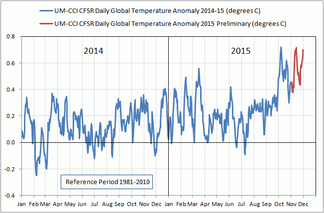

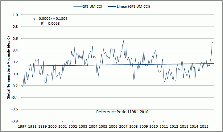
However, the trend in the UM CCI monthly estimates continues to be downward for the 21st century so far (nearly 15 years) and nearly flat since January 1997 (nearly 18 years).
Since the ENSO related peak in satellite estimates have sometimes shown a lag of 3 to 6 months after the ENSO peak, it will be interesting to see if they follow a similar pattern this time. The November satellite estimates suggest possibly not, but we still need to wait a few more months to be sure. Regardless, this short-term influence is more weather than climate.
TSI was solidly higher for most of October and November. compared to September, and temps tracked:
http://lasp.colorado.edu/data/sorce/total_solar_irradiance_plots/images/tim_level3_tsi_24hour_3month_640x480.png
Bob, the TSI plot is interesting, but do we know the accuracy of these estimates? If they are only accurate to plus or minus 1 W/m^2, which would be about plus or minus ~0.7%, then we can’t say much about these TSI trends.
Oops, make that plus or minus 0.07% corresponding to 1 W/m^2.
There will nearly certainly be some sort of peak from this nino. By all indications it will be a “strong” one, but even the last NOAA oracle I visited conceded it was likely to come in solidly second to 1997-8. The problem is nino 1+2 which predicted the last three godzillas flawlessly, yet is lagging and trending down.
Interestingly, sea level, which must now be considered a nino proxy for unknown reasons, is trending very closely with nino 1+2. Unprecedented.
Sometimes we naked apes are better served to watch and learn. Climate and weather are theoretically separated by time scale, but at our paltry understanding, climate is what we expect, and weather is what we get.
Reblogged this on Climatism and commented:
Roy Spencer On Satellite (UAH / RSS) v Surface Temperature Data (NASA GISS) :
With the ever increasing divergence of surface temperatures from satellite ones, and the subsequent divergence of overheated climate models to observed reality, it is worth a background on atmospheric measurement systems from former NASA climate scientist Dr. Roy Spencer, Ph.D. – climatologist at the University of Alabama in Huntsville who he developed the first temperature record based on satellites…
I claim 2014 won’t be the warmest global-average year on record.
..if for no other reason than this: thermometers cannot measure global averages — only satellites can. The satellite instruments measure nearly every cubic kilometer – hell, every cubic inch — of the lower atmosphere on a daily basis. You can travel hundreds if not thousands of kilometers without finding a thermometer nearby.
(And even if 2014 or 2015 turns out to be the warmest, this is not a cause for concern…more about that later).
The two main research groups tracking global lower-tropospheric temperatures (our UAH group, and the Remote Sensing Systems [RSS] group) show 2014 lagging significantly behind 2010 and especially 1998:

With only 3 months left in the year, there is no realistic way for 2014 to set a record in the satellite data.
Granted, the satellites are less good at sampling right near the poles, but compared to the very sparse data from the thermometer network we are in fat city coverage-wise with the satellite data.
In my opinion, though, a bigger problem than the spotty sampling of the thermometer data is the endless adjustment game applied to the thermometer data. The thermometer network is made up of a patchwork of non-research quality instruments that were never made to monitor long-term temperature changes to tenths or hundredths of a degree, and the huge data voids around the world are either ignored or in-filled with fictitious data.
Furthermore, land-based thermometers are placed where people live, and people build stuff, often replacing cooling vegetation with manmade structures that cause an artificial warming (urban heat island, UHI) effect right around the thermometer. The data adjustment processes in place cannot reliably remove the UHI effect because it can’t be distinguished from real global warming.
Satellite microwave radiometers, however, are equipped with laboratory-calibrated platinum resistance thermometers, which have demonstrated stability to thousandths of a degree over many years, and which are used to continuously calibrate the satellite instruments once every 8 seconds. The satellite measurements still have residual calibration effects that must be adjusted for, but these are usually on the order of hundredths of a degree, rather than tenths or whole degrees in the case of ground-based thermometers.
And, it is of continuing amusement to us that the global warming skeptic community now tracks the RSS satellite product rather than our UAH dataset. RSS was originally supposed to provide a quality check on our product (a worthy and necessary goal) and was heralded by the global warming alarmist community. But since RSS shows a slight cooling trend since the 1998 super El Nino, and the UAH dataset doesn’t, it is more referenced by the skeptic community now. Too funny.
In the meantime, the alarmists will continue to use the outdated, spotty, and heavily-massaged thermometer data to support their case. For a group that trumpets the high-tech climate modeling effort used to guide energy policy — models which have failed to forecast (or even hindcast!) the lack of warming in recent years — they sure do cling bitterly to whatever will support their case.
As British economist Ronald Coase once said, “If you torture the data long enough, it will confess to anything.”
So, why are the surface thermometer data used to the exclusion of our best technology — satellites — when tracking global temperatures? Because they better support the narrative of a dangerously warming planet.
Except, as the public can tell, the changes in global temperature aren’t even on their radar screen (sorry for the metaphor).
Roy Spencer On Satellite v Surface Temperature Data | NOT A LOT OF PEOPLE KNOW THAT https://notalotofpeopleknowthat.wordpress.com/2014/10/22/roy-spencer-satellite-v-surface-temperature-measurements/
2015 “Hottest Year Ever” Update :
2015 will be the 3rd Warmest Year in the Satellite Record « Roy Spencer, PhD
http://www.drroyspencer.com/2015/12/2015-will-be-the-3rd-warmest-year-in-the-satellite-record/
Climatism writes: “The thermometer network is made up of a patchwork of non-research quality instruments that were never made to monitor long-term temperature changes to tenths or hundredths of a degree”
Yes, exactly. And the very idea instruments used in Montana during the 1850’s, monitored and recorded by people wearing bifocals and bathrobes in blowing snow (in January) are precise or even accurate at the levels claimed is absurd.
+1. Now we only need a few billion more people with critical thinking skills under their belts.
“…precise or even accurate at the levels claimed is absurd”
The issue is the understanding of math. Like technology, math is pretty much magic for most people.
I have seen many times the claim that climate is like roulette and you can tell the long term results.
The ideas of “forcing” (applied to chaotic system with large oscillations), “internal variability” (because they can’t model the large oscillations), the word “climate” used as a precise physical concept like energy and entropy (not notions like “Bill Gate is rich” or “it’s hot in summer”)… people with real diplomas from real universities are putting up this nonsense.
People don’t understand what “internal variability” means; I wonder if they even understand that the design of the roulette implies no “memory”!
And they say internal variability (= the unknowns) explains previous climate changes and doesn’t explain recent climate change!
I wonder if pseudoscientific nonsense is like mass and if you concentrate it enough you get a black hole and then nothing sane can ever get out of it.
with the amo heading sharply into the cool phase there will be ever more reliance on those thermometers thousands of kilometres from prying eyes to maintain the narrative.
Is this current el nino in its dying days? (Lets so hope so I am in drought stricken North Central Victoria) I just noticed the BOM (aust) latest soi index reading as -5.3 significantly different from October at -20.2. http://www.bom.gov.au/climate/current/soihtm1.shtml
“Figure 1. The least-squares linear-regression trend on the RSS satellite monthly global mean surface temperature anomaly dataset continues to show no global warming for 18 years 9 months since February 1997, though one-third of all anthropogenic forcings have occurred during the period of the Pause.”
Wouldn’t that be better as “…one-third of all alleged anthropogenic forcings…”?
Amen brother, amen. “alleged”
Of course, in the MSM, to say “alleged” takes them off the legal hook.
They can allude to an allegation but they have no obligation to prove or defend what they asserted…er…to what they alluded.
Illusion at it’s finest!
It has been pointed out above that the trend line can not be projected into the future, and that statistical fact is often overlooked. But worse, is that just because two things rise over time does not mean one caused the other.
Over my lifetime, the rise in salaries we pay Kindergarten teachers approximately matches the rise in the retail cost of wine. Are those Kindergarten teachers bidding up the cost of wine with their increased salaries? Perhaps, but it may also be that monetary inflation caused both the rise in the cost of wine and the salaries of the Kindergarten teachers.
With that in mind, why do both the lukewarmers and the alarmists look to rising temperatures (minor though they have been) and the rise in CO2 as if we could prove one causes the other just from the time series? Are we all really that stupid? If temperatures (real temps not the fake adjusted stuff) started to rise again at the rate we have seen long term since the end of the Little Ice Age, how could any honest man claim that proves anything?
~ Mark
The one effect that CO2 has had is to change us from living in the age of enlightenment, into living in the age of stupid.
Mark writes: “If temperatures (real temps not the fake adjusted stuff) started to rise again at the rate we have seen long term since the end of the Little Ice Age, how could any honest man claim that proves anything?”
We couldn’t. Your point about correlation vs. causation is so well documented it’s nearly burned into the genes of any statistician. It’s literally the first thing out of the mouths of our instructors.
So why do people keep falling for it? My belief (and it’s just my opinion of course) is that folks want to feel important; it gives meaning to their lives. Wat better way is there to cater to a missing sense of self-importance than to suggest driving your car to the supermarket has a rich and compelling impact on the lives of everyone you know? The very survival of your species? It’s hubris writ large and it’s a very easy trap to fall in.
No one really wants to think they’re insignificant little pawns in the game of life. The idea they might have a real impact on something is attractive.
http://www.nytimes.com/2015/01/04/opinion/sunday/playing-dumb-on-climate-change.html
This is beyond pale even for the most inept warmistas.
Is Naomi Oreskes the name of many different academics interested vile pseudo-science?
Is Naomi Oreskes a school reject? or insane? or both?
a very astute observation bartleby , the meek, who in the past would never have been given the time of day have now inherited the earth. the same people have weaponised political correctness.
OMG, Bartleby — so true. I can only add, it also gives them a feeling of power, of control: how terrifying, to be dependent for one’s very life on something so capricious as weather; how comforting to think one could control it. They say, in effect, “The fact [their word, not mine] that we are doing it badly now, cooking our poor little planet, means that we can do it right! We are become Zeus!”
markstoval:
You say
Oh, it is worse than that!
Atmospheric CO2 concentration follows temperature at all time scales. This coherence is a statistical indication that if there is causality between the two then temperature changes cause the CO2 changes this. Indeed, the ‘Pause’ provides a statistical indication that atmospheric CO2 concentration and global temperature are each responding to some other parameter(s).
I explain the matter as follows.
Correlation and coherence can each and both provide information pertaining to causality.
Correlation is a mathematical relationship between two parameters. If the correlation is known over the length of the data sets, then their correlation indicates the magnitude of a change in one parameter that is expected when the other parameter changes by a known magnitude.
Correlation does NOT indicate a causal relation between two parameters.
But
Absence of correlation indicates absence of a direct causal relation between two parameters.
Coherence of two parameters indicates that when one parameter changes then the other parameter changes later.
Coherence can disprove that change of one parameter causes change in the other; i.e. if change in parameter A follows change in parameter B then the change of A cannot be the cause of the change of B (because a cause cannot occur after its effect).
So,
1.
absence of correlation indicates absence of a direct causal relationship
and
2.
when there is a direct causal relationship then coherence indicates which of the two parameters is causal.
Furthermore, coherence in the absence of correlation is strongly suggestive that both parameters are affected by another parameter (or other parameters).
For example, leaves fall off trees soon after children return to school following their summer break.
The coherence is great; i.e. both effects occur each year.
But the effects do not correlate; i.e. the number of returning children is not indicative of the number of falling leaves.
In this example, the time of year is the additional parameter which causes children to return to school and the leaves to fall off trees.
Another example would be the ‘Pause’ in global temperature rise while atmospheric CO2 concentration has continued to rise while at short time scales (i.e. months) atmospheric CO2 concentration has continued to follow atmospheric temperature. This is strongly suggestive that both parameters are affected by another parameter (or other parameters).
Richard
Nicely put Richard. Thanks.
Skeptics should try to teach the “common man” these facts of statistics more often. After all, the “CO2 is going to fry us” argument has always been a statistical one; and for some unknown reason the climate “scientists” rarely have a statistician on the team when they publish. I wonder why that is.
IPCC AR5 acknowledged a 15 year pause/hiatus/stasis/lull in text box 9.2 and the failure of the GCMs to model it. So not news.
I have grown very fond of Christopher Monckton over the years, and very appreciative of his apparently indefatigable defence of veracity. Plus, I like a writer who knows where an apostrophe should be, and where it should not.
Over 4,500 words that will be thoroughly ignored by the so-called main stream press.
Other than that, an excellent review of the situation.
Dr Spencer has a post on his site suggesting that 2915 will come in as the third warmest year on record.
He is suggesting that it will be considerably cooler than 1998.
Naturally, he points out that 2016 could, in view of the current strong El Nino, be a warm year and could possibly be warmer than 1998. Of course, no one knows precisely how the 2015/16 strong El Nino will pan out, and whether it will eventually cause temperatures to peak higher than that observed during the 1997/98 Super El Nino, and even to set a year record exceeding that set in 1998/
Time will tell, as will it with respect to a following La Nina.
2915? Wow that is a long range forecast 🙂
I know what you meant. 2015, I’m just being a smart ass.
the problem with this el nino is the claim it is a 2015/16 event. it looks to me that when we examine the numbers at the end of next year it will have been a 2014/15 event,and the peak everyone is expecting next year will already have passed. all imo of course,and unlike climate scientists i am quite prepared to be wrong.
I am thinking that the blob will dissipate in 2016 and the AMO will continue to reverse, thus greatly mitigating the affect of this El Nino on GMT verse the 2010 and 1998 event. Remember, global SSTs were at a record level not very long ago.
On HadSST3, the October anomaly of 0.700 was by far the highest October on record. The average to date in 2015 is 0.570, way ahead of the 2014 record of 0.479.
Should be interesting to see how the Climate Liars in Paris deal with the “Pause” this time. Will they claim it never existed, and use NOAA’s fabrication as proof, or some variation of the excuses – some 64, I believe. That last one is a howler – it’s “just luck” they say.
“Dr Mears writes: ‘The denialists like to assume that….'”
Dear Mr Mears,
Smearing people who disagree with your point of view has no place in scientific discourse. This is why people are no longer listening to you. This is why your profession no longer garners any respect. This is why the people you are trying to convince dislike and distrust you so much. This is also why if I had my way, I would strip your degree and send you back to the 2nd grade where hopefully you will learn the lessons in civility you have demonstrated you are incapable of.
Disgraceful behaviour for an adult. That he doesn’t see why this language is so revolting shows to me someone who has never properly grown up. Reads at a doctoral level, but interacts at a socially stunted remedial level. Even worse, he clearly surrounds himself with people who lack the social awareness to correct him.
Reblogged this on Idea Capitalists and commented:
Key facts about global temperature
Ø The RSS satellite dataset shows no global warming at all for 225 months from March 1997 to November 2015 – more than half the 443-month RSS record.
Ø There has been no warming even though one-third of all anthropogenic forcings since 1750 have occurred since the Pause began in March 1997.
Ø The entire UAH dataset for the 444 months December 1978 to November 2015 shows global warming at an unalarming rate equivalent to just 1.14 Cº per century.
clip_image012
Ø Since 1950, when a human influence on global temperature first became theoretically possible, the global warming trend has been equivalent to below 1.2 Cº per century.
Ø The global warming trend since 1900 is equivalent to 0.75 Cº per century. This is well within natural variability and may not have much to do with us.
Ø The fastest warming rate lasting 15 years or more since 1950 occurred over the 33 years from 1974 to 2006. It was equivalent to 2.0 Cº per century.
Ø Compare the warming on the Central England temperature dataset in the 40 years 1694-1733, well before the Industrial Revolution, equivalent to 4.33 C°/century.
Ø In 1990, the IPCC’s mid-range prediction of near-term warming was equivalent to 2.8 Cº per century, higher by two-thirds than its current prediction of 1.7 Cº/century.
Ø The warming trend since 1990, when the IPCC wrote its first report, is equivalent to 1 Cº per century. The IPCC had predicted close to thrice as much.
Ø To meet the IPCC’s central prediction of 1 C° warming from 1990-2025, in the next decade a warming of 0.75 C°, equivalent to 7.5 C°/century, would have to occur.
Ø Though the IPCC has cut its near-term warming prediction, it has not cut its high-end business as usual centennial warming prediction of 4.8 Cº warming to 2100.
Ø The IPCC’s predicted 4.8 Cº warming by 2100 is well over twice the greatest rate of warming lasting more than 15 years that has been measured since 1950.
Ø The IPCC’s 4.8 Cº-by-2100 prediction is four times the observed real-world warming trend since we might in theory have begun influencing it in 1950.
Ø The oceans, according to the 3600+ ARGO buoys, are warming at a rate of just 0.02 Cº per decade, equivalent to 0.23 Cº per century, or 1 C° in 430 years.
Ø Recent extreme-weather events cannot be blamed on global warming, because there has not been any global warming to speak of. It is as simple as that.
Regarding: “The RSS satellite dataset shows no global warming at all for 225 months from March 1997 to November 2015 – more than half the 443-month RSS record”:
As I said once before, it is also arguable that if the warming in RSS stopped 225 months ago, then a majority of the warming occurred after it stopped. I got a response that I was pulling a political stunt. But have a look at:
http://woodfortrees.org/plot/rss/plot/rss/trend/plot/rss/to:1997.17/trend
If you were to plot the height of a 30 year old man from birth to 10 years and birth to 30 years, you may conclude the same thing, even if the man stopped growing at age 20. If you want to know for sure the man stopped growing at age 20, plot the heights from 20 to 30 and not 0 to 30.
Donald,
You’ve got that backwards. In fact, all the warming in the RSS series occurred before it stopped, ie 1979-97, with temperatures flat to falling during the current interval, ie 1997-2015 and counting.
Regarding R.B. and G.M.’s comments below: As I said above, look at the link I provided. Most of the warming in the RSS record happened after March 1997.
As for W.B.’s the analogy with saying when a person stopped growing: If a 30 year old person had a spurt of extra rapid growth from 16 to 20 and then stopped growing, and sometime in that period is stretched temporarily by a medieval rack and measured and found to have had a peak height during that time, a flat linear trend of his height may occur with a start time near the beginning of the growth spurt. But did that person stop growing at 16, at the beginning of the growth spurt?
No. All analogies break down at some point. But I like your idea of a “medieval rack and measured and found to have had a peak height during that time”. Suppose that was applied and added foot for a brief period of time, but then the neck snapped back. That would be similar to 1997/1998. See:
http://www.woodfortrees.org/plot/rss/from:1979/plot/rss/from:1979/to:1999/trend/plot/rss/from:1979/trend
(Fake name, by the fake ‘David Socrates’. -mod)
I particularly enjoyed reading the section on OHC
Warmistas have long since lost any interest in Science as they now realize that science and knowledge are not on their side. They are proceeding purely along political lines, where belief conquers knowledge. Unfortunately they have on their side the World’s leading politicians of the West, who are some of the most scientifically illiterate that have ever been seen gathered together. Those like Vladimir Putin, who know the truth, are standing back in the hope that they will profit from the devastation of Western economies that will result from present Greeen/Warmistas policies.
“Warmistas have long since lost any interest in Science as they now realize that science and knowledge are not on their side.”
I like when they repeat “cherry pick(ed|ing)” as if they had any idea what that means.
RSS is cherry picked.
18 years is cherry picked.
Looking at the number of hurricanes is cherry picking.
(repeat ad nauseum)
As a rule, when you evaluate “science”, imagine a criminal trial:
Defense lawyer: The defense will present many witnesses establishing the accused was 120 km away from the crime scene.
Prosecutor: The defense is cherry picking witnesses who saw the accused but fails to mention the other witnesses who have not seen the accused away from the crime scene and the other places where the accused wasn’t seen.
Jury: collective facepalm
Judge: although very unusual, I suggest the prosecutor, and not the accused, to plead not guilty by reason of insanity
At the moment, with UAH6.0beta4 being very close to RSS, the accusation of cherry picking is not too valid. However should the pause be over 18 years on RSS, but disappear on UAH, that would be a different matter!
Simple:
Determining when temp trends begin and end using mathematical iteration is an essential tool of statistics and is certainly NOT considered “cherry picking” by anyone that understands mathematics and statistics…
Certinly there are statistical confidence intervals in relation to the duration of a particular trend, but any trend exceeding 10 years is certainly noteworthy…
Regarding severe weather trends, even IPCC’s 2013 AR5 report admits NO globally statistically significant trends for 50~100 years in severity nor frequency for: hurricanes, typhoons, cyclones, tornadoes, thunderstorms, droughts, floods, tropical storms, sub-tropical storms, hail, etc….
50~100 years (depending on weather phenomena) is certainly a statistically significant duration….
“RSS is cherry picked.
18 years is cherry picked.”
The hollowscene is cherry picked, the Phanerozoic (abundant life) is cherry picked. Any point back to the big bang is cherry picked. Even that might be cherry picked…
The entire field of Climate Sophistry is based upon Cherry Picking data.
1) They Cherry Pick flawed ground measurements over satellite.
2) They Cherry Pick the period that starts at the end of the Little Ice Age.
3) They Cherry Pick temperature graphs like the Hockey Stick over more well established reconstructions.
4) They Cherry Pick original statistical techniques unknown to the rest of the Scientific Community like Mike’s Nature Trick to “Hide the decline.”
5) They Cherry Pick periods to manipulate and leave other periods untouched.
6) They Cherry Pick CO2 as the cause and ignore the other more likely causes like the Sun, Oceans and water vapor.
7) They Cherry Pick flawed models with such a consistent methodology they selected a sample of models that all failed, and were all biased to over estimate temperatures.
Saul Alynski; Blame Others of What You are Guilty.
“co2islife: “…. over more well established reconstructions.”
..
Which ones are you talking about?”
To start, the temperature reconstruction used in the 1990 IPCC Report.
http://www.realclimate.org/images/ipcc_1990_panel3.jpg
Every temperature reconstruction before the Hockey Stick showed a Roman Warming, Medieval Warming, and Little Ice Age. Geological and Historical Records have established those events. The Hockey Stick re-wrote well known well established and widely accepted climate history. Only is Climate “Science” can the tyranny of the status quo be defeated so easily. No one, relying on independently accumulated data will ever reproduce the “Hockey Stick,” No honest scientist would ever manufacture statistical techniques to hide declines, ignore temperature data and use proxies that he knows are deeply flawed.