Guest Post by John Goetz
Adjustments to temperature data continue to receive attention in the mainstream media and science blogs. Zeke Hausfather wrote an instructive post on the Climate Etc. blog last month explaining the rationale behind the Time of Observation (TOBS) adjustment. Mr. Hausfather pointed to the U.S. Climate Reference Network (CRN) as a source of fairly pristine data that can be used to analyze TOBS. In examining the CRN data, there is no doubt that the time of observation affects the minimum, maximum, and average temperature recorded on a given day. Also, changing the TOBS one or more times during a station’s history can affect the station’s temperature trend.
Temperature adjustments have bothered me not because they are made, but because there is a broad assumption that they skillfully fix a problem. Somehow, climate scientists are capable of adjusting oranges into apples. However, when adjustments are made to temperature data – whether to correct for TOBS, missing data entries, incorrect data logging, etc. – we are no longer left with data. We are left instead with a model of the original data. As with all models, there is a question of how accurately that model reflects reality.
After reading Mr. Hausfather’s post, I wondered how well the TOBS adjustments corrected the presumably flawed raw temperature data. In the process of searching for an answer, I came to the (preliminary) conclusion that TOBS and other adjustments are doing nothing to bring temperature data into clearer focus so that global temperature trends can be calculated with the certainty needed to round the results to the nearest hundredth of a degree C.
The CRN station in Kingston, RI is a good place to examine the efficacy of the TOBS adjustment. This is because it is one of several CRN pairs around the country. Kingston 1 NW and Kingston 1 W are CRN stations located in Rhode Island and separated by just under 1400 meters. Also, a USHCN station that NOAA adjusts for TOBS and later homogenizes is located about 50 meters from Kingston 1 NW. The locations of the stations can be seen on the following Google Earth image. Photos of the two CRN sites follow – Kingston 1 W on top and Kingston 1 NW on the bottom (both courtesy NCDC).


The following images are of the Kingston USHCN site from the Surface Stations Project. The project assigned the station a class 2 rating for the time period in question, 2003 – 2014. Stations with a class 1 or class 2 rating are regarded as producing reliable data (see the Climate Reference Network Rating Guide – adopted from NCDC Climate Reference Network Handbook, 2002, specifications for siting (section 2.2.1) of NOAA’s new Climate Reference Network). Only 11% of the stations surveyed by the project received a class 1 or 2 rating, so the Kingston USHCN site is one of the few regarded as producing reliable data. Ground level images by Gary Boden, aerial images captured by Evan Jones.


CRN data can be downloaded here. Download is cumbersome, because each year of data is stored in a separate directory, and each file represents a different station. Fortunately the file names are descriptive, showing the state and station name, so locating the two stations used in this analysis is straightforward. After downloading each year’s worth of data for a given station, they must be concatenated into a single file for analysis.
USHCN data can be downloaded here. The raw, TOBs, and homogenized (52i) files must be downloaded and unzipped into their directories. All data for a station is found in a single file in the unzipped directories. The Kingston USHCN data has a file name that begins with USH00374266.
Comparison of Kingston 1 NW and Kingston 1 W Temperatures
Both Kingston CRN stations began recording data in December, 2001. However, the records that month were incomplete (more than 20% of possible data missing). In 2002, Kingston 1 NW reported incomplete information for May, October, and November while Kingston 1 W had incomplete information for July. Because of this, CRN data from 2001 and 2002 are not included in the analysis.
The following chart shows the difference in temperature measurements between Kingston 1 NW and Kingston 1 W. The temperatures were determined by taking the average of the prior 24-hour minimum and maximum temperatures recorded at midnight. The y-axis is shown in degrees C times 100. The gray range shown centered at 0 degrees C is 1 degree F tall (+/- 0.5 degrees F). I put this range in all of the charts because it is a familiar measure to US readers and helps put the magnitude of differences in perspective.

Given the tight proximity of the two stations, I expected their records to track closely. I found it somewhat surprising that 22 of the months – or 15% – differed by the equivalent of half a degree F or more. This makes me wonder how meaningful (not to say accurate) homogenization algorithms are, particularly ones that make adjustments using stations up to 1200 Km. With this kind of variability occurring less than a mile apart, does it make sense to homogenize a station 50 or 100 miles away?
Comparison of Kingston 1 NW and Kingston 1 W Data Logging
A partial cause of the difference is interruption in data collection. Despite the high-tech equipment deployed at the two sites, interruptions occurred. Referring to the previous figure, the red dots indicate months when 24 or more data hours were not collected. The interruptions were not continuous, representing a few hours here and a few there of missing data. The two temperature outliers appear to be largely due to data missing from 79 and 68 hours, respectively. However, not all differences can be attributed to missing data.
In the period from 2003 through 2014, the two stations recorded temperatures during a minimum 89% of the monthly hours, and most months had more than 95% of the hours logged. The chart above shows that calculating a monthly average when missing 10-11% of the data can produce a result with questionable accuracy. However, NOAA will calculate a monthly average for GHCN stations missing up to nine days worth of data (see the DMFLAG description in ftp://ftp.ncdc.noaa.gov/pub/data/ushcn/v2.5/readme.txt). Depending on the month’s length, GHCN averages will be calculated despite missing up to a third of the data.
Comparison of Kingston USHCN and CRN Data
To test the skill of the TOBS adjustment NOAA applied to the Kingston USHCN site, a synthetic TOBS adjustment for the CRN site was calculated. The B91 forms for Kingston USHCN during 2003-2014 show a 4:30 PM observation time. Therefore, a synthetic CRN 4:30 PM observation was created by averaging the 4:00 PM and 5:00 PM observation data. The difference between the USHCN raw data and the synthetic CRN 4:30 observation is shown in the following figure. Despite a separation of approximately 50 meters, the two stations are producing very different results. Note that 2014 data is not included. This is because the 2014 USHCN data was incomplete at the time it was downloaded.

Although the data at the time of observation is very different, perhaps the adjustment from midnight (TOBS) is similar. The following figure represents the TOBS adjustment amount for the Kingston USHCN station minus the TOBS adjustment for the synthetic CRN 4:30 PM data. The USHCN TOBS adjustment amount was calculated by subtracting the USHCN raw data from the USHCN TOBS data. The CRN TOBS adjustment amount was calculated by subtracting the synthetic CRN 4:30 PM data from the CRN midnight observations. As can be seen in the following figure, TOBS adjustments to the USHCN data are very different than what would be warranted by the CRN data.

Adjustment Skill
The best test of adjustment skill is to take the homogenized data for the Kingston USHCN station and compare it to the midnight minimum / maximum temperature data collected from the Kingston CRN 1 NW station located approximately 50 meters away. This is shown in the following figure. Given the differences between the homogenized data from the USHCN station and the measured data from the nearby CRN station, it does not appear that the combined TOBS and homogenization adjustments produced a result that reflected real temperature data at this location.

Accuracy of Midnight TOBS
Whether the minimum and maximum temperatures are read at midnight or some other time, they represent just two samples used to calculate a daily average. The most accurate method of calculating the daily average temperature would be to sample continuously, and calculate an average over all samples collected during the day. The CRN stations sample temperature once every hour, so 24 samples are collected each day. Averaging the 24 samples collected during the day will give a more accurate measure of the day’s average temperature than simply looking at the minimum and maximum for the past 24 hours. This topic was covered in great detail by Lance Wallace in a guest post two and a half years ago. It is well worth another read.
The following chart shows the difference between using the CRN hourly temperatures to calculate the daily average, and the midnight minimum / maximum temperature. The chart tends to show that the hourly temperatures would produce a higher daily average at this station.

Discussion
Automated methods to adjust raw temperature data collected from USHCN stations (and by extension, GHCN stations) are intended to improve the accuracy of regional and global temperature calculations to, in part, better monitor trends in temperature change. However, such adjustments show questionable skill in correcting the presumed flaws in the raw data. When comparing the raw data and adjustments from a USHCN station to a nearby CRN station, no improvement is apparent. It could be argued that the adjustments degraded the results. Furthermore, additional uncertainty is introduced when monthly averages are computed from incomplete data. This uncertainty is propagated when adjustments are later made to the data.
A Note on Cherry-Picking
Some will undoubtedly claim that I cherry-picked the data to make a point, and they will be correct. I specifically looked for the closest-possible CRN and USHCN station pairs, with the USHCN station having a class 1 or 2 rating. My assumption was that their differences would be minimized. The fact that a second CRN station was located less than a mile away cemented the decision to analyze this location. If anyone is able to locate a CRN and USHCN pair closer than 50 meters, I will gladly analyze their differences.
================================
Edited to add clarification on y-axis units and meaning of the gray band to the description of each figure.
Edited to add links to the CRN and USHCN source data on the NCDC FTP site.
Discover more from Watts Up With That?
Subscribe to get the latest posts sent to your email.
or …
Can Adjustments Right the Left?
Whether the minimum and maximum temperatures are read at midnight or some other time, they represent just two samples used to calculate a daily average.
============
calculating min and max temperatures at midnight or some other time of day is nonsense. the Six’s min/max logging thermometers was invented in 1782. min and max temperature happen do not happen at any specific consistent time during the day or night.
http://en.wikipedia.org/wiki/Six%27s_thermometer
In any case, a min_max record meets the required Nyquist criterion for validity in sampled data systems ONLY if the cyclic data function is a pure sinusoidal function.
If not, then there must at least be a second harmonic spectral component in a truly periodic function), and in that case a min_max record will not even give a believable average value for the function since the aliasing noise spectrum folds back all the way to zero frequency (which is the average value).
As to changing the value of a previously recorded observation, that is permissible ONLY in one situation. That situation wherein altering a previously recorded value is permissible, is when the typist makes a typo and enters a number different from that registered on the instrument being reported. In that case, replacing that number with the correct number that was read by the instrument, is allowed, but only by the observer that actually read the instrument, if (s)he wrote it down wrong, or by an aid who converted the written record to a machine record of the exact same data.
Any other instance of altering an instrumental record is blatant fraud in my book, and should call for instant dismissal.
Look at the photos of those sites above showing that the station parameters have been altered from time to time.
How is someone going to be able to re-assess the credibility of that station in light of its alterations, if somebody goes and changes the numbers.
Eventually, nobody knows just what numbers go along with what station conditions.
I don’t believe ANY global oceanic Temperature data taken before about 1980, because such data was oceanic WATER Temperature at some uncontrolled depth, and it was blithely assumed that the air Temperature was the same.
From buoy measurements of both water and air Temperatures simultaneously, starting circa 1980, John Christy et al reported in 2001 (I believe) that they are not the same; and they are not correlated, so you cannot recover the oceanic air Temperatures for that old obsolete water Temperature data.
For the 20 odd years of dual data that they recorded, the water Temps were something in the range of 40% higher than the air temps. (ONLY for that 20 years of data; no idea what the relation is for other times because of the lack of correlation.)
So I don’t buy any lame excuse for why they cook the books. That is scientific fraud of the worst kind in my book.
Is it that hard to grasp the concept, that later users of recorded data, can themselves take into account recorded information about site differences, when making use of data from that site.
It is very common to re-measure data, when improved instrumentation comes along. But you don’t change the earlier records done with older instruments.
Look at the history of attempts to measure the velocity of electromagnetic waves. But we don’t go back and “adjust” what Roemer, or Michelson, or anyone else actually measured at the time they measured it.
Thank Google for “climate unchange”.
You’re saying you got differences of 112 degrees C? 100 degrees C? 60 degrees C?
What now?
Reply to M Moon ==> “The y-axis is shown in degrees C times 100” — thus 0.01°C would show as “1” and 0.6 would show as “60”.
(Don’t ask me — not my graph….)
The GHCN data collected by NCDC is recorded in degrees C times 100. This is propagated through the GISS analysis, and results are presented by GISS in this manner. This form of presentation should be familiar to those who follow the temperature data.
Some Physicists use systems of units wherein they put …. c = h = k =1 and they seem to keep it straight somehow.
In those systems, Energy (E) is identical to mass (m) and also to frequency (nu) and Temperature (K).
Makes life simpler for a particle physicist I guess.
g
Which seems to be a propagation of BS. If someone presents temperatures to 1/100th °C one might ask how they preserved their reference ice baths and/or calibration for more than one day. Whereas if they present their data modified by multiplying it by 100 a casual reader might not note the level of precision they are claiming.
Or maybe it’s all an effort to preserve ink/storage by getting rid of decimal points.
The label on the y axis should be corrected.
I am awaiting a Zeke/Mosher demolition job on this or Goddard/Heller is perhaps closer to the “facts”? This is an interesting analysis. I am in favour of Inhofe starting an enquiry into this whole surface temperature adjustment “carry-on” and additionally USA should follow Australia in setting up a commission filled with independent experts in statistics without an axe to grind to looke at TOBS, UHI, homogenisation and other “adjustments” to US and global surface temperatures.
I’m not a betting man but my money would be on Goddard/Heller.
+1
Not sure if am reading this correctly but it seems the WMO give a quality rating of zero for Urban stations.
https://www.wmo.int/pages/prog/gcos/Publications/gcos-34.pdf
The real question is why the TOB adjustments for the past 100 years is Hockey Stick shaped.
I get that TOB might create a bias, and that adjustments might be warranted, but why does the adjustment so consistently cool the past and warm the present?
My recollection is that something like 40% of the claimed global warming over the past 120 years is due to TOB adjustments. Why should worldwide data collectors in China, Russia, Paraguay, Kenya, New Guinea, etc. all decide to shift their observations from afternoon to morning at just the right decades to warrant a Hockey Stick shaped “correction” to the observations?
Because the great majority of the changes in observation time were from evening to morning. That introduces a cooling bias and it has to be corrected by increasing the trend.
The problem arises when there is missing metadata. pairwise infers that and I strongly disapprove.
These adjustments have always seemed misguided, illogical and not based upon good scientific theory. I have experience with analog/digital conversion techniques and what they are doing just does not follow A/D conversion techniques. PERIOD. In essence their methods are analogous to assigning a test grade to a student that is out sick by averaging the grades of those to either side of his seat or by his last two grades – it is simply a WAG disguised as a good technique. Many times during the winter the coldest time of the day (0000 – 2400) is at 0001 and a few days later the warmest time of the day is at 0001. And the same in the summer. It all depends on the movement of the weather fronts. How do they factor this in their adjustments? How are they even aware of it?
Rich March 6, 2015 at 7:08 am
I have experience with analog/digital conversion techniques and what they are doing just does not follow A/D conversion techniques. PERIOD.
My experience is in data acquisition and processing in aircraft flight test where manipulation of data such as is done in Climate Science is strictly forbidden. Climate scientists seem to think it is OK to make their own rules.
Exactly. Maybe why so many engineers are skeptic of the AGW hypothesis.
Perhaps a new career field:
Data Masseuse.
They have rules?….Wai..What????
Could you calarify what you meant by your 4:30 CRN synthetic measurement? The USHCN measurement would be based on both min and max thermometers recorded at that time would it not? Just using the actual CRN temperature at the time of observation would not give you the same value. Did your synthetic calculation go from 4:30 of the previous day til the 4:30 that day and take the min and max between those two times to match the period during which the USHCN station would have made those measurements?
The CRN recorded temperatures on the hour. So 4:30 was the average of the min/max reading from 4:00 and 5:00 PM. By min/max reading, at 4:00 PM, what I mean is I looked backward 24 hours in time and used the minimum and maximum temperatures over those 24 hours. The same was done at 5:00 PM. I did not just use the min/max recorded during the 4:00 PM hour.
John,
acutally the CRN temperature measurements are made every 5 minutes. Hourly average, min, max, etc. are derived from them.
Gary–
OMG! So you’re saying that 12 measurements are taken each hour, which are then used to produce a single hourly “average”. Then, of the 24 hourly numbers, 22 are discarded to retain only the min and max. These two numbers are then “averaged” again to produce the daily “average” temp at that location, which must be “averaged” again to produce the “average” monthly or annual temperature, which is then compared to the historical “average” to determine how much colder or warmer we are. Not to mention further “averaging” across the state, region, nation and world so that we know how close to ultimate catastrophe we are. Remembering, of course, that the physical process that concerns us is the capture and retention of radiative energy, which varies as the fourth power of temperature and has nothing at all to do with “average” temperature! OK, I think I’ve got it.
skorrent1-
Nope, not even close. Please don’t confuse comparisons of the USCRN hourly data with the historic data. The USCRN hourly data was reduced to daily min/max values used to create values as a convenience to compare it with historic data daily min/max data. USCRN data is retained on line at the 5 minute resolution but most folks prefer to use the calculated hourly versions. By the way even the 5 minute values are produced from multiple reads. The algorithms are available on the USCRN. They are fairly simple and straightforward. No TOBS correction or Homogenization used with this data.
This is all about whether or not “it” is getting warmer. It begs the question of what does CO2 have to do with it?
The sea ice/sheets/caps on Antarctica/the Arctic/Greenland/Iceland are shrinking/growing yes/no/maybe depends on who’s counting.
Polar bears and penguins are endangered/having a hard time/pretty much as usual yes/no/maybe depends on who’s counting.
The sea levels are rising, land is subsiding yes/no/maybe depends on who’s counting.
The global temperatures are rising/falling/flat lining based on satellite/tropospheric/sea surface/land surface with or without UHI/TOB/homogenization/adjustments/bald faced lying yes/no/maybe depends on who’s counting.
Nothing but sound and fury, tales told by people missing the point, signifying nothing. The only meaningful question is what does CO2 have to do with any of this? How are these contentious topics connected to CO2?
IPCC’s dire predictions for the earth’s climate are based entirely on computer models, models which have yet to match reality. The projections began with a 4 C increase by 2100 which has since been adjusted down to 1.5 C without stilling those shrill Cassandras. The heated discussions mentioned above attempt to validate or refute those models, models driven by the radiative forcing/feedback of CO2 and other GHGs. IPCC AR5 TS.6 says that the magnitude of the radiative forcing/feedback of CO2 “…remains uncertain.” (Google “Climate Change in 12 Minutes.”) implying that IPCC was also uncertain in AR4, 3, 2, 1.
IPCC is not uncertain about one issue, though, redistribution of wealth and energy from developed countries to the underdeveloped ones to achieve IPCC’s goal of all countries enjoying above average standards of living.
Besides, the greatest threat to mankind isn’t CO2, it’s lead.
” IPCC’s goal of all countries enjoying above average standards of living.”
If this is what the IPCC wants, they will never acheive it. Whatever the standards of living are, half will always be at or below average.
To be fair they shown themselves to be constantly rubbish at statistics , so of course they cannot understand why everyone cannot be on the ‘average’ .
Well, now you’re assuming that average is the [median]
meanin that calculation. (Sorry, given the statistical discussion, I couldn’t resist. : ) )Ugh, median not mean.
[On average, most of us think we know what you mean about the medium modes. The large and extra-large modes? Not so much. .mod]
“IPCC is not uncertain about one issue, though, redistribution of wealth and energy from developed countries to the underdeveloped ones to achieve IPCC’s goal of all countries enjoying above average standards of living.”
We should refer to this IPCC goal in future as the “Lake Wobegon Goal”. 😉
That the goal of the entire “progressive” movement everywhere. They attempt to tell the “have nots” that if one just votes for them, they can improve their standard of living. Trouble is, in every case of which I am aware, it never works out that way in practice. If you look at places where they have been in control the longest, you find the greatest disparity of income and the most poverty. But this actually HELPS the “progressives” because then they have more people to whom they can sell their line of baloney.
Fixed that for you.
well, truth be told, they are planning the standard of living primarily to be improved by tossing a significant portion of humanity out of the lifeboat for the greater good.
Yes. May the force always be with you!
Thanks John for an excellent analysis. The biggest problem with such adjustments is not that they exist and are applied, but are applied with a broad brush without determining the state of the data to begin with. That’s the lack of skill that John refers to. The “cure” is often arbitrarily applied and far worse than the symptoms.
Am I missing something on your chart labels? Your +/-0.5 degF gray area spans 28 to -28 on the the y-axis. That makes no sense to me.
One thing I’ve never understood about TOBS bias is how it introduces a trend. I get how time of observation can bias the measured temperature, but I’ve no clue how that bias introduces a trend that must be corrected for. Sure, a *change* in TOBS could introduce a one time step change in bias, and if, somehow, many stations, at different times made the same shift in time of observation, in the same direction, introducing a bias that was higher than the previous bias, I can see how the overall average might trend upwards.
But such an orchestrated change seems, well, improbable. It seems that a change in time of observation would be just as likely to introduce a lower bias as it would be to introduce a higher bias.
I was hoping the gray band would not be confusing. It’s y-dimension is 1 degree F, or 0.56 degree C. Since the y-axis units are in degrees C times 100, I center that band from -28 to 28. I personally find the band useful to see the significance of the variation, because 1 degree F is something I can relate to.
TOBS introduces bias when a station changes the standard time observations are made. If a station operator has been recording temperatures at 5:00 PM for 30 years, and then a new operator comes in and records temperatures at 7 AM for the next 30 years, a cooling bias is introduced by the change from afternoon to morning. I was always skeptical of that until I downloaded the CRN data after reading Zeke’s blog post.
Well, it would help if the axis were labelled in the same units you describe the gray band with.
I do get that TOBS changes can introduce a bias, but what evidence is there for a system shift that would impact average temperature trends? I mean in your example, if the shift is in the opposite direction there is a warming bias.
A well written article. Very informative. Thank you, John.
After reading Zeke’s blog post, I could find nowhere the affect made to the monthly data you are posting here. Zeke ‘says’
At first glance, it would seem that the time of observation wouldn’t matter at all. After all, the instrument is recording the minimum and maximum temperatures for a 24-hour period no matter what time of day you reset it. The reason that it matters, however, is that depending on the time of observation you will end up occasionally double counting either high or low days more than you should. For example, say that today is unusually warm, and that the temperature drops, say, 10 degrees F tomorrow. If you observe the temperature at 5 PM and reset the instrument, the temperature at 5:01 PM might be higher than any readings during the next day, but would still end up being counted as the high of the next day. Similarly, if you observe the temperature in the early morning, you end up occasionally double counting low temperatures. If you keep the time of observation constant over time, this won’t make any different to the long-term station trends. If you change the observations times from afternoons to mornings, as occurred in the U.S., you change from occasionally double counting highs to occasionally double counting lows, resulting in a measurable bias.
To show the effect of time of observation on the resulting temperature, I analyzed all the hourly temperatures between 2004 and 2014 in the newly created and pristinely sited U.S. Climate Reference Network (CRN). I looked at all possible different 24 hour periods (midnight to midnight, 1 AM to 1 AM, etc.), and calculated the maximum, minimum, and mean temperatures for all of the 24 hours periods in the CRN data. The results are shown in Figure 4, and are nearly identical to Figure 3 published in Vose et al 2003 (which was used a similar approach on a different hourly dataset).If you keep the time of observation constant over time, this won’t make any different to the long-term station trends. If you change the observations times from afternoons to mornings, as occurred in the U.S., you change from occasionally double counting highs to occasionally double counting lows, resulting in a measurable bias..
If the TOA does not trend in the monthly average, then a single change would not change more than the month in which the time change was made in. His study only looked at the daily temperature changes based on TOA. He never shows how much it would change the monthly average, most likely because it doesn’t.
The same thought occurred to me. Over past decades there may well have been systematic TOBS changes globally. If they occurred at different times then, yes, it could produce an overall trend that would need to be corrected.
Recently there was a quite extraordinary post about data adjustments. It showed a set of raw and adjusted data sets for a number of stations. Incredibly, every station had been adjusted from a negative trend to a strong positive trend. Even if the adjustments were correct, it seems to me that if such enormous adjustments are required, then the original data is worthless. Hopefully this kind of industrial-scale adjustment only occurs in climate science. If engineers designing an airliner use this kind of adjustment then we have a big problem.
Looking at those graphs, I did think about TOBS. There was no sign of a step change that could have been caused by TOBS. It was an overall positive trend that came exclusively from the adjustments.
And here’s the point that you made:
TOBS could cause a trend in the global average. But there’s no way it could cause a trend in the data for a single station. It would have to be a step change when the change occurred. I severely doubt that the TOBS was being changed every year for a single station – and always in the direction that produced a positive trend.
The whole thing screams scientific fraud on a massive scale.
It seems a step change detection algorithm, at the station level, would correct TOBS issues as well as issues related to siting and instrumentation changes. If there is no step change, I see no reason to adjust the measured temperature at all. It is what it is, measured whenever at whatever time of day it was measured, and the data is sufficient to measure the existence of any trend at that location.
An experimental physicist’s bon mot:
“It’s hard, if not impossible, to fix in software the mistakes one made in hardware.”
In this case, the weather stations are providing physical data.
I have to laugh, and every experiment has limits on accuracy and precision, but instead of adding the error band which is the correct way to handle this data – and this is NOT a model but the raw data – they try to tweak it to say it was 20.15426 degrees C instead of saying 20 +/- 0.5 deg. C. Or they miss the fact they aren’t measuring the same thing when the area surrounding changes – but it also simply introduces more sources of error (no two meadows are the same, and putting asphalt nearby affects it, but just changes the error band).
The models are worse: http://wattsupwiththat.com/2015/02/24/are-climate-modelers-scientists/
The stock market has a specific closing price each day, and you can create models that hit the curve (backtesting), but they don’t work going forward even though there is zero error in the input.
“… they try to tweak it to say it was 20.15426 degrees C instead of saying 20 +/- 0.5 deg. C. …”
They are not trying to “tweak” anything. They are simply changing the data to suit their needs and desires. Some would call that cheating. Some would call that “Climate Science”.
How can you tell if an adjustment is ‘right’ or ‘wrong’? It’s like when they refer to the last 18+ years as The Pause. How do you know it’s just a pause? I guess they purchased a crystal ball with their last government grant.
And “pause” presumes it will resume going UP, when, in fact, if it goes down, it wasn’t a pause at all, it was (is?) a stop. Climalarmists control the language.
Yet they cannot control their mental diarrhoea.
They also control the ability to f*** about with the data until they get the result they want.
You carry out validation testing. John has now done that on the TOBS idea and shown that the adjustment is wrong.
The homogenization adjustments could be easily validated by taking this Rhode Island observation out of all the observations and then using the homogenization algorithm to ‘synthesize’ the reading from Rhode Island. Then compare the actual Rhode Island reports with the synthesized version from the homogenization process. Then set an acceptable error bound – say 0.05 degrees C (or whatever) and if the synthesized figure is outside those bounds then tell the programmer to try again, or more likely, say that synthesizing in that way is not possible with sufficient accuracy.
This validation should be automatically carried out against every single reporting station. Every run do a homogenization to provide a synthetic homogenized value for every reporting station and then do a comparison against the actual value. The same validation should be done for oceanic areas where ship observations could be used to check synthesized values. It would rapidly become apparent that synthesizing Rhode Island by using reports from stations up to 1200 Km distant (e.g. Indianapolis) doesn’t work.
But this validation approach is too much like engineering, trying to get the correct value. Climate ‘scientists’ do not appear to worry about correct values they want values that support their hypothesis and their funding.
Well Ian, if I were you, I would enter what you just wrote above in the Bullwer Lytton competition. It would be a sure winner.
Now just what in that logical sequence of adjustments that you described, determines which of the garbage is the “actual value.” ?? And which are the faux values ??
Once data are adjusted, they cease to be data. Rather, they are someone’s estimate of what the data might have been had they been collected timely from properly selected, calibrated, installed and maintained sensors and sites.
Consensed climate scientists dealing with surface temperature data appear to believe that they are the modern day, much improved embodiment of Rumpelstiltskin, able not only to spin straw (bad data) into gold (good data), but also to spin nothing (missing data) into gold (good data). I suspect the Brothers Grimm would be much impressed; or, perhaps, much distressed. 😉
I think the main problem is not when the measurements are made. Regardless whether they’re made in the morning or in the afternoon, they’re always minima and maxima over past 24 hours.
The problem is how the average is calculated. Because calculating it as arithmetic average of the two values is wrong. When the measurement is taken in the morning, you calculate average temperature between yesterday’s maximum and today’s minimum. When the measurement is taken in the afternoon, you calculate average between today’s maximum and minimum. But in both cases you’re omitting the other average. Because there are two average temperatures every day, the average temperature between maximum and minimum, and average temperature between minimum and another maximum. And the real average temperature should be calculated from both, not just one of them.
By calculating just one average, you’re omitting half of temperature behavior.
“does it make sense to homogenize a station 50 or 100 miles away?”
No.
I installed a Vantage Pro II weather station in 2009. Placed it 300 feet (called for 200 foot minimum) from my house in a clear area. I’ve been tracking since then. A rancher about 10 linear miles away (SW) also has a Vantage Pro II. His site is used by the Weather Channel to document “weather” data for our small town. We differ significantly on High Temp, Low Temp and rain fall on almost a daily basis. So no way 50 or 100 mile homogenizing makes any sense. If you go to 1200 km then it is just crazy.
I live in Ferntree Gully Victoria approx. halfway between the BOM sites of Ferny Creek and Scoresby. On an average, the temperature at Ferny Creek is 4C lower than Scoresby with 50% more rainfall. At Ferntree Gully we normally get Scoresby’s temperature with Ferny Creek’s rainfall. Try homogenising that.
Have you ever encountered the situation where a day occurs when your station reads hotter than your previous day, but the rancher’s station reads cooler than his previous day?
I don’t want to argue with you guys about science. I want to tell my observation. When I was a child I remember looking at all of the things in awe. Each day I could not wait to wake up to run outside to watch all of the things that were crawling or fluttering about making colours and shapes.
Then they made me go to school and they said to me 1thing + 1thing = 2 things. I said ” No, No, No, that is not correct “. but then I quickly understood that this was the society way and I should shift my brain into that way of thinking and always with me is a great sadness about relinquishing that childish understanding.
Well, if you won’t argue with me about science, I won’t argue with you about that.
it bothers me because I think there is a truth there. I think what I understood is that there are no 2 things the same so you cannot add them together.
1 caterpillar + 1 caterpillar = 2 moths
Except when they are butterflies
around 2% of the world is urban but 27% of the weather stations are in these areas, that must skew the data.
All the infilling over the Oceans and the artic and antartic; does that make sense?
That’ll be the “thirty acre pond” in the photo. & Right next door to the Cli-Sci Hundred Acre Wood.
Goetz == thank you for this. I have been planning and gathering data for a major essay on TOB “correction” for some time. I’ll add your, and Lance Wallace’s, data to the resources file.
BTW, my preliminary data show that the differences between averaging High/Low and averaging hourly temps are realtively huge, in both directions. The application of a single-directional numerical adjustment based on time alone is non-scientific.
But, but I thought that there were statistical modeling methods that would eliminate all that noise and improve the accuracy to 0.01 degree over many stations?
😉 I have pondered whether such methods render the result precisely inaccurate or inaccurately precise.
TOB is indeed questionable, but those adjustments are not very large.
 ?w=640 Note how areas considered rural may well not be, thus the real difference may not easily be determined.
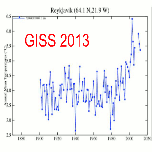
Best adjusted LA down .4 degrees for a century of warming due to UHI. How do they know that was not a large under adjustment?
In talking about Peterson 2003 Steve McIntyre stated…
In this data set that supposedly shows the following:
“Contrary to generally accepted wisdom, no statistically significant impact of urbanization could be found in annual temperatures.” actual cities have a very substantial trend of over 2 deg C per century relative to the rural network – and this assumes that there are no problems with rural network – something that is obviously not true since there are undoubtedly microsite and other problems. (five times the Best LA UHI adjustment)
Still well above the Best .4 adjustment to LA, is this study done in South Korea.https://notalotofpeopleknowthat.wordpress.com/2015/02/14/uhi-in-south-korea-ignored-by-giss
“the amount caused by urban warming is approximately 0.77 °C.
GISS adjustments however were essentially zero. ” A crude average of the above adjustments is –0.05C, so, in net terms, no allowance has been made at all for UHI.”
Surface T has risen much faster the radioscond…
Roy Spencer published this chart…
So when a significant under adjustment is done to an urban area, and that area is used to fill in rural areas up to 1200 K away, the downward adjustment is actually an upward adjustment to the record.
rural urban measured 7 real rural measured 5 UHI adjustment. – .4 urban changed to 6.6
rural station not used UHI adjusted down urban in filled to final rural number 5 changes to 6.6
(UHI down adjustment creates 1.6 degrees of warming)
I have often wanted Best to explain just the adjustments to one station. One station should be easy to explain right. Just say the algorithm did this for these reasons and all is well. However if that one station happens to match what they have done to the entire record, and those adjustments to that one station are clearly wrong, then their may be a systemic problem to the record
The meteorologist at the Icelandic Met Office is saying – the GHCN and GISS adjustments are unjustified. The adjusted data suppresses the earlier warming (1930 and 40) along with the cooling period to 1979, creating the impression of unprecedented recent warming, and flattening the decline to the late 1970s.
The fact that this clearly wrong Icelandic adjustment happened to most of the Iceland stations, and happened to the entire US record, and in other nations as well, far beyond in TOBS controversy, is alarming.
From: Tom Wigley
To: Phil Jones
Subject: 1940s
Date: Sun, 27 Sep 2009 23:25:38 -0600
Cc: Ben Santer
It would be good to remove at least part of the 1940s blip, but we are still left with “why the blip”.
di2.nu/foia/1254108338.txt
https://stevengoddard.wordpress.com/2015/01/24/before-they-could-create-the-hockey-stick-they-had-to-get-rid-of-the-post-1940-cooling/
The adjustments greatly exceed reason, and largely explain why UHA and RSS both still show 1998 s considerably warmer then 2014. If you just used the satellite data sets you would say with about 100 percent confidence that 1998 was warmer then 2014.
David A March 6, 2015 at 8:23 am
TOB is indeed questionable, but those adjustments are not very large.
NOAA declared 2014 the hottest year on record by 0.04 deg. Decisions are presumably made on that not very large number which they also later said had a 68% chance of being wrong. A very small number all of a sudden becomes a very big problem.
I agree. My point is that the historic record has been adjusted far more then the TOBS adjustments. Look at the Iceland adjustments in my post. They did the same thing to all of Iceland, to all of the US, to much or much of Australia, etc…
When your adjustments exceed the precision of the data, you can make no conclusions about the data. Using it to claim that 2014 was the hottest year on record is just a travesty.
I have no problem with the concept of TOBS. I do have a problem that adjustments to the past are such an on-going process.
The questions are pretty simple to answer.
Why are computer model generated data used as “fact” when related to climate conditions?
Does “GIGO” (Garbage In Garbage Out) still apply in this wonderful word of modeling?
How can arbitrary adjustments to computer model calculations make them more accurate or meaningful?
Why do we never hear the words Sun Cycles in any of the climate commentary?
The question is are they ‘arbitrary’ in the first place , given the user has a ‘need’ and the ability to change the parameters in such a way to ensure that ‘need’ is meant and given that even when reality proves them wrong their is no down side to making adjustments that reflect their ‘need ‘ rather than good science. Is it possible to rule out that ‘arbitrary’ is problem not the way these changes are made.
Africa makes up one fifth of land mass and has practically no data whatsoever- it needs 5000 new temp stations for coverage- WMO So Africa is mostly estimated!!
Most of the stations that do report are based at cities or Airports. In a points system the WMO gives Urban stations a zero for quality.
WMO-
“This disparity and unevenness in national network coverage introduces bias to the data and, therefore, it must be used with caution inresearch and applications.It cannot be expected that the quality of global climate products is currently adequate to effectively address national scale issues in Africa”
WMO
“This shortage of data is exacerbated by the uneven distribution of stations, leaving vast areas of central Africa unmonitored and representing the lowest reporting rate of any region in the world”
WMO-
“At the same conference it was revealed that despite covering a fifth of the world’s total land area, Africa has the worst climate observing networks of all continents, and one that is still deteriorating”
WMO-
“The density and coverage of existing climate observations in Africa have been described in many
publications as poor or sparse (Parker et al., 2011; Institute Water for Africa; Washington et al., 2006)”
Indeed its back to the issue of ‘better than nothing ‘ that is seen time and again in climate ‘science’
In reality if they where honest they could say that the amount and quality of data that is available is not enough to give a accurate value. But we can give one which is ‘better than nothing ‘ , but that will not keep the grant cash flowing in and will do nothing for political desires.
Here is the Pittsburg area. Now which T station do you use?
If the figures on that chart are temperatures – notice all the hot air round the university:)
LOL yes, and they range from plus 8 to negative 3. Essentially you can create whatever graph you want using any given station. But clearly the urban areas should be adjusted to the true rural, and those are far and few between. Best, GISS, BOM, the all do the opposite.
How did you make this map? Thanks.
This is lovely work, and far more like this needs to be done. This one example shows that it is entirely plausible if not actually likely that any sort of homogenization or TOBS correction is almost certainly intrinsically biased compared to a) the “true time average of temperature” (which even your 24 point/day integration does not properly reveal, although it is doubtless a lot more accurate than a 2 point/day integration to form the average). Indeed, simply using Euler integration compared to e.g. splining the data and integrating the spline (or otherwise using a higher order smooth curve fit to the hourly data) very likely introduces both integration error and bias depending on things like the mean convexity of the actual data.
It further shows that two sites located just over a kilometer apart, both (from the look of them) extremely well constructed and maintained, show quite different temperature readings. As you say, 0.01 C resolution is obviously impossible. 0.1 C resolution is dubious. I’d eyeball a guess that 0.2-0.3 C resolution is about right. One wonders what one would get if one scattered a collection of sites like these in a tight array spaced at (say) 1 km over 100 square kilometers, without regard to the suitability of the site — if a grid point drops a station in the middle of a parking lot, so be it. One wonders what one would get comparing the spatiotemporal average of these 100 sites to the results obtained from a glass thermometer read by a grumpy old man who refused to work on Sundays and perhaps was less than pristine in recording both his observations as might have been the case back in 1870. Such an individual might not have recorded his temperatures at a combined precision and accuracy of 1 whole degree C in the first place (given indifferent instrumentation) and might have failed to get up at midnight every night to make an observation and might have put the thermometer right up on his porch to avoid having to trudge two hundred meters to the thermometer, placed carefully in a box in the middle of a carefully mowed field, to read it by lantern-light with his presbyopic eyes.
The point being that if this one triplet of stations cannot produce a representation of the mean temperature in a single ~1 km patch of the earth that is self-consistent to within 0.1 C now, and which has a clearly visible bias relative to both the attempt to apply “corrections” and to the actual mean daily temperature that one is trying to represent from only two measurements with what is likely a seasonally shifting systematic bias you aren’t even looking at (cooling rates from sundown will lead to different temperature drop by midnight in the winter and the summer, relative to the entire shift over the day, and a 4:30 observation could be mid-afternoon heat in the summer and after dark in the winter at many locations) then what chance is there that measurements from 1870 can be meaningfully compared to measurements in 1970 or 2015?
The answer is slim to nil. Now imagine subtracting an imperfectly known base to create a temperature anomaly. This introduces another compounding of error. Now imagine taking the station data and kriging it to make it de facto cover the lake and the mountain range located immediately to the west and the desert to the east of a site.
One doesn’t need to go fifty meters. If one located stations like this in my front and my back yard, one would get differences like this, or even larger ones. If one located the station in the trees of a nearby wood, one would get a different reading.
And here’s a kicker. Look at these stations. They are beautiful! They are located in open, carefully mown fields, with a minimum distance to ANYTHING that might confound the measurements, painted white, and so on. All according to the rules.
But how much of the Earth’s surface is, in fact, mown field within a 50 meter border of anything like trees or water or mountains or ocean? Would that be (in spite of human activity) almost none?
It would.
If I wanted to measure the improvement in the grade performance of high school students, I would not go into fifty high schools and only measure the grades of the best students in the class as the basis of the “anomaly”. It’s like nobody ever heard of Monte Carlo (unbiased) sampling. Bizarre.
rgb
An excellent analysis. An anecdote speaking to the difficulty in obtaining “true” temperatures. I am staying on Hilton Head Island, SC this week. When we left our ocean ward (1/4 mile off beach) cottage my car thermometer showed 62F. Driving landward , literally in 4 minutes the temperature jumped to 74 before I got off the island. On such a small island I am not sure what the official temperature will be for some historical analysis 50 years from now.
Adding to what you observed, MOST of the energy stored in the air around us is not accurately presented by just the temperature, but must also include the amount of energy stored in the water vapor/liquid/ice. Even if the temperature in any given area stays the same, if the humidity changes, then there has been a drastic change in the amount of energy contained in a cubic volume of air. Likewise, often temperature and humidity change in equal and opposite directions to create a CONSTANT energy condition. Just measuring the temperature gives a very inaccurate picture of energy transfer. Now add to that the fact that CO2 is also fluctuating in any given location and you have a very, very muddied picture that in no way can be reduced to the simple equations that chicken-little-climatologists have been clucking as gospel.
@rgbatduke: Monte Carlo sampling sounds good, but how do you get a random sample without randomly dropping (say) a few thousand radio-transmitting thermometer “white boxes” (wiffle balls?) at randomly selected spots on the earth’s land and water surfaces? And then you need to do it again the next day, (week? random period?) right? Well maybe if they were small, cheap, biodegradable, and delivered by a large fleet of cheap aerial drones?
Or maybe satellite temperature measurements are the reliable method, even if they don’t take the atmosphere’s temperature within two meters of the surface.