The Guardian has a new blog called Climate Consensus – The 97%. The two primary authors are to be Dana Nuccitelli, a regular contributor at SkepticalScience, and John Abraham, Associate Professor at the University of St. Thomas.
Dana Nuccitelli’s first post at his new blog at The Guardian is titled “Why is Reuters puzzled by global warming’s acceleration?” His article is subtitled, “‘Climate scientists struggle to explain warming slowdown,’ said Reuters. But warming is speeding up, and scientists can explain it.” Nuccitelli’s first post at The Guardian is reminiscent of his posts at SkepticalScience—that is, it’s misleading and full of misinformation.
Data contradict the points Dana Nuccitelli is trying to make. In this post, we’ll briefly discuss ocean heat content data, how Mother Nature—not manmade greenhouse gases—creates warm water during La Niña events, how she releases that naturally created warm water during El Niño events and redistributes it around the oceans afterwards, and we’ll discuss Dana Nuccitelli’s misleading animation called “The Escalator”. Data explains how and why the vast majority of global warming occurred naturally…when it warmed.
OCEAN HEAT CONTENT
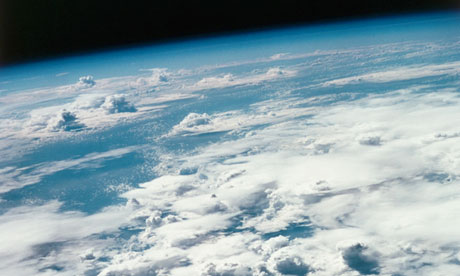
Nuccitelli begins his post with a picture from space of the Pacific Ocean with the caption:
Oceans, such as the Pacific pictured here from space, are absorbing much of the warming the planet is currently experiencing. NASA/ Roger Ressmeyer/ Corbis
Then the first sentence of his post reads:
The rate of heat building up on Earth over the past decade is equivalent to detonating about 4 Hiroshima atomic bombs per second.
Based on Nuccitelli’s opening illustration and statement, we should expect the ocean heat content of the Pacific Ocean to be showing a monumental amount of warming over the past 10 years. But, as shown in Figure 1, the ocean heat content data for the Pacific Ocean from pole to pole (90S-90N, 120E-80W) shows cooling. Right from the get go, data disagrees with Nuccitelli’s representations.

Figure 1
The NODC’s Ocean Heat Content data used in Figure 1 (and in the other ocean heat content graphs in this post) is the only regularly updated dataset of its kind that’s available to the public on a gridded basis through the KNMI Climate Explorer. There, users can select the coordinates of the data they desire. The NODC’s ocean heat content data represents the change in the heat stored in the oceans to depths of 700 meters or about 2300 feet.
The article in The Guardian also fails to describe all of the problems associated with ocean heat content data. Before the ARGO floats were deployed starting in the early 2000s, the temperature observations at depth were so sparse that the data has to be taken with more than a grain of salt, especially when dealing with the data below 700 meters. And the ARGO-era ocean heat content data has been adjusted so many times it’s difficult to keep track of all of them. Many of the problems with ocean heat content data were described in the blog post Is Ocean Heat Content Data All It’s Stacked Up to Be? It’s a long post, I’ll grant you that, but if you’re interested in ocean heat content data, it’s worth a read. Bottom line: even with all of the adjustments to the ARGO-era that added warming to the ocean heat content data, the Pacific data shows cooling over the past 10 years—contrary to what Dana Nuccitelli implied with his opening statement and illustration.
HOW LA NIÑAS CREATE WARM WATER IN THE TROPICAL PACIFIC
Nuccitelli continues:
We often hear from the media that the (surface air) warming has slowed or paused over the past 15 years. This isn’t a puzzle; climate scientists are well aware of several contributing factors, as a recent Reuters article – “Climate scientists struggle to explain warming slowdown” – eventually discussed. The accelerated warming of the oceans is likely the main contributor.
During years with La Niña events, more heat is transferred to the oceans, and surface temperatures are relatively cool as a result. The opposite is true during El Niño years. During the 1990s, there were more El Niño than La Niña events, which resulted in more surface air warming. One of the strongest El Niño events of the century happened in 1998, which not coincidentally was 15 years ago.
Dana fails to explain that Mother Nature, not greenhouse gases, creates ocean heat in the tropical Pacific–where El Niño and La Niña events take place. During La Niña events, the trade winds in the tropical Pacific are stronger. The stronger trade winds reduce cloud cover, which, in turn, allows more sunlight (also known as penetrating solar radiation because it penetrates into the oceans) to warm it. That’s why the long-term warming of the ocean heat content for the tropical Pacific was plainly caused by the 3-year La Niña events of 1954-57, 1973-76 and 1998-01, and during the freakish 1995/96 La Niña. Keep in mind that the 1995/96 La Nina provided the fuel for the 1997/98 El Niño, which was discussed by Nuccitelli. See Figure 2.

Figure 2
To further illustrate the role of La Niñas in the warming of the tropical Pacific, Figure 3, the ocean heat content there would have cooled since the 1950s without the 1973-76 and 1995/96 La Niña events.

Figure 3
Back to Nuccitelli’s statement:
During years with La Niña events, more heat is transferred to the oceans, and surface temperatures are relatively cool as a result. The opposite is true during El Niño years. During the 1990s, there were more El Niño than La Niña events, which resulted in more surface air warming.
That discussion is also misleading for other reasons. Sea surface temperatures (not ocean heat content) in the tropical Pacific cool in response to La Niña events because more cool waters than normal are being upwelled from below the surface of the eastern equatorial Pacific. Marine air temperatures and lower troposphere temperatures cool in response because the tropical Pacific is releasing less heat than normal through evaporation as a result of the cooler surface waters. (That cooler upwelled water is then warmed by the La Niña-caused additional sunlight as it travels from east to west across the tropical Pacific, and it collects in an area east of Indonesia called the west Pacific Warm Pool, where it warms the ocean heat content of the tropical Pacific.)
Note: The sea surface temperature data presented in this post is NOAA’s best: the Optimum Interpolation Sea Surface Temperature data, version 2, also known as Reynolds OI.v2. It’s a combination of observations from satellites, buoys and ship inlets. As noted in the link:
The optimum interpolation (OI) sea surface temperature (SST) analysis is produced weekly on a one-degree grid. The analysis uses in situ and satellite SST’s plus SST’s simulated by sea-ice cover. Before the analysis is computed, the satellite data is adjusted for biases using the method of Reynolds (1988) and Reynolds and Marsico (1993).
EL NIÑO EVENTS
An El Niño event releases that La Niña-created warm water from below the surface of the west Pacific Warm Pool, and an El Niño spreads that warm water eastward across the eastern tropical Pacific. There was so much warm water released by the 1997/98 El Niño that the sea surface temperatures for the entire East Pacific Ocean (from pole to pole or the coordinates of 90S-90N, 180-80W) temporarily warmed 0.5 to 0.6 deg C. See Figure 4. The East Pacific Ocean with those coordinates represents about 33% of the surface of the global oceans, so that was a monumental amount of naturally created warm water that was released by the 1997/98 El Niño. Notice also that the East Pacific sea surface temperature data hasn’t warmed over the 31 years of that dataset, based on the linear trend.

Figure 4
All of that naturally created warm water that’s now on the surface doesn’t simply disappear after a strong El Niño. Ocean currents redistribute that leftover warm water to adjoining ocean basins (which prevents the sea surface temperatures for remote areas, like the North Atlantic, from cooling proportionally during the trailing La Niña). The leftover warm water (and its counteracting effects on the trailing La Niña) is why the sea surface temperatures for the Atlantic, Indian and West Pacific Oceans warmed in a very obvious upward step of about 0.19 deg C, Figure 5, in response to the 1997/98 El Niño. Note that there was also a strong upward shift in response to the 1986/87/88 El Niño and a smaller step in response to the 2009/10 El Niño.

Figure 5
Without those El Niño events, the sea surface temperatures for the Atlantic, Indian and West Pacific Oceans would not have warmed since the early 1980s.
Nuccitelli was right with his statement, “During the 1990s, there were more El Niño than La Niña events, which resulted in more surface air warming.” But he failed to advise his readers:
1. that land surface air temperatures represent only 30% of the global surface temperature record,
2. that sea surface temperature data represent the other 70%,
3. that the satellite-era sea surface temperature data indicate sea surface temperatures warmed naturally in response to the naturally created warm water released from below the surface of the tropical Pacific during strong El Niños, and
4. that the warming of land surface air temperatures is primarily a response to the warming of sea surface temperatures.
For more information, including a discussion of the natural warming of ocean heat content data, refer to my illustrated essay “The Manmade Global Warming Challenge” [42MB]. For even more information, there’s more detail in my ebook Who Turned on the Heat? which was introduced in the blog post here. It’s available in pdf form here for US$8.00.
THE ESCALATOR
Nuccitelli goes on to write:
Reuters didn’t connect the dots between these two articles, telling us one week that oceans help explain the surface warming slowdown, and the next week claiming the slowdown is puzzling climate scientists. However, these ‘slowdowns’ happen on a regular basis. You can find one every 5 to 10 years in the surface temperature data, as illustrated in a graphic I created nicknamed ‘The Escalator‘.
The escalator is included here as Animation 1.
Animation 1
The caption for “The Escalator” reads:
Average of NASA GISS, NOAA NCDC, and HadCRUT4 monthly global surface temperature anomalies from January 1970 through November 2012 (green) with linear trends applied to the timeframes Jan ’70 – Oct ’77, Apr ’77 – Dec ’86, Sep ’87 – Nov ’96, Jun ’97 – Dec ’02, and Nov ’02 – Nov ’12.
Let’s drop back to what Nuccitelli wrote earlier:
One of the strongest El Niño events of the century happened in 1998, which not coincidentally was 15 years ago.
When people say ‘no warming in 15 years’, they’re cherry picking the timeframe to begin in an abnormally hot year.
“The Escalator” by definition is an exercise in cherry picking. Let’s illustrate, with the same data used by Nuccitelli, how global surface temperatures actually warmed without cherry picking the time periods. We’ll simply highlight 3 naturally occurring events, and use them as start and end years for shorter-term data illustrations.
Figure 6 shows the global land surface air temperature plus sea surface temperature anomalies (average of GISS LOTI, HADCRUT4 and NCDC datasets, like The Escalator) before, during and after the 1997/98 El Niño. The data highlighted in red are for the official El Niño months of the 1997/98 El Niño from NOAA’s Oceanic NINO Index. There was little warming during the years leading up to the 1997/98 El Niño and in the years following it. I’ve included period-average temperatures in blue to help highlight that fact. The dip in 1991 and rebound in 1994 is associated with the explosive volcanic eruption of Mount Pinatubo. That cooling is a response to the decrease in penetrating solar radiation caused by the “shading” effects of aerosols spewed into the stratosphere by the explosive volcano—not from a decrease in manmade greenhouse gases. That aside, the vast majority of the warming during the period of March 1988 to February 2013 was caused by the monumental amount of naturally created warm water released from below the surface of the tropical Pacific by the 1997/98 El Niño and redistributed on the sea surface after it–warm water that was created during the 1995/96 La Niña.

Figure 6
You’re probably wondering why I started the graph in Figure 6 at March 1988. That’s the first month after NOAA’s official months for the 1986/87/88 El Niño. If we look at the global surface temperature anomalies from March 1977 to April 1997 (the month before the 1997/98 El Niño), Figure 7, we can see that the 1986/87/88 El Niño caused a similar upward shift in global surface temperatures. The upward steps in Figures 6 and 7 are blatantly obvious when we break the data down into logical shorter time periods before and after the strong El Niño events. (Note: There was also a very strong El Niño in 1982/83, but the eruption of El Chichon in 1982 counteracted the impact on global surface temperatures of all of the warm water it released.)

Figure 7
Now for the period before the 1986/87/88 El Niño: See Figure 8. I’ve started the graph 10 years before The Escalator to show how “flat” global temperatures were leading up to the upward step in global temperatures in 1976. That step is associated with the Pacific Climate Shift, when the sea surface temperatures of the East Pacific ocean suddenly shifted upwards. There are numerous peer-reviewed papers that attempt to explain that natural warming, many with different causes and effects. That shift coincides with the end of the 1973-76 La Niña, which created, as shown Figure 2, the initial warm water used by the trailing El Niño events until the 1995/96 La Niña. Regardless of the cause, there was an obvious upward shift in global surface temperatures in 1976. I’ve highlighted in red the official months of the 1976/77 El Niño as a proxy for the climate shift. The upward step is pretty tough to miss. And again, I’ve used period average temperatures (in blue) before and after the 1976 climate shift to help illustrate its impact on global surface temperatures and to show how “flat” global temperatures were before and after that shift.

Figure 8
Now, if we merge all of the data from Figures 6 through 8, we have a more realistic view on how, when and why global surface temperatures warmed—a more realistic escalator. See Figure 9. There was no cherry picking involved, just a little common sense to highlight the primary causes of global warming since 1960.

Figure 9
CLOSING
Ocean heat content data for the Pacific Ocean contradicts Dana Nuccitelli’s opening statement and illustration. The ocean heat content data for the tropical Pacific show that Mother Nature is responsible for the fuel for El Niño events. Ocean Heat Content data and satellite-era sea surface temperature data also indicate the oceans warmed naturally, but you have to understand that ENSO works as a recharge-discharge oscillator (with La Niña as the recharge mode and El Niño as the discharge mode) to see Mother Nature’s handiwork. And as illustrated, Dana Nuccitelli’s Escalator is simply another way for global warming enthusiasts to hide how global temperatures actually warmed since 1976. In short, data contradicts Dana Nuccitelli’s first post at The Guardian’s new blog.
Feel free to furnish a link to this post at Dana Nuccitelli’s new home at The Guardian. The more the merrier. Unlike SkepticalScience, I don’t believe The Guardian has a track record of deleting comments that disagree with the hypothesis of human-induced global warming. And if Nuccitelli’s posts at The Guardian are similar to his posts at SkepticalScience, he’ll be presenting “The Escalator” again and again, so you can link this post to his future uses of The Escalator at The Guardian, too. And don’t forget the YouTube video On the SkepticalScience Video “Global Warming over the Last 16 Years” when he links that video from SkepticalScience.
Something tells me the Guardian has made a mistake employing someone who uses the term “denier.”
It would be a good thing if there were a ‘Name’ big enough, or enough of them, to get The Guardian to publish a rebuttal that led the reader to this Post.
Thanks Bob, trust the Grauniad to get it wrong.
“Unlike SkepticalScience, I don’t believe The Guardian has a track record of deleting comments that disagree with the hypothesis of human-induced global warming”
You are joking aren’t you?
The Guardian is world famous for massive censorship on the breadth and scale that would make a communist dictator blush. I mentioned Svensmark and was permanently banned.
The Independent is pro-AGW but doesn’t censor.
Another way to look at the standstill in temperatures since 1997, is to compare current temperatures against the average for 1997-2011.
You get the same result – no warming. In other words, the choice of the start year is not significant.
http://notalotofpeopleknowthat.wordpress.com/2013/04/25/no-warming-since-1997a-better-way-to-show-it/
Dana fails to explain that Mother Nature, not greenhouse gases, creates ocean heat in the tropical Pacific–where El Niño and La Niña events take place. During La Niña events, the trade winds in the tropical Pacific are stronger. The stronger trade winds reduce cloud cover, which, in turn, allows more sunlight (also known as penetrating solar radiation because it penetrates into the oceans) to warm it.
I think this piece of the post is what should be the take home message and is worth repeating. Without it, most Gruaniad readers will not see any difference as to whether global temps rise steadily, or in fits and starts, and will still attribute it to man’s emissions.
Graham says: “You are joking aren’t you? The Guardian is world famous for massive censorship on the breadth and scale that would make a communist dictator blush. I mentioned Svensmark and was permanently banned.”
I based my statement on the fact there there are a lot of comments from skeptics on the thread at The Guardian that oppose what Dana presented. They wouldn’t have passed moderation at SkepticalScience.
Regards
I’ll have to agree with Bob. SkS is even more highly censored (if one can imagine that) than the Guardian.
Nuccitelli though has now joined the ranks of professional liars with his denial of the OHC data as published at the Guardian.
Bob, the straws Nuccitelli et al are clutching at, is of course that “Recent warming rates of the waters below 700 meters appear to be unprecedented” (Trenberth in the Reuters article Nuccitelli is linking to). If someone comes up with a different and cooler estimate for that deep ocean heat content, I wonder what the next “heat hiding place” will be?
Ok – so I see a lot of upward stairsteps over the years we’ve had sensitive enough equipment to show them, right?
So does temperature ever step down? Or can temperatures be expected to gradually lower until the next surge of energy bumps them back up? It would be years before a downward step would even be noticeable, right?
The Guardian does exercise censorship. Maybe not all the times, but often, yes. I left very harmless (or so I thought) comments that were censored. Once I remember they had an article that blamed the US for scuppering the Kyoto protocol. I was the first to comment, and pointed out that maybe one day we will have to thank the US for this. My comment survived few minutes, then it was removed by the moderators. When I started posting asking why, all my comments (including the comments’ stumps) were totally removed. I used to read the Guardian, I used to think it was an excellent newspaper. I wrong was I?
Dana, like too many AGW hypesters, has developed a good gig. Why would he change anything now?
Presumably in the absence of a warming trend, the sea temperature in the final graph would ramp gently DOWN in the periods between El Nino events. So thanks Bob, a nice demonstration of how the El Nino phenomenon redistributes the excess heat in a series of discrete packets.
So why don’t the oceans as a whole cool down after an El Nino? Could it be that increased levels of greenhouse gases in the atmosphere are slowing down the escape of the LWR emitted by the seas (heat) meaning that the energy gained during a La Nina does not have time to escape the atmosphere before then next El Nino kicks in and bumps temperatures up a notch?
Sorry got my Nina’s and Ninos mixed up! Should be:
“…energy gained during a La Nina does not have time to escape during and after an El Nino before the next La Nina kicks in and starts to recharge the ocean heat content?
Why is anyone bothered with what the Guardian has to say about AGW. There is a pattern to their coverage and you can see this after any significant press or online article which comprehenively trashes the Global Warming myth. Recent examples would include articles in the Daily Mail and Telegraph pointing out that, amongst other things, there has been no warming at all in nearly twenty years in spite of the enormous increase in carbon dioxide generated by China and India.
The predicable response from the Guardian is to put up one or two writers with a scientific-sounding background to attack the offending article, ignoring every point made in it and refusing to answer all the awkward quesitons raised. The article will go on to re-state all the myths we have become so familiar with and end with the usual doom-laden predictions about what will happen if their message is not acted upon. This is followed by the all the usual cif comments which make the same doom-laden points with the added suggestion that if you don’t believe them you are mentally deficient.
Hi Bob
In the UK, lots of people have problems commenting at the Guardain, as many regulars at Bishop Hill will attest to.
However, If you see a commentor in the Guardain – bbcbias – whois very sceptical, well that is me.
The Guardain know who I am now, and they know where I write (ie here) and know if any of my comments disappear, that they might appear, shall we say elsewhere…. we have all learnt the hard way, to screencapture and save any comment we might make.
I had LOTS of problems in the past with my comments disapperaing.
not so much any more as the MODs will be fair If you give no excuses for my comment to be moderated, what usually happens is somebody complains, and very busy mods will just remove it. so no accusations of dishonesty, etc,etc as it will be removed, which is fair enough..
—————-my comment for Dana —————
formating better here:
http://discussion.guardian.co.uk/comment-permalink/23044359
—————————————————–
Interesting – Dana says:
“This was the conclusion of a scientific paper I co-authored last year, in which our team found more overall global warming (of the oceans, air, land, and ice combined) over the past 15 years than during the prior 15 years. ”
this was a actually comment on the following paper
D.H. Douglass, R.S. Knox
Ocean heat content and Earthʼs radiation imbalance. II. Relation to climate shifts
Physics Letters A, Volume 376, Issue 14, 5 March 2012, Pages 1226-1229
but Dana doesn’t mention, the critical reply he receives from the original authors…
► The authorsʼ misunderstanding of the climate shift concept is discussed. ► The Commentʼs argument is partly based on incompatible data. ► The authors over-interpreted our comments about carbon dioxide forcing.
http://www.sciencedirect.com/science/article/pii/S037596011201119X
Pielke jnr quotes from the paper, the paper is listed here (DK_reply_PLA_2012.pdf)
http://www.pas.rochester.edu/~douglass/papers/
D.H. Douglass, R.S. Knox, 2012: Reply to “Comment on ‘Ocean heat content and Earth’s radiation imbalance. II. Relation to climate shifts’ ” by Nuccitelli et al. Physics Letters A
The first and last paragraphs of his [Douglas] Reply summarize with
Nuccitelli, Way, Painting, Church and Cook
[1] comment on our Letter “Ocean heat content and Earth’s radiation imbalance. II. Relation to climate shifts”
[2]. Their criticism is unwarranted on at least three essential grounds. (1) It is based on a misunderstanding of the climate shift concept, which is central to our Letter; (2) in making its claim of incompleteness because of neglect of the deeper ocean heat content, it ignores our statement of possible error and introduces incompatible data; (3) it over-interprets our comments about CO2 forcing. We expand on these points.
In sum, we show that the criticism of our results (change of slope in the implied FTOA at the climate shift of 2001–2002) by Nuccitelli et al. is unwarranted because they used different data of less temporal resolution. A more careful analysis of this data shows, in fact, consistency and not conflict with our results.
so, perhaps a little bit of selective (not Skeptical) science from Dana
http://pielkeclimatesci.wordpress.com/2012/11/12/publication-of-reply-to-comment-on-ocean-heat-content-and-earths-radiation-imbalance-ii-relation-to-climate-shifts-by-nuccitelli-et-al-by-douglass-an/
A true sceptic shows both sides of the story……. so just helping out here.. 😉
Dana of course wheels out the Skeptical Science – ‘escalator’ graph..
My response (bbcbias):
http://discussion.guardian.co.uk/comment-permalink/23044359
no sceptic would draw that graph.. a construct of Skeptical Science.
The IPCC also has a problem with inappropriate graphs. ie their accelerating temp graph.
http://www.ipcc.ch/publications_and_data/ar4/wg1/en/fig/faq-3-1-figure-1.jpeg
http://www.ipcc.ch/publications_and_data/ar4/wg1/en/faq-3-1.html
A mathematician at Nottingham University explains the problems with this..
https://sites.google.com/site/globalwarmingquestions/howtheipccinventedanewcalculus
he also notes a problem with the IPCC process (see link above):
“The IPCC reports are subjected to careful review by scientists. So how did this blatant distortion of the temperature trends get through this rigorous review process? The answer to this question can now be found, because the previous drafts of AR4, and the reviewer comments, can now be seen on-line. (The IPCC was reluctant to release these comments, but was forced to do so after a number of freedom of information requests). The answer is quite astonishing.
The misleading graph was not in either the first or the second draft of the report that were subject to review. It was inserted into the final draft, after all the reviewer comments.
A sceptic would put ALL the trend lines in of similar duration, not just selecting a few, like the IPCC and Skeptical Science do when showing just one period of short term high rate of warming, a sceptic would show all. ”
http://www.c3headlines.com/2010/03/how-did-this-bogus-ipcc-graph-get-past-the-climate-science-experts.html
Sceptic blogs do not think much of Skeptical Science’s little graph that misrepresent how they would draw a graph.
ie.
http://www.bishop-hill.net/blog/2012/2/3/cherrypicking.html
Dana fails to explain that Mother Nature, not greenhouse gases, creates ocean heat in the tropical Pacific–where El Niño and La Niña events take place.
I’m not sure that saying ‘Mother Nature did it’ is a good way to explain anything. Or at least say ‘Mother nature, not man, did it’ instead of saying ‘not greenhouse gases’ because to me greenhouse gases are Mother Nature (at least once they’re released by man to join the natural gases).
Bob Tisdale:
At April 25, 2013 at 4:29 am you say
http://wattsupwiththat.com/2013/04/25/dana-nuccitelli-misleads-and-misinforms-in-his-first-blog-post-at-the-guardian/#comment-1287031
Sorry, but Graham is right. You are ‘setting the bar’ absurdly low.
Richard
Juice: I should have been more specific by stating manmade greenhouse gases.
If you are scrupulous with complying with the Guardians comments policy, you WILL, I think get published.. do not give any ‘pro’ commentators any excuse to report you.
What can happen, is, if you give he readers any excuse to report you, they will, and (very busy) mods will err on the side of caution..
Proof of this, is there were 3 accusations that Watts Up was a ‘d3nier’ blog funded by the Koch nrothers, I reported this, and the moderators have removed them, as they usually do..
BE very politie, civil and factual, and I think your comments will stand, avoid the personal, etc,etc
Just thought I’d plot up a comparison of surface temperatures (Hadcrut4) and what is really happening to “Temperatures” in the 0 to 2000 metre ocean.
http://s9.postimg.org/yypq6f0mn/Surface_and_Ocean_Warming_Feb2013.png
The Y = #.### X is equivalent to the temperature change per year. So Hadcrut4 falling at -0.006C per year while ocean temperatures down to 2000 metres are increasing at 0.002C per year (although down since the first measurements from Argo and the error margins are 8 times bigger than the trend rate so it might be more accurate to call it Zero).
What’s your guess for which way ocean temperatures will head now after viewing that chart.
I think you could argue the escalator represents a natural up and down tilted upwards by AGW or other warming factors just as well. A straight line in a la nina is an upward line without it. So the entire name of the blog, 97% consensus is… what can you say but an embarrassment and the sea warmth business an amazing, high-arcing hop into the confirmation bias hot tub, but I call 50-50 on the escalator point.
That last escalator step looks pretty tiny….getting near the top?
The inaccuracy in the escalator graph is that in the earlier short-term flat periods, the trends were not parallel to the smoothed GMST curve with 21-years moving average. However, in the current short-term flat period it is as shown in the following graph.
http://bit.ly/15FKX0n
As a result, the escalator graph is incorrect. The current flat period is due to ocean cycles and should last for another decade or two.
Here is what Prof Latif wrote:
Had forecasters extrapolated the mid-century warming into the future, they would have predicted far more warming than actually occurred. Likewise, the subsequent cooling trend, if used as the basis for a long-range forecast could have erroneously supported the idea of a rapidly approaching ice age. The detection of the anthropogenic climate signal thus requires at least the analysis of long records, because we can be easily fooled by the natural fluctuations, and we need to understand their dynamics to better estimate the internal noise level.
IPCC AR4 published only climate projections based on such scenarios with no attempt to take account of the likely evolution of the natural variability.
Source:
http://oceanrep.geomar.de/9199/1/JGE.pdf