
Guest post by Thomas Fuller and Tony Brown
When we separate what scientists have actually said from what messages are carefully prepared and communicated to us through the media, one thing jumps out to the most casual of readers.
Some marketing strategists reduced the information content of the messages given to the public and introduced popular symbols to indicate what they wanted us to believe was threatened by climate change.
For over 5 years we have been bombarded with images of polar bears, hurricanes, flooded cities, icebergs calving, drought-stricken deserts, and the like. Perhaps the most symbolic representation wasn’t even a picture, but a PowerPoint slide of paleoclimatic temperature reconstructions now famous as the Hockey Stick Chart.
Those symbols all have one thing in common. They were mistakenly used. As has been cataloged here and elsewhere, these ‘signature’ issues were either blown out of proportion or presented falsely.
Polar bears, like all large mammals that haven’t had the good fortune to be domesticated, have a shaky status on this planet–but that status does not appear to have very much at all to do with climbing temperatures. They survived higher temperatures in the past, and their population is rising–and would be rising even more quickly if we quit shooting them, that being the major cause of polar bear deaths.
There is no historical trend in either the frequency or intensity of hurricanes, as Roger Pielke Jr. has pointed out in academic publications. And yet global warming has been blamed for specific storms, such as Hurricane Katrina, in a manner that is frankly antithetical to the principles of science.
And so it is with icebergs calving (a completely normal and mechanical reaction to ice accumulation that happens whether temperatures are rising or falling), droughts (which were worse in the past) and all the other symbolic climate porn photography inflicted upon us.
Yesterday I wrote about sea level rise, and attempts to measure ice loss in Antarctica via satellite. And again, it is very clear that the results of scientific work are being hijacked in an attempt to push a scary message at us. The analysis of gravimeter measurements start with guesses and inferences, and the result is presented with a huge margin of error, and amounts to less than 1% of the annual ice loss Antarctica experiences every year.
Commenter TonyB went to the trouble of cataloging the difficulties inherent in sea level measurements. By rights it should be posted here as an article. I’ll paste it in at the bottom of this piece–and I will wager most readers will think it is more informative than my words above it.
But before I turn the stage over to TonyB, I want to make a couple of points:
First, it should be obvious that the manipulation of the messages isn’t coming from scientists. It is too professional, too slick and ultimately too wrong. This is a professional, coordinated media strategy using calendars with press schedules and release dates, a well-stocked photo library and a rapid response team that shoves new releases out the door in response to news events or skeptical messages that seem to be gaining traction.
Second, and really most important, all of the messages have very serious flaws in the narratives that accompany the pictures they ship out. And it is the exposure of these flaws that has crippled the climate change political movement, far more than criticism or political opposition.
If climate change or global warming is now a declining motivation for political and economic action, and it may well be, the reason is not Monckton or Morano. It is not even more measured criticism coming from McIntyre and Watts. Nor is it corrective science administered by both Pielkes.
It is their own butchery of the facts behind the images they decided we needed to see that hamstrung their movement. If they have been defeated in the first series of battles (in what I predict will be a 30-year war), they done it to themselves.
Here’s Tony–read on!
No problem. I was going to work this up into an article on sea levels one of these days although someone must have already posted an article here on this fragile part of a fragile science.
“We are being bamboozled by science which likes to have a nice graph to explain everything, unfortunately the real world is more complicated than that. Global sea levels are -like global temperatures-a nonsensical artifact dreamt up in a computer laboratory where satellite records are tacked on to manufactured and highly incomplete historic records from selected tide gauges.. Modern Sea level rises- where happening- are not being seen in context as another of those regular cycles that stretch back much further than the satellite records or tide gauges into the depths of recorded time.
This is the latest IPCC assessment which confirms sea level calculations from 1993 are by satellite.(page 5 onwards)
Link1
http://www.ipcc.ch/pdf/assessment-report/ar4/wg1/ar4-wg1-spm.pdf
The sea level calculations rely on an enormous number of variable factors including pressure, location, tides, warmth of oceans, structures, storms, wave heights, surges, stasis, location of the gauge/sensor, slope of the underlying strata etc. The accuracy of measurements is said to be 3cm (10 times the level of the alleged annual rise) but in reality is often vaguer than that because of the inherent difficulties of measuring. Observed real world sea levels generally simply do not show the rate of increase suggested by the IPCC (although this varies enormously from place to place for reasons cited above)
Link 2 The document below was written by many of our old friends including Phil Jones and Mike Hulme-page 19 gives the sea level data
http://ukclimateprojections.defra.gov.uk/images/stories/trends_pdfs/Trends_section1&2.pdf
The information for historic sea levels was ‘extended’ from a paper by one of the scientists at Proudman
Link3
http://www.pol.ac.uk/ntslf/products.php
Link 4 This is reconstruction of sea level data from 1700 of three extremely incomplete Northern Hemisphere records from which IPCC extrapolate their figures, take them to be a global figure and splice them on to the satellite records
Link 5 .
http://www.pol.ac.uk/psmsl/author_archive/jevrejeva_etal_1700/
These three are taken to represent global figures since 1700-much data missing and subsequently interpolated.
Amsterdam from 1700 (Van Veen 1945)
Liverpool since 1768 (Woodworth 1999)
Stockholm since 1774 (Ekman 1988)
It says there are differences even in the same ocean basin between tide gauges of up to plus or minus 6cm rendering their use for a global record to be irrelevant
Link 6
http://www.pol.ac.uk/psmsl/author_archive/jevrejeva_etal_1700/2008GL033611.pdf
pdf from 1700 link
6cm margin of error from tide gauges in same ocean basin
Both the following sites give a good description of the satellite process-which is being constantly refined but doesn’t get more extremely accurate as the inherent flaws in measuring capabilities can’t be fully resolved no matter how many satellite passes are made.
Link 7
http://www.tos.org/oceanography/issues/issue_archive/issue_pdfs/15_1/15_1_jacobs_et_al.pdf
Link 8
http://jchemed.chem.wisc.edu/Journal/Issues/1999/dec/abs1635.html
The following sites deals with problems of satellite accuracy and data;
Link 9
http://www.ocean-sci.net/5/193/2009/os-5-193-2009.html
Link 10
This with reliability
http://www.climateaudit.org/?p=859
Link 11
http://lightblueline.org/satellite-tracking-sea-levels-set-launch
The UK Environment Agency -where possible like to use physical tide gauges as well when developing flood defence schemes, which are both visually observed or can send data electronically. Best of all is gathering information from local people such as the Harbour master or those who work the fishing boats and who know what is really happening.
The following link leads to a graph produced by the Dutch Govt sea level organisation- and confirm sea levels are stable and are somewhat lower than during the MWP. (This won’t stop them reacting to the IPCC by raising sea defences)
Link 12
http://www.climateaudit.org/?p=61
Link 13
We have much observational evidence of historic sea levels (p162 on-including a map in the following link)
Ancient Greek explorer Pytheas traveled to Iceland and not only discovered the frozen seas lying one days journey beyond, but was the first to quantify the moons action as being responsible for tides, and took physical measurements of heights. Sea level heights are generally said to be lower today than back in the Roman warm period and Mwp.
Sea castles in the UK built in the 11th century are now above the sea level entrances which ships used to re-supply them.
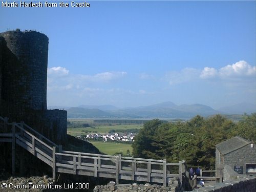
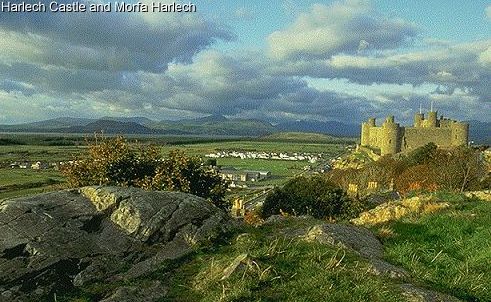
This links leads to a 1913 book on Harlech castle-one such building which is now high and dry-nothing to do with stasis or deposition, but that sea levels are lower now than when it was built 1000 years ago. Suggest readers select the b/w pdf
Link 14
http://www.archive.org/details/merionethshire00morr
Extract
“In 1409 an attack was made upon Harlech, led by Gilbert and John Talbot for
the King; the besiegers comprised one thousand well armed soldiers and a big siege train. The besieged were in the advantageous situation of being able to receive their necessary supplies from the sea, for the waves of
Cardigan Bay at that time washed the base of the rock upon which the castle stands. Greater vigilance on the part of the attacking force stopped this and the castle was surrendered in the spring of the year.
A remarkable feature of the castle is a covered staircase cut out of the rock, defended on the seaward side by a looped parapet, and closed above and below by small gatehouses. This was the water-gate of the fortress,
and opened upon a small quay below.”
Link 15 The following pictures show the current location of the sea.
http://westwales.co.uk/graphics/morfaharlech.jpg
Link 16
Sea in far distance from Harlech castle
http://westwales.co.uk/graphics/harlech.jpg
and this
Link 17
http://www.buildmodelcastles.com/html/castle_history.html
very good item about Harlech
Link 18
http://www.walesdirectory.co.uk/Castles/Harlech_Castle.htm
Sea levels AND temperatures were higher in the MWP and the Roman warm periods and presumably other extended warm periods (the period 1700 to 1740 is looking increasingly comparable to today).
The worlds leading sea level expert Professor Morner has called the IPCC figures ‘a lie.’ Google ‘The greatest lie ever told’
Morner says: “The mean eustatic rise in sea level for the period 1850-1930 was in the order of 1.0-1.1 mm/year,” but that “after 1930-40, this rise seems to have stopped (Pirazzoli et al., 1989; Morner, 1973,2000).” This stasis, in his words, “lasted, at least, up to the mid-60s.” Thereafter, “the record can be divided into three parts: (1) 1993-1996 with a clear trend of stability, (2) 1997-1998 with a high-amplitude rise and fall recording the ENSO event of these years and (3) 1998-2000 with an irregular record of no clear tendency.” Most important of all, in his words, “There is a total absence of any recent ‘acceleration in sea level rise’ as often claimed by IPCC and related groups.”
He concludes: “When we consider past records, recorded variability, causational processes involved and the last century’s data, our best estimate of possible future sea-level changes is +10 +/- 10cm in a century, or, maybe, even +5 +/- 15cm.” See also Morner (1995); INQUA (2000).”
I am inclined to agree with Professor Morner that sea level is not really doing very much generally (with exceptions either way in some places)
Link 19
http://www.publications.parliament.uk/pa/ld200506/ldselect/ldeconaf/12/12we18.htm
The above link dissects the data and states that a rise by 2100 of 5cm is possible…. plus or minus 15cm!
Morner stresses (as I do) that observational data contradicts the theoretical interpolated and massaged data that is used by the IPCC.
John Daly also had a good handle on all this.
Link 20
http://www.john-daly.com/deadisle/index.htm
The sea level is not rising at the rate suggested-it has stumbled in recent years according to many local gauges (what is global sea level supposed to mean with a million kilometres of coastline?)
To reach a 1 metre increase by 2100 means an average of nearly 11mm a year (only 90 years remaining). There is simply no evidence to show this is happening.
We must stop looking at just a few years of data as ‘proof’ of rising levels , and instead view things in a historic context, whilst retaining a great deal of scepticism at the notion you can create a highly accurate global figure in the first place, or that tacking dubious satellite data on to even more dubious tide gauge data is any way to create a worthwhile measurement .
I had intended to cover historic sea levels as a companion to my ‘arctic ice variation through the ages’ series.
Thomas Fuller http://www.redbubble.com/people/hfuller
Everyday, another brick is removed from The Warmist Wall.
“This is a professional, coordinated media strategy using calendars with press schedules and release dates, a well-stocked photo library…”
So Michael Crichton was describing reality after all in his novel “State of Fear.”
So finally, SeaGate is surfacing?
Another inconvenient thruth.
Rising sealevels is a scam.
Really interesting article about rises in sea level with a touch of irony. The initial article talks about the misuse of photographs to sex-up a topic and I’m sad to say this is what has happened with your photographs of Harlech Castle. The pictures which you use to explain how far the see is away from the Castle are taken at an angle which points approximately NNW and includes much salt marsh towards the estuary with Mt Snowdon in the background. Facing due West from the Castle is the shortest route to the sea and much closer that suggested by the photographs linked here. It’s still quite a way from the base of castle rock to the sea these days and it must have been been awesome to have seen the whitewashed castle next to the sea when originally constructed.
My opinion, as a regular visitor to that part of the world, is that the pictures used here do not fairly represent the proper distance from the castle rock to the current sea limits. There is no doubt however that significant sized ships could navigate to the castle when it was built and the sea is now some distance away, but some more accurate photographs should have been used and would still have made the point. At least we didn’t see any polar bears on icebergs in Cardigan Bay!!!
They were caught out by;
“For over 5 years we have been bombarded with images of polar bears, hurricanes, flooded cities, icebergs calving, drought-stricken deserts, and the like. Perhaps the most symbolic representation wasn’t even a picture, but a PowerPoint slide of paleoclimatic temperature reconstructions now famous as the Hockey Stick Chart.”
That’s how they got spotted. Without that hysteria, they might have got away with it!
Like it or not sea levels are rising. No amount of equivocation is likely to change that fact. Yes, sea levels have changed in the past and so has climate. These fluctuations only demonstrate how sensitive the climate system is and how easily it can be perturbed by either natural or artificial forcing. Championing the continued dumping of some 30 billion tons of fossil CO2 into the Earth’s atmosphere will, of course, require that sea levels do not rise, ice does not melt, thermometers read high, oceans do not acidify etc. Hardly a tenable position!
So what happens if the models are driven backwards?
What I mean is, given the actual sea level rises, apparently being 1.1mm/yr or less, what is the maximum global temperature rise compatible with the figure, going purely by expansion, and assuming ice changes are insignificant?
Oreskes and Conway describe the process as well in ‘Merchants of Doubt’. Unfortunately they forgot to look in the mirror or at who’s side the ‘Merchants’ are really on. Fear of nukes? There’s a campaign for that. Fear of GMO’s? Got that covered. Fear of the weather? No problem, have a polar bear sticker. Give generously, we’ve got an expensive fleet to run.
Anyone remember the name of the Alaskan village that was used as an icon for a long time (debunked in Junk Science)?
A minor typo correction to offer. Polar bear populations would be rising even more quickly if we quit shooting them, rather than quite shooting them.
In the UK, there is a PR agency called Futerra which seems to have done a lot of work in promoting emotive and sensational scares about climate (but that’s OK, we’re saving the planet!):
‘Futerra is the sustainability communications agency; from green to ethical, climate change to corporate responsibility. For over nine years we’ve helped you save the world.’
For an example of their despicable work, take a look at this pdf: http://www.futerra.co.uk/downloads/Sellthesizzle.pdf
It really is, quite simply, demented.
Mr Fuller wrote: “First, it should be obvious that the manipulation of the messages isn’t coming from scientists. It is too professional, too slick and ultimately too wrong. ”
Painfully so. Yet scientists have been reluctant to step forward and highlight the uncertainties even the IPCC authors admit to in the actual reports. There is a PR game on the go and there has been for decades. The summaries for policy makers are the key to this imo – a digest of alarm taken from a much larger, relatively more speculative report. Cherry picking on top of cherry picking on top of cherry picking.
So just how much influence does the Moon have on the effect of Sea Level rise? I saw a program that posed the question, What would happen if the Moon left us? It answered by indicating that the Moons Effect on the Tidal Bulge in the ocean would cause sea levels to drop dramatically near the equater as the tidal bulge vanished. Then the equatorial ocean water mass would migrate to the poles causing a Sea Level rise in the northern and southern latitudes.
Could the current Lunar Recession of 1.3″ per year cause the net alteration in Seal levels being observed?
When are you guys going to get this dubious about JAXA and other sea ice measurements? Given the large swing in computations based on methodology, they need to be audited, yet, you accept them as authoritative. I’d love to help, but, I can’t find their raw data… not the miniscule thumbnails they post, but, the actual data. (Those tiny images aren’t the raw data are they?)
Question for Thomas: Thanks for laying it on the line about who’s responsible for creating this mess. Can you also offer any insight about what their motivation would have been?
Sea-level rise is a joke.
I can find no physical evidence for it in California coastal before/after pictures.
Nothing has changed in 50 years at Shelter Cove on the Lost Coast.
Somebody posted a set from San Diego area that showed nothing happening in over 100 years.
I’m sure there are more pictures out there showing the same thing: Sea-level rise is a big dud.
“The results of scientific work are being hijacked in an attempt to push a scary message at us.”
Correct, but the scientists involved failed to speak up when they saw their work being hijacked by the media.
steveta_uk says:
September 7, 2010 at 9:56 am
So what happens if the models are driven backwards?
You get Vikings settling in Greenland in the MWP and the Romans growing grapes in England, which is the opposite of what the IPCC is peddaling.
GeoFlynx says:
September 7, 2010 at 9:55 am
“…Championing the continued dumping of some 30 billion tons of fossil CO2 into the Earth’s atmosphere …”
First of all, Geo, it isn’t 30 billion, it is more like 7 billion (see peer reviewed article –
http://www.theresilientearth.com/?q=content/climate-co2-sensitivity-overestimated)
Next, there is NO scientific support to the proposition that human’s contribution of CO2 to the atmosphere will lead to any of the calamities to which you refer.
So, just relax and enjoy the weather!
Between now and November the “green industries” will increase their efforts to use all forms of media to protect their interests. They are already using political issue ads supporting candidates that favor “Cap and Trade” and EPA regulations, and attack ads against those who don’t. You can expect more doom type press releases from researchers who have tied their careers to CAGW because they fear that grants and contracts may be cut off. They will use fear tactics because they are desparate. The November elections in the US may well be a tipping point in international climate science and energy use policy. How will you vote?
Scooper, try google maps (satellite view) – and note you have to zoom out to see the sea.
http://maps.google.co.uk/maps?q=Harlech+Castle,+Harlech,+Gwynedd+LL46,+United+Kingdom&hl=en&cd=1&ei=kHWGTNjQC5O3jAfG3YS7Dg&ie=UTF8&view=map&cid=5417031941500162822&iwloc=A&ved=0CI0BEKUG&sa=X
GeoFlynx,
What, in your opinion, is the current rate of sea level rise? What is the temperature sensitivity to 30bn tonnes of CO2? What is the expected effect on ocean ph?
Enquiring minds want to know.
GeoFlynx says:
September 7, 2010 at 9:55 am
“Like it or not sea levels are rising. No amount of equivocation is likely to change that fact.”
Equivocation?
Levels are rising at what rate, for how long, and more importantly, where?
What hard data do you have for a general rise since the MWP? It would seem that based on the evidence, sea levels have fallen quite a bit.
Bad Ways to measure sea level:
http://en.wikipedia.org/wiki/File:Post-glacial_rebound_in_British_Isles.PNG
The location of this castle is also on the area where post ice age glacial rebound is occurring
In this case, this mitigates against using this castle and any type of proof of higher seas during the MWP.
That’s not to take away from the statement that sea levels were higher in the MWP and RWP, just to use this castle as any type of proof of sea levels one way or the other is just as un-scientific as what the Warmest Alarmists are doing with their out of context statements.
Sea level is particularly difficult to measure because the coastlines where this can be measured are themselves not stable.
On a side note, do you think during the next ice age when all the Canadians are relocated onto our new continental shelf shorelines, that we will find while digging new subways, etc, older human settlements from the last ice age?
GeoFlynx,
You obviously accept at face value the alarmist assertions that:
1. CO2 is the dominant driver in the warming observed in the last 150 years and will contine to be the dominant driver in future decades.
2. Earth’s long term climate is sensitive and a modest increase in global temperatures will initiate a cascade of positive feedbacks resulting in certain climate catastrophe.
Given that most visitors to WUWT are not quite ready to accept the above as “settled science”, your previous post is simply another tiresome restatement of the basis of the alarmist position with which we are only too familiar.