Roy W. Spencer, Ph. D.
Since Gavin Schmidt appears to have dug his heels in regarding how to plot two (or more) temperature times series on a graph having different long-term warming trends, it’s time to revisit exactly why John Christy and I now (and others should) plot such time series so that their linear trend lines intersect at the beginning.
While this is sometimes referred to as a “choice of base period” or “starting point” issue, it is crucial (and not debatable) to note it is irrelevant to the calculated trends. Those trends are the single best (although imperfect) measure of the long-term warming rate discrepancies between climate models and observations, and they remain the same no matter the base period chosen.
Again, I say, the choice of base period or starting point does not change the exposed differences in temperature trends (say, in climate models versus observations). Those important statistics remain the same. The only reason to object to the way we plot temperature time series is to Hide The Incline* in the long-term warming discrepancies between models and observations when showing the data on graphs.
[*For those unfamiliar, in the Climategate email release, Phil Jones, then-head of the UK’s Climatic Research Unit, included the now-infamous “hide the decline” phrase in an e-mail, referring to Michael Mann’s “Nature trick” of cutting off the end of a tree-ring based temperature reconstruction (because it disagreed with temperature observations), and spliced in those observations in order to “hide the decline” in temperature exhibited by the tree ring data.]
I blogged on this issue almost eight years ago, and I just re-read that post this morning. I still stand by what I said back then (the issue isn’t complex).
Today, I thought I would provide a little background, and show why our way of plotting is the most logical way. (If you are wondering, as many have asked me, why not just plot the actual temperatures, without being referenced to a base period? Well, if we were dealing with yearly averages [no seasonal cycle, the usual reason for computing “anomalies”], then you quickly discover there are biases in all of these datasets, both observational data [since the Earth is only sparsely sampled with thermometers, and everyone does their area averaging in data-void infilling differently], and the climate models all have their own individual temperature biases. These biases can easily reach 1 deg. C, or more, which is large compared to computed warming trends.)
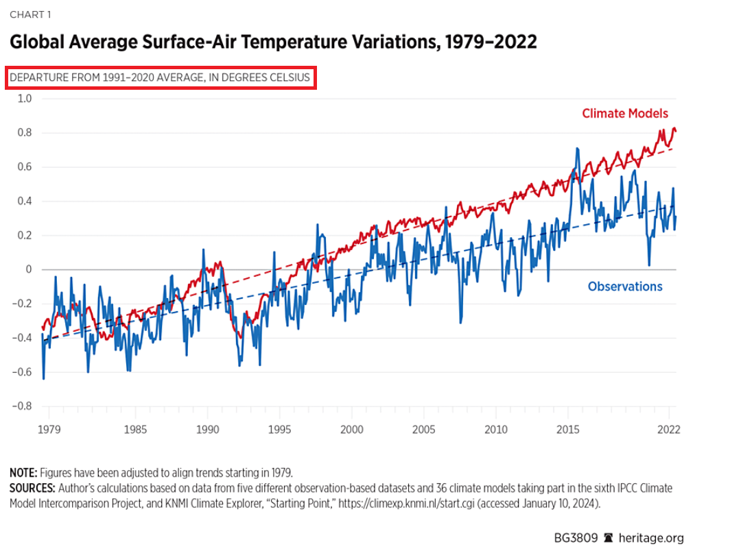
Historical Background of the Proper Way of Plotting
Years ago, I was trying to find a way to present graphical results of temperature time series that best represented the differences in warming trends. For a long time, John Christy and I were plotting time series relative to the average of the first 5 years of data (1979-1983 for the satellite data). This seemed reasonably useful, and others (e.g. Carl Mears at Remote Sensing Systems) also took up the practice and knew why it was done.
Then I thought, well, why not just plot the data relative to the first year (in our case, that was 1979 since the satellite data started in that year)? The trouble with that is there are random errors in all datasets, whether due to measurement errors and incomplete sampling in observational datasets, or internal climate variability in climate model simulations. For example, the year 1979 in a climate model simulation might (depending upon the model) have a warm El Nino going on, or a cool La Nina. If we plot each time series relative to the first year’s temperature, those random errors then impact the entire time series with an artificial vertical offset on the graph.
The same issue will exist using the average of the first five years, but to a lesser extent. So, there is a trade-off: the shorter the base period (or starting point), the more the times series will be offset by short-term biases and errors in the data. But the longer the base period (up to using the entire time series as the base period), the difference in trends is then split up as a positive discrepancy late in the period and a negative discrepancy early in the period.
I finally decided the best way to avoid such issues is to offset each time series vertically so that their linear trend lines all intersect at the beginning. This minimizes the impact of differences due to random yearly variations (since a trend is based upon all years’ data), and yet respects the fact that (as John Christy, an avid runner, told me), “every race starts at the beginning”.
In my blog post from 2016, I presented this pair of plots to illustrate the issue in the simplest manner possible (I’ve now added the annotation on the left):

Contrary to Gavin’s assertion that we are exaggerating the difference between models and observations (by using the second plot), I say Gavin wants to deceptively “hide the incline” by advocating something like the first plot. Eight years ago, I closed my blog post with the following, which seems to be appropriate still today: “That this issue continues to be a point of contention, quite frankly, astonishes me.”
The issue seems trivial (since the trends are unaffected anyway), yet it is important. Dr. Schmidt has raised it before, and because of his criticism (I am told) Judith Curry decided to not use one of our charts in congressional testimony. Others have latched onto the criticism as some sort of evidence that John and I are trying to deceive people. In 2016, Steve McIntyre posted an analysis of Gavin’s claim we were engaging in “trickery” and debunked Gavin’s claim.
In fact, as the evidence above shows, it is our accusers who are engaged in “trickery” and deception by “hiding the incline”
Roy, you are posing this as though it’s a rebuttal to what Gavin said, but you’re just confirming his comments. You have indeed plotted the graph this way in an effort to maximize any apparently divergence in the series, and despite your insistence that you’ve found “the best way” to do it, it’s unconventional and confusing to most people, who assume that you are plotting the series with a common zero (because every other anomaly time series they’ve seen is plotted in this way).
That’s not to say what you’re doing is wrong, per se, but at least be transparent about what you’re doing and why. “I want it to look like there’s as much of a difference between the series as I can so that people will think they’re diverging really strongly.”
AlanJ: Do you still not understand that the the divergence between the datasets is the SAME no matter how it is plotted? And, if you plot it the way Gavin wants, all you are doing is removing part of the excess warmth late in the period and changing it to excess COOLNESS early in the period? The divergence is the SAME. Gavin’s objection is an attempt to hide the divergence between the datasets! How is this not obvious??
Again, Gavin isn’t saying you’ve made an error in plotting, he’s saying you’ve chosen a way of visualizing the data that maximizes the apparent visual difference between the series. And now you’re kind of saying, “no, Gavin is wrong, what I’m doing is just plotting the series in a way that maximizes the apparent visual difference.” The error you made, and you acknowledged this so that’s all fine and well, was in your labeling.
The other points Gavin has raised are much more damning than this one, and you haven’t addressed those adequately, at least to my reading.
No, I’m plotting it in a way that doesn’t HIDE the divergence. If it maximizes the way your brain perceives the divergence, and that is the REAL divergence, then I’m sorry but I’m not a fan of hiding the truth from you.
“I’m not plotting it in a way that maximizes the divergence, I’m plotting it in a way that maximizes how your brain perceives the divergence.”
I’m not sure what is the point in repeating the same thing using slightly different words. I get what you’re doing, the issue is that it’s a weird convention and, combined with your mislabeling as Nick points out, misleading. Gavin’s response to your previous blog post was simply “he agrees with me.”
Poor AlanJ
Doesn’t like the AGW LIES being EXPOSED !!
Suck it up, little man. !!
AGW is not a lie
Your claim that AGW is a lie… is the lie, Mt. Forrest Gump of climate science.
Still no evidence of warming by atmospheric CO2, hey dlittle-dickie.
So now trying to widen AGW™ to include urban warming
That really is a very pathetic cop-out.
And an outright admission that you know you have no evidence of CO2 warming.
LOSER !!
You used to be reasonable, now you seem to be trying to discredit WUWT to get folks to switch to your website.
It’s a failed conjecture since there is still NO hotspot and still NO Positive Feedback Loop after years of waiting for it to show up.
AGW is a failure.
As a layman looking at both graphs, it would seem that the first graph shows the models running colder than the actual temperature at the start, then in 1997 the models and actual temps are in agreement and since then the models are running warmer. That is not true.
The second graph seems that when the models started they have been running warmer from day one. That is true.
So, when knowing lay people will look at the graphs, what is the impression they should be getting.
As a layperson, how would you interpret the same graph if present like this?
You could plot Roy’s data above in the same way. Is it telling you something different about model behavior? No, but it’s definitely making you think something different about model behavior. Why does he make the opposite choice? Because, as he says, he wants viewers to perceive the biggest possible divergence between models and data. That makes sense, that’s the narrative he’s trying to spin, after all.
It’s even more acute than this, though, because Roy doesn’t show the actual spread of the model ensemble. He’s implying that the model mean is drifting further and further from the observations, but in reality, the observations never exceed the bounds of the model ensemble spread, as you can see in the graph from RealClimate:
When you see this, it’s quite obvious that the models aren’t drifting away from the observations at all. Certainly they have slightly different trends, but the trend of the observations is keeping the series well inside the ensemble spread.
A garbage CHIMPS graph.
Literally the very exact same data Roy is plotting.
A cherry picked temperature series and different set of models.
But you are missing the point of the visual impression the graph gives to the lay person. They are not schooled enough to understand plotting data techniques, they are only interested in what they appear to see.
Nope, and you know it.
Should know it.
He knows it. You have to work hard to be that deceptive.
But why would you show the trends with equal values at the end, in essentially the present period – when that’s when it’s most obvious that they diverge.
Your plot seems to say the models are getting better and are perfectly accurate right now – which they are not – LIAR!
You misunderstand, I’m not advocating for visualizing the data using the technique I show, I’m saying it is, quite literally, identical to Roy’s technique, neither better nor worse, righter nor wronger. You object to it because you don’t like the way it makes the data look, but it’s literally exactly what Roy has done. In the below comment I illustrate the issue more clearly:
https://wattsupwiththat.com/2024/02/01/gavins-plotting-trick-hide-the-incline/#comment-3859840
If it is deceptive, then by definition it is wronger.
Dr. Roy’s plot makes it quite obvious that the temperature predicted by the models diverges from the temperature actually read and that the divergence gets worse over time.
Both your plot and Gavin’s requires one to work to figure that out.
While technically accurate, they are also inherently deceptive.
It is quite literally the exact method Roy is using.
You can’t measure how much the series have diverged using Roy’s method, do you see that? The numbers don’t align. The fact that you’re struggling so much to understand this does show that Roy’s approach is indeed confusing and oddball.
Liar. And Fake Data fraud.
I’m having no trouble seeing that there is nothing wrong with the chart. What I do see is you, tying yourself into verbal and logistic knots trying to justify your claims.
You are trying to argue that time somehow has an effect on how the climate works. It doesn’t. Trendologists are saturated in the idea that plotting a change against time will provide information about the cause. IT WON’T.
Time is not part of the functional relationship that can describe temperature. Get over it.
You want to argue something, start arguing about the things that can actually affect temperature. Attempt to derive parts of a function that actually works to predict what is happening.
I am always amazed at how the piece parts of the ideal gas law were derived long before they were combined. Creating models that attempt to make CO2 the one and only driver of temperature hasn’t worked and as Dr. Spencer’s graph shows that just isn’t ever going to happen.
Your arguing about the wrong appearance is just so much dust blowing in the wind. The fact is that they are diverging. That has been a fact in every iteration of models. Start discussing why they diverge rather than the graph itself being incompetent.
Nobody has claimed that the data is different.
The issue is do you plot the data in a way that makes what is happening obvious, or do you want to hide the incline.
Except they DON’T START at the end, do they
It is just an even more DELIBERATE MISREPRESENTATION.
So they haven’t adjusted the urban and fabricated GISS far enough yet.
Your point is ??
Better contact Gavin and tell him.. MORE ADJUSTMENT IS NEEDED.
Well, one hopes that the universe didn’t cease in December of 2023, so your “end” isn’t an end, it’s just an arbitrary point in time. Likewise, time did not begin in 1979, so the “beginning” is not the beginning of anything, just an arbitrary point in time. We could begin the series in 2000 and arrive at entirely different levels of divergence by the year 2023 using Roy’s method.
What a puerile arguement. !
Yes the scam, according to all your comrades, does start in 1979 !!
The data being shown and compared DOES start in 1979.
Or are you being deliberately blind !
Have you been taking lessons from Nick on how to change the subject?
As a layperson?
Probably something like…They have been getting better and better.
ps. Dont ask questions you dont want answers to.
Hmm, so maybe using a method that exaggerates differences isn’t a great method for presenting the data clearly? You might want to have a word with Roy.
Exaggerates differences? It does no such thing. A layperson may well think its getting worse as time goes on and that’s precisely what’s happening with models that run too hot.
Showing the truth is an exaggeration, to those who are used to dealing with deception.
“Hmm, so maybe using a method that exaggerates differences”
What has been exaggerated?
How does Dr. Roy’s chart exaggerate the difference? Or is that just what the talking points memo told you to say?
Dude, ANOMALIES exaggerate what is occurring. Fractions of a degree like 0.015 per year shown as a massive and dangerous increase is absolute exaggeration.
So, using the exact same data, if you plot it using one extreme, you are suggesting to the lay person that they are getting worse and worse, use the other extreme, they are getting better and better. Maybe there’s a reason the usual convention of placing both series on a common zero is followed?
Again, this is all arbitrary convention. It matters little how Roy wants to make his plot, provided he correctly label his axes. The point is that Gavin was dead on correct in his comment about Roy’s approach, and Roy himself has confirmed that he made the choice that suggests the largest possible difference (to the lay person).
Because they actually are and its to do with their trends.
I’ve illustrated the issue more clearly here:
https://wattsupwiththat.com/2024/02/01/gavins-plotting-trick-hide-the-incline/#comment-3859840
Repeating the same lies over and over again, does not improve them.
Yes, Roy starts at the beginning and shows the natural divergence. It can’t get much more straightforward than that.
It’s not Roy’s fault that some people can’t stand the truth.
They are getting worse. The difference between the models and reality has continued to increase over time.
Why does showing reality bother you so much?
dopey AlanJ is in a time warp.
Thinks time is going backwards…
… when it is really only his mind that is doing that.
… regressing back to a child’s mentality..
… caused by “climate change™” hysteria and desperation, of course.
Your first graph here infers to the lay person that the models ran cooler than the actual temps but kept getting better and better until around 2005 when they are right on the money balls accurate. That is the visual impression a lay person would get. So if that is the impression you want them to have, that is the graphing technique you would use.
And of course, that is a completely erroneous impression. The truth is the actual temperatures and the models diverge from the beginning, and diverge more and more as time goes along. That is the reality.
And of course your first graph totally destroys the whole AGW farce, because it shows absolutely nothing to worry about.
Well done again 🙂
Grate to have you on our side. ! 🙂
A couple of things come to mind:
The problem with using surface temperatures is separating changes in temperature due to changes in land use from changes in the atmosphere.
A perhaps bigger problem is relying on just one number, average global surface temperature, doesn’t prove that the models accurately model what is going on in the real atmosphere. Different parts of the earth are going to experience different effects of increasing CO2 levels – daytime high temperatures at the equator are probably going to change the least and mid-winter temperatures in the Arctic are probably change the most.
Finally, where is the equatorial upper troposphere hot spot predicted by the models.
The climate alarmists are still looking for that Hot Spot. They haven’t found it yet.
Without the Hot Spot, the climate alarmists have nothing.
“Models screened by their TCR”
Just what does that mean? screened by low TCR or high TCR ?…and still are about .3 degrees above observations. “Screening” implies selecting answers that make the results agree with the hypothesis, yet the graph implies a fairly poor job of achieving that agreement.
The average model warming rate is double the UAH actuals
Any chart that hides that fact is a lie.
The use of surface temperature numbers reduces the gap.
You are well ahead in the contest for the Biased Leftist Scientific Fool of the Day
IPCC uses the model mean in reports to scare people into doing stupid things, so why can’t Roy or any one else use the same thing to relax people into saner ways of behaving.
That huge pink and grey area above the observation graph doesn’t worry you, and show you that there is something wrong with the models – especially knowing that even the observations are inflated with UHI?
Or rather that the models are not drifting away from the observations as quickly as the models are drifting away from each other.
Which is an entirely different failure mode of the models. Only one model can be right, at most.
Claiming that the observations stay in the model range is just another way of giving a misleading impression.
Look at the difference between AlanJ’s chart and the UAH satellite chart (see below).
AlanJ’s chart is a good illustraion of how the global temperature record has been bastardized. Look at the difference between 1998 and 2016 on both charts. The bastardized chart shows 1998 as being much cooler than 2016, whereas the UAH satellite chart shows 1998 and 2016 separated by about one-tenth of a degree.
This is how NOAA gets a “hottest year evah!” every year out of their bogus temperature data. If you go by the UAH chart, you find NO years between 1998 and 2016 that could be described as the “hottest year evah!”
AlanJ’s chart is an illustration of climate change alarmist fraud.
Here’s the UAH satellite chart for comparison:
1) That graph is from the following RC webpage :
https://www.realclimate.org/index.php/climate-model-projections-compared-to-observations/
2) It shows surface “temps vs. models”, specifically using GISTEMP. Most of Roy Spencer’s graphs are for satellite “observations” (MSU instrument readings converted to temperature anomalies).
3) On the same webpage you can find CMIP5 (five) vs. Global TMT observations, as copied “inline” below.
4) Immediately following that graph is one showing how the observation trends compare to the “model ensemble spread” …
5) For some obscure reason RC don’t show the equivalent plots for the CMIP6 (six) Global TMT numbers, but only for the “tropical” subsets.
Question : Are the “observation” trends — when compared against the “latest and greatest” CMIP6 models — at the low end, the high end, or in the middle of the “model ensemble spread” … according to Real Climate ?
It doesn’t matter where in the model spread they lie, because the model spread is not a probabilistic distribution. This is one of the key points RC has been making for a long time. Treating the model ensemble as though the central estimate is the “best” estimate of model behavior is not correct, it is even more egregiously incorrect when you do as Roy does and show nothing but the central estimate.
Roy does indeed often focus on satellite observations, and he typically compares satellite observations of the lower troposphere (incorrectly) with surface temperatures. That is not what he is doing here, here is is comparing modeled surface trends with observed surface temps.
Here is the page from RC describing the CMIP6/MSU comparisons (with the caveat that it isn’t updated to show 2023):
https://www.realclimate.org/index.php/archives/2023/03/some-new-cmip6-msu-comparisons/
Please (re-)read the ATL article.
The very first paragraph is :
This is about the generic presentation of “temperature time[s] series” and their associated “warming trends”, not specifically about either “surface” or “satellite” datasets.
The start of the third paragraph of the ATL article :
I repeat, the issue is a generic one about the presentation of “temperature trends”, the choice of which specific “observations” can be used to illustrate the “problem(s)” can be made later on.
_ _ _ _ _
PS : The word “surface” doesn’t appear in the ATL article at all.
The word “satellite” only appears twice :
They were comparing multiple datasets / model ensembles to the UAH one, and trying to find the “best” way to present all of those “differences in trends” comparisons graphically.
Look again at RC’s “Tropical TMT-Corrected Trends 1979-2023 (CMIP6)” graphic and its “probabilistic distribution” compared to the 3 main satellite datasets.
The “NOAA” whiskers are less than 10% “in” the model spread, and its “best estimate dot” is well outside the range.
The “UAH” whiskers are around 45%-50% “inside”.
Even the “RSS” whiskers are at best 50%-55% “inside” … and both of the UAH and RSS “best estimate dots” are right on the (lower) limit …
Contrary to your bald assertion at the start of this post, that does indeed “matter”.
It matters if the observations fall within the ensemble spread, it does not matter whether they fall at the center or not, which is the implication Roy is trying to make. Roy also, we will note here, never actually shows the structural uncertainty in the observational datasets in his graphs, as RC has done here. Each satellite series has its own estimated uncertainty, and the spread in the different satellite estimates further expands this uncertainty. You can see pretty clearly in the time series of the data you present:
That the satellite estimates are mostly within the model spread, and given the uncertainty bounds they are indistinguishably with it.
Reality lies within the error model for the ensemble spread, part of the time, and the rest of the time just barely.
It is not an error model, it is the model ensemble spread – the envelope shows the range of the models. This is why treating it as a probabilistic distribution is fraught – the central estimate is not a more probable outcome than anything near the edges, it is just… in the center. The satellite data falls within the range of possible outcomes indicated by the models, sometimes it dips out of them (for UAH and NOAA), but the satellite data has uncertainty, and the uncertainty does not fall outside the model spread.
Oh look, Alan The Liar used a Big Word: “fraught”.
Impressive, even if embedded inside his latest word salad.
It falls into the “range” of the models, more often than not. For the rest of the time it is only barely within the range.
The past shown by the models has been tuned. To be accurate the trend being shown should only be for the time since that model was published.
[ Sigh ]
Please scroll back up to my first post in this sub-thread, and the phrase in your original post I reacted particularly “violently” to …
Please stop “moving the goalposts”.
The phrase you reacted violently to was referring to the surface temperatures, not the lower troposphere temperatures. You are the one trying to move goalposts by pivoting into talking about TMT. The surface temperature observations, the ones Roy is talking about in this post, the one we are discussing, never exceed the model spread:
Spammer. How many more times will you be posting this junk?
Says the person who goes around doing nothing but spewing invective and offering nothing of substance to the discussion? Physician, heal thyself.
Start your trend from the time the models were published. They have been trained to have a good match with the past, so the past is irrelevant. The match with temperatures from the time the model was published is what should be examined.
Did you miss my “PS” above ???
Oh dear, I’m going to have to get even more “shouty” at you so that you understand my frustration with your repeated DELIBERATE LIE.
The ATL article doesn’t contain the word “surface” AT ALL.
The main point is a GENERIC one about “plotting observational trends against those from climate models”.
The ONLY specific examples are given in :
Prove me wrong !
Please copy the part of the ATL article that specifically refers to a SURFACE dataset.
Part of what you are arguing is that the latest models show better agreement with the temperature trend. They should, they have been tuned to show the correct past.
What should be shown is the forecasts made by each iteration of the models for the period of time they were in effect if you want to show the correct forecasts. In other words, what did the models in 1979 show through 2100.
If what you say is true, then the models at the high end should be discarded and defunded. Why is the “spread” still shown if the spread has incorrect information in it?
Your first chart is a lie.
The trand lines have been changed from an overall of 0.4 and 0.7 where the second trend is 175% greater than the first to 2.7 to 3.3 where the second trend is only 122% greater than the first.
Typical of the climate change brigade, can’t even get the data right.
So roughly 80% of the trend is hindcasted? This sounds like an investment manager touting their stock market forecasting tool.
Just glancing at it, I would have thought that your new graph shows the two lines being in disagreement at the start, but getting better over time.
Which is actually the opposite of what is happening.
Congratulations, you have managed to make a graph that is even more deceptive than Gavin’s.
It looks to me that the hindcast is much better than the forecast. I guess it’s true that hindsight is 20/20.
The average of wrong projections is wrong also. The old adage of “two wrongs don’t make a right” applies here as well. Like it or not, it is an admission that science does not know what or why temperature is changing.
So much is being made of such a small amount of data it isn’t funny. We are in an ice age. This interglacial will end and that is what we should really worry about.
Alan J.
How were the “models screened for their transient climate response” as quoted in your graphed comparison between models and observations?
Did they keep the one or two models still within the envelope and ditch all the rest? Your graph doesn’t tell us.
I’ve seen a similar graph to this that was debunked because it kept 1980 to 1990 aerosol estimates through to the end in 2023 even though these estimates were known to be incorrect in the 21st century.
Aerosols were used as a plug to try and get the model to describe the cooling period from 1950 to 1980 and varied significantly.
Below is a quote from the U.S. Government report, “Atmospheric Aerosol Properties and Climate Change” 2009, that clarifies this.
“This agreement across models appears to be a consequence of the use of very different aerosol forcing values, which compensates for the range of climate sensitivity. For example, the direct cooling effect of sulphate aerosol varied by a factor of six (6 ) among the models. An even greater disparity was seen in the model treatment of black carbon and organic carbon. Some models ignored aerosol indirect effects whereas others included large indirect effects. In addition, for those models that included the indirect effect, the aerosol effect on cloud brightness (reflectivity) varied by a factor of nine (9).”
What’s actually weird is plotting the lines to see how they differ over time and starting both with different negative values!
The y axis, for both Roy’s and Gavin’s, is only to show the difference between the two no matter what is actually being measured.
Roy’s shows that “at a glance”.
Gavin’s (almost) requires a calculator!
(Gavin’s reminds me of that Lancet(?) graphic comparing heat deaths vs cold deaths for various countries. Definitely deceptive.)
Let’s not forget that they have become quite good at curve fitting, or hindcasting, so that it looks like the early forecasts were good when in fact they stink as the graph is no longer a representation of what they actually did forecast.
“Definitely deceptive”
Really! What other purpose could it serve, presenting the data like Gavin does?
Mr. Spencer is such a nice guy that he will take the time to debate a leftist. In spite of the fact they are wrong, annoying and will never change their mind.
The last leftist to take advice from a conservative was Mrs. Francis McGillicuddy, on March 15, 1964, and she was drunk at the time.
Last time I had a “chat ” with a couple of leftists gays, I told them to…
… “stick it where the sun don’t shine”
Pretty sure they slithered off and did exactly as suggested..
“Again, Gavin isn’t saying you’ve made an error in plotting”
Actually, he is. The y axis label is clearly wrong. And it isn’t easy to make it right.
But that’s still visually misrepresenting the divergence at both ends of the plot. If you’re interested in how much two lines are diverging (and that’s the claim of the plot) then the best way is to put it front and centre.
That’s why I say that the error Gavin is calling out is the labeling. Roy’s weird and unconventional technique of taking the point on the trend line at 1979 and setting that to zero, then translating the series to match, is very odd, but I don’t think it’s mathematically wrong, it’s just very clearly intended to visually draw attention to the difference in the trends. I agree that I’ve no idea how you’d properly label the y-axis.
Or in other words the accuracy of the models’ ability to project when compared to observations.
“trend line at 1979 and setting that to zero,”
That is where both trend lines start, 1979.
So yes, they should be set to zero.
That is not where time started, so the convention is necessarily an arbitrary one. Usually the convention is to set both series so that “zero” is in the same place for each. Roy doesn’t do this, so you can’t read the graph and actually understand how different a temperature at a given date is between the series.
You have totally misrepresented Roy’s whole argument… intentionally.
Roy is saying that graphing them crossing mid-way is misdirection.
…. and that they should be graphed starting at the same point.
You have just agreed with him completely.
“Usually the convention is to set both series so that “zero” is in the same place for each.”
So hard to keep your LIES and DECEITS straight, isn’t it AlanJ. !!
Roy has set them with zero starting at the same place.
That is exactly what you do if you are interested in seeing the trend difference.
Now Nick is saying trends don’t matter, even though that is all the whole AGW scam is based on.
It really is dumb popcorn type slap-stick entertainment ! 🙂
The purpose of a chart is to be visually honest at a glance.
The purpose of your comment can not be determined.
“is very odd, but I don’t think it’s mathematically wrong, it’s just very clearly intended to visually draw attention to the difference in the trends”
Isn’t that the point when comparing two trends?
We get that you don’t like the visual effects. But that’s politics, not science.
It is exactly like what is done with temperature anomalies. Why are anomalies not shown with a prefix of the global temperature.
We all know Gavin is a fool, and a data-mis-representer extraordinaire.
What is you point Nick??
These are obviously temperature anomalies starting in 1979….
1979 is the zero start point, no matter how you try to fudge it.
Are you saying one of the series was wrong in 1979…
… you know, the starting point of all this malarkey !!
WOW, you have just destroyed the whole AGW meme. !! WELL DONE. !!
Is it not the whole point of that graph to accurately display the difference between observations and model projections? If that is the case, then Roy’s graph does a much better job of doing so.
Roy,
As I showed below, the problem is that the axis marking is clearly wrong, as Gavin said. And it isn’t clear how to make it right. You can do what you do to emphasise the trend difference, but then you are no longer plotting the actual difference in temperatures, which is a more fundamental quantity.
Not for anomalies, it isn’t. You cant have your cake and eat it too.
Yes it is, but you must have a common baseline.
Difference from a mean isn’t an “actual temperature”.
Common base is where they both start.
All making them cross in the middle does..
…. is highlight how bad the discrepancy is IN BOTH DIRECTIONS.
No, Gavin is saying that it is wrong to plot the two lines in such a way that makes the divergence clear and obvious.
He nowhere says it is wrong to plot the lines this way, he points out, and Roy agrees, that doing so exaggerates the difference. Roy acknowledges that this is why he chooses to plot them this way, but then turns around and says Gavin is wrong when pointing that out.
Alan,
Every race starts at the beginning, not in the middle. To honestly compare trends, you must start both series at zero, or some appropriate initial point. I’m amazed that anyone argues this point.
As Roy says, it makes no difference whatsoever in the trends. It’s purely arbitrary convention – placing the first dot of each series on zero has no more physical basis than zeroing each series on the series mean. There’s no physical reason why the dots have the same value in 1979.
We could do it the other way, and place the most recent dot at zero, then it would look like both series were beautifully converging.
Excellent point … in rebutting your own argument!
If you can make a divergent series appear to be beautifully converging by manipulating the placement of the ending dot, then any method that obfuscates that actual divergence is NOT preferrable for displaying the data.
(Unless of course, hiding the results of the data series is your true purpose.)
Yep , it is designed to specifically hide the divergence for the simple minded…
ie…AGW cultists.
Anyone with any commonsense will see that it shows how badly the data diverges in both directions.
Part of the problem is knowing if the common base is truly the same. What is the underlying absolute temperature for each? There is no way to know if the models have an actual absolute temperature higher or lower than the “observed” temperature.
That is the problem with anomalies of any kind. They need to have a common base. As far as the graph is concerned, do they have the same absolute temperature as the base?
The problem is that CMIP6 does not start in 1979. So by anchoring it at the starting point of its trend from 1979-2023 you are actually starting the race in the middle. It just so happens that 1979 is a point where CMIP6 was relatively low while BEST was relatively high. This introduces a spurious augmentation of the trend for CMIP6 and spurious attenuation of the trend for BEST from 1979-2023. When we truly start the race at the beginning you get a much different picture of the situation.
So why not start them both at their actual starting points?
That’s deceptive because the point where models were fitted to the data versus forecasting is not shown. I would expect the fit should be good, but the value of the model, or lack thereof, is how well it predicts what is going to happen in the future.
The hindcast period is 1850-2013. The forecast period is 2014-2023.
The RMSD from 1850-2013 is 0.13 C.
The RMSD from 2014-2023 is 0.11 C.
CMIP6 exhibited slightly better skill during the forecast period than the hindcast period.
Regardless I’m going to let you pick the fight of deception with Andy May and Roy Spencer alone since I don’t necessarily think what they are suggesting is deceptive.
It is my understanding that a number of parameters used in the various models are adjusted to make the model output in the hindcast portion match the data. Given enough parameters to adjust, even a wildly invalid model can be made to fit the hindcast data, which I believe is related to the point that Andy May and Roy Spencer are trying to make. The main point is having the traces meet in the center tends to obscure the divergence.
The fact there is a divergence in the forecast period between the models and the actual leaves me to suspect that the models do not accurately represent the Earth’s climate. For comparison, Van Wijngarden and Happer’s study stated that the satellite data on the Earth’s matched the predictions they made for the climate zones that they analyzed.
That is correct. They are called free parameters.
That is called overfitting.
No. Roy Spencer’s point is that you should adjust one of the series so that both start at the same point. Andy May’s point is that you should start at the beginning of the race.
But is there really a divergence? When you start the comparison at the beginning of the race like what Andy May is suggesting then there is no divergence. When you start in 1979 (middle of the race) you have to adjust the observations down so that they start at the same point as the models in 1979. The divergence is the result of adjusting the observations down.
You are missing the point about using the absolute temperature of each as a base. Anomalies are not where the graph should be centered. Think about it. If one is based on an absolute temp of 14C and the other is based on an absolute of 15C, do the anomalies represent the same thing? What is more important to humans?
Lastly, the starting point should be when CMIP was published and not what it shows for past dates. We all know that the models are tuned to have semi-accurate depictions of the past. That is not a good area to examine.
Roy is doing it correctly
All this method needs is a proper explanation why the plot starts at zero
If enough folks start doing this, the misleaders will expose themselves each time they don’t do it properly.
It is too bad students are not taught this in US schools as part of rational thinking
That is the reason the misleaders get away with their shenanigans
End of discussion
The big question is…
Why do they continue to try their petty attempts at misdirection, just to support the Marxist anti-society agenda.
Seems we have red that doesn’t like the question…
.. but is cowardly refusing to answer.
Allen, what is wrong with plotting both trend lines starting from the same point… As Dr. Spencer points out,. the trend lines do not change their slope. The only change is the apparent size of the divergence. I, personally, prefer to see trend lines start from the same zero point.
“As Dr. Spencer points out,. the trend lines do not change their slope. The only change is the apparent size of the divergence.”
The Gavin chart shows a spread of about 0.15C, whereas Roy’s chart shows a spread of about 0.3C
The point is that you can’t measure the spread using Roy’s technique. But that’s what he’s inviting viewers to do. Because “zero” is not in the same place for both series. I could similarly take two series:
and just set their zeros any arbitrary distance apart:
And Roy would say, “this just helps separate the trends, and I haven’t done anything to change the trends at all, now you can just see how different they are better.” And, again, he’s not done something mathematically wrong, but in this example it is clearer to see why you can’t now say, “by 2023 the series have diverged by 20 degrees!” But that is what you are all doing with Roy’s series, and he’s not telling you that you can’t do that.
You can make zero the the same place for both trends. You’re dealing with anomalies and the value associated has no important meaning. It’s a value relative to a mean.
Yep, its a delta-T, and the offset value is totally arbitrary.
Roy has offset the means, so you can’t measure the distance between points between the two series at a given time and get a meaningful result. For exactly the reason illustrated above. People keep trying to implore me to accept that Roy’s technique doesn’t alter the trends, when I’ve never disputed this fact.
You can freely translate either series up and down the y-axis all you want, but you can’t extract meaningful information from how far apart from each other they are, which is what Roy’s technique invites viewers to do.
If one plotted an absolute temperature for each, the zero point would not matter. You could start the graph at 14.0 and end it 16.0 to see the actual divergence.
Ok, but they’re not absolute temperatures. Roy has plotted it in a way that has misled all of your peers into thinking the offset between the series is meaningful. That’s probably not a clear way to do the plot. And he made an error in his labels, that’s not a good way to do data visualizations, either.
The point is that the ΔT variation won’t change, but showing the absolute temperature will show there is more of a difference than just the divergence.
As far as I can see you’re the only one who plotted the means themselves. Nobody plots the means, they plot the anomalies. That’s what Gavin had plotted and that’s what Roy had plotted.
And in fact you haven’t plotted the means. I dont know what you’ve plotted. The Y axis looks like scaled anomalies to me. You absolutely can align both trends at zero for anomaly plots without loss of meaning or information and you have not made any argument as to why you cant.
If you look at Roy’s “right way” example in this post, the implication is that in 2015, one series is 0.4 degrees warmer than the other. That is an inference that numerous people in this thread are making. But it is not a meaningful number, Roy’s technique just invites people to think that it is, thus it visually exaggerates the difference between the series.
Again, the point is not that Roy’s approach is in error, it is just unconventional and confusing (which we know because, well, it’s confusing an awful lot of people in this thread). The point is that Gavin is exactly correct in describing Roy’s intention, and Roy is confusingly insisting that Gavin is wrong while plainly laying out that his intention was indeed to exaggerate the difference in the series.
The error he made in the plot, and has acknowledged, is the mislabeling of his y-axis. But despite acknowledging that error he hasn’t said how to actually fix it or describe in words what the axis is supposed to be. The plots aren’t showing deviation from a baseline average, they’re showing… deviation from a single point on the calculated trend line in 1979?
No it isn’t. Only a “layman” might think that without understanding what they’re actually looking at.
Offsetting by the anomaly value ONLY serves to obscure the differences in trends and adds no value to the plot whatsoever.
Well, no value unless you’re an activist trying to hide the incline.
If CMIP6 is what you are measuring against, then the graph should start no sooner than the point it was published. Anything before that should utilize the CMIP# that was in effect at the time. The whole point here is to analyze forecasts and not hindcasts.
Alan J., please get lost — you are stealing all my downvotes and ruining my record.
The climate confuser games could appear to be accurate if in the 1970s they were programmed with RCP 3.4 and a small water vapor positive feedback.
But the confuser game owners have no interest in appearing to be accurate.
The goal of climate confuser games is to scare people. The Russian INM model may be an exception.
Models do not produce data
Most of them produce CAGW, which is an imaginary climate never before experienced on this planet.
And they have ben predicting CAGW since the 1970s. That
is a lot of wrong predicting.
Mr. Spencer continues a long tradition of science integrity, which would disqualify him for a government bureaucrat climate “science” job. Alan J. would qualify.
That integrity also earned Roy and John bullet holes in the outside wall of their office a few years ago.
How about Roy just plots the slope of the series, would that make you happy? And then you would clearly see that the simulations are clearly over doing the warming.
It’s like slope that counts: how many degrees per decade.
The function of those models is to use the known to as accurately as possible predict the unknown. To me when you get down to it, the most revealing thing is that after decades it appears that the models have not been adjusted to try and correct their bias to possibly produce more accurate projections.
And it appears that they have not even bothered to replace the least accurate members in the ensemble with those that have been proven more accurate over time regardless of their source.
I think Roy being clear about what he’s plotting would make me happy, but, as Nick says, it isn’t clear how exactly to accurately describe what he’s plotting, because it’s very odd and unconventional, and introduces difficulty in comparing data values.
That is a derived quantity of the data values, which can no longer be compared. Importantly, too, it’s only comparing the slope of the observations with the slope of the central estimate of the model ensemble, which tells you exactly nothing about whether observations fall inside of what the models say might happen.
In the two plots in the OP the trends start at about -0.2 and -0.35 on the Y axis.
Explain to me what is the significance of those two numbers relative to one another.
AlanJ,
I think Roy is absolutely right. When comparing trends, it makes complete sense to normalise the starting points to the same y value, provided the graph is correctly annotated to make this clear.
I don’t like the way you repeatedly put words into Roy’s mouth by using quotes. Please don’t do it.
Roy’s method does not exaggerate any difference in the trends. To claim that is obvious nonsense. It simply makes them clear. In contrast Gavin’s method does tend to hide the difference, as Roy’s two graphs clearly demonstrate. If you showed the two graphs to people in the street, most likely the majority would say the second graph shows a greater trend difference, although of course they are both exactly the same.
“That this issue continues to be a point of contention, quite frankly, astonishes me.”
It astonishes me, too.
Chris
cwright: Roy’s method does not exaggerate any difference in the trends.
Yes it does. When you adjust observations down relative to the models you exaggerate the difference in trends from the point of adjustment onward. That’s what Dr. Spencer did.
You are arguing about the depiction of anomalies. How funny. You think averaging anomalies regardless of their baseline is ok, but have a problem with showing the difference between two different anomaly data sets. How mundane!
This is nonsense. The numbers are meaningless. But please…
What relationship do the numerical values used in the two series have between each other?
The divergence exists. Do you want to show the divergence, or change the plot to something that disguises the divergence.
Since the divergence is the topic, showing the divergence most clearly is obviously the way to go. I can understand why that upsets you. It must be rough trying to hide the science so that your paychecks can continue.
Plotting these graphs without real uncertainty limits is just as deceptive.
True, but generally we don’t know what they are. Well, for surface stations, less so for UAH.
But there are techniques to estimate uncertainties. For many surface stations they can be considerable: a starting point is their classification and history.
Ha! My place is 5.8 miles from the center of Anderson, IN situated in a semi-rural area. My home weather station typically shows the temperature at my place to be 2 deg. lower than that in Anderson. Anderson’s population is less than 55,000.
Measurement uncertainty is commonly just ignored in climate science.
Just using a single number to judge how well the models fit reality can also be deceptive. From what I understand, there are enough tunable parameters in the models to allow fitting to the global average temperature, but that doesn’t necessarily mean the modeled data represents what’s going on in specific parts of the world.
Or any part of the world for that matter.
Good post. We have:
Apparently, climate change ‘science’ is just a tricky topic.
Tricks are the only way they can make their science credible. I may have overstated it in the past as a ‘con’ but, essentially, without these tricks they have nothing.
You may also have missed the ‘anomalies’ trick and overused exaggeration of scales trick to exaggerate and show misleading tiny increases as massive, humunguous increases.
Anomalies are unfortunately necessary when comparing global surface stations at different latitudes and elevations.
But modelers use them to ‘hide’ the fact that the mandatory 30 year hindcasts diverge by about +/-3C despite being parameter tuned to ‘best hindcast’. Awful. Illustrated for CMIP4 in an essay in ebook Blowing Smoke. H/t Judith Curry who first made the observation. I used the chart from her paper.
The problem with using anomalies that have different baselines is more than wrong it is deceitful. Is a 2 degree increase in Barrow, Alaska’s baseline worse for the world than a 2 degree increase in Miami. Florida? We need to use a defined temperature for the globe that everyone agrees on.
I wouldn’t even call them “tricks”, just a despicable sleight of hand.
The biggest “adjustment” was to delete most of the global cooling from 1940 to 1975
While you have listed many examples of fraud with historical climate data, climate change is not about historical climate data
Climate change is data free predictions of CAGW global warming climate doom at some time in the future.
There are no data for CAGW because CAGW has never happened. CAGW is an imaginary climate.
With no data, CAGW predictions are not science. They are climate astrology, and have been wrong since 1979.
No-one has ever produced an actual NCAR publication with that plot, so it is impossible to know what the data actually is. If it is real, it could only be NH land and quite few stations; not at all comparable to GISS land/ocean.
https://www.newspapers.com/image/338868191/?terms=the%2Bdecline%2Bof%2Bprevailing%2Btemperatures%2Bsince%2Babout
Yes, that is a newspaper article. It appeared in a few places, sometimes attributed to one John Hamer (a journalist). But you won’t find there anything about what the data actually is, or a citation of something actually from NCAR.
Of course you won’t find the data now…. IT HAS BEEN CHANGED !!
Thing is, there is data from all around the world that still shows the large drop in temperature from 1940-1970
WOW..
Nick now says that it is impossible to know what happened around 1940 – 1970
You have just TOTALLY DESTROYED the whole AGW con-job
Well Done Nick !!
—
And why would anyone want anything that compares to the complete GARBAGE that is GISS.
“And why would anyone want anything that compares to the complete GARBAGE that is GISS.”
Good point!
As if GISS has some special knowledge about the temperatures of the past.
GISS is mostly made up out of whole cloth, especially the sea surface temperatures, and the only written temperature records GISS has available to them show it was just as warm in the Early Twentieth Century as it is today. But mysteriously, GISS shows the Early Twentieth Century as being cooler than today. The better to sell their “Hottest Year Evah! fraud.
GISS is JUNK.
GISS is climate alarmisms version of “1984” where the past depends on who is telling the story. Those who mannipulate the past, control the future.
Fake Data.
Another plausible trick :
How is it even possible without fiddling with the models results ? Are those models predictive of anything or just elaborated garbage ?
Hered is the plot in question:
Gavin’s objection was to the axis heading that each curve measures departure from the 1991-2020 mean. And it clearly doesn’t. The red curve is positive almost everywhere there. And the heading contradicts the statement here that it is adjusted to meet at the start. You can’t have both.
ps I added the red emphasis to the axis label.
The average climate computer game using RCP8.5 predicted a global warming rate roughly double the observations. Any chart that does not show that is a lie. Your chart does not show that. You are a liar.
“Your chart does not show that. You are a liar”
Sorry, it is Roy’s chart, not mine.
What is shows this that even the manic adjustments and massive urban warming that GISS represents..
…. STILL can’t keep up with the science fiction of the climate computer games
They just need to “adjust harder”.
I canceled my comment- should be a better way- like the way YouTube does it.
There’s a typo in the Chart caption. It is irrelevant to the conclusions. You can move the vertical scale up and down any way you want, the conclusions remain the same. Look up “red herring”.
It isn’t a typo. What would you replace it with?
The point of choosing a common base is you can see how far apart are the temperatures. Trend is secondary.
So you are saying the temperatures were not the same in 1979.
Oh dearie me. !
You know the aim is to try to hide the massive discrepancy in the trends.
but it only going to fool people like you and other AGW stall-warts…
… that WANT to be fooled.
Don’t understand the objection.
If you are interested in showing the divergence in a way that makes it easy for the viewer to see what it is at any given point in the series, because you want to discuss it, Roy’s technique does that.
The fact that the two series start at different points is immaterial to that. If you are trying to show the divergence, show it clearly.
To see the point, look at Gavin’s chart and try to figure out quickly what the divergence between the two series is at some arbitrary point. Then do the same on Roy’s chart. In Roy’s chart the magnitude of divergence at any given point can be seen at a glance.
Of course you can always argue that the divergence and its size over time is not something anyone should be interested in. If that’s your argument, make it.
Roy has taken a different approach, he thinks the divergence is important, he wishes to discuss it, so he’s adopted a plot which shows it clearly.
It seems to me that both you and AlanJ are arguing in bad faith. Your real objection is that you don’t think the divergence important to plot clearly and discuss. But you don’t actually make that objection.
If you want to discuss something, chart it clearly, as Roy has done. If your objection is that he has chosen the wrong thing to chart and discuss, make it explicitly.
The issue remains – how would you label the y axis? What are you plotting?
How much they diverge from each other is what is being plotted. Simple.
So, the label?
Both start at zero. Caption it to be what is claimed to be graphed, namely “Warming trends”
If it is actual temperature, you label it temperature..
and the red line shows twice the warming.
if it is anomalies… you label it anomalies and both lines should start at zero.
and the red line shows twice the warming.
The ploy of putting the lines meeting in the middle, only fools ignorant AGW cultists that want to be fooled.
And that is exactly the aim.
I think this is right.
The thing for Nick to say is not what he would label the axis as. Your suggestion is simple and obvious, and you add a legend at the bottom of the chart to explain what you’ve done. This is a presentation issue.
The real question is what to graph and why.
Imagine you are a business planner. A few years back a product manager made some dramatic forecasts for his product line, a real step change.
You need to present the results to your CEO. You do exactly what Roy has done. Your y axis is unit sales, your x axis is years. Your starting year is actual sales the year before the new forecast and program which was supposed to product the rise. The chart shows by year what was forecast and what was sold. Both lines have the same initial value, actual sales in year 0, then they diverge.
Give him Roy’s chart, and he will say, ‘Yes, we do have a problem’.
What other kind of chart does Nick want to use? The task is to present in a clear way how forecasts compare over time to actuals. We are trying to evaluate the credibility of our product manager, his track record. What else does that? How would Nick present the same data with the same objective of showing this clearly?
Inquiring minds want to know!
“This is a presentation issue.”
I agree. It could be done right. But it hasn’t been, yet.
I think its fine. If I were a CEO and this was a chart of actuals versus forecasts for a product line, it would tell me all I needed to know.
By a curious coincidence todays UK Telegraph has a chart of the same sort on EV unit sales versus forecasts. Its quite illuminating. Less decisive than the author of the piece thinks, but that’s the virtue of these kinds of chart, you can see what is happening at a glance.
But if you have a better way to present it, lets see it. What Roy’s chart shows is a divergence between actuals and forecast which increases over time. It lets you see at a glance that this has happened, and it also lets you roughly estimate the size of the divergence in any given year.
I can’t see anything wrong with it. But if you have a better way to show the same data, which allows a comparison of actual verus forecasts in a way that is either more illuminating or easier to understand, lets see it.
“if it is anomalies… you label it anomalies and both lines should start at zero.”
No they shouldn’t, they should both be zero at the average of the period used to calculate the anomaly which in this case was: ‘departure from 1991-2020 average’.
Roy didn’t like the way that looked so arbitrarily shifted the model data without indicating that he had made that change. To do so is deceptive, a correct way to show what he had done would be to have two y-axes indicating which data each applied to. Or shift both of them to be zero in 1979 and say that you’re plotting the anomaly wrt 1979.
Now I’m confused. If I have understood some of the previous arguments, you and Gavin have no issue with the graph itself and the discrepancy it is clearly showing, you’re main concern is the axis label?
I’m not concerned with pushing stuff around on a graph. But you need to know, and state, what you are graphing. A graph conveys more information than just trend.
But the AGW thuggie tell us the temperature trend is all important. !
You have just told us it is not… and destroyed the whole AGW meme. !!
Well done. 🙂
It certainly does, and in the case of a graph that supposedly shows how models are comparing to observations, the information it conveys is of the deceptive kind.
The only problem Nick, Gavin and AlanJ all have with Roy’s chart is that it shows the divergence all too clearly. Its like hide the decline.
Unfortunately it doesn’t show the divergence clearly because Dr. Spencer started the graph in 1979 which was a low point for CMIP6 and high point for surface temperatures. By anchoring the series at the start of the their trends from 1979 and only showing data after 1979 he actually hid the upward adjustment of models (or downward adjustment of temperatures) that he performed. You can better see what he did by zooming out and plotting the data from their actual start dates.
Yet again, I am not understanding the objection. Roy has done a chart which appears to show that there is an increasing divergence between actuals and forecasts from 1979 onwards.
You think he should have done a different chart, for a different period. Why? He is making a point about the actuals and forecasts 1979-present. Its a perfectly reasonable thing to do.
There is no allegation that his numbers are incorrect. His point is simple: its that, for the period he is considering, the forecast was wrong. For this period, the forecasts are too high and the gap widens through the period.
If you want to argue that’s not important, shows nothing, whatever, that is the argument you have to make. But there is nothing wrong with his graph, except that it makes his point inconveniently clear.
I don’t, either, understand what you mean by “a low point for CMIP6 and high point for surface temperatures”. They were what they were at that point, they weren’t either low or high in relation to anything relevant to this issue. The issue is comparing what happened to them going forwards, and the issue is not their absolute values, its the size of the gap between them.
And the answer is right there in front of us all, CIMP6 (forecast) was higher than surface temperature (actuals), and it got worse as the period studied lengthened.
Try all these intellectual contortions about it in a context like an investment committee at a Fortune 500 company, where they are measuring performance and money matters and people are focused on the facts, and you’d be shown the door in minutes.
Fact is, Mr Jones, you aren’t making your numbers, and your failure is getting worse every year, and you don’t even seem to understand the gravity of this situation, and keep talking about labelling the axes. Get out of here and come back with a plan.
Is what you would be told. Once. If they were very forgiving.
The objection is that he effectively hid the fact that the model was tracking low relative to the observation around 1979 and needed to adjust the observation downward to match the model which makes it appear like the model had been diverging much higher post 1979 when it really wasn’t.
Let me repeat…he ADJUSTED the observation DOWN to get the chart to look the way it did.
Are you arguing that the CMIP6 models were not adjusted to match the past? Start with the date the model was published and you’ll still see a divergence. THAT IS THE POINT!
No he didn’t. Its an anomaly. For all we know as viewers of that graph, the actual temperature at those two points was identical for both the observation and model and so aligning them is justified at the “temperature” level.
Maybe it is, maybe it isn’t. There is nothing in the anomaly graph that gives it.
Yes, he did. That’s not debatable.
What can debatable is whether the downward adjustment is justified.
The debate should be whether NOT adjusting the trends to have a common start is justifiable.
OK he moved one of the series. He’d have been better off to have moved them both to 0. But if Roy had set their starts to be zero, you could/would have made exactly the same argument.
“And the answer is right there in front of us all, CIMP6 (forecast) was higher than surface temperature (actuals), and it got worse as the period studied lengthened.”
Which shows that you have been misled by the way the graph has been ‘adjusted’. The forecast started lower than the surface temperature but increased faster.
“Unfortunately it doesn’t show the divergence clearly because Dr. Spencer started the graph in 1979 which was a low point for CMIP6 and high point for surface temperatures.”
The year 1979 was a low point for surface temperatures.
I believe it was around 1975 that articles started coming out about how the Earth might be entering into another Ice Age because of how much the temperatures had cooled since the 1930’s.
Science News had “Ice Age Cometh?” on its cover in 1975.
From the hot 1930’s to the late 1970’s, the temperatures cooled about 2.0C. So where do you get this “high point” for surface temperatures?
Here’s the U.S. regional chart (Hansen 1999) as an example:
There is no “high point” for surface temperatures on this chart in 1979. You must be talking about some bogus, bastardized temperature chart.
No just talking about global data not a regional plot.
Yeah, but when all the regional data shows the same thing, that makes it global. There is no “global” data before the satellite era, beginning in the late 1970’s.
All the regional data shows the same temperature profile as the United States, where it was just as warm in the Early Twentieth Century as it is today with a significant cooling spell in between then and now.
I would label it with the actual absolute temperatures the anomalies are based on. Bet you the models have a much higher global temperature absolute temperature which would make the difference even worse.
“ Trend is secondary.”
And here we all were thinking from all the gnashing and wailing from the AGW thuggie..
… that the temperature trend was ALL THAT MATTERED !
Nick’s right, you labelled it as ‘departure from 1991-2020 average’, that is not true.
If you want to show it in this way you should have two y-axes, a red and a blue to show how much you have shifted the one graph wrt the other. If you “move the vertical scale up and down any way you want” you should tell your reader that you have done so and by how much, not to do so is dishonesty.
Yes, dual axes would be a more appropriate approach.
Not really. Labeling the y-axis with actual absolute temperature would be more clear and more accurate.
It would still be necessary to use two y-axes since the origins of the linear fits are not the same.
Unfortunately for Gavin et al, graphing the actual temperatures the models are modelling would be disastrous to their cause.
Their deviation to the actual temperatures will be huge. They have a spread of about 1C from reality during their stable control runs.
Ref: Tuning the climate of a global model
One might say they’re not even modelling the earth and that’d be hard for Gavin et al to defend.
GISS IS NOT REPRESENTATIVE OF GLOBAL TEMPERATURES.
It is manically adjusted urban data.
Why keep using data that you KNOW is totally unfit-for-purpose, Nick.
You are only FOOLING YOURSELF.
Averaging the outputs of multiple climate models is absurd, like averaging raspberries and rocks.
It’s Dr Spencer’s graph, not mine.
Shows the divergence even between the concocted GISS mal-data and the computer games of the AGW scammers
You need to get a message to Gavin, that more adjustments are needed.
There goes Nick, cowardly ducking responsibility AGAIN.
You posted it here !!
Yep!
Yes he did, Spencer talked about in his post without posting the graph so it wasn’t clear what the ‘typo’ was. Nick did us all a favour by showing us what was being discussed.
See.. now it is being graphed from the same starting point.
You just destroyed your whole argument.
Well Done
Anyone notice the large negative trend after the 2016 El Nino
Aren’t they lucky there was another El Nino. 😉
At the Mann vs Steyn trial, Abraham Wyner from Wharton School of Business, University of Pennsylvania gave evidence yesterday. He gave accounts of statistics in climate research such as uncertainty of measurement of data, autocorrelation, and choice of pathways during studies leading to the replication crisis in publications world-wide.
His evidence, from the extracts I heard, was quite supportive of the ways that many WUWT authors write. Geoff S
p.s. will cynics respond with the tired “Well, he would say that”?
If I have two estimating equations:
y=at+b
y=ct+d
and the concern is to show whether the slopes a and c are statistically different the values of b and d are irrelevant. The question is solely about whether the ratio a/c is statistically different from 1, or a-c is statistically different from 0. There are a variety of statistical techniques for attempting to estimate the question. Whether b and d are statistically different is a separate question, as is whether the two equations cannot be statistically separated. Trivially, by amplifying or diminishing the Y axis scale of a graph it is easy to creat a visual impression of bigger or smaller slopes and differences in slopes – which is why only a proper statistical analysis should be considered.
If I have two thermometers, one labelled in C and the other in F, I expect the readings to follow the rule
9/5C=F-32
I might check the freezing point measurements to ensure that the intercepts are indeed 0 and 32. But maybe the recorded measurements from each I am comparing are separated by distance and by time. Will I get a slope of 9/5ths? Is there a possibility that although calibrated accurately at freezing point, one or both thermometers are out of whack at other temperatures? Alternatively, if one is incorrectly set against its measuring scale, it may record the temperatures with a constant offset, and the freeze point will not be correct: however, differences in temperature may be registered correctly.
The only discussion is about the difference between slopes and an intercepts in simple linear models.
Exactly.
Actually the values of b and d are vitally important. If “b” is from models and is at 15 degrees and “d” is from actual observations of absolute temperature and is 14 degrees, then knowing the starting point is extremely important to knowing the accuracy of the models.
Climate science will never understand this.
Using the RSS data compared to CMIP5 it appears the data-model divergence starts around 2000 when the models were genuinely forecasting instead of partly hind-casting so valid linear trend comparisons should start then — maybe?
As the CC folks love linear trends for extremely non-linear “data”. let’s recall that y = m*x + b. One can change “b” all one wants. to move the intersection point, but that doesn’t change “m”, the slope, also called the trend. Someone has forgotten whatever he knew about basic algebra.
They just like to graph them in such a way to try to fool their fellow very-dumb AGW cultists.
I just don’t get Nick’s complaints about the y-axis labeling. it’s just a simple translation. I’m no expert on the climate models, but my understanding is that they do the exact same thing to the model runs. The individual results of the different model runs don’t line up with each other. They adjust or “standardize” the runs so they line up and present a neat and tidy picture. But since it shows what the climateratti want I guess it’s OK.
If they normalize then average the outputs, all you would see is a big plate of spaghetti.
Except “b” is important to know how accurate the model truly is.
“There are three kinds of lies: lies, damned lies, and statistics.” – Benjamin Disraeli (per Mark Twain)
There’s a 4th, climate models. 🙂
They are far worse than “imperfect”. If something is worthless, it has no degree. It is simply worthless.
Reducing the complexity of climate to a single digit for the globe is an absolutely ridiculous concept that is the stuff of scammers.
The only valid comparison for climate models against reality is to compare them spatially and temporally. For example, how well did they predict the temperature for London, England in December 2023.
Only clowns and climate scientist reduce the complexity of climate to a single meaningless number.
On Day 10 of the Mann v Steyn case, a statistician talks about the reliability of data. He concludes that Mann’s hockey stick chart is “misleading”.
The whole concept of reducing climate change to a single dominant driver and coming up with a single number to confirm it is beyond misleading. It is fraudulent science – a massive scam perpetuated on people who are unable to think logically and ask curious questions.
“On Day 10 of the Mann v Steyn case, a statistician talks about the reliability of data. He concludes that Mann’s hockey stick chart is “misleading”.”
Glad to hear it. I’m glad the judge heard it.
Judge, you and the rest of us are being misled by climate alarmist temperature data mannipulators. The reaction to these mannipulations is in the process of destroying the economies and societies of the Western world.
Help us out here, Judge. Question the official mannipulated temperature record and the dire conclusions drawn from it.
Read this transcript.
https://www.wmbriggs.com/post/46331/
The usual suspects won’t like these words.
Being skeptical of everything is a good idea. It will serve one well.
I could relate to the subatomic particle reference. We’ll get it figured out one of these days, but we don’t have it figured out now.
To be sure, a lot of those come from String Theory(?). There are lots high-energy subatomic particles that can be directly observed in cloud chambers.
Such are the degrees of dooming but I strongly suspect we’re never gunna pin the doomsters down to only one tipping point.
For many years I have advised conservatives to avoid denying AGW. The best arguments refute the predictions of CAGW. Which are reflected by the average climate confuser game.
Mr. Spencer is comparing predictions with reality. The proof that is a good approach is the huge amount of flak being received from leftist commenters here,
They are going berserk.
Like monkeys in a cage at the zoo when I walk past them clanging my steel water cup on the bars. Banana peels came flying at me. Not that I would ever do that again.
The leftists here are throwing a lot of banana peels at us.
Note to bNasty2000
You deny AGW, yet frequently mention UHI changes distorting temperature measurements. UHI increases are AGW, meaning you are contradicting yourself.
Still no evidence of atmospheric warming by CO2 …… Oh dear.. so sad….
AGW™ is to do with warming by atmospheric CO2… hence all the Net-Zero crap.
AGW™ has NEVER been about urban warming, even though it is the main cause of warming. In fact , they want to cram more people into urban areas.
Trying to redefine AGW™ just because you know you have NOTHING…. loser !!!
You really are thick, aren’t you little-dickie. !
A complete and utter NUTTER !!
“They are going berserk.”
Look at yourself.. they are not the only ones !! 😉
Why do you keep going totally manic and off the deep-end?
We agree on most things about the CO2-based AGW scam !
Heck we even agree that you have NO EVIDENCE of warming by atmospheric CO2 !
Oh really? UHI is now AGW. You are lost.
Yes. Humans created urban areas so any warming that occurs due to urbanization is anthropogenic. According to Dr. Spencer’s dataset on UHI the contribution to the global average temperature is about 0.03 C. It may not be a lot, but it is there.
What is your definition of AGW? UHI consists of all warming due to urbanization and not just CO2. You clearly have a different definition of AGW than that used by most which pertains to the assumed radiative heating effect of atmospheric CO2. You are playing symantic games.
.03C is not measureable and the +/- renders it meaningless. There is no evidence that CO2 warms the atmosphere but there is evidence that CO2 does not produce an increase in temperature other than through thermal resistance which is provided by all greenhouse gases of which H2O is the major player.
AGW is global warming caused by anthropogenic influence.
Again…humans are the cause of urban areas. Any consequence of urbanization is therefore anthropogenic.
Your definition is at odds with the AGW hypothesis that atmospheric CO2 is the major forcing for climate change. UHI does not fall under the accepted definition of AGW hypothesis; apples and oranges.
First…UHI does not have to be the dominant cause of warming for it be anthropogenic. Second…UHI is definitely an element that fits into the land use change category.
So if its part of the hypothesis why are the temp databases adjusted to remove UHI effects (yes stop laughing at the back).
It’s the easiest way to mitigate any bias. Remember, the UHI effect and UHI bias are different albeit related concepts. The effect is the real phenomenon in which land use changes amplify temperatures. The bias is the error introduced in spatial averages when an urban/rural station is used as a proxy for a rural/urban area. The idea is that if you remove the UHI effect then you mitigate the UHI bias.
BTW…did you know that the UHI bias (not the effect) can be negative? This occurs when a station moves from the city center to a suburban site like an airport when then the ratio of rural-to-urban stations within a grid cell increases.
Here are some golden oldie climate confuser models versus reality charts, I believe from John Christy, Ph.D.
Would the whole issue of the starting point not be moot if you plot the first derivative of the graphs, i.e. the rate of change? Preferably with error bars. Seems more insightful to me and avoids a lot of discussion.
Dear Dr Spencer,
I already asked this question but received no reply (https://wattsupwiththat.com/2024/01/31/spencer-vs-schmidt-spencer-responds-to-realclimate-org-criticisms/#comment-3859018).
It is not a frivolous question, it lies at the centre of the entire debate, and it is still on my mind.
Dear Dr Spencer,
Has anybody taken a deep-dive into any corn belt temperature datasets. I don’t mean have they read the metadata (which is often faulty), or tossed the data against the wall to see what sticks using Excel, I mean, have they actually sat down with datasets and metadata and teased them for all their hidden signals? For example, the site changes that happened but were not reported, or those that were reported but which made no difference. On our side of the climate debate, a consistent, objective methodology for assessing individual station data is missing in action.
I make the point with respect, that trend analysis is not all about pictures and surveys and classifications (which are all useful), it is 90% about the data and whether they are homogeneous (not affected by non-climate factors). Averaging across faulty data derives a faulty average no matter how it is done.
I continually hear the claim that “we know temperature has increased”, but who are those that say it has? Which data did they use; how did they arrive at the conclusion? As far as I can work-out those that make the loudest noise have no experience in taking weather observations, none have started with a clean-slate of data, they universally use off-the-shelf datasets, and most draw conclusions that support causes. Bjørn Lomborg is a typical example, but there are many others.
An expert is someone who can defend their case, but for most, they depend on others or they just have not done the work.
Australian temperature data contributes to global datasets. However, physically-based, objective, replicable BomWatch protocols shows individual weather station datasets are dominated by site-change and rainfall effects [and with those effects accounted for] no trend or change is attributable to the climate.
In making claims about warming of surface temperatures, we MUST adopt transparent, objective and defendable protocols, and avoid making ambient claims based on climate hearsay or off-the-shelf datasets that may be biased.
Yours sincerely,
Dr Bill Johnston
http://www.bomwatch.com.au
When running the 200m, the start positions are are staggered so as the total distance run round the bend is the same. It is fair. But it makes it hard to judge who is running fastest until the bend is passed.
The same starting positions could be used for the 100m, with no bend and different tape positions for each lane. It would be fair. But it would make it hard to judge who is running fastest until the tapes were passed.
There is a reason no-one tries to run a 100m race with different starting positions. And it is not related to who is running fastest.
It’s just a silly thing to do.
All I know is that every day I hear about the “climate emergency”. I look around- having worked out doors for 50 years- and I don’t see any emergency. I see improved weather compared to 50 years ago. This relentless emergency thing is like screaming fire in a theater.
THERE IS AN EMERGENCY AND WE MUST CHANGE EVERYTHING- AND WHILE AT IT- LETS IMPROVE DIVERSITY, EQUITY, BLAH, BLAH, BLAH, BLAH, BLAH. KEEP ALL THE SIRENS BLASTING 24/7.
Day after day after day after day. The lunatics are running the asylum. And phony scientists help perpetuate the scam as it’s in their professional interest.
They’re ain’t no emergency.
Here in Wokachusetts- everyone plays the game. It’s comparable to the Germans in the ’30s who went along with you know who.
I don’t have a problem with anchoring two series to the starting point of their trends. It’s something I do especially when I want to visualize the structural divergence.
I do acknowledge that this could still create an issue if one series starts low thus augmenting its trend while the other starts high thus attenuating its trend.
It is important to point out that the surface temperatures trends have an uncertainty of around +/- 0.05 C/decade so they are still mostly consistent with GCMs
Anyway, here is my own graph of observations plotted with the older CMIP3.
I’ll illustrate the issue with CMIP6 from 1850 to 2023 compared with BEST. Notice that using Dr. Spencer’s method the CMIP6 series starts at a relative low point while BEST is at a relative high point in 1979.
More of the usual trendology BULLSHIT about uncertainty, much like the garbage models you promote.
What bullcrap about uncertainty. Let me ask you a question. I have a Rigol oscilloscope with an uncertainty of ±0.001 volts and a resolution of 0.001 volts. I plug it into my computer, set it to record a reading every 0.01 seconds until a total of 1,000,000 readings are taken. I find the readings have a mean of 0.501 volts with a variance of 0.005 and an experimental standard uncertainty of 0.071. This provides an experimental standard uncertainty of the mean of 7.1×10⁻⁸ (0.071/√10⁶).
Can I quote the measurement as “5.01×10⁻¹v ± 7.1×10⁻⁸”?
Or should I quote the measurement as 5.01×10⁻¹v ±7.1×10⁻²?
This is exactly what you are asking us to believe. That is, that one can lower the measurement uncertainty by dividing by the number of samples. It is not only incorrect, it is inexcusable after having it pointed out.
This is what we who make measurements deal with consistently. Computerized measurement devices make the calculation of uncertainty values easier to quantify. Taking millions of samples of the same thing makes it simple to see what should be quoted.
Plus when you show values less than what was measured, everyone who has dealt in the applied sciences shakes their head. I had no college class, supervisor, or regulatory person who would accept that.
From John Hopkins University jhu_significant_figures.pdf (chem21labs.com)
You appear to misunderstand the article you link, as they point out the mean should not be quoted to more significant figures than the measurement however that does not limit the value of the standard deviation (except it should not be presented to more than one sig fig). The example they gave is “In the event that the uncertainty is in a digit that is not significant, report it as such. For example you might report a value as 123.5 ± 0.02 if the data limited you to 4 significant figures but the uncertainty was in a smaller digit.” In your example the first expression gives you the spread of the values: 5.01×10⁻¹v ±7×10⁻², the uncertainty of the mean is 5.01×10⁻¹v ± 7×10⁻5 (the sqrt(10-6) is 10-3)
If you studied measurement uncertainty you would know that one option for uncertainty is to use a half-interval one decimal digit beyond the recorded measurement. This done with LIG’s and triple beam balances. In the example of 123.5, the data is measured to one decimal digit. However, under the right conditions, the uncertainty of individual measurements could be ±0.05. As the measurements are combined you could end up with a ±0.02.
Not only have I studied it but I have taught it. I was commenting on your misrepresentation of the article you cited and correcting your error in the calculation of the example you gave.
Why didn’t you post the entry as it was stated. Notice the “not significant”, it doesn’t say not a significant digit, only not significant.
Lastly, you didn’t even mention the part about the data limiting the number of figures that are significant. That is the really important part. Climate science is renowned for taking measurements recorded to the integer values in the early 20th century and adding three decimal digits to those measurements via averaging. Make a comment on that.
“Why didn’t you post the entry as it was stated. Notice the “not significant”, it doesn’t say not a significant digit, only not significant.”
Actually I suggest you read it again, it says: it says “the uncertainty is in a digit that is not significant”.
You just repeated what I said. Thanks!
Thank you for this, Roy!
It’s common practice among climate alarmists to plot many different temperature indexes (or other quantities) atop one another, with the baselines for each one adjusted to minimize the apparent spread, or with the midpoints or full-period averages aligned rather than the starting points, to “hide the incline.”
The more traces they plot, the better that trick works to hide the incline. Here’s an example from Jim Java (@priscian):
Here’s what that graph hides:
Here’s my discussion of it…
Tweetstorm:
https://twitter.com/ncdave4life/status/1743540444984709347
Tweetstorm compilation:
https://twitter-thread.com/t/1743544360069673160
Beautiful. That’s exactly what I was thinking about in my comment to Retired_Engineer_Jim, above. I just couldn’t describe it as clearly and didn’t know where to find the gaphs of the model results without the adjusted baselines.
My 2nd graph is from WoodForTrees, and there’s a WoodForTrees link in the tweetstorm. Very useful website.
This graph of yours is a perfect illustration of the difference between how the UAH satellite shows the years 1998 and 2016, and how NASA Gistemp shows the difference between 1998 and 2016.
The UAH satellite chart shows 1998 and 2016 separated by about one-tenth of a degree C, whereas the NASA chart shows the separation at about five-tenths of a degree C.
NASA bastardized the data for the period between 1998 and 2015 so they could falsely claim that almost every year during that period was “the hottest year ever!”, scaring people year after year. Pure alarmist climate change propaganda. Put out by a taxpayer-funded, government organization.
The UAH satellite chart shows NO years between 1998 and 2015 as being the hottest year ever since none of them are hotter than 1998. And there were hotter years than 1998, in the Early Twentieth Century, for that matter.
After reading dozens of comments, I have concluded that AlanJ is as dense as Nick Stokes when it comes to assimilation of information that is contrary to his world-view.
Congratulations AlanJ, I didn’t think it possible anyone could reach Stokesian levels of density.
IMO Best comment is from Andy May:
“Every race starts at the beginning, not in the middle. To honestly compare trends, you must start both series at zero, or some appropriate initial point. I’m amazed that anyone argues this point.”
Climate Models and data are in fact a time-series race.
Quoting Roy: “That this issue continues to be a point of contention, quite frankly, astonishes me.”
It doesn’t astonish me, we’ve all known for some time that global warming aka climate change aka climate crisis has ceased to be factual and scientific, but has morphed into a religion. Trying to argue with religious fanatics has always been a waste of time.
Does that mean you agree that the graph should have started at 1850 (the beginning of the race) and not 1979?
How do you propose to accomplish this?
More trendology extrapolations?
You have models that started making predictions in 1850?
I don’t, but the CMIP consortium does.
And what were they based on?
I suspect they were tuned to reach what they thought the global temperature was at that time. And, calculated it to the millikelvin!
Before the satellite era?
Before the IPCC says AGW started in the 50s?
There are always choices to be made. In this case the justification is to compare to the satellite data.
1850 is when CMIP6 starts. The IPCC does not say that AGW started in the 50s.
It claims attribution can be made in the 50s. That’s the science. Anything else is wishful thinking.
For example AR4 says
Nick is far and away the most insightful commentor on your website, Anthony, so I take being grouped with him as a tremendous compliment, but I’m sorry to say that it’s not an apt comparison because my contributions are not particularly knowledgeable.
I don’t think it matters where you start, 1979 isn’t any more the beginning of the race than 1960, or 1940, or 2020. What matters is that you’re clear about what you’re doing and what its implications are, which Roy is not. He’s not clear because I believe he is trying to spin a narrative rather than plainly inform people.
Alan The Liar exposes himself as just another in the long line of Nitpick Nick groupies and sycophants.
I think Roy is very clear. You’re just dense.
I mean, he is very good at clearly articulating the misleading things he says and making them sound convincing. I don’t think Roy suffers from a lack of intelligence, I think he’s trying to trick people. It’s not as thought he is ignorant of all the various errors Gavin is pointing out on RC – they were committed intentionally.
Yet more projection.
Mr. W: Indeed, Mr. J has been posting misleading graphs his whole WUWT posting career, his colored GAT map being iconic. He didn’t know what was “wrong” with Spencer’s work until Stokes provided the talking point. I think he may be a sock puppet, but who would waste so much time on farcical arguments?
He’s literally adjusting the observation down relative to the model to make the divergence appear larger than it actually is.
So the key to being considered insiteful is to mindlessly support what the climate alarmists want you to believe.
Again with the assumption that you “just know” what other peoples motivations are.
_ _ _ _ _ _ _ _ _ _
“The faithful believe in something, cynics believe in nothing, skeptics find the balance.” — Dr. Wayne Dyer
“Religion is a culture of faith; science is a culture of doubt.” — Richard P. Feynman.
“Science is a process, not a doctrine. It’s a profession, not a priesthood.” — Jeffrey A. Singer
“What is wanted is not the will to believe, but the will to find out, which is the exact opposite.” — Bertrand Russell
Groundhog Day vs. Models
Here is the same data using the “beginning of the race” method and updated through 2023.
“Hindcasting” doesn’t count, because…
I’m going to let you pick that fight with Anthony Watts alone.
So you’re ok with the baseline adjustments of the model runs to hide the discrepancies and make it appear as if they all agree? Ok, got it…
No. I’m not okay with it in the context it has been presented. That’s why I think Andy May, Roy Spencer, and Anthony Watts suggestion, which effectively adjusts the observation down relative to the model, it creates the appearance of a spurious divergence.
The divergence is real. Nobody is denying it on either side. Why would you even say this?
The divergence is the result of adjusting the observations down. That’s hardly what I’d call real.
Because it is an indisputable fact.
It’s also an indisputable fact that the numbers are meaningless in this context.
So as far as I can see it’s indisputable that something happened (your point) and indisputable that it’s irrelevant (my point)
The spaghetti needs tomato sauce!
1/
If one performs two linear fits of the form
y = mx + b
to two sets of data yielding two slopes, m1 and m2, and two intercepts, b1 and b2, respectively.
Then, to compare the data trends, only the slopes m1 and m2 matter; the intercepts, b1 and b2, are irrelevant.
In this regard, the Schmidt / Stokes / AlanJ counter-argument is not even wrong.
It’s a bit disconcerting to read that senior scientists at the Godard Institute and CSIRO do not [or perhaps refuse to?] understand this basic point.
2/
However, in every fit to any data, there are uncertainties which correspond to how well the fit approximates the data. In this case, m1 ± Δm1 and m2 ± Δm2, wherein
± Δm represents the uncertainly in the fit slope.
As noted by several other posts, comparing two plots without error bars is meaningless; one does know if the two plots are the same within errors or not.
So a failing grade to both parties in this regard.
While I’m on a role . . .
3/
Computing an ensemble average from a set of general circulation models [GCMs] is a meaningless exercise. One does not know if the models are independent or not, and if not, then to what degree are they correlated. It’s as useful as averaging over the population of the US and concluding that an average American has slightly less than one testicle.
The proper method would be to perform a standard sensitivity analysis.
In the basic version of such an analysis, one would vary one input parameter over its range of uncertainty, while keeping all other input parameter values constant at their mean values.
The resulting variations in the output are added in quadrature, assuming the inputs are independent. This variation in the output, in this case global temperature, should be represented by an error bar.
I have yet to see such a basic sensitivity analysis in the literature. If anyone is aware of such a study, then a link would be appreciated.
4/
In addition, as a GCM evolves over time, errors accumulate. One would expect to see an increase in the uncertainty / error of the output as the time series progresses; the error / uncertainty in the output global temperature should increase over time. This is a type of propagation of errors.
Again, I have yet to see such a propagation of error analysis in the literature.
If anyone is aware of such a study, then a link would be appreciated.
These types of error analysis are standard in the physical sciences. Without them, one cannot conclude if the claimed results are meaningful, i,e., statistically significant or not.
Climate science seems to be the exception.
Regarding #4:
Frank P (2019) Propagation of Error and the Reliability of Global Air Temperature Projections. Front. Earth Sci. 7:223. doi: 10.3389/feart.2019.00223
Brilliant.
Thank you for the reference.
The paper seems to confirm what I suspected, that, ignoring other problems for the sake of argument, the GCMs have no predictive ability with regards to future global temperature and, as such, it is folly to base economic decisions upon these GCMs.
Pat’s work was not given a warm welcome by the vast majority of climate science, including some who post to WUWT. The vast majority does not understand that uncertainty is not error, their rejection boiled down to: “the error cannot be this big.” He was black-balled by all the climate journals.
Where did you come from? You know that your scientific background in data analysis will be denigrated by several on this site, don’t you? Don’t feel bad, we have several mathematicians/statisticians that supposedly know much more than you about how to treat physical measurements! Glad to have you aboard.
Thank you for your welcome.
Anyways, I won’t presume anything about the site and commenters and deal with any disputes if and when I encounter them.
Why choose the mid point. Why not simply line the data up at the endpoints then there would be no divergence at all.
/sarc
Hollywood has been placing actors on boxes for years so their heads line up. As a result there is no discrepancy in heights.